Friday, December 31st, 2010

Canal Cruise Slideshow

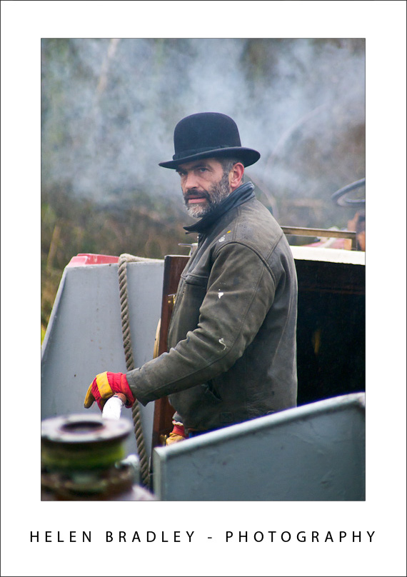
A couple of weeks ago I spent four days on the Isabella – a canal boat – travelling from her moorings at Bishop’s Stortford down to Tottenham in London.

I was totally pampered by owners Grahame and Sue and got to see some wonderful English scenery as we chugged along at a princely 4MPH which is pretty fast until you realise that every mile you hit a lock and those take around 15 minutes to get the boat in and out of – so 4MPH very quickly becomes about half that speed overall. It’s a great way to unwind and to really appreciate this beautiful country and the magnificent legacy of those people who built these great inland waterways and the continuing efforts of everyone charged with keeping them navigable.

Click here to view the slideshow of images from the trip.

Helen Bradley

Friday, December 31st, 2010

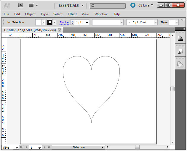
Creating a perfect heart shape in Illustrator

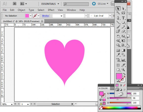
Here’s how to create a perfectly symmetrical heart shape in Illustrator:

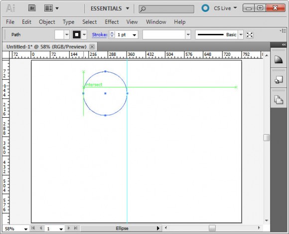
Start in Illustrator and drag a guide to use to position the shape.

Select the Ellipse tool, click on the guide to start and draw a circle shape to one side of the guide. Add the Shift key to make a perfect circle.

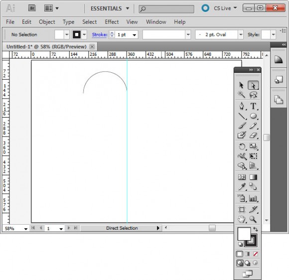
Select the direct selection tool, drag over the bottom half of the circle to select it and press Delete. You should now have a semicircle shape.

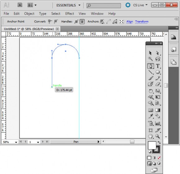
Click the pen tool and then click on the outermost anchor point, the one furthest away from the guide. Click and drag downwards adding the Shift key after you’ve started dragging to ensure the line curves correctly.

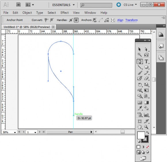
Click again on the guideline and immediately add the Shift key and drag downwards to create half of a heart.

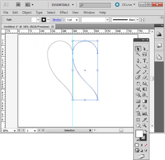
Click on the half heart shape to select it. Drag to the right and as you do, add the Alt and Shift keys (Option and Shift on the Mac) and move the shape until it snaps to the grid line. This should create a duplicate shape.

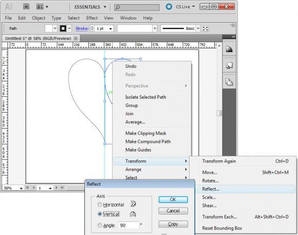
Right click this shape, choose Transform > Reflect > Vertical and click Ok. You now have two halves of the heart.

With the selection tool, drag over both sides of the heart to select them, choose Object > Path > Join to join these into a single shape. You can now remove the guide and you have a custom heart shape.

Helen Bradley

Thursday, December 30th, 2010

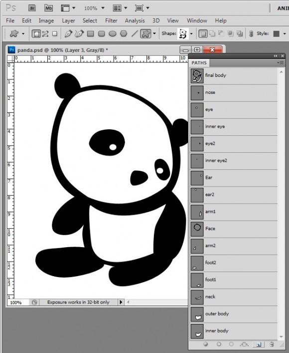
Kawaii Panda Shape – free download

I’ve been messing around today making shapes in Photoshop. This is my final Panda Kawaii shape which I’m offering as a free downloadable shape that you can import into Photoshop and use yourself.

I find shapes are easiest to build up from pieces so I make each piece then build them up bit by bit into the final shape by combining the paths. It’s painstaking work but ultimately rewarding to have a custom shape you can use anytime and scale to any size.

Here is the link to download the shape file – you can use the shape for your own designs but you aren’t permitted to sell the shape or offer it for download from your own site.

Helen Bradley

Thursday, December 30th, 2010

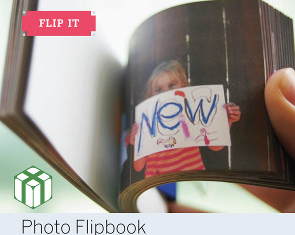
New Year Project – Photo flip books

I recently got asked how you make a photo flip book – you know one of those little books you flip the pages from and something happens?

Well as luck would have it those cool folks over at O’Reilly used to have a magazine called Craft! and they asked me to write an article for them on just this very topic. So, click this link and you will see how to create your very own photo flip book.

I used clips from a movie file for this flip book so there’s lots of fun for everyone involved from writing the signs to making the film and then the tech side of extracting the frames and making the book.

It’s a great snow day/rainy day project.

Helen Bradley

Tuesday, December 28th, 2010

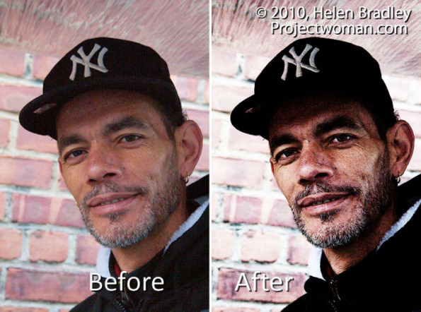
Photoshop: Grunge Portrait Effect

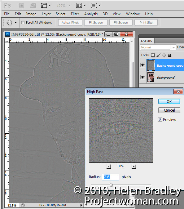
To create a high contrast grunge portrait effect, first duplicate the image background layer, then choose Filter > Other > High Pass, select a Radius that shows lines on the image but not a lot of colour – typically a value of around 5 is sufficient – and click Ok. Set this layer’s Blend Mode to Overlay.

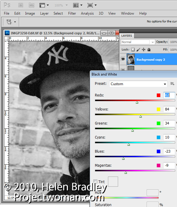
Duplicate the background layer again, moving the duplicate to the top of the layer stack and convert the layer to black and white by choosing Image > Adjustments > Black & White. Adjust the sliders to create an interesting black and white image – dragging the red slider to the left often to darken the reds often works well. Set the blend mode of the layer to Hard Light.

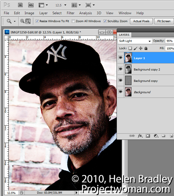
Select the top layer and press Ctrl + Alt + Shift + E to create a flattened version of the image and set this layer’s blend mode to Overlay, Soft Light or Hard Light as desired. Adjust the opacity to suit.

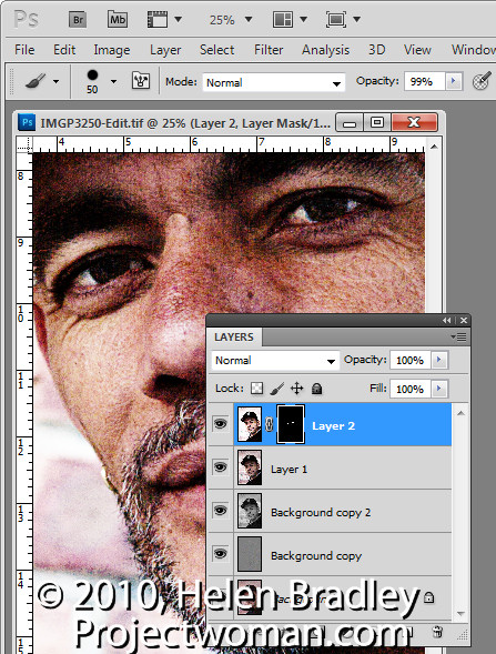
Make a new flattened layer by pressing Ctrl + Alt + Shift + E and use the same process as before to fix the eyes. Choose Image > Adjustments > Curves and adjust to brighten the eyes only. Add a black filled layer mask by pressing Alt as you click on the Add Layer Mask icon. Paint with white on the layer mask to bring details back in the eyes and adjust the opacity of the layer to suit.

Helen Bradley

Sunday, December 26th, 2010

Photoshop Creative: A Simple Composite


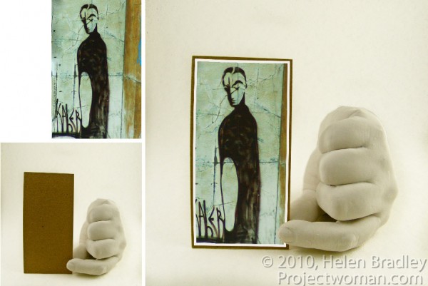
In this post, I’ll show you how to create a simple composite by placing one image in another. Along the way, I’ll not only bend one image to fit its new position but I’ll also show you a layer style trick that overcomes the problem that you’ll see if you scroll down to step 6 and take a look at what happens when I mask the image to make the fingertip show.

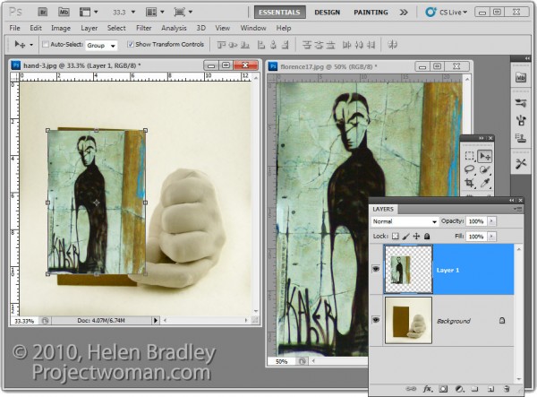
1 To create this composite, open the images to use. We’ll assemble the composite in the image of the plaster hand. Start by dragging the background layer from the photograph into the hand image. It will appear on its own layer and you can now close that image as it is no longer needed.

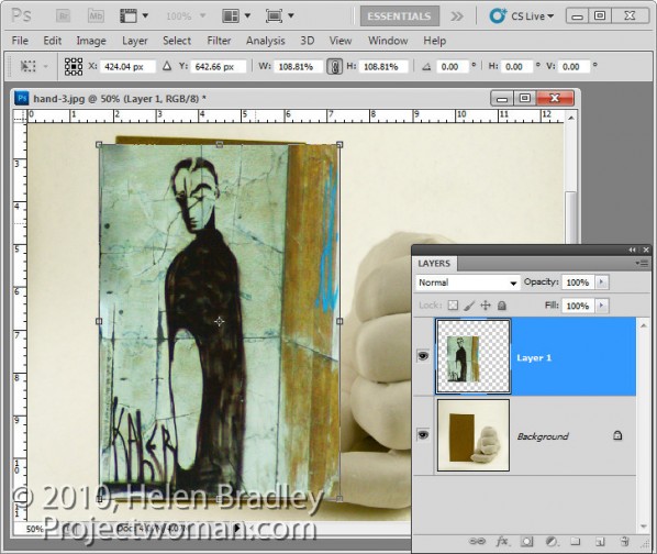
2 Size the imported image to fit where it needs to go. In this case the border will be added inside the image so I’ll make the image almost as large as the cardboard it will be ‘attached’ to.

Size the image in proportion so you don’t skew it. To get it to fit on in dimension it will probably be either too tall or too wide in the other dimension and that’s fine.

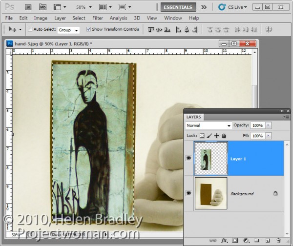
3 Once you’ve applied the transformation, select the rectangular marquee tool and drag over the area of the photo that you want to retain. Choose Select > Inverse to invert the section and press Delete to delete the excess image.

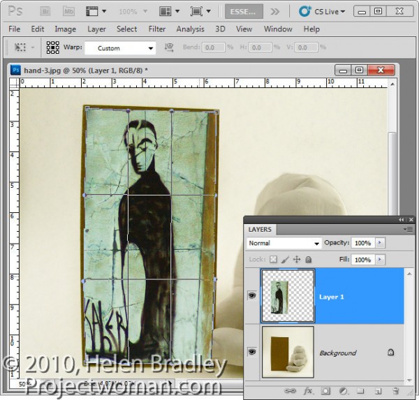
4 To warp the image to fit the shape of the card, select the image and choose Edit > Transform > Warp. This adds a series of warp handles to the image. Drag on these to bend the image so it fits over the area you want to cover.

When you’re done, confirm the transformation.

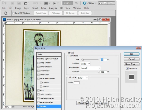
5 To add a white border around the image as if it were a photo stuck to the card, select the image layer, click the Add a Layer Style button at the foot of the Layers palette and choose Stroke.

Set the color to white and the size to a size appropriate for your image. Set the position to Inside so you get square corners on the image (if you choose Center or Outside the corners will be rounded).

 When you are done, click Ok.

6 With this image layer still selected, click the Add Layer Mask icon at the foot of the Layers palette.

Select a medium hard brush, set the foreground color to black and paint on the mask to reveal the finger on the underlying layer. This makes the finger look like it is above the image and not behind it.

One simple way to do this is to hide the photo layer and use a tool like the Quick Selection tool to select over the finger on the background layer. Then, with the selection in place, display the top layer and select its mask. With black as the foreground color, press Alt + Backspace (Option + Delete on the Mac), to fill the selected area on the mask with black.

You’ll see that we have some problems with the mask because it distorts the stroke around the picture. We want the stroke applied to the image and we don’t want the mask to have any effect on it – right now it is having an unwanted effect.

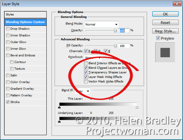
7 To solve the problem, double click the Effects entry in the Layers palette to open the Layer Styles dialog. In the Blending Options area of the dialog, select the check box for Layer Mask Hides Effects.

This configures the mask on the layer to hide not only the image content on that layer but also a style applied to that layer.

Helen Bradley

Tuesday, December 21st, 2010

Lightroom: Embracing Brightness

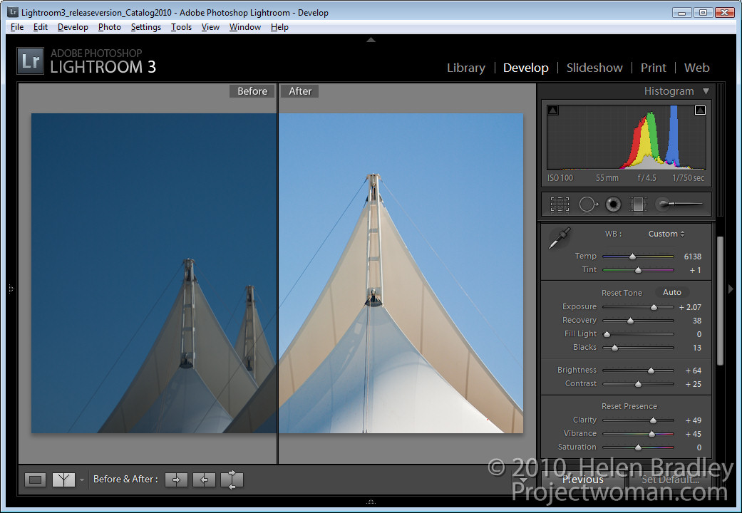
In previous posts I’ve advocated using the Exposure slider to lighten an image but lately I’ve added the Brightness slider to my workflow. I’d encourage you, if you haven’t already done so, to experiment with it on your images.

However, before we begin a word of warning about Brightness/Contrast in general. Brightness adjustments in some programs aren’t as good as in others. If you’re using Photoshop CS2 or earlier, for example, use Curves or Levels to lighten an image not Brightness. In Photoshop CS3 the Brightness/Contrast tool was re-engineered and instead of adjusting all pixels equally as it used to do with the result that highlight areas were routinely destroyed in the process, it now protects the lightest pixels as it lightens the image. Before trusting your image to a program’s Brightness and Contrast tool, check your histogram before and after using it and make sure you aren’t blowing out highlights in your quest for a lighter/brighter image.

Now, back to Lightroom.


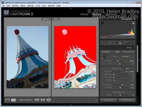
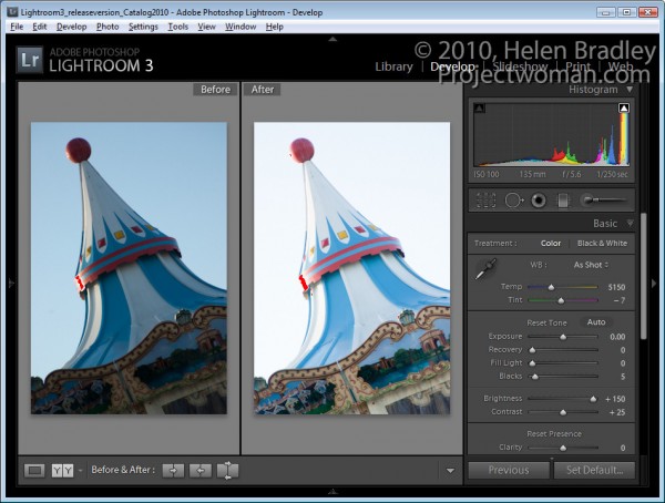
Take a look at the image shown here. If I leave Brightness at the default value – which for my camera is +50 but which may be different for yours, and if I crank up the Exposure to the maximum value, a lot of the lighter  pixels in the image get blown out.

Of course I would never adjust an image to this value but it’s a useful exercise to see how Exposure works.  


When I do the same thing in reverse and leave Exposure at its default value of 0 and crank Brightness up to its highest value only a small number of pixels are blown out.

Using the Brightness slider lightens the image while at the same time protecting the lightest pixels in the image from being blown out as a consequence.

So what does this knowledge mean to you in a typical Lightroom workflow? Well, my new Lightroom workflow for lightening and brightening an image involves using the Exposure slider first of all to adjust the overall exposure of the image but I stop short of where too many highlights get blown out.

Next I test the Recovery tool on the image. Hold the Alt key as you drag on the Recovery slider to check to see if there are blown out highlights (they show as varying colors on the black background). Drag to the right to see if they can be recovered . If they can’t be recovered ease off on the Exposure and check again.

If I have shadow areas in the image that are still overly dark I’ll adjust these using the  Fill Light slider. This tool helps recover detail hidden in shadows, but it’s not a tool I’d use for an overall brightening effect.

Finally, I use the Brightness slider to increase the overall image brightness. Somewhere between the Exposure slider and the Brightness slider is the sweet spot for lightening an image.

From there, I’ll adjust Vibrance and Clarity and sharpen the image.

While we’re on the topic of the Brightness slider, check out the default value on an unedited image so you know where your starting point is. For most raw images, Lightroom defaults to a Brightness of +50 and Contrast of +25 as its starting point.

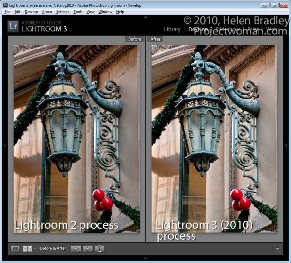
Also take care when working with images you had processed in Lightroom 2 with Lightroom 2 settings. When you upgrade to Lightroom 3, you’ll have a choice of Updating your images to the new Lightroom 2010 Process. My experience is that this can result in a significant lightening of images which were processed in Lightroom 2 so I apply this update on an image by image basis so I can reverse it or adjust for it as I go if necessary.

Helen Bradley

Thursday, December 16th, 2010

Using Lightroom Compare View

In an earlier post, I showed you how to use Lightroom’s Survey View to choose one image from a selection of images. In this post I’ll show you how to use another of Lightroom’s specialty views – Compare View which has a similar purpose but which operates very differently.

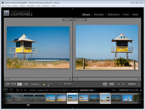
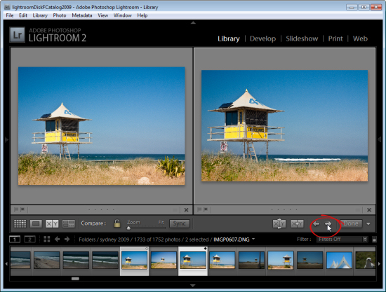
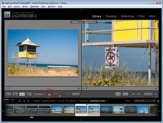
Start in the Library module, select an image and then click Compare View or press C. When you do, Lightroom shows two images, the one you had selected and the one you most recently selected before this one in this same folder.

If you didn’t previously select an image, for example if you selected Compare View immediately after you selected a folder, the first image in that folder will be the only one selected so Compare View will show the first image and the one immediately to its right in the Filmstrip.

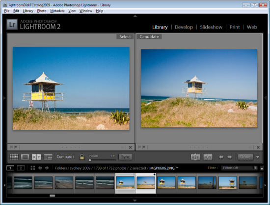
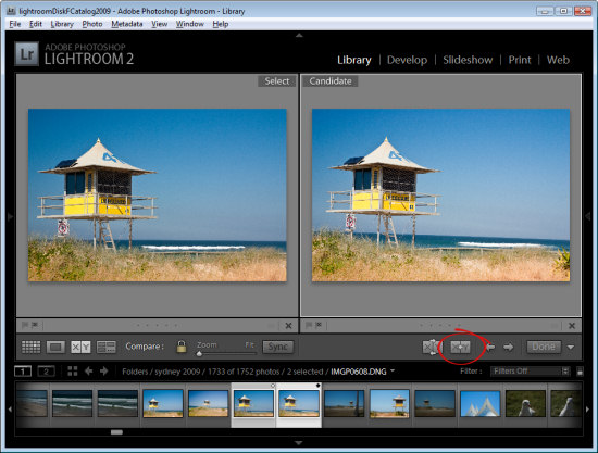
The two images you see are labeled Select and Candidate. The Select image is fixed and the Candidate image can be changed. To do this, click the left or right arrows underneath the Candidate image to move in the direction of the arrow through the folder. This replaces the Candidate image each time you click an arrow with the next image in the Filmstrip.

When you find an image that you want to use as your new select image, click the X<Y (Make Select) button and the Candidate image moves to become the Select image and the next image in the filmstrip in the direction that you had been moving will be the new Candidate.

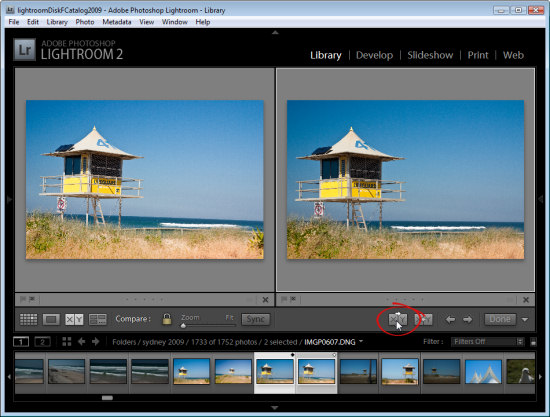
To simply swap the two images, click the Swap button to swap the two images. The current Select image becomes the new Candidate and vice versa.

Continue to work through the images on the filmstrip comparing them until you have the Select image that you want to use.

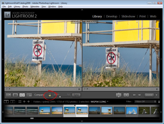
In Compare View, unlike Survey View, you can zoom the images. The lock icon on the toolbar, when locked, lets you scale both images at the one time using the Zoom slider.

If you unlock the padlock icon by clicking it, just the currently selected image (which can be either the Select or Candidate image) will zoom when you click the Zoom button.

You can also use Compare View with just one image by deselecting one of the images in the Compare View. Each image has a small X under its bottom right hand corner, which you can click to remove it. If you remove the Select image this way, you can work through images as Candidate images until you find a Candidate worthy of being a Select image and, when you do, click the Make Select button and the Candidate will become the Select image and the next image in the sequence will become the Candidate.

Click Done to exit Compare View with the Select image selected.

How Compare View and Survey View compare

While Survey View allows you to compare multiple images with each other and to remove images you do not want until you get the one that you do what, Compare View works a little differently in allowing you to view only two images. The Select image always remains in place, but you can scroll through multiple images very quickly to determine if any of them are a better candidate for your needs than the select image. If it is, you can replace them and continue your comparison.

While Compare View allows comparison between only two images, it is more complex to use and understand than Survey View. However it’s a useful way to make a choice from two images as to which is the better and then continue to compare your current ‘best’ pick with others in a sequence.

Helen Bradley

Sunday, December 12th, 2010

Choosing images using Survey view in Lightroom

Lightroom’s Survey view is a tool that makes choosing one image from a group of images a simpler process. In this post I’ll show you how to use Survey View and some tricks for working with it.
Step 1

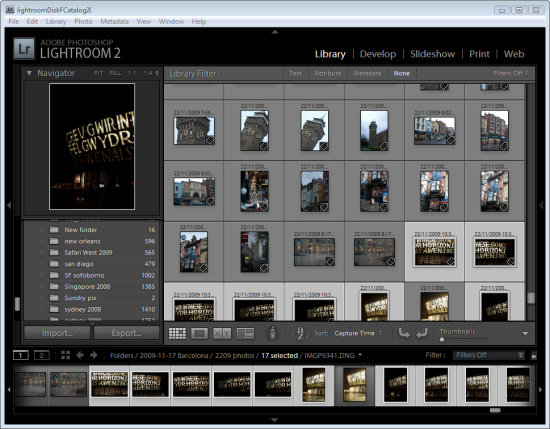
To see it at work, in the Library module, select a series of images on the filmstrip by clicking on one and Shift + Click on the last. Alternatively hold the Control key (Command on the Mac) as you click on each image that you want to make a choice from.
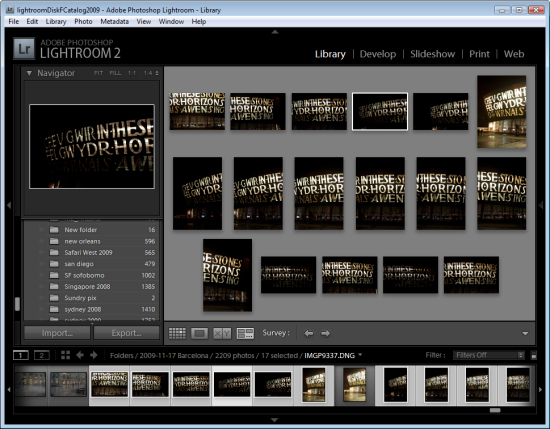
Step 2

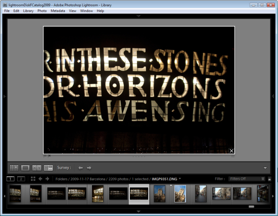
To enter Survey View, choose View > Survey, click the Survey button on the toolbar or press the letter N.

Once in Survey view, you will see only the images that you had selected. You can add more images by Control + Clicking (Command + Clicking) on them to select them in the Filmstrip.
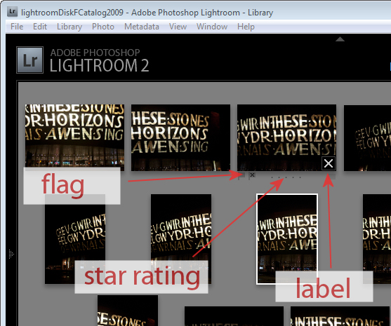
Step 3

In Survey View, you can rate your images with a star rating, flag them and label them or simply use the view to narrow down your choices to a single image.

To rate an image, click the star value beneath the image – this appears when your mouse hovers the image.

You can pick an image by selecting it and press P to flag it, U to unpick or remove the  flag setting from it and X to reject it.

Click the label indicator under the far right of the image to select a label to apply to the image.
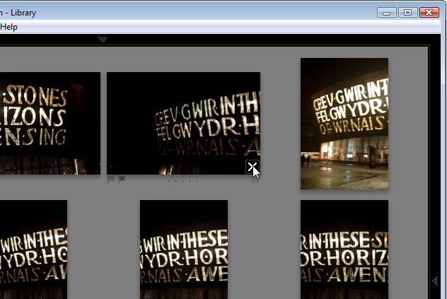
Step 4

Press Shift + Tab to hide all the panels to maximize the viewing area. When an image is selected notice the X in its bottom right corner. Click that and the image will be removed from Survey View. Note that it is only removed from this view not from Lightroom and not from your disk – Survey View is simply a method you use to pick the best image from a sequence and has no other purpose.

Start removing those images you do not want by clicking their X buttons or Control + Click (Command + Click on the Mac) to remove them.
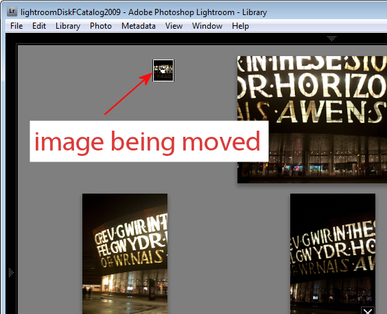
Step 5

Provided you are working with a Folder of images or a Collection (but not a Smart Collection, All Photographs or Previous Import), you can reorder images in Survey View. To do this, drag and drop an image into the position you want it to appear in the group.

Files in a Smart Collection, All Photographs and Previous Imports can be selected and viewed in Survey View but you cannot reorder your images if they are selected from any of these collections..
Step 6

At any time you can exit Survey View by clicking G for Grid or E for Loupe.

The advantage of using Survey Mode is that you can quickly identify the image that you want from a series of images eliminating all the other images from the view as you do so.

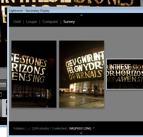
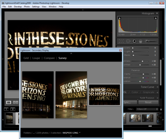
You can open Survey View in a separate window if desired. Press F11 to open the new window and select Survey as what should display in this window.

Using this secondary display window you can move Survey View to a second screen if you’re using two monitors or position Survey View in one area of your screen and work on one of the images in, for example, the Develop module at the same time.
Step 7

When you have only the image or images you want to use remaining selected, press E or G to exit Survey View. These images will remain selected so you can now do something with them such as adding them to a collection, export them or take them to Photoshop for editing.

Helen Bradley

Thursday, December 9th, 2010

Replace Windows Calculator

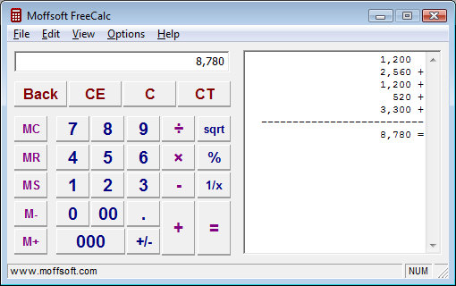
When I use a calculator I like to see the tape – that way I can see what I have done so I can check that the result is based on correctly input data and operators.

Frustratingly the Windows calculator does not include a tape function – seriously it’s not like it would be wasting trees to include one!

My solution is to use Moffsoft FreeCalc which you can find here: http://www.moffsoft.com/downloads.htm. This is a simple calculator you can enter values into using the buttons or the keyboard and it includes a tape that lets you check your entries.

Unbeatable value and a smart replacement for the Windows Calculator app.

Helen Bradley
Page 1 of 212