Monday, February 28th, 2011

Scale a Gradient in Illustrator CS5

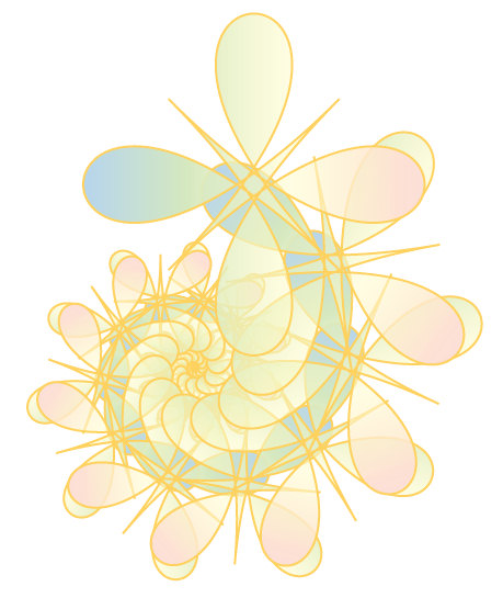
If you’re working with Illustrator CS4 or Illustrator CS5, you can scale, rotate or vary the opacity of a gradient using the gradient bar.

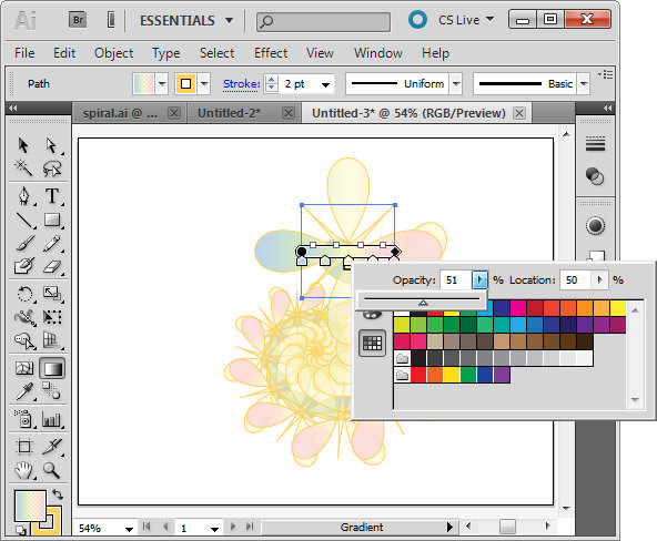
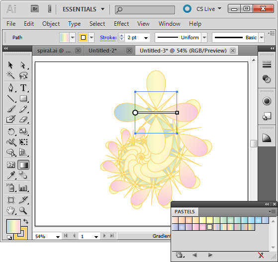
Here I am working with the spiral shape I created in an earlier post on Creating Cool Spirals in Illustrator. Here I have selected the original path using the Selection tool and then clicked the Gradient tool in the toolbar. This displays the gradient bar over the image.

To make a color from the gradient partially transparent double click the marker for that color on the gradient bar. This displays the Swatches dialog with a slider which lets you change the Gradient Opacity at this point.

You can repeat this for other color markers on the bar. Adjusting the opacity of colors for this spiral shape lets colors from shapes underneath appear through the original gradient.

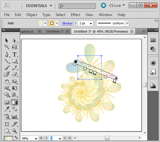
To rotate the gradient, hold Alt as you drag on the square marker to rotate it.

To scale the gradient drag on either end of it to stretch it. You can also move the bar to change how the gradient is applied to the shape.

Helen Bradley

Friday, February 25th, 2011

Scale a font’s height but not width in Word 2010

how to increase font height but not font widthI call this post – one step forward, two steps back. It’s a funky solution but it rocks and that’s why it’s worth today’s post.

Ok, you are in Word and you want to make a great title for a document. But it’s a little long so you can’t make the font really big cause that stretches it too wide. Hmm..

Ok, there’s a setting for scaling font width but not height – so what do you do? Well, with a little ingenuity you can solve the problem by scaling the width – in the reverse direction.

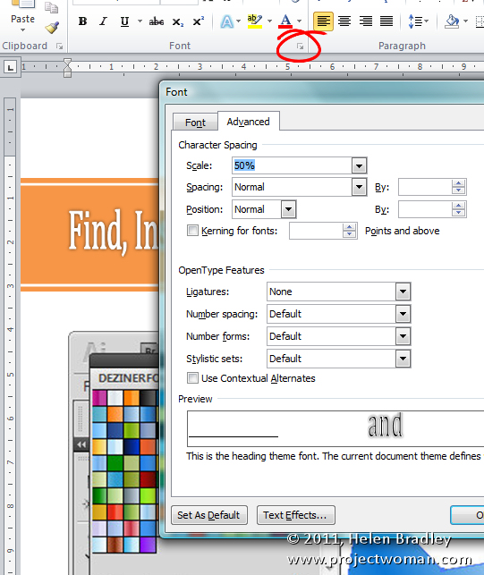
Select the text to alter then click the small icon in the bottom right of the Font group on the Home tab of the ribbon and click the Character tab. Set the Scale of the font to around 50% to shrink its width. Now, back in the Home tab, size the font up so it is nice and big. The ‘big’ font setting gives you the increased font height – which is what you want, and the small Scale value gives you the narrow width which solves the “too wide” problem.

Helen Bradley

Wednesday, February 23rd, 2011

Find and install Gradients in Illustrator

If you’ve come to Illustrator from Photoshop then Gradients will be a feature that will take some getting used to.

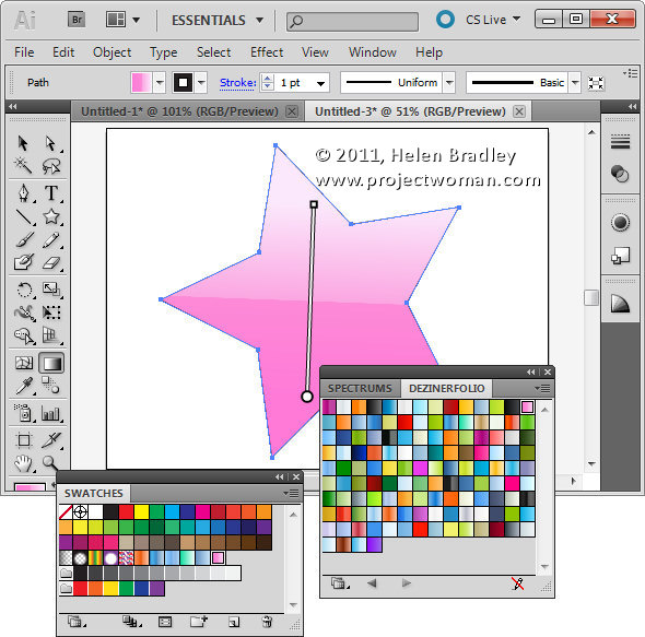
There is no fly out menu on the Gradient palette to use to load new gradients and instead gradients are available through the Swatches palette.

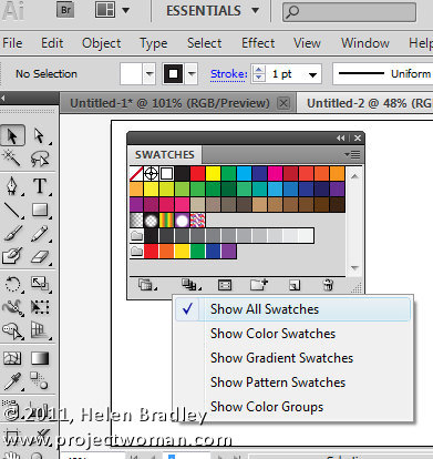
Choose Window > Swatches to view the Swatches palette and make sure that you click the Show Swatch Kinds menu at the foot of the palette and click Show All Swatches. This will display all the swatches you have available.

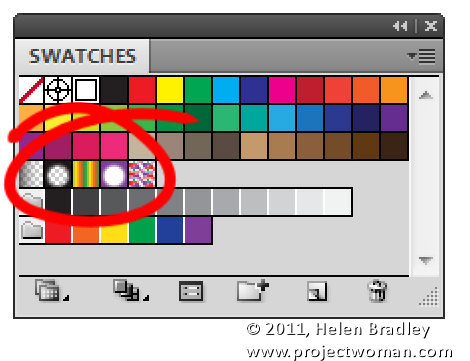
In the middle are your gradients. These include Fade to black, Super Soft Black Vignette, Green Yellow Orange, Purple Radial, and Laguna.

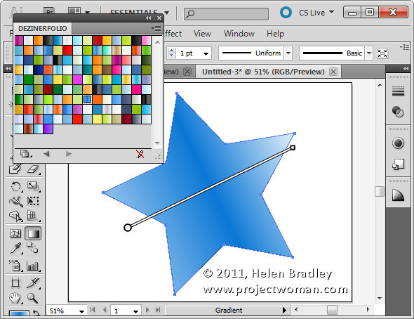
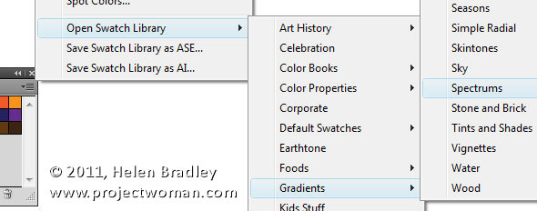
To find and load additional gradients, click the fly out menu on the Swatches palette and select Open Swatch Library > Gradients and then select a set of Gradients to open. These open in a palette all of their own.

Select a gradient to use for an object from this palette and, when you do, it is automatically added to your Swatches palette.

Like Shapes, Brushes and other features of Illustrator you can also find, free gradients online and then download and install them into Illustrator.

How To Install downloaded Gradients

To install downloaded gradients first locate and download the file and, if necessary, unzip it. Once you unzip the gradient you should have an AI file which is your gradient file. I downloaded a set off Web 2.0 Gradients from http://www.dezinerfolio.com/2007/10/15/130-web-20-gradient-swatches-for-illustrator/

Place the .AI file you downloaded in your Illustrator Swatches folder. The location of this depends on your operating system. On Vista it is [user name]\AppData\Roaming\Adobe\Adobe Illustrator CS5 Settings\en_US\Swatches. For other versions and countries you may need to choose Adobe Illustrator CS4 Settings or en_GB etc..

On the Mac choose: [user name]:library: ApplicationSupport: Adobe: Adobe Illustrator CS5: en_US: Swatches.

Close and reopen Illustrator and the gradients will be available in the Swatches palette in the User Defined group.

You can then select and use any of the downloaded Gradients for your objects.

Helen Bradley

Tuesday, February 22nd, 2011

Excel – copy a chart or worksheet as a picture

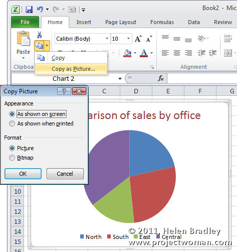
Image showing how to copy part of a worksheet or a chart as a picture

Sometimes you need to place a copy of a worksheet or a picture of an Excel chart onto your website or into a document. When you need only the image itself (not the link or an embedded version of the worksheet) you can make a copy of the area or graph as a picture.

So, with the worksheet open, select over the area that you want to convert to a picture. Or, if you need a picture of a chart select the chart. Now, from the Home tab, click the Copy dropdown list and choose Copy As Picture.

From the dialog which appears, choose Bitmap if you want an image the same size as you see it on the screen. To get an image you can make larger than this, choose Picture as this creates an image which scales well.

Then select either ‘As shown on screen’ or ‘As shown when printed’ as required. Click Ok and the picture will be copied to the Windows Clipboard. You can now paste the image into another application using that application’s Paste tool.

Helen Bradley

Tuesday, February 22nd, 2011

Photography – why you should use a polarizer

Polarizer.jpg

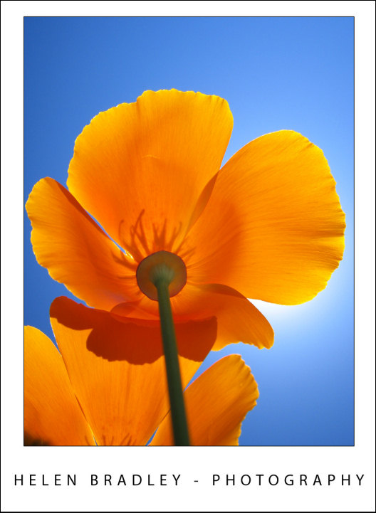
Using a polarizing filter on your camera’s lens ensures crisp blue skies and saturated colours even as here, when shooting into the sun.

You may have already noticed that you can encounter problems you’re capturing photos in very bright sunlight. On the beach, for example, you may find your camera exposes for the lighter areas leaving the remainder of your photograph underexposed and very dark.

In bright sunlight you can benefit from using a Polarizing Filter over the lens of your camera. These filters are obtainable for most DSLR cameras and simply screw onto the lens.

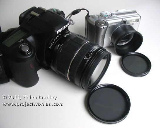
For a point and shoot camera you’ll need to determine if it can take a polarizing filter either on a bracket that screws into the camera’s tripod mount or, in some cases using a special adaptor called a tele converter that screws over the lens and that has a screw mount for the filter.

Image showing a polarizing filter for a dslr and one for a point and shoot which uses a tele converter to mount it

How to buy

When purchasing a polarizing filter for a digital camera you will generally want to purchase a circular polarizer. The other option is a linear polarizer – however circular polarizers are typically recommended for cameras that meter through the lens (TTL) which is what a digital SLR does.

When using your polarizing filter notice it has a marker on it that you can use as a reference point for adjusting it. Look through the viewfinder and turn the filter slowly. As you do this you will notice that the preview will change.

At some point of the rotation it may have no effect at all and at other points it will have an increasingly strong effect. Turn it until you get the effect you are looking for which is good rich color and no washed out skies. When you find the sweet spot go ahead and capture your photo.

A polarizing filter will give you better colour saturation and brighter, bluer skies. It’s also a good filter for photographing things under water from above the water surface such as a tropical reef or seaweed because it cuts out the sun’s reflection on the water surface allowing you to capture the underwater detail.

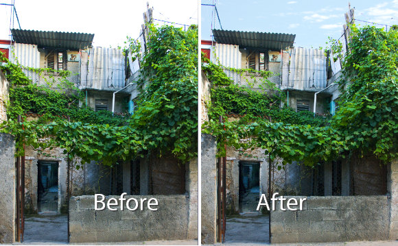
This blue sky would have been washed out if the photo had not been captured using a Polarizing filter:

An image shot using a polarizing filter to ensure rich blue skies

Helen Bradley

Monday, February 21st, 2011

Replacing skies in Photoshop

Reader Michael P. recently sent me an image he’s been working with – his challenge was to replace the sky in the image. The problem was that in replacing the sky the image had ended up with a lot of halos around the edges making the sky replacement look less than believable.

Kindly Michael sent me some of the images he wanted to work on to explain how to fix them more realistically.

This is the building we’ll work with:
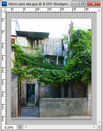
Here’s what I did:

Start by duplicating the background layer.

Drag the background layer from your sky image into your image – if you hold Shift as you do this it  will be positioned in the middle of the image.

Move this layer so it is over the blown out sky.
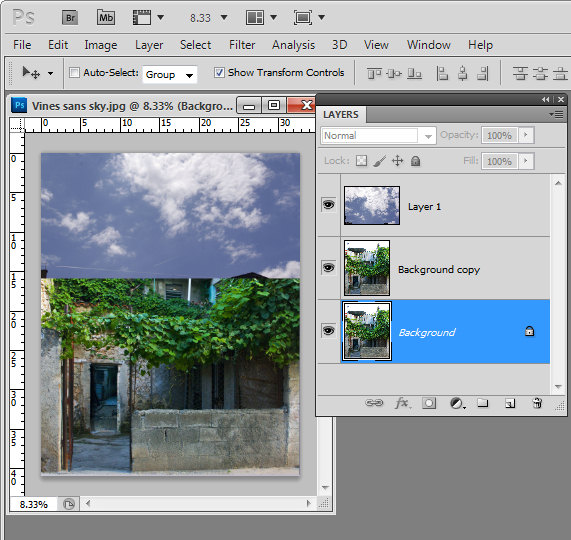
Move the sky layer so it sits between the two image layers.

Select the topmost layer of the image, select the Add a Layer Style icon at the foot of the layer palette and select Blending Options.

In the Blend If  area locate the This Layer bar and drag in from the right hand side of the bar. To split the adjuster in two, hold the Alt key as you drag one marker away from the other.

If you have a really blown out sky set the right side of the marker at 255 and the left side at a value that gives you a good blend effect for the sky – such as 248 or so.

Each image will require different settings.

Look at the result and see if the sky that you’ve brought in really suits the image.

Unfortunately I don’t think this sky works particularly well for this image and the image needs something a lot less dramatic.
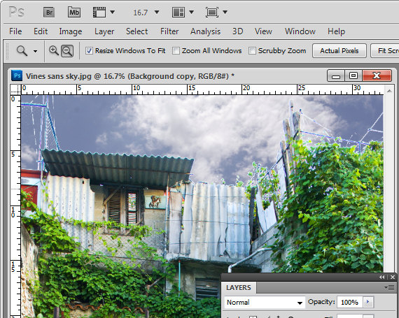
Here is a sky from my own collection which I think will work better.
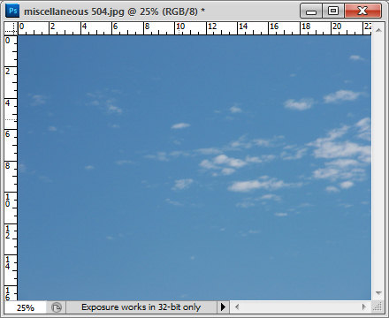
I dragged it into the image above the first sky layer but under the second image layer. The original Blend If adjustment settings work just fine with this sky so there is nothing more to do there.
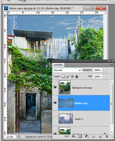
However, there are still problems along the skyline. These can be easily fixed by lightening the sky which I think is still way too dark for this image.

Select the sky layer and choose Image > Adjustments > Levels. What I am looking for here is to lighten the sky so that it blends in more with the image and looks more like it belongs.
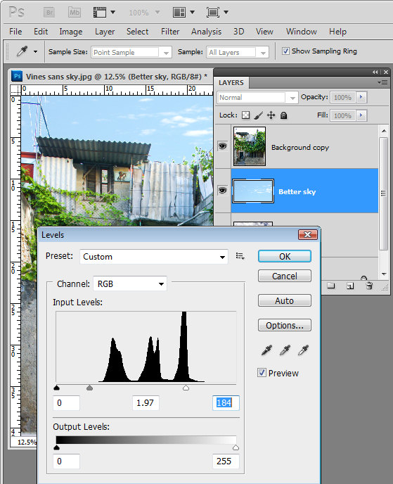
Having lightened the sky, you’ll can further blend it into the image by adjusting the opacity of the sky layer down a bit.

Because the original image is underneath the sky as well as on top of it the effect of reducing opacity is to blend the sky into the underlying image.
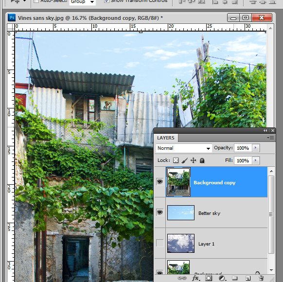
If you find some bleeding of the sky into the buildings you can add a mask to the sky layer by selecting that layer and click the Add Layer Mask icon at the foot of the layer palette.

Paint with black on the mask to remove any blue sky in lighter areas of the building.
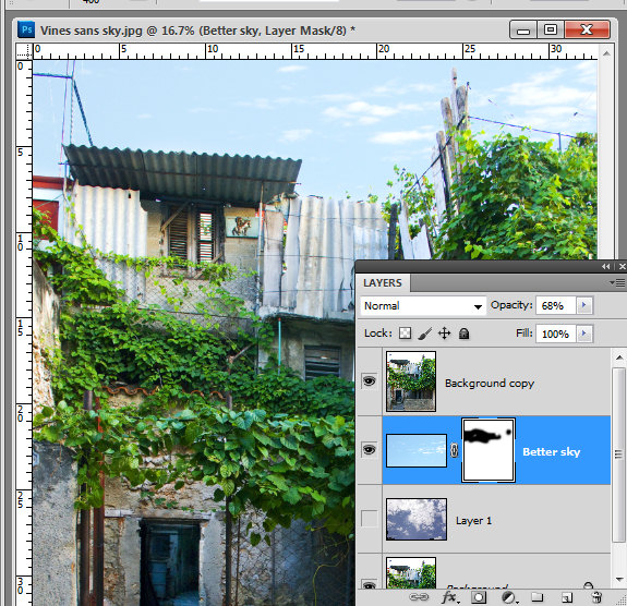
Typically if you find that you’re getting distinct over-lapping of sky around the edges where the blown out sky meets buildings or other elements in the image, the problem will be that you’re trying too hard to replace the blown out sky with something that is too much sky for the image.

You’ll get a better result if you work with a much lighter but still interesting sky.

If you find that you have some very light elements in the original image that are showing white fringing over the blue sky you can avoid these by placing a portion of the sky with white clouds in it under these areas to minimize the obvious white edges.

Helen Bradley
Friday, February 18th, 2011

Create Cool Spirals in Illustrator

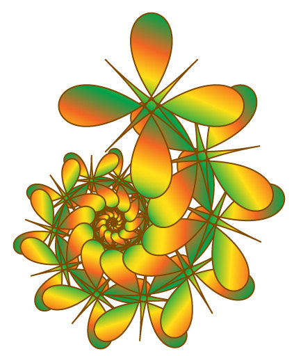
Spiral shapes are simple to create in Illustrator using some of its built in effects.

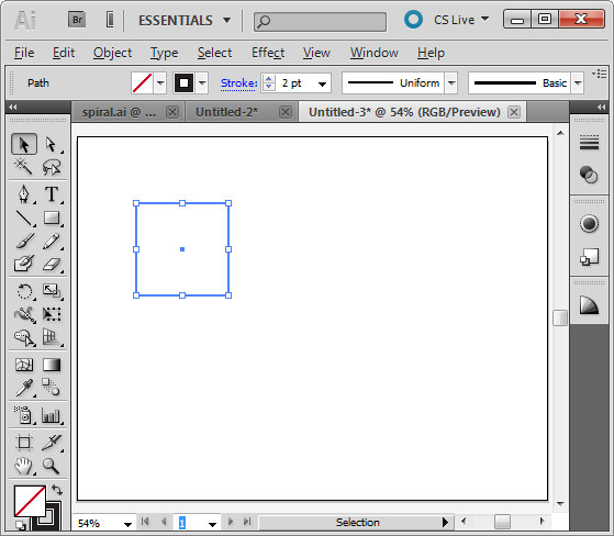
To get started, create a new image and select the rectangle tool. Hold Shift as you drag to create a small square on the artboard.  Set the stroke to around 2 pixels, set black as the stroke color and don’t apply any fill.

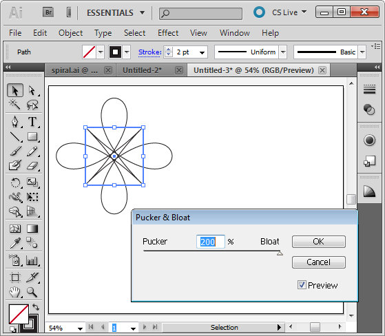
With the shape still selected, choose Effect > Distort & Transform > Pucker & Bloat. Enable the Preview checkbox and drag the slider to create an interesting shape. Here I dragged it to 200, which gives an interesting floral shape. Click Ok to confirm the transformation.

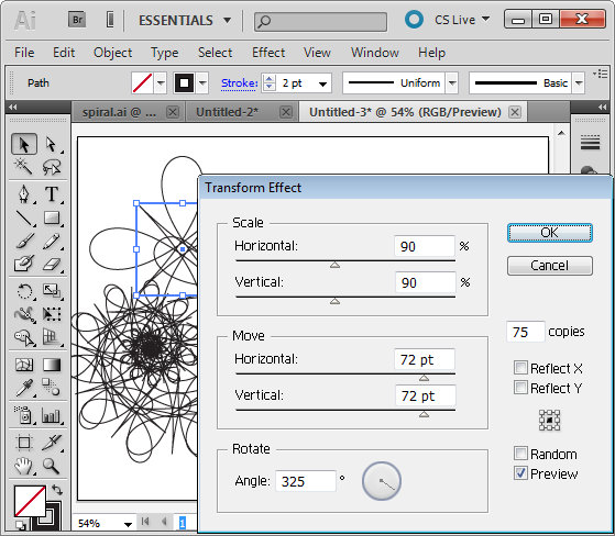
To create the spiral, with the shape still selected choose Effect > Distort & Transform > Transform to open the Transform Effect dialog. Enable the Preview checkbox. Set the number of copies to, for example, 75 and then experiment with various settings of the various sliders.

Changing any of the sliders will alter the shape significantly. Here I set Scale: Horizontal and Vertical to 90% so the shape gets incrementally smaller each transformation. I set the Move: Horizontal and Vertical to 72 pt so the shape moves both horizontally and vertically a small increment each transformation and the Rotate Angle to 325 degrees so each shape is rotated as it is transformed.

Once you have a shape that you like, click Ok.

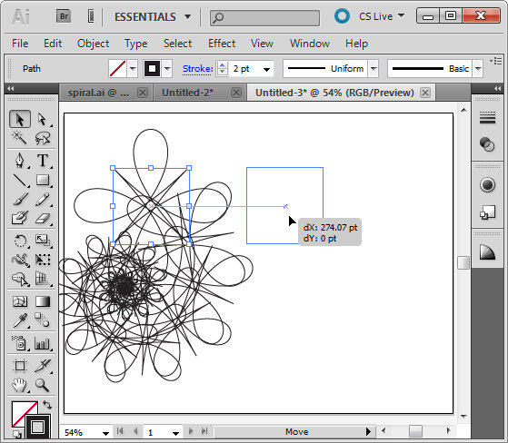
If necessary, use the Selection tool to move the shape back so it sits within the artboard.

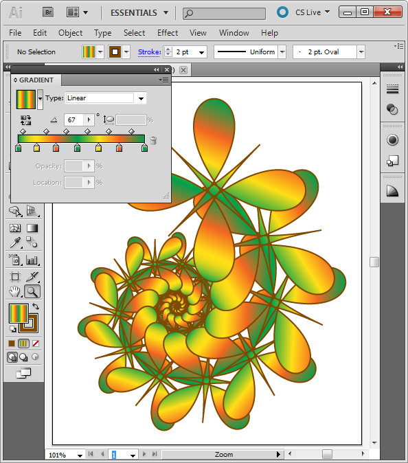
With the shape still selected, set the Stroke to a color of your choice. Select Fill and select a gradient such as the built in Green, Yellow, Orange gradient. By changing the angle of the gradient, for example, you can change the look of the filled shape.
In an up coming blog post I’ll show you more about working with Gradients in Illustrator.

Helen Bradley

Thursday, February 17th, 2011

Excel – Hide a sheet in a workbook

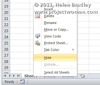
Excel hide a sheet in a workbook from view

If you have data on a worksheet that you don’t want others to see, you can hide the sheet but in such a way that the data on that sheet can still be used in formulas, for example.

To do this, right click the sheet tab for the sheet to hide and select Hide.

Now that the sheet is hidden, you can unhide it if necessary at a later date by right clicking any sheet’s tab and choose Unhide and then select the sheet to unhide.

If you hide the last sheet in the workbook, it will be less obvious to a user that there is a hidden sheet that they’re not being given access to.

Helen Bradley

Wednesday, February 16th, 2011

A cool resource for understanding Av and Tv

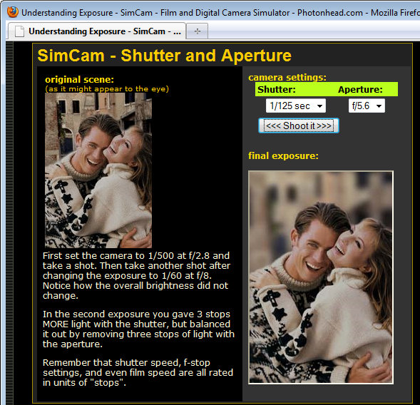
photon simulator showing how shutter speed and aperture relate when taking photos

I’ve been explaining recently why you might shoot in Av (Aperture Priority) or Tv (Shutter Priority)  mode.

Sometimes it can be hard to understand these things so I’ve found a cool tool you can use to see how these interact. Click here to visit the hands on simulator.
The simulator is an interactive camera that you can use online to experiment with aperture and shutter speed. You get to set the speed and the aperture and take your shot – the preview shows you what the image will look like with those settings.

Helen Bradley

Tuesday, February 15th, 2011

Create the Orton effect in Lightroom

The Orton effect is a process named after photographer Michael Orton. The process is a darkroom one where you take two negatives, both overexposed – one properly focused and one slightly out of focus. Sandwiching these together and processing them gives you an image with a slightly surreal look to it.

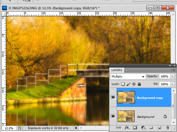
In Photoshop you can create a faux Orton look by duplicating your image’s background layer, set the layer’s blend mode to Screen and flatten the image. Duplicate this layer and set the blend mode to Multiply. Add a medium size radius Gaussian Blur to the topmost layer and, if desired, lighten the image and add some grain to it to give it a classic Orton look. I have a detailed blog post showing how to do this step by step here.

I’ve seen a few people who have said that you can’t replicate this effect in Lightroom because you don’t have layers in Lightroom. However, I’ve developed a workaround solution that gives a comparable result which I really like.

The advantage of this solution is that it can be saved as a Lightroom preset so you can apply it to other images at any time in future.

The process involves starting out with a well-adjusted image so process it as you would any image.

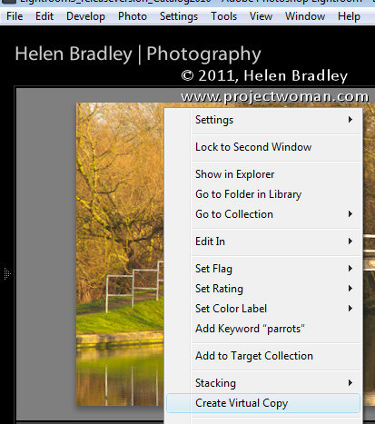
If desired make a virtual copy of the image by right clicking it and choose Create Virtual Copy.

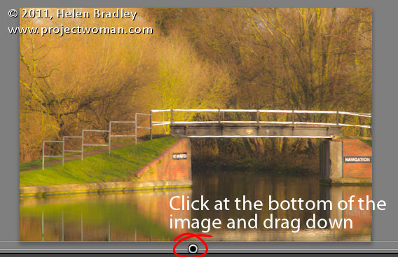
Add a graduated filter to the image. Start the filter just inside the bottom edge of the image and drag down until you are just over the edge. What you want is for the filter to be anchored to the top edge of the image and to extend all the way across the image at a full intensity.

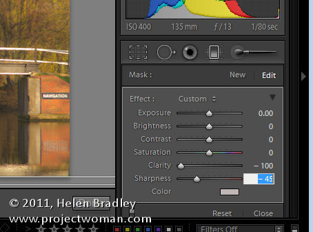
Set the Graduated filter so all values are zero except Clarity = -100 and Sharpness = -45. The combination of negative clarity and sharpness softens the image. Click the Done button under the image.

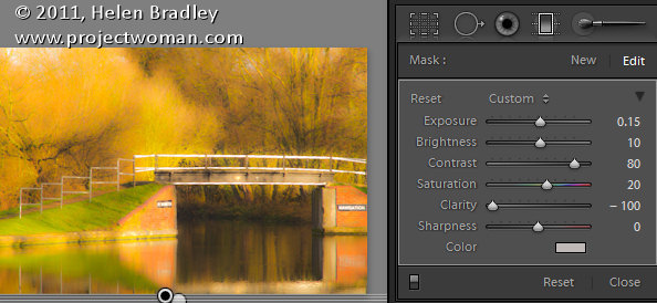
Now add a second Graduated filter over the top of the other one. Apply these settings to the image. Exposure +0.15, Brightness +10, Contrast = +80, Saturation +20, Clarity -100.

You can vary any of the settings on this last Graduated filter if desired to improve the image. What you’re looking for is an image with an ethereal glow.

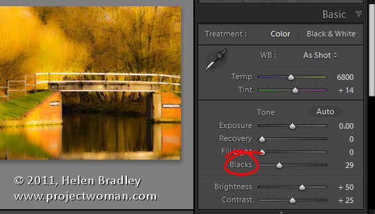
It will help you to get this effect if you boost the Blacks in the image in the Basic panel.

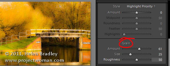
Finish off the effect by opening the Effects panel and add some grain to the image.

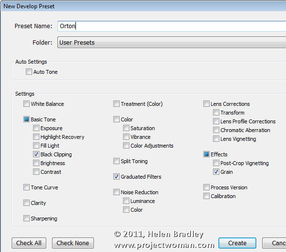
To save this as a preset, click the plus symbol opposite the Presets panel on the left – give the preset a name and disable all checkboxes and then select only the Grain and Graduated Filters checkboxes. If you want to add the increased Black to the preset, click the Black Clipping checkbox too. When you’re done, click Create to create the preset.

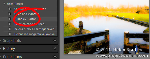
You can now apply this preset to another image. First make sure to properly expose the image and then, open the Presets panel and click your preset to apply it to your image.

You may need to tweak some of the settings for the image as a result of doing this but you should have an image that has a glow effect to it and with a good approximation of the classic Orton look.

Of course, you can achieve the same effect in Adobe Camera Raw.

If you want to avoid the work and use my preset instead – here’s a link to download my free Orton Lightroom preset.

Helen Bradley

Page 1 of 212