Friday, January 28th, 2011

Crafting images in Lightroom

Lightroom has more tricks up its sleeve than simple photo fixes such as exposure and contrast. It’s possible to craft images inside Lightroom and, in many ways, the tools in Lightroom make the task easier than it would be in Photoshop or another editing program.

In this post I’ll show you a way to turn a relatively hum drum image into something much more visually exciting. So, when you don’t get the image you want straight out of the camera see if, armed with some simple Lightroom tools, you can coax some better results from it. Remember too that this is a creative technique – you’re not looking for realism as much as a way to create a different look for your image.

Step 1

Start out with an image that has what I call “good bones”. It needs to be pleasingly composed and it needs to have something that compels you to want to look at it and to spend some time working with it. Good contenders for this process are images with interesting skies and these include heavy clouds and clouds captured at sunset and sunrise.

Step 2

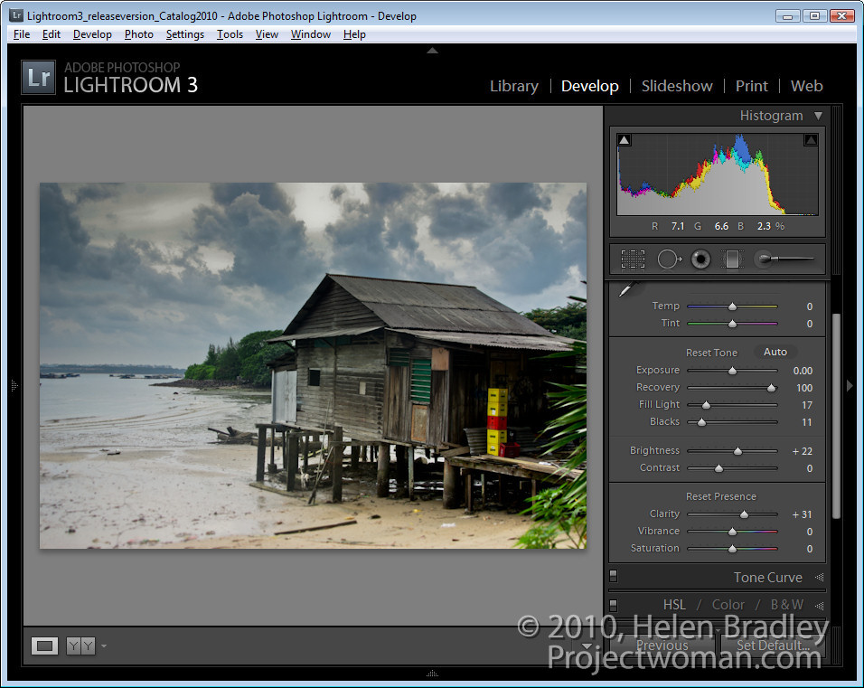
In the Develop module use the adjustments in the Basic panel to apply global adjustments to the image. I focus in detail on the adjustments that aren’t available in the Adjustment Brush and Graduated Filter such as Blacks, Fill Light, Recovery and Vibrance.

I will adjust the Recovery slider at least half way to the right and adjust Fill Light to get some detail from shadows. I’ll adjust the Blacks even to the extent of plugging some shadows for now. I’ll also use other adjustments such as Exposure and Brightness just as a start.

The fact that none of these changes are permanent is a big plus because if you don’t like the results later on you can come back and readjust them.

Step 3

Having dealt with the overall image I’ll now turn my attention to parts of it. Here there are three areas in particular – the hut and bottom right of the image, the bottom left and the sky.

Starting with the hut I’ll drag the Graduated filter in from the bottom right of the image. Then I’ll bring some detail out in that area by adjusting Brightness, Exposure and Clarity.

Step 4

The sky is treated the same way as the hut. This time the Graduated Filter is dragged down from the top. Then I decreased Exposure and Brightness to reveal the detail in the clouds. I added some Contrast and Clarity and a hint of dull yellow color.

Step 5

In the bottom left of the image another Graduated Filter adjustment fine tunes this area of the image and adds a hint of dirty yellow color. Reducing both Sharpness and Clarity softens the details here.

At this point I might consider adding a second Graduated Filter over the top of this one to again reduce Clarity to soften the details even more. The Graduated Filter can be used cumulatively so adding one on top of the other enhances the effect.

Step 6

Once I’ve finished with the Graduated Filter, I will return to the Basic panel and fine tune the settings there. Here I adjusted the Brightness and Fill Light to lighten the image a little.


Step 7

At this point I cropped the image to remove some excess detail from the bottom and right edges to focus interest more in the water and the hut.

Step 8

To finish, I used the Adjustment Brush on the plastic crates. By painting over them with the brush and reducing the Exposure slightly they are made a little less distracting.

At any time I can revisit any of the changes I have made including those applied with a Gradient Filter or the Adjustment Brush and adjust the settings if desired.

Not every image will lend itself to this treatment but many will. You should note too that here I was working on a jpg image and because of the in camera processing applied to jpg images and the fact that much of the data that the camera captures is discarded in the process of saving an image as a jpg, the scope for adjusting this image was significantly less than would have been the case if I had the image captured as a raw file.

Helen Bradley

Thursday, January 27th, 2011

Help! Windows can’t find my Camera Card

Lately I have been having all sorts of problems with my camera card in multiple computers in that the computers couldn’t (or wouldn’t) recognize a card when I put it in the card slot.

It got to the stage where it was fairly obvious that the problems were less an issue with the camera cards themselves and more a problem with Windows.

So, if your SD, XD or compact flash card isn’t being recognized by your computer, don’t blame the cards or yourself and, instead blame Windows! And then step through this process to fix the problem:

Step 1 Click the Start button and choose click Settings > Control Panel and open the Device Manager. On Windows Vista you’ll need to have admin status to do this.

Step 2 Locate the Universal Serial Bus Controllers option and open it.

You’ll see some USB mass storage devices listed and these control your USB Mass Storage Devices. You need to disable them so right click each USB Mass Storage Device and choose Disable. Repeat this for all the devices listed – only disable the USB Mass Storage Devices – not anything else and don’t Uninstall them – just disable them.

Step 3 When you do this, you’ll be warned that you need to reboot your computer so do this and Windows will automatically find your mass storage devices when it boots.

In future, it’s best not to use the option to Safely Remove a Storage Device and instead open up My Computer, locate the drive, right click it and choose Eject. This safely ejects the card so that you can remove it and ensures that the storage device isn’t clobbered so it doesn’t work any longer.

Helen Bradley

Thursday, January 27th, 2011

Understand your cameras settings – Part 1 – Aperture

All digital SLRs and many point and shoots can operate in manual or semi-manual modes. If you capture most of your photos using Auto mode it’s time to look at some of the benefits you can get by switching to semi-manual operation.

With these modes you control the aperture or shutter speed and you get a chance to capture more creative photos. So how do you do this and what settings do you use? In this series, I’ll explain your camera’s Aperture Priority and Shutter Priority (Av and Tv) modes and also explain why your ISO setting  is important to understand too.

If your camera can operate in manual mode you’ll have settings such as M, Av, Tv and P on your camera’s dial. The two settings we’ll focus on are Av and Tv where you set the aperture or shutter speed yourself.

What is Aperture?

This begs the question, what is aperture and what is shutter speed? Aperture is, very simply, the size of the hole through which light enters your camera. The larger the hole, the more light gets in.

Aperture is described using an f number which is calculated using a complex formula. A rough rule of thumb is to think of aperture being a fraction so an f number (often called a f-stop) of f/2.8 is bigger than f/22 for example.

Understanding aperture

Aperture not only has a direct relationship to the amount of light let in to the camera, it also affects depth of field. When you use a large aperture such as f/2.8 you will get a small depth of field so only a small distance in front and behind the point of focus in the photograph will be in sharp focus and the remainder of the image will be out of focus.

Depth of field is a creative tool that many photographers use to their advantage. For example, when photographing a beautiful flower, you’ll want the focus to be on the flower and not the things behind it. Using a large aperture such as f/2.8 throws the background out of focus. The photograph at the top of this post is an example of a large aperture and a small depth of field.

On the other hand, using a small aperture such as f/8 or f/11 gives you a large depth of field so everything in the photograph will be in focus – useful when photographing landscapes for example.

The relationship between Aperture and Shutter speed

When you set the aperture using the Av setting on the camera, the camera sets the shutter speed to an appropriate value. This is because there is a direct correlation between aperture and shutter speed.

When you use a small aperture, only a small amount of light comes into the camera so you need to compensate for this by using a slow shutter speed to ensure you capture enough light.

On the flip side, when you use a large aperture such as f/2.8, you get lots of light so the camera will set a fast shutter speed.

When you use Av mode, you’re effectively saying, I’ll set the aperture I want and you – the camera – are to adjust the other settings to give me a good picture. When you are in Av mode, there will be a dial or other option you’ll use to set the desired aperture value.

Helen Bradley

Tuesday, January 25th, 2011

Color an object to match an exact color in Photoshop

Completed image color matched to a selected=

Finished project: a garage door color matched to a selected Pantone color. Image (c) Sarej, sxc.hu.

One issue that a lot of people face is matching color in Photoshop. You may have a Pantone color that you want to match to or some other color and you want an image to be colored this way.

The solution is to start with a Grayscale version of the image, so desaturate the image to start with and make sure it is light enough to take your color – so if you want to use a light color brighten it to suit.Image of desaturated image ready to apply color to it

Now add a new fill color layer to the image by choosing Layer > New Fill Layer > Solid Color and click Ok.

Set the solid color to the RGB or CMYK values of the color that you want to match. Set the Blend Mode for the layer to Color.

Color blended layer showing initial recoloring of subject to match a pantone color

I chose Pantone 359C which has RGB values of 161, 216 & 139.

Right now you’ll have a reasonable match for the color but not as good a one as you can get.

To improve it, select the Color Sampler Tool, which sits under the Eyedropper tool in the tool palette, and click in an area of the image that you want to be that particular color.

Because the grayscale values will vary, you need to identify a place in the image that you want the color to be exactly your chosen color. Around it, the other tones in the image will vary as they should – some will be lighter and some will be darker. Click on that point to add a color sample point.

Image showing color sample point in place we want to exactly match the Pantone color

Now add a curves adjustment layer by choosing Layer > New Adjustment Layer > Curves. Click Ok to create the curve adjustment. If you’re using Photoshop CS3 or earlier, Ctrl + Shift + Click (Command + SHift + Click on the Mac) on the color sample point to mark this point on the curve in the Red, Green and Blue channels.

If you’re using CS4 or later, the functionality of the curves dialog has changed. In this case, you should use the On Image Adjustment tool, which is the tool in the top left corner of the curves dialog, which has a hand on it. Click this, then Ctrl + Shift + Click (Command + Shift + Click on the Mac) on the sample point to add the marker to the Red, Green and Blue channels.

Image showing marking color sample point on the RGB curves

Now select the Red channel, click on the marker you just added and adjust the Output value to the Red value of the RGB color number that you want to match. Repeat this for the Green and the Blue channels. Then close the dialog. In my case I’ve set the Red output value for this selected point to 161, the Green to 216 and the Blue to 139 to match the Pantone color values. If you are trying to match a CMYK value then you’d do the same thing but for the Cyan, Magenta, Yellow and Black channels.

Image showing curves dialog and adjusting the Red green and blue curves to match the RGB values of the chosen Pantone or CMYK color

To remove the Color Sample Point, select the color sample tool and hold Alt as you hover over the sample point. It turns into an icon like a pair of scissors which you then click to remove the sample point.

You will end up with an image where, at your designated point, the color is exactly as you wanted it to be.

Thanks to blog reader Lesley Clarke for posing the question.

Helen Bradley

Tuesday, January 25th, 2011

Simple Photoediting workflow – Step 14 – Optimize your image

When you’re ready to prepare your photo for printing or sharing on the web. Use the Image > Resize > Image size option to adjust the image size.

Make sure the Constrain Proportions and Resample Image checkboxes are selected so you can set the desired size correctly.

For web display, set the resolution to 72 pixels per inch and then set the Width and Height dimensions to the desired value. Remember as you do this that even a very large monitor is only 1920 x 1080 pixels in resolution so you don’t generally want an image to be more than that size if you’re just putting it up on your website, for example.

For printing, set the resolution to anything from 150 – 300 pixels per inch and set the size to your desired print size such as 5 x 7in. Because you are resizing the image (not cropping it), it probably won’t resize to the exact proportions but you can get it close to this.

To save the image, choose File > Save As and, if you are planning to display it on the web save it in the JPEG format.

For printing and storing locally on your computer, the TIFF format, Photoshop .PSD format or a high quality JPEG are acceptable.

If you plan to both print a copy of the photo and share one on your web site, for example, size it for printing first, and save that copy and then resize for the web and save this version with a different name.

Other stories in this Simple Photo- Editing Workflow series:

Step 13 – Sharpen

Step 12 – Major Surgery

Step 11 – Getting to black and white

Step 10 – Fixing Redeye

Step 9 – Fixing Imperfections

Step 8 – Fix Skin tones

Step 7 – Fix Color problems

Step 6 – Fix muddy images

Step 5 – Fixing under and overexposed images

Step 4 – Straighten

Step 3 – Crop an image

Step 2 – Make a duplicate

Step 1 – Assess the image

Helen Bradley

Monday, January 24th, 2011

Photoshop – Free Valentine heart shapes download

free download 14 valentine heart shapes for photoshop

I’ve been messing around in Photoshop this week making heart shapes. As a result I wrote a blog post to show you how to make these shapes yourself.

Just in case you want to take the easy way out, here is a free download with a collection of 14 hearts just in time for you to use for Valentine’s Day projects.

As with all  my downloads, you are free to use them for non commercial purposes, they may not be given away, they may only be downloaded from this site. Commercial licenses are available by request.

Helen Bradley

Monday, January 24th, 2011

Join two tables together in Word

How to join two tables together in Microsoft Word

Quite often you’ll find that you have two tables in a Word document and you want to join the two together to make just one table. The solution is simple but way from obvious.

To do this, first select over all the cells in one of the two tables. If the table is underneath the one you want to join it up to, then press Alt + Shift + Up Arrow to move the table up the document so that it joins the bottom of the table before it. Keep pressing the key until the top row that you have selected joins the bottom border of the one above.

If you have selected the topmost table, then press Alt + Shift + Down Arrow until the top table locks onto the table below.

You can also drag one table up or down until it joins but this method is very slick. It also works on a single row so you can take one row from one table and move only it to join up with another table or to become a table all of its own. Experiment with this key combination – I’m sure you will love it.

Once you’ve done this, the tables will be joined to make one single table. If desired, you can then adjust the positioning of the columns so that the columns match between the two tables – this isn’t required but you may want to do it if the columns are supposed to be the same throughout.

Helen Bradley

Thursday, January 20th, 2011

Word – place a table over newspaper columns

Place a table over two columns in Word

Sometimes you’ll need to include a table in a document but place it so that it’s placed over a series of columns rather than inside the column itself.

To do this, click where you want the table to appear and insert the table at this point.

Hold your mouse over the table and you’ll see the table selector above the top left corner of the table. Click it to select the table and drag the table into position.

The default text wrap settings for a table in Word is that the text wraps around the table so there’s no special option to set to make this happen.

You can widen the table cells as large as necessary. If desired, the table can be sized so it fits the full width of the page or you can make it any size that you want.

To adjust the wrapping of text around a table, right click the table selector (the little square above its top left edge) and choose Table Properties > Table tab. Here you can select how text flows around the table or you can make it not flow around it if you want the table to push the text completely out of its way.

Here too you can alter the alignment of the table – by choosing Left, Center or Right.

This table behavior is consistent across Word 2007, 2010, 2003 and earlier versions.

Helen Bradley

Thursday, January 20th, 2011

Step 13 – Simple Photoediting workflow – Sharpen the image

When you have finished working on an image you should sharpen it to make the edges in the image look crisper so that they look better when printed on paper and displayed on the screen.

In Photoshop Elements, choose Enhance > Unsharp Mask and set the Radius to around 1.0 – 2.0 pixels. Select a low Threshold value of somewhere between 3 and 10 and adjust the Amount as required.

You will require a higher level of sharpening for images that you will print than you need for display on your computer screen or on the web, for example.

Use the Preview option to check the before and after results of sharpening to ensure you are getting the desired result. You should see the sharpening effect clearly at 100% view, but you should avoid making  visible halos around the edges in your image.

If your image was a little soft and lacking sharp focus before you begin, use a larger Radius value for the sharpening.

If you have been creating layers as you fix your image you must apply sharpening to a flattened version of the image, so choose Layer > Merge Visible to do this.

Other stories in this Simple Photo- Editing Workflow series:

Step 12 – Major Surgery

Step 11 – Getting to black and white

Step 10 – Fixing Redeye

Step 9 – Fixing Imperfections

Step 8 – Fix Skin tones

Step 7 – Fix Color problems

Step 6 – Fix muddy images

Step 5 – Fixing under and overexposed images

Step 4 – Straighten

Step 3 – Crop an image

Step 2 – Make a duplicate

Step 1 – Assess the image

Helen Bradley

Tuesday, January 18th, 2011

Word: Inserting a line Between Columns

Word - how to add lines between columns in a Word document

One of the features of Microsoft Word is the ability to insert a line between columns in a Word document.

In Word 2003 and earlier choose Format > Columns and there is an option for Line Between in the dialog. Select it and click Ok and a line will appear between the columns.

In Word 2007 and 2010 the option is harder to find. You need to select the Page Layout > Columns > More Columns Option. This opens the Columns dialog, which gives you the opportunity to select the Line Between checkbox.

If you want to disable this feature, go back to the columns dialog and disable the checkbox.

Helen Bradley

Page 1 of 3123