Thursday, September 27th, 2012

Photoshop make stripes quickly and easily

Learn how to make colored stripes in Photoshop. This uses a mosaic filter to turn a regular image into blocks of color from which stripes are extracted. Once you’ve done that you can then create a madras check from this stripe image and I’ll show you how to do that too.

Check out all our tutorials on our YouTube channel.

Complete transcript of this video:

I’m Helen Bradley. Welcome to this video tutorial. In this tutorial I’m going to show you how you can create quick and easy stripes in Photoshop. And this is going to work in practically any version of Photoshop. Before we start and I show you exactly how to create this effect let’s have a look and see the kind of effect that we are creating. What I have here is a series of stripes in Photoshop. It’s a document that is full of stripes. And you can see here that I’ve also been able to create this as a sort of plaid look. So we’re going to look at both options here, and we’re going to create this set of stripes from a photograph really, really easily. So let’s just get rid of that document. And let’s go to our starter document. Now you can start with any document at all. I like to choose something that’s in the sort of range of colors that I want to see in my stripes. This is what I got my stripes from. So if you want pink and blue stripes then find an image that has say pink and blue flowers in it, or you could adjust it with a Hue/ Saturation adjustment later on. But we’re going to start with a filter. I’m going to choose Filter and then Pixelate and then Mosaic. And what the Mosaic Filter does is it turns this image into a sort of mosaic look. And what I want is nice big cells because that’s going to give me the stripes that I’m going to use in a minute, and the bigger the cells the less stripes I’m going to have. So I’m going to just choose quite a big value for us for now and just click Ok. And so there are the beginnings of my stripes. And now we’re going to use a tool, probably a tool that you’ve never used before and wondered what it’s purpose was, but this is this tool here. It’s the Single Row Marque Tool. And we’re going to click at the edge of a row because we want to take just one row of this image. And these are going to be the colors that we’re going to use. So I’m looking for something here with some blues and pinks and yellows in it. So let’s just select this one here. So I’ve selected a single row. And I’m going to choose Edit Copy because that’s copied that row. And now let’s create a new document. And I’m going to make it nice and big so let’s say three-and-a-half thousand pixels by three-and-a-half thousand pixels. And it can have white as its background. That’s Ok. I’ll click Ok. I’m going to add a new layer. And I’m going to paste my copied shape into it, Edit Paste. And it’s coming in here in the middle. It’s just such a small line, it’s almost impossible to see. But I’m going to target the Move Tool just by pressing the letter V. And now I’m going to drag it to fill the image because these are my stripes. And when I click the checkmark I now have my stripes. Now I’ve lost a bit of the yellow off the edge. So maybe I can just bring it in here. And I’ve got some slightly thinner stripes. And if I don’t like this color here I could just drag that off the edge and not even use it. So now I’m going to crop my image because I want to crop it to delete the cropped pixels. So I’ll just press Enter to crop it to size. And there is our stripe. So we could create this as a pattern if we wanted to use it over and over again, or if we just want to use it for now then we have it in place. So let’s see how we would make that into a plaid. I’m just going to duplicate this layer because I want to keep my stripes just in case I want to use them again later on. And what I’m going to do is reduce the opacity of this layer to about 60 percent, and then I’m going to duplicate it again. So I’ve got two layers each of about 60 percent opacity. And all I’m going to do is target this top layer, let’s grab the Move Tool, and I’m going to rotate it around 180 degrees. So I’m just going to hold the Shift key as I do that so it’s rotated to exactly the right number of degrees and just click the checkmark here. So now I have this sort of plaid madras sort of stripe pattern. I could change the blend mode if I wanted to by targeting the top layer and change the blend mode to something like Overlay. And that will give me a contrastier look. I could also try Difference or Exclusion. And that’s making a sort of otherwise brown and green pattern turn into a blue sort of pattern. So we have all sorts of options here. Here’s our original stripes garnered from our original photograph. And then what I’ve done is created two copies of it at an angle to each other and 60 percent opacity with a blend mode to create something that’s more like a madras stripe pattern. And this could be copied as a pattern or saved as a pattern by choosing Edit Define Pattern. We could use that as a pattern at any time. Before I create it as a pattern I’m just going to make sure that I’ve got rid of those pixels at the edge. I want it to be exactly square, and that’s not exactly square. But you can see the possibilities of working with stripes and patterns in Photoshop. I’m Helen Bradley. Thank you for joining me for this video tutorial. You can find more of my Illustrator, Photoshop and Lightroom videos on this YouTube channel. And visit projectwoman.com for more blog posts and Photoshop tutorials.

Helen Bradley

Wednesday, September 26th, 2012

Wonder with a wide angle

Wide angle lenses come in two types, some are wide angle and some are fisheye. I have a fisheye and from my experiences recently with it, I am tempted to buy the other type – not because I don’t like the fisheye, but because I see the possibilities with a wide angle lens.

Where I use a wide angle is when I have a lot of stuff in front of me – generally high things and where it just doesn’t fit in the screen.

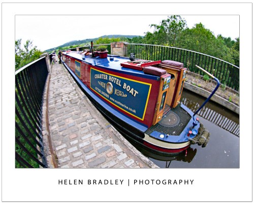
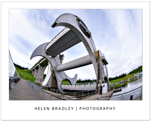
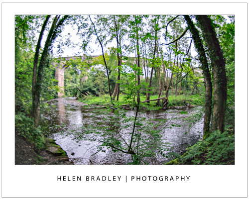
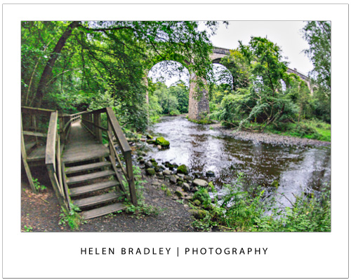
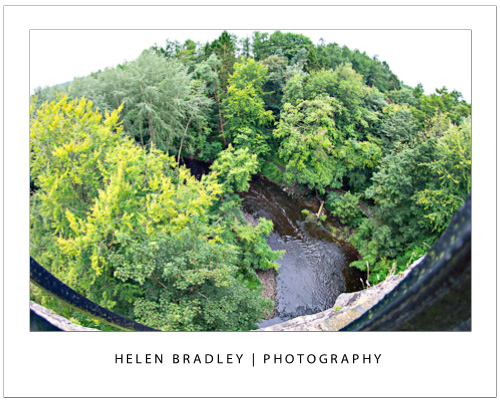
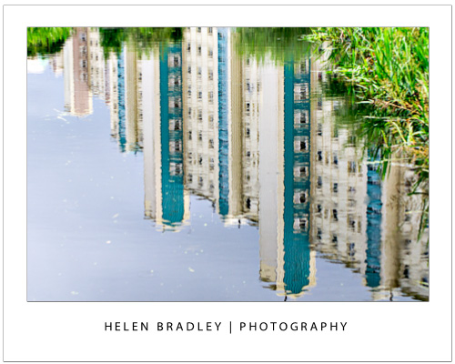
These next images are from the Avon Aqueduct in Scotland. It is high and wide – impossible to capture without a wide angle, but with a wide angle lens everything fits nicely and you get an idea of the scope of the structure.


Now on the top of the aqueduct, which by the way is a canal for boats, the view is expansive. Huge, wide, diverse and you really want everything in the one shot if you can. Here, again, the wide angle saves the day and lets you get plenty of the scene in your shot.


In fact, this trip to Scotland, I pulled the wide angle out a few times. Tall buildings, streetscapes and bridges all got captured with it. I love the curve you get with the fisheye but I’d like the option to just get a wide shot without the bulge sometimes.

Helen Bradley

Wednesday, September 26th, 2012

Trevor’s Photoshop tip of the Week – Precision Painting with Caps Lock

(photo by: Benjamin Earwicker)

Would you like more precise control when using the Brush Tool?  You can change your Brush cursor to show as a crosshair by pressing the Caps Lock key on the keyboard. Repeat this to reset it.

Helen Bradley

Tuesday, September 25th, 2012

Trevor’s Quick Word Tip – Paste Preferences

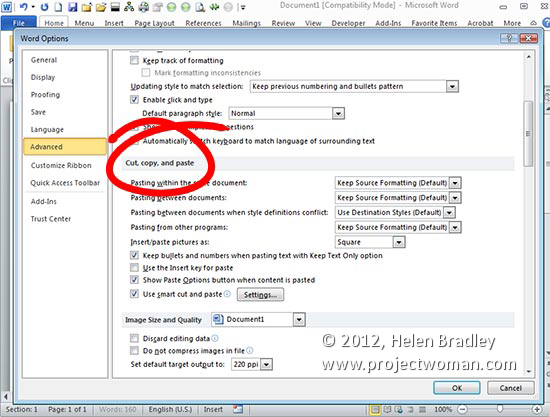
Setting up your pasting preferences in Microsoft Word can speed up your workflow when you’re working from another resource.  You can do this by clicking File > Options (Office button > Word Options in Word 2007) and then click Advanced. You’ll find what you’re looking for under the Cut, Copy and Paste section. Set your default paste preferences to those that best fit your needs and click OK.

Helen Bradley

Monday, September 24th, 2012

Photoshop CS6 Shapes, Paths, Vectors and Selections

Photoshop CS6 has new tools for working with Paths and Shapes. Learn how to use these and how to turn shapes into paths and how to fill and stroke paths and shapes.

Check out all our tutorials on our YouTube channel.

Complete transcript of this video:

Hello, I’m Helen Bradley. Welcome to this video tutorial. In this tutorial we’re going to look at the new vector tools in Photoshop CS6. And we’re going to answer questions like what’s a path, how do I find it, how do I turn a path into a selection, how do I make a path from a selection, and how I can work with the new vector tools.

Photoshop CS6 has some new vector tools and we’re going to have a look at those in this video. And we’re going to work out how you can use those tools to do exactly what you want to do.

Now the Custom Shape tool is in the position it always used to be and it’s sharing a toolbar position with things like the Rectangle, Rounded Rectangle, Ellipse, Polygon and Line tool. And all of these are Path tools. But we’re going to select the Custom Shape because it’s a little bit of an interesting tool.

And here are my Custom Shapes so I can select any of these custom shapes to draw on my space. Now I’m going to choose a filled shape such as this one here and just click it so it is selected. Now I can draw it on my workspace, but the way I draw it depends on what I have chosen here.

And I can choose a shape, a path or pixels, and we’re going to look at the shape and path options. So let’s start with shape. And let’s select some colors for this shape because when you’re working with shapes color is important. Now I have a shape selected I’m just going to drag this flower shape into my workspace.

If I hold the Shift key it’s going to be constrained to the shape of a flower that was originally drawn. If I don’t hold the Shift key you can see that I can make it wide or tall. And if I draw it with the Alt key pressed it’s going to be drawn around my initial starting point. Let’s just let go of that for now and let’s click and drag here to start drawing my flower.

Now if I want it placed around the initial starting point I’m going to press the Alt key and you can see that it jumps back into position. If I add the Shift key I can get it constrained to the right shape. And only when I let go the left mouse button does anything happen.

So what’s happening is I’m getting a filled flower. And we can see up here that the fill is the current foreground color, but it can be changed. While this shape is selected we can select a different fill for it. You can see that blue is now its fill but that’s not the foreground color for our workspace. And you can see that it has no stroke but we can add a stroke if we want to.

So let’s add a pink stroke to this shape. At the moment the Stroke is 3 points but we can increase that so we can make it thicker or thinner. And we can also change the nature of the stroke. For example we could have a dashed stroke or a dotted stroke. And there are other options that we’ll look at in future videos. But this shape is a path, so we can actually make changes to it.

I’m going to grab here the Direct Selection Tool because that allows me to select points on this path. And you can see by dragging over these points I can select anyone of these points. I’m just going to turn the stroke off for the moment because I think it might be easier to see the points without the stroke in the way.

When one of these points is filled and the others are empty this is the one that we’re going to affect. So let’s just drag out on that. And you can see that my shape has now changed shape because I have altered that point. So it is a path that is able to be adjusted. But still we can change the fill. And when we change the fill the fill of the entire shape is affected.

When we add a stroke back onto this the stroke of the entire shape is being affected by our choices. Now there are some other things that we can do with shapes. I’m just going to add a new layer to this image, just put it at the top, and I’m going to fill it with the red.

Now let’s consider the situation where we may want to for example cut out a shape from inside this red selection. So let’s go back and grab our custom shape tool. And we have our same flower shape selected. And I’m going to draw the shape onto my area. And because I was working with a red fill it has a red fill. But let’s just color it green so that we can see it clearly.

Now let’s consider the situation where really what we wanted to do was to create a path from this. Well, we don’t have to undo it and start all over again, particularly if this is a complex shape because what we can do is go to the paths palette. And here is our shape path, and we can do with that anything that we could do with a path originally in Photoshop.

One of the things that we can do is click on it and load that path as a selection. Now if that path is a selection then we can do things with it. For example we could come down to this red filled layer and we could poke a hole in this layer by just pressing Delete. And that will delete the contents of the layer where this selection is made.

One of the other things that we can do, I’m just going to Ctrl Z to undo that, one of the other things that we can do with selections is we can stroke them. So we could choose Edit Stroke and we could stroke this selection with a different color. So let’s stroke it around its inside.

Let’s press Ctrl D to undo the selection, and you can see that now we have a stroked flower because we’ve been able to stroke that selection. I’m just going to undo this again. And let’s go back to our shape up here. I want to just make sure that we just have a red filled layer here and we have our shape up here.

And here it is as a shape. And it can be moved around because it is a shape. So we can move it around the workspace. Let’s go back to the Path’s tool and there’s something else that we can do with shapes. What we can do in addition to loading the path as a selection is that we can stroke it with a brush. But to do this we’re going to have to make a work path out of the shape.

So what I’m going to do is with the shape selected I’m going to choose Edit Copy so I’ve copied the shape onto the clipboard. And now I’m just going back to this layer here and I’m going to do Edit Paste. And look what happens in my Paths palette. This time I have a Work Path. And a work path not only can be turned into a selection and not only can be filled with a foreground color, but I can also stroke it with a brush.

Let’s go and get my Brush and let’s go and get a brush to use. Now I’ve got lots of brushes here, but let’s create something like this particular little leaf brush. And I’ve got it at a fairly small size. I’m hoping that this is going to work just fine here for this particular image.

We’ve got a foreground color so I’m going to click Stroke Path With Brush. And what that does is it applies that brush to the current path. But we need to of course make that into a work path before that’s going to work. Now let’s have a look at how we can turn a selection into a path. Let’s just go and get another filled layer. I’m just going to get rid of everything that I have here right now.

Let’s fill this with white, and then we’ll just get rid of the Work Path as well. So I’m going to press Alt Backspace on the PC, Option Delete on the Mac, and I’m going to make up a selection here. So I’m going to make a rectangle, and then I’m going to go and grab the elliptical marque, and with Shift held down I’m going to add to that. So this is now my selection.

Now let’s say I want to make this into a shape that I can use over and over again. Well with the Paths palette open I can create a work path from this selection. So I’m just going to click to Make Work Path From Selection. And now this is a path. Now because it’s a path we can do all sorts of things with it.

For example we can click on it to select it and we can change its points. And we can also do things like turn it back into a selection, stroke it with a brush and fill it, and we can make it a shape. Let’s choose Edit and then Define Custom Shape. And this now becomes a custom shape in my shapes collection. I’m going to call that a Tab shape and just click Ok. Let’s get rid of our Work Path.

And now let’s go back into our shapes collection. So I’m going to click on Custom Shapes. And this time I’m going to make it a shape and I’m going to give it a fill and I’m going to give it a stroke. And let’s go into our shapes collection and let’s go and grab our new custom shape.

And now when I drag it onto the workspace it’s going to behave like any of the custom shapes inside Photoshop. It has this stroke and we can adjust the stroke size. We can adjust the type of stroke that it has. We could fill it with everything that we can fill a regular shape with.

So there’s the basic introduction to some of the new shape and path features of Photoshop CS6. My name is Helen Bradley. Thank you for joining me for this video. You’ll find more of my video training sessions on my YouTube channel.


Helen Bradley

Friday, September 21st, 2012

Photoshop Stitches and Dashes with Brushes

Learn how to make dashes and stitches in Photoshop using brushes and then how to paint with them and use them to stroke shapes.

Check out all our tutorials on our YouTube channel.

Complete transcript of this video:

Hello, I’m Helen Bradley. Welcome to this video tutorial. In this tutorial I’m going to show you how you can make dash lines and stitches using brushes in Photoshop. And this is going to allow you to not only paint with stitches but also to use these to stroke things. One of the really nice effects that you can achieve in Photoshop is the idea of having dash lines that might show as for example faux stitching on an object. I’m going to show you the basics of doing that now. The first thing I’m going to do is create a really small document. So I’m thinking about 300 x 300 because I want to create my stitches. It’s going to be transparent. Now stitches are a brush so the first thing I’m going to do is go and grab my brush. And I’m going to use a rounded rectangle for this. So I’m just going to select the rounded rectangle tool, and I’m going to draw something that I can use as a stitch. Now I’ve drawn it as a shape. So let’s just undo that and let’s go and draw this as just pixels. It’s a much better option. And I’m just going to call that my brush shape. Now you can get into more detail with your brush shape. What I’m going to do is just show you how you can use this to create stitches. So now that we have this shape I’m just going to Ctrl Click on it so I have a selected. I’m going to make it a brush by choosing Edit Define Brush Preset. I’m just going to call this Stitch and click Ok. And now I can get rid of that document. So now we’re ready to use of the stitches to draw around this shape and perhaps across it as well. So I’m going to select my Brush tool and I’m going to select the very last of my brushes which is my new stitch. And right now it’s not going to do really very much of what I want it to do. But we’re just going to undo that and let’s go and set it up to be a bit more friendly. We’re going to open the Brushes Panel to do this. And this is my brush. And this is the reason why it’s painting the way it is is because that’s the way it’s set up to paint. So I’m going to adjust its spacing so it looks a little bit more like stitches. And I can make them close together or far apart. I can also change the size of them because they’re pretty large right now. But I could make them considerably smaller if I want to. Now I can adjust Shape Dynamics as well. And we’ll just see right now how this brush is going to paint and see if we need to make some changes to it. Now I’m going to add another object to this design. Let’s just add a shape up here. Let’s go and fill it with a darker orange color, Alt Backspace, Option Delete, Ctrl D or Command D to deselect the selection. And now with my brush I’m going to paint with white, and I’m going to paint some white stitches across this shape. So I can either paint with my paintbrush or I can click once up here to start my painting and then Shift Click across the other side so that I get evenly placed stitches, Click once, Shift Click on the other end. Now as you can see the brush is not really following the shape of my painting so I want to change the way that this brush is behaving. But to do that I’m going into shape dynamics. And I’m going to make sure that Size Jitter is disabled because I don’t want it to change size. And I don’t want the diameter to change either so I’m going to remove that. I don’t want the Angle to change so I don’t want it to change as I paint. But I do want it to follow the direction of my brush. And I also do not want any Roundness Jitter. So I’m going to make sure that everything is disabled except that the controls are for the Angle is now following the direction of the brush. And now look how it’s painting. Wherever my brush goes it’s starting to follow that brush. So that’s a lot more of the way I want that brush to be painting. Okay, let’s face the problem of this circle. I’m going to actually just increase the size a little bit for this circle. Let’s turn that off. So now I have my brush selected and I want a stroke around the circle. So let’s just go and get this layer. And I can Ctrl Click on this layer to make a selection but I want a stroke inside the shape. So I’m going to choose Select Transform Selection because that allows me to transform this selection. And provided I now hold Shift and Alt as I drag in I’m going to actually drag in on the shape so that it now becomes a concentric circle inside the original circle. I’m going to click the checkmark here. So now I have a strokeable selection. But I want to stroke it so I’m going to choose Window and then Paths, and I’m going to turn it into a Work Path. And when it’s a Work Path it can be stroked with a brush. And this is the option here. So I have my brush selected, my color, my stitch, and it’s all set up. I’m going to click here to Stroke Path With Brush. And we’re seeing not only the path but also the brush so let’s just trash the path for now. And you can see that I now have a stitching line inside the shape. And because I have the angle correct the stitching line is going around the shape as if that shape were actually stitched. So there you have a way of creating brushes in Photoshop that you can use for stitching. You know how to make straight stitching lines and you know how to make stitching lines that follow your brush. And you also know how to stitch a shape by creating a path and then stroking that path so that you have this really nice effect. I’m Helen Bradley. Thank you for joining me for this video training session. Look out for more of my video tutorials on my YouTube channel.

Helen Bradley

Wednesday, September 19th, 2012

Reflections make the ugly look charming


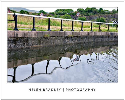
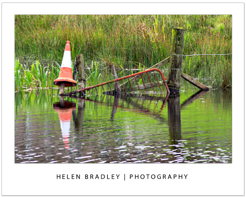
I really cannot emphasise too much how reflections can help you capture wonderful images. They can make even the most ugly objects like discarded road signs and rusty fences look great. It seems that anything reflected seems to grow an immediate charm factor and you can take advantage of this.

In this image, the traffic cone caught my eye so that made the subject something to look at. Perched on the old fence and standing in the canal it had a certain charm. Then the reflection made the shot. If I could pull it all together I had a worthwhile image. I like the result.

When you are out, look for reflections – you will find them in water and in shop windows, in car windows and all sorts of places you might not think of but they are there.

Helen Bradley

Wednesday, September 19th, 2012

Trevor’s Photoshop tip of the week – Filling in with Background Color

(photo by: Anita Levesque)

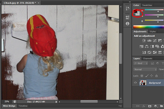
Want to fill your selection or layer with your current background color? Simply press Ctrl + Delete or Ctrl + Backspace on a PC or Command + Delete on a Mac and your background color will completely fill your selection.

Helen Bradley

Tuesday, September 18th, 2012

Photoshop Sunburst Tutorial

Learn how to use Distort filters to create a cool sunburst in Photoshop.

Check out all our tutorials on our YouTube channel.

Complete transcript of this video:

Hello, I’m Helen Bradley. Welcome to this video tutorial. In this tutorial I’m going to show you how to create a quick and easy sunburst in Photoshop. To create my sunburst I’m going to start with a new image. I’m going to make mine 3,000 x 3,000 pixels in size so it’s a reasonable size. I’ve yellow selected as my foreground color. I’m just selecting the Rectangular Marquee Tool and just selecting about half of this image and filling it with the foreground column by pressing Alt Backspace on the PC, Option Delete on the Mac. I’m going to do Select Inverse so that I have the other half of the image selected. Again, I’ll select white as my foreground color and fill it with that color and then Ctrl or Command D to deselect the selection. So all I have right now is an image where half of it is yellow and half of it is white and it’s all on one layer. To distort it I’m going to start with the Filter Distort Wave, and that’s the first part of my sunburst. I’ll select Square as the type. And now I’m going to set the Wavelength. And you’ll find that the larger you set the Wavelength you get more of these stripes. Don’t worry that they don’t extend yet. What you’re worried about at this stage is the number of them. So I want about that number of stripes. Now I’m going to increase the Amplitude until I get stripes all across my image. So all I’m doing is square, equal values or nearly equal values for Wavelength and then adjusting the Amplitude until I get what I want in this little diagram here in this little preview window. And then I’m just going to click Ok. Before I leave here I’m just going to make sure that I Crop this because what I want is the exact same starting point and ending point. So here I’m starting on an orange stripe and I’m going to end over here on a white stripe. I’m just going to make sure that I have a pretty good crop here because that will make my wraparound work well in the next step. And the next step is to use the Filters again. We’ll choose Filter, and again this Distort option, but we want Polar Coordinates. And all I do is select the Polar to Rectangular or Rectangular to Polar that gives me the effect. If you don’t remember which one to use just flick between the two because it’s going to be really obvious which one gives you your sunburst and which one doesn’t. And obviously Rectangular To Polar is what I want so I’ll just click Ok. And here is my sunburst shape. It really is as easy as that. And I have a silhouette because I love to use silhouettes with sunburst shapes. So let’s just drag and drop a silhouette layer into here and then we can size it to suit. Now you can do all sorts of things with your sunburst effects. We could grunge this. We could texturize it. We could do all sorts of things with it. But to create it is as simple as a layer that is half of one color, half of the other color. Then you’ll Filter Distort, Wave to create a series off stripes, then you’ll Crop it so that you get the beginning of a stripe on one side and the end of the corresponding stripe on the other side. So you get this seamless sort of sunburst effect and you don’t have one really large stripe and then use Filter Distort Polar Coordinates to rotate it around. So there you have a sunburst effect in Photoshop.

Helen Bradley

Tuesday, September 18th, 2012

Trevor’s Quick Excel Tip – Navigate cells

Move around the cells in your workbook without touching your mouse using the Up and Down and Left and Right Arrow keys. To jump to the edge of the current block of data press Ctrl + the appropriate arrow key – so to move to the last row press Ctrl + Down Arrow.

Helen Bradley

Page 1 of 212