Sunday, February 28th, 2010

Step 6 Photo-editing workflow – Fixing muddy images

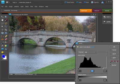
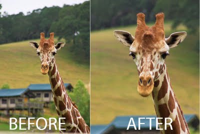
Images which lack a full tonal range (a range of colors from very light/white to very dark/black), often look muddy and the colour in these images will also look flat. To adjust the tonal range of an image to darken the dark areas and lighten the light areas thus stretching the colour you have over the widest possible range.

In Photoshop Elements choose Enhance > Adjust Lighting > Levels. The levels histogram shows the tonal range of pixels in the image – ideally the chart should stretch the full width of the area it is contained in. If it doesn’t reach from the very left edge to the very right edge, drag the sliders underneath the chart inwards so that they sit under the points where the chart data begins and ends. You can adjust the middle slider to lighten or darken the midtones in the image.

Helen Bradley

Friday, February 26th, 2010

Windows Vista – Missing Mail icon

controlpanel

Things have moved in Windows Vista 64 bit and sometimes it’s hard to find things you know should be there.

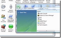
One item that is hard to find is the Mail icon that you need to use to add profiles for Outlook, for example. You’ll find it in the Control Panel but not alongside all the other icons. Instead, click the View 32-bit Control Panel Items View 32-bit Control Panel Items group. There you will find Mail alongside other options like Java, QuickTime and some others.

Helen Bradley

Thursday, February 25th, 2010

Step 5 Photo-editing workflow – Fixing over and underexposed images

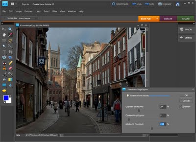
If you have an image which is under exposed or over exposed you can recover some of the detail in the light and dark areas using the Shadow/Highlight adjustment.

In Photoshop Elements choose Enhance > Adjust Lighting > Shadows/Highlights. The default setting lightens the shadows but leaves the highlights untouched but you can adjust each of these areas using the sliders to bring back into the shadow and highlight areas.

Adjust the Midtone Contrast slider if necessary to get the desired result.

Helen Bradley

Wednesday, February 24th, 2010

Spotting Images in Photoshop

By Helen Bradley

Many of the images that you take particularly cityscapes, like most portraits, can do with some spot fixing. I’ve been traveling through Europe a lot lately and because it’s considered almost de rigeur to smoke there, many of the photos that I have are littered with cigarette butts and assorted garbage.

And although you may not realize it, even small cigarette butts will detract from an image. A few minutes spent cleaning up an image can result in it having a way more polished look. Here are my top techniques for cleaning up litter and unsightly blemishes.

A word of advice before you begin: make a duplicate of the original image and work on this. Then you have the original image to look back at and see just how much improved the image is after the spot fixing is complete.

Step 1
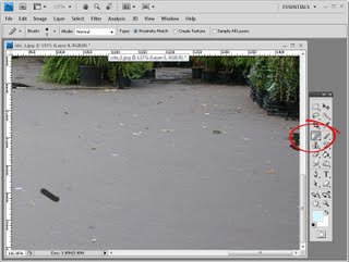
Spot Healing Brush
For simple spot fixes the Spot Healing Brush cannot be beaten. It doesn’t require you to make a selection of a source area to use for the fix so you can get to work fixing the image straight away.

Ensure your brush is large enough to cover the problem area but not any bigger – the idea is to spot fix just the problem area and to leave as much of the original image intact around it. Zoom in close to where the flaws are and paint over each flaw one at a time.

The Hand tool is useful here as you can press and hold the spacebar as you drag on the image to reposition and when you let go the mouse and spacebar the Spot Healing Brush will be still selected.

It can take five minutes or more to spot a really bad image, but the overall result will be significantly improved.

When you’re using the Spot Healing Brush tool, make sure that you have the Proximity Match option enabled, not Create Textures. Proximity match gives a better result with most spotting tasks.
Step 2
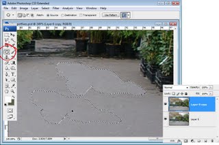
Patch Tool
For larger jobs where, for example, the Spot Healing Brush won’t fix the problem because it’s too close to something with different texture or it’s such a large problem that it really needs a bigger solution, use the Patch Tool or the Clone Tool.

With the Patch Tool you make a selection around the area that is the problem, making sure that the Source option on the toolbar is selected. Now drag the marquee away to find an area to use as the fix. Sometimes you may need to apply this fix a couple of times, and you may need to clone around the edges of the area later on to improve the overall appearance and to add some texture back into the image.
Step 3
Clone tool
To use the Clone Tool, select the tool, locate an area of the image that you want to clone from – this is your source image area – and Alt + Click (Option + Click on the Mac) on that area to sample it. Then start painting on the image – typically this works best if you click repeatedly rather than painting as painting tends to introduce repeated patterns into the fix which scream “Look! I tried to fix this in Photoshop!”

In Photoshop CS4, the Clone Tool has a preview so you can line things up neatly making it a very handy tool for fixing elements where there are lines or other things that need to be matched up in the fix.

You can also use the Clone Tool to add some texture back into areas that the patch tool has removed texture from even after the fix has been applied.
Step 4
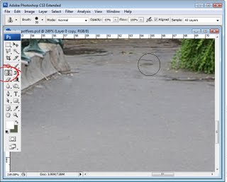
Healing Brush
The Healing Brush tool works similarly to the clone tool, but it has a healing ability built in so it’s a handy tool to use too.

With the Healing Brush tool you need to again Alt + Click (Option + Click on the Mac), to sample the area of the image to use as the fix, and then click over the area that needs fixing.

The healing aspect of this brush blends the solution over the problem so you could, for example, have quite a dark solution area in your brush, but when you paint over a lighter area to fix it, the fix will lighten as it is blended in.

In the example above we couldn’t use the Healing Brush to fix the water running out from under these plants as it would tend to want to blend in and darken the area being fixed when we need it to be lighter. In the case of the water, the clone tool is the best option because it lets us paint over the water area with lighter pixels without trying to blend in the result which would simply darken it again.
Step 5
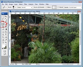
Take a good look
Once you’ve fixed the obvious problems take a good look at your image at 100% and see if there are things that are distracting to your eye that you may want to fix. These will generally be things that are lighter, brighter or in sharp focus as they are things our eyes are attracted to. If these are ugly and not really central to the image itself, then get rid of it. I removed some of the tree labels at this point.

To finish the image I added some color to the sky, adding some saturation and a curves adjustment and then cropped in a little closer.

Helen Bradley

Monday, February 22nd, 2010

Step 4 Photo-editing workflow – Straighten

A photo where an obviously horizontal line like the horizon or the foot of a building runs at an angle instead of straight across an image is disconcerting to the eye.

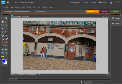
To straighten a photo click the Straighten tool on the toolbar and drag a line across what should be the horizon in the image. In Photoshop Elements when you let go of the mouse, the photo will automatically be straightened using the line you have drawn.

Before you draw your line you can choose one of the options on the toolbar to configure the tool. These include choosing CropToRemoveBackground which ensures that uneven edges of the image are cropped away in the straightening process.

Helen Bradley
Saturday, February 20th, 2010

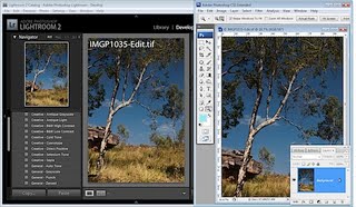
Lightroom: What is it and When Should You Consider it?

by Helen Bradley
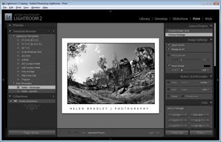
There have been questions posted as comments recently asking about the role of Lightroom in a photographer’s workflow. Many posters who are not currently using Lightroom aren’t sure whether Lightroom it is an alternative to Photoshop or where it fits if you have Photoshop too. I thought it was a good time to look at where Lightroom fits in the Adobe line up and to explain why Lightroom isn’t a Photoshop alternative.

Lightroom was developed from the ground up as a tool for photographers and one which would provide a logical workflow for processing a lot of images in an effective and efficient way. Photographers have special needs for handling images from photo shoots and these aren’t necessarily reflected in how Photoshop is designed.

When you handle a lot of images in Photoshop you download them and preview them in Bridge. If they require fixing or printing, you take them via Camera RAW (if they are Raw files) to Photoshop. In Lightroom most of your workflow takes place inside Lightroom – Lightroom contains the organizing tools of Bridge and the processing tools of Camera RAW so, if it is an alternative to anything it is better seen as an alternative to Bridge and Camera RAW rather than to Photoshop itself.

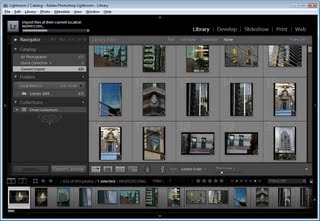
In Lightroom you import only those images you want to use and manage inside Lightroom. If an image isn’t in the Lightroom catalog then Lightroom cannot see it. This is in contrast to Bridge which shows you the entire contents of folders on your hard drive. In Lightroom you can build preview images as you import them or later on and these are also stored in the catalog – this makes it quicker for you to view and work on your images in contrast to using Bridge. Lightroom’s Library module also contains tools for managing images such as adding keywords, sorting and cataloging them.
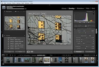
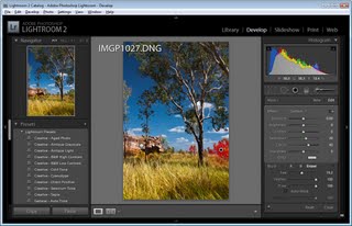
The Lightroom Develop module is the equivalent of Photoshop Camera RAW and it contains tools for applying image wide fixes. You can use these on any image that Lightroom can import and this includes Camera RAW images, JPEGs and Tifs. Lightroom also has a few tools which let you fix limited areas of an image, such as the Clone, Heal, Graduated Filter and Adjustment Brush. However it is here that the differences between Photoshop and Lightroom are most apparent – there are lots of things that Lightroom cannot do that Photoshop can. Photoshop is a pixel editor so it can be used to affect images all the way down to pixel level – Lightroom isn’t. Photoshop supports layers and layer masks, Lightroom does not. Photoshop can merge panoramas, HDR sequences and align and blend layers – none of these features appear in Lightroom. In Photoshop Extended you can work with video and 3D – again these aren’t features of Lightroom.
Other modules
The remaining modules in Lightroom are SlideShow, Print and Web which are tools for displaying images either as slideshows, web pages or assembling them for printing. Some of the same things can be done using the combination of Bridge and Photoshop but this is where Lightroom tops Photoshop. The Lightroom tools work better because your images are already there, organized, open and ready to work with and the tools are very fast.

Where does Lightroom fit?
So, if you are asking yourself if Lightroom is an alternative to Photoshop, the answer is No! It is, however, a possible alternative to using Bridge and Camera RAW although there may still be times if you are using Photoshop and Lightroom that you may still opt to use Bridge rather than Lightroom. For example, Lightroom can’t handle the wide array of file types that Bridge can and sometimes you won’t want to import images into Lightroom – for example if you use stock images you may not want them mixed up with your own photos. In this case you may choose to access them from Bridge rather than going to the trouble of importing them into Lightroom.

Most people who use Lightroom report significant savings in the amount of time they spend processing their images. This makes sense as all your images, once they are imported into Lightroom are immediately available and you can edit them without opening them and changes are saved inside the Lightroom catalog and not to the file itself (unless you change the default behavior). Most people who use Lightroom also report that they use Photoshop less than they did before because many of the fixes they might have performed in Photoshop can now be managed in Lightroom. Since I made the commitment to Lightroom, this is my experience – much less time spent working on images overall and much less time spent in Photoshop.

There are many people who can benefit from using Lightroom to manage their digital photo workflow and there are many who will not. If you work with lots of images, if you need to apply the same fix to multiple images, if you need to get your images from the camera and out to your client in a very short time – then Lightroom totally rocks.

On the other hand if you create composites or spend most of your post production time on a handful of images perfecting them by editing them and crafting them into your vision, then Lightroom may not offer any significant advantages. Remember too, that any program will take time to learn and Lightroom doesn’t always follow the Photoshop style of doing things so there is a learning curve you’ll need to commit to before you will feel at home in Lightroom.

So, there’s my take on Lightroom and Photoshop. Now it is over to you. What has your experience been – do you use Photoshop less now you have Lightroom? Did you try Lightroom and not continue? We’d love to hear

Helen Bradley
Friday, February 19th, 2010

Step 3 Photo-editing workflow – Crop


Use the Crop tool to focus in on your subject and remove unsightly background.

To crop an image and remove the excess, click the Crop Tool on the toolbar and click and drag the crop marquee over the image.

Adjust the edges of the marquee so they surround the portion of the image that you want to retain. Double click on the image to crop the excess away and to leave only the portion of the image that you want to keep.

Keep the rule of thirds in mind when you crop your image and, where possible, place the subject off centre for a nicer resulting image.

If your subject is moving such as a car or if it is a person who is looking to the right or the left, make sure to allow plenty of room ‘in front of them’ when you crop.

If you put a moving object too close to the edge of the image it will send your viewer’s eye off the edge of the image in the direction of the movement.

Helen Bradley
Thursday, February 18th, 2010

Word 2007 – Picture styles

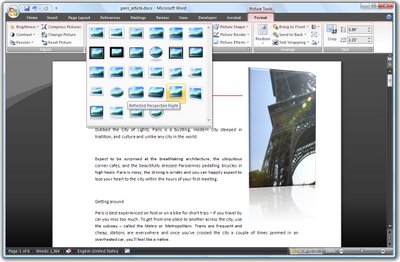
Word 2007 comes with a range of styles you can use when inserting images into your document.

To see them at work, insert a picture into your document, click the image and choose Picture Tools > Format on the Ribbon.

The Picture Styles are formats you can apply to your image and they include some very attractive looking options.

Once you’ve selected a picture style you can adjust things like the Effects which are attached to it.

For example, you can create a picture reflection by selecting the picture and then choose the Picture Effects > Reflection option to create a reflected edge.

You can also recolor the picture border if desired by using the Picture Border option. If you have a picture inserted in a document and formatted the way you like it but determine that you don’t like the picture and want to replace it, choose Picture Tools > Format and click the Change Picture option and choose an alternate picture to use. The format will remain and only the picture itself will change.

Helen Bradley

Tuesday, February 16th, 2010

Lightroom 3 Print Improvements

By Helen Bradley
With Lightroom 3 Beta having just been released, the first thing that most people will do – as I did – is to look and see if the features that you’ve always wanted in the program have been added.

One of the areas that Lightroom 2 fell a little short on in my book was the Print module. I wanted to be able to print with a colored background without having to import a background to use as a Identity Plate to achieve the effect and I wanted to be able to assemble a single printed sheet incorporating multiple images but I didn’t want them to have to always be the same size.

Ok, so the good news is I am a very happy gal! Both these problems are fixed in the new Lightroom 3 Beta. In fact, the new print module in Lightroom 3 Beta totally rocks.

Over the next few weeks I plan to post on some of the new features in the Lightroom 3 Beta but today I just want to show off the new Custom Picture Package tool.

Get the beta!
If you haven’t used Lightroom before or if you are interested in looking at the new Lightroom 3 Beta, visit http://labs.adobe.com to download the free Lightroom 3 Beta. As always you should never trust vital stuff and day to day work to a beta version of any software – it’s there to work with and experiment with but you can’t expect it to be 100% reliable.

Ok, technical stuff out of the way, let’s get into the Print module in Lightroom 3 Beta.

Step 1
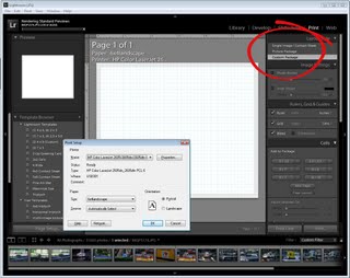
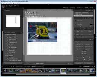
Start with a selection of images – this can be a folder of images or a collection. Click the Print module and select Custom Package. Click the Page Size button and select your printer and page size – even if you will print to a JPEG file you still need to do this – Ok, so it’s not perfect!.
Step 2
Get ready for the most exciting change to Lightroom in my book at least. Grab an image from the filmstrip and drag and drop it onto the grid. Keep the grid visible for now as it makes it easier to line everything up.

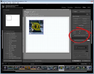
When you drag and drop the image in position, you can resize it as desired.

Step 3
If you want the container to match the image aspect ratio click the Lock to Photo Aspect Ratio checkbox. If not, deselect it and you can size the image to any dimension you like – so you can create a portrait shape image from a Landscape one, for example.
Step 4
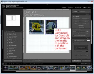
You can now drag and drop a second image into the display and size it to any dimension.

If your image is larger than the container, hold the Control key (Command on the Mac) and drag the image inside the container to find the best position for it.

Step 5
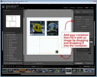
Continue and add the images that you want into your display.

If you prefer to use fixed size containers, you can click to add specific size containers using the options in the left hand panel. You can then drag images from the filmstrip to fill them.
Step 6
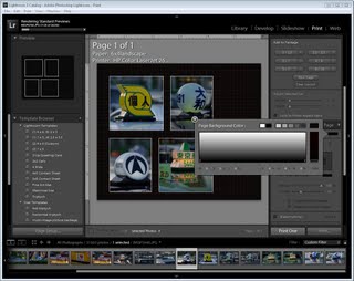
To change the background color, select the Page Background Color option and choose a color to use. If you choose anything other than solid black, you’ll still see the grid lines on the screen but these won’t print and you can turn them off if they’re in the way.
Step 7
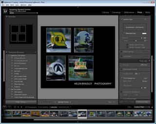
Click the Identity Plate and you can add your own identity plate as you could with other versions.

When you’re done, from the Print To options, select to print to a printer or to a JPEG File and you can then print by clicking the Print/Print to File button.
Step 8
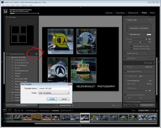
Before you leave the module, click the + symbol to the right of the Template Browser entry on the left panel and type a name for your template so it is saved and you can reuse it again in future.

While it’s still not perfect, the Print module in Lightroom now has support for features that were not achievable with Lightroom 2 without complex workarounds and which will be appreciated by avid Lightroom users everywhere.

Helen Bradley

Monday, February 15th, 2010

Step 2 Photo-editing workflow – Duplicate the image


Save the image with a new name before you begin to make sure you never overwrite the original.

There is nothing worse than destroying an original image by being just a little careless. You will never do this if you don’t work on your originals.

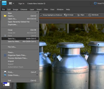
So, before you begin any fix, open your photo in your photo editing software and save the image giving it a new file name. This ensures you do not overwrite the existing image when you save the file later on and ensures you’ll always have your original image.

To do this, choose File > Save As and give the image a new name. Check the title bar of the image window to ensure you are now working on the saved copy not the original. If not, close the original image and open the copy before continuing.

Helen Bradley

Page 1 of 212