Learn how to darken the edges of an image using a Vignette in Lightroom
Vignettes are a darkening or lightening of the edges of an image – they can make an image look very attractive.
To add a vignette, open the Effects panel, set the Style to either Highlight Priority or Color Priority – Paint Overlay is the least attractive option. Drag to the left on the Amount slider to add a dark vignette and to the right to add a light one.
The Midpoint slider adjusts how the effect is applied to the edges of the image. Increase it to remove the vignette from the edges leaving it mainly in the corners.
Roundness controls the roundness of the vignette, drag to the left to make it more square, to the right to make it more circular. Feather controls the softness of the edges so use 0 for a hard-edge and 100 for a very soft edge.
Highlights applies when you use a negative Amount to create a darkened vignette. Zero gives no change and larger values preserve highlight contrast when you select Highlight Priority or Color Priority.
How to use the Masking Slider to limit image sharpening to only the edges in the image
The Masking slider in the Lightroom Detail panel allows you to control the areas of the image that are sharpened and those that are not.
Hold Alt (Option on the Mac) as you drag on the Masking slider. As you do you will see a black and white overlay on the image. The areas that are black are not sharpened, those that are white are sharpened. The farther you drag to the right the more the sharpening is limited to just the edges in the image where you want it to be applied to.
Drag on the slider to control just how much of the image you want to have sharpened. When you’re done, adjust the Amount to a value that makes sense for the image.
Learn how to suppress halos with the Detail Slider when Sharpening in Lightroom
The Detail slider in the Detail panel in Lightroom lets you suppress the haloes you create with the Radius slider.
At zero position you will fully suppress any halos and at 100 you will have no halo suppression so you will see all the halos added using the Detail slider.
This means that a low value for the Detail sider sharpens only the largest edges in the image and a large value for Detail will tend towards sharpening everything.
Hold Alt (Option on the Mac) as you drag on the Detail slider to see the effect on the halos around the edges in the image.
Typically if you use a high Radius value then you will want to use a low value for Detail and vice versa.
Learn how to fine tune sharpening with the Amount and Radius Sliders
The Detail panel in Lightroom controls sharpening on the image. Use the Amount slider to manage the intensity of the sharpening – set this to a high value to begin.
The Radius slider adds halos around the edges in the image which is what gives the sharpening effect.
For an image with lots of fine lines and detail such as a building select a low radius. For a portrait or an image with softer detail, use a high radius value.
Hold the Alt key (Option on the Mac) as you drag on the Radius slider to see the halos.
Create the Orton Effect in Lightroom with the Clarity Slider
The Orton Effect is named after photographer Michael Orton. This process results in a somewhat surreal image which has a slightly out-of-focus look while retaining lots of edge detail.
You can quickly give an image a faux Orton look using the Clarity slider in Lightroom. All you need to do is drag the Clarity slider to the left close to -100 and then, increase the Blacks in the image to an higher than usual value.
Of course there is a lot more to the Orton effect than this but this gives you a good start and, for many images, may be all you really need.
Learn how to create uneven lines that look hand drawn to use for cartography and other uses in Photoshop. Make use of Hue/Saturation adjustment to add vintage color, use brushes to create a pattern for the lines. Also, show how to render lines in black and white without any shades of grey and, lastly, how to distort them slightly. This video also shows how to add shadow around land mass and multiple lines of edging for a land mass.
Transcript:
Hello, I’m Helen Bradley. Welcome to this video tutorial. In this tutorial I’m going to show you some line drawing techniques for creating maps in Photoshop. In this video I’m going to show you how you can create the effect that we have here around the edge of this chart. We’re going to draw the edge. We’re going to add this shading and also create these lines so that we can see how this could be created. The pattern in the middle is just a very simple pattern fill. We won’t be covering that, but we’ll be covering everything else in this video tutorial.
So to get started I’m going to start with a new image. And I’m going to choose File and then New. And I’m going to create a very tall image. So it’s going to be 2,000 pixels tall, RGB color. Background contents of white is just fine, so I’ll just click Ok to create that image.
And what I want to do first of all is to create these lines. And we’re going to do that using a paintbrush. So I’m going to click on the paintbrush and let’s select a brush to use. And what I want is something relatively small so I’m going to start with something like this 4 pixel brush. And then I’m going to choose Window and then Brush to open this brushes panel here. And what I want to do is to set up the brush so it’s going to paint the lines for me. So first of all I’m going to adjust the spacing so that there’s increased spacing between the brush tips. And I’m going to leave the size at about 4 pixels. Then I’m going to shape dynamics because I want the size of the brush to vary.
So I’m going to increase this quite a bit so we start seeing that there’s some variety in the brush here. Minimum diameter I don’t want to change at all. And that’s pretty much all I need to do with the brush right now. And then I’m going to test it. So I’m going to make sure that I have black set as my background or foreground color, which it is here. And then I’m going to click with my brush here and I’m going to Shift click at the bottom because that will create a straight line of brush strokes. And let’s just have a look in here a bit closer at this.
You can see that we now have this sort of dotted line which is different varieties of line. Now if that’s not quite what I want I can just zoom out and we can start again. So I’m just going to undo the brush and perhaps we’ll go back and make the brush just a little bit bigger than it was. So let’s go to brush tip shape, increase the size just a little bit, and perhaps bring down the size jitter or up the minimum diameter so that we haven’t got quite so much variety in our brushes. I’m going to click here and then Shift click to finish my brush stroke.
Now what I want is a sampling of this. So I’m going to use this tool here which is the single column marquee tool, one of the few times you will ever find a need for this particular tool. I’m going to zoom in here so that I can see exactly what I’m selecting and I’m just going to click to select a single line through this image. Now that’s not the world’s best. So let’s just try again. My brush stroke is not completely vertical so that’s causing me some problems here. Let’s start this again. I’m going to click here, and again let’s Shift click to create a straight line. And let’s see if that’s a bit straighter. That will be when we click just to one side of it. So that’s going all the way through the dot.
So I’m just going to choose Edit and then Define Pattern because this is going to be a pattern. And it will be just this dashed line as our pattern so I’ll click Ok. I can now close this image because I don’t need it any longer. And let’s see how our pattern will work.
I’m going to create a new document, this time 2,000 by 2,000 pixels in size. And this time I’m going to fill it. So I’m going to choose Edit and then Fill. And I’m going to fill it with a pattern. So I’m going to select Pattern. And the very last pattern in this container here will be the pattern we’ve just created so I’ll click Ok. And there are our lines. And that’s a starter for our map.
Now with our lines we can make these bigger. So I’ve got a background layer here but I can click to make it into a regular layer. And we can just enlarge this. So if we want larger lines all we need to do is to just drag up and down on this to just make the lines a whole lot wider than they are. And because they’re lines we can just size everything like this.
If you want to make sure that that there are no gray areas to the lines, as you can see they’ve got slightly fuzzy sides here, just use Image and then Adjustments and then Threshold. And that just makes the lines black and white. They’re pure black and white now. And if you want a bit of variety, Edit, Transform and then Warp. And you can just adjust the lines with a little bit more of a curve or something through them so that they look a little less like they’re straight lines and perhaps a little bit more hand-drawn feel about them, Ok. Now let’s add our map part.
So I’m just going to grab the Lasso tool and for this exercise just draw a very wiggly sort of coastline that we’re going to use for our map. And white is my foreground color so I’m going to Alt Backspace, Option Delete on the Mac, to fill this with white. Now I want an edge around here so I’m going to choose Edit and then Stroke. And I’m going to stroke the edge with black. I’m just going to get all my tools over on this screen. So I’m going to select Black. And I’m going to make this a 6 pixel to begin with. And it’s going to be on the inside of this shape so I’ll just click Ok. And there’s our 6 pixel stroke.
Now I’m going to bring in this size. So I’m going to choose Select, Modify, Contract and I’m going to contract this by 10 pixels because I think that will be enough and then add another stroke. So again, Edit, Stroke. And this time I’m going to just use a 3 pixel stroke, but again on the inside. And then we’ll repeat that again, Select, Modify, Contract by 10 pixels and then repeat the stroke, Edit, Stroke and just click Ok. And then when I press Ctrl D you’ll see that we have the edges around here. But I’m actually just going to undo that Deselect right now because I have another piece to go in here.
What I want to do is to fill this shape with the grass so I have that as a pattern. So I’m going to choose Edit and then Fill, and again still pattern but here is my grass pattern here that I created earlier. And I’m just going to fill it with the grass pattern. Now we’re going to see how to create the shading around the edge. So I’m going to deselect the selection. I’m going to make sure I’m selected on the land, which is where the shading is to go, and I’m going to choose the Add Layer Style button here. And we’re going to choose an outer glow.
Now outer glow sounds like it should add some lightness around the edge but we can use it to add darkness. All we’re going to do is to select a dark color. Well we’ll stick with black right now. Now we can’t use screen as our blend mode. We’ll have to use something that will darken. So we’re going to choose multiply. And we’re going to set this if we want it to be full strength at 100 percent opacity. And we can adjust the size which is really the feathering around here. And the spread is how big it is. It would sound better to me if spread were really the feathering and size was the actual size. But that’s what you’re going to use.
So I’ll just click Ok. And now if we want to add this sort of sepia tone to the image, I’m going to make sure I have the image selected, and we’re going to do that with the hue/saturation adjustment layer, Layer, New Adjustment Layer, Hue/Saturation, click Ok. We’re going to select Colorized because we want to colorize this. And then we’re going to go and pick up our sort of brown color, increase the saturation and adjust the lightness. And you’re just looking for that sort of effect that is going to say vintage map to you. So I’m probably just going to select that for now.
And then I would finish off by cropping my image. We probably don’t need quite as much sea visible. In my image I have a one to one crop set here. That’s why it’s behaving a bit strangely. And there is our final result.
We’ve created lines using a brush in Photoshop. They’re all different size lines and we’ve created this sort of effect of an old-fashioned map. And actually if I just drag this adjustment layer up over the top of the fill we’ll really get that look of a vintage map.
I’m Helen Bradley. Thank you for joining me for this video tutorial. Look out for more of my Photoshop tutorials on this YouTube channel. Subscribe to the channel. If you enjoyed it please comment and like this video. You’ll find more videos, tips, tricks and tutorials at my website at projectwoman.com.
Learn how to make paisley shapes in Illustrator using Graphic Styles. I demonstrate graphic styles such as scallop edges stroke style, dotted stroke and a stroke that shows dots that vary in size from big to small.
Transcript:
Hello, I’m Helen Bradley. Welcome to this video tutorial. Today we’re going to be using Adobe Illustrator and we’re going to be making paisleys with graphic styles. Before we go ahead and actually create our paisley shape let’s have a look and see what we’re aiming for.
This is a paisley that I’ve created using graphic styles and we’re going to create these graphic styles so that we can create it ourselves in future. You can see that there’s a scalloped border around the edge and you’re going to learn how to make this scallop border. You’ll also see how to make these blue dots which are another graphic style and then how to make these pink dots so that they change in size. So each of these is a graphic style and it’s just applied to the shape really, really easily. So it’s a very simple process to create this once you create the graphic styles. And they themselves are pretty simple too.
So let’s just close this down for now and we’re going to work on this document here. For ease we’re going to start with a rectangle because it’s just a whole lot easier than drawing paisleys right now. So let’s do a rectangle. And the first graphic style we’re going to create is that scalloped edge. So we’re going to start by selecting a stroke color to use. And I want my scalloped edge to be a sort of pale blue so I’m going to select that as my stroke color. And I want the fill color for this to be a sort of darker blue so I’m going for a darker blue here. Now the stroke is going to need to be fairly wide so I can see my dots so let’s make that 20.
And here we have the beginnings of our scallop edge but it’s just not looking a lot like a scallop border right now. What we need to do is to go into the appearance panel. So you would select Window and Appearance to get to it. Now we’re going to change the stroke so that we actually have dots. So I’m going to click Stroke here. And what I want to do is I want to make sure that the Cap is round and I want to use a dash line and I want this option here that aligns dashes to corners and paths. And I want to make my dash zero and then my gap something less than the weight of the lines. So here 16 is a pretty good fit here and that’s going to give me my scallop border.
Well it’s giving me a two side scallop right now, but that’s easily fixed. You see this appearance panel works very much like a layers panel and so the appearance that’s at the very top is the one that way we’re seeing over the top of everything. And right now that’s the stroke. If we put the fill over the top of everything then the fill would fill up to the edges of this rectangular shape and we’d be left with a scallop border not on the inside of the shape. So all I need to do is to target the fill here and just drag it up above the stroke. And you can see when I drag it above what I’m seeing is this scallop border. So now that we’ve created the first of our graphic styles we’re just going to save it. And I’m just going to click here for new graphic style and it’s now saved.
Now we can go ahead and create the second one which was those blue dots. We can continue to work on the shape here. That’s just fine. Because we’ve already saved the graphic style we won’t be losing if we make changes here. The first change I want to do is I want to remove the fill entirely. So this will be an empty rectangle with just a border. I’m going to select a different color for the stroke and this time I’m going for an even darker blue than we’ve been working on. So let’s go for this dark blue here. And let’s go for stroke and we want to change the values here. I want the weight to be 16. So this is going to be a slightly thinner set of blue dots which would be appropriate if we’re trying to make a shape that’s going to be reducing in size every time we add a graphic style to it. But I want the gap to be bigger because I want things to be circles and I want them to be dots separated from each other not overriding each other. And I do that by changing the gap value. So I’m going to make that 25. And you can see that that’s giving me my circles. So there’s our second graphic style. Let’s just save that.
And let’s go ahead and make the third one. The fill again is nothing, but this time I’m going to choose pink as my shape and we want to make pink dots that vary in size. And that’s just a little bit different to what we’ve been doing previously. Now the weight needs to be a bit smaller because it’s going to be further into the center of this paisley shape. So I’m going to reduce the weight down to 12 points. Because the weight is 12 points I’m going to decrease the gap. So I’m going to make that 16 so the dots are a little closer together. And now we have to make sure that our dots are going to reduce in size. So I’m going to make sure that I have my shape selected. Again, let’s go to stroke and let’s have a look at how we make them reduce in size. At the moment the profile is uniform so all these dots are the same uniform shape. If I change it to width profile one what I get is small to large and that’s what’s giving us these different shape dots. So there’s our third graphic style and we’re just going to save that.
Now if I was to trash this document I’m going to lose those graphic styles so let’s go ahead and let’s make our paisley in this document. So I’m just going to delete the rectangle shape. And we’ll go ahead and make a paisley but use the pen tool to do that. So I’m going to click and drag to start my shape. I’m just going to make it using 3 points so click and drag at the top of the circle. And you can see that we’re still using that last graphic style so it’s happening in place as we draw. It’s not the one we want but we’ll put up with it for now. What I do want is this original style so I’m just going to click on it to apply it to that shape. And here is our paisley shape with the first style on it.
Now all we need to do is to make the same shape but a little bit smaller. So I’m going to select the move tool here and I’m going to choose Edit, Copy and then Edit, Paste in Place. And that should give me a second version of the shape. Let’s just make this a bit bigger here so we can see where we’re working. I’m just going to size this down. And right now I’m going to size it down in proportion so I’m holding the Shift key as I resize it. I’m just going to drop it into place here. And this time instead of this scallop border I want to use the blue dots. So I’m just going to tap on the blue dot graphic style and you can see that we’ve got the scallop with its second layer. And again, I’m going to select that layer, choose Edit, Copy and then Edit, Paste in Place, Paste in Back, placed anywhere, really it doesn’t matter. I’m going to just move it out of the way here. I’m going to Shift and resize it so it’s a smaller size, apply my pink dots to it and just move it back into place. Actually I think I want it a bit smaller still because I have an idea for an intermediary step.
Okay let’s just go and get the blue one. We’re here. I’ve got it selected. I’m going to Edit, Copy and Edit, Paste it. And this time I’m going to add just a very plain stroke. So I’m going to get a green and I’m going to make it a weight of about 10 points. And let’s just go to the stroke options here and let’s just turn off this dash line because I want it to be a plain line. Now I’m thinking that’s a bit wide for this purpose. So let’s just make it that and let’s put that into place. It’s not small enough yet. I think I can resize this in place a little bit. So there’s our paisley shape. And we can do this over and over again using graphic styles. We will have to save these graphic styles though if we want to use them in other documents. So from this right click menu we can choose Save Graphic Style Library and we could save that as a set of graphic styles that we could use again in future.
But you’ve seen here how to create a scallop border, how to create a graphic style that is just dots and how to create a graphic style that is a series of different size dots and then how to apply them to increasingly smaller size shapes so you can create a paisley that looks like this very quickly and very easily. And of course these graphic styles can be applied to any shape so you could do it to circles or stars or whatever it is that you want to draw.
I’m Helen Bradley. Thank you for joining me for this video tutorial. Look out for more of my video tutorials on this YouTube channel and please subscribe to the channel if you’d like to hear about new videos because we do distribute them twice a week. You can find more of my tutorials and links to other work on projectwoman.com and please like this video by clicking the like button if you liked it. And I always look forward to hearing your comments.
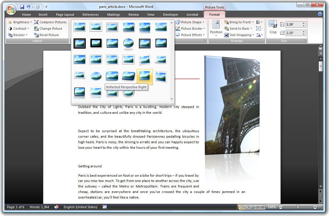
Word 2007 comes with a range of styles you can use when inserting images into your document.
To see them at work, insert a picture into your document, click the image and choose Picture Tools > Format on the Ribbon.
The Picture Styles are formats you can apply to your image and they include some very attractive looking options.
Once you’ve selected a picture style you can adjust things like the Effects which are attached to it.
For example, you can create a picture reflection by selecting the picture and then choose the Picture Effects > Reflection option to create a reflected edge.
You can also recolor the picture border if desired by using the Picture Border option. If you have a picture inserted in a document and formatted the way you like it but determine that you don’t like the picture and want to replace it, choose Picture Tools > Format and click the Change Picture option and choose an alternate picture to use. The format will remain and only the picture itself will change.