Saturday, March 1st, 2014

Create a Graffiti Wall Effect in Photoshop

Learn to paint graffiti without a risk of being arrested

See how easy it is to create a graffiti effect on a wall in Photoshop. The video shows you how to use a graffiti font to create graffiti writing and how to use styles and colors to format the test to make it look like real graffiti. Then see how to use the Vanishing point filter to place the graffiti text onto a wall in a photo. Finish the effect by blending the text with brushes, blend modes and textures all created using layers and masks so that the effect can be edited in future.

Helen Bradley

Thursday, August 22nd, 2013

Lightroom Tip – Sharpen only the edges in the image

How to use the Masking Slider to limit image sharpening to only the edges in the image

The Masking slider in the Lightroom Detail panel allows you to control the areas of the image that are sharpened and those that are not.

Hold Alt (Option on the Mac) as you drag on the Masking slider. As you do you will see a black and white overlay on the image. The areas that are black are not sharpened, those that are white are sharpened. The farther you drag to the right the more the sharpening is limited to just the edges in the image where you want it to be applied to.

Drag on the slider to control just how much of the image you want to have sharpened. When you’re done, adjust the Amount to a value that makes sense for the image.

Helen Bradley

Saturday, March 23rd, 2013

Photoshop – Masking 101 for Use in a Collage

Learn to use Masks in Photoshop. Here we look at how to collage a series of images together, using masks in Photoshop.

Transcript:

Hello, I’m Helen Bradley. Welcome to this video tutorial. In this tutorial we’re going to look at Masking 101. So we’re going to get you started with masks in Photoshop.

In this introduction to masks I’m going to show you how you can use masks to create images like this collage image. This collage image has been built up from a number of images and they’ve all been masked so that everything can appear nicely on top of each other.

The first image was the tail end of some cows and then I added an image of a tree. And this image has been masked so that we can see part of the cows’ tails behind it. But you can see that these two images are sort of blending into each other with this mask effect. Then we have the cow by herself and again we’ve masked her so that we can see the image of the tree behind her. And then we’ve added an image of some hay over here, and again added a mask to the hay image around the edge of the cow so that we’re getting this sort of almost seamless blended effect all the way across the image. And then we’ve got some milk cans and then finally we had some different effects that sort of tied the whole thing in together. But we’re going to have a look at masks and we’re going to have a look at it doing the last three images in this particular collage, just seeing how that would have been put together.

So I’m going to open the images. I’ve got a couple here open already. I’ve got the milk cans and the hay and let’s just go and get the cow. And I’m going to create an image that these will all going into. I think a thousand pixels is a bit too big so let’s try 800. And to start off with I’ll just drag and drop these images in. But this cow needs to be flipped first of all because I had her flipped in the original. So I’m going to flip her there and then just drag her in here. I’m just dragging on the layers and then just pressing V for the move tool so that I can move her into position. I’m holding Shift as I scale her up to full size. I don’t want to save the cow image. I want the hay image now so I’m going to drag and drop it into position. And I’m going to make sure I’ve got a fairly hefty overlap here because the overlap is going to allow me to blend these images together. And finally the milk cans and drag and drop them into position. And that’s a pretty big image too. I think actually it’s much bigger than the others. I’m pressing Ctrl T and then Ctrl 0, that’s Command T, Command 0 on the Mac, to just re-size these milk cans and just drag them into position.

So I’ll start off with a collage like this by just grabbing my images and just pulling them into position with a nice hefty overlap. And in this case I’m going to crop these images so that we don’t have anything extra hanging around. And now let’s go ahead and do the blending. And I’m going to do this by first looking at this layer here the cow and the hay. So I’m going to zoom into this area so that I can see what I’m doing, move the image across, and I need to mask this hay layer.

So to do that I’m going to click the Add Layer Mask icon here and that adds a mask to the hay layer. I need to have that mask selected. I need to select a brush to use. I’m just going to make sure that I have a brush here. I’m looking for a sort of solid-ish brush. This is a hard mechanical 38 pixels. Now it’s too hard but I can soften it by just taking down its hardness to make it nice and soft. And then I’m going to make sure that my mask layer is targeted and I’m going to set these colors here to their defaults by pressing the letter D.

Now we can already see that if this mask is white we’re seeing the hay. So that means if I want to see the cow I need to paint on it with black. So I’ve got black paint now. I’ve got the mask targeted and I’m painting on the mask where the cow is to bring the cow back in through the grass. Now I’m not going to be a 100 percent fussy at this stage because one of the benefits of using masks is that we can come back later on and edit it. So I’m looking for the edges of the cow but I’m not worried that I’m getting a bit of extra green here because I want to know where her edges are so then I can get a little bit closer to her in a minute. So I’ve got her pretty much there.

Now I just need to neaten it up. And to neaten it up I’m going to switch to white being my foreground color. I’m going to get a much, much smaller brush, make sure I’ve got my mask targeted and I’m going in close to the cow’s face here to make sure that I get an edge that gives me none of this green because it’s a really, really bright green that she’s standing on. And it’s not really doing a lot. The hay image I think is the prettier image. So again I’m just going to get close in to her here. Now this might take me half an hour to do to get a really nice result and the sort of result that I want. And I can also start working with a larger softer brush so I can make sure that I have it even softer. And I can work with a lower opacity if I want to and I can even paint in mid gray because with masks you can paint in black or white or any shade of gray because a mask is a gray-scale image. Now I’m just having a look at these milk cans. And I think that probably there’s one too many. So before I go much further I’m going to select the milk can layer and get rid of this first one because I don’t really like it that much. Now I’m going to grab the next three, I’m just going to move them over a bit.

There’s a bit of excess image hanging around but I’m not too worried about that. I’m going to add a layer mask to this layer. So now we have the overlap. And I want to bring the grass through the milk can so I’m going to paint on this layer again in black and white. So again a nice big brush, I’m going to switch colors by pressing the X key because I want to blend these images in together. I want to sort of suggest that there’s a seamless transition from one image to the other. And I’ll do that with a very soft edge so we almost can’t see where the grass image ends and the milk cans begin. And with this particular image I found that there was enough shine on the milk cans that we could perhaps even suggest that the grass image was showing through the milk cans. And I’m doing that by just adjusting down the opacity of the brush. So I’m not painting it full opacity and I’m just tapping where I want perhaps a little bit of the grass image to appear, again to really blend these images together. And if I’ve made a mistake and if I want to go back then all I need to do is change my paint colors and I can go back and paint out the effect that I’ve just painted in. And I can do this over and over again until I get the exact effect that I’m looking for.

Masks are a handy way of blending images in a way that allows you to come back later on and make changes to it. If I were saving this masked image because I want to make changes to it later, I want to come back and work on it a little bit later, I would do so by saving this as a PSD file. So I’d choose File and then Save As and make sure that when I’m saving it, it’s being saved as a PSD image. That will ensure that the masks and the layers are all there when I come back next time. The biggest mistake you’re going to make when you’re working with masks is when you actually work on the image instead of the mask itself. So if you start seeing that you’re painting in black, that’s telling you that you have the image layer selected not the mask layer. If you’re working on a mask you really need to have that mask layer selected.

I’m Helen Bradley. Thank you for joining me for this video tutorial. Look out for more video tutorials on this YouTube channel and visit my website at projectwoman.com for more tips, tricks and techniques with Photoshop, Photoshop Elements, Lightroom, Illustrator and lots more.

Helen Bradley

Sunday, December 27th, 2009

Sharpening in Lightroom


When you’ve finished doing your basic color correction to an image in Lightroom you’re ready to look into sharpening the image. In a previous posts I explained the basics of sharpening and how to use the High Pass Filter in Photoshop to sharpen an image. Today I’ll show you how to sharpen in Lightroom.

You’ll find the sharpening tools in the Detail area in the Lightroom Develop module. It’s best to work on the image at a 1:1 ratio as this ensures that the sliders that you’ll use can be seen at work on the image. If you aren’t in at least 1:1 view you will have to work from the small preview window. To select 1:1 zoom, click the indicator in the top left of the screen.


You have four sliders in the sharpening area. Amount controls how much sharpening is applied to the image. This can be considered to be your fine-tuning tool.

The Radius is one of the key settings to use. The Radius value can be moved between 0.5 and 3. Typically, a good Radius to start sharpening with is around 0.5 to 1 and then adjust it from there if the sharpening is insufficient. Images with large areas that are not very detailed such as portraits, may need larger values for the radius where images with a lot of fine detail may respond better to smaller values.


The Detail slider reduces the haloing in the image. The higher the value you use for Detail, the more halos you will see around the edges in the image. The lower the Detail value the less halo effect and the smoother the result.

You can see how the slider works when you are viewing a 1:1 preview size. Hold the Alt or Option key as you drag on a slider. The higher the Detail value the more lines you will see in the grayscale preview indicting the sharpening effect on the image.

The Masking slider works to mask out areas of smooth color. What it does is to enhance the edges and remove the sharpening effect from areas in the image that have smoother color transitions which you probably don’t want to be sharpened.

Again, you can hold the Alt key as you work with the slider. The slider values range from 0 – 100. At zero, everything in the image is sharpened and at 100 only the edges are sharpened. In the preview, the white areas are those being sharpened and those that are black will not be sharpened.


If you aren’t using 1:1 view you will need the preview window to be visible so you can see the results when using the Masking and Detail preview options. To view this, click the arrow in the top right corner of the Detail area.


When you’re starting out learning how to sharpen it can be difficult to see just what effect the sharpening is having on the image. If you press the backslash key you’ll return to the unedited image rather than to the image as it was before you started sharpening it.

This is a time where virtual copies can be useful. Wind back the history to just before you started sharpening the image. Right click the image and choose Create Virtual Copy. This creates a virtual copy of the image whose starting history is the current view of the image after your initial fixes have been made.


Now when you sharpen the image and use the Before and After settings you can see the change that the sharpening is applying to the image because that’s the only change to the virtual copy that you are editing.

Typically, if you are displaying images on the web you want to sharpen the image so that what you’re seeing on the screen is what you want to see when the image is on the web. On the other hand, for printing you generally apply heavier sharpening to the image as some of this will be lost in the printing process.

Helen Bradley

Saturday, July 4th, 2009

Photoshop Creative: Make a Collage Photo Banner


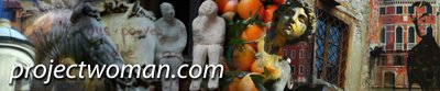
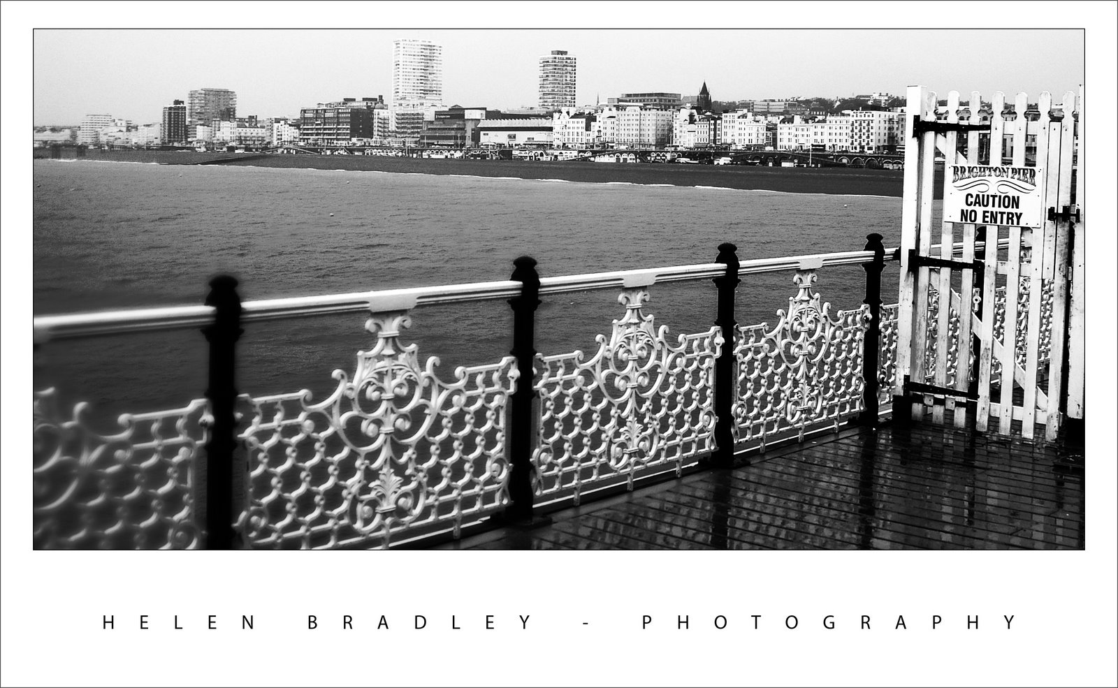
When you’re creating a photo blog or website a photo banner lets you showcase a range of your work. You can create a collage of photos for a banner in Photoshop or Photoshop Elements very easily. Here’s how


Step 1
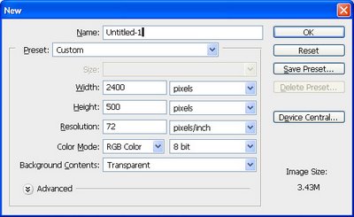
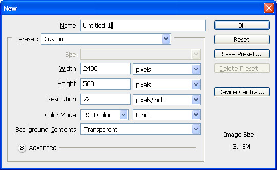
Start with a new image the size of your banner or a multiple of it. So, for example, if your banner is going to be 1200 pixels wide by 250 pixels you can start with this size image or double it so you have a bigger space to work and size it down as the last step.

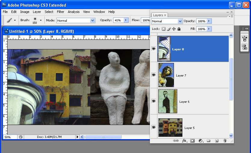
Here I’ve created a document 2400 x 500 at a Resolution of 72 pixels/inch, RGB Color and with a Transparent background..


Step 2
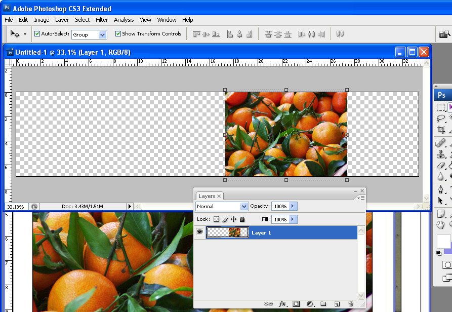
Open the photos to work with. These should be fixed and color corrected but they don’t need to be sized. I like to open more images than I will use so I have lots to choose from. A combination of close-ups and distance shots gives your banner a lot of variety. Flatten all the images to a single layer.

Select the Rectangular Marquee tool and drag over an area to use from the first photo. Select a generous portion of the image allowing plenty of room to the left and right of the main portion of the image that you are interested in as you will use this area to blend the layers. Chose Edit > Copy and then switch to the banner image and choose Edit > Paste. Close the original image.

Press Ctrl + T and then Ctrl + 0 and size the image to fit your banner. Use the Move tool to position it in place.


Step 3
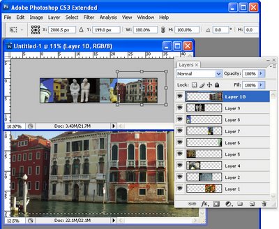
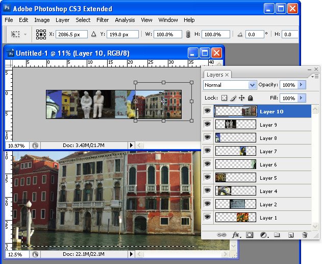
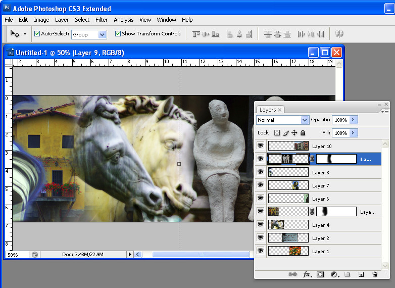
Select the next photo to use. Copy a piece from it and paste it into your banner image. Size it and move it into position. Continue to do this until your banner is full. The images should each appear on a separate layer and they should all overlap by significant amounts.

If desired, drag the layers into a different order to position the images where they should appear in the collage.


Step 4
Starting on one side of the image, select the Eraser and select a soft brush or a textured one such as the Chalk 44 pixels brush. Adjust the brush size so that it’s big enough to work with, reduce its Opacity to around 50 percent and click on the layer in the layer palette that contains the image to blend.

Erase over the edge of the image to reveal the layers below. As you work, give some consideration to how you want the images to blend together. In some instances, simply softening the hard edge of the image will be sufficient. However, if there are significantly different colors on each layer you may want to be more creative about how you blend the layers together.


Step 5
If you’re familiar with using masks you’ll find that you’ll get better results with a mask than you do with the eraser as the blending can be easily undone.

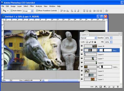
To use a mask, add a mask to the layer that you’re working on and then paint over the mask in black to remove the image from this layer. If you make a mistake, paint in white. To add a layer mask, click the Add a Layer Mask icon at the foot of the Layer palette.

Work across the image softening the edges where the images overlap. It’s at this point that you will see the benefits of having plenty of overlap between the images as this will give you plenty of room to blend the images together.

Some layers may lend themselves to being used as overlays rather than a part of the image. For example, a photograph of text can be placed over another image with its Blend Mode set to Multiply and its Opacity lowered so you get a layering of photos.


Step 6
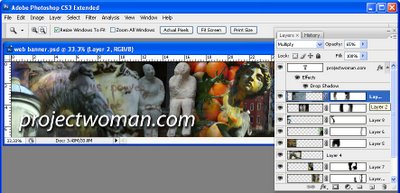
Finish your banner by adding some text. Click the Text tool and click on the banner and type your text. Use a Drop Shadow layer style to make the text rise above the background so it will be more easily read.

Ready to learn more? Here are some more creative Photoshop tutorials from my blog:

Photoshop: Fold a photo

Photoshop: Turn daylight into sunset in one easy step.

Helen Bradley

Wednesday, March 4th, 2009

Sharpening in Lightroom 2

Sharpening is the last step in editing an image. If you’re working in Lightroom then you have a very sophisticated Sharpening tool at your disposal. It’s hard to determine what the coolest part of the process is – the Detail and Masking sliders or the fact that sharpening is applied to only the image luminosity so it doesn’t mess up the image colors.

To sharpen in Lightroom, open the Develop module and the Detail panel to show the sharpening tools. A good starting point for most images is to set the Amount to 100, set the Radius to 1.0 and the Detail to around 25. As an aside, it’s nice to see that Lightroom is realistic about the appropriate radius to use and it limits you to a value between 0 and 3 which takes some of the guess work away from determining what value you should use.

Now you have a starting point, adjust the Detail and Amount sliders to see how they affect the sharpening. To see the before and after, press the backslash (\) key. The Detail slider is unique to Lightroom – it doesn’t appear in Photoshop. What it does is to remove halos around the sharpened edges. Low values for Detail reduce halos and higher values allow them.

The Masking slider is a way cool tool. It lets you remove the sharpening from texture areas of the image and areas that you typically would not want to be oversharpened such as skin tones. To use it, drag the Masking slider to around 75 and compare the results. You should see less sharpening in areas that don’t typically need it the larger the Masking value. To see what the mask looks like, hold the Alt key (Option on the Mac) as you drag on the slider and you’ll see a grayscale mask in place of your image. The white areas of the mask are the areas that will be sharpened – they are the edges in the image – and the black areas are those that will not be sharpened or which will be sharpened with less intensity.

The mask gives you a lot of control over how the sharpening is applied to the image and it prompts the question “why isn’t this in Photoshop too?”

Helen Bradley

Thursday, October 18th, 2007

Brighton Pier

Oh wow. I had all these photos of Brighton Pier. It was raining cats and dogs when I got there so I had to shoot everything with water dripping down my neck and trying desparately to keep water off the camera.

I though I’d probably lost out on good shots. Not so! A little fix here and there and I have some great results. I love this Caution, No Entry one. I had to adjust this image twice, once to bring in the pier and water/buildings detail and a second time to get the reflections in the timber pier flooring. I used a mask to bring in the bits I wanted to use. You wouldn’t believe what I started with and how far it came, so – just in case you’re interested, here’s a preview of the starting image:

Helen Bradley