Friday, October 30th, 2009

The Color of light


The light of an oncoming storm has tinted this image and its moodiness complements the subject of the photo.

Without some form of lighting it is impossible to take a photo – a photo is, after all, a representation of the light that enters the camera and which is captured by the film or camera’s sensors. There are, however, different types of light and, when you understand something about the light that surrounds you, it will help you capture better photographs.

Perhaps the most important thing to understand about light is that it has a colour. While the light cast by the midday sun is the purest light and devoid of a colorcast, the same is not the case for early morning light or the light in shadows. Early morning sunlight throws a warm glow over a scene and the same happens in the evening as the sun sets.


This sunrise shot of gondolas on the Grand Canal in Venice has captured the unique early morning light.

This pink coloured glow is called warm light because of its warm pink orange tone and it not only gives you wonderful early morning and sunset photos but the same warm tones are extremely flattering when photographing people. In fact it is possible to buy what are called warming filters that attach to your camera and which filter the light coming into the camera to give a flattering pink cast to the image.

You can mimic this effect in most photo editing software by applying a slight orange pink colorcast to the image or, in programs such as Photoshop, using the built in photo filter tool to do this. You simply select the type of Warming Filter to apply to the image.

Not all outdoor light is warm or neutral, the light in a shaded area on a sunny day will generally be more blue so your photos might show a blue cast. However if you’re photographing in an area shaded by foliage, the colour cast will be more green because the light is being filtered through the green of the plant leaves. The unfortunate side effect of this is that photos taken in a garden setting may result in the subject showing a slightly green tone to their skin.


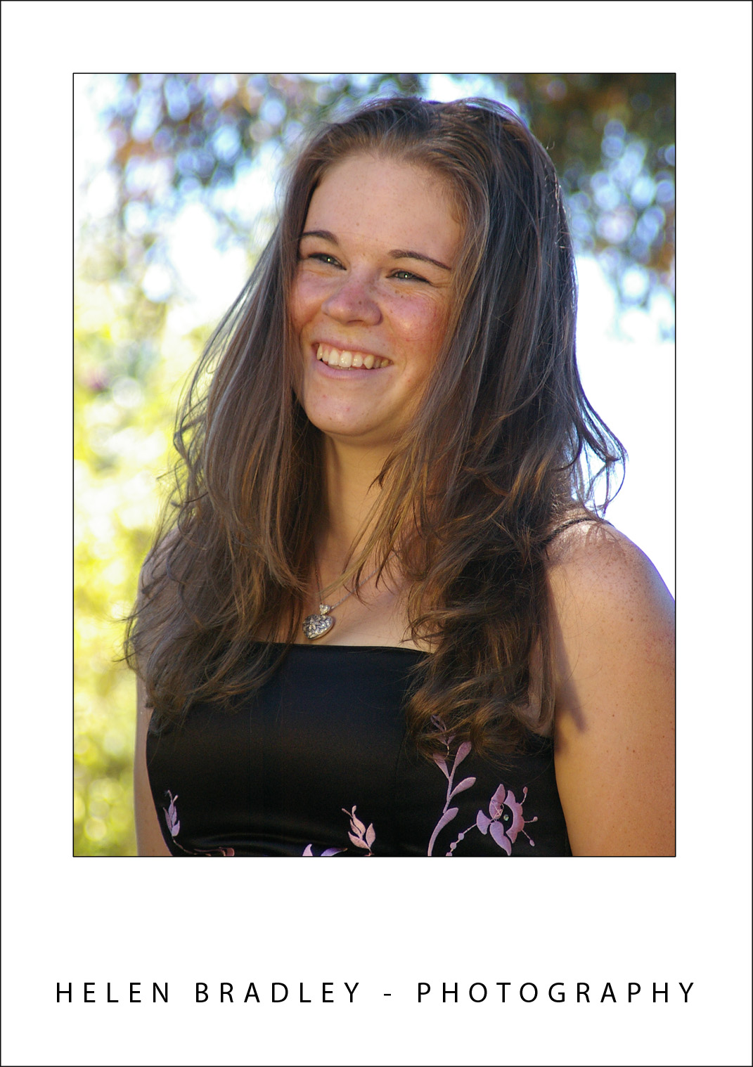
To help counter the lack of light in the shadows additional light has been bounced onto the subject’s face using a reflector.

Light indoors is different again. A standard light globe will throw a pink yellow light whereas fluorescent tubes throw a blue green light. Photographs of people taken in fluorescent lighting can show their skin as being washed out and unattractive because of the light’s colour. To help you balance the light that is coming into your camera it has a tool called white balance. Using this white balance tool you select the type of light that is in the location (such as tungsten or shade) and the camera will adjust the resulting image to show a more neutral tone. So, if you’re photographing in fluorescent light the camera will neutralize the blue green light to give you a more neutral result. If you’re shooting in Camera RAW the adjustment won’t be made to the final image – you can, however, make it yourself using your camera raw pre-processing software.

When photographing a sunset, because you want to capture the gold, red and pink colours of the sunset, it is best to select a daylight sunny setting for your white balance so that the camera does not make any adjustments to the colour. In this situation the camera will record what it sees and you’ll get your sunset not a neutralized version of it!


When capturing sunsets make sure not to use a white balance adjustment or you will lose the colors.

Another creative use for White Balance is to warm an image. If you’re shooting a photo in full sun and you want it to have a warmer look, use the shade setting on your camera when you do so. This applies a slight warming colour to the image much as you might get by adding a warming filter to a lens.


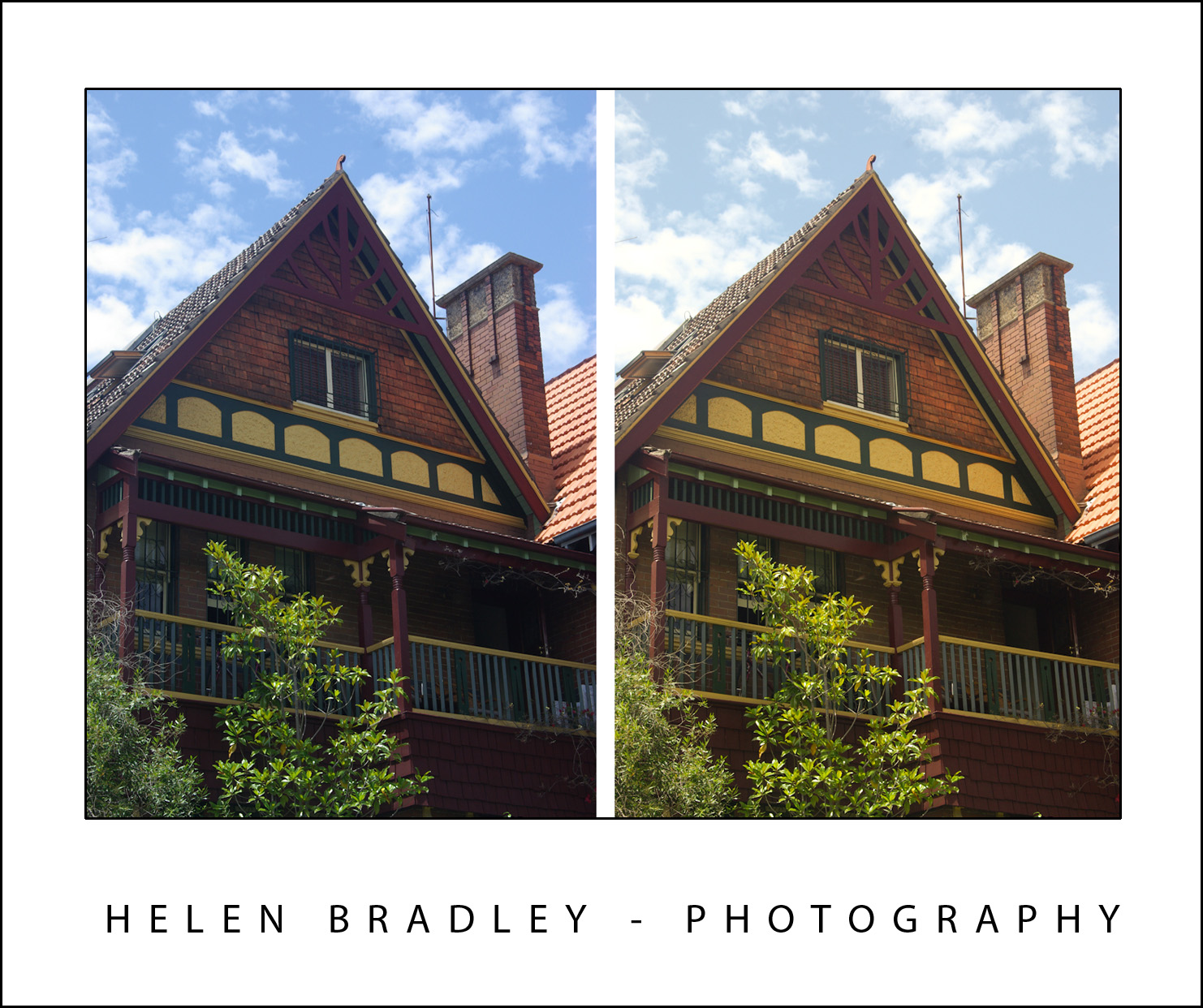
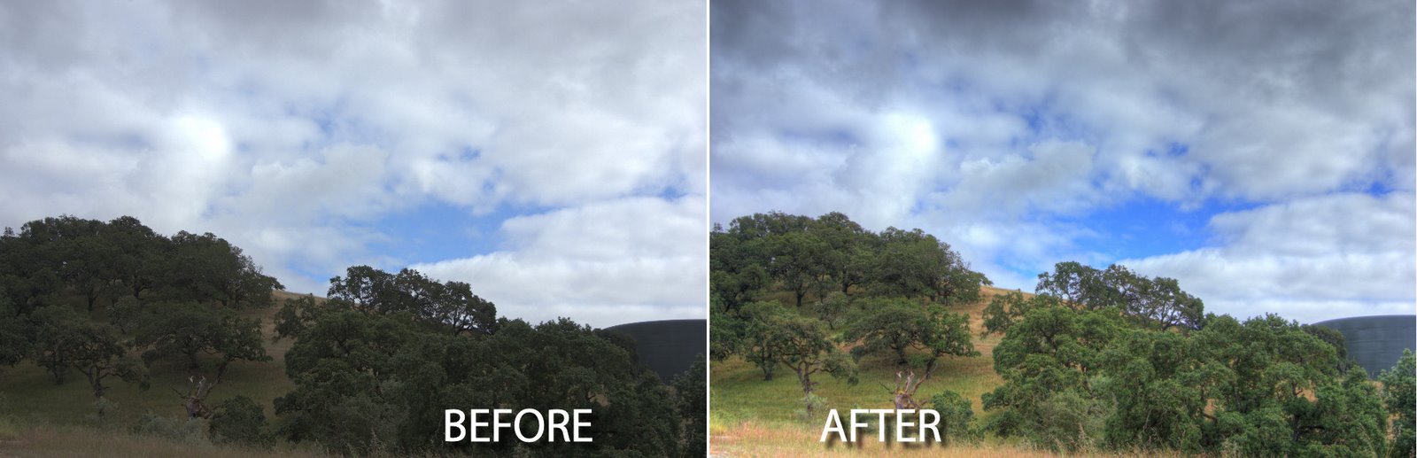
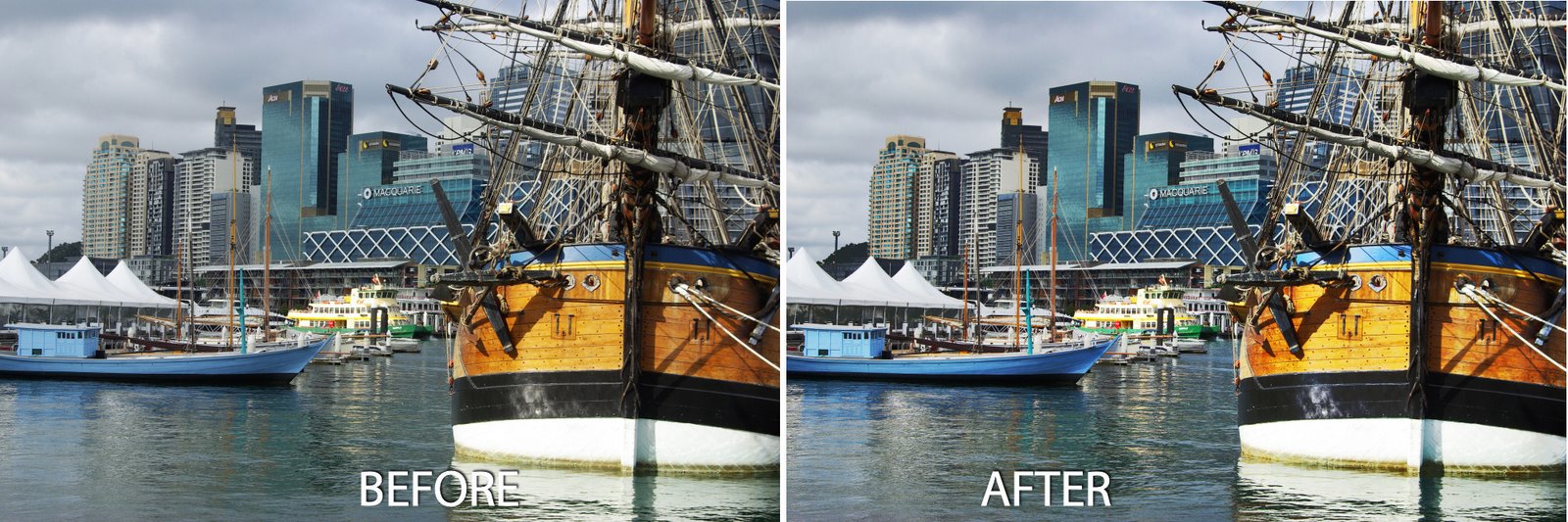
Using a different camera setting you can alter the warmth of an image, the version on the left is cold, the one on the right is warm.

As you become more aware of the quality of the light that you’re photographing in, you will be able to make it work for you and the result will be better and more artistic photographs.

If you’re interested in learning more about white balance, visit this recent post on Understanding the Need to White Balance: http://www.projectwoman.com/2009/09/understanding-need-to-white-balance.html

Helen Bradley

Thursday, October 29th, 2009

Outlook 2007 create a new empty calendar

Sometimes you will need a new empty calendar in Outlook. You might need this if you’re planning an event and you need to keep everything for the even separate from your own calendar.

Or you might need a blank calendar so you can print blank pages to complete by hand.

So, when you need a blank calendar you can easily create one in Outlook. Choose File > New > Folder and give your folder the name you wan to use for your calendar.

From the Folder Contains list choose Calendar Items, from the ‘Select where to place the folder’ list choose Calendar, and click OK.

Click the Calendar option to display your calendars and, in the list, your new calendar’s name will appear.

You can click its checkbox to display it. If there is already one calendar visible, clicking its checkbox will display both calendars side by side or in overlay mode.

To change the display, right click the Calendar tab and choose either, View In Side-by-Side mode or View in Overlay mode.

Helen Bradley

Monday, October 26th, 2009

Photomatix Pro: Create an HDR image


It seems like HDR or High Dynamic Range imagery is all the rage right now. There are lots of tools around for assembling an HDR image and, although Photoshop now has a tool to do this, PhotomatixPro is much more sophisticated and the results are much better, so I’ll show you how to use it.

Before we start, however, a bit of background as to what HDR is and why you might use it. One of the limitations of digital cameras is that they can only capture an image with a fairly narrow dynamic range – the range of lights and darks in the image. In fact, faced with a scene that has very bright areas and very dark areas, you and I can see much more detail in the scene than the camera can capture in one shot.

However, the camera can capture lots of images of the same subject each with a different exposure. So you can expose for the light areas and again for the dark areas and again for the midtones and capture 3 of more images of the same subject that together show all the rich detail in the shadows and in the highlights. What HDR software does is to help you assemble these images into one image with a wider range of lights and darks than you can get in a single image.

To capture for HDR, ideally you need a series of images shot using a tripod so you eliminate movement between the images. Your overall camera settings should not change from one image to the next – except that the exposure for each will be different. Typically you’ll use your camera’s Auto Bracketing feature to capture the series and it’s best to limit your shooting to a scene that won’t change while you’re capturing it so you don’t get movement between frames.

It is possible to render an HDR image from a single camera raw image and you would have to do this if you were shooting a moving crowd for example. However it’s best, where possible to capture multiple separate exposures. If you’re using an IS camera disable this feature when shooting on a tripod – leaving it on can actually cause camera movement.

A trial version of Photomatix Pro 3 is available from www.hdrsoft.com so download and install it. If you don’t have suitable images to work with, there are three sets of sample images on the site that you can use. Here’s how to assemble an HDR image from multiple exposures:


Step 1
Launch Photomatix Pro 3 and select Generate HDR image. Select your series of images and click ok. You can use three or more images and the program can read DNG files so you don’t have to convert these first.


Step 2
In the dialog you can select to Align the images if you think there may be some movement and you can change the White Balance setting. You can also select to reduce ghosting artifacts which may occur if there is movement between images such as people walking.

Click Ok and wait as the processing is performed.


Step 3
The resulting image won’t look good and that’s to be expected. You can save it at this point if desired by choosing File > Save As and save it as a .hdr image. You can later open this and work on it without having to generate the HDR version from the source images again.


Step 4
Choose Tone Mapping and you’ll begin to see the possibilities in the image. Click Show Original to compare the image with what you had previously. You should see enhanced detail in the shadows and in the highlights.


Step 5
To get a surreal effect, from the Smoothing options, select a low value – the lower the value the more surreal is the image and the higher the value the more realistic is the result. Adjusting the Strength downwards will also help you retain more realism if that’s what you want.


Step 6
Use the Color Saturation slider to adjust the saturation of the colors in the image and use Luminosity to adjust the overall lightness.


Step 7
There are also presets you can select from in the Presets dropdown list such as Painterly, Grunge, Natural and Smooth Skies.

Step 8
When you have an effect you like, click Process to process the image using the settings you chose.

When the finished image appears, choose File > Save As to save it and you can then open it in Photoshop or another editor to finish working on it.

Helen Bradley

Monday, October 26th, 2009

Freeze the action


Whether you’re taking photos of a football match, motorbike racing or the kids riding their bicycles, you’ll find yourself trying to capture movement. Photographing moving objects can be tricky but there are some simple techniques you can use to make it more likely that your photos will be successful.

Plan your approach
Before you begin shooting find a good place to shoot from. Get to the event early so you have time to look around for a good position to stand. If you have a telephoto lens, a position in the stands at the races or football will let you get close to the action even when you’re far away and you can get good shots over the heads of the crowd. Alternately, get right down to the boundary fence for a different perspective of the action.

Anticipate the action and be ready to shoot it. Point the camera to where you think something will happen and press the camera shutter half down to focus the shot and wait. When the action comes into the frame, press the rest of the way to take the shot. If your camera has a sports mode – it is generally indicated by a running figure – use that. Sports mode reduces the time it takes to capture a shot by increasing the amount of light coming into the camera. The faster the shot is captured, the less the subject moves while the shutter is open and the less blurry they’ll be.

For most sports there are times that can be considered high action – a player about to take a high mark, a goalie trying to save a goal in soccer or horses jumping from the starting gates. Anticipating these events and capturing them can give great results.


15 year old sports photographer Jacinta Oaten used a combination of anticipation, great location, large aperture and fast shutter speed to get the wonderful shots featured in this post.

To blur or not to blur
Blur should not be seen as a bad or undesirable thing. By shooting at a slower speed and allowing the background to be well focused and the subject slightly blurred you can get an impression of action in your shots. To slow your camera down so you can blur the action, choose Landscape mode or, if your camera is manually adjustable, slow the speed down for example to around 1/15 th of a second.

To reduce blur in a shot, use the fastest speed setting of which your camera is capable. If this doesn’t work, follow your moving subject with the camera. Stand still and point towards the subject and start moving the camera to match their movement. Shooting as the camera is moving along with the subject results in the subject being focused and the background blurred. Again, you will have a pleasing sense of movement in your shot.


To capture the action at the rodeo I used burst shooting mode to maximize the chance of getting a good shot.

Your camera’s burst shooting mode is also handy at capturing action. In this you’re your camera takes a series of shots in a short time interval. Instead of having one shot, you now have six or nine taken in very short succession. In some cases these shots are smaller in size than regular shots so, before using this mode, ensure your camera is set to capture at its highest resolution and to store at the lowest compression so you ensure these shots are the best they can be. However, the very speed of capturing the shots makes it more likely you will get a shot you like from those you’ve taken.

Look around you
When shooting action scenes, don’t focus entirely on the action and miss out on the stories that happen behind the scenes. Often people sitting in the crowd will make a good shot, so when someone is about to kick for a goal, turn around from your position on the boundary fence and shoot the crowd’s reactions to the kick. Look for other scenes that are compelling such as the athlete’s reactions at the end of the race or a bored official reading a book with action taking place all around.


Finding a good position to shoot from and anticipating the shot can give some great results.

Know your camera
The high point of a game when your favourite player is about to shoot for goal is not a good time to realise you don’t know how to operate your camera. Before you pack your camera for an event, spend time familiarizing yourself with its settings. Know how to find and use the various camera modes and practice following motion – taking shots of cars driving down the street is a good way to do this. Check your camera’s settings to make sure you’re taking the quality shots you think you are and check that the compression format being used is acceptable. If you’re using a camera with a small number of megapixels (3 or less), buy a big storage card so you can shoot at the highest quality and lowest compression possible.

If you’re using a digital camera, take plenty of shots and delete the ones that didn’t work out later on. Consider any space left on your camera card at the end of the day as being a wasted opportunity to try your new skills.

Helen Bradley

Saturday, October 24th, 2009

Lightroom: Print with colored backgrounds


One issue with Lightroom is that all the images that you print from the print module print with white backgrounds.

While Lightroom does not offer color backgrounds for images, there is a workaround that you can use to print with any color background you like.

Here’s how to do this:


Start in Photoshop or another bitmap editor that lets you create and save JPG images. Create a new image the size of the page that you want to print.

For convenience, I’d create images for all the paper sizes you plan to use all at once. This means you may want one for 5 x 7″ paper, one for 4 x 6″ and one for Letter paper for example. Whatever size you print at, create a new image that size and at around 96 pixels per inch if you’re using a solid color background.


Fill the document that you have created with the color background that you want to use. For example, if you want a black background, fill the documents with black and for another color background, fill the document with that color.


If you typically use an Identity Plate to print your name or other details on the image in Lightroom then you’ll need to know that what you’re doing right now is creating something that will replace the Identity Plate in Lightroom so you can’t use both a background and a text identity plate.

However, if you know this ahead of time you can add the same details you add to your identity plate to this image as text.

If you plan to do this, you’ll will need separate documents for each paper size in each of the two orientations: Landscape and Portrait. If you’re just using plain backgrounds you won’t need to create one in each orientation as you can rotate the images later on – you just won’t want to rotate something that has text in it. You will probably want the images to be a better size for printing so 1500 x 1000 pixels will print on 6 x 4 paper at 250 dpi so the text will look crisp and neat.

Once you’ve created all your documents, save each with a name that indicates its size and color and, if relevant, its orientation. I suggest you save it somewhere that will make it easy to find and so they are safe from being removed accidentally.


Return to Lightroom and switch to the Print module. Set up your image or images to print. You can use a Contact Sheet/Grid layout or a Picture Package.

To add your background locate the Overlays panel on the right and click the Identity Plate checkbox. Click on the Identity Plate to display the menu and select Edit. When the Identity Plate Editor dialog opens, click the Use a graphical identity plate option and click Locate File.

Select the image that you created for this paper size (and orientation, if applicable), and click Choose. Click Ok to add the image as the Identity Plate.


When the image appears in the document set the scale to 100 so it fills the page layout and drag it into position.

You might notice that you cannot make the image any bigger than the page itself and you can’t drag it out of its original aspect ratio – this is why you need to create multiple versions of the image one for each paper size as the ratios 8:10, 5:7 and 4:6 are all different.


Once you’ve dragged the background over the entire page, click the Render Behind Image option in the Overlays area.

This moves the solid color image behind the pictures on the page.

You can now change the stroke border if desired to, for example, add a white or gray stroke if you’re using a black or dark gray background.

Then go ahead and print your image.


You might realize by now that any image can be used as a print background.

So, for example, you can crop an image in Lightroom to the size that you need for the background, export it to disk as a JPG and then reimport it as an Identity Plate to use as a background for your printed images.

You could do this with a black and white version of an image or a color version. The Overlays > Identity Plate area also provides an Opacity slider allowing you to make the image partially opaque to lighten it so it doesn’t overwhelm the images you are printing.


When you are done, save your Identity Plate by clicking on the Identity Plate option, choose Edit and then from the custom dropdown list, choose Save As and save it so that it can be easily accessed next time.

Helen Bradley

Friday, October 23rd, 2009

Excel 2007 – Check for Duplicates


The new Excel 2007 has far superior tools for finding and removing duplicate entries in a list. Thankfully – because this has been a nightmare in earlier versions.

To find and remove duplicates from a list of data in Excel 2007 first format the area as a table by selecting it and, from the Home tab, choose Format as Table.

Click on any cell in the table and choose Table Tools > Design tab on the Ribbon.

Select Remove Duplicates to display the Remove Duplicates dialog. In this dialog are the Column headings for your data and all are selected by default. To remove the duplicate data from your worksheet leave all the column headings selected and click Ok.

If you want to remove rows where only certain data matches, leave the column headings for those particular rows selected and deselect the column headings for those columns which may have data that differs from one row to another. Now click Ok.

It is sensible to save your worksheet before running this Remove Duplicates option just in case you delete data by accident. If this happens and if you haven’t closed the file, you can recover it using the Undo button.

If you are using an earlier version of Excel, here are links to earlier relevant posts:
Excel – finding duplicates
http://www.projectwoman.com/2007/02/excel-finding-duplicates.html
Check for duplicates in an Excel list
http://www.projectwoman.com/2007/01/check-for-duplicates-in-excel-list-1.html

Helen Bradley

Wednesday, October 21st, 2009

Photographing for eBay and the web

A few years ago the most complex photographs most of us took were photos of the kids birthdays and our own holidays. These days we’re more likely to be taking photographs that in the past would have been the work of a professional photographer. If you have a website or if you sell in online auctions, you’ll have confronted the issue of photographing things so they look their best and present well when displayed on the web.

When capturing images for the web, some of the work can be done in your image editing software but most of it needs to be done in camera. It’s more efficient and more effective to shoot right to begin with rather than have to fix up problems later on.

Location, location, location
Start by finding a good location to shoot in. For smaller objects you can generally shoot indoors on a clutter free tabletop. A sheet of paper taped to the tabletop and which extends up all the way behind the object will provide you with a seamless background the technical term for which is a sweep. This is exactly what a professional photographer will use only their version will be make of heavy plastic and yours will be paper. You can also use a heavy fabric such as upholstery fabric – provided it isn’t crushed or creased. Hang the paper or fabric or tape it into position and sit the object on it.


This statue was photographed in a light place indoors with a sweep made from a sheet o paper taped to the wall.

Check in your digital camera’s LCD screen to make sure that your sweep extends to cover the entire area behind the object and in front of it so you can capture and later crop the image without any surrounding area showing.

Where you are photographing small objects such as for online auctions or where the size of the object is important, include a coin or ruler in the photograph. This way the viewer can ascertain the relative size of the object from the visual clue you have provided.

Image size
For shooting web images, you don’t need to shoot large images because the size of images required for most web images is quite small – anything more than around 1,000 x 1,000 in size will be more than you need. You can configure your camera to shoot small images or resize in your software later on.

Use Macro mode
To shoot small objects, switch your camera into Macro mode which is indicated on the camera by a small flower icon. You use macro mode so you can get the camera close to the object and so it can still focus. If you don’t use the macro setting, chances are that the shot will be out of focus as most cameras cannot focus up close if you use any other setting. Make sure to back off the zoom too – most cameras won’t focus in macro mode with the camera zoomed in.


Using the macro feature on your camera give you a nicely focused area with the rest of the image out of focus.

Get in close
Get in close and fill the viewfinder with the object so you capture as much detail as possible. If you’re using standard household lights you will need to adjust the camera’s white balance setting so that the image doesn’t have a colour cast. The light supplied by household globes is coloured and will colour your images if you don’t correct for it and it’s easier to do this when you’re capturing the image rather than later on. Avoid, where possible, using a flash as the image will be blown out – if you have to use a flash, place something over it so the light goes in another direction and not direct onto your object.

Depth of field
One benefit of the macro feature is that generally captures part of the image in focus and the rest nicely out of focus. For this to be successful make sure that the portion of the image in focus is what you most want to show clearly. To see what will be in focus, press the shutter half way down and watch to see what is in focus, if this isn’t correct, move the camera so that the part of the object you are interested in is in the centre of the viewfinder and press the shutter halfway down. The move the camera to recompose the image and finish by pressing the shutter the remainder of the way.

Lightboxes rock!
If you are doing a lot of small object photography, consider purchasing a light box and some special daylight balanced globes. A small collapsible studio like this will make the task of photographing objects a lot easier – the light will be diffused by the light box, you won’t have to adjust for colour and you can photograph anytime day or night. If you don’t have a light box, take the object outside or place it in a well lit area of your house making sure that the area has a neutral background. If you use the macro feature you can still get a good image with a nicely blurred background.


A light box like this is a great way to capture photos of small objects for the web.

While photographing objects for the web is challenging, armed with the right tools and knowledge of the features of your camera that are there to help you, you can get some great results.

Helen Bradley

Tuesday, October 20th, 2009

Outlook 2007: Redirect replies to someone else

When you send and e-mail for someone else you may not want the replies to be directed to you. For example if a co-worker is out of the office and needs you to send an urgent email on their behalf – you will want replies to go to them, not you.

You can do this in Outlook 2007 from the New Message dialog. Click the Options tab and select the Direct Replies To option in the More Options group.

From the dialog, set the reply to address for this email and click Ok.

Now you can send the email but replies will go to where they are supposed to go.

Helen Bradley

Monday, October 19th, 2009

Photoshop: Enhancing midtones


If you’re a Photoshop and Lightroom user you may, like me, love the Clarity adjustment in Lightroom and wish it were available in Photoshop too. The Clarity slider lets you adjust the contrast in the midtones of an image which gives an over all sharpening and color boost to the image midtones.

As yet, there is no Clarity tool in Photoshop (although there is one in Camera RAW). There is, however, a technique which has been popularized by Mac Holbert which does a similar thing. While the Photoshop technique is more cumbersome than using the Clarity slider in Lightroom it does work very well and gives very similar results.

Once you’ve performed the fix a couple of times you may want to create this as an Action so that you can run it on your images at any time you need to do boost the midtones.


Step 1
For an already flattened image, duplicate the background layer by right clicking it and choose Duplicate Layer.

For an image that already has multiple layers, click the topmost layer and press Ctrl + Alt + Shift + E to create a merged layer to work on.


Step 2
In the layers palette set the Blend Mode of this new top layer to Overlay and set its Opacity to somewhere around 20 to 25 percent.


Step 3
Select the Add a Layer Style button at the foot of the Layers palette and choose Blending Options.

In the Blend If section of the dialog, locate the This Layer slider. Drag the indicators under the slider in to approximately one-third of the width of this slider so you’re dividing it into thirds.

Hold the Alt key (Option on the Mac) to divide each slider into two pieces and position the outside halves at approximately the 1/6th mark, use the image as a guide.

The positioning of the sliders does not have to be exact. All you’re doing here is removing the very lightest pixels and the very darkest pixels on this top layer from this fix, so it remains applied to the midtones only.

By splitting the sliders, you’re ensuring that there is a gradual change from where the effect is applied and not applied.


Step 4
If you’re using Photoshop CS3 or CS4, you can convert the topmost layer to a Smart Object before continuing. To do this, right click the top layer and choose Convert to Smart Object.


Step 5
Choose Filter > Other > High Pass and set the Radius to approximately 50 pixels. Click Ok.

The High Pass filter sharpens the image and the Overlay fix applies a contrast and saturation boost. The Blend If sliders ensure that the fix is applied only to the image midtones.


Step 6
Any of these adjustments can be changed. You can adjust the Radius of the High Pass filter to a larger or smaller value and, if desired, increase or decrease the layer Opacity to apply more or less of a contrast boost.

You can also adjust the Blend If sliders to apply the fix to a larger or smaller range of the image tones.

Helen Bradley

Saturday, October 17th, 2009

Word 2007 – Instant Document Elements

Hand in hand with the new Building Blocks tools in Word 2007 are the new smart document elements created using content controls.

These elements allow you to instantly create headers, footers, text boxes and cover pages for your Word documents.

To see how these work, select the Insert tab and select the Cover Page dropdown list. From here you can select a sample cover page to use for your document.

If you select one such as Exposure a new cover page will appear in your document. This particular one includes an image and space in which to type the document abstract, the year and document title as well as your company name, etc.

You can select and delete any of these elements that you don’t want to use on your cover. Alternately, click on the elements you do want to include and type the information prompted for.

To replace the photograph on the cover page, click it to select it, right click and choose Format AutoShape > Colors & Lines tab and click the Fill Effects button. Select the Picture tab and click Select Picture to choose a replacement image.

Once you’ve selected the replacement image, enable the Lock Picture Aspect Ratio checkbox and click Ok twice. The original image will be replaced by the one you chose.

If you later change your mind and choose an alternative Cover Page, the text you’ve typed will, where it is appropriate, appear in the alternate cover page and the original page will be removed automatically.

Headers and Footers
Other elements which work similarly to the cover page are to be found also on the Insert tab and these include the Header and Footer and Text Box. To add a header to your document, for example, select the Header option and choose the header to use.

It makes good sense to choose the same style header as you used for the cover page as these are designed to look good together, although this is not a requirement and you can choose any header you like.

Similarly, you can add a footer by clicking the Footer button and choose a footer to add to the document.

Text boxes
The Text Box tool lets you add a formatted text box which contains prompts as to where you should insert your content. In this case, select a text box style that suits the type of text you want to insert such as a breakout quote or a sidebar.

Any element such as Header content or a Text Box can be reformatted by right clicking its edge and choose Format AutoShape or Borders and Shading, or whatever prompt suggests that it will let you format that particular element – what you see in the menu will depend on the element you have selected.

For example, you can change the fill color of a Text Box and, if you change it to a fill color which is a theme color, the Text Box color will update later on if you change the document theme.

To change the theme, select the Page Layout tab and choose an alternate option from the Themes list. By holding your mouse over a theme you can preview its effect on the document underneath, select the theme you want to use. To change the font used, select the Theme Fonts option to right of the Themes list and choose an alternate font combination.

Helen Bradley

Page 1 of 3123