Wednesday, October 31st, 2012

Word 2013 – What’s new

Learn what is new in Word 2013 and how you can put it to work in your day. Features include new Design tab, start screen, Layout Options, PDF editing, Table border painting, styles and sampler, Read Mode options, Present Online, Save to skydrive, insert images and video from the web.

Transcript:

Hello, I’m Helen Bradley. Welcome to this video tutorial. Today we’re going to look at what’s new in the new Word 2013. This is the new start screen that you’ll see when you start Word 2013. And it’s similar to that in Excel and PowerPoint and Publisher. You’ll see the recent documents that you’ve had open down the side of the screen here, and you’ll be given the option to open other documents for example from SkyDrive or your local computer. There are templates here and these are current so at the moment it’s sort of October so we’re seeing Thanksgiving and Halloween templates. They will change with the seasons. If there is a template that you like you can click on it and you can pin it to your start screen. You can also click to have a look at it in more detail. If there are multiple images you can look through it here. If you want to use it click Create, otherwise just close it down, and you can go and have a look at another template. You can search online for templates and there are some suggested searches here. If you have your own templates you can click Personal and view the templates that you’ve created for yourself. Up here in the top corner are details of the account that you’re currently logged into. So this tells me I’m logged in to this particular SkyDrive account. Let’s open a document and we’ll start working inside the new 2013.

Here I have a document open inside the new Word 2013. You’ll see that the screen is very clean. It’s got that sort of metro style interface that is typical of the new Office 2013 suite. Everything is very flat and your documents sort of take center stage. So let’s have a look at a couple of the new features. The first one is the new read mode. I’m going to View and then Read mode because a lot of people actually use Word as a reader. So I’m just going to set this back to the layout that you will see by default. This is this sort of two column layout which allows you to work through the document and read it and particularly appropriate for using on a tablet. You can change this to the regular page layout if you want to by choosing Paper Layout. There are paper colors that you can choose. We’re obviously using sepia at the moment. And you can set it to the default which is two columns, narrow or wide as you choose.

There are some other features here. If you right click a word you can click Define and it will be defined on the screen for you. I don’t have a word that’s actually going to be definable to show you that, but it works just fine. The other thing in this read mode is that you can look at things more closely. For example we might look at this chart and double click it. And it will now open over the top of the document so that we can look at it in more detail. And that happens as well with smart art. Now this read mode is not looking at the document the way it would be presented so things may overlap if they’re complex. The important thing about this read mode is that it’s for reading the document and not sort of previewing it the way it’s actually going to appear when it’s printed.

I’m just going to escape out of here to go back to the regular Word. Now one of the other changes to Word is in the review area so I’m going to open a different document. I have one here that has track changes in it. The track changes feature has been overhauled a little bit. Let’s go into review and I’m just going to show the new mode which is simple markup. In simple markup we’re going to see the document as it would be if all the changes were incorporated. So that’s text that is inserted is inserted and text that has been marked for deletion is deleted. And we can switch between these two modes either by choosing simple markup or all markup here on the tab, or we can click these lines. These are lines indicating that there are changes here, but we’re seeing it in simple mode at the moment. So we’re not seeing the changes. We’re just being warned that there are changes. Click again and now we can see what the changes are.

There are some changes too to comment. So for example if somebody adds a comment to a document, if you want to reply to that comment you can click this Reply button that allows you to now reply to that comment. The changes here are quite significant because in the past if you wanted to reply to a comment all you could do was add another comment. So conversations could become quite long and complex as they sort of scrolled down the page. Here now all the comments or all the conversation about a particular point can be isolated inside a single comment. And I’m just going to delete that comment. Let’s just get rid of it in its entirety and let’s go back to viewing this document in the new simple markup.

Now I’m going to get rid of all the changes in this document. I’m going to accept everything because I want to show you some of the new design features in the new Design tab. The new Design tab has put together some of the features that were really difficult to find in earlier versions of Word, in particular the sort of document formatting styles. Now you can see what the document formatting styles are. And if you like one you can click on it to apply it to your document. And there are lots of different styles here to choose from. This is the one that we were using previously, but they’re easy to find and to use. If you see one that you like, for example we might like this sort of gray look, we could change the color scheme that’s applied to it. So we could make it blue for example. There’s also the ability to choose different font combinations for our document if we like the look of it but prefer a different combination of fonts for example.

Now if we create a look that we like and we want to use it every time we open Word then we can set this as default. This is a new option on the Design tab. If we click this, this is now going to be the default look for all our documents in future. So this new Design tab has lots of features on it that make things more accessible than they were. Of course if we want to format individual elements on this page we’d back to the Home tab and selecting styles. But these styles are linked to the design or the document format that we’re using here from the Design tab.

Still in this document I’m just going to change its rotation back to normal and we’re going to have a look at the new layout options that we have for this. One of them is this layout options icon here which makes it more accessible to find the text wrapping options. In the past these were really quite difficult for people to find. And now they’ve been attached to the image itself. You can also opt to move the image with the text or fix its position on the page. If you click See More you’ll get the more traditional layout dialog. There are also alignment guides so watch as I move this image around the page. It becomes aligned or we can see when it is aligned to various objects on the page because we get this green alignment guide appearing. So we can see when it’s aligned with paragraphs, with margins of the page, perhaps the edge of the page itself. So this allows you to align things up more easily than you’ve been able to do in the past. Now still in this document we’re going to have a look at the new navigation pane. I’m choosing View and then Navigation Pane. This document has been set up using styles. So because it’s been set up using styles I can navigate the document by selecting the headings in this navigation pane. It just makes it easier to move around and particularly a long document. In addition, there are these new collapse icons. Again, because this document has been formatted using heading styles these collapse and expand icons appear and I can click on them to collapse the document down to just the heading. So imagine this in a really long document. If you had really large headings that had lots of text underneath then you could collapse your document so that you only work on the headings that you’re interested in working on at the time and then you can expand the other headings as you go through it. Now this is a feature that used to be available in outline mode but it’s been brought into print layout. So it’s accessible to any document that you create using heading styles, not only the ability to collapse and expand paragraphs but also this slightly smarter and more useful navigation pane.

Now as well as collapsing parts of the document you can now collapse the ribbon. So you can click here to collapse the Ribbon and it collapses to just the headings. And then you can click to open it. You can pin it or unpin it depending on what you want it to appear like. I’m going to pin it because I like to see the ribbon particularly on large screens.

Before we start looking at tables let’s just go to headers and footers. I’m going to choose Insert and then I’m going to just insert a plain old header into this document. One of the changes here to the header option is that there is access to document info. You can get access to the author, file name, pathname and document title from the Header tab and that’s new in this version of Word. So let’s just close out of there and let’s switch to a document that has a table in it. Here we have a document that has a table in it, and with the table selected we now have options for formatting that table. From the Design tab you’ll see that there are additional table styles here. And these are theme aware so they’re going to look like the theme itself. So I’ve just applied one of them here. Now I can go ahead and format this table a little bit better if I want to. I’m thinking that the text would be better white. So let’s just go and get some white text, and let’s make it a bit bolder.

Now there is a new feature with the design of this table in the border. So we’re going to the table, let’s just grab the table. I’m going to the Design tab and here are our new border styles. This allows us to bypass the old border option that was available inside Word and to paint borders on. Now I can click here for border styles, and I’ll get borders that are theme aware. So these are borders that look like the theme. So I’ll just select one, but I might make a slight change to it. I think I’ll add a slightly wider border. So I’m choosing the color I want from the styles, but I’m making it a bit wider. Now I’m going to click on the border painter and I’m going to start Painting this border onto my table. And wherever I click and paint it’s going to be painted on. So this allows me to paint borders on where I want them to appear and to remove them where I don’t want them. For example, I could just set a border to none and they would be removed. Now let’s say that I make a mistake down here and I paint this border on by mistake. I want to go back to the regular border. Then all I need to do is from the border styles option here is choose my border sampler. I can sample a border. It’s now attached to the border painter. So having sampled it, I can now paint it back onto the table. So this gives me a lot more flexibility in working with tables than I’ve ever had particularly with borders and tables because that’s really been a nightmare issue for a lot of users.

Now the other thing that I can do in tables that I haven’t been able to do easily in the past is to add a row or a column. All I need do is to position my cursor just where I want the row or column to be inserted and I get this new indicator. And I can click to insert a row. I’m just going to undo that. But let’s go and see that the same thing appears between columns so we could add an extra column to the document. Let’s just undo that. We could also add one at this edge if we want to. So there are some new features inside Word not only new table styles but the ability to paint on borders, to sample borders and to access border styles.

The new features in Word 2013 extend to images and video. If you click the Insert tab you get access to online pictures. So you can view images that are in the office.com clipart collection. You can search Bing or you can go and search your own SkyDrive account. So let’s just type cupcake here. You can see that our cupcake image came from there, but you can add additional images by just clicking on them to insert them into your document. The same thing happens with video content. You can click Online Video and access online video. The benefit of these insert video and online picture options is that you can insert content direct from the web without needing to download it and save it to your computer first.

Let’s have a look at some of the screens that are available here. The open screen gives you access to recent documents, and if you click Computer you’ll see access to your recently open folders. And you can pin folders here as well as pin documents here. You can also get access to your SkyDrive account. One of the new features is in this share Option because you can now present online. If you click this you can go into a present online feature that is presented through the Office presentation service which is a new service. And this is similar to presenting a PowerPoint presentation online. Your presentation or your Word document is uploaded and you’re given a link that you can then share with others and they can watch as you present the document to them. You also have the ability to publish blog posts and invite people also to share your document. This would be done via a SkyDrive location. Here are the account options. Here you can see what account you’re currently logged into. You can also add services. For example we could add a LinkedIn or Twitter service here. We’re already connected to Facebook and SkyDrive, and you can see your update options.

The other feature that I want to talk about is the ability to open and edit PDFs. So I have the open screen available here, and there is a PDF that I just downloaded. So I’m just going to click it to open it. Now you’ve never been able to do this before inside Word and that is to open a PDF for editing. Now the application is not perfect. In fact it’s far from perfect, particularly with complex documents like this one that actually has images and pieces in it. But if we go to the select pane here we’re able to actually locate the picture and the elements that are part of this document so I can actually find these shapes. And I’m just deleting them. So I’m getting rid of these shapes that made the image and now I have something more attune to the original PDF and I could make changes to it. I would probably need to reformat this table as tables aren’t particularly friendly. But you do get access to the internal contents of a PDF file which you couldn’t in the past.

So there’s a roundup of the features that are new in Word 2013. I’m Helen Bradley. Thank you for joining me for this video. Please subscribe to my YouTube channel so that you’re advised of new videos. You can also find more blog posts and information on my website at projectwoman.com.

Helen Bradley

Wednesday, October 31st, 2012

Trevor’s Quick Illustrator Tip – Quick Close

Photo by: salssa via sxc.hu

You can close the current document you are working on to clean up your work area, by pressing Ctrl + W on a PC and Command + W on a Mac. If you haven’t saved the image you’ll be prompted to do so before it closes.

Helen Bradley

Tuesday, October 30th, 2012

7 Camera Settings for Capturing Better Photos

Whether you are using a Point and Shoot or a DSLR camera here are seven camera settings that will help you capture better photos:

Tip 1 – Adjust for light

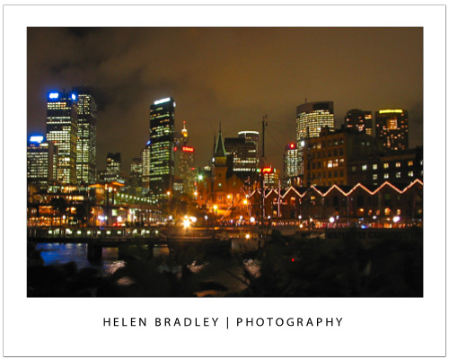
Most digital cameras, in particular SLRs, let you select ISO film equivalencies. Choose 100 – 200 sensitivity for photographing in bright light conditions and use 400 – 800 when there is less light.  In very poor light you can capture at 3200 – 6400 or higher but you will find that, as a result, there will be more film grain visible in the final image a a result.

To capture an image like this at night you should have an ISO setting of at least 800 -1600 or higher and a tripod to steady the camera.

Tip 2 – Choose your mode

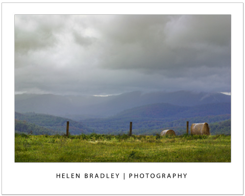
Most cameras, in particular point and shoot cameras have settings for portrait, landscape, night shooting, sports, etc. Choose the correct mode for the type of conditions and the camera will automatically configure the ideal settings to ensure the best shots in the available light conditions.

For an image like this choose Landscape mode so it is all in focus.

Tip 3 – Depth of field

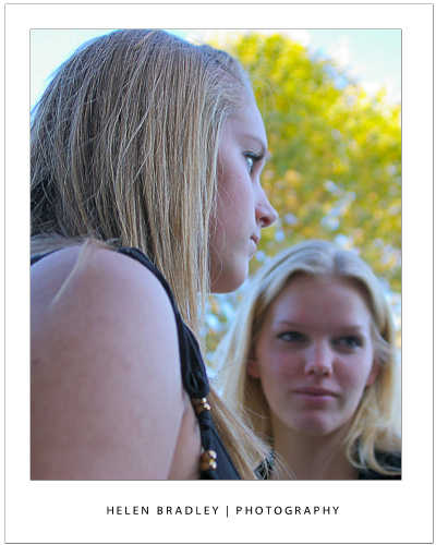
Use your camera’s Aperture Priority setting and set the aperture to a small f stop such as 2.8 to capture photographs with an interesting depth of field. Focus the camera on the object to appear in focus and, when you do, objects in front and behind this object will appear pleasingly out of focus.

Here I focused on the girl in front with a very small f stop and she is in focus – the girl facing us is not.

Tip 4 – Axe the digital zoom

Of the two types of digital camera zoom, which you will find in both point and shoot cameras and camera phones only Optical Zoom is a true zoom . If your camera offers digital zoom it is best to disable it or avoid using it. Digital zoom merely increases the size of the image captured and crops away the area not required. Optical zoom actually zooms into the scene to capture it at full size.


Tip 5 – Adjust exposure

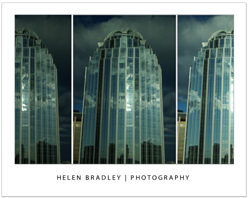
Avoid over or under exposed photos using your camera’s exposure compensation settings. These can usually be adjusted to somewhere between -2 to +2EV. To lighten a shot use + values and to darken one, use – values.

Here is the same Boston building captured at -2, 0 and +2 exposure – the one on the right is the better exposed shot.

Tip 6 – Set the correct White balance

Different light sources throw different color casts onto your photos. For instance, inside lighting such as florescent and tungsten globes will throw blue/green or orange tints onto your image. When shooting indoors without a flash, set the white balance mode to match the light source, to remove any undesirable color cast.

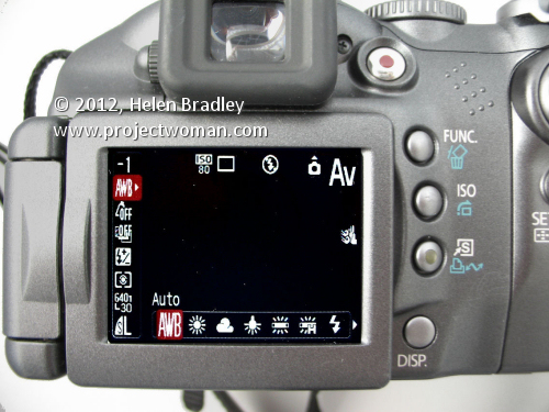
This camera is set to an ISO of 80 (suitable for a very bright day) and AWB – Auto White Balance – this  means the camera will adjust the white balance – not good for indoor shooting but should be fine out of doors in full sun.


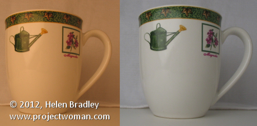
The image on the left was shot in tungsten light with no white balance adjustment. The one on the right was shot in the same position but with white balance set to tungsten light – the color is much improved.


Tip 7 – Set the Flash

Use your flash when capturing portraits on a very bright day. While it may seem counter productive, the flash will light your subject’s face and avoid the deep shadows that the overhead sun will cast on their face.

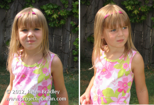
On the left the little girl is captured with no flash and over head sun. On the right I fired the flash and her face and clothes are more evenly lit.


Helen Bradley

Monday, October 29th, 2012

Lightroom – Faux Orton Effect

Learn how to create a Faux Orton Effect in Lightroom, which produces intriguing photos using glowy colors and contrasting details. I also demonstrate how to save the effect as a preset to reuse over and over again.


Transcript:

Hello, I’m Helen Bradley. Welcome to this video tutorial. In this tutorial I’m going to show you how to create the Orton effect or a faux Orton effect on an image in Lightroom.

I have an example of the Orton effect that we’re going to create here in Lightroom. This is the original image and this is the image with the Orton effect applied to it. What I’ve done is I’ve softened the image and then tried to boost the blacks a little bit. You can’t get a true Orton effect in Lightroom because you can’t apply layers in an image. So what I’m trying to do is to bring in some of the characteristics of an Orton effect, a slightly lighter more glowy sort of image with some sharp blacks in it and a sort of hazy look to it. So let’s see how we might do this.

With this image open in Lightroom, first of all I’m going to the Develop module and I’m going to upgrade this one because it’s been worked on in earlier version of Lightroom. So I’m just going to upgrade it to the new process version. And I’m happy with that so let’s just go back to the image that we’re working on. I’m going to make a virtual copy so we can see how far we’ve come. And we’re going to be working on this virtual copy.

Now the first thing I’m going to do is just adjust this image. I’m not so much worried about the histogram as I am about getting some things out of this image that I want to get out of it. But I’m going to turn off the highlight clipping because I’ve got that turned on here. You can see highlight clipping is showing here. So I want to hide this for now. Let’s turn off the histogram and let’s just adjust the image a little bit. I’m just going to set my black point. You can see I’ve got the Alt or Option key held and I’m just trying to darken this to get some blacks in the image. It needed quite a bit of darkness in the image. And let’s go up with the whites right now.

Okay, so once I’ve got the image adjusted reasonably well to get a little bit of contrast and I’m starting to see some blacks let’s start going for this Orton effect. And one of the things we’re going to do is to reduce clarity. So we’re going to bring the clarity right down on this image. I do want quite a bit of vibrance because I want a quite a bit of color. And now let’s go and add some more reduced clarity. I’m going to click the graduated filter. Now this allows me to apply a graduated filter to the image. And it needs to be anchored to a side of the image. So I want it anchored to the top so I’m just going to drag down here to create it. And because it has saturation set to minus one hundred what we’re seeing is that we’re seeing no saturation in this images at all. So that’s convincing us that this is the graduated filter. Of course I do want saturation in that image so I’m going to take it back to normal but I am going to reduce clarity. And that’s adding some more of that softening effect to this image. And I’ll click Done.

Now I can boost that even more by adding a second graduated filter to do exactly the same thing. So again, clicking on Graduated Filter, making sure I select New. This time I’m going to drag up. It doesn’t matter whether I go up or down but I just want two filters on this image. So I want to add the effect. So here’s the second filter. Again, the default on this one is for saturation to be minus one hundred. I just want to take that back to normal. And what I want to do is kill the clarity. And I can also kill the sharpness by taking that down a bit too. I might increase the exposure a little bit more in the way of highlights. And I can go to this one as well, click on this and again, bring down the sharpness on this layer, just tweak that a little bit and maybe add a little bit of exposure and highlights on that one, maybe even some shadows until I get the effect that I’m looking for. And I’ll click Done.

At this point I may want to come back and re-adjust my blacks on the whole of the image. You can see that the blacks have been affected by that adjustment and I don’t have nearly as much black as I had before. So let’s go in and adjust the blacks. Having done that I’ve brought way more black in I think than I want. So let’s just go and bring up the highlights a bit on the basic image underneath all those adjustments, and again, kick up the shadows a little bit.

So there’s the basic Orton effect applied to the image and having done that I could just go onto the next image. But I could also make this a preset that I can use in future. In the Develop module I can go up to presets here and I can click the plus symbol. So here we are New Orton because I think I have an old one, okay, and I’m going to select which options I want in there. I do want graduated filters. I didn’t use split toning. I did use color. I did use process version and calibration. I didn’t use any post-crop vignetting or grain. I didn’t use any lens correction or noise reduction here. I did use some color. I didn’t use any sharpening so I’m going to that out. I didn’t use any tone curve adjustment. But I did adjust clarity and I did adjust these settings. I didn’t adjust white balance. So now that I’ve made a selection of everything that I want added to this particular develop preset, I’m just going to click to create it.

Now this is a new Orton preset. And of course it’s been applied to this image by default. But let’s go and get another image shot in similar circumstances to this and let’s go and apply it to this image. And all I do is to click New Orton, and it is than applied to this image. The process version is applied and all of the settings that we included including the two graduated filters here and here. The reason why I used a graduated filter and not adjustment brush is that adjustment brush cannot be included in a develop preset whereas the graduated filter can. And now I’ve got a new Orton preset that I can use with any of my images. All I do is click on the image and then click on this new Orton preset and it’s automatically applied to the images.

Now if I don’t like it I can Ctrl Z to undo it. In the case of this image that I had already applied it to I kind of like it, but I think the saturation is too much. So I can use that as a starting point for working with this image. And I can then adjust the sliders because all you’re doing by creating a preset in Lightroom is actually recording what the sliders are set at. So you can use that as a starting point and then adjust the sliders as you like from there.

So there’s how to create a faux Orton preset in Lightroom to apply to your images. I’m Helen Bradley. Thank you for joining me for this video tutorial. If you liked the tutorial please like the video here on YouTube. Think about subscribing to my YouTube channel so that you get updates whenever we launch videos which at the moment is a couple of times a week.

Helen Bradley

Friday, October 26th, 2012

Trevor’s Quick Photoshop tip – Zoom with your scroll wheel

 photo by: Cierpki via sxc.hu

Do you want to fluidly zoom in and out of your project with the scroll wheel of your mouse? Well you’re in luck because in Photoshop this can be activated in Preferences. To go to your General Preferences, press Ctrl + K on a PC and Command + K on a Mac and check the Zoom with Scroll Wheel checkbox and press OK. Now you can zoom in and out of your images using just your mouse.

Helen Bradley

Thursday, October 25th, 2012

Droste Effect in Photoshop

Create the Droste Effect in Photoshop CS4 or CS5 or CS5.5 (not supported in CS6). Uses Bender and the Droste Filter.

Check out all our tutorials on our YouTube channel.

Complete transcript of this video:

Hello, I’m Helen Bradley. Welcome to this video tutorial. I’m going to show you here how to create the Droste effect using Pixel Bender in Photoshop. Now you need Photoshop CS4, CS5 or CS5.5. This does not work at the time of recording with Photoshop CS6. Before we start creating the Droste effect let’s have a look and see what it is that we’re trying to achieve. And this is the Droste effect that we’re going to create. And you can see it’s just a set of repeating images inside of each other. They’re actually based on a cocoa company’s advertisement. Their box had the cocoa packet being repeated within itself. And it’s been named the Droste effect because of that. Now we’re going to do it using Pixel Bender which is not being supported in Photoshop CS6. And in the description of this video on YouTube you’ll find that there is details about where you can get Pixel Bender and how to install it. So I’m assuming that you’re working with Photoshop CS4, CS5 or CS5.5 and that you have Pixel Bender installed and the Droste filter installed. So let’s get going with this. Let’s just put this image aside and we’ll go and get our original image. As I said it works particularly well when you have somebody off center so let’s just zoom out of this image a little bit. And the first thing we’re going to do is to add some extra area around the image. And I’m going to do this using the crop tool. So I’m going to select the crop tool, select over the image and then hold Alt or Option and then just drag out to create some extra canvas around the area of this image and just click the checkmark here. Now the canvas has come in with the current background color which has suited me really well because that gives me a white edge. Let’s flip these colors around and let’s go and do the same thing. Again, Alt or Option, and this time I’m only going to add a very small black canvas. Now you can do this any way you like. I just want to do it the quickest way possible. So now we have an image that is a black and white frame around our image. We’re going to go and see just how big this image is, reading it off with Image, Image Size. And the image is 1,076 by 905. Now this is an important because the filter needs to know this. So you’ll want to write this down. And we’re ready to get started with the filter. So we’re going to choose Filter and then Pixel Bender and then Pixel Bender Gallery. Now we already have the Droste filter selected. If you haven’t used this filter before you’ll probably have something like Cassini so you’ll just want to go down and select Droste. And this is the Droste effect. And we’re just going to first of all regardless of what it looks like here we’re going to start with entering the values that we read off for the size of the image. So it’s 1,076 by 905. And then we’ll adjust things like the radius inside and radius outside when we actually need to. We’re going to leave strands ate 1 and periodicity at 1. Strands and periodicity are the number of times that this will rotate. So if we send it up to 2 you’ll see that we get something that’s actually got two rotations. We don’t want that for this effect. We really only want one. And periodicity at 1 is fine too. The zoom is going to allow us to zoom in or out of this image. And at the moment we’re just going to leave zoom all the way out. Center is going to center the image itself. So when I drag on this the image rolls over, not the center of the actual portion of the image that we’re working with. You can see that if I just center shift I’m getting a very different effect on the image. Now center shift is something that I typically will adjust because I want to make sure that she is sitting opposite the image and the image is not actually over the top of her which it would be here. I’m going to adjust the rotation because at the moment it’s rotated at an angle and I really want it straight. So I’m going to rotate it a bit so that she is straight up and down. And having done that I want to bring the center of the image down. So I’m just going to adjust the vertical and perhaps also the horizontal so that I get the effect that I’m looking for. And I can combine that with zoom. Background RGBA is just the background of the image if this were showing any background, which it’s not. And levels and levels start you just don’t need to be working with at all. Transparent inside just makes it circular so we don’t want to use that. There’s really nothing below these settings that we’ve been working with that we really even want to see. So let’s just check and make sure that we’re getting the result that we want. Perhaps adjust these radius values to get a bigger image. And I’m thinking I like that a bit better, straighten it up with the rotate, perhaps move the center a little bit. And when we’re happy with the result that we’ve got, we’re just going to click Ok. And there’s our finished Droste effect. If we added some more levels we would see some more repeats in here. You can see that the repeats have sort of stopped. So we could go back and add more levels and that would give us a better result. Let’s just go and do that because all our settings will be still in place. And so what we’ll do is we’ll just increase the number of levels here and click Ok. And that’s giving us more repeats in the image here. But there’s the Droste effect filter created using the Pixel Bender plug-in in Photoshop CS4, CS5 and CS5.5. I’m Helen Bradley. Thank you for joining me for this video tutorial. If you liked this video please give it a thumbs up in YouTube. You’ll find more video tutorials on my YouTube channel and look out at projectwoman.com for more tutorials and articles on Photoshop, Illustrator and Lightroom.

Helen Bradley

Wednesday, October 24th, 2012

5 Quick Tips to Improve your Photography Today!

If you want to add a quick boost to your photos, follow these five tips to take better photos today… and everyday!

Tip 1 – Get close to your subject

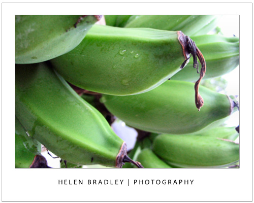
The single simplest way to improve your photographs is to move physically closer to what you are photographing. If you can’t get physically closer then zoom in close using your camera’s zoom.

This image was captured from the verandah of a house in the tropics so it was possible to walk up very close to the clump of bananas on the palm.


Tip 2 – Capture Close ups with Macro

When shooting an object close up, set your camera to its Macro setting which is indicated by a small flower – you can set it using either a setting on the camera itself or from inside its menus. Zoom all the way back out (macro and zoom don’t mix) and check that the camera is able to focus on what you’re shooting – if not, move further back a little and try again. Most cameras can capture shots using macro mode as close as a few inches from the object.

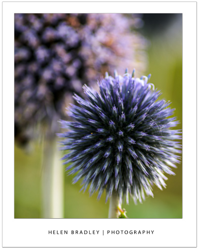
This flower was captured with a macro setting – one side benefit of this is that the background is thrown out of focus showing an attractive shallow depth of field.

Tip 3 – Follow the Rule of thirds

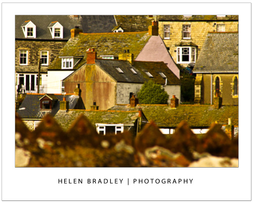
The rule of thirds is a tool for creating a dynamic composition for your image. To apply it, draw an imaginary tic-tack-toe board over the scene you see in the  camera’s LCD screen or the viewfinder before you take the shot. Position the subject of the image along a horizontal a vertical line or at the  intersection of the lines. This ensures, for example, that the  horizon appears across the top or bottom third of an image and never right in the middle.

In this image the out of focus wall in the foreground is along the bottom line of the imaginary tic-tac-toe board.

Tip 4 – Capture from an Unusual Angle

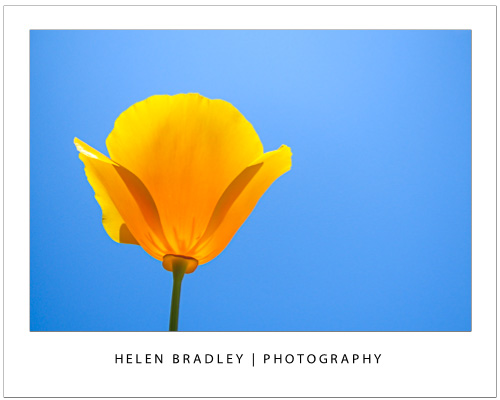
Look for different angles to shoot from. Take a portrait  from a vantage point high above the person and look for different angles when photographing classic buildings so you  capture photographs that aren’t the same as everyone else’s.

In this image the camera was positioned under the flower and facing the sky and the translucency of the flower shows beautifully.

Tip 5 – Respect the “no flash” zone

The effective radius of your camera’s flash is around 9-12 feet so it won’t work in a sporting stadium at night. Instead use a long exposure time and mount the camera to a tripod.

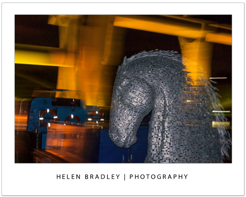
In the image below the short radius of the flash has lit the statue which is close to the camera. A long exposure has captured the light on the structure behind. Read this post to discover how setting a curtain flash lets you combine both flash and long exposures.


Helen Bradley

Wednesday, October 24th, 2012

Trevor’s Quick Illustrator Tip – Simple Zoom

Photo By: Joana Croft
It’s true you can press Ctrl + + and Ctrl + – to zoom in and out on a PC or Command + + and command – on a Mac, but I find this tricky to do on a small keyboard such as the one on my laptop. If you have a mouse with a scroll wheel you can hold the Alt key and scroll up to zoom in or scroll down to zoom out. This works no matter which tool is selected at the time. The tool you were working with gets targeted again when you release the Alt key. I find this an easier way to zoom in and out when I am working on an image.

Helen Bradley

Wednesday, October 24th, 2012

PowerPoint 2013 – What’s new and cool

PowerPoint just got a whole lot cooler, so come check out what’s new. I’ll walk you through many of PowerPoint 2013’s features, including the new start screen and account screens, how saving is new, using the new task panes, charting options, and discovering theme variants.

Transcript:

Hello, I’m Helen Bradley. Welcome to this video tutorial. Today we’re going to be looking at the new PowerPoint 2013 and asking what’s new and cool for PowerPoint users. There is a lot to like about the new PowerPoint 2013. And we’re going to have a look at some of the features of it here in this video.

The first thing is the Start screen. This opens as soon as you open PowerPoint 2013. And there’s a lot here for new users. You can actually turn the screen off. But I think most people are going to opt to turn it on. The default is to start with a new presentation with a default theme, but you can see here that we’ve got recent files that we’ve opened in PowerPoint so they’re all available to us. We could go online and search for templates and themes online. And there are some suggested searches here. We can also click here to open other presentations that we might have stored on SkyDrive or on our local computer or SharePoint. And up here is the current account. So when You open PowerPoint 2013 or any of the new Office 2013 applications you’re going to be logged into your SkyDrive account, and this is access to it. And here we could switch accounts if we wanted to. These are just for testers so I think that they’re probably going to go in the final production.

But let’s have a look and see what would happen if we selected one of these templates. So I’m just going to click this one to open it. And you can see here that there’s some variants in this theme. We’re having a look right now at the More Images so we can see what this layout is going to look like if we select this particular one. And there’s this title layout, and this is what the chart would look like, and then smart art graphics, and this is a photo layout. And then there are different variants, different color combinations that we could use in this particular theme. Now what they’ve done in PowerPoint 2013 is that they’ve removed some of the color options that we had previously and sort of scaled them down to a more manageable group. So this particular design has four color options and you choose one of them and go with it rather than having to select from a set of color schemes that are probably twenty or thirty of them.

So I’m really liking this sort of red one so let’s click Create. And we’re now all ready to start our PowerPoint presentation. None of this is going to be unusual for PowerPoint users. A little bit has changed with the interface here. You can see that it’s got a metro style look to it so everything is a lot flatter. There’s no dimension in the screen, no shading. The buttons have sort of all gone to the back and really what we’re doing is focusing a little bit more on the content of our presentation.

Let’s go to Backstage View before we come back here though and see what’s there. I’ll click File to go to Backstage View. Now some of these options have changed. There’s Save and Save as. If we go to Save as you’ll see that by default we’re now saving to SkyDrive so this is the SkyDrive account that I was already logged into. Details are up here, and it’s opting to save it to SkyDrive by default. If I want to I can save it to my own computer so I can click Computer and this gives me access to my own folder structure. I can also add a place. So I could add things like a SharePoint location or a different SkyDrive account. Print is pretty standard. There’s not much changes here but Share has some options. You can invite people to share your document on your SkyDrive account. You can email it. You can present it online or publish your slides here. Export here we’ve got our PDF, XPS document support. Here’s the video option. Here’s packaging it for a CD, creating handouts and changing our file type. Down here are the standard options. This is general options for working inside PowerPoint and there’s not much changed here. Let’s go back here however to this Account area. And this is where you manage your accounts. So at the moment you can see that I’ve got a connected service with my Facebook account, my SkyDrive account, Twitter. I can also add LinkedIn if I wanted to. I could add Flickr. There’s the ability to add SharePoint or another SkyDrive account, lots of options here. And I imagine that over time we might see even more appearing here. This is also showing me where I am with my product. I can get updates and get information about whether the updates are installed, whether there are any, and it’s just telling me which version of Microsoft PowerPoint I’m using. So there’s our Backstage View. There’s our Start screen.

So let’s go back now and have a look and see what’s different inside the PowerPoint interface itself. The ribbon is pretty standard from the older versions of the ribbon. The difference is that the Design tab is split in two now with the themes and the variants. So here we have the various themes that we can use. We’re using this one here, but you can see that what we’re using this variant of it. This is another one of the built in themes for PowerPoint 2013, and here are the variants so we could make it blue or pink, whatever we want to do here.

The Developer tab is now visible by default so that’s a big change for people who want access to macros. I’ve got some additional things open here, and it’s picked up my old handy Tools tab which is one that I added to my PowerPoint 2010 and it’s been brought forward into 2011. So too has the add-in Visual Bee. But these are things that I’ve added in myself. They’re not actually in the default PowerPoint install. There is a new button here on the toolbar. It’s the Touch Mode button, and you can enable it if you’re on a touch screen. With that enabled, if I just tap it what happens is that the buttons become a little bit further apart and everything is a little bigger for work on a touch screen. Click it again and everything shrinks down just a little bit.

Let’s have a look at adding a chart so I’m just going to go back to the Home screen. And we’ll do a new slide with a chart so I’m going to choose a title and a content slide. And let’s just add a chart to our Presentation and close this down. These settings here are new, and these are in Excel as well. So these give you the ability to add chart elements or remove them. For example if we don’t want a legend we could just disable the legend here. We could also for example disable the chart title if we planned to add the chart title in as the slide title. There’s access here to styles and color options. And you can see that we could change the colors but we’ve got a smaller subset of colors this time. And they’re more true to the theme itself. So we’ve been given smaller numbers of options but probably more relevant options if you could think of it that way. And then here we’ve got other settings. We can change the values and the names. So there’s options here for working with our chart.

Let’s go again and let’s add another new slide. This time I want to add an image. So I get a choice of selecting pictures from my own computer or online pictures. Online pictures allows me to select images from Office.com clipart. I can search them using Bing or I could go and get them from my SkyDrive account. It’s also possible for me to get them from my Flickr account. So let’s just go and get an image right now. Let’s go and get a coffee image. Okay, let’s grab this one here. And I’m going to insert it so I’m just clicking it and tap Insert. And now we’ve got our image inserted on our slide.

Now if we wanted to make changes to this image we would typically go to the Picture Tools Format tab. But watch what happens when I right click the image here and choose Format Picture. What we get is this new format picture pane here. It’s a task pane. And in it are all the things that we can use to format our pictures. So let’s go ahead and let’s add a reflection to this picture, just add a very simple reflection to it.

Okay, let’s go now and add another slide and this time I’m going to add a small art graphic. So let’s just add a default smart art graphic. But look what’s happened to our pane. Now we’re seeing Format Shape options because these are the options that we can use with this smart art graphic. If we go back to this slide here and click on the picture the pane is still there. It stays in place if we want it to, but it changes to show us the kind of options that we have for the object that we’re working with. And I think users are going to really like this because you don’t have dialogue sitting over the top of your slides. This is all tucked away on the side and you can leave it open as you work. And it’s just giving you much quicker access to things. You can see we haven’t moved away from the Home tab and yet we’ve got most of the smart art tools available that allow us to format the smart art as we work.

Now another handy tool we’ve got is the eyedropper tool. So I’m just going back to this image and I am going to click on the image and go to Picture Tools Format tab. And I’m going to select Picture Border. So instead of actually choosing one of these theme colors what I can do is use the new eyedropper tool. What the eyedropper tool does is to allow me to select a color from the image itself. So I can just mouse over an area of the image and select that as the color of my picture border for example. So it’s now my selected color so I can now add a border to the image that is a color that I’ve selected from the image itself. Now you may be missing the color options that you used to have inside PowerPoint, but we still have access to them. We just have access to them in a limited way.

So let’s say that we like this general layout, but we’d really like it to be a different color combination. In this case we’ll go to the View option and we’ll go to Slide Master View. In Slide Master View we can control the slide master that controls the look and feel of out presentation. And you can see here that the All Theme Color options are back again. So for example if we wanted to use a theme color for example medium we could do that. And here’s our medium color scheme that’s now been applied to the presentation. I’ll close Master View and let’s go back into the Design View.

We’ve still got the four options that came with this slide presentation, but we also have our own custom option that’s a Slide Master that we can use. Now if we like this color scheme in preference to the other variants we can save it as we always could, just drop down this theme option and save the current theme. So you do get the customization options of being able to change colors, but you get it where they really should have been all along which is in the Slide Master because you really want it to be thematically strong and you want this color scheme to be applied throughout the entire presentation. Now some of the other options that are available inside PowerPoint 2013 is the Video options so you can select Online Video or Video on your PC. There are a few more options in working with video content. You’ll find things in the Slide Show menu.

When you go to rehearse a slide show or set up a slide show you’ll have different options in terms of viewing presenter view so you can actually see presenter view if you want to. So let’s just do that. And let’s send the slide show to the monitor and the primary monitor which is not the one I’m using right now, and let’s do Presenter View. And let’s just view the slide show. So here’s our Presenter View. You can see that we can see which slide we’re on and we can navigate through the slides. In fact this is my title slide and this is the next one up. And there’s two and three. We can also use a See All Slides option where you can see the slides themselves. You can press Escape here and you’re just going back into Presenter View, not ruining the presentation which is actually running on my second monitor right now. You’ve got the ability to zoom into the slide show so you can click on here and zoom it up full screen. And there are the standard laser pointers so you can use a laser pointer on your screen and you can see other slide show options here.

So there’s plenty to like about this new PowerPoint 2013. I think you’ll like it a lot. If you haven’t already done so why not go and download the customer preview and install it and have a play around with it. I’m Helen Bradley. Thank you for joining me for this presentation. You can find more of my videos here on my YouTube channel. I encourage you to subscribe to the video channel as we’re releasing at least two new videos every week. And also follow me at projectwoman.com where you’ll find tips and tricks for all the Office applications as well as much, much more. If you liked this video please go ahead and like it and I’m always happy to hear your comments.

Helen Bradley

Tuesday, October 23rd, 2012

Trevor’s Quick Word Tip – Setting your Preferences

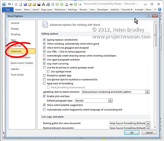
It’s generally a great idea to go through Word and set it up for your own personal working style.  Head to the preference area by clicking File > Options (Office button > Word Options in Word 2007) and click Advanced. Here you can set preferences for Editing, Printing, Display and so on to make Word work the way you want it to.

Helen Bradley

Page 1 of 3123