by Helen Bradley
Why have boring old column and bar charts when you can have picture charts instead?
Learn how to replace bars and columns in Excel charts with small images stacked up to show the values being compared.
Image charts like this are one of Excel’s secrets so let me show you how to make them.
In the video you will learn how to replace columns and bars in Excel charts with images. You will see how to find images to use and how to stack and resize the images to fit the chart’s columns and bars.
PowerPoint just got a whole lot cooler, so come check out what’s new. I’ll walk you through many of PowerPoint 2013’s features, including the new start screen and account screens, how saving is new, using the new task panes, charting options, and discovering theme variants.
Transcript:
Hello, I’m Helen Bradley. Welcome to this video tutorial. Today we’re going to be looking at the new PowerPoint 2013 and asking what’s new and cool for PowerPoint users. There is a lot to like about the new PowerPoint 2013. And we’re going to have a look at some of the features of it here in this video.
The first thing is the Start screen. This opens as soon as you open PowerPoint 2013. And there’s a lot here for new users. You can actually turn the screen off. But I think most people are going to opt to turn it on. The default is to start with a new presentation with a default theme, but you can see here that we’ve got recent files that we’ve opened in PowerPoint so they’re all available to us. We could go online and search for templates and themes online. And there are some suggested searches here. We can also click here to open other presentations that we might have stored on SkyDrive or on our local computer or SharePoint. And up here is the current account. So when You open PowerPoint 2013 or any of the new Office 2013 applications you’re going to be logged into your SkyDrive account, and this is access to it. And here we could switch accounts if we wanted to. These are just for testers so I think that they’re probably going to go in the final production.
But let’s have a look and see what would happen if we selected one of these templates. So I’m just going to click this one to open it. And you can see here that there’s some variants in this theme. We’re having a look right now at the More Images so we can see what this layout is going to look like if we select this particular one. And there’s this title layout, and this is what the chart would look like, and then smart art graphics, and this is a photo layout. And then there are different variants, different color combinations that we could use in this particular theme. Now what they’ve done in PowerPoint 2013 is that they’ve removed some of the color options that we had previously and sort of scaled them down to a more manageable group. So this particular design has four color options and you choose one of them and go with it rather than having to select from a set of color schemes that are probably twenty or thirty of them.
So I’m really liking this sort of red one so let’s click Create. And we’re now all ready to start our PowerPoint presentation. None of this is going to be unusual for PowerPoint users. A little bit has changed with the interface here. You can see that it’s got a metro style look to it so everything is a lot flatter. There’s no dimension in the screen, no shading. The buttons have sort of all gone to the back and really what we’re doing is focusing a little bit more on the content of our presentation.
Let’s go to Backstage View before we come back here though and see what’s there. I’ll click File to go to Backstage View. Now some of these options have changed. There’s Save and Save as. If we go to Save as you’ll see that by default we’re now saving to SkyDrive so this is the SkyDrive account that I was already logged into. Details are up here, and it’s opting to save it to SkyDrive by default. If I want to I can save it to my own computer so I can click Computer and this gives me access to my own folder structure. I can also add a place. So I could add things like a SharePoint location or a different SkyDrive account. Print is pretty standard. There’s not much changes here but Share has some options. You can invite people to share your document on your SkyDrive account. You can email it. You can present it online or publish your slides here. Export here we’ve got our PDF, XPS document support. Here’s the video option. Here’s packaging it for a CD, creating handouts and changing our file type. Down here are the standard options. This is general options for working inside PowerPoint and there’s not much changed here. Let’s go back here however to this Account area. And this is where you manage your accounts. So at the moment you can see that I’ve got a connected service with my Facebook account, my SkyDrive account, Twitter. I can also add LinkedIn if I wanted to. I could add Flickr. There’s the ability to add SharePoint or another SkyDrive account, lots of options here. And I imagine that over time we might see even more appearing here. This is also showing me where I am with my product. I can get updates and get information about whether the updates are installed, whether there are any, and it’s just telling me which version of Microsoft PowerPoint I’m using. So there’s our Backstage View. There’s our Start screen.
So let’s go back now and have a look and see what’s different inside the PowerPoint interface itself. The ribbon is pretty standard from the older versions of the ribbon. The difference is that the Design tab is split in two now with the themes and the variants. So here we have the various themes that we can use. We’re using this one here, but you can see that what we’re using this variant of it. This is another one of the built in themes for PowerPoint 2013, and here are the variants so we could make it blue or pink, whatever we want to do here.
The Developer tab is now visible by default so that’s a big change for people who want access to macros. I’ve got some additional things open here, and it’s picked up my old handy Tools tab which is one that I added to my PowerPoint 2010 and it’s been brought forward into 2011. So too has the add-in Visual Bee. But these are things that I’ve added in myself. They’re not actually in the default PowerPoint install. There is a new button here on the toolbar. It’s the Touch Mode button, and you can enable it if you’re on a touch screen. With that enabled, if I just tap it what happens is that the buttons become a little bit further apart and everything is a little bigger for work on a touch screen. Click it again and everything shrinks down just a little bit.
Let’s have a look at adding a chart so I’m just going to go back to the Home screen. And we’ll do a new slide with a chart so I’m going to choose a title and a content slide. And let’s just add a chart to our Presentation and close this down. These settings here are new, and these are in Excel as well. So these give you the ability to add chart elements or remove them. For example if we don’t want a legend we could just disable the legend here. We could also for example disable the chart title if we planned to add the chart title in as the slide title. There’s access here to styles and color options. And you can see that we could change the colors but we’ve got a smaller subset of colors this time. And they’re more true to the theme itself. So we’ve been given smaller numbers of options but probably more relevant options if you could think of it that way. And then here we’ve got other settings. We can change the values and the names. So there’s options here for working with our chart.
Let’s go again and let’s add another new slide. This time I want to add an image. So I get a choice of selecting pictures from my own computer or online pictures. Online pictures allows me to select images from Office.com clipart. I can search them using Bing or I could go and get them from my SkyDrive account. It’s also possible for me to get them from my Flickr account. So let’s just go and get an image right now. Let’s go and get a coffee image. Okay, let’s grab this one here. And I’m going to insert it so I’m just clicking it and tap Insert. And now we’ve got our image inserted on our slide.
Now if we wanted to make changes to this image we would typically go to the Picture Tools Format tab. But watch what happens when I right click the image here and choose Format Picture. What we get is this new format picture pane here. It’s a task pane. And in it are all the things that we can use to format our pictures. So let’s go ahead and let’s add a reflection to this picture, just add a very simple reflection to it.
Okay, let’s go now and add another slide and this time I’m going to add a small art graphic. So let’s just add a default smart art graphic. But look what’s happened to our pane. Now we’re seeing Format Shape options because these are the options that we can use with this smart art graphic. If we go back to this slide here and click on the picture the pane is still there. It stays in place if we want it to, but it changes to show us the kind of options that we have for the object that we’re working with. And I think users are going to really like this because you don’t have dialogue sitting over the top of your slides. This is all tucked away on the side and you can leave it open as you work. And it’s just giving you much quicker access to things. You can see we haven’t moved away from the Home tab and yet we’ve got most of the smart art tools available that allow us to format the smart art as we work.
Now another handy tool we’ve got is the eyedropper tool. So I’m just going back to this image and I am going to click on the image and go to Picture Tools Format tab. And I’m going to select Picture Border. So instead of actually choosing one of these theme colors what I can do is use the new eyedropper tool. What the eyedropper tool does is to allow me to select a color from the image itself. So I can just mouse over an area of the image and select that as the color of my picture border for example. So it’s now my selected color so I can now add a border to the image that is a color that I’ve selected from the image itself. Now you may be missing the color options that you used to have inside PowerPoint, but we still have access to them. We just have access to them in a limited way.
So let’s say that we like this general layout, but we’d really like it to be a different color combination. In this case we’ll go to the View option and we’ll go to Slide Master View. In Slide Master View we can control the slide master that controls the look and feel of out presentation. And you can see here that the All Theme Color options are back again. So for example if we wanted to use a theme color for example medium we could do that. And here’s our medium color scheme that’s now been applied to the presentation. I’ll close Master View and let’s go back into the Design View.
We’ve still got the four options that came with this slide presentation, but we also have our own custom option that’s a Slide Master that we can use. Now if we like this color scheme in preference to the other variants we can save it as we always could, just drop down this theme option and save the current theme. So you do get the customization options of being able to change colors, but you get it where they really should have been all along which is in the Slide Master because you really want it to be thematically strong and you want this color scheme to be applied throughout the entire presentation. Now some of the other options that are available inside PowerPoint 2013 is the Video options so you can select Online Video or Video on your PC. There are a few more options in working with video content. You’ll find things in the Slide Show menu.
When you go to rehearse a slide show or set up a slide show you’ll have different options in terms of viewing presenter view so you can actually see presenter view if you want to. So let’s just do that. And let’s send the slide show to the monitor and the primary monitor which is not the one I’m using right now, and let’s do Presenter View. And let’s just view the slide show. So here’s our Presenter View. You can see that we can see which slide we’re on and we can navigate through the slides. In fact this is my title slide and this is the next one up. And there’s two and three. We can also use a See All Slides option where you can see the slides themselves. You can press Escape here and you’re just going back into Presenter View, not ruining the presentation which is actually running on my second monitor right now. You’ve got the ability to zoom into the slide show so you can click on here and zoom it up full screen. And there are the standard laser pointers so you can use a laser pointer on your screen and you can see other slide show options here.
So there’s plenty to like about this new PowerPoint 2013. I think you’ll like it a lot. If you haven’t already done so why not go and download the customer preview and install it and have a play around with it. I’m Helen Bradley. Thank you for joining me for this presentation. You can find more of my videos here on my YouTube channel. I encourage you to subscribe to the video channel as we’re releasing at least two new videos every week. And also follow me at projectwoman.com where you’ll find tips and tricks for all the Office applications as well as much, much more. If you liked this video please go ahead and like it and I’m always happy to hear your comments.
It’s probably happened to you, you’ve created an Excel chart and the columns are so narrow they are almost unreadable. The chart is ugly and it appears as if there’s nothing that you can do because nothing that should work does work.
The problem typically happens when you have a chart with an X axis that is has date data and where you aren’t plotting every day but, instead, for example, one day a week.
The solution is to click the X axis of the chart so that you have it selected, right click and choose Format Axis. From the Axis Options panel, select Text Axis. This turns your skinny bars into something a lot more attractive.
If the bars still not thick enough – and typically, for me, they aren’t – click on one bar to select the series, right click and choose Format Data Series. From the Series options, decrease the Gap Width value to around 35 percent. This option won’t work unless you first set the X axis to a Text axis although you and I both wish it would!
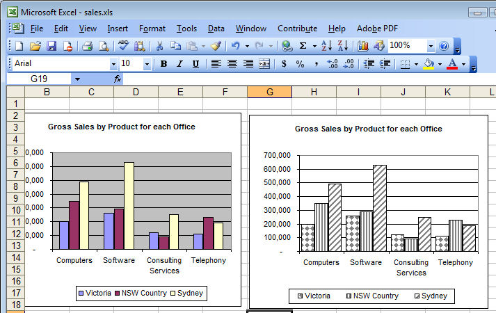
When you have a great big Excel column chart with heaps of delicious data but all in one series, it makes sense for the chart to be plotted in wonderful technicolor. However that’s an option Excel 2010 doesn’t make it very easy to find. If you try the Chart Tools > Design tab you can choose a multi-color chart but that only colors each series a different color so it won’t work when all your data is in one series.
The solution is to click on one column to select it then right click and choose Format Data Series > Fill group. Locate and check the Vary Colors by Point option and you’ll have a wonderful multi-colored series – much more enlightening than a plain old single color chart don’t you think?
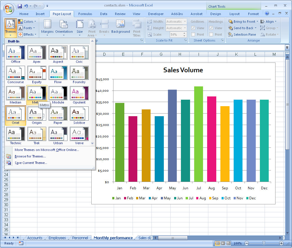
If the colors aren’t to your liking (you are getting just a little bit fussy but I do know exactly what you mean) select the Page Layout tab and check out the Themes – there’s sure to be one which will make your chart perfect.
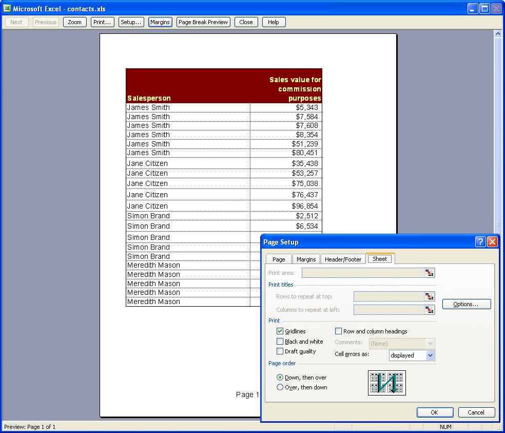
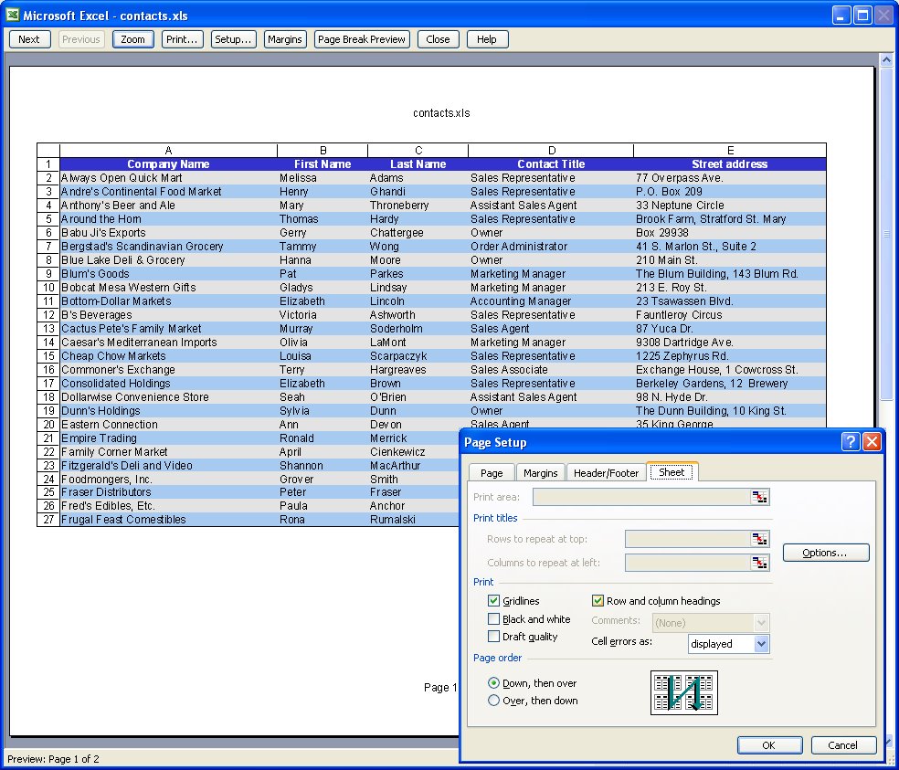
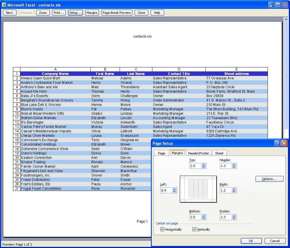
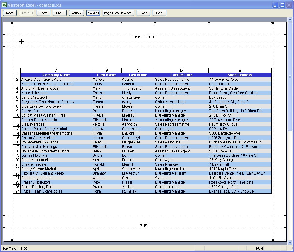
Excel offers some cool options for printing worksheets. Here are six of my favorite techniques:
1 Printing grid lines (or not)
To print grid lines on your final printout, choose File, Page Setup, Sheet tab and enable the Gridlines checkbox. This prints horizontal and vertical lines much like you see on the screen in editing view.
2 Printing row and column headings
To print the letters A, B, C etc above the columns on your worksheet and the row numbers choose File, Page Setup, Sheet tab and enable the Row and column headings checkbox. This works particularly well when combined with printing Gridlines but can be used without gridlines too.
3 Setting your own page margins
You can configure the margins around the page by choosing File, Page Setup, Margins tab. Set the margin values and use the Horizontal and/or Vertical checkboxes to centre a small worksheet on a larger page.
4 Drag a margin into place
You can also control margins from the Print Preview screen. Click Margins to turn the margin indicators on. You can now move these into new positions by simply dragging on them.
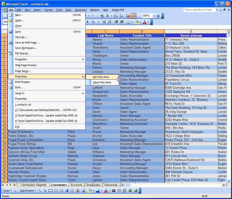
5 Select an area to print
When a print area is set, this will print by default regardless of how big the worksheet is. Drag over the area to use and choose File, Print Area, Set Print Area to configure it. To clear the print area, so you can print the entire worksheet, choose File, Print Area, Clear Print Area.
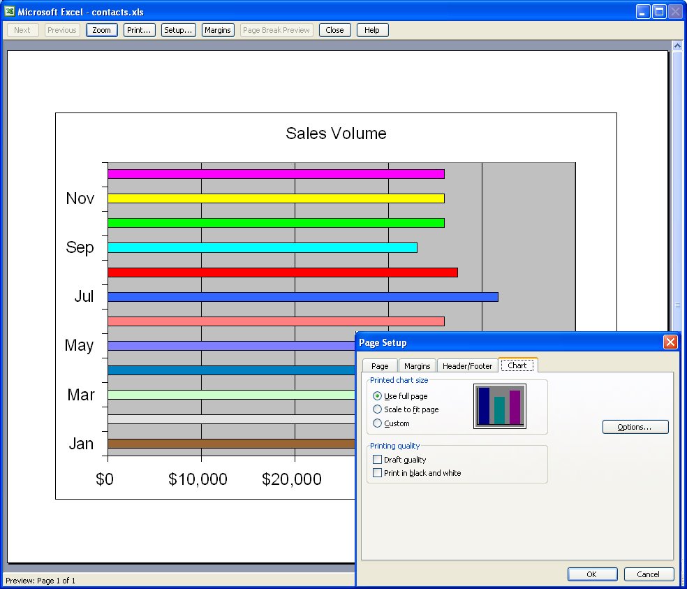
6 Print a chart
When you click a chart on a worksheet to select it and choose File, Page Setup, the page setup dialog shows no longer contains the Sheet tab and, instead, contains a Chart tab. This shows options for sizing and printing charts. When you click Print, only the chart will print.
It isn’t always the case that you want to chart multiple series of data on a single chart. Sometimes you only have a single series and Excel, by default, plots all the bars or columns so they are colored identically. Boring!
Luckily, in Excel 2007 a solution is at hand. Simply select and right click the series and choose Format Data Series > Fill > Vary Colors by Point. Excel colors each bar a different color. Best of all, the colors are linked to themes so you can change the colors by changing the Theme – the theme tools are on the Page Layout tab.
So, no more boring single color charts – ever – please!
Although your Excel chart might look great in color on the screen, if you’re printing to black and white or printing in color and planning to reproduce the charts in black and white you might be disappointed with the final result. Light green, light blue and light orange all look very different on the screen but are indistinguishable in black and white.
So, when your chart is destined for reproduction in black and white, set it up so it is guaranteed to be readible. To do this, select each series or data point by clicking on it, right click and choose Format Data Series (or Format Data Point)> Patterns tab > Fill Effects > Pattern and use a grey or a black and white pattern. Repeat for all the series and save before printing. The chart is guaranteed to look good when printed.
Colour me stupid. I am reeling from having single handedly wiped out all the images from my blogs – yep! 2 of them decimated by my stupidity. I’m now resorting to begging friends, family, neighbours and anyone I meet (ok I’m exaggerating, but I am desperate), to spend time helping me put it all back together. I have the images, they just aren’t on my server any more and my computers and Blogger have this love hate relationship, the more frustrated I get with how slow the connection is the slower they go – see! they say, if you think that was slow, try this.. seriously it is hours of work to get this all back. Hence no delicious new posts.
This happened over two weeks ago so I’m slowly resigning myself to putting it back over time, so here’s today’s tip – no image – sheesh – don’t talk to me about images!
To make the column widths on an Excel 2007 chart wider – or narrower if you think they aren’t awful enough when you have long X-axis values, right click a column choose Format Data Series. From the Series Options selection drag the Gap Width value close to the No Gap end of the slider for a larger column and the other direction for a smaller one. This increases the column width by decreasing the gap between the columns. Click Close and you’re done.
Now, back to uploading images one by one .. hell, even Noah got them in two by two!
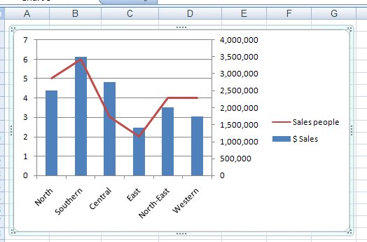
Disaster will strike your Excel charts if you try to plot very large data values and very small values on the one chart. You’ll see the big values but the little ones will blend into the x-axis of the chart so you won’t even see them.
To include both sets of data on the one chart, add a second axis and plot the smaller values against it. Now you’ll be able to see them alongside the very large values.
To add your second axis, select the chart, select the series you can’t see (click on one you can see and use the tab key to move until you have it selected). Right click and choose Format Data Series. Select Series Options, Secondary Y Axis. With the data series that should be plotted against the secondary axis still selected, right click and choose Change Series Chart Type and select a different chart type such as Line.
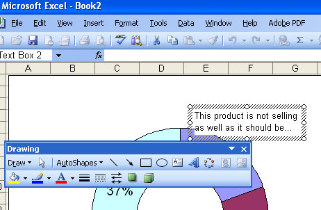
It’s easy enought to place a title or Y and X axis titles on a chart but what about a note or comment?
The secret is in the Drawing tools. Display the Drawing toolbar and click on the Text Box button. Now you can drag a text box on your chart and add text inside it. Size it, format it and you’re off.