Friday, May 4th, 2007

Reuse a Chart’s "Look"

Sometimes you’ll create a chart that just looks so good you want to save the ‘look’ so you can use it again. You can do this by turning your chart into a template. This would be a technique you could use if you were creating a report and you need to use multiple charts that are all formatted in a similar way.

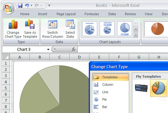
To save a chart as a template, first display or create the chart and select it. On the Chart Tools, Design tab, choose Save As Template in the Type group. In the Save In box check you’re using the Charts folder and type a name for your template and click Save. Later, to apply the template, to a chart you’re about to create, select your data the Insert tab, click the Other Charts button to open the list and choose All Chart Types. Choose Templates and then the template you just saved. If you already have a chart created, click the chart and click the Design tab, then Change Chart Type. Click Templates, then click the template to use from the My Templates area.

You can store lots of templates to meet any need you might have and change from one to the other as required.

Helen Bradley

Saturday, March 31st, 2007

Data labels on Excel charts

Data labels on your charts show your viewer the values they’re looking at and after all – isn’t that the purpose of the chart?

To add Data Labels to a chart, click the chart and choose Chart, Chart Options. Click the Data Labels tab and choose a style that will look good on your chart. Typically values is a good choice but, for pie charts, for example, a different type might work better.

Helen Bradley

Friday, February 16th, 2007

Excel 2003 lists

Excel 2003 offered a cool new tool for managing data that was in a list format. It made Excel the place of choice for small lists and it simplified the process of charting list data – Excel lists expanded automatically to allow for more data to be entered and charts based on the list data automatically expanded to include the new data – wonderful!

Here’s how to work with lists in Excel:

  1. Turn an existing table of data into a list by clicking on a cell in the range and choose Data, List, Create List. If your list has a heading row, enable the My list has headers checkbox and click Ok. Notice the border around the list.
  2. To add a row, click in the list area and click in the last (Insert) row which has an asterisk in its first cell. It is also possible to add a row in the middle of the list by clicking where the row should appear and choose List, Insert, Row.
  3. When data is created as a list, the AutoFilter feature is enabled. To sort data in the list, click the dropdown arrow to the right of the column (field) to sort on and choose Sort Ascending or Sort Descending as required. To sort on multiple columns, use the Data, Sort dialog.
  4. To create a complex filter for your list, click the Custom option from the dropdown list for the field that you want to create the query on. Set the tests to use and select And or Or depending on what information you need to extract. Click Ok to view the results. To display all records again, choose Data, Filter, Show All.
  5. When you create a chart based on list data it will be automatically updated when you add a new item to the list. To create your chart, click in the list and click the Chart Wizard button on the new List toolbar and proceed through the Wizard as you would for any other chart.
  6. To perform calculations on list data use the Toggle Total Row button. This adds a total row to the list and totals the right most column. To disable this total or create another one, click the down pointing arrow to the right of the total and choose None or a different calculation. Each column has its own down pointing arrow from which you can select the calculation to be made on that column’s data.

Helen Bradley

Page 2 of 212