Wednesday, December 31st, 2008

Akemashite omedeto gozaimasu


Happy New Year!

This year marks my second year in Tokyo for New Years. This time I’m lucky enough to be staying at the Park Hyatt Hotel in Shinjuku. Featured in Lost in Translation it is as beautiful and wonderful as shown in the movie.

Here are a batch of my photos. Starting out with a couple snapped at Harajuku yesterday. It’s the home of Cosplay – costume play and such a fun place to hang out.

Reflections abound in this city of skyscrapers:


These drink machines are everywhere and sell some very interesting and colourful drinks:


Love this inside neon sign – some things look very different when lit up:


This time I’m finding a lot more graffiti around. Some angry, some artistic and some colourful:


I think this is a old bowling alley sign, the alley is long gone but the sign is still there…


Very strange indeed. There was a whole wall dotted with these signs. Not sure what these guys did but I imagine it wasn’t good!

Helen Bradley

Sunday, December 28th, 2008

Don’t Spell Check This..


Often when you’re working on a document including one which contains code, or foreign language words you will want the document spell checked but you’d like the code or foreign language words omitted – so you’re not distracted by the red underlining everywhere.

To do this, in Word 2007, select the text you don’t want to be checked and double click the Language entry on the status bar – typically this will show English (United States) or similar. When the dialog appears, choose the Do not check spelling or grammar checkbox. This disables spell checking for this particular word or selection. The rest of the document is spell checked as usual but words you don’t want to be checked, won’t be.

Helen Bradley

Saturday, December 20th, 2008

Drawing Organic Shapes in Word

I needed something cute for a magazine sample the other day so I decided to create an organic shape. I needed three edges to be straight and one rounded.

Here’s how it’s done, it makes use of nodes and Bezier curves, fairly simple to do when you know how.

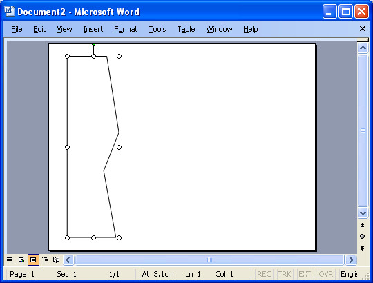
Start with a new Word document. Display the Drawing toolbar and choose AutoShapes > Lines > Freeform. Start in one corner and click once to begin. Click at each point around the shape so you’ll have a polygon shape. If you hold Shift as you click you’ll make a straight line and, if desired, it will be perpendicular to the previous one too. It’s important you get straight sides and square angles when you want your shape to butt up against a page edge.

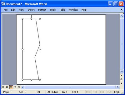
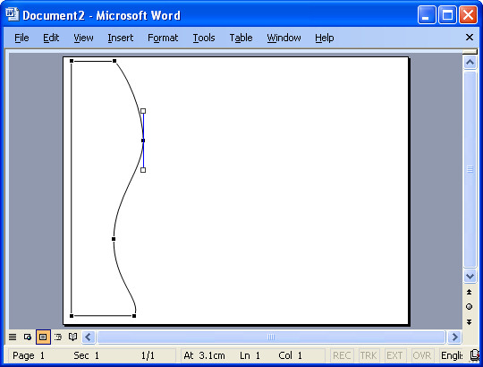
Click the shape to select it, right click and choose Edit Points. Control + Click on a point to delete it if you don’t need it. Right click on a point that you want to be rounded and choose Smooth Point and then drag on the handles to shape it nicely.

When you’re done, click outside the shape to deselect it. click it again and right click, choose Format AutoShape. Choose Line Color > No Line and choose your Fill Color. Hold Control as you click and drag on the shape to duplicate it and set the Fill Color of this one a different color. Repeat if desired.

To arrange the shapes, click one to select it, right click and choose Order > Send to Back to send it below the others. Choose Order > Send Behind Text to send it below the text. The second command is used to move the shape to the bottom layer of the document below the text. Use the first command to change the layer order of the shapes so they are stacked as you want them to be.

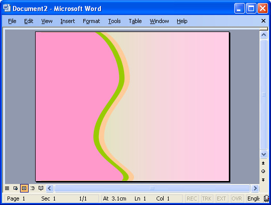
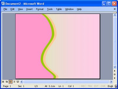
When you’re done you should have a page that looks something like this, I sized the shape to fill the page and moved it to the edge of the page. I also added a gradient filled rectangle under everything just to finish it all off.

Helen Bradley

Wednesday, December 17th, 2008

Fix the Headings in your Excel 2007 tables


Excel 2007 has some great tools for working with and formatting tables (previously called Lists in earlier versions). To create a table, select the range that contains the table data and from the Home tab select Format As Table. Select a table format style and, when prompted to, confirm that the selected area contains all the data for your table, whether or not your table has headers and click Ok. When you do this you will see that each heading cell displays a dropdown arrow to the right of its contents.

Unfortunately, if your headers are right aligned, the table headings will run into the arrows and be partially hidden. I don’t know why Microsoft doesn’t create a fix for this because it looks awful. To avoid this happening, select the heading cells, right click and choose Format Cells. Click the Custom setting and type @ and four spaces and click Ok. This should add sufficient spaces to the right of a heading to move the headings a little to the left so the headings can be seen clearly. Now it all looks much nicer as you see above.

Helen Bradley

Thursday, December 11th, 2008

Singapore – East meets West


Singapore is totally amazing and in places totally unexpected. There is colour everywhere – in the temples and in the regular buildings too. The Hindu temples are so beautiful that they simply take your breath away.

The heat is ubiquitous and the humidity ensures you never feel dry! It is monsoon season so yesterday we had a huge thunderstorm – lightening and thunder and inches of torrential rain. It’s so well designed that everything drains instantly so it’s just left wet and steamy afterwards.

I walked to Little India and took a cruise on the river. Just spent time acquainting myself with the layout of the city and got a hint of its magic.

Here are some images and the stories they tell. First up, details from one of the Hindu temples:

The buildings are so colourful and what would a day in Asia be without laundry!

Elevators at the W hotel:

Shophouses on the river and window detail:

Muslim temple detail:

Gotta love neon – the Singaporeans do!

Detail from a city building – looks like snowflakes:

Helen Bradley

Thursday, December 11th, 2008

Adding Keywords to multiple images in Lightroom


Let’s preface this blog entry by stating that what follows makes no sense at all.

I ran into some inconsistent Lightroom behaviour when trying to add keywords to images. The scenario was this: I needed to add the same keyword to a number of photos all at once. While you can do this as you import the images, sometimes you’ll be importing images which shouldn’t all have the same keywords so doing it in Lightroom later on makes more sense.

Problem is that you have to be in the right view to do it – choose the wrong one and you can waste a lot of time and have precious little to show for it. Please Adobe – make this simpler and more intuitive because right now it’s darn right frustrating and it really makes no sense at all.

Until Adobe fixes the problem, here’s the low down on adding the same keywords to multiple images in Lightroom. First select the Library and then choose Grid View, if you don’t this things will fail, miserably. Choose View > Grid or click the Grid View button.

Now select the images to add the keywords to – click on one and Shift + Click on the last, for example. Type the keywords in the box which says “Click here to add keywords” and press Enter.

You can also copy keywords from one image and then paste them into others by copying the keywords then select the images to paste into (making sure you are in Grid view – it doesn’t work otherwise) and then paste the keywords into the “Click here to add keywords” box – use Control + V to do this.

If you try this and it fails you’re not in Grid view. Heaven help me – there’s no reason I can see why you should have to go into Grid View to do it but you do.. so now you know.

Helen Bradley

Wednesday, December 10th, 2008

Curves + Luminosity = Better Tones.


In the last blog entry I mentioned some cool things you can find in the Curves dialog that help you adjust the tonal range of your image. Today I’m going to show you how to wreck the color in an image in the name of improving tonal range.

The Curves dialog has four channel options – you can work on the RGB composite channel (the default), or you can work on the separate R, G or B channels. Problem is that although adjusting the R, G or B channels independently can help you improve the tonal range of the image – it can also totally mess with the color. For this reason, few users bother working with the individual channels. Makes good sense? No!

You see working with individual channels is a good fix. If the Red or Green channel lack contrast you can hype it up using a curves adjustment. You’ll mess up the color but, if you’re using an Adjustment Layer, you can simply change the blend mode of the adjustment layer to Luminosity and immediately the messed up color disappears and the adjustment is limited to luminosity only. Instant fix.

So, next time you need to apply a Curves adjustment, check the channels in the Channels palette. If you see a channel that lacks contrast – adjust it to add contrast to it. Then set the blend mode of the adjustment layer to Luminosity to remove the color problems you just created.

Helen Bradley

Sunday, December 7th, 2008

Where on the Curve are you?

The Curve dialog in Photoshop hides some surprise features that aren’t immediately apparent at first glance. In Photoshop CS3 and later, one surprise is that you now have the adjusters under the chart that you’re used to using in the Levels dialog inside Curves. So it’s easy to perform a Levels adjustment in Curves – the reverse isn’t true – Levels can’t do a Curves adjustment. So I don’t use Levels for increasing tonal range in my images anymore – Curves does everything I need.

Second tool is the sampler. If you want to add contrast in a particular area of an image it helps if you can find that area on the curve. Simple. Just move across and hold the left mouse button as you wave your mouse pointer over the area of your image to sample. When you do this, you’ll see a marker move along the curve showing you where those pixels are in the curve. This is the area you want to steepen – the steeper the curve, the more contrast in that area. So pull the curve above the area you want to affect upwards and pull the curve below that area downwards to steepen the curve and you’ll get more contrast in that area of the image.

To add markers to the curve – Control + Click (Command + Click on the Mac) on a point in the image and you will add a marker on the curve indicating exactly where those pixels are to be found. You can use the marker to anchor the curve so it doesn’t move when you pull the curve above or below it or drag on the marker to change the shape of the curve at that point.

Helen Bradley

Thursday, December 4th, 2008

Straightening images with Photoshop’s Lens correction tool


Let’s be honest, Photoshop’s tool for straightening an image sucks – well it would if it really were a tool – it’s not even that. It’s a cumbersome workaround.

Start with the Ruler tool (if you can find it – it’s stuck away under the Eyedropper) then ‘measure’ along the line you want to be horizontal. Then choose Image > Rotate Canvas > Arbitrary and accept the value for the angle – that’s what you used the Ruler tool to measure. Wow, that’s sophisticated – NOT! And it gets worse. While now have a ‘straight’ image, the edges look horrible. Grab the Crop tool and crop the image to remove the messy edges.

So, while there isn’t a tool, there is a slightly smarter workaround. Choose Filter > Distort > Lens Correction – ok, I promised it would be smarter – I didn’t say it would be any easier to remember where to find it.

In the Lens Correction dialog, drag on the Angle to straighten the image – best thing about this is that you get a grid to guide you. Then, drag the Scale slider upwards until the rough edges disappear. Then click Ok and you’re done.

So, there you have it, a one stop straightening tool – still sucks compared with programs like Paintshop Pro and Photoshop Elements which will straighten and crop in one step but it does it in one menu rather than 3 tools – I call it an improvement – just!

Helen Bradley

Thursday, December 4th, 2008

Yes Master…


I love it when folks call me or email to pose questions. It’s hard when you work with apps every day to remember there are folk out there for whom Word and Excel are a daily challenge and not necessarily in a good way.

Today’s came from my partner, a PowerPoint file with a serious case of bloat. Now, if it were a cow, you’d do something rather disgusting with a knife between the ribs – no it doesn’t kill them, it cures them – lets all the nasty gasses out. In PowerPoint, the solutions are different. One cause in this file was the lack of use of a Slide Master. You see the person (not my partner, she’s better at PP than that) put a wonderful but very large image on all the slides – each one had its own version of the image – instant bloat.

The solution, next time would be to build the file properly and put that image on the background layer of the Slide Master – when you do this it automatically gets added to all slides – if you have 100 slides you still have only one image – instant slimming for your file.

If you need a plain slide – no image, you create two masters – one with an image and one without – use the master you need for the slide you’re creating. Pretty easy stuff and makes a presentation much easier to email – that was the problem here – at 7Mb it was too big for most folk’s email inbox so it bounced right back and something that big doesn’t bounce so much as go splat!

The solution I used on this file was different. I didn’t want to go rebuild someone else’s file at no charge – so I grabbed a great app called PowerPoint Minimizer – it shrinks PP files really really small so folks like me can look good by solving a problem that everyone else has spent hours on in a matter of minutes.

Find PowerPoint Minimizer here for download. Best thing is you can trial it and see how it works.

Helen Bradley