Sunday, February 28th, 2010

Step 6 Photo-editing workflow – Fixing muddy images

Images which lack a full tonal range (a range of colors from very light/white to very dark/black), often look muddy and the colour in these images will also look flat. To adjust the tonal range of an image to darken the dark areas and lighten the light areas thus stretching the colour you have over the widest possible range.

In Photoshop Elements choose Enhance > Adjust Lighting > Levels. The levels histogram shows the tonal range of pixels in the image – ideally the chart should stretch the full width of the area it is contained in. If it doesn’t reach from the very left edge to the very right edge, drag the sliders underneath the chart inwards so that they sit under the points where the chart data begins and ends. You can adjust the middle slider to lighten or darken the midtones in the image.

Helen Bradley

Sunday, December 7th, 2008

Where on the Curve are you?

The Curve dialog in Photoshop hides some surprise features that aren’t immediately apparent at first glance. In Photoshop CS3 and later, one surprise is that you now have the adjusters under the chart that you’re used to using in the Levels dialog inside Curves. So it’s easy to perform a Levels adjustment in Curves – the reverse isn’t true – Levels can’t do a Curves adjustment. So I don’t use Levels for increasing tonal range in my images anymore – Curves does everything I need.

Second tool is the sampler. If you want to add contrast in a particular area of an image it helps if you can find that area on the curve. Simple. Just move across and hold the left mouse button as you wave your mouse pointer over the area of your image to sample. When you do this, you’ll see a marker move along the curve showing you where those pixels are in the curve. This is the area you want to steepen – the steeper the curve, the more contrast in that area. So pull the curve above the area you want to affect upwards and pull the curve below that area downwards to steepen the curve and you’ll get more contrast in that area of the image.

To add markers to the curve – Control + Click (Command + Click on the Mac) on a point in the image and you will add a marker on the curve indicating exactly where those pixels are to be found. You can use the marker to anchor the curve so it doesn’t move when you pull the curve above or below it or drag on the marker to change the shape of the curve at that point.

Helen Bradley

Friday, November 9th, 2007

Rooftops in the rain – Brighton

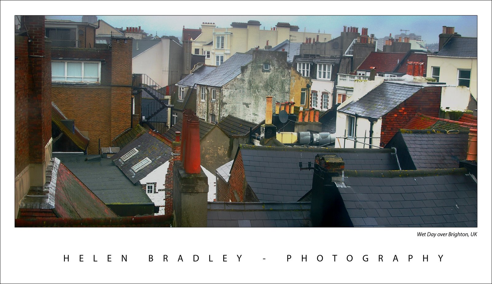
When I was in Brighton we had one beautiful summer like Sunday when everyone was walking along the beach and it was all so gorgeous and then, next day, it rained cats and dogs.

Here’s a photo I took from my hotel room window across the roofs of Brighton the day it rained. I don’t think the windows of the Queens Hotel had been washed since good ol’ Queen Vic gave her name to the hotel so they were pretty interesting to shoot through and, of course, they only opened 6in from the bottom so shooting through the gap was impossible.

The original was flat and lifeless as one might expect. A Levels adjustment is a great starting point for a photo like this. Simply choose Layers, New Adjustment Layer and then choose Levels. Drag the little triangle sliders in from the left and the right till they are just under the places where the chart data begins and ends. This darkens the darks and lightens the lights and instantly boosts the tonal range in the image and gives it more contrast and life. The middle slider handles the midtones so you can drag it to the right or left as required for your image.

For the rest of this image I worked hard to get the colour and detail back. The cream buildings in the background were treated independently of everything else as they just kept getting lost in every solution I tried. Masks are great for this, fix one part of the image with adjustment layers, then hide the adjustment layer and work with another one focusing on the other part of the image. Then, use the mask on each adjustment layer to paint in or remove the fix from areas of the image. When I want most of the fix I just paint in black over the areas that I don’t want the fix to be applied to. When I only want little bits affected by the mask, I fill the mask with black (white reveals, black conceals), then paint with a low opacity, soft white brush to bring back the fix in the small areas that it is needed.

I also used the Selected Color adjustment on this image, I’ll talk more about it in a future blog post.

Helen Bradley

Thursday, November 1st, 2007

Brighton Pier No. 3

I fell in love with Brighton and Brighton Pier. The day I had to photograph it the rain nearly put an end to my photoshoot. However, I managed to get some great images. This is of the pier looking back to Brighton, the only real colour is in the life preservers and I love that you can see some of the Brighton buildings through the water pouring down the window. The repeated elements really work in this image.

The photo needed a bit of a levels adjustment, I use this to punch the contrast up a bit more than I get from the camera. The crop makes the image look so much more interesting than the size that it came out of the camera.

Helen Bradley

Wednesday, October 24th, 2007

More color – because I just can’t resist it

Here’s another of my Paris images. I had to drag color out of this image, kicking and screaming using the Curves feature. Problem was, all the Curves and levels caused grief with the light in the bottom right. I loved this light and it has a wonderful shape so I was bummed to see it as a big black blob.

So, back to the image, I corrected it separately for the light and then masked various portions of it until I had the best of both worlds – the light and the rest, sort of like having your cake and eating it too… kinda brings poor ol’ Marie Antoinette to mind doesn’t it? You know.. Paris, the revolution..

Helen Bradley