Friday, September 23rd, 2011

Photoshop: Applying fixes using masks

Sometimes a photo needs two opposing fixes applied to different areas of the image. This poses a dilemma – if you fix one area you’ll make the other areas far worse than they started out being and vice versa. The solution is to apply both fixes but to do this on different layers and to blend the results together using a mask. Here’s how to do it:

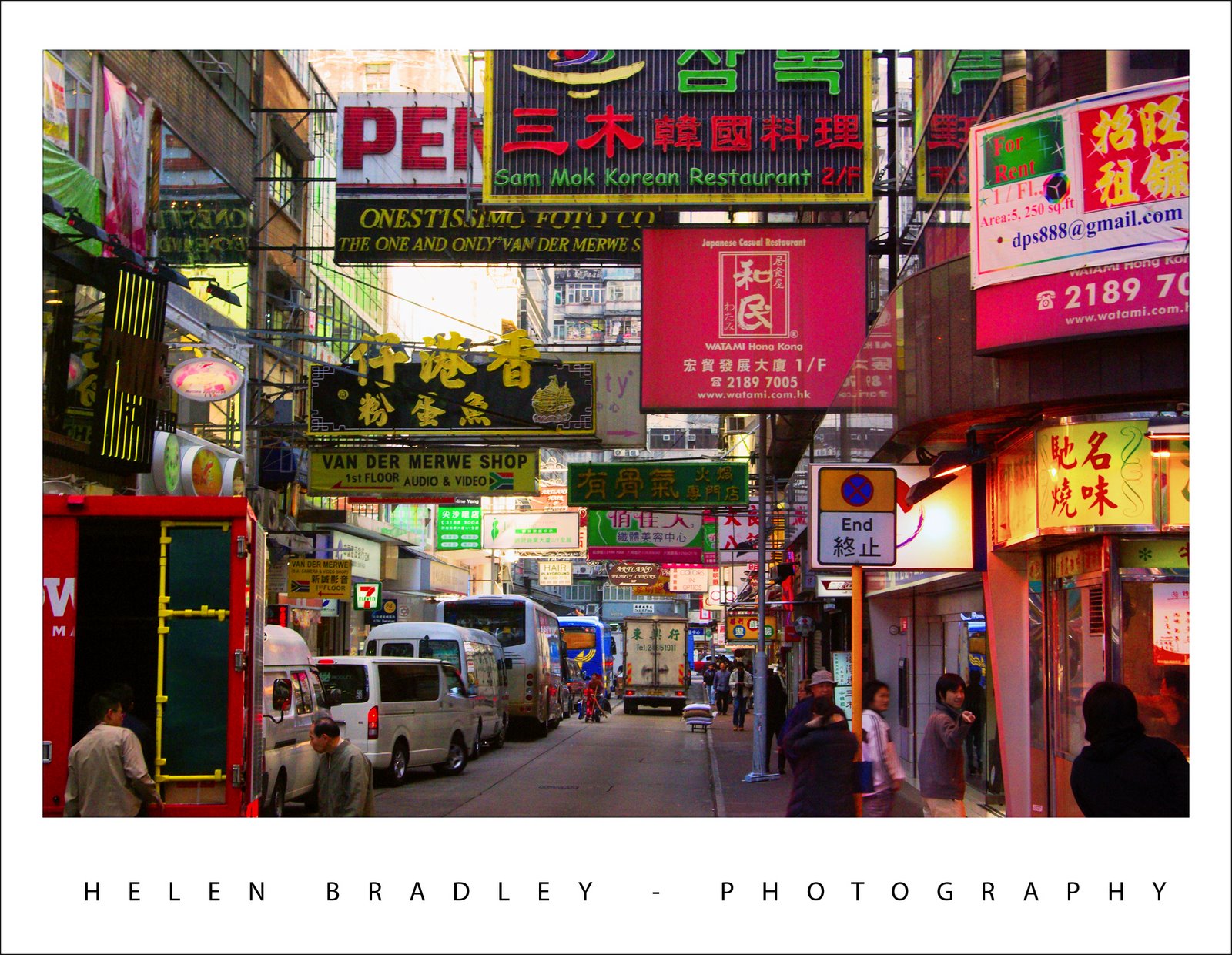
Look at this photo – the sign in the middle is dark and hard to read and the area behind it is lighter than it should or could be. The camera has exposed primarily for the lighter areas in the image but the entire image needs work.

Step 1

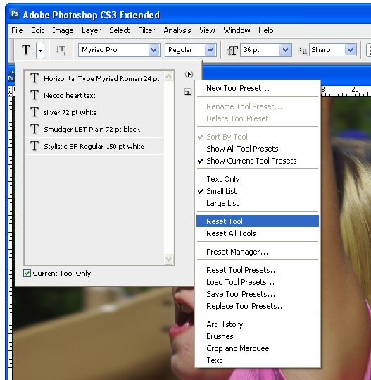
Make multiple duplicate layers

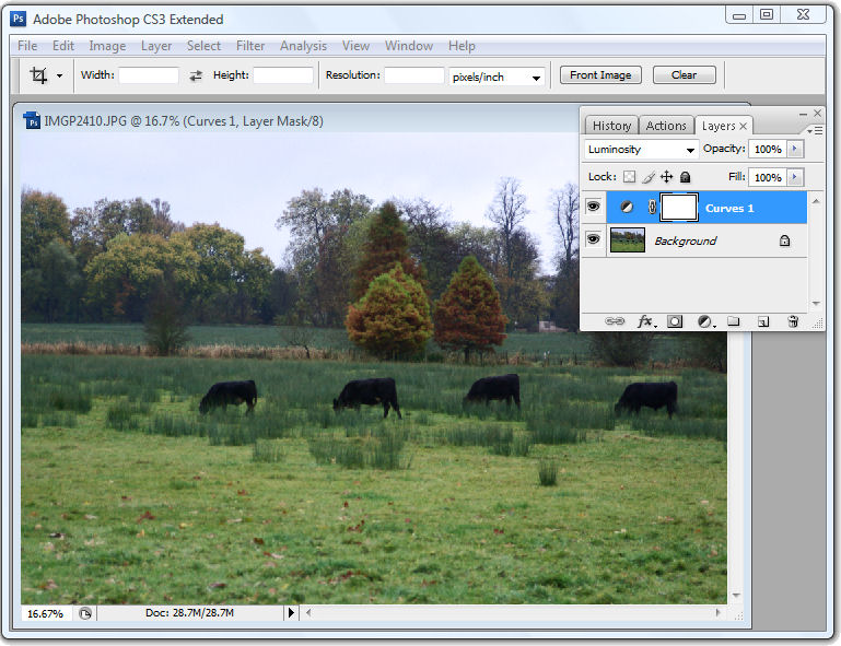
To fix the image make two copies of the background layer so that you do your work on duplicate layers. To do this, right click the Background layer in the Layers palette and choose Duplicate Layer and then repeat this step a second time. Disable the visibility icon on the topmost layer and select the middle layer.

Step 2

Using Shadow/Highlights to lighten the darks

To bring detail out of the darker area in the sign, I’ll use the Shadow/Highlights tool. To do this choose Image > Adjustments > Shadows/Highlights and adjust the Shadows but leave the highlights settings untouched. Typically the default setting will be all you need but you can fine tune the settings using the sliders which appear when you click Show More Options if desired. Ignore the impact that this fix has on the lighter areas of the image.

If you prefer to use another tool for this fix, do so. The important thing is to fix the shadows and ignore any changes to the highlights.

Step 3

Levels to fix the highlights

Enable the visibility icon on the top layer and select the top layer – this hides all the changes you have made so far. Choose Image > Adjustment > Levels and adjust the levels to improve the contrast in the lighter areas of the image – this time ignore the darker areas entirely as they are not part of this fix. You can also adjust the saturation using Image > Adjustments > Hue/Saturation if desired.

Again, if you prefer to use another tool, do so. The important thing is to fix the highlights and ignore any changes to the shadows.

Step 4

Blending the results with a mask

The top layer contains the adjustment for the lighter areas of the image and the middle layer contains the adjustment for the dark areas of the image. To blend these layers, I’ll use a layer mask to selectively adjust the opacity of the top layer so I can see the fix applied on the middle layer through it.

Unlike the layer opacity slider which sets every pixel to the same opacity value, a mask lets you adjust the opacity selectively so one area can be 100% opaque and others can be partially or fully transparent.

To add a mask to the top layer, first select the topmost layer and click the Add Layer Mask button at the foot of the layer palette. This adds a white layer mask to this layer. When working with masks, “black conceals and white reveals” so the white mask reveals everything on the top layer and the image is unchanged.

Step 5
Set the foreground color to black, select a soft round brush and set its Opacity to approximately 20%. Click on the mask to select it – it will have a small border around it showing that you have it selected. Now paint over the darkest areas of the image to reduce the opacity of the top layer where you are painting – this reveals the fix from the layer below. Using a low opacity brush lets you reduce the opacity gradually to build up the effect.

Continue and paint over the darker areas of the image to reveal more of the layer below through the mask. It can help to see how much more detail you can still recover if you turn the visibility of the top layer on and off. Make sure to select the layer mask again before painting on the mask – if you don’t do this, you’ll paint on your image.

If you go too far, make white your foreground color and paint on the mask to bring back parts of the top layer of the image. This is one of the benefits of using a mask – simply by painting you can apply or remove the fix. You wouldn’t have this flexibility if you used the Eraser tool on the top layer, for example.

To finish, I rotated the image to straighten the sign and cropped it to remove the distracting elements on the left side of the image.

Helen Bradley

Sunday, December 26th, 2010

Photoshop Creative: A Simple Composite


In this post, I’ll show you how to create a simple composite by placing one image in another. Along the way, I’ll not only bend one image to fit its new position but I’ll also show you a layer style trick that overcomes the problem that you’ll see if you scroll down to step 6 and take a look at what happens when I mask the image to make the fingertip show.

1 To create this composite, open the images to use. We’ll assemble the composite in the image of the plaster hand. Start by dragging the background layer from the photograph into the hand image. It will appear on its own layer and you can now close that image as it is no longer needed.

2 Size the imported image to fit where it needs to go. In this case the border will be added inside the image so I’ll make the image almost as large as the cardboard it will be ‘attached’ to.

Size the image in proportion so you don’t skew it. To get it to fit on in dimension it will probably be either too tall or too wide in the other dimension and that’s fine.

3 Once you’ve applied the transformation, select the rectangular marquee tool and drag over the area of the photo that you want to retain. Choose Select > Inverse to invert the section and press Delete to delete the excess image.

4 To warp the image to fit the shape of the card, select the image and choose Edit > Transform > Warp. This adds a series of warp handles to the image. Drag on these to bend the image so it fits over the area you want to cover.

When you’re done, confirm the transformation.

5 To add a white border around the image as if it were a photo stuck to the card, select the image layer, click the Add a Layer Style button at the foot of the Layers palette and choose Stroke.

Set the color to white and the size to a size appropriate for your image. Set the position to Inside so you get square corners on the image (if you choose Center or Outside the corners will be rounded).

 When you are done, click Ok.

6 With this image layer still selected, click the Add Layer Mask icon at the foot of the Layers palette.

Select a medium hard brush, set the foreground color to black and paint on the mask to reveal the finger on the underlying layer. This makes the finger look like it is above the image and not behind it.

One simple way to do this is to hide the photo layer and use a tool like the Quick Selection tool to select over the finger on the background layer. Then, with the selection in place, display the top layer and select its mask. With black as the foreground color, press Alt + Backspace (Option + Delete on the Mac), to fill the selected area on the mask with black.

You’ll see that we have some problems with the mask because it distorts the stroke around the picture. We want the stroke applied to the image and we don’t want the mask to have any effect on it – right now it is having an unwanted effect.

7 To solve the problem, double click the Effects entry in the Layers palette to open the Layer Styles dialog. In the Blending Options area of the dialog, select the check box for Layer Mask Hides Effects.

This configures the mask on the layer to hide not only the image content on that layer but also a style applied to that layer.

Helen Bradley

Wednesday, June 17th, 2009

Photoshop – keep a log of everything you’ve done

How many times have you created a neat effect on an image using Photoshop and then wanted to duplicate the effect on another image? The problem is that unless you’ve taken notes about what you’ve done, it is often difficult if not impossible to remember exactly the steps you took to get the final image.

While Photoshop has a History feature this is of limited use. One problem is that, by default, Photoshop only stores 20 history states so, if you’ve performed a lot of steps they may not all appear in the list. The second problem is that, even if you have configured Photoshop to store a large number of history states, all you see in the History panel is a brief description of what you did to the image such as Gaussian Blur, Apply Image, Blending Change and you don’t see the actual settings used.


The History panel in Photoshop lists the basics of what you’ve done but not the detail.

Here are some ways to improve on the basics and keep a log of your work:


Step 1
Before you start work on an image choose Edit > Preferences > General and select the History Log checkbox. You can select to save log items to the image Metadata, to a separate text file or to both. If you select either Text file or Both you’ll be prompted to enter a file name and a location to save the file to. Do this and click Save.

From the Edit Log Items dropdown list select Detailed. Sessions records only the time you spend working on a file, Concise records the Sessions information and the detail from the History palette and Detailed records the detail about the changes – it’s Detail you need.


Step 2
Now, when you work on an image, the detail is stored in the text file, the Metadata or both, depending on the setting you chose.

If you chose to store the data in a text file you can later open the text file with a word processor or a text editor such as Notepad on the PC.

If you chose to record the history in the image metadata choose File > File Info > History and you can read details of the edits you made to the image in the dialog. Use this information to perform the same steps on another image


Tip
To configure Photoshop to store more than the default 20 history states, choose Edit > Preferences > Performance and set the History States value to a higher number. You should note that this History information is available in the History palette and only while the image is still open – it is lost when the image is closed – unlike the Log data which is stored permanently.

Helen Bradley

Wednesday, April 15th, 2009

How to merge or combine paths in Photoshop

One of the most difficult things to work out how to do in Photoshop if you work with paths is to know how to merge or combine two paths into one.

Say, for example, you have a working path and a second path and you want the two to appear as one path so you can save it or work with it as a single entity. It sounds easy but merging or combining paths is anything but.

The solution is this:


First, convert the working path to a regular path by double-clicking on its name and click Ok. In this example, I have Path1 and Path2.

Click to select Path2 in the Paths palette. Select the Path Selection Tool and click on the path so it is selected (you will see its nodes appear). Press Ctrl + C (Command + C on the Mac), to copy it to the clipboard.

Click on Path1 in the paths palette so that it is now selected and press Ctrl + V (Command + V on the Mac) to paste the copied path into this path. You now have a single path that contains both your paths and you’re almost done.

Check the Tool Options bar as it contains the tools you need to work with the two paths. You can add the shape, subtract the shape, take the intersection of the two shapes or exclude overlapping shape areas – click each and check the diagram in the path thumbnail to see the result to determine which one you want. Select the desired option and click the Combine button and the paths will be permanently joined.

Here is an example where one path is contained inside a second path. You can choose from a number of options for combining the paths depending on whether you want the doughnut, the hole or something different!

Helen Bradley

Saturday, April 11th, 2009

Photoshop: Panorama with a twist

Panoramas don’t have to perfectly or neatly aligned. If you’re looking for a fun way to create a panorama in Photoshop the best way to achieve the effect is to throw away the rule book on how to capture and assemble a panorama and try something a little different. In this article, I’ll show you how to capture the images and create a stylish panorama which is anything but perfect.

Traditionally, you capture images for a panorama using a tripod and taking care to ensure that all the shots overlap and that the camera settings do not change from one image to the next. For my panorama I ignored the rules and captured my images with a hand held camera, ignoring changes in the camera settings and continually varying the camera angle from one image to the next. However, you will still need to have plenty of overlap from one image to the next as the panorama tool needs this to assemble the final image for you.


Download the panorama sequence onto your computer and open all the images in Photoshop. Choose File > Automate > Photomerge to open the Photomerge or panorama tool. Select the Cylindrical, Auto or Perspective options – each renders a different result and disable the ‘Blend images together’ checkbox – this is important as you don’t want the images blended at all. Click Add Open Files to select the open files as those to create the panorama from. Click Ok and wait as Photoshop assembles a panorama from the images that you have selected – this may take some time.


When the process is complete you will have a panorama that is bent in interesting directions with the images making up the scene overlaid over each other in a haphazard arrangement.


To add the final touches to the project, start by adding a new layer behind the panorama images by choosing File > New > Layer and click Ok. Drag it to the bottom of the layer stack and fill it with your chosen background colour. To get a colour that works with your image, sample one from the image itself using the eyedropper.

To adjust the panorama’s contrast and brightness add a new adjustment layer by clicking on the topmost layer and choose Layer > New Adjustment Layer > Curves. Drag on the curve until you have a result you like. This adjustment layer will affect all the layers in the image. If you need to adjust only one layer, select it and choose Image > Adjustments and select the adjustment to make – doing it this way ensures the adjustment affects only the selected layer.


Select one of the layers in the image and click the Add Layer Style icon at the foot of the layer palette. Select Stroke and set the stroke Color to White and add a large enough sized stroke that you can see it clearly. Set the Position to Inside and click Ok.


In the Layers palette, right-click on the Layer Style that you just created and choose Copy Layer Style. Select all the panorama layers in the image right-click and choose Paste Layer Style to apply the stroke outline to all the layers.


For additional interest, click some of the layers in the image and either drag them a little out of position or drag their layer to a different position so they are more or less visible. You can also add a drop shadow to the layers the same way you applied the stroke outline.

Helen Bradley

Wednesday, December 10th, 2008

Curves + Luminosity = Better Tones.


In the last blog entry I mentioned some cool things you can find in the Curves dialog that help you adjust the tonal range of your image. Today I’m going to show you how to wreck the color in an image in the name of improving tonal range.

The Curves dialog has four channel options – you can work on the RGB composite channel (the default), or you can work on the separate R, G or B channels. Problem is that although adjusting the R, G or B channels independently can help you improve the tonal range of the image – it can also totally mess with the color. For this reason, few users bother working with the individual channels. Makes good sense? No!

You see working with individual channels is a good fix. If the Red or Green channel lack contrast you can hype it up using a curves adjustment. You’ll mess up the color but, if you’re using an Adjustment Layer, you can simply change the blend mode of the adjustment layer to Luminosity and immediately the messed up color disappears and the adjustment is limited to luminosity only. Instant fix.

So, next time you need to apply a Curves adjustment, check the channels in the Channels palette. If you see a channel that lacks contrast – adjust it to add contrast to it. Then set the blend mode of the adjustment layer to Luminosity to remove the color problems you just created.

Helen Bradley

Thursday, September 25th, 2008

Return to your Photoshop tool defaults


One issue with tools like the Photoshop Type tool is that it remembers the settings from last time you used it. Sometimes this is a good thing, most often it is not.

If you need to reset the tool or its associated Character or Paragraph palette options, click the tool or palette and from the appropriate flyout menu (the Type tool’s flyout menu is in the top right corner of the Tool Presets dialog), choose Reset Tool.

Make sure you don’t have a text layer selected when you do this if you don’t want its settings changed to match the reset options.

Helen Bradley

Tuesday, January 15th, 2008

Streets of Hong Kong

Some of the best photo opportunities in Hong Kong happened around dusk as the lights began to cast their magic on the streets. The time frame is tight, you need to be there, camera in hand, and catch the mix of daylight and night light. But the rewards are definately there for the taking as shown here. This shot, to my recollection was taken in the Temple street night market area.

My new Pentax K10D digital SLR was my companion for this trip. It was its first outing so I was interested to see how it would perform. True to some reviews, as I captured mainly in JPEG format, the images lacked saturation. I did boost it in camera slightly uisng the saturation adjustment but I opted to stop short of boosting it too much in the camera and fix the images myself later on.

I did take advantage from time to time of the K10D’s push button RAW mode which lets you press a button on the case and take one RAW image. I did this when I had time to take two shots and when I had something I thought would lend itself to working with in Camera RAW.

However, and this is a big thing, in Photoshop CS3 you can open any JPEG image in Camera RAW and work with a subset of the Camera Raw functions on the image. This is a very powerful new tool and makes it easy to apply some fixes that would take more time in Photoshop – and, because you’re working in Camera RAW, the fixes aren’t saved to the image so they can be undone any time.

Curious? Open Photoshop CS3 Bridge, find your JPEG image and right click it. Instead of choosing Open, choose Open in Camera RAW and go play!

Helen Bradley

Wednesday, December 19th, 2007

Color that rocks! Autumn in Paris

Ok, this post is Color that Rocks not Color that Pops.. I am really really sick of hearing the word POPS, it is officially Over, Out, Done, Finished – Gone!

I have to hold myself back from screaming “No! No! No! can’t you find another word” whenever someone uses it. Seriously, we need something different, it is so overused.

Ok, Rant [officially] over.

This photo is yummy.

I shot it in Paris in, duh! Autumn. The colors took a lot of work to bring out but they are dazzling. Next work I do on it will be to remove the people. I love them… it gives the image a sense of life … but a friend doesn’t – so they are going.

I have used this image as an example for the color change tool in Photoshop. Open an image to change colors in and choose Image > Adjustments > Selective Color. Now you can select colors in the image – yellows for example and add red or green or blue to them. Select any color and add more of something else to it.

This photo turns from Autumn into Spring in a few minutes – bypassing Winter entirely!

If you make your changes on a duplicate of the image then you can blend and control the effect with a layer mask. So simple and so effective.

Helen Bradley

Wednesday, November 28th, 2007

Paris Rooftops

Ok, so there is this really cool place in Paris to shoot from. It’s called the Montparnarse Tower – it’s in Montparnarse (duh) and it’s this big office building. The beauty of it is that it has a rooftop area you can visit and it doesn’t cost a heap. It also has breathtaking 360 degree views of Paris all the way to the Eiffel Tower and across the Seine.

Ok, so they can be breathtaking views if it isn’t foggy and smoggy. Memo to self: don’t go there early in the morning before the wind has blown the mess away.

The Eiffel Tower could be seen, just!

Here is one of the photos I took of the rooftops in Paris from the tower. The poor air quality killed the color so there was precious little to recover and the overall image was muddy. The solution was to duplicate the image a few times and then drag bits and pieces of color and detail back out of it. The light roofs were a big issue, fix the tonal range enough to fix the image and the gorgeous detail in the roofs disappeared.

The solution is to fix the image multiple times on multiple layers. On each layer, focus on a specific detail. Then clobber the whole lot together again using Layer Masks you just paint on the bits you want and paint out those you don’t.

Helen Bradley

Page 1 of 212