Tuesday, November 20th, 2007

Paste to a layer mask

Ok, here’s the dilemma. You have two images open in Photoshop and you want to add one image as a layer mask into the other.

One solution is to copy the first image, then switch to the second. Click the layer mask and switch to the Channels palette. The layer mask appears as a channel. Select the channel’s visibility icon to make it visible, select the channel to make it active, and click Edit, Paste. Deselect its visibility, reselect the RGB channel to make that one active, switch back to your Layers palette and the pasted selection is in your layer mask. This solution has the advantage that the copied/pasted piece doesn’t have to be the same size as the layer mask.

The alternate solution if the two images are the same size, is to use Apply Image. Select the target layer mask, choose Image, Apply Image and, as the Source, select the image to copy from, the layer to copy and click Ok. Now the selected layer (or the merged source) is pasted into the Layer Mask.

Two alternatives, the second is easier to use but it does require two same size images.
Helen Bradley

Friday, November 9th, 2007

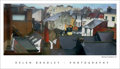
Rooftops in the rain – Brighton

When I was in Brighton we had one beautiful summer like Sunday when everyone was walking along the beach and it was all so gorgeous and then, next day, it rained cats and dogs.

Here’s a photo I took from my hotel room window across the roofs of Brighton the day it rained. I don’t think the windows of the Queens Hotel had been washed since good ol’ Queen Vic gave her name to the hotel so they were pretty interesting to shoot through and, of course, they only opened 6in from the bottom so shooting through the gap was impossible.

The original was flat and lifeless as one might expect. A Levels adjustment is a great starting point for a photo like this. Simply choose Layers, New Adjustment Layer and then choose Levels. Drag the little triangle sliders in from the left and the right till they are just under the places where the chart data begins and ends. This darkens the darks and lightens the lights and instantly boosts the tonal range in the image and gives it more contrast and life. The middle slider handles the midtones so you can drag it to the right or left as required for your image.

For the rest of this image I worked hard to get the colour and detail back. The cream buildings in the background were treated independently of everything else as they just kept getting lost in every solution I tried. Masks are great for this, fix one part of the image with adjustment layers, then hide the adjustment layer and work with another one focusing on the other part of the image. Then, use the mask on each adjustment layer to paint in or remove the fix from areas of the image. When I want most of the fix I just paint in black over the areas that I don’t want the fix to be applied to. When I only want little bits affected by the mask, I fill the mask with black (white reveals, black conceals), then paint with a low opacity, soft white brush to bring back the fix in the small areas that it is needed.

I also used the Selected Color adjustment on this image, I’ll talk more about it in a future blog post.

Helen Bradley

Wednesday, November 7th, 2007

Photoshp CS3: Copy a Layer Mask

Often you’ll need to copy a layer mask from one layer to another so you can mask out the same area on two layers. I do this when I mask the hightlights highlights in an image to protect them from being blown out.

Copying a layer mask doesn’t look easy or intuitive – there’s no menu command for it. However it can be done very simply. Hold the Alt and Control keys at the same time and drag the layer mask from one layer and drop it onto another. If there is already a layer mask on that second layer you’ll be prompted to replace it, answer Yes to the prompt.

Helen Bradley

Wednesday, October 24th, 2007

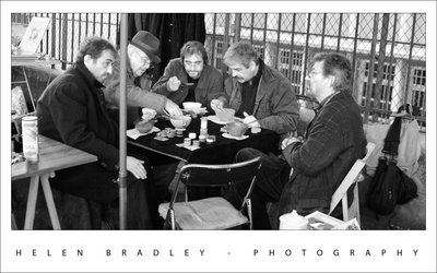
Port de Vanves market – Paris

We visited the Port de Vanves market in Paris. This funky market only happens on a Saturday and Sunday morning from 7:30am till around 1:30pm. It is really near a Metro station (tell me what isn’t in Paris!) and it’s not on the tourist beat so it’s more French than you might expect. It was so much fun and I bought lots of little bits and bobs for my artwork. My mum bought me this cute paper mache horse which is hand made and which is on little wooden wheels – way too cute.

These five guys were stall holders who were taking time out to grab some lunch. They were so wonderful and kind to let me capture this photo.

This photo is a compilation of two I took. I aligned them using the new Photoshop Auto Align layers command and then masked out the bits I didn’t want from the top layer. This let me use the best facial expressions for each person. I used the – new to Photoshop CS3 – Black and White adjustment layer to mix the black and white because this gives you the ability to select colours in the image and take them to black or white. The result is much richer image than I could create with, for example, the Hue/Saturation tool or even the Channel Mixer.

Helen Bradley

Tuesday, October 23rd, 2007

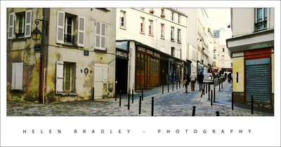
Monmartre – in color

One thing I love doing to photos is to mess around with the color. This photo was ripe for it and I dragged heaps of color out of the image and then worked to blend and tone it back down until I had a look I really liked.

The building is just by Abbesses Metro station in Montmartre, Paris. The station itself has the original Art Nouveau signage and canopy and it has a huge spiral staircase which is covered in art going up and photography going down – ask me, I climbed it and photographed every step of the way up and down. This building is just across the road from the station and it’s gorgeous. It’s a photographer’s delight and very, very French.

If you look really close you’ll even see a face and hands painted onto the face of the building.

Helen Bradley

Thursday, October 18th, 2007

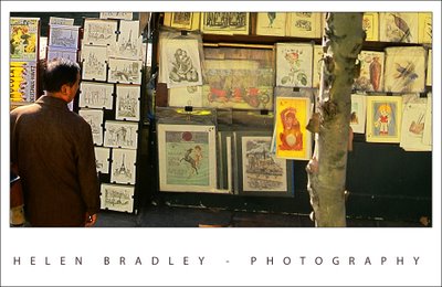
Shopping for books by the Seine – No 2

I took yesterday’s image and decided I wanted to look at it another way. So, I cropped it horizontally this time and worked a lot with the colors. I wanted not only to crisp it up but to punch some of the colors.

I’m working on some notes from Dan Margulis from Photoshop World in Las Vegas – his 5 minutes to a picture postcard class.

One of the great tricks I learned there is using the Luminosity channel to add punch to a photo. The idea is to duplicate the main layer in the image and then select this duplicate layer. Then use the Apply Image command. It’s a command most people don’t use because it’s so damn obscure but I’ve used it quite a bit before and I love it. Here you apply a channel such as the Red, Green or Blue to the image but, after you’ve done this, instead of accepting the default blend mode in the Layers palette – which is Normal and which makes the image Greyscale, you use the Luminosity blend mode to take the contrast but drop the color.

It’s a great tool – it’s only one of Dan’s tricks but it is fun to play with. Use the Green channel for portraits and the red channel for skies.

I did a lot to this image to try and recover and enhance the color. I started out by balancing the color to remove the cast. Then used a range of tools including curves and apply image to try to punch up the color.

I quite like the result.

Helen Bradley

Saturday, September 8th, 2007

Photoshop World hits Las Vegas

I’m spending the week in Las Vegas taking in all the best that PSW (Photoshop World to those in the know – now you’re included!) has to offer. It’s a great opportunity to take classes from the likes of Scott Kelby, Matt Kloskowski, Jim DiVitale and photographers Moose Peterson, Joe McNally and Vincent Versace.

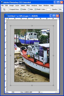
My best tip and one I’ve seen quite a few instructors embrace is the crop canvas enlargement. It works like this, you use the crop tool to enlarge the canvas – seriously.

To do it, shrink the image down using the Zoom tool then enlarge the window so you have a little image and a big window. Click the Crop tool and drag it on the image, it won’t go any larger than the image right now – don’t panic.

Let go the mouse now drag the crop marquee handles outwards. Do it on all the sides that you need to add canvas. To do it evenly all around, hold the Alt/Option key as you drag on a corner handle. Check your background color as that’s the one that will be used to fill the new area. Press Return/Enter and you’re done.

Wow… one to show your friends just how good you are – you can now use the Crop tool to make an image bigger!

Helen Bradley

Wednesday, May 16th, 2007

Vanishing Point in Photoshop CS3

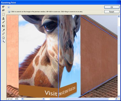
The Vanishing Point Filter in Photoshop lets you create perspective grids that you can drop an image into.

To do this, copy the image to paste into the grid into the clipboard and open or create the image to put it into. Add a new layer to this image, select it and choose Filter, Vanishing Point Filter.

Click the Create Plane Tool and click on the four corners of the grid. Move the points if necessary, you need a blue grid (if it’s yellow or red it isn’t correct and won’t work). Now, you can drag a second related plane by holding the Control key (Command on the Mac) and drag from a side to create a second pane. Don’t worry about the direction just that it’s at right angles to the existing pane. Let go the mouse. Hold the Alt key (Option on the Mac) and drag to align the pane, fine tune using the Angle value.

Now either continue to create planes or paste the image using Control + V (Command + V on the Mac). Select the Marquee tool and move it into position on the grid. Use the Transform tool to size it if desired. When you’re done, click Ok.

If you need to remove or delete the plane – for example to start over, click on it so it’s selected and press Backspace.

The Vanishing Point Filter is heaps of fun – use it to apply an image to a building, the side of a truck, or just in thin air!

Helen Bradley

Page 2 of 212