Wednesday, April 29th, 2009

Replace a sky in Photoshop


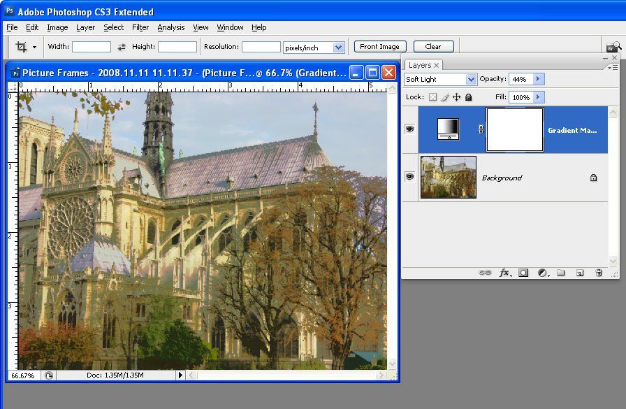
One of the most disappointing things that can happen to you as a photographer is to have a once in lifetime chance to take a photograph of something and to have the weather let you down. So, instead of luscious blue skies you’ll get grey or dull skies in your image.

You can replace a dull sky in an image in a number of ways. One method I like to use involves the Blend If tool because it avoids the need to make a detailed selection around the area of sky to replace. This is particularly handy if the skyline has trees or other wispy elements along it. The principle of this tool is you blend two layers together conditional on the overall lightness or darkness of the top or bottom layer or you can do it conditional on the lightness or darkness of a color on the top or bottom layer.

For this purpose I keep a file of blue skies. Anytime I’m photographing, I’ll swing the camera upwards and shoot a few new sky images for my collection. Then, when I need a sky, I have plenty to choose from.

Here’s how to seamlessly change the sky color in Photoshop:


Step 1
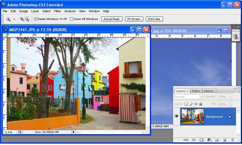
Open both the image which needs a new sky and an image of some sky.


Step 2
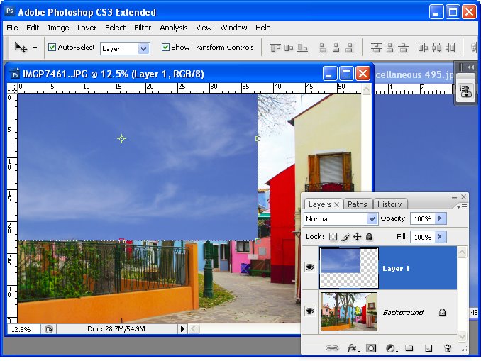
Drag the background layer from the sky image into the main image. It will appear at the top of the layer stack.


Step 3
Move and size the sky layer so it overlaps the problem area.

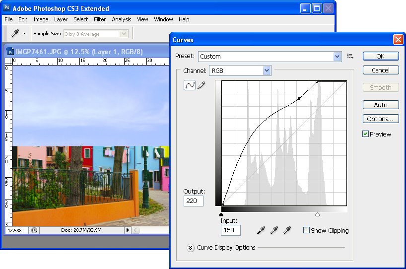
If the sky is too dark or light for the image, use a tool like the Curves tool to lighten it so it blends in better with the target image.


Step 4
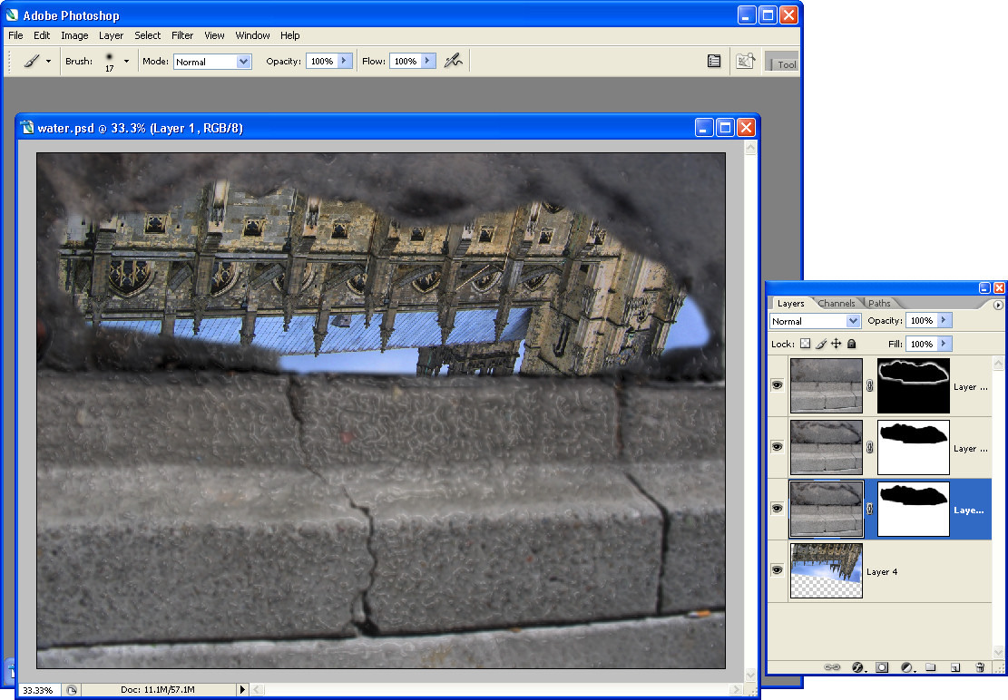
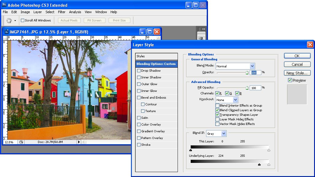
Click the sky layer so it is selected in the layers palette and click the Add a Layer Style icon at the foot of the Layers palette. Click Blending Options to open the Layer Style dialog.

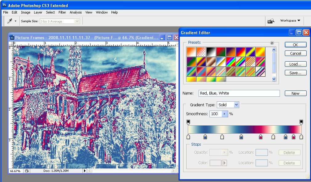
Locate the Blend If area at the foot of the dialog. You will use Blend If to blend this layer with the layer below. To do this, drag the slider at the far left of the Underlying Layer panel in to the right – almost all the way to the right edge of the slider.

As you do this, you reveal the underlying layer in all areas except the lightest – the areas which contain the blown out sky.


Step 5
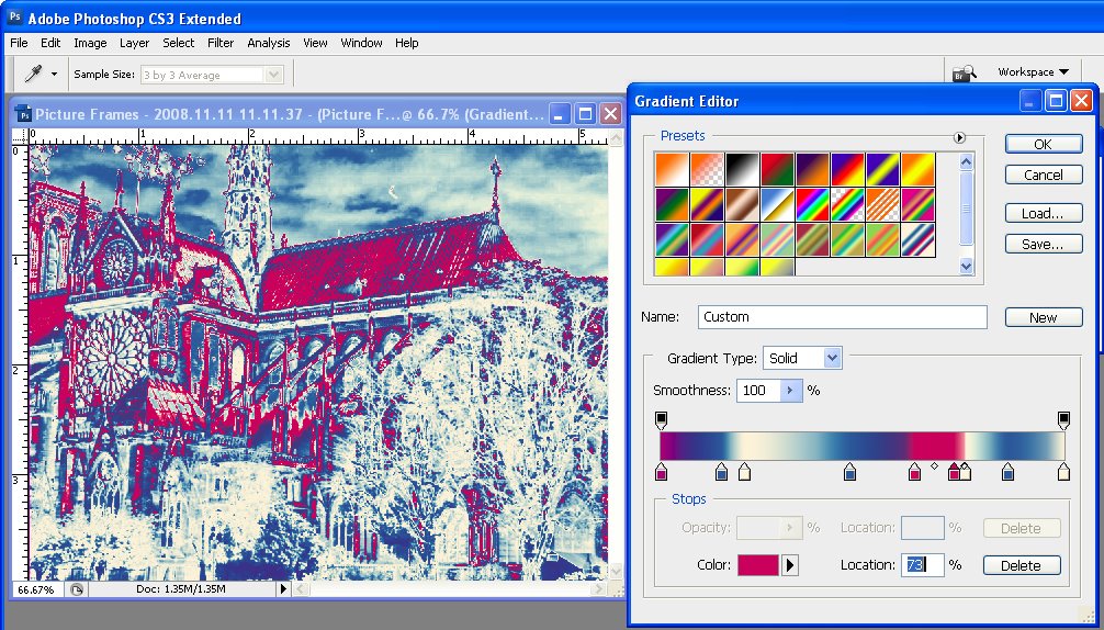
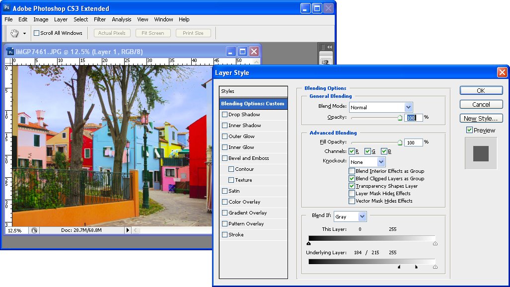
To smooth the transition between the sky and the remainder of the image, hold the Alt key and drag away one half of the small slider to split it in two. Drag the two pieces apart. The area to the left of the markers delineates where the effect is applied 100% and between the two pieces is where the effect transitions from 100% through to 0%. Click Ok when you’re done.


Step 6
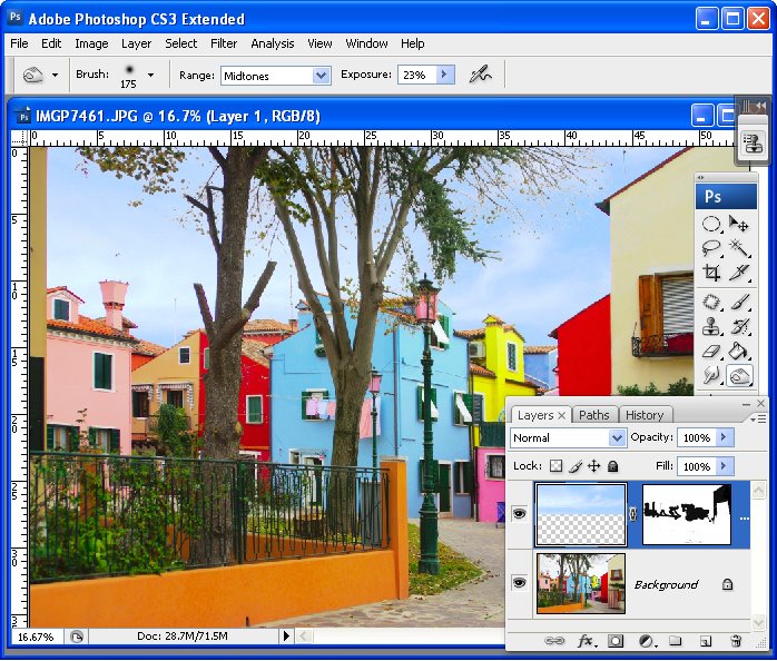
To fix any problems where the sky has blended into the original image in an inappropriate place, either move the sky further up the image so it doesn’t overlap that area of the image or, if this can’t be done, use a layer mask. With the sky layer selected, click the Add a Layer Mask icon at the foot of the Layer palette. Paint on the mask in black to reveal the original image underneath.


Step 7
Now is the time to look at the image and determine what it needs to finish it. You might need to tweak the sky color and lightness using a Curves adjustment on the sky layer now that the sky is actually in place in the image.

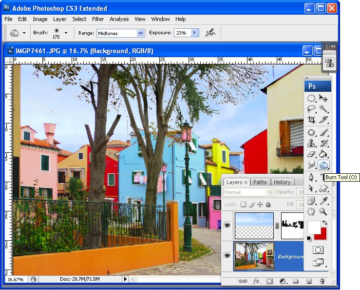
In some cases you may see a halo effect around the tree branches and leaves or along the edges of buildings where the two images are blended. You can remove these using the Burn tool by painting over these areas with a low Exposure brush and with the Range set to Midtones or Shadows as necessary.

Note:
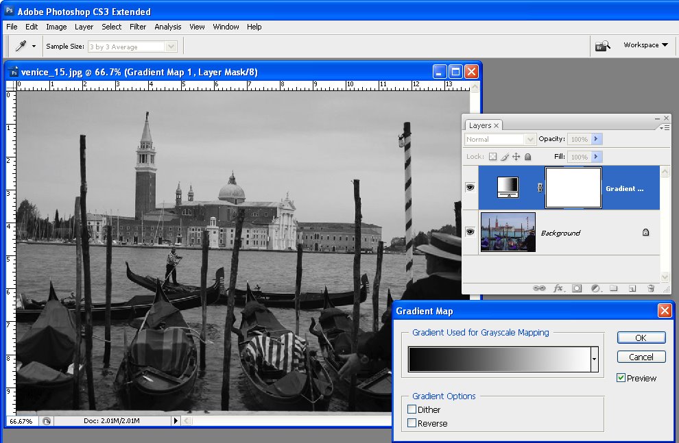
The Blend If tool can also be made to work on a single channel which can give better results in some situations. Select Blue, for example, from the Channel list in the Blend If area (rather than the default Grey) and adjust using that.

Helen Bradley

Sunday, April 26th, 2009

Photoshop: Color with Gradient Maps

When you’re looking for a fun effect to add to an image, the Gradient Map tool might be just the ticket. This tool has a serious side in creating custom black and white conversions and a more frivolous one in adding color to an image. I’ll show you how to use it for both purposes.

Before we start a word about how the Gradient Map works. It is an adjustment so you can find it on the Adjustment menu and you can also apply it using an Adjustment Layer. It applies a gradient of color to your image depending on the tones in the image. So, where the image is darker the tones at the left of the gradient are applied and where the image is lighter the tones at the right of the gradient are applied. The midtones are colored with the color in the middle of the gradient. If you want the effect reversed, you can reverse the gradient and the colors are applied in reverse.

The serious side of the Gradient Map tool is its black and white gradient. You can use this to convert an image to black and white. By changing the gradient, you can affect what parts of the image go to black and which parts go to white.

Step 1
To see this at work, open an image and add a Gradient Map adjustment layer by choosing Layer > New Adjustment Layer > Gradient Map. From the Gradient list choose the Black, White gradient and click Ok. The image now shows as black and white.

Step 2
To adjust the way the gradient is applied, double click the adjustment layer and double click the gradient to open the Gradient editing dialog. You can now add stops below the gradient bar to adjust how the colors are applied. For example, if you add a second black stop to the right of the first one, you can set all the tones that are mapped to this area of the gradient to black rather than them ranging from black to a dark grey.

Step 3
By adjusting the midpoint marker between two stops you can control how the gradient transitions from one color to the next. If you drag it to the left you steepen the transition from the left most color to a color that is half way between the colors in the stops either side of the midpoint marker. Of course, here we’re talking about black, grey and white as colors, but in a minute the stops will be applying colors to the image and they work the same way.

Step 4
To apply a color gradient to an image to give it a more creative look, repeat step 1 to open an image and to add a Gradient Map adjustment layer to it. This time choose one of the colored gradients. If the gradients aren’t to your liking, click the flyout menu on the Gradient tab and load a second gradient set and use one of those.


Step 5
These gradients, like the Black, White gradient can be edited so you can tweak the colors or add new ones until you get exactly the effect you want.

Step 6
Like any adjustment layer, you can achieve further creative possibilities by setting the blend mode of the adjustment layer to something other than Normal. You can also reveal some of the underlying color from the image if you reduce the layer opacity.

I blog for the Digital Photography School and this post first appeared on that site.

Helen Bradley

Wednesday, April 22nd, 2009

Word 2003 – Disable the Insert key

If you still use Word 2003 or earlier you’re at risk of Word suddenly taking off and gobbling up text as you type. The problem is that the Insert key toggles insert/overtype mode and if you press it by accident you can end up in overtype mode so everything you type just replaces something else! Yikes it can be frustrating.

Now, Microsoft solved the problem in Word 2007 by disabling the Insert key so it no longer switches into overtype mode any more. That annoys some folks so I wrote a post here about fixing it so it goes back to its old behaviour. But this post is for hapless Word 2003 users and I’ll show you how to disable the Insert key so it won’t switch into overtype mode. The solution only affects Word so your other programs work as expected.

To disable your Insert key, choose Tools > Customize and click the Keyboard button. Scroll to find the All Commands category and scroll the Commands list to locate the Cancel option. In the Press new shortcut key box click once and then press the Insert key. Click Assign and then Close. This assigns the Insert key to the Cancel command so that it no longer operates OverType mode.

If you ever need to use OverType mode, double click the OVR indicator in the status bar to enable or disable it.

Helen Bradley

Thursday, April 16th, 2009

Send to PowerPoint missing? Not really!


In Word 2003 you could create an outline in Word and then send it to PowerPoint where it would be converted to a PowerPoint slide show. Level 1 became the slide title and level 2 the first level bullet points and so on.

I hear a lot of grumbling that this feature has been removed from Office 2007 – not so! It just isn’t quite where you expect it to be. In fact, you have a few options in PowerPoint 2007 and Word 2007.

Option 1
You can add the Send to PowerPoint button to the Word 2007 Quick Access toolbar by clicking the Office button and choose Word Options > Customize and from the Commands not in Ribbon collection choose the Send to Microsoft Office PowerPoint option and click Add to add it and then Ok. Now you can click it to send the outline file to PowerPoint.

Option 2
You can also approach the task from PowerPoint 2007 which is really the better option. One alternative is to open the Word outline file in PowerPoint and the slides will be automatically created for you. To do this click the Office button and choose Open and from the Files of type list choose All Files so you can see and open your Word file.

Option 3
This is my fave!

Open PowerPoint 2007 with a new slide show and make sure your Word 2007 outline file is closed.

Choose the Home tab on the Ribbon and click the little arrow on the New Slide button. This opens a menu which includes the option Slides from Outline – select this and open your Word 2007 outline file. The slides are automatically created for you.

So, the option to Send to PowerPoint is not there in Word 2007 but you have so many more ways to complete the task now.

Helen Bradley

Wednesday, April 15th, 2009

How to merge or combine paths in Photoshop

One of the most difficult things to work out how to do in Photoshop if you work with paths is to know how to merge or combine two paths into one.

Say, for example, you have a working path and a second path and you want the two to appear as one path so you can save it or work with it as a single entity. It sounds easy but merging or combining paths is anything but.

The solution is this:


First, convert the working path to a regular path by double-clicking on its name and click Ok. In this example, I have Path1 and Path2.

Click to select Path2 in the Paths palette. Select the Path Selection Tool and click on the path so it is selected (you will see its nodes appear). Press Ctrl + C (Command + C on the Mac), to copy it to the clipboard.

Click on Path1 in the paths palette so that it is now selected and press Ctrl + V (Command + V on the Mac) to paste the copied path into this path. You now have a single path that contains both your paths and you’re almost done.

Check the Tool Options bar as it contains the tools you need to work with the two paths. You can add the shape, subtract the shape, take the intersection of the two shapes or exclude overlapping shape areas – click each and check the diagram in the path thumbnail to see the result to determine which one you want. Select the desired option and click the Combine button and the paths will be permanently joined.

Here is an example where one path is contained inside a second path. You can choose from a number of options for combining the paths depending on whether you want the doughnut, the hole or something different!

Helen Bradley

Sunday, April 12th, 2009

Update Lightroom Previews


I travel with a laptop and I take most of my photos when travelling. All this adds up to me wanting to get my images into Lightroom quickly so I can see what I have but so I can do it on the run in the airport lounge, for example.

Because of this most of my images are imported using the Minimal previews which are, let’s face it, pretty awful but they are fast. When I get home and I have the time, I want to update the previews to Standard which is a good working size for me.

To change and update the preview size for a folder of images, choose Library > Previews and choose to render 1:1 previews or standard size ones. You’ll be asked if you want to apply this to one image or all of them – choose All and go do something else while Lightroom grinds away at the task.

In the top left corner of the screen you’ll see how many previews it has to make and how far through the process it has got. If you have multiple folders needing updating repeat the process and Lightroom will continue to work on multiple tasks at once.

To change the actual preview defaults, choose Edit > Catalog Settings > File Handling tab and set the Preview size – it won’t need to be any larger than your screen and Medium quality is a good compromise between speed and quality.

Helen Bradley

Saturday, April 11th, 2009

Photoshop: Panorama with a twist

Panoramas don’t have to perfectly or neatly aligned. If you’re looking for a fun way to create a panorama in Photoshop the best way to achieve the effect is to throw away the rule book on how to capture and assemble a panorama and try something a little different. In this article, I’ll show you how to capture the images and create a stylish panorama which is anything but perfect.

Traditionally, you capture images for a panorama using a tripod and taking care to ensure that all the shots overlap and that the camera settings do not change from one image to the next. For my panorama I ignored the rules and captured my images with a hand held camera, ignoring changes in the camera settings and continually varying the camera angle from one image to the next. However, you will still need to have plenty of overlap from one image to the next as the panorama tool needs this to assemble the final image for you.


Download the panorama sequence onto your computer and open all the images in Photoshop. Choose File > Automate > Photomerge to open the Photomerge or panorama tool. Select the Cylindrical, Auto or Perspective options – each renders a different result and disable the ‘Blend images together’ checkbox – this is important as you don’t want the images blended at all. Click Add Open Files to select the open files as those to create the panorama from. Click Ok and wait as Photoshop assembles a panorama from the images that you have selected – this may take some time.


When the process is complete you will have a panorama that is bent in interesting directions with the images making up the scene overlaid over each other in a haphazard arrangement.


To add the final touches to the project, start by adding a new layer behind the panorama images by choosing File > New > Layer and click Ok. Drag it to the bottom of the layer stack and fill it with your chosen background colour. To get a colour that works with your image, sample one from the image itself using the eyedropper.

To adjust the panorama’s contrast and brightness add a new adjustment layer by clicking on the topmost layer and choose Layer > New Adjustment Layer > Curves. Drag on the curve until you have a result you like. This adjustment layer will affect all the layers in the image. If you need to adjust only one layer, select it and choose Image > Adjustments and select the adjustment to make – doing it this way ensures the adjustment affects only the selected layer.


Select one of the layers in the image and click the Add Layer Style icon at the foot of the layer palette. Select Stroke and set the stroke Color to White and add a large enough sized stroke that you can see it clearly. Set the Position to Inside and click Ok.


In the Layers palette, right-click on the Layer Style that you just created and choose Copy Layer Style. Select all the panorama layers in the image right-click and choose Paste Layer Style to apply the stroke outline to all the layers.


For additional interest, click some of the layers in the image and either drag them a little out of position or drag their layer to a different position so they are more or less visible. You can also add a drop shadow to the layers the same way you applied the stroke outline.

Helen Bradley

Thursday, April 9th, 2009

Cool Word 2003 and 2007 Breakout Boxes


Breakout boxes or pull quotes are a great way to add visual variety to a very text heavy document. Even if you don’t have images you can use you can still add some color and interest to the page. To do this, you will need some text to use – ideally it will be an interesting quote or sentence or two from the document itself. You will copy this so it appears in the correct position in the text but so it is also a feature element on the page.

Create a textbox
Start by selecting and copying the text. Click outside the text so it is no longer selected and choose Insert > Text box and draw a textbox on the page. Click inside it and choose Edit > Paste to paste in the text on the clipboard.

Format the text
Text in a breakout box looks better if it is formatted differently to the surrounding document, for example you may want to center it, change the font and adjust the line spacing to double line spacing so that the text looks very different.

Format the text box
You can add a colored background behind the textbox by selecting the textbox and choose Format > Textbox and from the Colors and Lines tab select a Fill Color for the textbox. To remove the border line, choose Line Color > No Line (or choose a line option that you like), and click Ok.

Add quote marks
Adding an oversize pair of quotation marks helps delineate the breakout box or pull quote from the remainder of the document. In this instance it’s best to place the oversize quotation marks each in a separate textbox, format them so they are very large, set the textbox so that the fill color is set to No Fill and the line color to No Line and then drag it into position over the textbox that contains the breakout text.

Set the wrapping
If you set this small textbox’s wrapping to in front of text the text will not be forced to wrap around it and the textbox with the pull quote will control the wrapping not the double quote marks. Format the double quote marks in an interesting font that has an attractive shape for the quotes so that you create an interesting effect.

Helen Bradley

Thursday, April 9th, 2009

Stupid Photoshop Tricks #3: Faux Reflections – Pt 2


Reflections in Puddles
Creating a reflection that looks like a puddle on the ground is a fun technique. Start with an image of a pavement or brick and convert the background layer to a regular layer. Add a new layer on the image and, using black paint and a semi hard brush with 100% opacity, paint a puddle shape over the image.

Open the image to use as a reflection in the puddle and flip it vertically by choosing Image > Transform > Flip Vertical. Drag this layer onto the image with the black puddle in it and move it to the bottom of the stack. Control + Click on the layer thumbnail for the puddle to select it, add a feather to the selection and choose Select > Inverse to invert it. Hide the puddle shape layer.

Now click the original image layer and click the Add Layer Mask icon at the foot of the Layer Palette and a layer mask will be added to the image opening a hole in the pavement so you see the image through it.

Move the image into position and then darken the pavement if desired using the Burn tool or duplicate the pavement layer and apply the Multiply blend mode to the duplicate and then reduce the opacity to suit.

To edit the reflection paint with black or white on the mask layer. Painting with black will add the reflection in that area and painting with white will remove it. With some fine tuning you should have an interesting result, fig 1.


Fig 1 Create a reflection in a pavement image to show off your favorite sky or streetscape.

Mirror Reflections
Having said in part 1 that you should avoid using mirrors to create reflections, here is one way you can do it with a single image and without sacrificing reality – unless of course that’s what you want to do.

Open an image of a reflective object – a car rear vision mirror is a good choice and it’s easy enough to go out and shoot one if you don’t have anything else to work with. Convert the background layer of the image into a regular layer by double clicking on it and click Ok.

Open an image with a scene that you want to show reflected in the mirror and drag the image layer from this image onto the image with the mirror in it. You can now close the second image.

When you look at objects through a mirror they are in revere so you should mirror any image that has type or signs etc, that will look wrong if not flipped. To do this, click the layer to flip and choose Edit > Transform > Flip Horizontal. Hide this new layer for now by clicking its Layer Visibility icon.

Click the bottom layer to make it active and make a selection around the area where the second image should appear inside the mirror. Feather the selection a little by choosing Select > Feather and apply a small feather value to soften the edge – in Photoshop CS3 and CS4 you can use Refine Edge to refine the selection edges.

With this selection in place, click the Layer Visibility icon for the topmost layer so it is visible again. Click the Add Layer Mask icon at the foot of the layer palette and, immediately you do this, a layer mask will be created that automatically places the image inside the mirror.

Notice that the layer mask is a black and white image and, where it is black, that part of the image is hidden and where it is white that part of the image shows. A final touch is to darken the inside edge of the mirror as it was in the original image, see fig 2.


Fig 2. This simple reflection is created by placing a scene inside a reflective object such as a car mirror.

To adjust what portion of the image appears in the mirror, undo the link between the layer mask and the image (it is a small chain icon between them in the layer palette), move the layer into a new position and apply the link again.

If you’re interested in seeing some great real life pavement reflections so you can analyze their characteristics to apply them to your images, visit Photochiel’s wonderful Reflectins collection at Flickr: http://www.flickr.com/photos/photochiel/sets/140720/show.

Helen Bradley

Wednesday, April 8th, 2009

Accessing the Clipboard contents in Word 2007


In previous incantations of Word it was fairly easy to see, and therefore to know, that the Office clipboard contains more than just the most recently copied or cut item. In Word 2007 this is not the case and you need to know where the clipboard is and to understand that it contains much more of your document history than you might think it does.

How it works is that it retains everything you copy and cut to the clipboard during the current session. As you copy or cut something, all the other items are moved further down the stack leaving the current item at the top. This is the item that is pasted in if you choose the Paste option. However, you can paste anything that is on the clipboard, provided you can find it.

In Word 2007 click the Home tab and, below the Paste button you will see a small entry for the Clipboard and a flyout indicator. Click it and the clipboard will appear and all the items in it will be listed. The clipboard stores up to 24 items and as each additional one is added the one at the bottom is lost. You can paste any of the items that display in the list into your document by just clicking on it.

So, next time you know you cut or copied something a while ago and you need it back, check the Clipboard, chances are it’s there waiting.

Helen Bradley

Page 1 of 212