Wednesday, June 29th, 2011

DIY Color Changing Clip Art

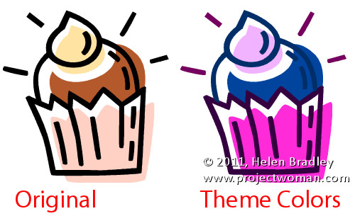
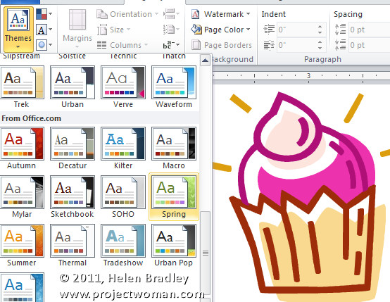
Much of the illustration Clip Art in the Microsoft Clip Organizer can be edited by changing its colors. By doing this you can not only recolor the art to match the look of your document but, if you use Theme colors then the art will change color when the Theme or Color scheme changes.

Now you won’t need information technology degrees to learn this – but maybe you’ll be so good at it, you just might consider graphic design college.

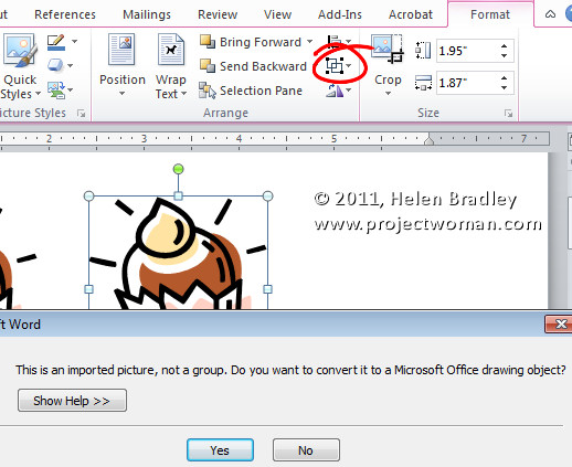
So, let’s see how the recoloring is done. First select the Clip Art and from the Picture Tools -> Format tab click the Group > Ungroup button. Answer Yes if you are prompted to convert the image to a Microsoft Office Drawing Object. In some applications  such as Publisher you’ll need to repeat the process and select Ungroup again.

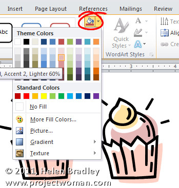
Now click on individual parts of the object and either remove them or recolor them by selecting a Shape Fill Color from the Drawing Tools > Format tab. If you use Theme colors then the colors will change later on when the theme changes.

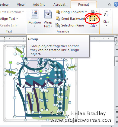
When you are done and you have recolored all the pieces you want to recolor, select all the pieces, right click and choose Group.

Change the document theme or Color Scheme to see the image change color to match the look of the theme.

Helen Bradley

Wednesday, June 22nd, 2011

Word – joining up short lines

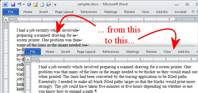
One of my readers – Joe – recently asked for some help regarding removing spaces in Word. He thought that the problem with the text was additional spaces, but when I looked into it, it appears that something else is causing the issue.

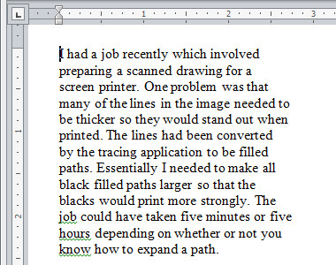
Here is a piece of sample text and you can see that it is a series of short lines which my reader wants to make into one continuous paragraph.

To see what is causing him issues click the Show/Hide¶ button on the Home tab of the Word Ribbon.

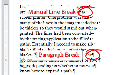
At the end of each line you will find either a Paragraph Marker or a Manual Line Break – each is different and you need to work out which you have at the end of each line. Also determine if there is a space before each of the markers. If there is not a space you will need to add it yourself. Here is a mix of both markers but no spaces:

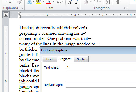
To make the lines flow into each other, from the Home tab on the Ribbon click the Replace option. If you need to replace Paragraph Markers, enter ^p into the Find What box. If you need to replace a Manual Line Break then enter ^l (lower case L) into the Find What box.

If you need to add a space, click in the Replace With box and press the Spacebar once – if you don’t need to add a space, then leave the Replace With box empty.

Click Find Next and then click Replace. Check to make sure the replacement is working as expected. If it is, click Replace All and lines will be joined together into a single paragraph of text.

Typically you only have to replace one type of marker and not both, but if you have both, then you will need to find and replace each individually.

When you’re done click Show/Hide¶ again to hide the extra characters from view.

Helen Bradley

Tuesday, June 14th, 2011

Help! My Excel Chart Columns are too Skinny

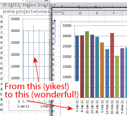
It’s probably happened to you, you’ve created an Excel chart and the columns are so narrow they are almost unreadable. The chart is ugly and it appears as if there’s nothing that you can do because nothing that should work does work.

The problem typically happens when you have a chart with an X axis that is has date data and where you aren’t plotting every day but, instead, for example, one day a week.

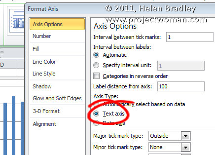
The solution is to click the X axis of the chart so that you have it selected, right click and choose Format Axis. From the Axis Options panel, select Text Axis. This turns your skinny bars into something a lot more attractive.

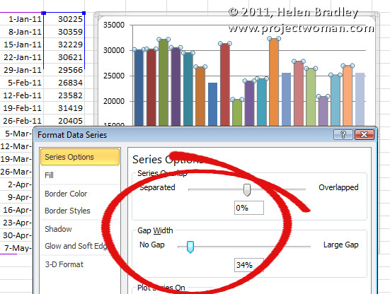
If the bars still not thick enough – and typically, for me, they aren’t – click on one bar to select the series, right click and choose Format Data Series. From the  Series options, decrease the Gap Width value to around 35 percent. This option won’t work unless you first set the X axis to a Text axis although you and I both wish it would!

Helen Bradley

Monday, June 13th, 2011

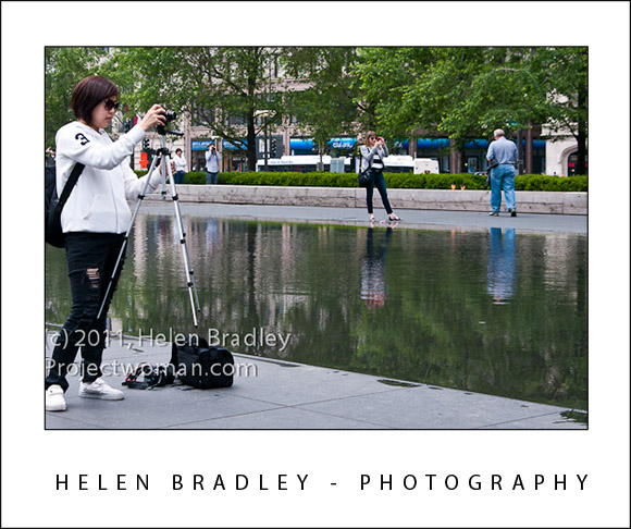
A tripod that works with you!


I want one of these tripods. No more bending down to look through the viewfinder because it never winds high enough. No more adjusting the camera to change from shooting landscape to portrait.

This tripod works with  you. It does just what you want it to when you want it. It’s on my list for Santa this year, for sure.

P.S. What the heck was this girl thinking? I never once saw the tripod touch the ground. It really was very funny to watch. Here she does another portrait orientation shot with it – notice how she’s rotated the camera to get the tripod in a more accommodating position.

Helen Bradley

Sunday, June 12th, 2011

Have Patience – it will be rewarded – guaranteed!

Something I’ve been thinking about lately is patience. The secret to this image isn’t the place although it was pretty cool or the weather – a hundred feet above the buildings are surrounded with grey fog. It isn’t my camera – it’s good but not great or my skills, anyone on Aperture priority sitting where I was would have got the same shot. No! the secret of this one is patience.

I spent about an hour shooting kids playing in 1 inch of water at this fountain. Waiting. Watching. Hoping for something to happen. I found a good location, got comfortable, and waited. I got a lot of good shots but when this kid opened the umbrella I knew I was onto something. I pressed the shutter and kept going – I didn’t stop when I thought I had the shot I just kept shooting. When I got home, the shots I thought were great were good.  This was the winner,this was the shot that keeps me going out every day… looking for magic.

Next time you’re out shooting – be patient. Find a good spot and wait until magic happens for you.

Helen Bradley

Saturday, June 11th, 2011

When is the art yours and when is it not?


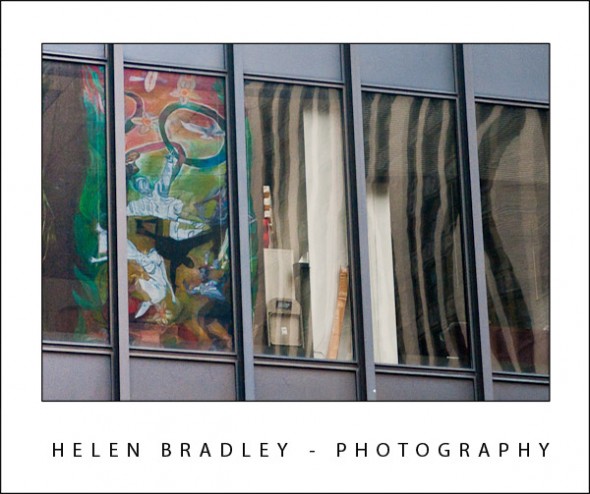
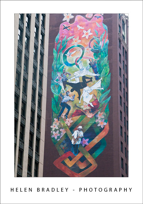
I’m not talking copyright here but rather, when is a photo about your vision and when it is just recording someone else’s. I think that when you take a photo of something someone else created it’s probably more about the recording process than that the result is truly art. Take this image below – it’s a piece of building art that I photographed but really, beyond placing myself in position to capture the image I didn’t contribute any of my vision to the result.

However, the image at the top of this post is something else indeed. Here the same piece of art appears but it looks very different. I had to find this image – it was a reflection in the windows of a building across the street. Here I made a creative choice about what I captured and what I left out, where the reflection appeared and how the result would look. I contributed my artist’s vision to the photograph.

Ask yourself next time you’re out photographing – are you recording someone else’s work or creating your own?

Helen Bradley

Friday, June 10th, 2011

Excel multi color column charts

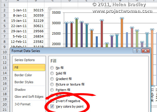
When you have a great big Excel column chart with heaps of delicious data but all in one series, it makes sense for the chart to be plotted in wonderful technicolor. However that’s an option Excel 2010 doesn’t make it very easy to find. If you try the Chart Tools > Design tab you can choose a multi-color chart but that only colors each series a different color so it won’t work when all your data is in one series.

The solution is to click on one column to select it then right click and choose Format Data Series > Fill group. Locate and check the Vary Colors by Point option and you’ll have a wonderful multi-colored series – much more enlightening than a plain old single color chart don’t you think?

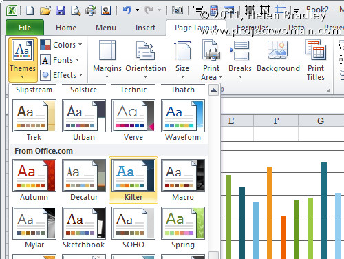
If the colors aren’t to your liking (you are getting just a little bit fussy but I do know exactly what you mean) select the Page Layout tab and check out the Themes – there’s sure to be one which will make your chart perfect.

Helen Bradley

Sunday, June 5th, 2011

Developer Tab in Excel 2010

Some things Microsoft does make no sense at all. For this read showing the Developer Tab in Excel 2010. Ok first of all why hide the damn thing. Second of all why change how it is displayed from Excel 2007 to 2010 – yep they did – and yep it makes NO sense to do so.

The Developer tab contains some sweet goodies like form tools which let you put a button on a worksheet to run a macro – but you won’t know you can do this till you show the Developer tab.

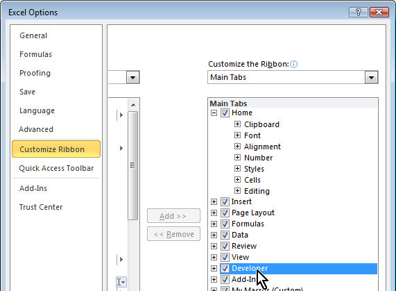
Ok… here’s how: Click the File button and click Customize Ribbon. In the left panel is the Developer toolbar but its checkbox is deselected. Click to check it and Voila! you now have a Developer tab.

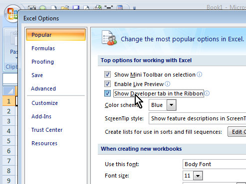
In Excel 2007, skip; the fuss – there is no Customize option and the option to display the Developer toolbar is in the first panel you see in the Excel Options dialog.

Helen Bradley

Sunday, June 5th, 2011

Install and use the Droste Filter in Photoshop CS4, CS5 & CS5.5

I an earlier blog post I introduced Pixel Bender a new extension for Photoshop CS4 and CS5 from Adobe Labs. In this month’s tutorial I’ll show you a great filter which lets you create a Droste effect with an image. The filter is free to download and once it is installed you can apply it from inside Pixel Bender. It was created by Tom Beddard who is author of a lot of really wonderful filters – you can see more of them here: http://www.adobe.com/cfusion/exchange/index.cfm?event=authorExtensions&authorid=14858639

The Droste effect is an image effect named after a Dutch cocoa company called Droste. In 1904 it produced packaging for its cocoa product showing a woman carrying a tray with a box of cocoa and a cup on it. A small version of the package appeared on the cocoa box on the tray and so on – each version of the image being successively smaller than the last.

To create the Droste effect you must first have Pixel Bender installed so, if you don’t, visit my earlier post to learn where to find it and how to install it. Then, you’ll need to download the Droste filter from: http://tinyurl.com/pbdroste.
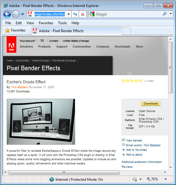
Unzip the folder and copy the .pbk file to your Program Files\Adobe\Adobe Photoshop CS5\Pixel Bender Files folder. Restart Photoshop and the Droste filter will be in place.
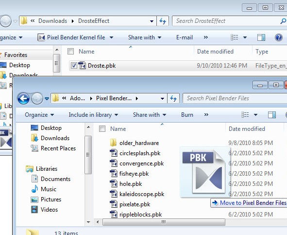
 

Start with an image that is square with some element of interest centered in the middle of the image. I chose a flower against a neutral background – start with something simple as you learn how the filter works – then plan to use a more complicated image later on.

Make a note of the size of the image by choosing Image > Image Size and write down the image width and height.

There is a physical limit to the file size of images you can use with Pixel Bender which is 4096 x 4096 so make sure your image is smaller than this. Even smaller images render faster.

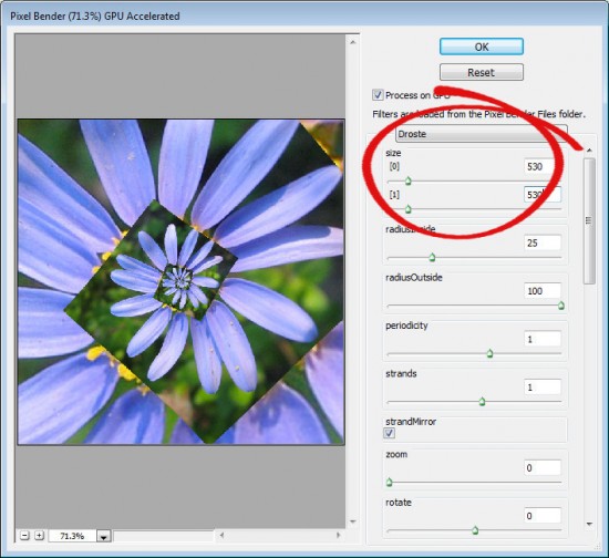
To run the filter, choose Filter > Pixel Bender > Pixel Bender Gallery and select Droste from the dropdown list. If you have used the filter previously, hold Alt (Option on the Mac) and click on the Reset button to reset the filter settings.

Set the Size [0] and Size [1] sliders to match the width and height of your image – my image is 530 x 530 pixels.

By default, you should see a typical Droste file image with straight edges.
 

To turn the straight edges into a curved spiral, deselect the TransparentInside checkbox.
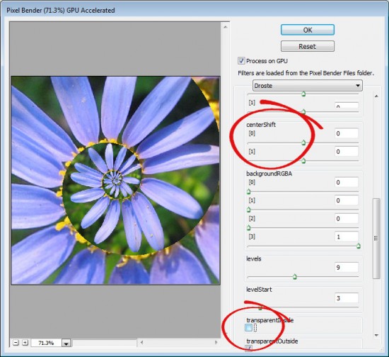
If the image is off center, the spiral will look askew at this point. To change the center point of the image and align it with the center of the spiral, adjust the centerShift [0] and [1] sliders – each of these operates in a different dimension. Adjust the center of the image until the spiral looks correct.

To adjust the center of the image itself, use the Center [0] and [1] sliders.

If you do not have an image spiral that completely fills the image area you will see some black background color outside the spiral. You can control the color used for this background by setting the BackgroundRGBA values. The [0] setting controls the Red value, [1] controls Green, [2] controls Blue and [3] controls the opacity of the background. The default is that all sliders are set to 0 and the Opacity slider to 1 which gives the black color. You can view the current background by setting Levels to 2 and the LevelsStart value to 1. Then create your own background color and, when you’re done, increase the Levels value to back up again to around 7.
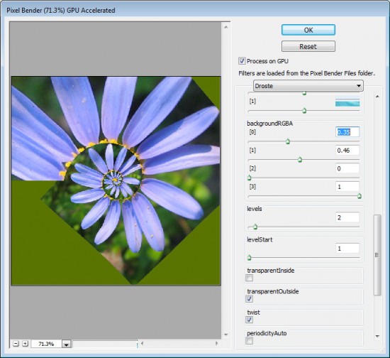
To make the spiral tighter or looser, adjust the RadiusInside value. Set it to a very small value to get a small number of loops and to something like 50 to get one with lots of loops. The default setting is 25.

Decreasing the OutsideRadius twists the spiral more tightly. The default value of 100 makes the spiral looser.

Periodicity is the number of times the image repeats in each loop of the spiral. If you set this to 2 the image will be repeated twice per spiral – the Default value is 1.
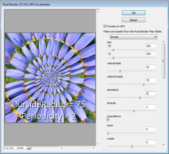
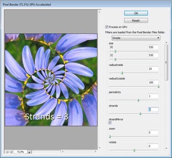
The Strands value sets the number of loops in the spiral. If you set this to 2 you will have two interlocking spirals and if you set it to three you’ll get three strands/spirals  and so on.
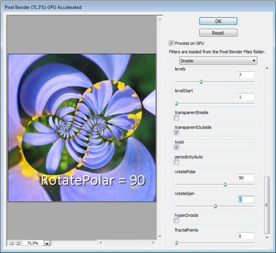
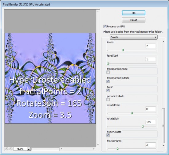
Other interesting effects include using the RotatePolar value. By setting it to, 90 as shown here you will get different spiral loops on the screen. Having done this, you can then select RotateSpin to adjust the effect.
If you enable HyperDroste then adjust the FractalPoints value, you will create an image that is reminiscent of a fractal style image.

If desired adjust the Zoom value to zoom into the design.
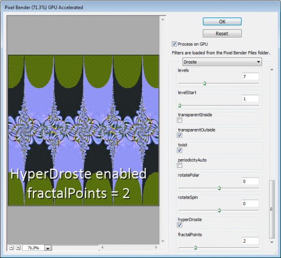
Use RotateSpin and RotatePolar with FractalPoints and HyperDroste to fine tune the effect.

When you have a design you like, click Ok button to apply the Droste effect to your image.

Once you know how the controls in the Droste filter work you’re ready to apply it to a more complex image.

To get best results, start with a square image with something of interest in the center and make sure to set the image dimensions in the filter before working with the other sliders.
 

Helen Bradley