Wednesday, October 30th, 2013

Paint Text Formats in Google Docs

You’ll often discover that copy-pasted text from other parts of the web does not match the font styling of your document.

For example, you may copy a quote from an article and find it in 10 pt and a different font or color. Google Doc’s new paint format tool solves this problem by letting you instantly match foreign text’s style to your own by copying the formatting from one set of text to another.

To use it, select any of the text from your own document and select the paint roller icon from the left side of the toolbar. The selected text’s styling will be saved in the paint tool, and the next body of text you select will have the styling “pasted” onto it such that the foreign text now matches your own. So, with the template text and paint tool selected, select the text with incorrect styling and it will be fixed instantly.

Helen Bradley

Tuesday, October 29th, 2013

Controlling Depth of Field in your Photographs

Learn what depth of field is and how your camera settings affect it

Some subjects need to be fully in focus to be shown at their best and others need dreamy out of focus backgrounds to create the right setting. The feature that is key in both situations is called depth of field – it gives you both that ‘everything in focus’ look and it also gives you soft out of focus look. Depending on what you are photographing getting the depth of field right is often the difference between a snapshot and great image.

I’ll explain what depth of field is and how to control it with your camera settings.

What is depth of field?

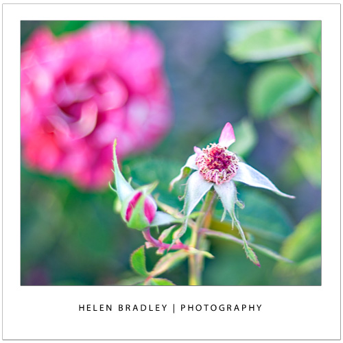
At its simplest, depth of field is the zone of sharp focus in front of, around and behind the subject in your photo when you are focused on that subject. When you have a shallow depth of field, only a small area around the subject will be in focus and quite often only a small part of the subject will be in focus. Everything else in the image will be out of focus with things further away from the subject, either in front of or behind the subject, being more out of focus the further away they are. This image has a shallow depth of field – it’s a great way to shoot flowers:
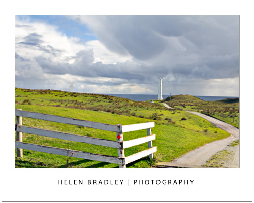
When the depth of field is deep, nearly everything in the shot is in focus. You control the depth of field in your images by adjusting the camera’s settings for aperture, adjusting the focal length of the lens and the distance you are from the subject. This image has a deep depth of field – that’s important as we want to see everything in this scene from the grass in front of us to the horizon miles and miles away.
Let’s look at each of these in turn.

Control depth of field with aperture

One way that you can control the depth of field in an image is to change the aperture that you are using. For this, you will need to have your camera set to Aperture Priority or Manual mode. Selecting an aperture that is very large, such as f/1.4 to f/2.8 will give you a shallower depth of field around your subject. The aperture used for this image was a huge f1.4 so only a small portion of it is in focus:


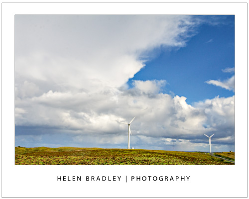
If you shoot with a small aperture, such as f/9 to f/11 or more you will find that more of the image will be in focus, which gives you a deeper depth of field. If everything else stays the same, the difference in the aperture setting you use can result in a very different image. The aperture used here was a small f11:
One benefit of shooting with a large aperture, such as f/1.4 to f/2.8, is that a lot of light is getting into the camera so you can use a fast shutter speed. Conversely, a down side of shooting with a small aperture such as f/9 to f/11 or more is that less light gets into the camera so you will need to use a slower shutter speed  or a higher ISO value. In some cases you will be shooting with such a slow shutter speed that you will need to use a tripod.

Control depth of field with focal length

The focal length of your lens can also have an impact on the depth of field when you use this to make a subject bigger. So, if you are shooting with a 50 mm lens, you will get a much deeper apparent depth of field than you would if you were capturing an image with a 200 mm lens at the same aperture and if, in both situations the subject size is the same. The depth of field is actually not significantly different but it looks different because there is more background in an image when you capture it with a 50mm lens than you will get when you capture it with a 200 mm lens. So a rough rule of thumb is that the more zoomed into the subject that you are, the shallower the depth of field will appear to be. This giraffe was shot at f5.6 which isn’t a particularly large aperture but it was shot at 300mm zoom so the giraffe is quite sharp and the background is nicely out of focus:


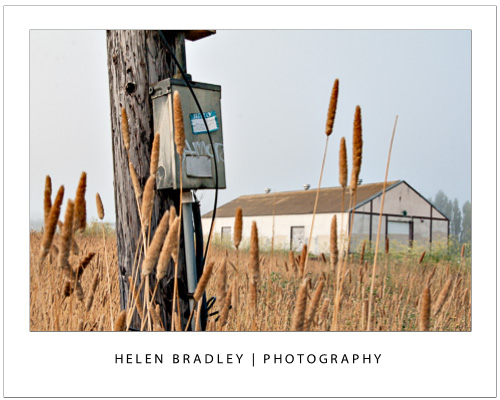
If you are shooting landscapes you will get best results when you use a short lens such as a 28 mm lens as the image will appear to have a much deeper depth of field. On the other hand, a zoom lens can be a good lens to use when shooting portraits because the further you’re zoomed in to the subject the less background will be in the image and the shallower depth of field you will appear to have. This image was shot at f11 with a 28mm lens so everything from the lamp post to the building is in focus:
Control depth of field by varying the distance from your subject

The distance between the subject and the camera is another way that you can impact depth of field. So, for example, if you photograph a subject close up, such as in the region of up to 10 feet away, then the depth of field will be much shallower and more of the image behind the subject and a little in front of the subject will be out of focus. On the other hand, if you move the subject further away from you so that the subject is 20 feet away then the depth of field will be much deeper and there will be a lot more of the image in front and behind the subject in focus. This image was shot with a 200mm lens – the singer was relatively close to the camera  and the background was some distance behind him so the musician is in focus and the background nicely out of focus:

Whenever you’re considering depth of field, you should also note that, when the subject is in focus, the amount of the image that is in focus behind the subject will be greater than the amount of the image that is in focus in front of the subject. The ratio is approximately one-third to two-thirds, so the depth of field will extend roughly one-third in front of the subject and two-thirds behind the subject.

Helen Bradley

Sunday, October 27th, 2013

Create an Archive of Your Entire Google Account

If you rely on many of Google’s products, you may have stored a lot of important data on your account.

Even though Google’s servers are very reliable, it’s still a good idea to backup your critical documents, photos, messages, etc. Fortunately, Google provides a service called Google Takeout which provides a quick and easy way to backup everything on your Google account, even your Google+ circles and pages. The service can be found under your account settings, labeled download your data. You can also find it at this link.

At the Takeout page you’ll find a full list of what is being archived. You can uncheck anything you don’t need to save. If you click on a category, a list of settings will appear for that category. Sometimes no changes can be made, but some categories allow you to change their archive’s file format. Others allow you to filter what you want to save, so that only specific data—such as a certain folder in your documents library—will be archived.

Once you have selected your desired settings, click “Create Archive.” If your account includes a lot of data, it may take a while to finish generating the archive. You can leave the page, however, and Google will email you when the archive is ready for download so you don’t have to wait around for it. To finish the process simply follow the provided download link to download your Google profile archive.

Helen Bradley

Thursday, October 24th, 2013

Help! My Photoshop Color Picker looks weird

How to get the color picker to look the way you want it to look

or How to fix the Color Picker when it looks all funky

Sometimes when you open the color picker in Photoshop it looks one way and other times it looks a different way. It might even seem like there is  no rhyme or reason to how it looks and that it changes without (what it may seem like) no input from you.

Of course, nothing could be further from the truth but knowing that won’t solve the problem of why it changes and how to change it back!

To change it, don’t go looking under Preferences for all the Color Picker choices. While some preferences can be found in the Preference area the secret changes are made inside the Color Picker itself.

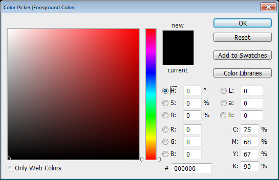
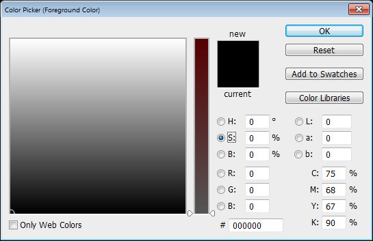
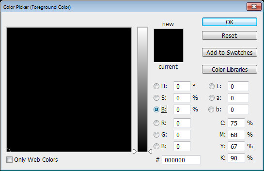
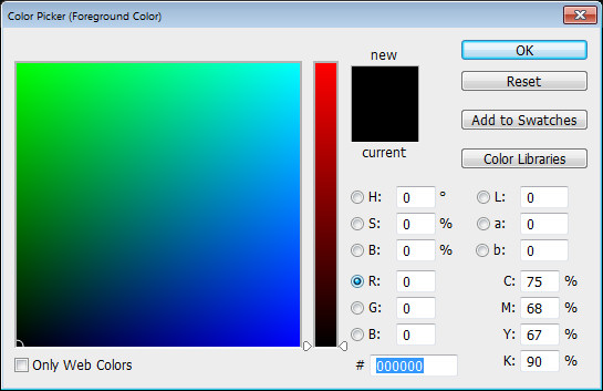
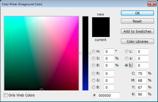
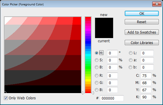
To see them at work, click to open the Color Picker. What you see here depends on what is clicked in the right of the dialog (when you realize this everything becomes blindingly obvious).

Click H for Hue to see this:

And S for Saturation to see this:

And B for Brightness to see this:

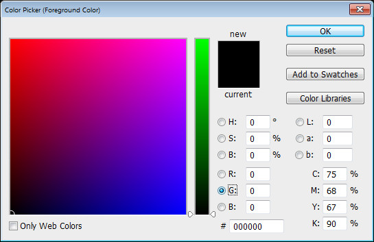
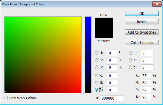
Each of R, G and B make the picker look different:


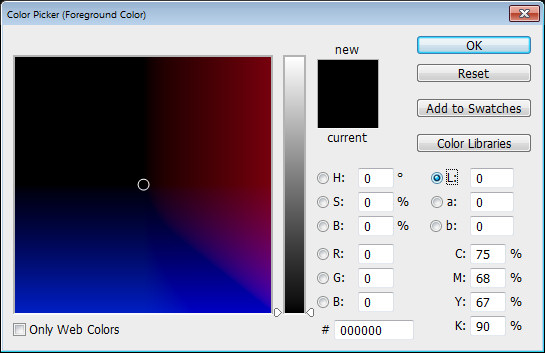
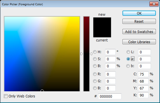
As does choosing L or a or b:

And each looks different if you have the Only Web Colors dialog checked:

Now you know what affects how the Color Picker looks you can choose the one that makes the most sense to you.

Helen Bradley

Sunday, October 20th, 2013

Hanging Indents in Google Docs

If you’re writing a paper with a bibliography or works cited page in Google Docs, you may be frustrated to find there’s no formatting button for hanging indents.

You can create these manually, however, using Doc’s ruler tool. If the ruler is not already visible, select View > Show Ruler. It will appear across the top of your document.

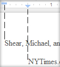
To create your hanging indent, first select the text you wish to add the indent to. Notice two small blue shapes on the left side of the ruler, a triangle and rectangle.

The rectangle represents your left margin, the triangle your indent. There is also a grey section of the ruler that shows you the standard 1 inch margin. Move the triangle to 1/2 inch right of the left margin. Keep in mind that while a 1/2 inch indent is standard, you should adjust this if a different sized indent is required. Now pull the rectangle back to the original left margin. You should see your text move with these shapes such that the text’s margin aligns to the rectangle and the hanging indent aligns with the triangle.Keep in mind that just like any other formatting choice, this indent will only be applied to text you’ve selected or text written following the change.

Helen Bradley

Thursday, October 17th, 2013

6 Sites for free Illustrator Gradient Swatches


Free Downloadable Illustrator Gradient Swatches for you to try

While Illustrator comes shipped with a range of gradient swatches you will probably find that there are never enough gradients for your needs. Luckily there are a few good quality freely downloadable gradient swatch sets that you can use to expand your Illustrator toolkit.

While there are a lot of gradient swatches you can download for Photoshop there are not a lot of free options for Illustrator. I’ve scoured the web to find you this collection – they all download and install correctly and they aren’t from spammy sites (some others not included here are from spurious sites – so beware!).

1. Opengraphicdesign.com

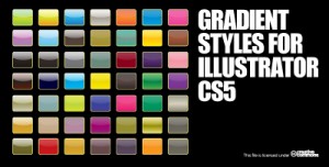
This selection of 48 vector gradients makes a good starter pack. There are some handy black and light colored gradients as well as a lot of green and blue ones too. If you’re looking for a simple collection of gradients to start off with this a good choice.


2. Metallic gradients from Deviant Art

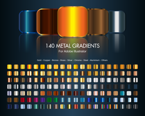
Deviant Art is always a great place to find handy downloadable things. Here we’ve located 140 metal gradients for Illustrator. There are a range of gold, metal gradients as well as copper, bronze, brass, silver, chrome, steel, aluminum and other metallic looks. This is a good starter collection of metallic gradients.


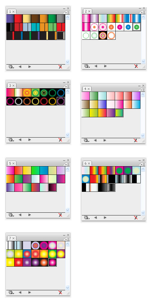
3. Gradients one to seven

This group of gradients in files called (somewhat unimaginatively) 1.ai to 7.ai is a selection of handy gradients. While it would be nicer if these gradients were all in one pack that’s not the case so you may want to grab the lot and perhaps assemble them into a single swatch file of your own.


4. VectorPortal gradients 

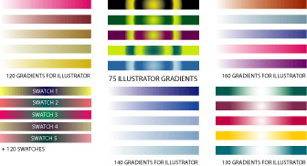
4. At Vectorportal.com you’ll find a series of six gradient packs totalling over 700 gradients. The images for these packs look a little on the small side but don’t let this fool you – each pack ranges in size from 75 – 160 gradients per pack. All six can be downloaded from this site.


5. Web and button style gradients from Faisaljasnak

From Faisaljasnak comes this set of gradients for Illustrator. These gradients range from subtle color shifts to gradients suitable for buttons and other web elements.


6. Adobe Exchange hosted gradients

This next group of downloadable gradients is accessible from Adobe’s own Exchange website.

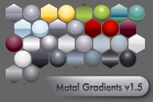
The first in this round up is  Metal Gradients V1.5 .


This second lot is a small set of 3 metallic gradients:


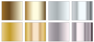
This final set is of another 8 handy metallic gradients:

Once you’ve downloaded your swatches visit this post for instructions as to how to install and use the swatches in Illustrator.

Helen Bradley

Wednesday, October 16th, 2013

A Comment on Comments

Sometimes you’ll want to add a comment to a piece of text but not so that it actually appears in the text.

For example you may want to ask someone else who is working on the document with you a question about something mentioned in the text or you may want to remind yourself to check the source of a quote you have used. The best choice for this task is Word’s Comment option. Select the text to attach the comment to and select Review > New Comment. A comment box will open to the side of the document with your initials and a comment number in brackets (eg [HB1]).

If your initials or name are incorrect, alter them by selecting File > Options > General and changing the Username and Initials text boxes.

If you’re viewing a document which contains a number of comments you can move from one to the next quickly by using the Previous and Next. Use the Delete Comment button to delete a comment, leaving the text it’s attached to intact – right clicking a comment and selecting Delete Comment works the same way. You can edit the text in a comment simply by selecting the comment and typing.

You can choose to print with or without comments by selecting the print range dropdown menu under print settings and checking or unchecking Print Markup.

Using comments is particularly useful when you’re working on a document with someone else as they effectively allow you to ‘carry on a conversation’ about the document.

Helen Bradley

Sunday, October 13th, 2013

Use OpenType to Beautify Fonts in Word 2010 & 2013


Using OpenType, you can add caps, ligatures, and other styles to your fonts to beautify your text.

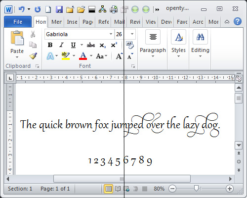
To get started with OpenType in Microsoft Word 2010, and in particular if you have the font Gabriola installed, type some text using the font Gabriola. Include some numbers because Gabriola has a particularly attractive range of numbers.

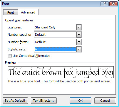
With the text selected from the Font group click the dialog launcher to open the Font dialog and select the Advanced tab.


From the Ligatures dropdown list, select Standard Only and from the Stylistic Sets dropdown list select style 6 and click Ok to apply it to the text. You will see that the text changes to show some attractive swashes on some letters. If you change to a different Stylistic Set you will see that some characters may change. You may need to increase the line spacing to see the full swashes appear.

This OpenType font feature only works for fonts that actually have these characters in them, which include Gabriola, Calibri, Cambria, Constantia, Corbel, Consolas and Palatino Linotype. You must also be working on a .docx format document and not in compatibility mode in Word. If you don’t have access to these font features, choose File -> Options -> Advanced and scroll to the bottom of the screen and click Layout Options. Ensure that the Disable OpenType Font Formatting Features checkbox is disabled.

In Word, if you set the typeface to Gabriola and then start typing you’ll notice that as you type, the characters may change because the position of the characters in relation to other characters around them has an effect on how individual characters are drawn.

Helen Bradley
Saturday, October 12th, 2013

Reinstate a RAW or DNG image in Camera Raw


Remove all the edits you’ve made to a raw or dng image in Adobe Camera Raw

No doubt you’ve encountered the situation where you have a raw file or a dng that you’ve worked on in Adobe Camera Raw or Lightroom and you one day look at it and think – “what was I thinking?”

You decide you want immediately to remove all the changes you’ve made to the image. Easy? Not really!

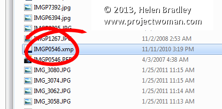
If you’re working with a raw image then you can locate the image on disk and alongside it will be its sidecar xmp. Shall I say that again, because to the uninitiated ‘sidecar xmp’ just sounds so cool doesn’t it. What it is is an .xmp file with the same name as the raw file and it contains the edits you made to your image. The sidecar xmp file is used because you cannot write data to a camera raw file so the edits have to go somewhere. They go in this little xmp file as a set of text entries – delete the file and you remove the edits, permanently – in fact just remove the xmp file to another folder where ACR can’t find it and you’re done.

In Lightroom you can wind back edits to an image from the Develop module in the History panel on the left of the screen. Open the panel and select the bottom-most entry to wind back the changes you made to the image.

Unfortunately this won’t work if you made changes in a program that wrote an .xmp file and it won’t work if the changes were made to a dng file, written to that file and then the file was imported into Lightroom.

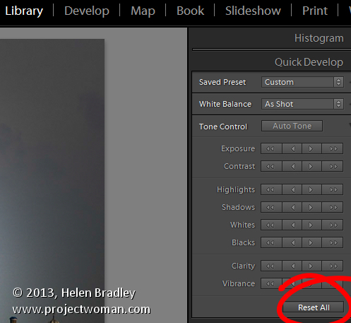
In that case, go to the Library panel and open Quick Develop and click Reset All – that removes all the edits.

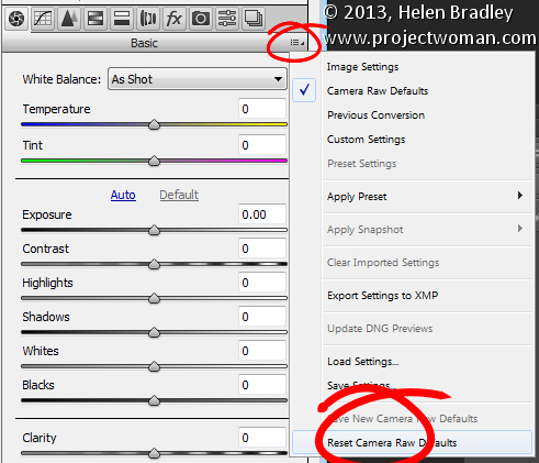
In ACR, go to the small menu in the top right of the edit pane and choose Reset Camera Raw Defaults. This removes the edits and returns the image to its out of camera state (see image at the top of this post)

This is also very handy for teachers who teach using a set of images – if you need to start over editing an image with a new class, this option will help you start over with a clean image.


Helen Bradley

Thursday, October 10th, 2013

Lightroom Tip – Adjusting White Balance

Adjusting your White Balance in Lightroom

Lightroom has a set of tools that you can use to adjust white balance in your images. To see these at work open an image in the Develop module. At the top of your Basic panel are the white balance adjustment tools.

White Balance Options

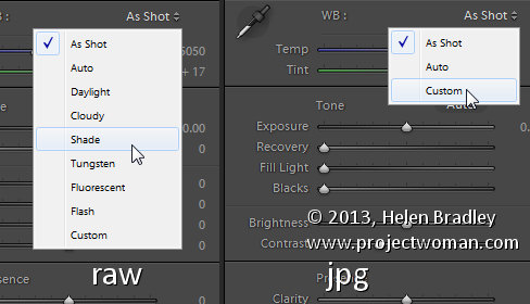
The dropdown list will show you some options for adjusting white balance – what is shown here will vary depending on how your images are captured. If you capture in raw then the white balance dropdown list will contain the same options as you have on your camera for setting white balance. If you’re capturing jpg images then there are fewer options – As Shot, Auto and Custom.

On the left are the options for a raw image and on the right those for a jpeg image.

The Temperature and Tint sliders also have different units of measure depending on whether you’re working with jpgs or raw images. For jpg images both the sliders range from +100 to -100. If you’re working on a raw image then the Temperature slider shows degrees Kelvin from 2000 – 50,000 and the Tint slider ranges between + 150 and – 150.

Kelvin is a measurement of the color of light – daylight is around 5,500 degrees Kelvin. Lights we consider to be warm or pink/orange in color including tungsten globes are around 3,000 degrees Kelvin and cool lights which are blue in color such as overcast daylight are around 7,000 degrees Kelvin and higher.

Adjust White Balance

To adjust the white balance in the selected image you can select an option from the White Balance dropdown list to use to fix the image or you can use it as a starting point and then fine tune the result.

You can also manually adjust the Temp slider to add warmth or remove it from the image. Drag the sider to the left to add a blue tint to the image (to cool it down), or to the right to add a yellow tint to it to warm the image.

Use the Tint slider to balance out any excess magenta or green in the image. Drag towards the right to add magenta to the image cancelling out any green tint and drag to the left to add a green tint cancelling out any unwanted magenta.

White Balance Selector

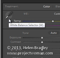
You can also use the White Balance Selector to adjust white balance. You can select the tool by clicking on it or press W.

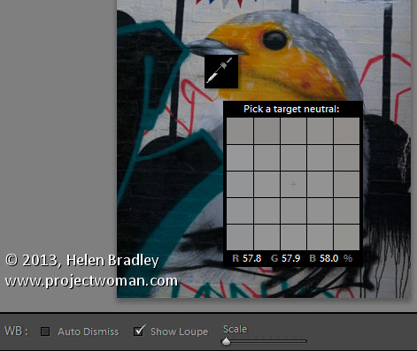
From the White Balance toolbar under the image you can select options that make the White Balance tool easier to use. I suggest you deselect Auto Dismiss as you can then click on the image in various places to attempt to fix it. If you have Auto Dismiss enabled you’ll only be able to click once before the selector is dismissed so, if that fix isn’t perfect then you’ll need to select the tool again to attempt another fix. This is a cumbersome way to work so I prefer to disable Auto Dismiss and put the tool away only when I am done with it.

If you click the Show Loupe checkbox then you’ll see a 5 by 5 pixel grid beside the mouse cursor. The center point in the grid is the pixel that you are currently targeting and which will be used to adjust the image if you click. This grid makes it easier for you to pick the correct point in the image to adjust to. The scale itself can be increased or decreased using the Scale option on the toolbar.

At the bottom of the loupe itself are the RGB percentage values of the pixel under the cursor. These values tell you if the pixel is neutral or not. If it is neutral then the percentages of R, G and B will all be equal – if they are not equal then there is color in that pixel.

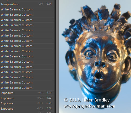
To balance the image using the White Balance selector, click on a pixel that should be neutral grey – not white or black. When you do so, Lightroom will adjust the image so that the selected pixel is a neutral grey and, as a result, all the color in the image will change. At the same time Lightroom adds an entry to the image History for that adjustment. This means that you can wind back the history to return to an earlier white balance fix, if desired.

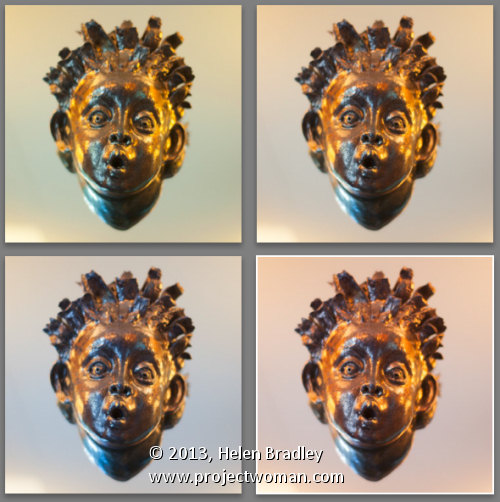
You should be aware that adjusting image white balance is to an extent a subjective assessment – so there is no one value that is “correct”. There are, instead, a myriad of different results that can be achieved so look for one that is it pleasing to you. In most cases viewers prefer to see some warmth in photos as they are more pleasing to the eye if they are warmer rather than cool.

I find that a good approach to take is to experiment with the white balance selector to see the effect on the image by selecting different pixels to adjust to. Then choose the most aesthetically pleasing result.

Helen Bradley
Page 1 of 212