Tuesday, November 24th, 2009

Word 2007: Make your own Click and Type controls

Word 2007’s new Content Controls let you do some pretty snazzy things in your Word documents.

You will have worked with Word’s own controls when you add a cover page or header and footer using the Insert tab options in Word 2007. In this case you may have noticed that, if your document already has a title configured in the document properties, the title appears automatically on the cover page and in the header.

Alternatively, if it doesn’t have a title, when you double click the Title area and type one, any other object in the document that includes a title will be updated automatically. This behavior occurs because the document information is inserted using content containers which are linked to the document properties.

You can take advantage of this behavior in your own designs and you can create and use unlinked content containers to prompt for details to be inserted in your own documents.

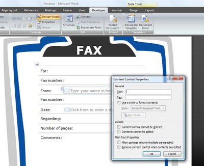
To see how content containers work you’ll need to display the Developer tab which you can do by selecting the Office button, click Word Options and from the Popular category choose the Show Developer tab in the Ribbon option.

Click the Developer tab and, in the Controls area you’ll find entries for the Building Block Gallery and for elements such as a Date Picker and a Text Box which you can use in your documents.

So, for example, to prompt a user to insert an entry from the Quick Part Gallery, click where you want the Quick Part Gallery entry to appear. Click the Developer tab and click the Design Mode button so you are in design mode.

Now click the Building Block Gallery button. This inserts a small content container with the words [Choose a building block] as the prompt. Exit Design Mode by clicking Design Mode button once again and you will see that the document contains a clickable link in this position prompting the user to choose a building block.

In practice, all the user needs to do is to click on the Choose a building block link to show the dropdown list and they can then select the building block to insert at this position in the document.

You can also provide a link that the user clicks on to type custom text. To do this, check you’re in Design Mode and select the Text button from the Controls group. Between the markers type the text describing the content to be inserted in this position.

To test this, deselect Design Mode and click the element to see it highlighted and type the text prompted for. The text you type appears in line with regular text in the document and can be formatted by right clicking on the text and apply a format to it.

Note, however, that the entire content control is formatted at the one time and individual letters and words cannot be formatted independently of the others.

Helen Bradley

Saturday, November 21st, 2009

Barcelona – Day Three


Today I headed to Park Guell to see some of the magnificent mosaic work there. I hadn’t thought that the curved mosaic seats would be anywhere near as big as they were and likewise I thought the lizard would be huge and he’s very small. Funny how photos never quite prepare you for the real thing.

I shopped at a market, took three busses and the metro a few times and walked around 10 miles in all. I am so bummed to be leaving here tomorrow. The hotel Casa Camper is fantastic, the city is both quirky and colourful and I’ve loved it more than I had expected. It’s also a city brimming with things to do and I could have spent a week or more quite easily.

Tomorrow it is back to London and on to Cardiff to Dr Who and Torchwood territory – look out for photos from Cardiff Bay and the Millenium Center.

Here is the link to today’s photos.

Helen Bradley

Thursday, November 19th, 2009

Barcelona – Day Two

Taking a bit of a break from Gaudi architecture (not a total break, just a bit of one), I headed to the older parts of Barcelona today to walk and enjoy the activity on the streets. Today’s images are an eccletic bunch – more graffiti, statues, houses and stuff that took my fancy.

Click here to see them.

Helen Bradley

Thursday, November 19th, 2009

PowerPoint Placeholders

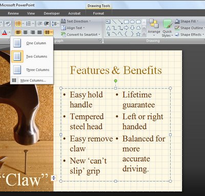
One of the long awaited features of PowerPoint 2007 is its ability to format a two column placeholder for a slide.

This lets you place multiple columns of text inside a single text placeholder.

To do this you will need to be working in Normal mode so choose View > Normal.

Click the text placeholder that contains the text that you want to display in multiple columns and from the Home tab click the Columns button in the Paragraphs group.

Select the number of columns to split the text into and it will be automatically adjusted to suit.

Simple when you know how?

Helen Bradley

Wednesday, November 18th, 2009

Barcelona – Day One


Today is my first day in Barcelona and I’ve have had my jaw dropped all day today. I imagined the buildings here would be wonderful but they exceeded even my estimation.

In the interests of showing a lot of photos and not bogging down the blog I have created a slideshow and linked them here.

Since I’ve got the system up and running, I’m hoping this will make slideshows easier to create in future – thanks Lightroom for making this a fairly transparent exercise.

Helen Bradley

Sunday, November 15th, 2009

Showcase your photos

This fun Photoshop technique lets you showcase your photos on a computer screen or billboard and it uses the vanishing point filter to distort and crop the image.

The Vanishing Point Filter was first introduced with Photoshop CS2 so you will need Photoshop CS2 or later for this project.

Step 1
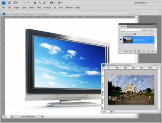
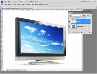
Open an image of a computer screen (or a billboard) in Photoshop and open the image you want to place on it.

The Sacré Coeur image is mine and the computer screen is © iStockPhoto, Dmitry Kutlayev.

Size the image to place on the computer screen to the approximate size the image needs to be having regard to the size of the computer screen image. The computer screen I used is 1600 x 1200 so I sized my photo smaller than this.

Step 2
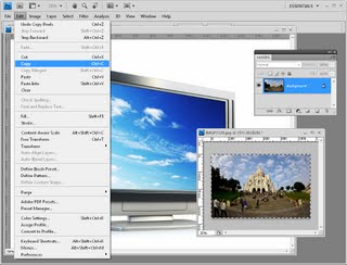
Create a new blank layer on the computer screen image (Layer > New > Layer) and then switch to the image you want to add to the screen or billboard. Choose Select > All and then Edit > Copy. Return to the computer screen image.

Step 3
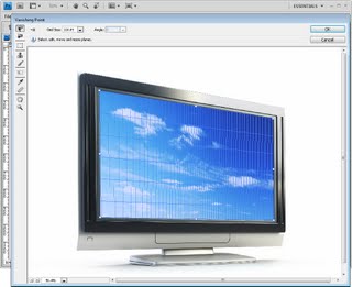
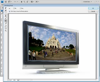
Choose Filter > Vanishing Point and click Ok. This opens the image in the vanishing point filter.

Step 4
Here you can create the perspective grid for the image. To do this, click the Create Plane tool and click at all four corners of the area that you want to paste the photograph into.

If the grid is red, it is not a grid that can be used so you need to readjust the corners until it turns blue. You can adjust the grid size if that makes it easier to see.

Step 5
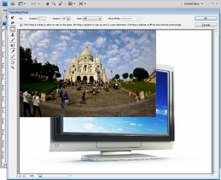
Once the grid is in place, press Ctrl + V to paste the image from the clipboard into the filter.

Step 6
Click the Transform tool and size the image to approximately the size it needs to be.

Drag the image over the grid and you will notice that it reshapes to conform to the perspective of the grid.

Step 7
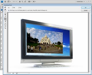
Size the image so it fits in the area covered by the grid. Any portion of the image that extends beyond the grid is automatically hidden.

Step 8
When you are done, click Ok to return to Photoshop. Your image should be neatly aligned inside the screen.

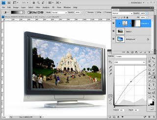
To finish, you can add a curves adjustment layer that lightens the image to match the screen lightness. You can also add a gradient to the curves layer mask to adjust the lightening of the image to match the original screen lights and darks.

Step 9
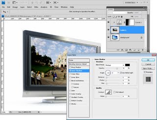
I also added a shadow to the layer by selecting the layer and select the Add a Layer Style button at the foot of the layer palette. Select Inner Shadow and create an inner shadow for the image so it appears more realistically situated on the screen.

Using a similar technique, you can place a photo on an image of a billboard or any other similar flat but angled surface.

.

Helen Bradley

Sunday, November 8th, 2009

Five secrets of the Photoshop crop tool

If you’re used to clicking the crop tool dragging the tool over your image and pressing Enter, it may surprise you to know that there are other options that you can use when cropping in Photoshop.

Here are my five “best-kept secrets” of the Photoshop crop tool.

1 Rotate as you crop

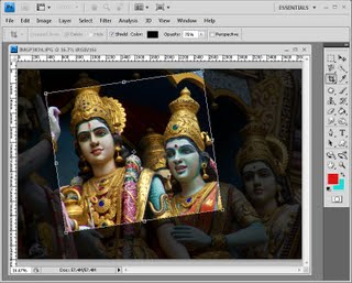
When you drag the crop marquee over an image, you can rotate it by letting go the mouse button and drag on one of the corners of the marquee to rotate it. When you double click you will rotate and crop the image at the one time.

2 Perspective crop
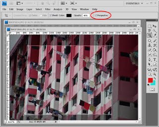
You can fix perspective at the same time as cropping by first dragging a crop marquee over the image. Let go the mouse button and click the Perspective checkbox on the toolbar. Now when you drag on a corner of the marquee the corners move independently of each other allowing you to position the marquee along the lines you want to crop to in the image. When you crop the image it is cropped and distorted to create a rectangular image. You can use this to fix distorted perspective in your images.

3 The crop that’s not a crop
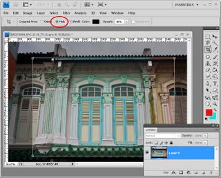
Once you have selected an area to crop, you do not actually have to crop it, and you can, instead, simply hide the cropped area rather than permanently deleting it.

To do this, you need to be working on an image layer and not the background layer so double-click the background layer and convert it to a regular layer. Drag a crop rectangle over the image and from the tool options bar, select the Hide option. When you double click the cropped area will be hidden but still accessible.
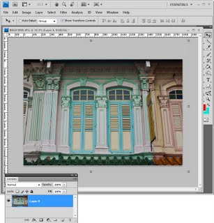
You can now select the Move tool and reposition the image inside the area that you have cropped it to. This is useful when you want to crop an image to 4 x 6 in size and you want to experiment with different ways to compose the image within this area.

4 Create and use crop presets
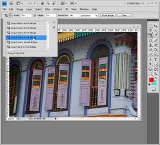
When you click the Crop tool you can choose from various presets by clicking the dropdown list to the immediate right of the tool in the tool options bar. Click a preset and drag on the image to create the crop marquee. You can turn a portrait crop to a landscape one (or vice versa) by selecting the preset, drag over the image and then rotate the marquee ninety degrees by holding the Shift key as you do so to constrain the rotation to multiples of 15 degrees.

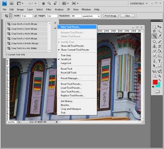
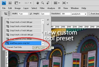
To create your own preset, set the width, height and resolution in the tool options bar and then click the fly-out menu for the crop tool and select New Tool Preset. Give your preset a name and click Ok. It will appear at the foot of the presets list and you can select and use it anytime in the future.


5 Crop to the same size
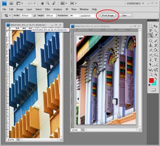
To crop two images to the same size, select the Crop tool and make active the image you want to match the size of. Click the Front Image button on the tool options bar to configure the Crop tool with the dimensions of the front image.

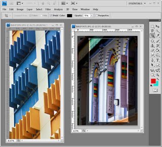
Select the image you want to crop and drag a crop rectangle over that image. When you double-click to finish, the image will be cropped to the same size and resolution as the original image – in some situations this may mean that the image will have increased in size.

Warning:
If the Crop tool isn’t working as expected, press Esc to exit the tool and click the Clear button to reset it – some settings are sticky and you may not remember you had set it to special crop settings earlier in an editing session.

Next time you go to crop an image, remember that there are more options for the crop tool than may initially meet the eye.

Helen Bradley

Thursday, November 5th, 2009

Excel 2007- In Cell Dropdown List


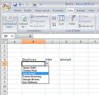
When you need to enter data from a small subset of entries into a range in Excel 2007 you can do it more easily using a custom designed dropdown list.

To configure a dropdown list in a cell type the list of items to use in a single column in a spare sheet in the workbook.

Select these cells and choose the Formulas tab Define Name, type DataForList as the name in the dialog, set the scope to Workbook and click Ok.

Switch to the sheet where you want to add your dropdown list to some cells, select the cells that should display a list of data to choose from and choose Data tab > Data Validation > Settings tab.

From the Allow: dropdown list choose List and, in the Source area, type =DataForList and click Ok.

Now, whenever you click a cell in this range you’ll see a dropdown list appear from which you can choose a list entry for that cell.

If you’re using Excel 2003, here is a link to an earlier post explaining how to do this in Excel 2003:

Automatic cell entries in Excel 2003
http://www.projectwoman.com/labels/validation.html

Helen Bradley

Wednesday, November 4th, 2009

Tell a story


If you think back to English composition lessons at school, your teacher, like mine would have told you that a story needs a beginning, a middle and an end. Photographing an event is like telling a story except that, instead of telling it in writing, you’re telling it in pictures. Like a story, your photo story needs a beginning, a middle and an end.

All too often, our photography captures the middle or end of the story and the rest isn’t photographed. If you make sure to set the scene with your photos, you’ll have everything you need to scrap an entire event.

So, when you next head out with a picnic basket in hand for an afternoon by the river, start photographing before you leave home. There are stories to be told of little Hannah who always looses her shoes, Mum making piles of sandwiches, teenager Tim who wants to take his new computer game with him, and lots of other typical family behaviours to record. When you’re at the picnic spot, take a photo of your favourite place by the river and the lunchtime spread before everyone tucks in. Later on, photograph what remains when they’re done and dad as he snores the afternoon away under a tree.

Finally, photograph everyone jammed into the car ready to head home and the mess of gear piled up in the front entry waiting to be returned to its place in the house when you’ve unpacked.

An unexpected story


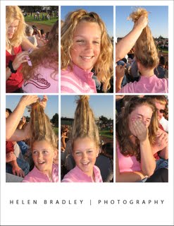
These photos tell the story of Casey’s funny hairdo from beginning to end and the effect she had on bystanders.
In the photos above, Casey created her funny hairdo as we sat waiting for a graduation that was late starting. The photos have nothing to do with the event itself but it is a few minutes of laughter that none of us who were there will ever forget! The story unfolds in the photos – they show not only the hairdo she created but the action leading up to it and the reaction of those sitting close by when they saw it.

When you focus on capturing an entire story rather than just individual shots you will find you have fresh adventures to capture with your camera.

Helen Bradley

Tuesday, November 3rd, 2009

Simple Lightroom image fixing workflow

Whether it’s a photograph of mom that you’re sending to her or an image that you’re preparing to print, most photos can use some fixing before they’re ready to be shared or used.

Here’s a quick and easy Lightroom workflow that I apply to most every day images before sending them to family and friends, posting them to Flickr or my blog or printing them for a paper based photography project.

If you’re new to photo editing or to Lightroom, this step by step process should get you on the way to fixing your images.


Step 1
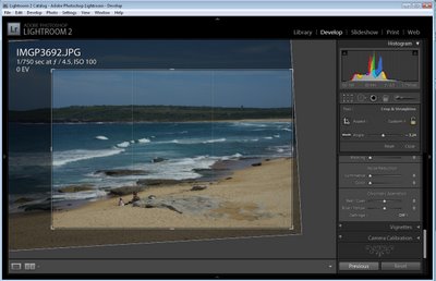
The first step to fixing an image is typically to straighten and crop it so that you remove any areas that you don’t want to include in the final image.

To help you apply the rule of thirds to your crop, in Lightroom the crop grid, by default, shows a ‘rule of thirds’ grid over your photo.

Place an object of interest in the photograph over the intersection between the gridlines or place the horizon or another strong horizontal line along one of the horizontal lines to achieve a pleasing composition.

Here I’ve cropped and sized the image to place the waterline along the top line of the grid.


Step 2
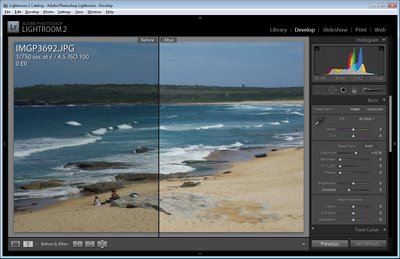
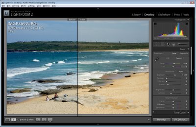
Adjust the Exposure by dragging on the Exposure slider. This image is a little underexposed and the histogram falls well short of reaching the far right of the chart area. Increasing the Exposure fixes this.


Step 3
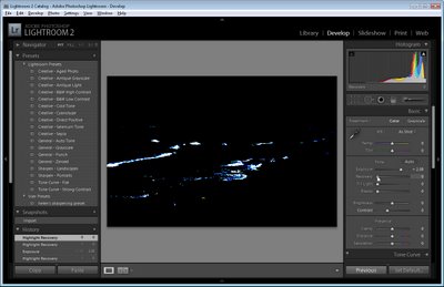
To test to see if you need to use the Recovery slider to recover blown highlights, hold the Alt key (Option on the Mac) as you click on the Recovery slider handle. If you see light areas on the image, drag to the right to recover them.

Here I artificially increased the Exposure before doing this to show you what the image will look like if you need to use the Recovery slider. If you see something like this on your image and if it is nicely exposed, drag the Recovery slider to the right to remove/reduce these areas.


Step 4
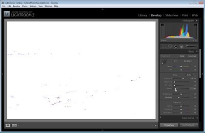
Hold the Alt key (Option on the Mac) and drag the Black slider to the right until you see the smallest hint of black appearing in the image. You use this slider to ensure that your image has some blacks in it.

By now the histogram should extend to the very left and right of the chart area ensuring that your image has a good tonal range.


Step 5
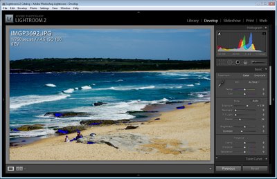
If you have some areas that are clipped you will see white arrows in the histogram area. You can hold your mouse over these to see the clipped areas on the image. If areas are clipped you will have blown out highlights or plugged shadows which are generally undesirable.

Here I have over adjusted the Black Clipping slider so there are some plugged shadows that you can see colored blue on the image.


Step 6
You can use the White Balance tools to adjust the white balance in the image. Drag the Temp slider to the right to add warmth to the image or to the left to make it colder. Dragging to the right warms the image by adding peach/orange tones to it and dragging to the left cools the image by adding blue tones.

If you’re shooting in RAW or DNG then there will be a range of options available from the White Balance dropdown list.

Here I’ve added a lot of warmth to the image to show what is possible.


Step 7
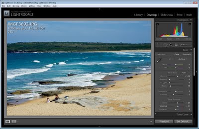
You can also adjust Brightness and Contrast although I prefer to skip these adjustments and add some Clarity to adjust and sharpen the midtones and some Vibrance to boost the color in the undersatuated areas in the image.

From here I would sharpen the image and it’s ready to go.

In a future post I’ll explain the basics of sharpening in Lightroom.

Helen Bradley

Page 1 of 212