Wednesday, February 29th, 2012

Adobe Launches Photoshop Touch for the iPad

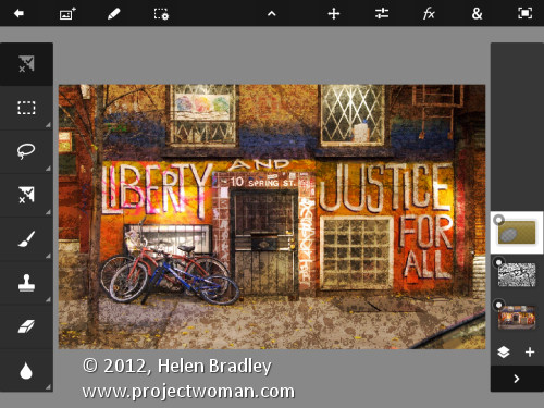
It has been a long time coming – way too long – but Adobe finally launched Photoshop Touch for the iPad.

I have reviewed it here for PC World and I wrote a how to for creatively editing images with it for Digital-Photography-School.com.

The app costs $9.99 so it isn’t cheap by iPad app standards but I think it is worth it. Downsides are non editable text, 1600 x 1600 px file size limit, no true editable masking tools and no adjustment layers. But it does have good layer tools (unlike Adobe Ideas you don’t have to shell out 99c for each new layer!), blend modes and it is easy to use.

Helen Bradley

Tuesday, February 28th, 2012

Shoot right at night – Tip #3 – Set a high ISO

While a flash is handy for taking snapshots of friends, it’s useless when the subject is more than about 10-15 feet away as this is the range of a typical flash. It also makes it impossible to shoot candid images.

So, the best solution to shooting at night is to turn the flash off – before you head out, make sure you know how to disable the camera’s flash so it doesn’t fire.

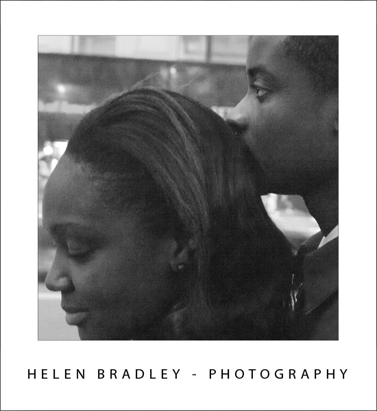
If your camera lets you do so, set the ISO equivalent to use for capturing the shot, increase this at night to 1600 or more. In the shot above the ISO was 6400, the image is grainy but a flash would have disturbed the couple and that would have spoiled the candid moment.

The shots will be more grainy – like film, shots taken at higher ISO levels are more grainy even when shot digitally. However, grain is not a ‘bad thing’ and night time images can look particularly interesting when the film grain is obvious.

Helen Bradley

Saturday, February 25th, 2012

Photoshop – Replace a Face

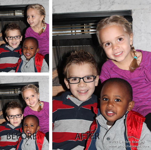
A reader recently emailed me a couple of photographs of her children. Unfortunately, as often happens with small children, one image had two of the three children looking at the camera and smiling and the other image had the exact opposite combination – only one child looking great. Her question was – could she take the good face from one of the images and paste it into the second image.

The answer is yes, and here’s how to do it in Photoshop without any need to cut and paste:

Step 1

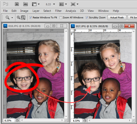
Open both images in Photoshop. Drag the background layer from one image onto the other – in my case I dragged the background layer from the image with two out of the three faces correct and dropped it into the image that has only one good face.

You will have an image with two layers – the top has two good faces and the one below has the other one. Close the other image.

Step 2

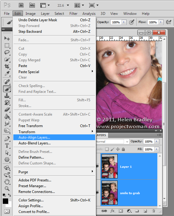
Select both layers in the image that you’re working on and choose Edit > Auto-Align Layers and select Auto.

Photoshop will now align the two layers so that the faces in both layers will be aligned on top of each other. To do this you need to have two images with very little difference between them and this image lined up pretty well as a result.

Step 3

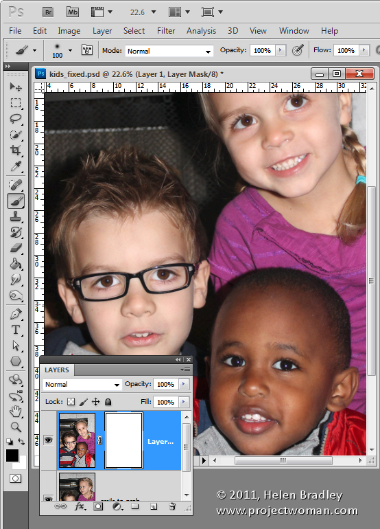
Click on the topmost layer and add a layer mask to it by clicking the Add Layer Mask icon at the foot of the Layers palette.

The mask is filled with white by default which means that the entire contents of the top layer is visible and the bottom layer not visible at all.

Step4

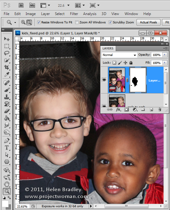
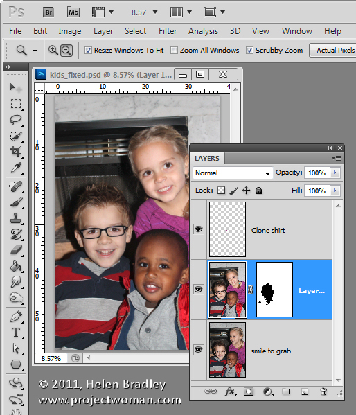
Select black as your foreground color and choose a soft edge brush. Target the mask by clicking on it so you’re painting on it and then paint over the child’s face in the image to reveal the face from the layer image below.

Step 5

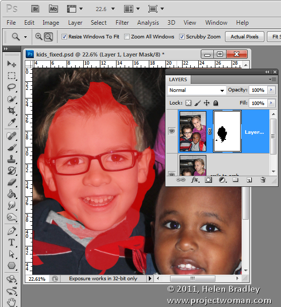
You’ll need to make some small choices about how much of the layer below you reveal with the mask – if you take too much you can paint back on the mask with white to reveal the top layer again.

I made some small adjustments around the child’s collar to hide the fix. The red portion of the image shows the mask – I turned this on – it won’t typically be visible to you as you work.

Step 6

Finish by taking a critical look at the final image and, if necessary, adjust the mask or add a new layer and clone elements from the layers below to fine tune the image.

I had to do a small amount of cloning of the little girl’s shirt to fix a small problem and then I cropped the image and it was complete.

The entire process took all of around ten minutes.

Photoshop Elements

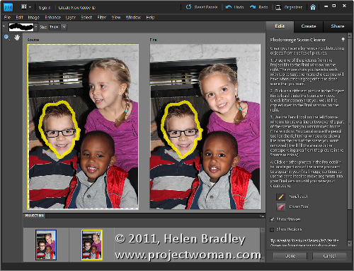
You can get similar results in Photoshop Elements 7 and above by opening the two images and choose File > New > Scene Cleaner and follow the instructions there.

Helen Bradley

Friday, February 24th, 2012

Shoot right at night – Tip #2 – Find the interest

At night what can look very uninteresting during the day can take on an entirely different look.

A single light on a wall or a neon sign can make an interesting shot and, when it is raining you’ve got a double bonus of night lights and reflections in the wet surfaces.


Helen Bradley

Tuesday, February 21st, 2012

Excel – conditional sums


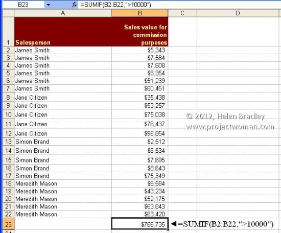
In some instances you may want to sum a column of numbers depending on the contents of that column. For example, if you want to total the sales figures in the range B3:B35 but only where those values are greater than 10000, this SUMIF formula will do the work:

=SUMIF(B3:B35,”>10000″)

The Sumif function takes first the range to sum and then the condition to match. In this case you will be summing all values in column B from rows 3 to 35 inclusive which contain values greater than 10000.

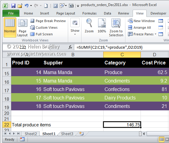
The SUMIF function can also sum a different range than that used for the test. Here it sums all values in the range D2:D19 where the corresponding values in the range C2:C19 are Produce.

=SUMIF(C2:C19,”=produce”,D2:D19)

Helen Bradley

Monday, February 20th, 2012

Shoot right at night – Tip #1 – Get the light

When the sun goes down, a world of different lights opens up and it’s a great time to pull out your camera for some stunning photos. However, before you go out to shoot at night, there are some things to think about that will help you take great shots even when the lighting isn’t ideal.

Today we’re starting a new tip series – shooting right at night and here’s the first tip:

Make light or capture what little there is

At night, there’s obviously less light than there is during the day. So, to get good shots you either have to replace the missing light with a flash, or open up the aperture so more light gets in and slow the shutter speed so the camera gets enough light to register the image. You can also up the ISO – in the next few tips we’ll look at each of these options in more detail and find some great topics for shooting at night.


Helen Bradley

Sunday, February 19th, 2012

DIY Excel functions

With a little bit of coding experience it is possible to create your own functions in Excel 2010 and earlier.

In Excel 2010, make sure the Developer toolbar is visible – if it is not, follow this post to make it so.

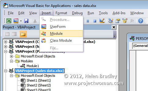
Now choose Developer tab and click the Visual Basic button. In the Project – VBAProject pane, select the current file and choose Insert > Module.


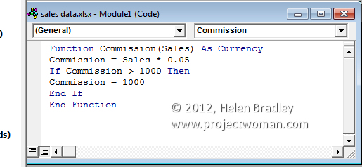
Type this function into the dialog and then close the VB editor and return to your worksheet:

Function Commission(Sales) As Currency
Commission = Sales * 0.05
If Commission > 1000 Then
Commission = 1000
End If
End Function


To test your function type this formula into a worksheet:
=COMMISSION(20000)

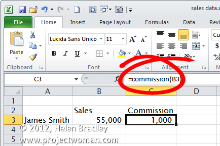
or as shown here:

=COMMISSION(B3)

The function calculates commission at 5% of the amount of sales. If the 5% value is more than $1,000 then the commission is pegged at this amount – to check this, test the function with a very large number. Functions created this way are only able to be used in the current workbook.

Helen Bradley

Thursday, February 16th, 2012

Excel 2010 – quick and easy calculations

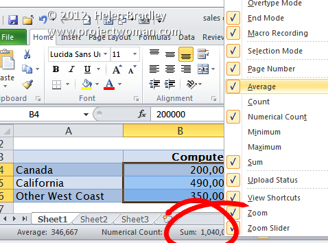
One of the handiest calculation tools in Excel isn’t a function and instead it appears automatically on the Status Bar.

Select a series of numbers and in the Status Bar you will see, by default, the Sum of those numbers.

Right click the Sum and you can select from other calculations such as Min, Max, Count Items, Count and Average. These calculations are useful when you need to quickly check a calculation. It doesn’t get any  more convenient than this.

Helen Bradley

Wednesday, February 15th, 2012

Capture a great Panorama


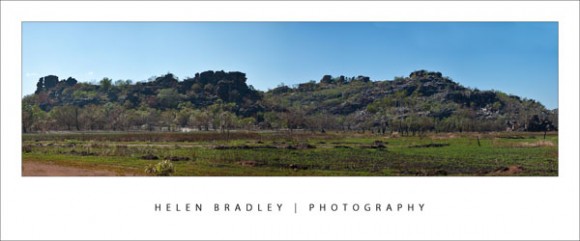
There’s something very compelling about panoramic images. They’re much wider than regular photos and, instead of showing the small portion of a scene that is in front of the camera lens, they show much more.

Some panoramas show a semi circle around a point and others wrap around a full 360 degrees showing everything there is to see. Panoramas have been popular with photographers since the early days of photography. Then, as now, they were created using a series of side by side images put together to form a single seamless image.

Today’s digital cameras and photo editing software let you create panoramas quite easily. Even simple cameras like prepaid phone cameras and point-and-shoot cameras are advanced enough to have a panorama setting. There are, however, some tips and tricks for taking the photos that will help ensure you get a great panorama and I’ve thrown in my best solution for when things go wrong!

Use a tripod

When you take photos for your panorama make sure you stand in one position to take all the shots. It is easiest if you fix the camera to a tripod and test to ensure it will swing around smoothly to capture the images that you want to take. If you don’t have a tripod, practice standing in one position and rotating your body to capture the images.

This painted sign on the building above was too large to capture in one shot but it works well as a panorama.

Overlap the images

When taking the individual shots for a panorama, make sure that the photos overlap each other by around 25 percent. This means that the objects that appear on the far right of one photograph should appear on the far left of the next photograph in the sequence.

If your camera has a panorama feature you can use this to help configure the overlap for the images. Your photo editing software uses the overlapping areas as a key for aligning and matching the images so it’s important that you have enough of an overlap for the software to do its work. On the flip side, avoid having too much overlap as that’s not desirable either.

Try to photograph scenes that don’t change rather than subjects that are moving as it’s much harder to match up your images if people are moving around in them such as in this image:

I had to put a lot of work into tidying up this image – with so much action it was far from an ideal topic for a panorama but the results were worth it.

Fix your settings

When capturing photos for a panorama make sure that you do not alter your camera settings, such as the zoom, between shots as this will mess up your images and they won’t be easy to match.

If you’re using a digital SLR camera, keep the exposure the same between shots too. Using Aperture priority mode is a good choice.

There are some classic occasions when a panorama is an obvious solution and I dream of one day spending an afternoon at Lord’s capturing that wonderful cricket ground as a panoramic image. Other shots that work well as panoramas include scenery and landscapes. However panoramas aren’t limited to major spectacles and you can capture a series of two or more images of anything from a sign to a streetscape and assemble it into a panorama.

I’ve shot panoramas of signs, cityscapes, the mounting yard at a racecourse and I’ve done one of my street so one day I will be able to look back and see then what I see now, as I stand on my front porch.

If you’d like to learn more about creating Panoramas, check out this post on Creating Panoramas with a twist. It’s a great way to save an imperfectly shot panorama.

http://www.projectwoman.com/2009/04/photoshop-panorama-with-twist.html

Helen Bradley

Friday, February 10th, 2012

Ho-Hum to Wow! in Gimp


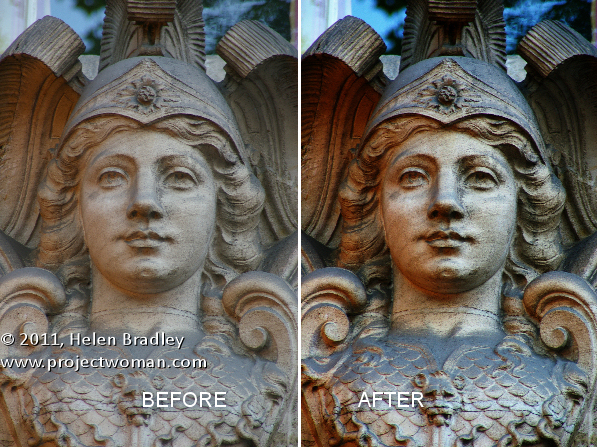
Some time ago I wrote a blog post http://projectwoman.com/2009/03/photoshop-color-that-packs-a-punch.html which involved using the LAB color space to adjust an image. In the interests of those of you who use Gimp, this blog post is a revisit on the topic of dragging color out of lackluster images this time using Gimp.

One of the hidden secrets of Gimp is that it supports the LAB color space so you can get access to the L, a and b channels in an image. This adjustment therefore produces similar results to those you can achieve with my earlier post using Photoshop it’s just that the process in Gimp is a little different.

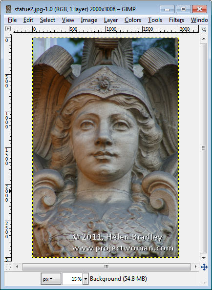
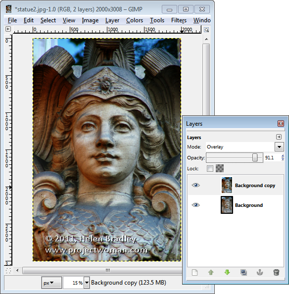
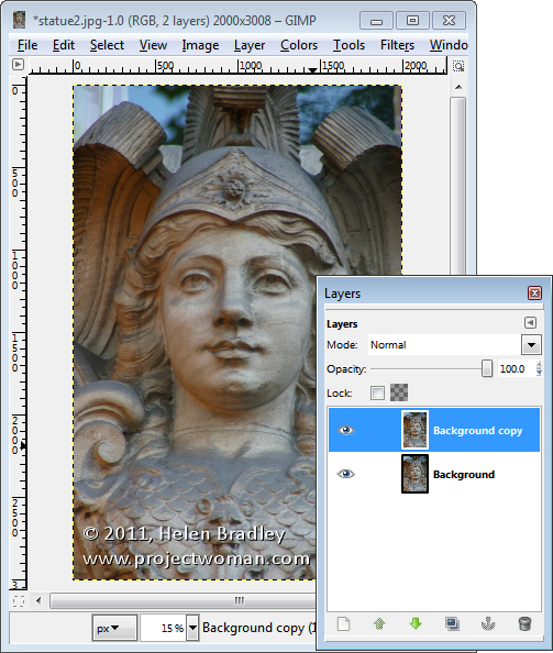
Start out with an image that could use a color boost. This image of a statue over a door in Paris is very monochromatic so it’s a great contender for this process.

Start by making sure your Layers panel is visible – if not, choose Window > Dockable Dialogs > Layers (or Control + L) to display it. Right click the Background layer and choose Duplicate Layer. Select this new top layer.

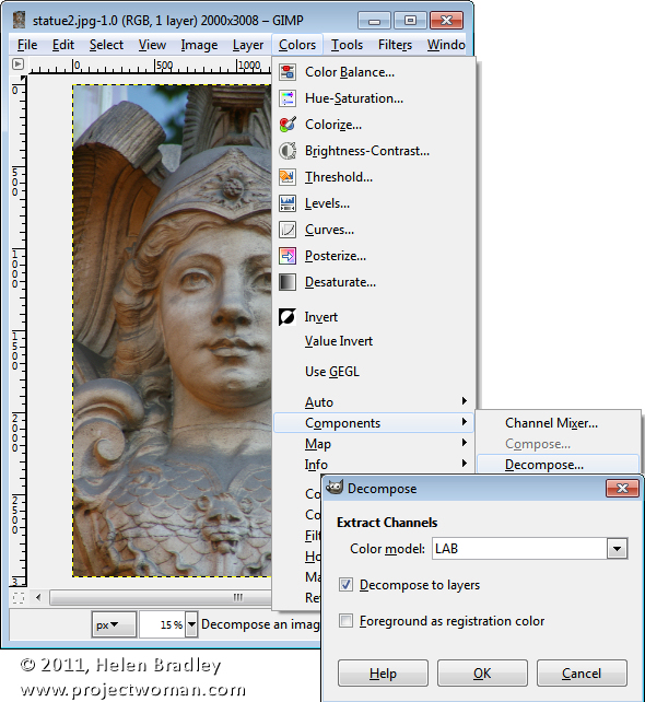
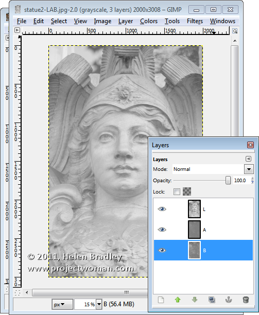
To convert the image to LAB color, choose Colors > Components > Decompose. From the color model dropdown list, select LAB. You will want to decompose to layers so select Decompose To Layers and click Ok.

You’ll have a new image on the screen with three layers. Right now you’ll be looking at the L channel and below it in the Layers palette are the A and B channels.

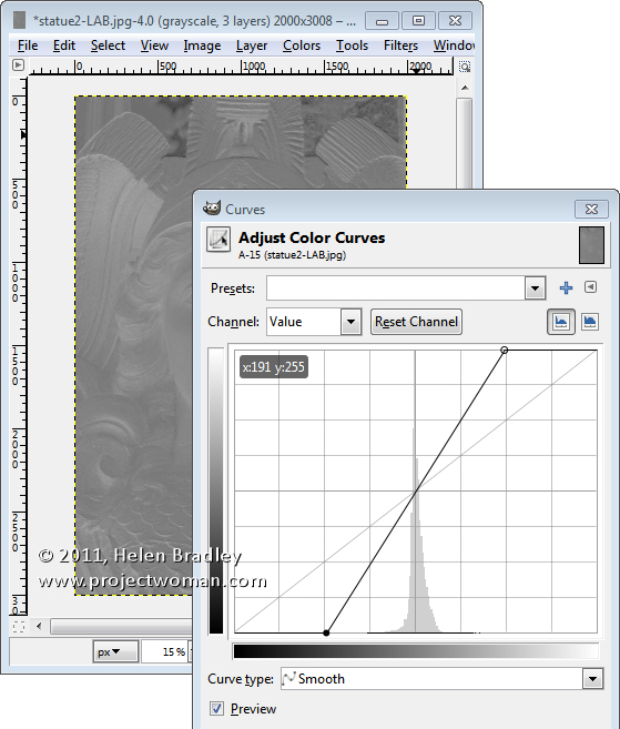
Disable visibility on the L layer and click the A layer to select it. You should have a dark murky almost negative looking image on this layer. Choose Colors > Curves and adjust the curves by dragging the top right and bottom left points on the curve one, two or three boxes inwards on the grid. You can read off the values so pairs of values  like (30,0) and (225,255) or (64,0) and (191,255) are good.

You need to make sure the line goes through the middle of the grid, or you will get an unwanted color cast in the final image. This A channel controls the Magenta and Green in the image and you’re boosting it now to very high levels. Click Ok.

Repeat this by disabling the visibility on the A channel and do the same on the B channel. This is the Yellow/Blue channel. When you’re done, turn back on the visibility of all three channels. You should see no difference in the image at this stage.

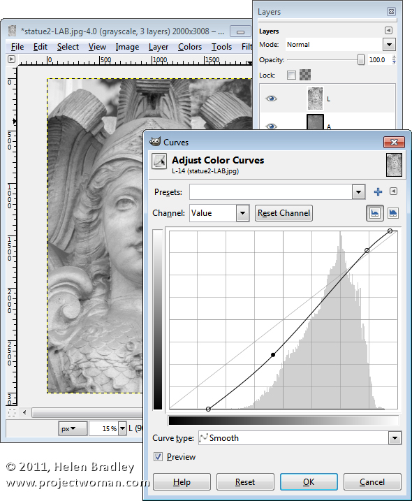
If desired, you can adjust the contrast in the L channel using curves – this will give you some additional boost in contrast in the final image. The L channel is the luminosity channel and it has no color in it at all so you can create a different shape curve here and there is no requirement for the line to go through the middle of the grid.

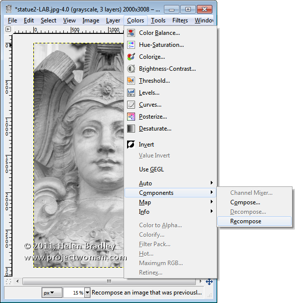
When you’re done, choose Colors > Components > Recompose. The layers will be recomposed back into the original image.

To see it, you will need to close the LAB version and return to your original image. Because you’re working on a duplicate layer, you can now blend the top layer by selecting a different blend mode such as Overlay for the top layer and then adjust down the Opacity to suit.

Helen Bradley
Page 1 of 212