How to get the color picker to look the way you want it to look
or How to fix the Color Picker when it looks all funky
Sometimes when you open the color picker in Photoshop it looks one way and other times it looks a different way. It might even seem like there is no rhyme or reason to how it looks and that it changes without (what it may seem like) no input from you.
Of course, nothing could be further from the truth but knowing that won’t solve the problem of why it changes and how to change it back!
To change it, don’t go looking under Preferences for all the Color Picker choices. While some preferences can be found in the Preference area the secret changes are made inside the Color Picker itself.
To see them at work, click to open the Color Picker. What you see here depends on what is clicked in the right of the dialog (when you realize this everything becomes blindingly obvious).
Click H for Hue to see this:
And S for Saturation to see this:
And B for Brightness to see this:
Each of R, G and B make the picker look different:
As does choosing L or a or b:
And each looks different if you have the Only Web Colors dialog checked:
Now you know what affects how the Color Picker looks you can choose the one that makes the most sense to you.
Learn a quick fix using lab color mode in Photoshop for adding a color boost to your images. It is simple, you can make it a preset so it is easy to use again in future and it packs a real punch!
Transcript:
Hello, I’m Helen Bradley.
Welcome to this video tutorial. In this tutorial I’m going to show you a simple photo fix using LAB mode that’s guaranteed to add punch to your photos. Before we get started let’s have a look and see what it is that we’re aiming for.
This is going to be are starter image and this is the effect that we’re going to get very quickly and easily with this image. Now this might not be my ending point traditionally in fixing this image but I want to show you how to get from here to here. And where you take it from there is up to you.
Now this fix that I’m going to show you uses the LAB color mode otherwise known as LAB color. And you can’t use it in other applications because it is not available. So for example this mode is not available in Photoshop Elements but you can use it in Photoshop. And it works particularly well when you have colors that are sort of all in the same palette.
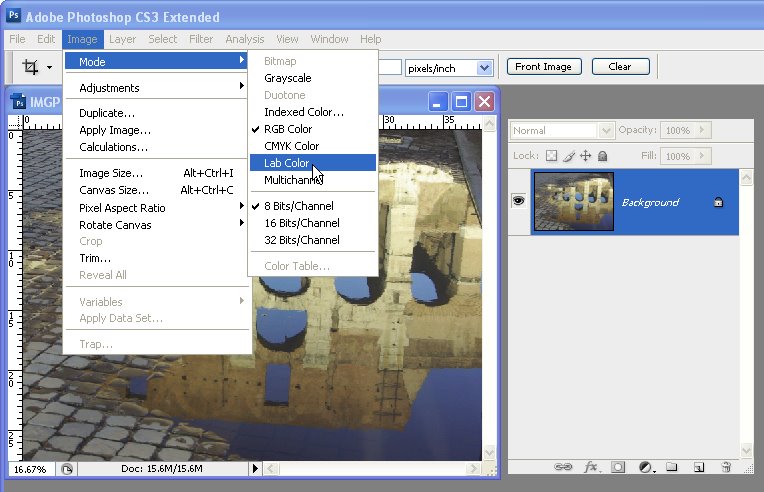
You can see here that we’ve got some browns and sort of gray blues but there’s not a lot of differentiation between them. It also works pretty well with desert scenes, lots of greens in an image where there’s not a lot of definition between the greens. So the effect is very, very simple. I’m going to start with my layers palette visible and I’m going to choose Image > Mode > LAB Color.
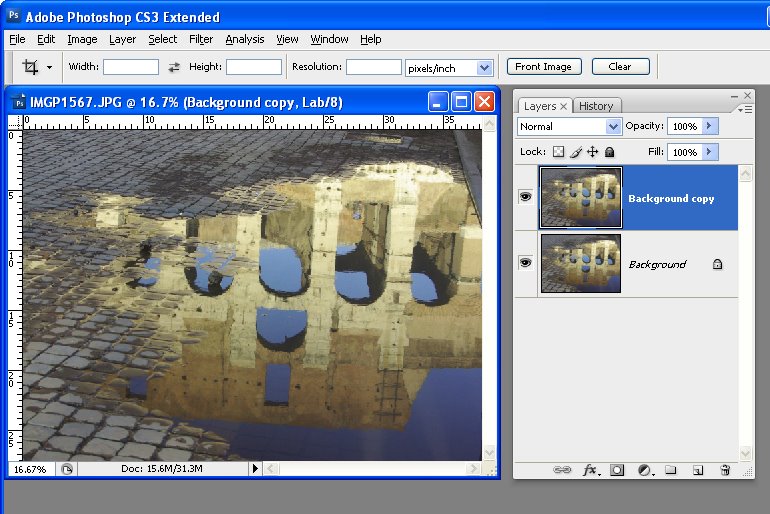
I’m going into LAB color mode. And that’s just switched the image into LAB color. And then I’m going to duplicate the background layer. So I’m going to right click it and choose Duplicate Layer and click Ok. So now I have two versions of the image one on top of the other.
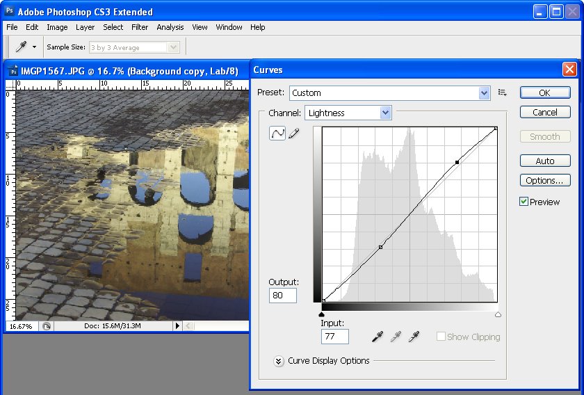
Now the adjustment that we’re going to use with this image is a curves adjustment. So I’m just going to put everything out of the way for a minute and let’s go and get our curves adjustment, Image > Adjustments > Curves.
Now I like to save this fix when I create it as a preset. So I have it here. It’s called three boxes. I’m not going to use it this time because I want to show you exactly how to do it but this is how you would do it. And you can actually then save it as a preset so you can use it over and over again.
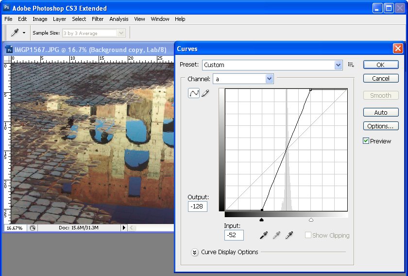
Now the curves dialog is showing you at the moment the lightness, the L channel in LAB. The other two channels are A and B and we want to work on A and B. These are the two color channels. Now this is going to be a little bit confusing if you haven’t dealt with it before. I’m going to explain it to you but you don’t actually need to know anything about it.
I do want to make sure that I’m showing this smaller grid. So I’ve got my options available here and I’m making sure I’ve got a smaller grid. The A channel is the green magenta channel. So this is magenta, this is green. So when I drag in here I’m going to drag in three boxes and you can see that I’ve added a lot of green to the image.
And it works best when you have an image that’s nicely white balanced. So if your image has got a colorcast I suggest you fix it before you come in here. So I’ve dragged in here three boxes on the bottom of the image, bottom of the curve, and now I’m going to drag in three boxes on the top of the curve.
And you come in the exact same number of boxes. You can do one, two or three. Three is just a really, really big effect. And I want to show you exactly how that works. The idea is for this line to go through the middle. So we’re not adding a colorcast to the image. We’re just boosting the colors. So that’s the A channel, magenta and green.
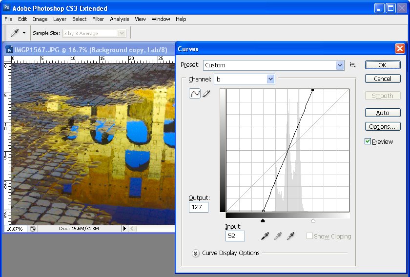
The B channel is yellow and blue. And this is blue and this is yellow. We’re going to do the exact same thing. We’re going to come in a certain number of boxes. Now we could come in two boxes in either direction in this channel. I’m actually going to do three. But you can come in a different number of boxes than you used for the A channel but you’ve got to do the same number of boxes in a particular channel.
So if we’re in a B channel then we’ve got to go three boxes, three boxes or two, two or one, one. But we can’t do different numbers because if we do the line here no longer goes through the middle and we’re throwing a colorcast on our image. That’s why you’ve got to come in the exact same number.
So A channel, magenta/green, boosted that, B channel, blue/yellow, boosted that. The L channel is lightness. So if you want to you could add some contrast in using this channel but you don’t have to. The fix is not about that. So I’m just going to remove it. We’re just going back in with the colors that we’ve boosted.
At this stage if you want to save this as a preset click this little icon here and do Save Preset. And I’m just going to save it for you so that you can see how it works. Again, let’s call it LAB fix and I’ll click Save. And here it is here and we can apply it at any time to our image by just clicking on it. So now that we’ve done this we’re headed back into RGB mode.
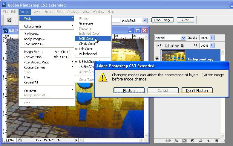
So I’m going to click Ok. Now I’m going to choose Image > Mode > RGB Color. Now I’m going to be prompted to flatten this or not flatten. Now I don’t want to flatten. I want these two layers separate so I’m going to choose Don’t Flatten.
However, if we had done curves as an adjustment layer we would be forced into flattening that adjustment layer because it won’t come back into RGB color. That’s why I used just a regular adjustment on a duplicate layer because an adjustment layer won’t work for this process. So I’m going to choose Don’t Flatten because I want my two layers.
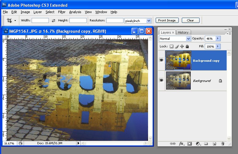
And you can see here that we’re back in RGB. And now what I’m going to do is I’m going to select a blend mode to blend these two layers together and I’m going to use the overlay blend mode. And I use that because it’s a really nice contrasty blend mode. If it’s too much of an effect you can always dial down the opacity.
I’m taking it back to the original image and now I can walk it back up and stop wherever it is that I think I’m getting a good fix. So that’s an LAB color fix. I think you’re going to really like it. It’s one of my go to fixes. I use it a lot and particularly on images like this because as you can see the starter image is really, really blah but this image a whole lot better and I really love it.
I’m Helen Bradley.
Thank you for joining me for this video tutorial. Look out for more tutorials on this YouTube channel and please subscribe to my channel so you’ll be notified when new videos are released. And at the moment we’re releasing every Monday and Thursday.
Also visit my website at projectwoman.com for more tips, tricks and tutorials on Photoshop, Lightroom, Illustrator, Photoshop Elements and a whole lot more.
Some time ago I wrote a blog post http://projectwoman.com/2009/03/photoshop-color-that-packs-a-punch.html which involved using the LAB color space to adjust an image. In the interests of those of you who use Gimp, this blog post is a revisit on the topic of dragging color out of lackluster images this time using Gimp.
One of the hidden secrets of Gimp is that it supports the LAB color space so you can get access to the L, a and b channels in an image. This adjustment therefore produces similar results to those you can achieve with my earlier post using Photoshop it’s just that the process in Gimp is a little different.
Start out with an image that could use a color boost. This image of a statue over a door in Paris is very monochromatic so it’s a great contender for this process.
Start by making sure your Layers panel is visible – if not, choose Window > Dockable Dialogs > Layers (or Control + L) to display it. Right click the Background layer and choose Duplicate Layer. Select this new top layer.
To convert the image to LAB color, choose Colors > Components > Decompose. From the color model dropdown list, select LAB. You will want to decompose to layers so select Decompose To Layers and click Ok.
You’ll have a new image on the screen with three layers. Right now you’ll be looking at the L channel and below it in the Layers palette are the A and B channels.
Disable visibility on the L layer and click the A layer to select it. You should have a dark murky almost negative looking image on this layer. Choose Colors > Curves and adjust the curves by dragging the top right and bottom left points on the curve one, two or three boxes inwards on the grid. You can read off the values so pairs of values like (30,0) and (225,255) or (64,0) and (191,255) are good.
You need to make sure the line goes through the middle of the grid, or you will get an unwanted color cast in the final image. This A channel controls the Magenta and Green in the image and you’re boosting it now to very high levels. Click Ok.
Repeat this by disabling the visibility on the A channel and do the same on the B channel. This is the Yellow/Blue channel. When you’re done, turn back on the visibility of all three channels. You should see no difference in the image at this stage.
If desired, you can adjust the contrast in the L channel using curves – this will give you some additional boost in contrast in the final image. The L channel is the luminosity channel and it has no color in it at all so you can create a different shape curve here and there is no requirement for the line to go through the middle of the grid.
When you’re done, choose Colors > Components > Recompose. The layers will be recomposed back into the original image.
To see it, you will need to close the LAB version and return to your original image. Because you’re working on a duplicate layer, you can now blend the top layer by selecting a different blend mode such as Overlay for the top layer and then adjust down the Opacity to suit.
I like to see lovely saturated color in my photos but sometimes the color I capture just doesn’t do justice to the subject and it isn’t what I remember the scene looked like. Boosting the color can turn a lackluster image into one that totally rocks. So, if you find that the color in your photos is lacking, here’s what I do to make it better. The process is ridiculously simple, it requires no selections to be made, and it can be recorded as a simple action. It’s my kind of fix – quick, easy and very powerful.
A word about LAB The fix uses the LAB color space. This is not an often used color space and it isn’t available in most other programs so you won’t be able to mimic this effect in, for example, Photoshop Elements. However, LAB has been around in Photoshop for years.
In the RGB color space you work with the red, green and blue channels and in CMYK you work with cyan, magenta, yellow and black channels. In LAB you have three channels; L, a and b. The L channel is the lightness channel and, if you adjust it you adjust only the lightness in the image and you don’t change any of the color in the image. This sets Lab apart from RGB and CMYK as color and lightness are separate in LAB where they aren’t in the other modes.
In Lab the two color channels are a and b. The a channel contains color information for the green and magenta in the image. The b channel manages the blue and yellow colors in the image. If you were to look at these channels they would look very light because they contain only color information and no lightness data.
By separating lightness from color as LAB does you can make adjustments that would be difficult or time consuming to do in any other color space. However, that said, I think this fix works best on animals, landscapes and streetscapes – but not on close ups of people. On people it tends to destroy the natural skin tones.
How to fix in Lab To see this LAB fix at work pick an image that has color in it but which you think could use a color boost. Step 1 With the flattened image open in Photoshop, choose Image > Mode > LAB Color. If you’re working on a flattened image you won’t see anything except LAB/8 appearing in the title bar of the image.
Step 2 Duplicate the background layer of the image by right clicking it and choose Duplicate Layer. You’ll make your adjustments on this duplicate of the background layer so that you can blend them into the background layer later on.
Step 3 Choose Image > Adjustments > Curves to apply the curves adjustment to the duplicate background layer. Don’t use an adjustment layer as you’ll only have to flatten it on returning to RGB anyway.
In the curves dialog, the L channel is visible on the screen. This channel that contains only lightness and darkness values so that you can drag on the curve to adjust this if desired.
Step 4 Select the a channel – this is the magenta/green channel. In a standard Photoshop setup green is on the left and magenta is on the right. Drag the bottom edge of the curve inwards 2-3 squares. Then drag the top edge of the curve inwards the same number of squares. It doesn’t matter how many squares you drag but you must drag the same number on either end so the curve line crosses the middle of the grid – this stops you from inadvertently inducing a color cast into the image.
Step 5 When you’ve adjusted the a curve, repeat the process with the b curve. At this point the image is probably looking very scary indeed. However, you need to make the adjustment strong enough that you get too much color rather than too little at this stage. Click Ok to apply the curve to the top image layer.
Step 6 To return to RGB mode choose Image > Mode > RGB Color. When prompted, select the Don’t Flatten option. This is critical because you want both layers intact back in RGB mode.
Step 7 Now drag the Opacity slider for the top layer back to 0 so you see the original image and slowly walk the slider back up until you get the amount of color you want in your image. When you’re done, save the result.
Once you’ve done this a couple of times, you’ll appreciate how much of a boost in color you can get and how fast you can do it. Record the fix as an action and you can do it in one click and then just adjust the opacity to suit.
In some cases altering the blend mode of the top layer can yield pleasing results. The blend modes in the Overlay, Soft Light, Hard Light, Vivid Light, Linear Light and Pin Light grouping in the Blend Mode list give the best results. You can also duplicate the top layer and apply different blend modes to each copy to bring out different areas of the image.
So, if you want to produce eye-wateringly beautiful color in your photos, chances are that a Lab color fix like this is just what you need.
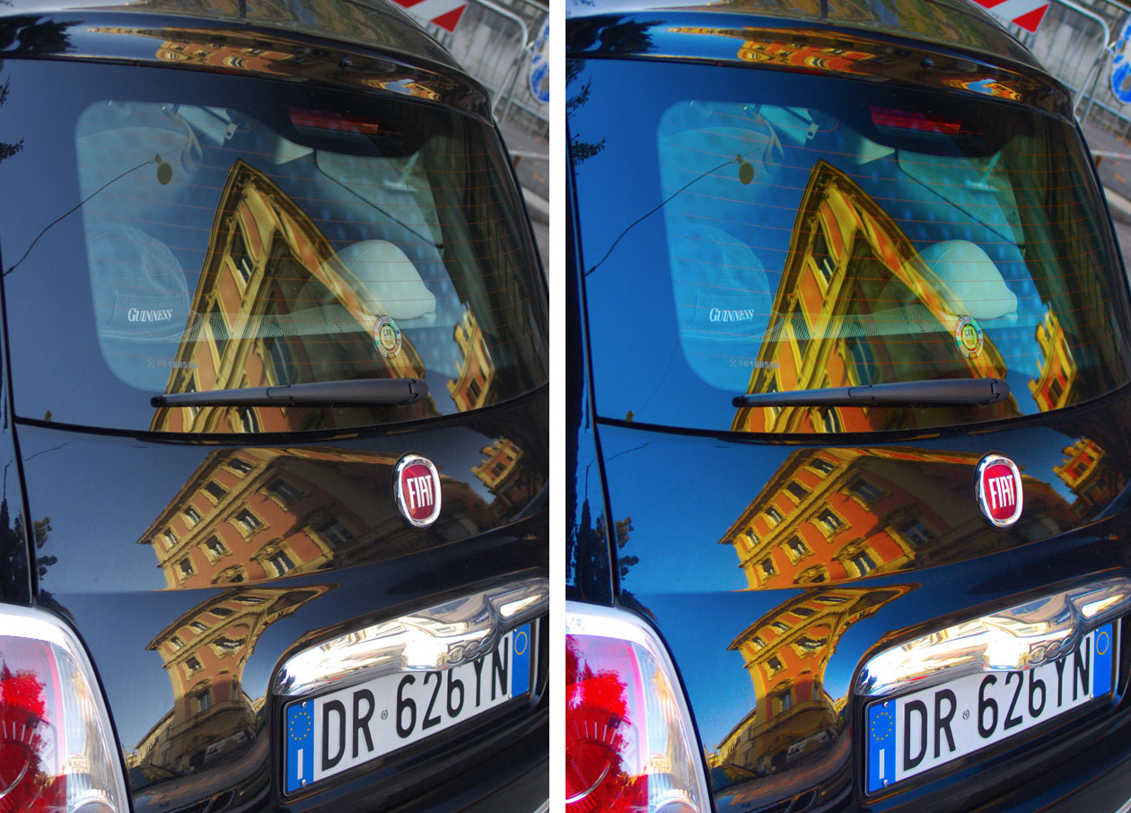
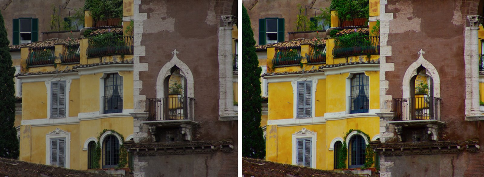
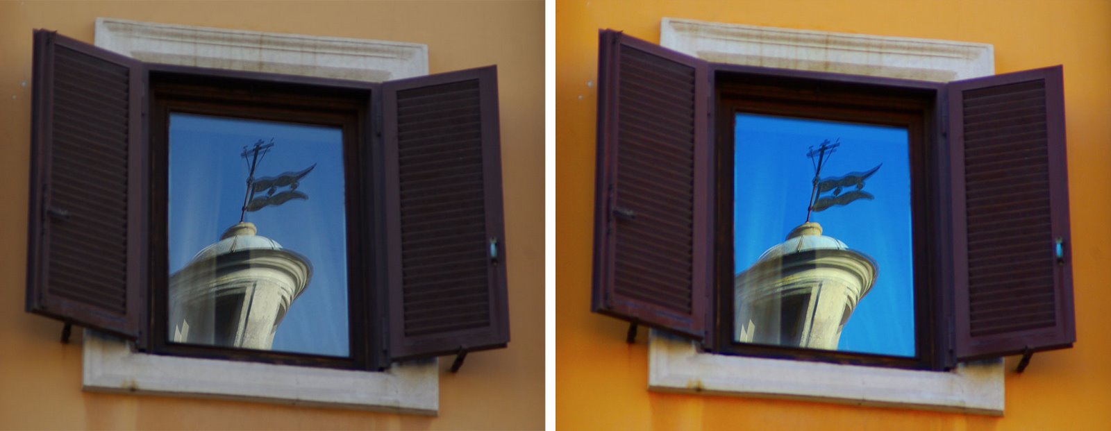
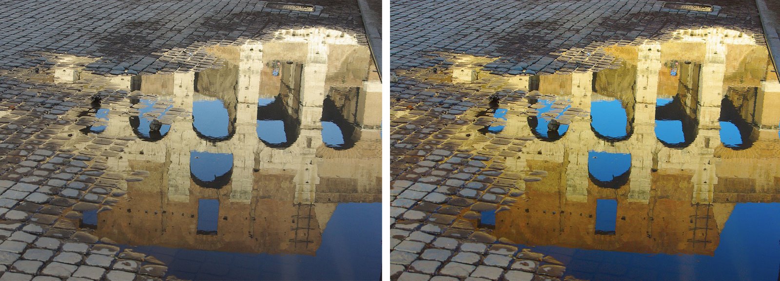
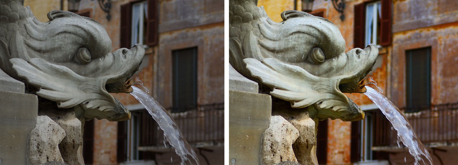
The images below show the original image on the left and the LAB color fix applied to it in the image on the right. No adjustments other than working LAB and blending the resulting layers have been used on the right hand versions.
Post Script: To learn more about LAB color mode and the fixes that you can perform using it, look no further than Dan Margulis’ book— Photoshop LAB Color: The Canyon Conundrum and Other Adventures in the Most Powerful Colorspace – it’s practically the definitive book on Lab by the master of Lab himself.
I contibute to the Post Production blog at Digital Photography School and this post first appeared there.
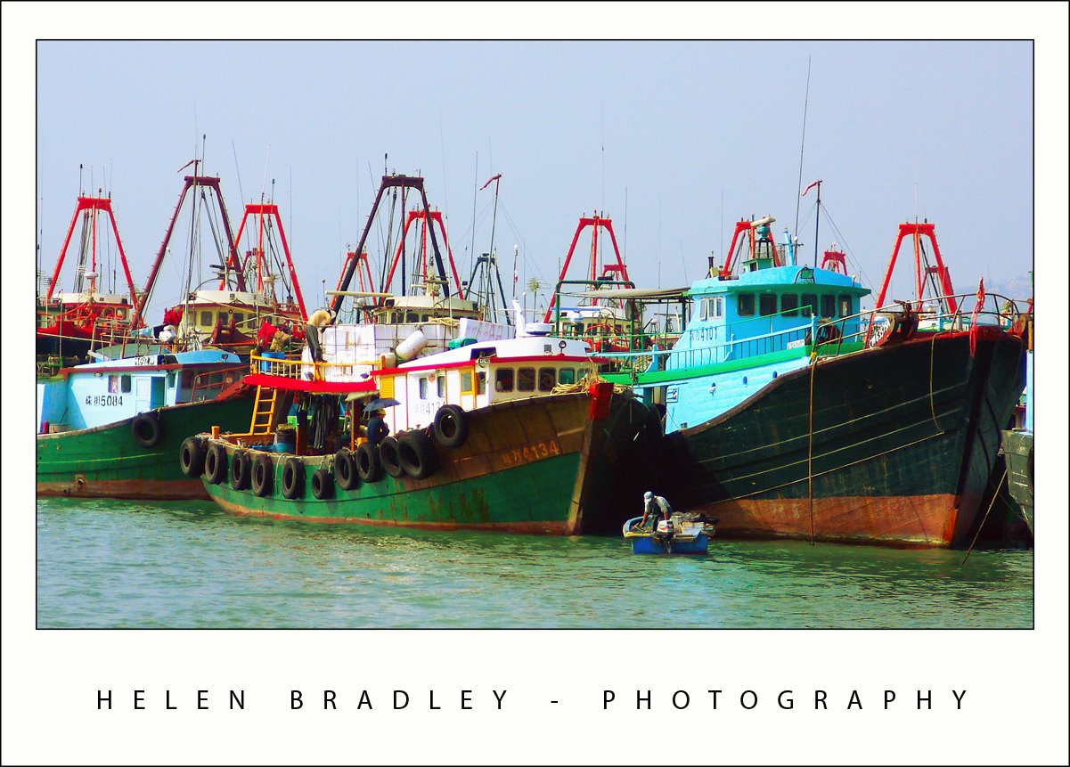
When I was in Hong Kong I went first to order chops at Man Wa Lane (Chop Alley) which is in the Sheung Wan area of Hong Kong. Chops are stamps with your name engraved on them in Chinese characters that you use to sign things. Because they are your name and your birth year symbol, they ideally are hand carved for you. I have wanted one for years and there’s no better place to get it than Chop Alley.
With a few hours to spare until I had to pick up the chops, I headed by ferry to the wonderful Cheung Chau island. There are no cars here – everyone bikes or walks and it’s just the most wonderful place. One side of the island is a fishing port and the other side is beach.
This photo is from the fishing port side. The atmosphere was horribly grey and polluted so the image was totally lacking in color as well as having a pretty ghastly color cast. First step is to remove the color cast. I use the “color by the numbers” approach of sampling white, neutral and black areas of the image and then adjusting curves until they are within the ball park of correct. Then, I took the image to LAB to boost the color using curves on the A and B channels. You can’t do so easily unless you remove the color cast first. The result is wonderful and one of a series of boat images I’m working on.
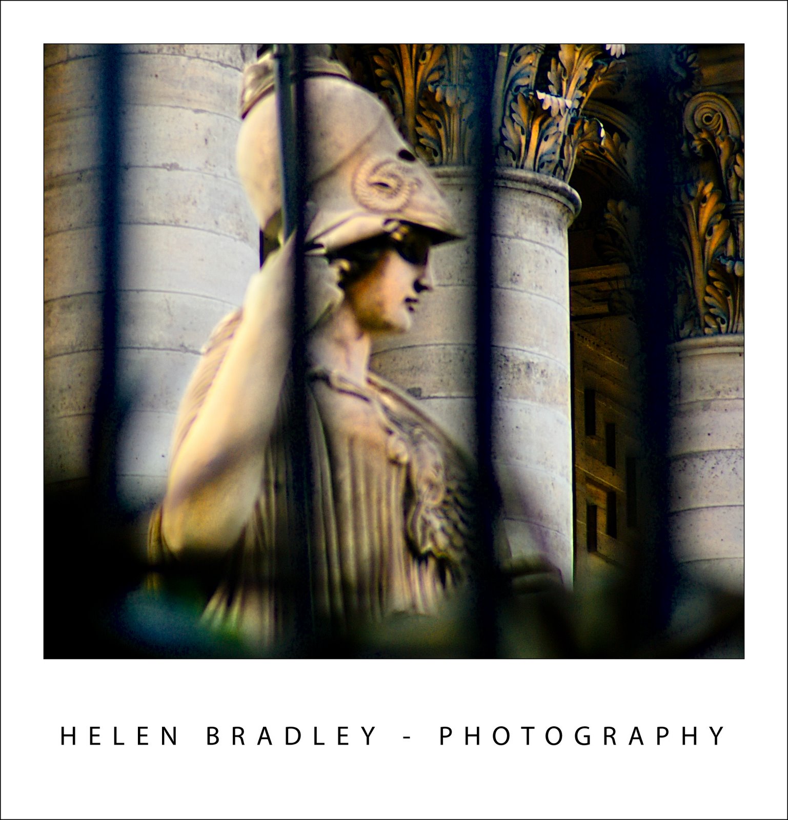
This beautiful photo was taken at The Opera in Paris. It was early morning and I was walking past as I saw this beautiful statue. There were bars between me and it and the photo isn’t actually in very good focus. But there, a bit of work in LAB and it looks just fantastic.
BTW, as I was working on this image, I encountered a problem – I couldn’t save a copy as a JPEG. Yikes! what is happening here? I thought about it for quite a while, then discovered I hadn’t moved back to RGB from LAB color – can’t save a JPEG image using the LAB color space – so now you know. Switch back to RGB when you’re done and you can save it.
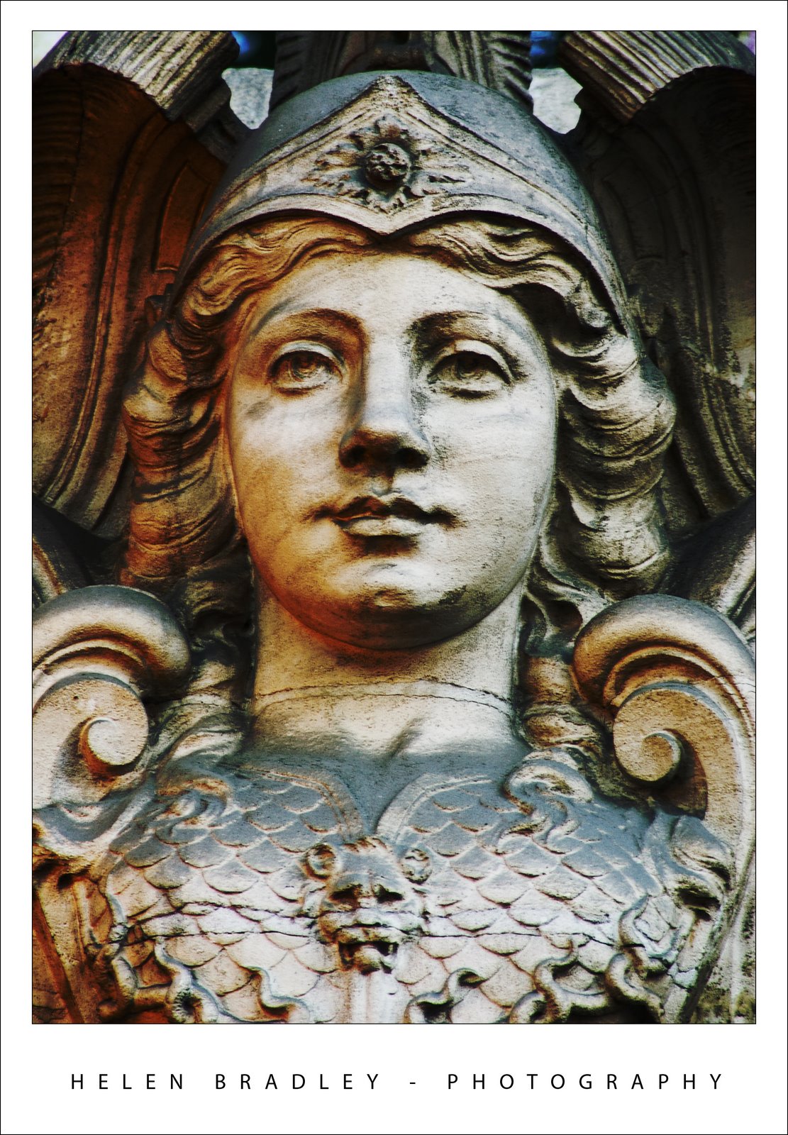
I just adored Paris. I recognised my love of the city as I flicked through the photos I had taken there – at least some of them – there are thousands.
This is one of them. The sculpture itself isn’t notable, it’s just a small piece from above a doorway in some Parisienne backstreet. Yet it’s part of what is magic about Paris – there is so much there – more than you could take in in a lifetime.
This picture underwent a simple Levels adjustment to bring up some of the contrast and then a huge Curves attack to bring some colour into it. I totally abused the Curves dialog and the image gave up its magic. I actually blame Dan Margulis for this. Yesterday I watched one of his Man from Mars videos and I just couldn’t resit applying the technique to this image and it gave wonderful results. Thanks Dan!
You can find Dan’s video at Peachpit (along with some of my own Photoshop articles and videos). It’s a huge download – around 90Mb but, believe me, it’s worth every bit of it. Don’t blame me if you fall in love with the Curves adjustment as a result of watching it. Then, when you’re done, treat yourself to one of his LAB colour videos – it’s almost better than chocolate! And, add to your Christmas wish list his wonderful book Photoshop LAB Color: The Canyon Conundrum and Other Adventures in the Most Powerful Colorspace.