Tuesday, September 15th, 2015

Black Text on a White Background and Vice Versa

Invert text in one simple step in Photoshop

Today I needed to make some text which is white where the layer below is black and black where the layer below is white.

I didn’t want the text to have to be made in two ways (for preference) and I did want it to remain editable. Turns out it is all very easy and it works like magic.

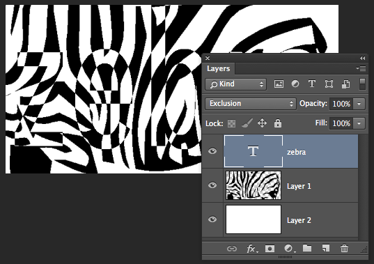
Start by creating your black and white layer. I used a zebra image but you can use anything. Type your text on a layer above and make it white. Then just set the blend mode for the text layer to Exclusion and the colors will flip – the white text will become black where the image below is black.

The wonderful thing about this effect is that the text remains editable and so too is your background. You can move or adjust the black and white layer and the text layer and everything just changes to match.
Simple to do, when you know how.

Sunday, September 6th, 2015

How black is Illustrator Black?

I’ve been working with glossy things in Illustrator recently and I’ve encountered an interesting situation in relation to black.

To create the glosses for the baubles I am making, I need to use a black to white gradient in screen blend mode. It turns out that there are different ‘grades’ of black and, although they look pretty much the same on the screen when you are looking at the black objects, they actually work differently when using with blend modes.

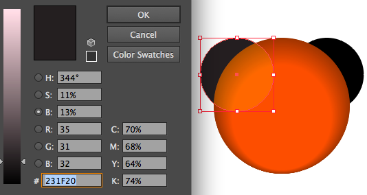
Here is the regular Illustrator black (from the Swatches panel) – I am working in RGB mode, and this is how a filled black circle looks when added over the underlying shape and blended using Screen blend mode. You can see clearly where the circle begins and ends. You can also see from the Color palette that the black isn’t truly black:

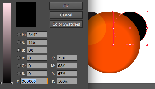
Here is the same shape, but this time I’ve set the K value in the CMYK specification for the color as 100% (RGB are all 0) and the result is very different and you can’t see the edges of the circle:

Even though I am working in RGB and even though I only plan to use the images on the web, nevertheless creating a more blacker black using the CMYK color specification makes for a different and better blend (at least in this situation). If you need to, it might be a good idea to add a black black to your swatches so it will always be available.