Wednesday, April 30th, 2014

Link an Image to a Web Page in WordPress

Stop stressing – here’s how to create a link from an image in WordPress.org

It’s dead easy to create an image as an anchor in HTML so, when a visitor clicks your image they are taken to a web page. The same cannot be said for a self hosted WordPress page – it’s ridiculously hard to link an image to a webpage until you know how it is done and then it is simple!

I made the mistake in the past of trying to edit the HTML myself. It was an exercise in frustration as WordPress just seems to knock the code out and link back to the image and not the page. I got it to work a few times but I’m blowed if I can remember exactly how. So, today, when I was editing a post my assistant wrote about free fonts that included pictures of the fonts I realized I needed to solve this problem and fast!

I wanted the font images to be linked to the download page – should be simple, but it isn’t.

Here is an image linked the way WordPress defaults to linking – it just opens the image in its own browser window – sucks!

Now lets look at what it should do – click this and it opens a new browser window at the download site:

The solution is part WordPress and part html hack!

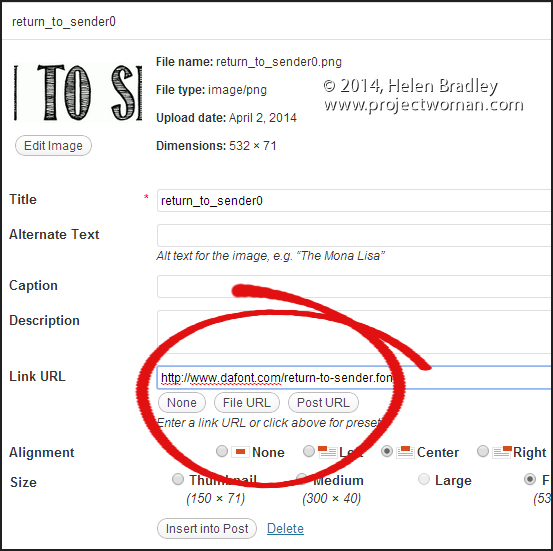
To begin, when you go to insert the image into the post there is a link box – into this you should type the link you want the image to open when clicked.

Unfortunately this won’t open a browser window so you’ll then have to go to the HTML view and locate the image link and add the code after the image – the code is a simple target=”_blank” entry inside the tag itself as shown here:

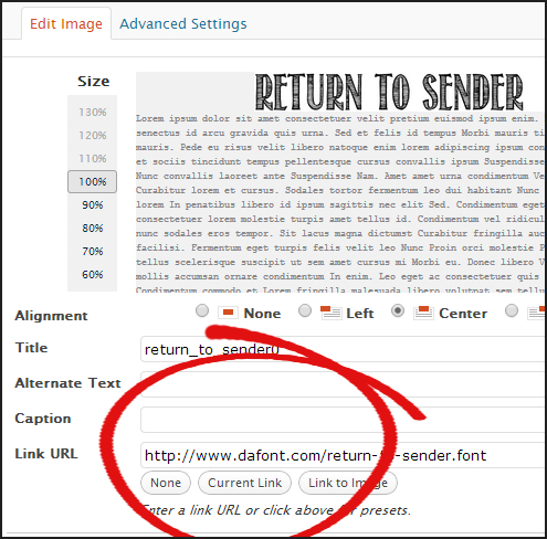
Now, if you put an image into a post and forget to add the link all is not lost – in fact it works better. If you click on the image in Visual view you’ll see two icons, click the image icon to open up a screen which lets you edit the image code:

Now you can add the link code:

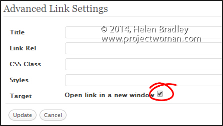
Then click the Advanced Settings tab and enable the Open Link in a New Window checkbox, then click Update and you’re done.

It’s not as simple or as clear as it might be but I’m willing to bet that this post will help out a  lot of struggling WordPress bloggers!

Helen Bradley

Sunday, April 20th, 2014

Luxuriating in chalkboard goodness


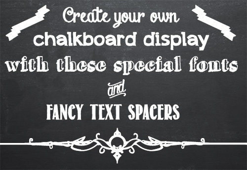
Find all the resources you need to create and print your own chalkboard designs.

Grocery stores and cafes seem to be chock-full of hand drawn chalkboard menus these days. Of course, who can blame them when they look so great? While most of us are not skilled enough artists to reproduce the fancy flowing chalkboard fonts, our computers certainly are. Recently the chalkboard craze has come online, and font artists across the internet have given us dozens of wonderful chalk-like fonts to choose from. I’ve compiled a list of my favorites of these fonts, including some special symbol fonts for text dividers and flourishes. I’ll step you through the process of finding these fonts so that you can get to work on your own chalkboard designs.

Chalk Board Backgrounds

To create a chalkboard you’ll need a background. I have a couple of recommendations here. There are some nice backgrounds available from foolishfire.com – these are available in black, blue, and green: foolishfire chalkboards. If you wish, you can do a search and find your own. I like to use Compfight (www.compfight.com) – it’s an easy way to find images with commercial and creative commons licences and many of them are a good size. Just be sure to check the licence for any image you download. If you want a fast solution, lots of choices and you’re prepared to shell out a few bucks, then buy a chalkboard background from shutterstock.com.

Of course, if you’d like to make a chalk board design for commercial purposes you’ll have to ensure the image owner has given you the right to do so – in this situation cases using a Shutterstock stock image might be the prudent choice.

Chalk Board Fonts

Fortunately there are many great fonts available for free on the web. The following list contains only free fonts (although some charge for commercial use) that I think look great on a chalk board. If you don’t know how to add new fonts to your computer check out my font installation tutorial first. It’s really easy and once you do it a couple of times you’ll be an ace at doing it!

Chalk Hand Lettering Shaded

Appleberry

Grutch Shaded

Return to Sender

Drawing Guides

These two fonts are comprised of symbols that are perfect for breaking up text and adding some extra flair to your design.

Adhesive Nr. Seven

From this Moment


And that’s it! With these wonderful fonts and a chalkboard background the possibilities for your chalkboard designs are endless. If you find yourself wanting more, a quick Google search for chalkboard fonts should turn up lots of fun fonts to use.


Helen Bradley

Helen Bradley

Sunday, April 20th, 2014

Create a new Default Custom Swatch in Illustrator CC

Learn how to quick start a new document with your preferred swatches in place automatically

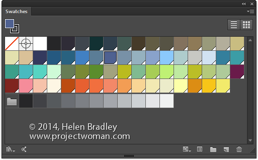
By default Illustrator starts all new documents with a preset set of swatches in the Swatches palette. If you prefer, you can create your own custom set of default swatches, save them and have them show up when you start a new document. Here’s how:

Create a new document – the size you create it as being will be the default for all documents created based on this profile as will the other settings in the New dialog.

Now choose Window > Swatches and select all the swatches you don’t want and drag them onto the Trashcan icon to delete them.

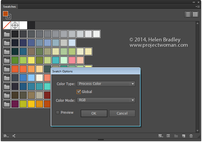
Add all the swatches you do want to have available to the Swatches palette. If you want some colors to be global colors, select them, click the Swatch Options button and click Global.

You can add any type of swatch at this point including pattern, gradients and solid colors.

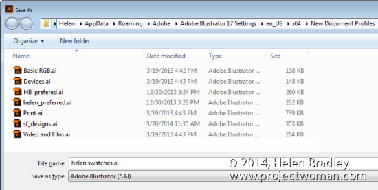
Then when you are done, choose File > Save As and save the file to one of these locations depending on your version of Illustrator and  your operating system:

On the Mac save the file to:


~/Library/Application Support/Adobe/Adobe Illustrator 17/en_US/New Document Profiles.

The tilde (~ ) indicates your hidden user library.
You can open it this way:
1 Launch Finder
2 Choose Go > Go to Folder
3 Type ~/Library and click Go
4 This opens the ~/Library folder and you can now navigate to the appropriate folder listed above.

In Windows 7:

First make sure you can see hidden folders and locate this folder (the exact folder structure may vary slightly but it should be pretty easy to find):

C:\Users\AppData\Roaming\Adobe\Illustrator 17 Settings\en_US\x64\New Document Profiles

To locate your c:\users\\AppData folder, launch Windows Explorer and type this in the address bar :
%USERPROFILE%\AppData
This automatically opens the AppData folder for you so you can now navigate to the desired folder as detailed above.

The name you give to your file is the name that the document profile will appear as in future so make it descriptive of the purpose of the document.

Once this is done, you can close the document.

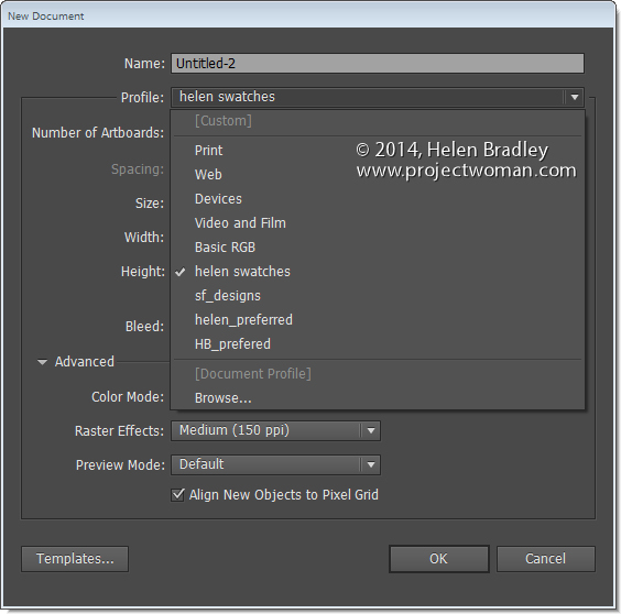
In future you can open a new document based on this profile by choosing File > New and choose the document profile from the Profiles list.

When you do so, your swatches will appear automatically. You can have multiple custom profiles so create them for the tasks you do most often.

Helen Bradley

Helen Bradley

Thursday, April 10th, 2014

Make a Style that forces a page break in Word

If you always start a new page for a particular type of heading – include the page break in the style

When you always start a major heading item on a new page in a Word document you can configure your heading style so it has the page break built into it – saving  you having to insert it manually.

To do this, select some text with formatted with the style that is to include the page break and locate the style in the Style gallery. If it does not appear there, display the Styles and Formatting task pane by clicking the dialog launcher in the bottom right of the Styles area in the ribbon.

Right click the Style name, choose Modify and then Format.

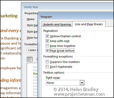
Click the Paragraph option and then click the Line and Page Breaks tab.

Enable the Page Break Before checkbox and click Ok twice.

The page break is now part of the style so a new page will be started each time you use that style. The style will also update and effect any text already formatted using that style in the current document.

Helen Bradley

Tuesday, April 8th, 2014

Create a stepped edge gear shape in Illustrator


Here’s how to easily create a shape with a stepped edge much like a steampunk gear, in Illustrator

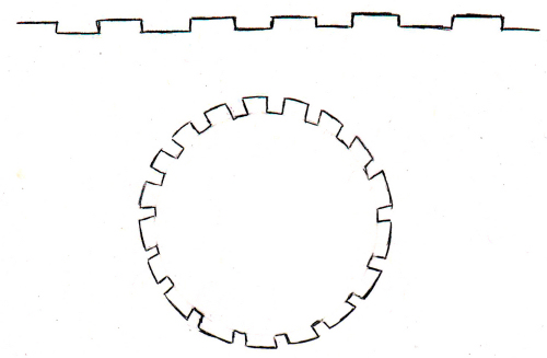
I love steampunk and I’ve even been known to create and give away a set of free steampunk brushes here on Projectwoman.com. Today, however I’m talking about  how to make your own steampunk shapes. A reader approached me and kindly drew out the shape he was interested in achieving and this is what he wanted:

Here’s how to do it easily using the Stroke options in Illustrator.

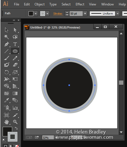
Draw a circle by clicking the Ellipse tool and holding Shift as you draw out a circle. I filled mine with black and added a thick grey stroke around the circle. You can make your stroke and fill the same, I’ve made them different so you can see what is happening.


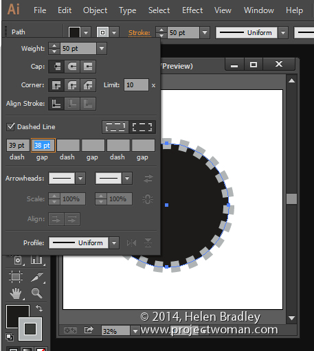
Click the underlined word Stroke on the Tool Options bar to open the Stroke panel. Set the Cap to Butt Cap, enable the Dashed line checkbox, set the Dash and Gap values to your preferred values.  A good place to start is to set the Dash and Gap to the same (or nearly the same) value as the point size of your stroke. Then alter the Dash value to change the length of the dashes and the Gap value to change the gap amount. Click away when  you are done.


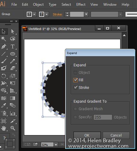
Now, with the shape still selected choose Object > Expand Appearance, then Object > Expand, leave Fill and Stroke checked and click Ok.


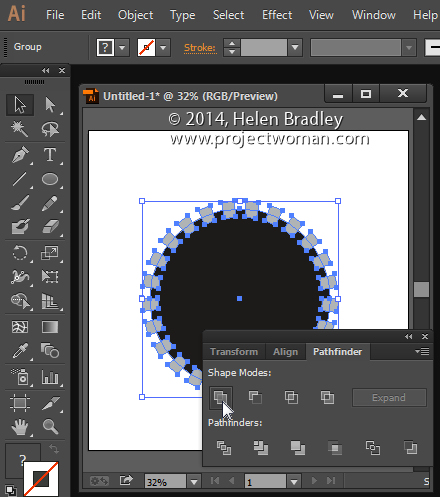
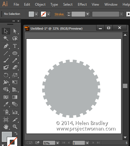
Now, with the shape still selected, in the Pathfinder palette (view it by choosing Window > Pathfinder), click the Unite icon (top row, far left). This creates a single shape with the edges you have described.


And that does it – there is your circle with a stepped edge and gear-like shape:


Helen Bradley