Friday, September 30th, 2011

Secrets of the Lightroom toolbar

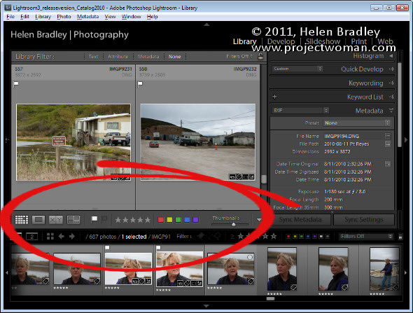
If you’ve seen items come and go in your Lightroom interface and if you’re confused about what exactly is happening chances are you hit a keyboard shortcut that displays or hides one of the interface features. When I was new to Lightroom it was the Toolbar – I could make disappear in a heartbeat – problem was it took a lot longer to work out what had gone and how to get it back.

As I soon learned, the toolbar can be hidden and displayed using the T shortcut or you can choose View > Toolbar. The toolbar is visible in Library, Develop, Slideshow, Print and Web view – but here’s the catch – there is a separate toolbar for each module and hiding one doesn’t hide them all – likewise displaying a toolbar only does so for the current module not all of them.

That said, you’ll want to have the toolbar visible in most of the modules most of the time because it has some handy features that you will use regularly.

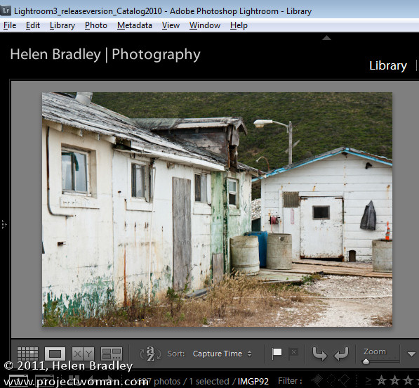
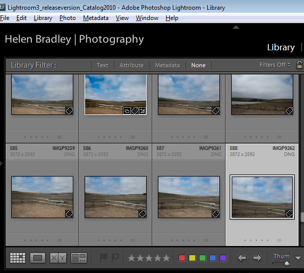
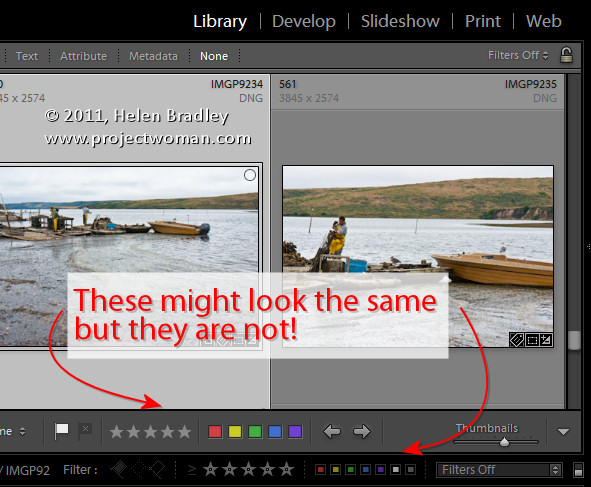
The toolbars in the Library and Develop modules are customizable – those in the other modules are fixed in what they display. To add to the general confusion, the toolbar you see in Grid view and the one you see in Loupe view in the Library module are both toggled on and off as if they were the same toolbar but they are separately customizable so you can select which tools appear in which view and they can look very different in each view as shown in these images of firstly Loupe view then Grid view:

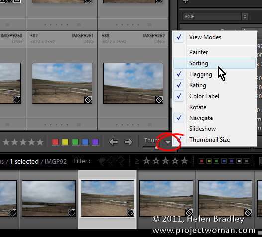
To customize a toolbar click the down pointing arrow at its far right and select the options to display and hide. When you are working on a laptop, for example, and where screen real estate is a valuable commodity, you’ll need to be judicious about what tools are visible and which are not.

One option on a laptop that I like to disable is the rotation tool in Grid view in the Library. The reason is that I can set the thumbnails in Grid view so they show rotation icons so I don’t need the additional tool on the toolbar. However, in Loupe view this rotation tool doesn’t appear so I add it to the toolbar.

If you often resize your thumbnails then including the Thumbnail Size slider is a good idea – if you need the space it takes up for other tools then hide it and learn the = and – shortcut keys for managing the thumbnail size instead.

One gotcha that is a guaranteed disaster in the making for new Lightroom users is the apparent duplication of rating, color and flags on the Toolbar and on the bar across the top of the Filmstrip. These are NOT duplicates and instead they are each very different options. The tools on the Toolbar are used to apply a flag, color and rating to images in the Grid or Loupe views. Those above the filmstrip are filters that you use to filter your images based on the flags, colors and ratings you have applied to them. It is important to understand the difference. If you get into trouble and some of your images disappear, selecting Filters Off from the drop-down list above the filmstrip will display all your images again.

Helen Bradley

Thursday, September 29th, 2011

iPad 2 – Delete multiple emails at a time


There are a few ways to delete multiple emails at a time on the iPad, none of them particularly intuitive and there is no big Select All option so it has to be done individually:

Start by turning the iPad into landscape mode and click the inbox. If you click the Edit button (top left) then you can select multiple emails to delete very quickly. Then click the Delete button which appears bottom left.

To make sure I don’t have too many emails to deal with at a time, this is how I have my email account configured:

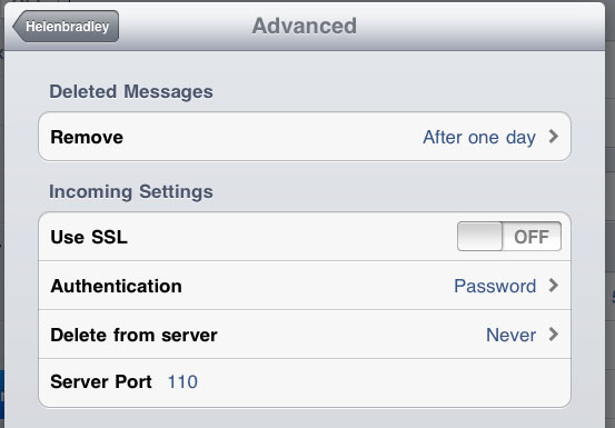
First of all, because I deal with email on my desktop, I don’t want the iPad to delete emails from the server so that option, in Settings > Email is set to Never. To find it, click your account name and click Advanced.

Then I set the Remove option in this same dialog to After one day.

All these settings and actions make checking emails on the iPad a fairly simple process – but I, like you, wish there were smarter Select All and Delete All options.

Helen Bradley

Tuesday, September 27th, 2011

Timeline in Microsoft Word 2010

The new SmartArt feature in Word 2007 and 2010 helps you create timelines very easily:

Step 1
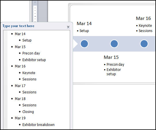
Choose Insert -> SmartArt -> Process and select one of the process options such as Basic Timeline and click Ok. Type the text into the textboxes in the SmartArt object. Alternately, click the arrows at the far left of the object and add text via the dialog.

Step 2
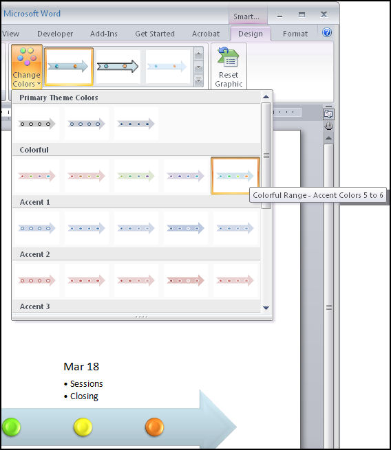
To format the timeline SmartArt, select the object and choose Format -> Design on the Ribbon and then select one of the SmartArt Styles. Click Change Colors to alter the colours used in your SmartArt object.

Step 3
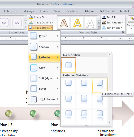
From the Shape Effects list you can customise an effect such as reflection or shadow for the art. In addition, as the look of a SmartArt object is controlled by the document theme you can choose Page Layout -> Themes and select an alternate theme for your document.

Helen Bradley

Tuesday, September 27th, 2011

Color Correction in Photoshop

One of the most difficult things to do when you’re starting out in digital photography is to recognize and remove a color cast from an image. Not only do you need to work out that you’ve got a color cast, but you also need to find a means of fixing it.

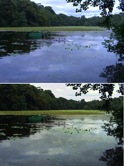
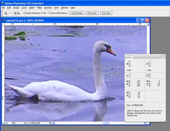
One method of color correction is one that I learned from Photoshop gurus, Dan Margulis and Taz Tally – any errors in this process are mine and not theirs. The process relies on reading data from the image and then adjusting the numbers that the image provides. It’s a way to remove a color cast that is relatively simple and which involves reading and setting RGB values rather than making objective decisions about an image. I’ll show you how to do this using an image shot in the early morning and which is hazy, underexposed and which has very poor color.

Step 1
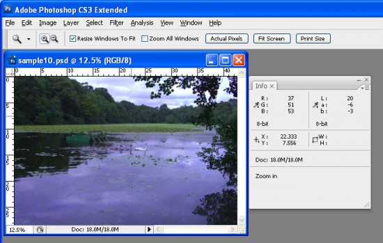
To get started, open an image that you think has a color cast. Choose Window > Info to display the Info palette. This gives you information about the pixels in your image and, if you’re working with a standard photo, you’ll have RGB mode displayed in the upper left corner of the dialog.

Step 2
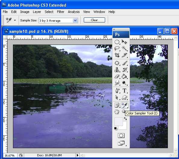
To make the color correction I’ll use the Info palette to display information about the image. To do this I’ll need to make some color sample points on the image and I’ll do this using the Color Sampler tool which shares a toolbar position with the Eyedropper. Click the Color Sampler tool and, from the toolbar, select the 3 x 3 Average Sample. This is important as you’ll want to sample a larger area than just a single pixel.


Step 3
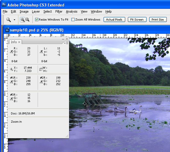
Now locate a place on the image which should be white or a light neutral gray in color. Click on it with the color sampler tool and you’ll see a marker appear on the image with the number 1 beside it. Make sure the point you select is one which should be white or light gray and don’t select an area of the image which is blown out such as a light spot.

Repeat the process, this time clicking on another point which should be either white, black or a neutral gray. This gives you a second sample point. You can continue and add a total of four markers if desired. Each should be placed in an area of the image which should be white, black or a neutral gray.

Step 4
Check back in the Info palette to read the color information for each of these points. For the lightest points you should see values of around 245 for the R, G and B channels. For the darkest points the value should be around 15 for each of the channels. For gray points you should have equivalent values of R, G and B, although they can be any value, they just need to be roughly the same for each.

Step 5
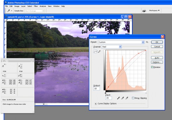
If your image has a color problem you’ll find that the numbers at each point are not within a range of 2 or 3 values of each other. To color correct the image what you’ll do is adjust the curves for each of these channels to bring them closer to each other. Choose Layer > New Adjustment Layer > Curves and click Ok. You’ll be correcting individual channels so from the Channel dropdown list select Red and then Ctrl + Click on the first point that you marked in your image. This adds a small marker on the curve line which shows you where this point in the image appears on the curve.

Identify whether you need to increase or decrease the value at this point. To increase it, drag upwards and to decrease the value drag downwards. You’ll see that you’re not making subjective judgments here; you’re simply adjusting the curve to bring the numbers closer together and closer to the desirable value of 245 for a white point and 15 for a black one.

Step 6
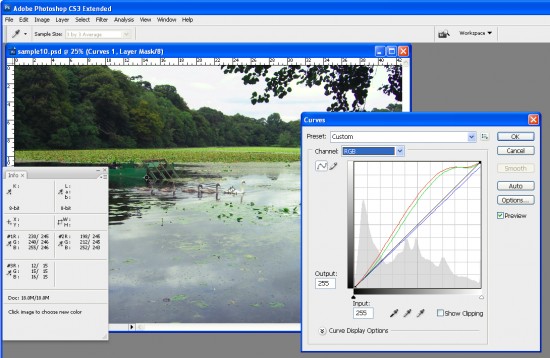
Repeat this last step for all the sample points that you created on the image and then repeat it for the Green and Blue channels so that you end up with all the sample points containing values that are within 2 to 3 values of each other.

Step 7
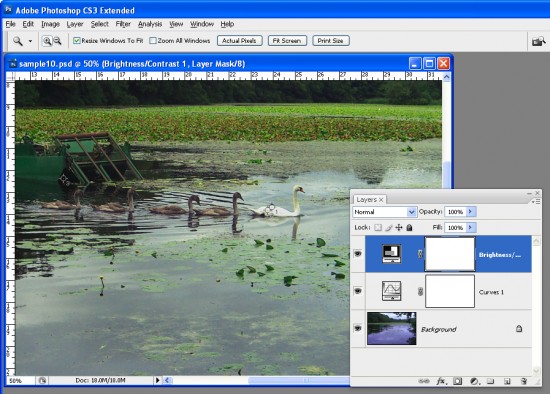
When you’re done, click Ok to close the Curves dialog. You can now apply other fixes such as adding contrast to the image with a further Curves adjustment or use the new Brightness/Contrast tool in Photoshop CS3.

Using the Info palette combined with sample points on the image makes it easier to remove color casts by reading and adjusting numbers.

Helen Bradley

Saturday, September 24th, 2011

iPad 2 -Blog to a self hosted WordPress blog


Ok, the challenge is how do you blog from your iPad to a self-hosted WordPress blog and how do you do it with images from your iPad?
Well, the actual blogging part is simplicity itself. Just crank up Safari and log in to your WordPress dashboard. From there you can do almost anything you want – except the one thing you really want to do – add images from your iPad to your post!
Ok. So, Safari is a great place to work in but we have to solve the image problem and for that we use the WordPress app for the iPad – good news is that it is free so download it from the store and get it started.

Then in the WordPress app you can add your blog – you just type its URL including the /wordpress/wp-admin bit and type your ID and password. You only do this once.

Here you will likely encounter a problem that your blog isn’t configured to allow this type of editing. You will get this message that XML-RPC services are disabled.

What you need to do is to go to your computer and log in to your blog using an admin account – if it is your blog, then chances are you are an admin anyway. Then go to the Settings group on the left and click Writing. Then, locate the Remote Publishing area and enable the “WordPress, Moveable type, MetaWeblog and Blogger XML-RPC publishing protocols”. Once you have done this you’re ok to go and your blog will be added to the WordPress app. If you have multiple blogs you can add more than one, which is smart.

Now, the big reason why we’re using the WordPress iPad app is that it lets us get images up to our WordPress blog so you don’t have to write your content in the app but you do have to upload your images using it so you can get them from the Gallery later on.
So, first of all crop your images and rotate them – I find it easier to do this on the iPad and you can use any program you like – I use Photoshop Express but you can use anything.

Now click on your blog name to get access to your WordPress site on your server.  You will see some links at the foot of the screen which take you to the various parts of your site – click the Posts button to view your posts and click the little Add button at the top of the panel on the left to add a new post. Here you type the post content.

To add images, click Done and then find the little icon in the bottom right that looks like a landscape image – click it and add images from your Camera Roll.

Regardless of where you are when you do this all the images go one after the other into the post… this is the sucky part but it really is a small issue – at least they are there!

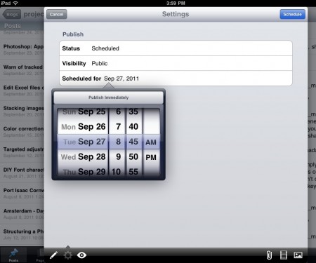
Before you leave the WordPress iPad app, click Done and click the Settings button (bottom Left) and set a Schedule for the post – I make this a day or more but at least an hour so ahead of time so I have enough time to fix the image issue back in WordPress in Safari before everything goes live.


Now, still in the WordPress app, go ahead and Upload and Update everything. Then go back to Safari and log in to your blog.

By the way, I haven’t mentioned it yet, but it really helps to have one of those bluetooth keyboards so you have arrow keys and you can use shortcuts to copy and paste and select stuff. It beats working with your fingers on the screen – if you’re serious about blogging on the iPad you really need one. I use the Zagg one which I really like.
Back in WordPress on Safari I just delete all the code which has been added for the images as they are seldom where I want them to be. Now I move into position in the post and add the images using the regular WordPress Add Image button – the pictures are all in the Gallery – thanks to the WordPress app.

In WordPress in Safari I can do things like add Captions and descriptions and scale any image that need resizing.

On a scale of 1 to 10 it would be easier to be able to do everything from inside Safari or inside the WordPress app but I wouldn’t call this difficult or unnecessarily cumbersome. I can live with the slight workaround for the sake of being able to blog with images from the iPad in WordPress to a self hosted blog.

I’d rate it around a 7/10 ease of use and functionality and I love it. In fact this is the last big issue I’ve had with the iPad and not being able to blog to my WordPress blogs would have been a deal breaker for me. I need to be able to blog on the road and I want to do this with images – in particular as I am doing an apple a day blog over at my design site and looking at heaps of cool iPad apps so not being able to include images would be horrible!


Helen Bradley

Friday, September 23rd, 2011

Photoshop: Applying fixes using masks

Sometimes a photo needs two opposing fixes applied to different areas of the image. This poses a dilemma – if you fix one area you’ll make the other areas far worse than they started out being and vice versa. The solution is to apply both fixes but to do this on different layers and to blend the results together using a mask. Here’s how to do it:

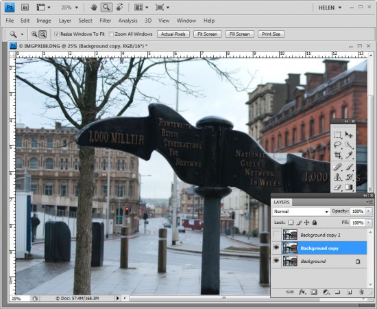
Look at this photo – the sign in the middle is dark and hard to read and the area behind it is lighter than it should or could be. The camera has exposed primarily for the lighter areas in the image but the entire image needs work.

Step 1

Make multiple duplicate layers

To fix the image make two copies of the background layer so that you do your work on duplicate layers. To do this, right click the Background layer in the Layers palette and choose Duplicate Layer and then repeat this step a second time. Disable the visibility icon on the topmost layer and select the middle layer.

Step 2

Using Shadow/Highlights to lighten the darks

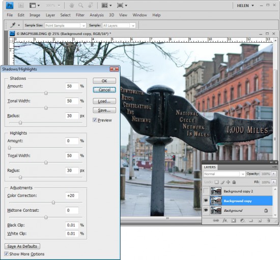
To bring detail out of the darker area in the sign, I’ll use the Shadow/Highlights tool. To do this choose Image > Adjustments > Shadows/Highlights and adjust the Shadows but leave the highlights settings untouched. Typically the default setting will be all you need but you can fine tune the settings using the sliders which appear when you click Show More Options if desired. Ignore the impact that this fix has on the lighter areas of the image.

If you prefer to use another tool for this fix, do so. The important thing is to fix the shadows and ignore any changes to the highlights.

Step 3

Levels to fix the highlights

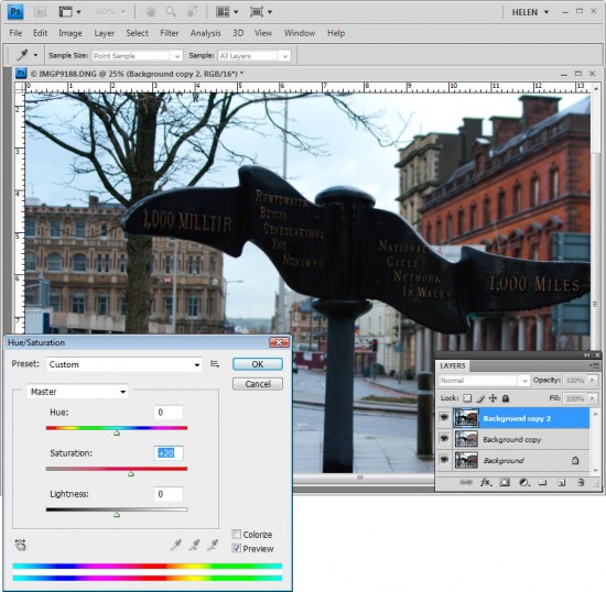
Enable the visibility icon on the top layer and select the top layer – this hides all the changes you have made so far. Choose Image > Adjustment > Levels and adjust the levels to improve the contrast in the lighter areas of the image – this time ignore the darker areas entirely as they are not part of this fix. You can also adjust the saturation using Image > Adjustments > Hue/Saturation if desired.

Again, if you prefer to use another tool, do so. The important thing is to fix the highlights and ignore any changes to the shadows.

Step 4

Blending the results with a mask

The top layer contains the adjustment for the lighter areas of the image and the middle layer contains the adjustment for the dark areas of the image. To blend these layers, I’ll use a layer mask to selectively adjust the opacity of the top layer so I can see the fix applied on the middle layer through it.

Unlike the layer opacity slider which sets every pixel to the same opacity value, a mask lets you adjust the opacity selectively so one area can be 100% opaque and others can be partially or fully transparent.

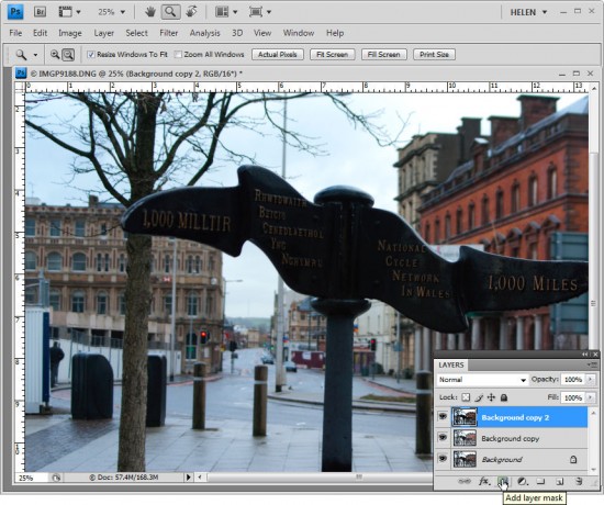
To add a mask to the top layer, first select the topmost layer and click the Add Layer Mask button at the foot of the layer palette. This adds a white layer mask to this layer. When working with masks, “black conceals and white reveals” so the white mask reveals everything on the top layer and the image is unchanged.

Step 5
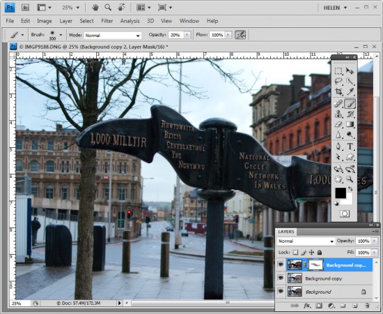
Set the foreground color to black, select a soft round brush and set its Opacity to approximately 20%. Click on the mask to select it – it will have a small border around it showing that you have it selected. Now paint over the darkest areas of the image to reduce the opacity of the top layer where you are painting – this reveals the fix from the layer below. Using a low opacity brush lets you reduce the opacity gradually to build up the effect.

Continue and paint over the darker areas of the image to reveal more of the layer below through the mask. It can help to see how much more detail you can still recover if you turn the visibility of the top layer on and off. Make sure to select the layer mask again before painting on the mask – if you don’t do this, you’ll paint on your image.

If you go too far, make white your foreground color and paint on the mask to bring back parts of the top layer of the image. This is one of the benefits of using a mask – simply by painting you can apply or remove the fix. You wouldn’t have this flexibility if you used the Eraser tool on the top layer, for example.

To finish, I rotated the image to straighten the sign and cropped it to remove the distracting elements on the left side of the image.

Helen Bradley

Thursday, September 22nd, 2011

Warn of tracked changes in Word 2010

Microsoft Word 2010 has some great security settings but I am continually disappointed that Microsoft hides them away so they are so difficult to find.

One of these settings is crucial to enable so you don’t accidentally send a document out to a client with, for example, a comment in it saying what a idiot your client is. The revelation that you think they are an idiot might be news to them – and you’re not going to look too smart yourself.

The culprit is tracked changes. It is all to easy to have Tracked Changes enabled but to have your document show only the final version of the text. Behind the scenes every insertion and deletion is being stored in the document even if you aren’t seeing it. However the information will be accessible to anyone viewing that document – not a smart idea!

If you don’t think this is a big deal you might be interested to know that lots of smart people have been caught out by it, including Microsoft itself. This blog post showcases stories of businesses and government caught out by tracked changes.

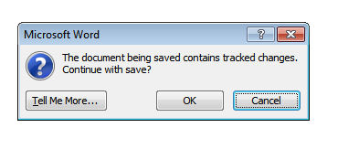
To stop this happening to you, you can do a few things but I like the method that you set once and, from there on, Word will do the work for you. This involves having Word tell you if a document you are about to print or save has tracked changes in it. Ignore the warning at your own risk!

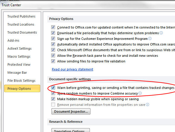
To configure this, choose File > Options > Trust Center and click Trust Center Settings then Privacy Options. Enable the “Warn before printing, saving or sending a file that contains tracked changes or comments” checkbox.

Now, in future, Word will show a warning if a document contains tracked changes even if they are hidden from sight.

It should be on by default and it should be easier to find… but there it is… and don’t say I didn’t warn you about it.

Helen Bradley

Tuesday, September 20th, 2011

Edit Excel files on the go

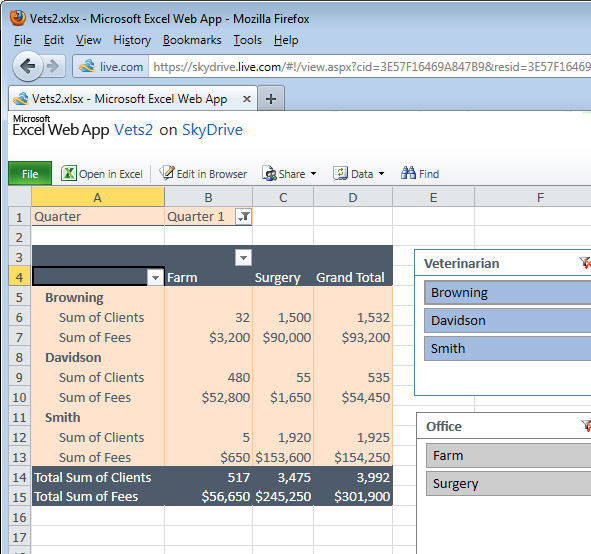
If you have access to a PC and an internet connection then your options for working with an Excel spreadsheet away from your desk are good – thanks to the Microsoft Office WebApps. Even though many of the advanced Excel tools you are used to using offline won’t be accessible online they won’t be destroyed by opening a file in the Excel WebApp either. You can view charts and filtered table data and features such as the new Slicers in an Excel 2010 PivotTable can be used to work with the data.

Of all the cloud based apps, including Google Docs, the Microsoft WebApps are your best option for working with Excel spreadsheets in the cloud when you are away from your desk and the apps are free.

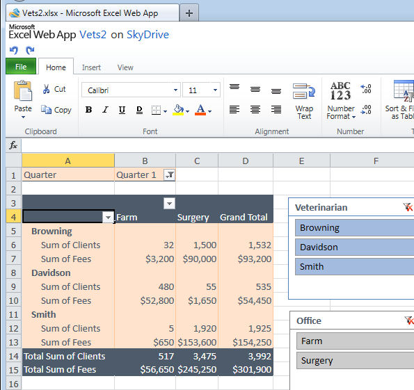
You can sign up for a free SkyDrive account at skydrive.live.com and that’s where you get access to the WebApps which include Excel, Word, PowerPoint and OneNote. I selected to upload this file then view it in the Excel viewer. To work on it beyond selecting options in the Slicers I can click Edit in Browser to open the file in the free cut down version of Excel online.

One benefit to using SkyDrive is that you can upload files from your local computer to SkyDrive where they are stored for you. You can work on the files online and later download them to your computer when you want to work on them there.

Helen Bradley

Tuesday, September 20th, 2011

Stacking images in Lightroom

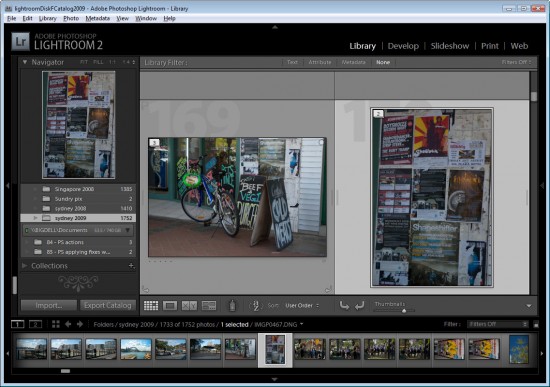
When you have a lot of similar images from a shoot, you can organizing them using the Lightroom Stacks feature. This allows you to stack images together so that only one image representing the stack appears in the Grid, Filmstrip and Loupe. This can clean up the screen reducing the number of images you see.

Get started with Stacks in Lightroom
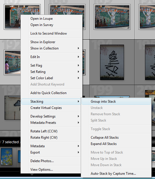
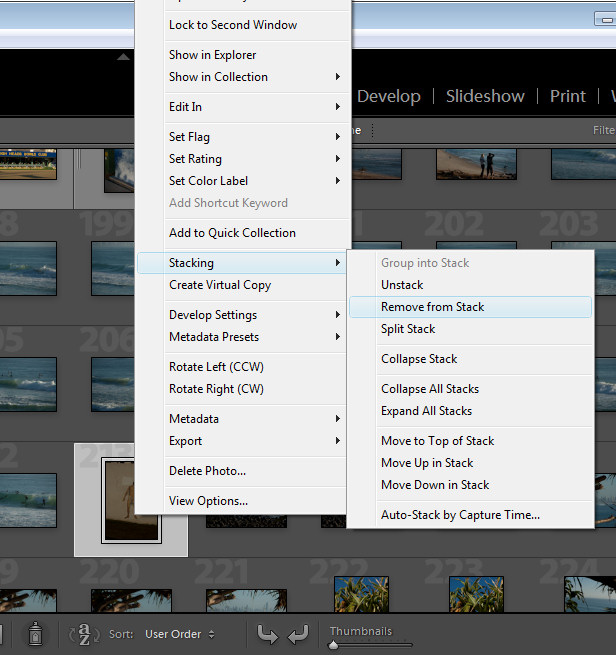
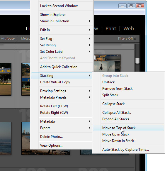
To stack images, in the Library module, select the images to stack, right click and choose Stacking > Group Into Stack. This stacks the images on top of each other.

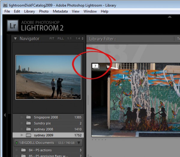
In Grid view you will see a small number in the top corner of the image at the top of the stack showing the number of images in the stack.

You can add an image to a stack by dragging and dropping it on top of a stack.

Expand a Stack
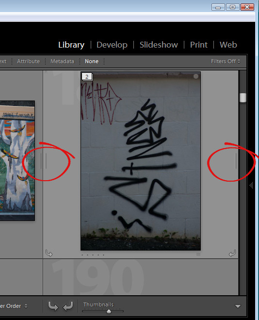
To expand a stack, right click on the number showing the number of images in the stack and choose Expand Stack from the Stacking shortcut menu or click the double line marker either side of the stack. Click the double line marker again to collapse the stack or right click an image in the stack and choose Stacking > Collapse Stack.

When you expand a stack, the images from the stack have a darker color underneath them indicating that this is an expanded stack.

There is some important terminology to know about stacks. You collapse and expand a stack to view or hide the images in the stack. If you unstack a stack you permanently remove the stack – you do not remove the images just the stack. There is no restack command so, when you unstack a stack, your only option for getting it back is to reselect the images and stack them again. You also cannot create a stack in a collection – you may only stack images in a folder.
Change the visible image
To change the image at the top of the stack, expand the stack, click the image to use as the top image and choose Stacking > Move to Top of Stack. The topmost image is the one that is visible when you collapse the stack again.
Remove an image from a Stack
You can remove an image from a stack by expanding the stack, right click the image to remove and choose Stacking > Remove from Stack.

Stack for HDR
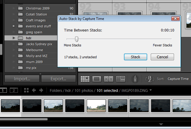
There is another stacking option you can use, for example, where you have captured a series of images to use for a panorama or where you have captured a series of bracketed exposures for HDR processing. Because these images will have been captured within a short period of time, you can stack them based on capture time. To do this, select all the images, right click and choose Stacking > Auto-Stack by Capture Time. Set the time between stacks value – as you do you will see an indicator telling you how many stacks this will give you and how many images will remain unstacked. Use this as a guide to the optimal value to use. Click Stack to have Lightroom create your stacks for you.

Once this is done, right click and choose Stacking > Collapse Stacks to view the stacks that you have made. This is a quick way to group images that are most likely to be part of the same sequence of images and if one or more stacks aren’t correctly formed, you can either unstuck them or split a stack in two by right clicking the image at the point that the split should be made and choose Stacking > Split Stack.

Stacks are a useful way to restore order to a large folder of images containing a lot of similar images. By stacking images you’re not altering the images in any way, simply organizing them a little more neatly.

Helen Bradley

Thursday, September 15th, 2011

Color correction in Lightroom

Lightroom has tools for correcting color not just across the entire image but also for correcting individual colors.

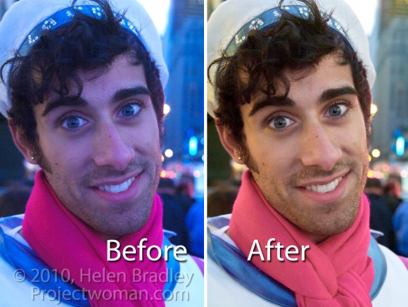
This image was captured in New York’s Time Square where the light is unpredictable at best especially at night because of the bright advertisements and neon signs. Because the colors of the lights change constantly it’s impossible to correct the color in camera using its white balance adjustment. Instead this has to be handled in post production.
Step 1
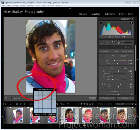
To start off color correcting an image in Lightroom’s Develop module, open the Basic panel and click the White Balance Selector which is the eyedropper in the top left corner of the panel.
Deselect the Auto Dismiss checkbox on the toolbar so the tool remains visible. Click on the image in a place that should be neutral gray to adjust it. If you don’t get the right correction the first time, click again on a different area of the image until you get an adjustment that looks correct to you. What you’re looking to do at this point is to remove the overall colorcast in the image.

Notice as you hold the White Balance Selector over the image that the Loupe shows a gird of pixels around the area you have the mouse held over and it also shows the relative percentages of red, green and blue in the pixels over which the mouse is hovering. Where the color in an image should be neutral grey, these values should be the same and if they are not, there is a color cast.

When you have a result you like, either return the White Balance Selector to its position in the Basic panel or press Escape.

Step 2
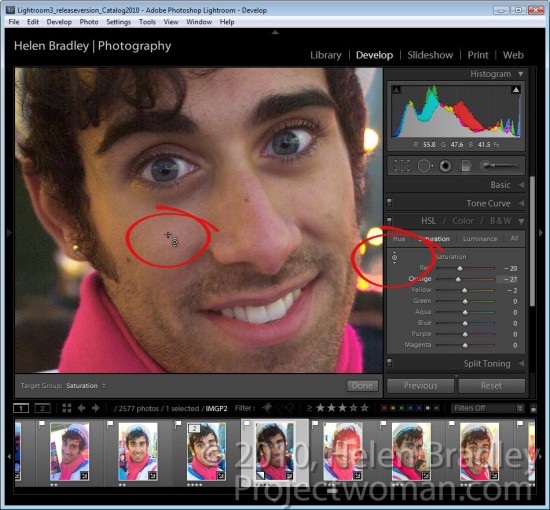
If some individual colors are still incorrect you can adjust these using the HSL panel. To do this, select HSL and then Saturation and use the Targeted Adjustment Tool to drag on an area of the image downwards to decrease or upwards to increase the color saturation at that point in the image. In this case, the skin needed to be desaturated because of the color of the light reflected on it.

Step 3
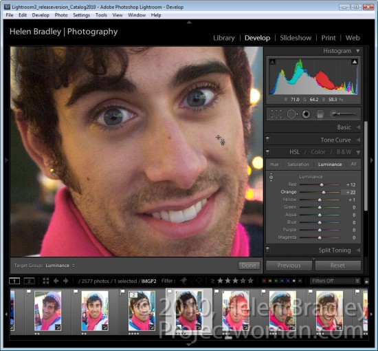
When you have adjusted Saturation, click Luminance and, if necessary use the same Targeted Adjustment tool to increase or decrease the Luminance in areas that are too dark or too light.

For this image I decreased the Saturation and increased the Luminance of the skin tones until I had a result I liked.

Once you’ve fixed the color problems, you can return to the Basic panel and continue to adjust the image using the tools there.

While sites like Times Square will never be an ideal place to capture images you can compensate at some level for poor color using the tools you have at hand in Lightroom.

Helen Bradley

Page 1 of 212