How to get the color picker to look the way you want it to look
or How to fix the Color Picker when it looks all funky
Sometimes when you open the color picker in Photoshop it looks one way and other times it looks a different way. It might even seem like there is no rhyme or reason to how it looks and that it changes without (what it may seem like) no input from you.
Of course, nothing could be further from the truth but knowing that won’t solve the problem of why it changes and how to change it back!
To change it, don’t go looking under Preferences for all the Color Picker choices. While some preferences can be found in the Preference area the secret changes are made inside the Color Picker itself.
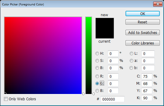
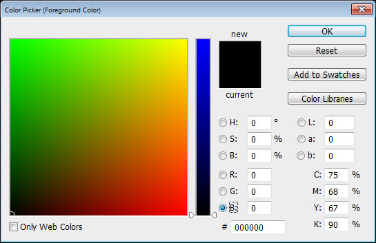
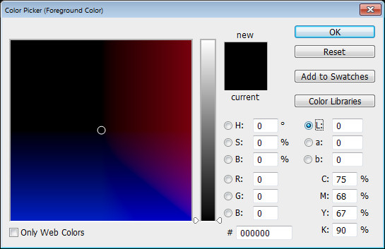
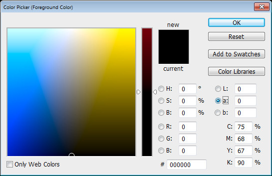
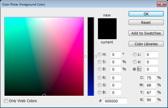
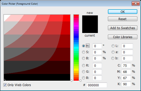
To see them at work, click to open the Color Picker. What you see here depends on what is clicked in the right of the dialog (when you realize this everything becomes blindingly obvious).
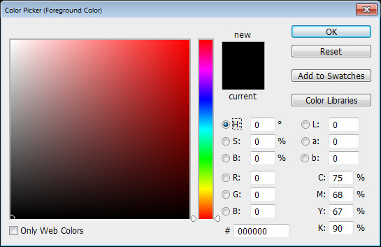
Click H for Hue to see this:
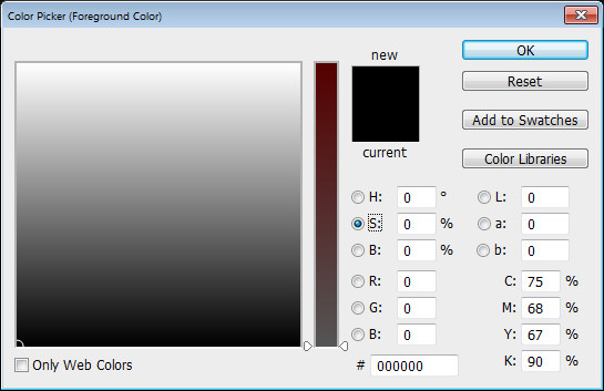
And S for Saturation to see this:
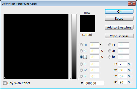
And B for Brightness to see this:
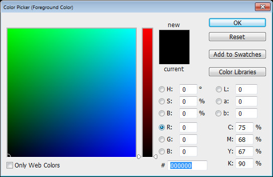
Each of R, G and B make the picker look different:
And each looks different if you have the Only Web Colors dialog checked:
Now you know what affects how the Color Picker looks you can choose the one that makes the most sense to you.


