Saturday, March 15th, 2014

Scroll though Blend Modes in Photoshop – Mac and PC

scroll through blend modes on the mac

by Helen Bradley

Learn the keystrokes that help you quickly scroll through blend modes in Photoshop on the PC and Mac

On the PC, being able to scroll through the blend modes in the Layers palette is a simple as selecting one blend mode in the list then use the Up Arrow and Down Arrow key to go from one to the next.

On the Mac, it isn’t as easy but it (thankfully), can be done.

On the Mac, click in the Blend Modes list and select a blend mode. Then use the Shift + + or Shift + – keys to scroll up and down the list. Unlike on the PC, the Mac keys roll you around the list so, when you reach the bottom and press Shift + + once more you go right back to the top. Neat huh?


Helen Bradley

Saturday, March 1st, 2014

Create a Graffiti Wall Effect in Photoshop

Learn to paint graffiti without a risk of being arrested

See how easy it is to create a graffiti effect on a wall in Photoshop. The video shows you how to use a graffiti font to create graffiti writing and how to use styles and colors to format the test to make it look like real graffiti. Then see how to use the Vanishing point filter to place the graffiti text onto a wall in a photo. Finish the effect by blending the text with brushes, blend modes and textures all created using layers and masks so that the effect can be edited in future.

Helen Bradley

Wednesday, January 29th, 2014

Vintage inspired shape in Illustrator

Learn to add multiple fills and strokes to a single shape in Illustrator

Illustrator can be a challenge to learn and once you get hold of the basics you may be so relieved that you have progressed this far that you forget to dig deeper for better and smarter ways to create designs.

One feature of Illustrator is the ability to add multiple strokes and fills to a single shape, to order them so they appear on top of each other correctly and even to blend them using Blend Modes.

This video shows how to turn a star into this vintage inspired free pattern filled shape in Illustrator. It’s simple to do when you know how – just a few minutes of video can open up a wealth of opportunities for being creative in Illustrator – Enjoy!

Helen Bradley

Sunday, June 3rd, 2012

Edit and Create on the go with Adobe Photoshop Touch

By Helen Bradley

On Monday, Adobe launched its Photoshop Touch application for the iPad. This long sought after app runs on the iPad 2, and not on the iPad 1, and it requires that you have iOS 5 installed. The app costs $9.99 which is at the high end of the price range for photo-editing apps in general but Photoshop Touch seems to have got the feature set about right so most people will probably consider it worth the money.

I use the iPad a lot for working with photos I’ve shot using a digital SLR camera in raw and which I’ve resized, converted to jpeg and downloaded to the iPad. Those images I have on the iPad are there because they are funky or because they lend themselves to some artistic play. So, I looked at Photoshop Touch in this light – I wanted to see if it would be part of my iPad image creative workflow. For heavy duty work, Photoshop and Lightroom will remain my tools of trade.

When you launch Photoshop Touch you get two options, viewing the tutorials or doing some work.

There are 10 tutorials that you can work through each of them is project based so you learn the program by learning a technique not by learning how individual tools work. These are text and image tutorials and not video ones, but they are interactive so you can learn as you go.

The second option is Begin a Project which is where I’ll start. You get the choice of adding an image from your iPad, the Adobe Creative Cloud, the Camera, Google or Facebook. I chose Local Photos then the Photo Library and an image from my iPad.

In the main editing area you’ll find the tools on the left, layers on the right and menus across the top. The program pays lip service only to Photoshop.  Some icons are familiar but others are more iPad than Photoshop so Photoshop users may find it a bit confusing where iPad artists will find it more familiar.

You can add multiple images and multiple layers. I wanted to texture this image so I clicked the Add Layer button and selected Photo Layer.

Once you select a second photo you get to size it as you import it – you can also rotate, flip or skew it too. Click Done to proceed to the editing area.

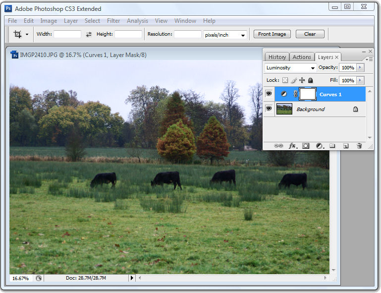
Now, with the layer selected, you can apply adjustments to it.

I chose Curves as this was a texture and I wanted more contrast. There are no adjustment layers so the Curves adjustment is being applied just to the targeted (top) layer. As you can see, you can adjust the RGB composite channel or the individual red, green and blue channels.

With the texture layer still targeted you can apply a filter to it by clicking the FX button. There is a range of filters including Basic, Stylize, Artistic and Photo. Some add things like drop shadows, blurs and glows and others are more artistic.

I chose Stylize > Old Photo, configured the settings and tapped Apply. Unlike Photoshop where the foreground and background colors need to be selected before you run a filter, here you can select the colors to use in the filter settings – this really is a feature that Photoshop should have.

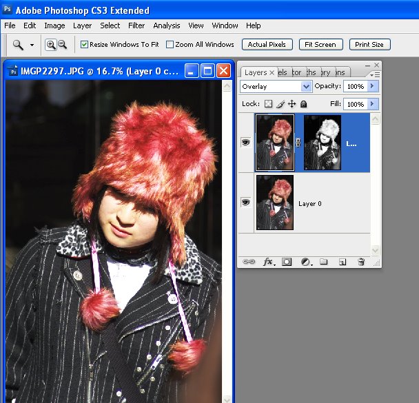
To blend the layers you click the Layer icon and you get a choice of blend modes and the chance to adjust the layer opacity.

There are no masks but you can use a gradient to fade the effect – when you do the gradient is applied to the layer and you can only undo it by tapping Undo – you can’t go back and edit it.

You can also add a new Empty Layer and fill it with a gradient.

And then blend it using a layer blend mode as I have done here.

I finished by cropping the image and then saving it.

You can then email it or send it to the Camera Roll or upload the project to the Adobe Creative Cloud so you can access them from there.

There are limits to Photoshop Touch and one is the 1600 x 1600 pixel image size limit. The text tools are rudimentary and, as a long time Photoshop user, I’d like to see editable masks and editable text. That said, for fixing photos and tinkering with creative projects this program is a welcome addition to the Adobe family.

This app will appeal to a range of users. There are plenty of basic tools that are easy to use but also some more advanced features for working with images. The Scribble Extract tool does a reasonable job of extracting a subject from a background and you can tinker with gradients and fades to get some interesting effects. You don’t need to know how to use Photoshop to use the app but your knowledge won’t go astray.

Helen Bradley

Wednesday, February 29th, 2012

Adobe Launches Photoshop Touch for the iPad

It has been a long time coming – way too long – but Adobe finally launched Photoshop Touch for the iPad.

I have reviewed it here for PC World and I wrote a how to for creatively editing images with it for Digital-Photography-School.com.

The app costs $9.99 so it isn’t cheap by iPad app standards but I think it is worth it. Downsides are non editable text, 1600 x 1600 px file size limit, no true editable masking tools and no adjustment layers. But it does have good layer tools (unlike Adobe Ideas you don’t have to shell out 99c for each new layer!), blend modes and it is easy to use.

Helen Bradley

Friday, March 27th, 2009

3 Step Photoshop Every Image Quick fix


Ok, so not technically Photoshop only – this tip works for any image software that supports layers, has layer blend modes and can do a gaussian blur. That includes Photoshop, Photoshop Elements and Paintshop Pro as well as lots of other great photoediting programs.

This is a very quick fix for boosting and image and giving it a really nice look.

Step 1
Start by duplicating the image layer by choosing Layer > Duplicate Layer.

Step 2
Add a Gaussian blur to the top layer by using Filter > Blur > Gaussian blur. You need to use enough radius to get a nice light blur on your image. For smaller images you need only a small value blur – say 2-4 and for larger images you will need a higher value. Click Ok when you’re done.

Step 3
Now set the Blend Mode for this blurred top layer to Soft Light or Overlay. You’ll get a nicer looking image and the colors will get a nice boost. Reduce the layer opacity a little if necessary.

This is a simple and effective fix and isn’t that the best type?

Helen Bradley

Wednesday, December 10th, 2008

Curves + Luminosity = Better Tones.


In the last blog entry I mentioned some cool things you can find in the Curves dialog that help you adjust the tonal range of your image. Today I’m going to show you how to wreck the color in an image in the name of improving tonal range.

The Curves dialog has four channel options – you can work on the RGB composite channel (the default), or you can work on the separate R, G or B channels. Problem is that although adjusting the R, G or B channels independently can help you improve the tonal range of the image – it can also totally mess with the color. For this reason, few users bother working with the individual channels. Makes good sense? No!

You see working with individual channels is a good fix. If the Red or Green channel lack contrast you can hype it up using a curves adjustment. You’ll mess up the color but, if you’re using an Adjustment Layer, you can simply change the blend mode of the adjustment layer to Luminosity and immediately the messed up color disappears and the adjustment is limited to luminosity only. Instant fix.

So, next time you need to apply a Curves adjustment, check the channels in the Channels palette. If you see a channel that lacks contrast – adjust it to add contrast to it. Then set the blend mode of the adjustment layer to Luminosity to remove the color problems you just created.

Helen Bradley

Tuesday, April 15th, 2008

Hong Kong Trams

One of the most wonderful things about Hong Kong is its cultural and social diversity. Along side this tram is a person on a push bike – with a basket full of things they are pedalling around town. It’s a sight you see a lot, high rise buildings, wealthy people contrasted with push bikes and mountains of laundry hanging off the sides of buildings. Gotta love this place, I certainly did.

This image needed more contrast and a bit of tweaking on the colour side to highlight its delicious pastels. My contrast fix of choice is now, officially Curves in Photoshop. But these aren’t your dad’s curves or your mums! They are curves on steroids – select the channels R,G and B and adjust each of them to get the best contrast in the image, just don’t look at colour – look at contrast. Then, when you’re done, you did apply your fix on an Adjustment layer didn’t you? Set the Adjustment Layer blend mode to Luminosity. Notice how the wonky colours disappear and your image’s contrast is adjusted perfectly? Luminosity blend mode applies the change to the image’s luminosity (lights and darks on a grey scale) and keeps it away from messing with colour – Like I said, not your mum and dad’s curves.. these are for real Photoshoppers!

Helen Bradley

Friday, March 21st, 2008

Fixing with Luminosity masks

Luminosity (Luminance) masks are an interesting tool. Consider the situation where you need to apply a fix to an image but the lighter portions of the image are ok, it’s the darks that aren’t – or vice versa.

Start by duplicating the image layer and apply the fix to the top layer. Concentrate on the portion of the image that needs fixing, ignore the disaster that’s happening in the areas that don’t need fixing.

When you have the fix in place, it’s time for the fun stuff. Locate a channel which has the detail you want for your mask. You need a channel that is dark where you want the fix to be less and light where you want it more (or vice versa, as you can invert the mask). When you have your channel, Control + Click on the channel (Command + Click on the Mac) to load it as a mask. Now go back to the image and add a mask to the layer – it is automatically created as a luminosity mask based on the channel you used. So, your new mask is white where the channel is light and dark where the channel is dark. Of course, if you need it in reverse, add your mask, select it and press Control + I to invert it. Where the mask is lighter, the fix is more strongly applied and where the mask is darker, the fix is least strongly applied.

In the image above, shot in Harajuku, Tokyo on New Year’s Day, I’ve used a Luminosity mask based on the image’s own red channel to add some extra contrast and colour to the wonderful hat. I duplicated the image layer and applied a simple Overlay blend mode to that layer. Then I added the Luminosity mask to force the fix into the areas lightest in the red channel – ie where the reds in the image are located and less so in areas which weren’t red. (If this sounds wrong to you, remember that in RGB mode, the red channel is lightest where red is located and darker where it isn’t, ditto the green channel – it’s lighter where the green is and darker where it isn’t, etc..)

There’s also a handy shortcut you can use to make your masks if you know which channel to use. Use Control + Alt + 1 for the Red channel in a RGB image, Control + Alt + 2 for the Green and Control + Alt + 3 for the Blue. In LAB, the same shortcuts will get you the L, a and b channels respectively.

Helen Bradley