Saturday, April 27th, 2013

Photoshop – Monochrome Stamp Effect

Learn to create a monochrome stamp effect from a photo in Photoshop. Includes using filters such as Posterize, black and white, threshold and the Photocopy and Stamp filter to adjust the image to get the effect. Also see how Dodge and Burn can help you fine tune the effect.

Transcript:
Hello, I’m Helen Bradley. Welcome to this video tutorial. In this tutorial I’m going to show you how you can convert an image so that it looks like a stamped monochromatic image.

Before we get started on this tutorial this is the effect that we’re looking for. I have an original bird image here and what we’re going to do is to firstly get rid of the background around the bird. And then we’re going to convert it to black and white. We’ll posterize it and then we’ll apply a filter to it. And finally we’re going to apply the Threshold Adjustment. And we’re going to end up with this sort of stamped monochromatic effect from an original photograph. So let’s just hide that and let’s get started on the image that we’re working with. And I have a duplicate image sitting here.

Now I’ve already gone ahead and made the mask for this image so that we’re not wasting a lot of time cutting out the bird. But essentially what I would use is the Quick Select tool to just select over the bird. And then I made a duplicate of the background layer by just dragging it onto the New Layer icon and then just clicked this Layer Mask icon and that adds a layer mask to the image. So there’s the bit that we had selected. Then obviously I would make a much better selection and this would give me my isolated bird here.

So the next thing that we’re going to do is to convert this to black and white. So I’m going to click on the topmost layer and we’re going to do this using an adjustment layer. The reason for this is that it can then be redone later on if we don’t like the effect. So I’m going Layer, New Adjustment Layer, Black and White and click Ok, and here is the black and white adjustment.

Now what I’m looking for here is that we’re going to make this into a pure black and white only image later on so I want plenty of detail here. So I’m just going to walk these sliders in either direction to see where they go. And I want some edge detail because that’s going to define the birds so I probably want to bring the blue channels and the purple channels over towards the black. And let’s just see where the red gets us. I want to definitely see the bird’s eye so I want that to be different to the colors surrounding the bird. So I’m just looking for a reasonably good black and white conversion at this point, and I’ll just close that down.

Next we’re going to use Layer, New Adjustment Layer, Posterize. And what the posterize adjustment does is it flattens the image to a certain number of colors. They’re called levels but here we’ve got four levels of lightness and darkness. So if we had a color image we’d have four colors. And we can wind this up to a sort of surrealistic amount or we can take it back to a less realistic, more stylized amount. And that’s exactly what we want here.

But you’ll see that every time you change this it has different affects around the edge. So the difference between 5 and 7 and perhaps 6 and 5 is really quite significant. So I’m looking for a number of levels that gives me a good result. I’m worried about the eye disappearing here. Three is not enough. Four is a whole lot better. I really quite like that four so I’m just going to let that be what we’re using here. At this point if we were not getting the exact result that we like we could go back and dodge and burn on this layer. So we could grab the Dodge or Burn tools here to darken and lighten the image by clicking on these, taking the highlights, just make the brush a little bit smaller and perhaps brush around the edges here to darken it up which will ensure that later on we’re going to get some dark edges around the edge of our bird. So if that’s of concern to you selecting a tool such as Dodge or Burn will allow you to lighten and darken the areas around this bird that you want to have lighter or darker.

So for example if we really wanted to see this eye we could lighten the areas around the eye. So you can craft that to an extent using the Dodge and Burn tools here. So I’m just going to burn in a little bit around the top of the leg and the sides of the leg here, and perhaps just under the belly. So once we’ve done that I’m going to come up to the topmost layer and I’m going to make a flattened version of the image so far. And I do that by holding Ctrl and Alt and Shift and E, that’s Command, Option, Shift E on the Mac. And this gives us a flattened version of this that we can now apply a filter to.

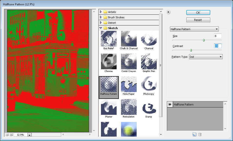
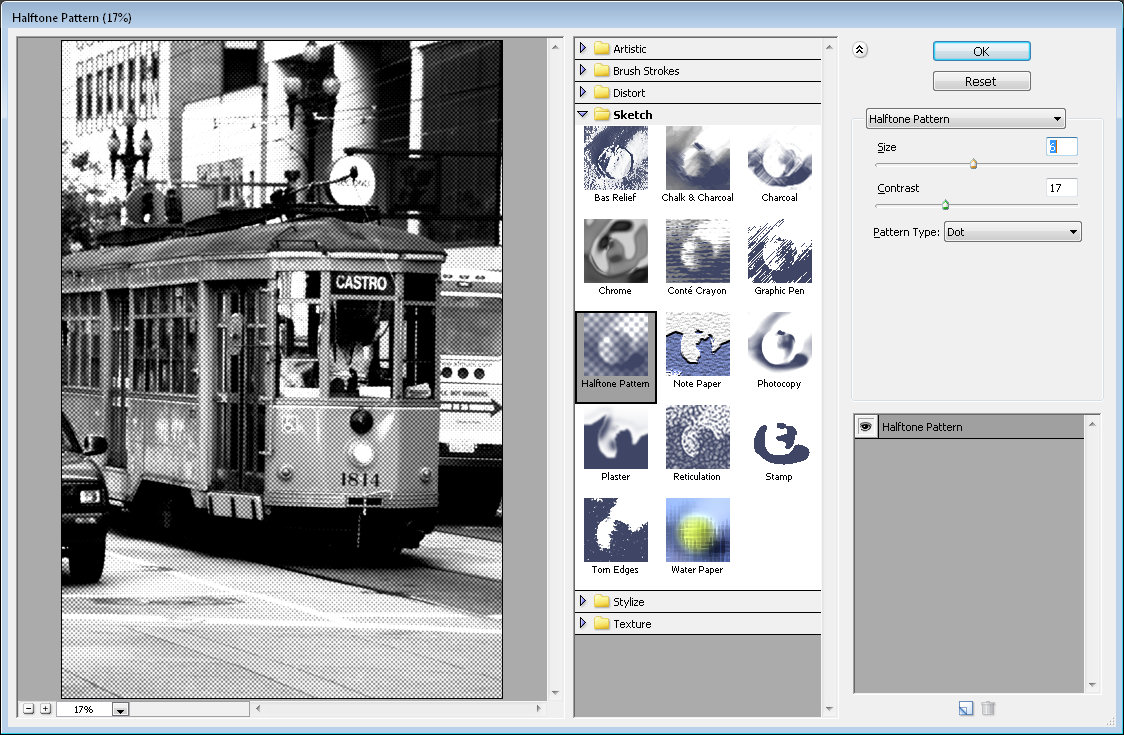
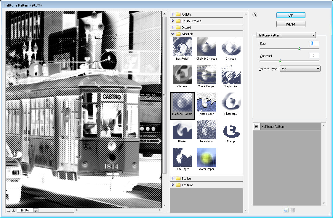
I could use smart filters but the filter is just going to be fine for this. So I’m going to choose Filter and then Filter Gallery but before I do this I’m making sure I’ve got black and white as my foreground and background colors because the filter set that we’re using relies on black and white for the color. So if you don’t have black and white selected as the color it’s not going to be a black and white effect that you’re going to end up with. So I’m just going to drag this back in. And I used the Photocopy earlier, and I found that that was a really good result for me.

But you could also try the Stamp and see if in the light and dark balance you can get what you want with the Stamp. We’re going to get pretty much the Stamp effect by just using the Photocopy. But I’ve got a way of getting rid of these sort of almost blurry sort of gradient detail in the bird’s back. So I’m going to ignore that for now and just go for a good sort of stamped effect. I’m looking at the blacks and the whites in this image because that’s essentially what I’m going to get at the end of this. So I’m going to say that that’s good and click Ok.

And the final tool that we need to make these areas disappear is a Threshold Adjustment. And again, I’ll do this using an adjustment layer with Layer, New Adjustment layer and then Threshold. Now Threshold is an unusual sort of filter. What it does is it turns everything either pure black or pure white. There is no in between. And this selector here tells Photoshop at which point we want the colors to go to white or to black. So if we wind this back down a little bit we’re going to get rid of some of these areas in here and they’re become darker or lighter according to how we have this selected.

So I’m just going to go around about that midpoint because we do have this as an adjustment layer which means that if we make changes to this layer they will affect the adjustment layer. So I’m just going back to the Dodge tool here and just see if I can get rid of the very obvious sort of circling effect here, so I’ll just make that a little less obvious that that was something that got left behind with the Photocopy filter. Let’s just bring the exposure right up. And there’s our finished bird there. And we can do whatever we like with it.

You may want to save it out so that you could use it perhaps with a background color or something like that. But there’s this sort of stamped monochromatic effect created in Photoshop. And it’s done very easily by first just isolating the object and then converting it to black and white in a way that gives you the contrast that you want, posterize it to flatten it to some levels of color or levels of tonal range, create a brand new layer from that and apply a Photocopy or Stamp filter to it and then finally finish off with the Threshold Adjustment.

I’m Helen Bradley. Thank you for joining me for this video tutorial. If you liked the tutorial please Like it and comment on it and share it with your friends. Look out for more videos on my YouTube channel and visit projectwoman.com for more tutorials on Photoshop, Photoshop Elements, GIMP, Lightroom, Illustrator and a whole lot more.

Helen Bradley

Friday, June 29th, 2012

Photographing in Black and White Part 6 Filters


Traditionally, when shooting with black and white film, photographers use filters to enhance the colours in the image.

Using red, yellow or orange filters when shooting landscapes or shots where the sky has interesting detail can help darken the blues in the sky giving them more punch than they would otherwise have.

You can purchase coloured filters that screw onto the lens of a digital SLR or which can be placed over the lens of a point-and-shoot camera using an adaptor ring.

The images captured with these filters will show different conversion of colours to black and white than you would see if you were to shoot in regular black and white without the filter.

The image at the top shows two different renderings of a single image the first with a red filter and the second with a blue filter.

Helen Bradley

Sunday, June 3rd, 2012

Edit and Create on the go with Adobe Photoshop Touch

By Helen Bradley

On Monday, Adobe launched its Photoshop Touch application for the iPad. This long sought after app runs on the iPad 2, and not on the iPad 1, and it requires that you have iOS 5 installed. The app costs $9.99 which is at the high end of the price range for photo-editing apps in general but Photoshop Touch seems to have got the feature set about right so most people will probably consider it worth the money.

I use the iPad a lot for working with photos I’ve shot using a digital SLR camera in raw and which I’ve resized, converted to jpeg and downloaded to the iPad. Those images I have on the iPad are there because they are funky or because they lend themselves to some artistic play. So, I looked at Photoshop Touch in this light – I wanted to see if it would be part of my iPad image creative workflow. For heavy duty work, Photoshop and Lightroom will remain my tools of trade.

When you launch Photoshop Touch you get two options, viewing the tutorials or doing some work.

There are 10 tutorials that you can work through each of them is project based so you learn the program by learning a technique not by learning how individual tools work. These are text and image tutorials and not video ones, but they are interactive so you can learn as you go.

The second option is Begin a Project which is where I’ll start. You get the choice of adding an image from your iPad, the Adobe Creative Cloud, the Camera, Google or Facebook. I chose Local Photos then the Photo Library and an image from my iPad.

In the main editing area you’ll find the tools on the left, layers on the right and menus across the top. The program pays lip service only to Photoshop.  Some icons are familiar but others are more iPad than Photoshop so Photoshop users may find it a bit confusing where iPad artists will find it more familiar.

You can add multiple images and multiple layers. I wanted to texture this image so I clicked the Add Layer button and selected Photo Layer.

Once you select a second photo you get to size it as you import it – you can also rotate, flip or skew it too. Click Done to proceed to the editing area.

Now, with the layer selected, you can apply adjustments to it.

I chose Curves as this was a texture and I wanted more contrast. There are no adjustment layers so the Curves adjustment is being applied just to the targeted (top) layer. As you can see, you can adjust the RGB composite channel or the individual red, green and blue channels.

With the texture layer still targeted you can apply a filter to it by clicking the FX button. There is a range of filters including Basic, Stylize, Artistic and Photo. Some add things like drop shadows, blurs and glows and others are more artistic.

I chose Stylize > Old Photo, configured the settings and tapped Apply. Unlike Photoshop where the foreground and background colors need to be selected before you run a filter, here you can select the colors to use in the filter settings – this really is a feature that Photoshop should have.

To blend the layers you click the Layer icon and you get a choice of blend modes and the chance to adjust the layer opacity.

There are no masks but you can use a gradient to fade the effect – when you do the gradient is applied to the layer and you can only undo it by tapping Undo – you can’t go back and edit it.

You can also add a new Empty Layer and fill it with a gradient.

And then blend it using a layer blend mode as I have done here.

I finished by cropping the image and then saving it.

You can then email it or send it to the Camera Roll or upload the project to the Adobe Creative Cloud so you can access them from there.

There are limits to Photoshop Touch and one is the 1600 x 1600 pixel image size limit. The text tools are rudimentary and, as a long time Photoshop user, I’d like to see editable masks and editable text. That said, for fixing photos and tinkering with creative projects this program is a welcome addition to the Adobe family.

This app will appeal to a range of users. There are plenty of basic tools that are easy to use but also some more advanced features for working with images. The Scribble Extract tool does a reasonable job of extracting a subject from a background and you can tinker with gradients and fades to get some interesting effects. You don’t need to know how to use Photoshop to use the app but your knowledge won’t go astray.

Helen Bradley

Sunday, June 5th, 2011

Install and use the Droste Filter in Photoshop CS4, CS5 & CS5.5

I an earlier blog post I introduced Pixel Bender a new extension for Photoshop CS4 and CS5 from Adobe Labs. In this month’s tutorial I’ll show you a great filter which lets you create a Droste effect with an image. The filter is free to download and once it is installed you can apply it from inside Pixel Bender. It was created by Tom Beddard who is author of a lot of really wonderful filters – you can see more of them here: http://www.adobe.com/cfusion/exchange/index.cfm?event=authorExtensions&authorid=14858639

The Droste effect is an image effect named after a Dutch cocoa company called Droste. In 1904 it produced packaging for its cocoa product showing a woman carrying a tray with a box of cocoa and a cup on it. A small version of the package appeared on the cocoa box on the tray and so on – each version of the image being successively smaller than the last.

To create the Droste effect you must first have Pixel Bender installed so, if you don’t, visit my earlier post to learn where to find it and how to install it. Then, you’ll need to download the Droste filter from: http://tinyurl.com/pbdroste.

Unzip the folder and copy the .pbk file to your Program Files\Adobe\Adobe Photoshop CS5\Pixel Bender Files folder. Restart Photoshop and the Droste filter will be in place.


Start with an image that is square with some element of interest centered in the middle of the image. I chose a flower against a neutral background – start with something simple as you learn how the filter works – then plan to use a more complicated image later on.

Make a note of the size of the image by choosing Image > Image Size and write down the image width and height.

There is a physical limit to the file size of images you can use with Pixel Bender which is 4096 x 4096 so make sure your image is smaller than this. Even smaller images render faster.

To run the filter, choose Filter > Pixel Bender > Pixel Bender Gallery and select Droste from the dropdown list. If you have used the filter previously, hold Alt (Option on the Mac) and click on the Reset button to reset the filter settings.

Set the Size [0] and Size [1] sliders to match the width and height of your image – my image is 530 x 530 pixels.

By default, you should see a typical Droste file image with straight edges.


To turn the straight edges into a curved spiral, deselect the TransparentInside checkbox.

If the image is off center, the spiral will look askew at this point. To change the center point of the image and align it with the center of the spiral, adjust the centerShift [0] and [1] sliders – each of these operates in a different dimension. Adjust the center of the image until the spiral looks correct.

To adjust the center of the image itself, use the Center [0] and [1] sliders.

If you do not have an image spiral that completely fills the image area you will see some black background color outside the spiral. You can control the color used for this background by setting the BackgroundRGBA values. The [0] setting controls the Red value, [1] controls Green, [2] controls Blue and [3] controls the opacity of the background. The default is that all sliders are set to 0 and the Opacity slider to 1 which gives the black color. You can view the current background by setting Levels to 2 and the LevelsStart value to 1. Then create your own background color and, when you’re done, increase the Levels value to back up again to around 7.

To make the spiral tighter or looser, adjust the RadiusInside value. Set it to a very small value to get a small number of loops and to something like 50 to get one with lots of loops. The default setting is 25.

Decreasing the OutsideRadius twists the spiral more tightly. The default value of 100 makes the spiral looser.

Periodicity is the number of times the image repeats in each loop of the spiral. If you set this to 2 the image will be repeated twice per spiral – the Default value is 1.

The Strands value sets the number of loops in the spiral. If you set this to 2 you will have two interlocking spirals and if you set it to three you’ll get three strands/spirals  and so on.

Other interesting effects include using the RotatePolar value. By setting it to, 90 as shown here you will get different spiral loops on the screen. Having done this, you can then select RotateSpin to adjust the effect.

If you enable HyperDroste then adjust the FractalPoints value, you will create an image that is reminiscent of a fractal style image.

If desired adjust the Zoom value to zoom into the design.

Use RotateSpin and RotatePolar with FractalPoints and HyperDroste to fine tune the effect.

When you have a design you like, click Ok button to apply the Droste effect to your image.

Once you know how the controls in the Droste filter work you’re ready to apply it to a more complex image.

To get best results, start with a square image with something of interest in the center and make sure to set the image dimensions in the filter before working with the other sliders.


Helen Bradley

Wednesday, February 2nd, 2011

Photoshop: High Pass Softening

You may already know that it is possible to sharpen an image using the High Pass Filter. But did you know it’s possible to use the filter to soften an image?

To see this at work, start with an image open on the screen.

Step 1

Duplicate the image background layer or if you have an image that has adjustments in it, create a flattened version of the image on a new layer at the top of the layer stack. To do this target the topmost layer and choose Layer > New > Layer.

Target this new layer and press Ctrl + Alt + Shift + E (Command + Option + Shift + E on the Mac) to create a flattened version of the image on this new layer.

Step 2

You will apply the High Pass Filter to this layer.

To do this, you can convert the layer to a Smart Object by choosing Filter > Convert for Smart Filters.

If you’re working on a version of Photoshop earlier than CS4, you can still use this process without converting the layer to a Smart Object.

Choose Filter > Other > High Pass and set the High Pass filter Radius to a value that shows gray and white lines on the image. Stop short of the image showing too much color. The larger the radius value, the more the softening effect although too large a Radius will be counter-productive. Click Ok to apply the filter to the image.

Step 3

In the Layers palette, set the Blend Mode of the top layer to Soft Light.

To soften the image, select the High Pass filter layer and choose Layer > New Adjustment Layer > Invert. You’ll need to create a Clipping Group between the Adjustment Layer and the High Pass Filter layer by selecting the Adjustment Layer and choose Layer > Create Clipping Mask.

Step 4

Create a black filled mask on the High Pass Filter layer by Alt + Clicking on the Add a Layer Mask button at the foot of the Layer palette (Option + Click on the Mac).

Set the Foreground color to white and paint on the mask with a soft round brush in the areas that you want to soften the image such as the skin tones here. This image shows the masked area – you won’t see this as you work.

Step 5

If you created a Smart Object the High Pass Filter can be adjusted by double clicking on the filter in the Layers palette and adjust the Radius value.

You can use a different blending mode on the masked layer such as Overlay if that gives results you like better and you can also change the opacity of the layer to reduce the intensity of the effect.

Helen Bradley

Wednesday, December 16th, 2009

10 things for your camera bag

Regardless of where you are travelling to this holiday season here are my top 10 things to have in your camera bag:

  1. 3 sets of batteries – one in the camera, one in the charger and one in your pocket
  2. Battery charger and a power cable suitable for use wherever you’re travelling
  3. Spare memory stick or smart card for extra storage on the road
  4. Cooler to put the camera in if it’s hot where you are headed (leave the ice behind)
  5. Polarizing filter to suppress reflected light for more color in your images
  6. Tripod for capturing panoramas, macro shots and for longer exposures
  7. Camera manual to refer to if you have questions that you can’t resolve
  8. Lens cleaning cloths, cleaning fluid and a brush to blow dust from the lens (not your shirt tail – please!)
  9. A variety of lenses including a macro lens if your camera takes interchangeable lenses
  10. Underwater camera housing for your digital so you can take it swimming with you

Helen Bradley

Friday, September 18th, 2009

Understanding filters in Photoshop and PS Elements


When I was young, my dad told me that if at first you don’t succeed you should try and try again until you do. In today’s post, I am going to tell you why this adage relates to editing photos by working with filters in Photoshop Elements and in Photoshop.


Not good! start with the wrong colours and filters suck, big time!

Step 1
Start by opening an image that you like, set the foreground color to white and the background color to black and choose Filter > Distort > Diffuse Glow. When you do this, the image will take on a rather nasty dark glow. There is pretty much nothing that you can do to this image that is going to make it look good. You can try to remove the graininess and glow and increase the clear amount to 20 but if you do that, you’ve effectively removed the filter effect. The short answer is it looks ghastly and you might be wondering just what you did wrong?


Same image, better result, it’s the colors that are the difference

Step 2
Exit the Filter Gallery, switch the foreground and background colors so that black is now the foreground color and white is the background color. Reapply the filter using Filter > Distort > Diffuse Glow. This time the filter looks very different.

The explanation is that Photoshop Elements (and Photoshop) use the foreground and background colors when applying the filter. This time go ahead and crank up the Graininess and adjust the Glow Amount until you get a nice glow on your image. Adjust the Clear value to suit and click Ok. Now you have a very different looking result.


Understanding colors and filters
There are many of Photoshop Elements Filters that work differently depending on the current foreground and background colors settings. The Halftone Filter is one of these so, for example, if you have red and green selected the halftone pattern will appear in red and green – not always the desired look.


Instead, set the foreground to black and the background to white and apply the Halftone Filter using Filter > Sketch > Halftone Pattern. This time you’ll get something more like the result that you are looking for.


Switch black and white in the color swatch and try again – and the result is different and not so appealing.

What you need to know
The short lesson to take away from this post is that when you are applying filters in Photoshop Elements or in Photoshop the foreground and background colors that you have selected will have a big impact on how some of the filters work. In most cases the filters affected are the Sketch filters but others use the colors too.

Select the right color mix and the result is pleasing to the eye. Select the wrong color mix and you could be excused for thinking filters just aren’t for you.

Helen Bradley

Tuesday, September 1st, 2009

Capturing Autumn Colours


With cool autumn days comes a change in colour in many of the trees around us. While here in California we don’t have the great swashes of autumn colour that they enjoy on the east coast there are still patches of colour to capture that you won’t encounter any other time of the year.

So, it’s time to grab your camera and head out to make the most of the season. If you’ve got little people in your life (or you’re just a big kid yourself), you’ll find piles of golden leaves that just beg to be rolled in or thrown high in the air!

The best time to capture the colours of autumn is when the colours start appearing. The time frame between the best of the autumn colour and bare branches can be very short. A brief thunderstorm or burst of strong wind is all that separates a beautiful tree laden with autumn colour from being a pile of leaves on the ground. It’s all too easy to wait too long for the perfect day that never comes and, along the way, miss out on some great shots.


When capturing autumn colour look for contrasts such as the play of a golden tree against a bright blue sky. While banks of yellow and gold make great photos, a sharp contrast between two colours can make for a great image.

If you miss the best of the colour, and if there aren’t a lot of leaves around – get up close and shoot those leaves that you can find. Even a few splashes of colour can capture the feel of the season.

Use a filter
If you’re using a SLR (single lens reflex) camera with removable lenses you will be able to purchase and use filters with your camera. In addition, some point and shoot cameras can also take these filters. If yours can, then consider investing in a Polarizing filter. There are two types of polarizing filters, for a film SLR camera you will use a linear polarizer and for a digital SLR or point and shoot, you use a circular polarizer. These filters screw into the front of the lens and they work in a similar way to your polarized sunglasses by cutting the glare and giving you better and more intense colours particularly when the sun is very bright.

Don’t forget to remove the polarizer when you have finished shooting – you won’t want to use it indoors, for example or in low light conditions. Of all the filters you can purchase, a polarizing filter will give you results you can’t duplicate using software fixes.


The Digital SLR on the left has lenses that take filters like the polarizing filter shown. You can buy the special adapter shown for some point and shoot digital cameras such as the one on the right – you simply screw the filters on to the adapter.

Finding good shots
The sun in autumn is lower in the sky than it is in summer when it is almost overhead. This low angle of light makes for long shadows which give you great photo opportunities.

Also look out for autumn colours reflected in still water or buildings. The contrast between the autumn colours and other objects in the water or the angular shapes of a building are an interesting contrast.

If you live in the city, chances are that your local park has trees that will change colour with the season so look for opportunities to capture the colours there. If you’re shooting the kids as they play among the leaves, get down to their level so you’re looking directly at them and not at the top of their heads. Alternately, capture them as they gather up leaves and throw them into the air. To get best results with action shots like this, use your camera’s sports mode so the action is frozen. If your camera has a burst shooting mode this is handy too as it will fire off a series of shots in quick succession so you capture all the action. You can also simply use the autumn colours to provide a background to your portraits. If you use a large aperture setting of around f2 the background will be blurred and the subject will be in sharp focus. Smaller aperture settings will give you more of the photo in focus.


When you’re shooting in autumn, remember that all the standard techniques for taking great photos apply. You should compose your images carefully so it’s clear what the subject of the photo is. Avoid placing the horizon directly across the middle of the photo and, instead move it up or down to create a more interesting shot. Make sure to check the background of your photos so you don’t capture light poles and other distractions that will ruin the shot.

Autumn is all about looking for the opportunities that the season provides and taking advantage of them.

Helen Bradley