Five Must Know Features of the Photoshop Brush Tool
Brushes are used a lot in photo editing from removing blemishes and smoothing skin to dodging and burning and painting on masks. Here are five important features of the brush tool in Photoshop.
1. Adjust Size, Opacity and Hardness from the Keyboard
When a brush is selected you can adjust its size without having to open the Brushes palette by clicking the [ and ] keys on your keyboard.
Provided a brush is selected you can change its Opacity by typing a number. For example, type 5 to set Opacity to 50%, type 1 for 10% and 0 for 100%.
To adjust the hardness of the brush hold the Shift key as you tap either the [ or ] keys on the keyboard. Each tap increases or decreases the hardness by 25% in the range 0%-100%. The results of doing this are harder to see as there is no hardness indicator on the tool options bar. However, if you have the Painting Cursor set to Normal Brush Tip in preferences you will see a difference in the brush size as you do so
2. Save the Brush
When you have a brush configured with your preferred settings, save it as a Tool preset. To do this from the Brush Preset list in the top left of the screen click the Create New Tool Preset button and type a name for the preset. Click Ok.
In future you can select this saved preset from the list and just start painting with it.
3. Disappearing Brushes
One of the very annoying things that will happen to most of us at one time or another is to have the brush appear to disappear. Instead of the regular brush cursor which shows the size and style of the brush you will see a crosshair cursor.
The issue is not with the brushes themselves but is with the Caps Lock key. If you disable Caps Lock on your keyboard the more visual brush cursor will reappear.
4. Paint a Straight Line
To paint in a straight line, click at one end of the line, hold the Shift key and click at the other end of the line. This draws a continuous brushstroke between both points.
If you adjust the spacing of your brush by using the Brush panel Spacing option to make it more than 100% you can create a line of dots this way.
This can also be used to remove power lines with the Spot Healing Brush Tool. Click at one end of the power line, Shift + Click at the other end to paint a straight line over the power line and it will be removed automatically.
5. Quickly Show the Brush Panel
You can quickly show the Brush panel so you can choose a brush to use by first selecting a tool that uses a brush such as the Brush Tool, Dodge, Burn, Eraser tool and so on.
Then right click on the image and the brush panel appears automatically. To select a brush and exit the panel in one step, double click the brush to use.
And now it is over to you. What other features of Brushes do you think are valuable for photographers to know?
A Quick Guide of Shortcut Keyboard Combinations to Accent Marks over Characters
Word allows you to create accented letters quickly using its inbuilt accent shortcuts. To do this, press the accent shortcut key combination, then release, and follow it up with the letter to accent.
Some of the more commonly used shortcuts are:
Circumflex – Ctrl+Shift+^ (caret/6) followed by (a, e, i, o, u)
Grave – Ctrl+` (accent/grave) followed by (a, e, i, o, u)
Acute – Ctrl+’ (apostrophe/quotation mark) followed by (a, e, i, o, u, y)
Cedilla – Ctrl+, (comma/less than) followed by (c)
Umlaut – Ctrl+Shift+: (colon/semi colon) followed by (a, e, i, o, u, y)
Learn more about the formatting applied to text in your document with this handy Keyboard Shortcut
If you want to quickly find out what formatting has been applied to any piece of text, click in the text and press Shift + F1. A task pane will open in the right of Word window. This Reveal Formatting task pane displays details about the text format being used for the word that your insertion point is closest to.
With this task pane open you can click on any piece if text to learn more about its formatting.
Create a cancelled postal stamp watermark to use in Photoshop and Lightroom. See how to use the path tools to create the watermark and then save it as a png image with a transparent background so it can be used over your images.
This is the video explanation of the blog post on the same topic which you can find here:
Transcript:
Hello, I’m Helen Bradley. Welcome to this video tutorial. In this tutorial I’ll show you how to create a postage style copyright stamp that you can use on your images. In this tutorial I’m going to show you how you can create a copyright symbol like this which is a couple of concentric circles and some wavy lines and text. And it’s got an overall texture to it.
This is a tutorial that I created for digital-photography-school.com when one of my readers there was having a bit of difficulty following along. So that’s why I’ve created this as a video tutorial. And because of this I’m going to be doing it step-by-step as I did it for that particular tutorial on the Digital Photography School site. And you’ll see in the comments here just below the tutorial I’ve given you a link to that site if you want to follow along.
So the first thing that I did in that tutorial was to create a brand new image. So I’m going to do that now. I’m going to choose File and then New. And I’m going to do a letter size image, landscape. So it’s 11 inches wide by 8.5 inches tall, and it’s 300 pixels resolution, RGB color and the background contents are white. So I’m just going to click Ok. And here’s our starting image.
Now we’re going to add a new layer so I’m going to have my layers palette visible. So if you don’t have it visible choose Window and then Layers so that you can see it. And we’re going to add a new layer and we do that by clicking this little icon here. It’s the Add New Layer icon. It looks like I clicked it twice. So I only want one new layer here. And we’re going to draw our circles using the Ellipsis tool. And it’s here in the toolbar so let’s just have a look and see what we’re looking for.
We’re looking for this tool here. It’s the Ellipsis tool. And when you choose it you want to choose Paths from the tools option palette. Now the options are a little bit different in earlier versions of Photoshop. There are three icons here and you want to make sure that you click the icon that says Path when you mouse over it. They’re the exact same options. They just deliver differently. And this is Photoshop CS6’s version so I have Path selected.
I’m going to drag to draw an ellipsis, but you can see that this is going to be a sort of oval. I want it to be a circle so I’m going to hold Shift as I draw it. And if it’s not in the correct position before I let everything go I’m going to hold the Spacebar and move it into position, let go the Spacebar and just make sure that I have the outermost of my circles created. And when it’s dead right, I’ve still got the Shift key held, I’m going to let go of my Left Mouse button.
So now I have a circle the shape of this outer circle that we’re going to use. Now this is now going to be colored in and we want to stroke this circle. And we do this by going here to the Paths palette. Now the Paths palette you get to by choosing Window and then Paths. And the topmost path is going to be called your work path and that’s the one that you’re working with. This is this circle here. We want to stroke the circle with a brush so we’re going to go and select a brush to use.
So I’m going to click on my Brush tool and then I’m going to select the kind of brush that I want to use. And I’m going to use a hard sort of brush here. So I’m going to select that brush. It’s a hard brush. And let’s just check and see from the original tutorial just how big it needs to be. And apparently it needs to be 40 pixels. So let’s just take it up to around 40 pixels. That’s 39, but that’ll be fine.
I’m going to set black as my foreground color. So I’ve set my brush and my foreground color and what I want to do now is with this path selected I’m going to choose the option that says Stroke Path with Brush. So that’s this icon here. So I’ll click it to stroke the path with a brush. Now I’ve got a funny sort of stroke here and the reason is that my stroke is set to something I don’t want it to be set to. So let’s just wind that back with Edit, Undo.
Then I’m going to right click on this Path option here and choose Stroke Path. And I want to disable this option here, Simulate Pressure. I just want to stroke it with the brush so I’m going to click Ok. Now it’s working the way I want it to. So now I have my path stroked, well at least the outside stroked. Now I need to use the outside to make the inside because it’s going to be really easy to make a concentric circle. To do that I’m going to click on this tool here. It’s the Path Selection tool.
This is the one I want and it shares a position with the Direct Selection tool. But it’s the black one, the Path Selection tool that I want, and I’m going to click on my path so it is selected. Now I want to transform this. And the transformation handles have not appeared so I’m going to press Ctrl T to make them appear. I want to drag in on this handle. But I want to make sure that I don’t lose the circle and I want to make sure that I don’t lose the fact that it needs to be concentric. So I’m going to just hold down both Shift and Alt as I drag in on this handle. So let’s Shift Alt and drag inwards. And you can see that what I’m doing is making a concentric circle. It has the exact same middle as the original circle. I’m going to let go of my Left Mouse button and then let go of the shift and the Alt keys. Now my work path here is a much smaller path so I’m just going to click the checkmark here.
Now I’m going to do exactly the same thing. I’m going to select my brush and I’m going to stroke it, make sure black is my foreground color, and I’m going to stroke this path with the brush. And I get the exact same effect. Now what I need to do is to make a path for my type. And it needs to be a little bit bigger than this inside circle. So again, I’m going to click this Path Selection tool. I’m going to press Ctrl and T to show my handles, I’m going to hold down Alt and Shift, that’s Option and Shift on the Mac, and this time drag out just a little bit so that I get a path for my type, let go of the Left Mouse button, let go the rest of the keys and click the checkmark. Now I’m going to add my text. And to do that I’m going to select my Text tool and then select my type. And I want to use Myriad Pro.
So I’m going to go down here until I find Myriad Pro. And I think the type that I suggested in the article that we used was about 24 points so I’m going to click that. I have black as my type color. So everything looks pretty good. I’m going to hold my mouse over the line, over this path that is still selected, and when I do you’ll notice that the I-beam pointer changes from this I-beam to an I-beam with a short of squiggly line. That means I’m typing on the path. So I’m going to click to do that.
Now the first thing I need to do is to add my copyright symbol. So I’m going to hold down the Alt or Option key and type out 0169 on the keyboard because that gives me copyright, and now 2013, and I’m going to type my copyright details. And I think I’ll do this all in capitals. And I’m using Helen Bradley, projectwomam.com. And I think actually I just want to put a www in there so I’ll just arrow back and make that change.
Now so far my type hasn’t quite stretched all the way around my words. So the next thing we need to do is to stretch it just a little bit more. And I’m going to do that using the Character Spacing tool. So first of all, I’m going to make sure that all my text is selected and then I’m going to choose this dialogue here which will get me to the Character Spacing dialogue. Now this is two dialogues.
There’s a paragraph and a character, and we want the character. And what we want is this tool here, this VA tool. And it’s a scrubby slider so all I need to do is to adjust it a little bit. And can you see that the text is getting bigger every time I drag on it? And I think I’m going to wind that back just a little bit because I could probably add a trailing dash to this. And that’s now all the way around that shape. And let’s just up that to bold because I don’t think it’s really quite dark enough for me. And if I’m using bold I’ll going to have to wind back up on my character spacing a little bit. And so now I’ve created my text on a circle.
Now the only thing that I’m a little bit concerned about is I think that this circle could be a little bit smaller. So I’m going to reselect my text layer here, and again with Alt and Shift selected, I’m going to drag inwards just a little bit to resize that circle path that the text is on because I just think it was a little bit on the big side. So I’m a little bit happier with my text now.
So we’re ready now to go ahead and to create the wavy lines. And we’re going to do that by clicking on the Custom Shape tool here that shares that toolbar position with the Ellipse tool that we used earlier. But this time we want Custom Shape. And from the Shape dropdown list here what we’re looking for is this wiggly line wave shape. Now this is shipped with Photoshop so you will have the wave shape. If you don’t have it in your collection you can click this little fly out arrow and choose All to add all the shapes or append all the shapes to your shapes collection. But this is the one we’re using.
I’m going to drag the shape onto my image and then use the Path Selection tool to just move it into position. Now at the moment it’s a series of closed paths and I want to open these paths. And I’m going to do that by clicking here on the Add Anchor Point tool. Unfortunately you can’t just delete points in Photoshop to open up these curves.
We first of all have to add a point in here that we can then go and delete to open it up. It doesn’t work otherwise. It’s a bit of a nuisance. But this is how we’re going to do it. So I’m going to click once with this Add Anchor Point tool on the ends up all of the shapes. And now I’m going back to the Direct selection tool. And I’m going to make sure that I’m selected on this point that I just added, so it’s black and everything else around it is not, and I’m going to press the Delete key. And that will just break that path in two. And I’m going to repeat that for each of these points.
So select it and press Delete, select it, press Delete, select it, and press Delete. Now if Photoshop is running out of memory if you’ve been using it quite a bit, you might find as I just did earlier that that was not working. Every time I pressed Delete the entire path was going. So I just closed down Photoshop and reopened it and went back to where I was working and it’s working perfectly. So now I have my lines. And you’re probably beginning to see a pattern here because this is just another path. And we can stroke it because we have our tool that we can stroke it with.
So I’m just going to go back and make sure my brush is selected. The same brush is selected, black paint, click on the work path so that I have it selected and now I’m going to stroke it. And that is giving us our lines. And so if you wanted to leave it at this point you could because everything is in place. But I’m going to go ahead and add a Grunge effect to it.
Now we’re ready to create our Grunge effect. And to create that, first of all what we need to do is to flatten the image. But in flattening it I need to remove the white layer from the flattened version. That is because later on when I will put this copyright image over my photograph I want the background to be transparent. So I want to keep this white layer out of the action right now. So I have two visible layers. I’m going to click on the topmost layer and press Ctrl Alt Shift and E to create a new flattened version of this layer. So this is the version that I’m going to use. And now I’m going to bring in a texture layer.
So I have a texture image open here, and I think it’s a really nice texture to use. So I’ve got the texture open. And to add the texture to this particular layer I’m going to select the layer and click the Add Layer Mask icon because that adds a layer mask to the image. And now this texture has to be made the exact same size as this image so I’m going to choose Image and then Image Size. And I want to resize it to the exact same size as this one.
So I can do that by just clicking Window and just pointing to the image whose size I want to borrow. And that’s apparently the size of this image here so I’m just going to click Ok. And because it’s a texture image it doesn’t matter that I’m skewing it a bit out of proportion because nobody really knows what a scratch is supposed to look like. Having done this, and it’s critical that you resize the texture to the exact same size as this image or you can’t use this next technique, which is to apply the texture as a mask.
So I’m going to click on the mask, and I’m going to choose Image, Apply Image. And if you don’t have the texture file the exact same size it will not appear here. So it does obviously appear here so that’s exactly what I want. I want to apply the texture to the image. And at the moment it’s set to Multiply blend mode. But I can test other blend modes and I can even test inverting the layer. So I’m just going to look for the best effect that I can get here.
In fact in the tutorial I suggested that we use Hard Light. So that looks like the one that we’re going to use, Hard Light. So I’m just going to click it and click Ok. And that gives us the sort of texturize look to our shape. And again, I was going to create this as a new layer so I’ll click on this layer and again press Ctrl Alt Shift and E to gives me a newly stamped layer. Well it’s not appearing to work right now. So let’s just add a new layer and press Ctrl Alt Shift E because that will work. And then we’re going to save this as a PNG image. But before I do it I think it’s going to be cropped because I think it’s a bit too big at this stage.
So I’m just going to crop down to get rid of the bits of the image that I don’t want and click the checkmark. And now I’m going to save this but making sure that I have this background turned off because I want it to be a transparent image. So I’m going to save it as a PNG image. So I’ll choose File, Save as, and I’m going to call this HB copyright, black, and PNG. And I’m going to make sure that I select PNG from this list here. And here’s PNG. So I’m going to select it and just click Save and click Ok. And that’s now saved as a PNG image.
Having done that I then want to make it white. So I’m going to choose Image and then Adjustments and then I’m going to invert it so what was black becomes white. And now if I just test this with a black filled layer behind it, you’ll see that it’s now a white image. So we could use that to go over the top of for example a very dark image.
So having created that I’m going to turn off my background because I want this to be a transparent image, and I’m going to resave it this time as a PNG. But this time I’m going to call it white. So again, this is going to be HB copyright, and it’s going to be white, PNG. I’m going to save it as a PNG image, and Ok. And so this is now the copyright image that I can use on my images in future.
I’m Helen Bradley. Thank you for joining me for this video tutorial. And look out for more of my tutorials both on digitalphotographyschool.com and also on my own website at projectwoman.com.
Get to Your Previous Insertion Point with This Shortcut
When you move around a Word document it can be time consuming to find the place you were previously. Word records the last places you worked and you can return to them at any time by pressing Shift + F5. Press this combination four times and you’ll be back to your current position and along the way you’ll have visited three previous editing positions.
Learn how to crop and resize in bulk in Lightroom. If you have a lot of images you need to, for example, crop to 5 x 7 and then save at a particular pixel size and resolution, you can learn how to do this quickly and effectively in Lightroom. This makes use of the tools in the Quick Develop panel in the Library module.
Transcript:
Hello, I’m Helen Bradley. Welcome to this video tutorial. In this tutorial I’m going to show you how you can bulk crop and resize images and export them from Lightroom.
A reader recently posed a question to me and that was what do I do if I need to crop all my images to 5 by 7 in size and get them out as 500 by 700 pixel images. In Lightroom that’s not that difficult to do. What I suggest you do is you do it from the Library in Quick Develop mode. So I’m going to select the images here and then I’m going to select Crop Ratio and I’m going to choose 5 by 7. And that will crop all of these images to 5 by 7 images. But look what it’s done with the verticals. It’s cropped them to 5 by 7 but it’s kept that same vertical alignment.
So now let’s go to the Develop module and just see what we’re seeing here. This is the crop marquee. And you can see that this image, each one of these images in fact has been cropped to 5 by 7. And let’s go and find a vertical crop and see how it’s been cropped. Again, it’s been cropped to 5 by 7 but in a vertical direction. So this means that all of these images have automatically been cropped.
All we would do is have a quick look and make sure that important parts of the image have not been cropped off. If these were people we’d have a quick check to make sure that somebody’s head hasn’t been chopped off for example. And having done that now knowing that everything is cropped to 5 by 7, to export these images at 500 by 700 pixels in size or 700 by 500 we would select all of them by clicking on the first and Shift click on the last. I’m going to right click and choose Export and then Export again and we would just set up the Export option. So here I’m going to put this in a folder called 5 by 7.
I don’t want to rename these files. All we want to do is to resize them. But what I do want to do is I want to select Resize to Fit. And the longest edge since I know that these are all 5 by 7s is going to be 700 pixels and the resolution I can set to 100 pixels per inch. So these are then going to be 5 by 7 images at 100 pixels per inch resolution. And all I need to do is to click Export and Lightroom is going ahead and it is cropping and resizing all of those images so that they are all going to be the exact right size that we chose. And here they are including the ones that were verticals. You can see that these are 500 by 700 pixels in size. This one is 700 by 500 because it’s a landscape image.
So in Lightroom you could batch resize and export these images in just a matter of a few seconds by just choosing the right option. And that is here in the Quick Develop module setting a crop ratio for those images. This is not something you can do easily in the Develop module, but it’s something that you can do very, very simply here in the Quick Develop area of the Library in Lightroom.
My name is Helen Bradley. Thank you for joining me for this Lightroom video tutorial. If you liked the tutorial please comment, press the Like button, consider subscribing to my YouTube channel. You’ll also find more of my tutorials, tips and tricks on my website at projectwoman.com.
To quickly move a whole paragraph up or down a Word document, click in the paragraph and press Shift + Alt + Up Arrow (or Down Arrow).
The same key combination will move an entire table row up or down a table and, when the top or bottom of the table is reached, it detaches the table row from the table to create another table which will continue moving through the page. This is a quicker and simpler way to split a table.
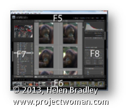
Use the function keys F5, F6, F7 and F8 to clean up your Lightroom screen.
F5 controls the visibility of the top panel, F6 controls the bottom (Filmstrip) panel, F7 controls the left panel, and F8 controls the right panel. Pressing any one of these keys will hide or display the appropriate panel.
To hide all the panels, press Shift + Tab. To bring them back again, press Shift + Tab again.
Learn to create a monochrome stamp effect from a photo in Photoshop. Includes using filters such as Posterize, black and white, threshold and the Photocopy and Stamp filter to adjust the image to get the effect. Also see how Dodge and Burn can help you fine tune the effect.
Transcript:
Hello, I’m Helen Bradley. Welcome to this video tutorial. In this tutorial I’m going to show you how you can convert an image so that it looks like a stamped monochromatic image.
Before we get started on this tutorial this is the effect that we’re looking for. I have an original bird image here and what we’re going to do is to firstly get rid of the background around the bird. And then we’re going to convert it to black and white. We’ll posterize it and then we’ll apply a filter to it. And finally we’re going to apply the Threshold Adjustment. And we’re going to end up with this sort of stamped monochromatic effect from an original photograph. So let’s just hide that and let’s get started on the image that we’re working with. And I have a duplicate image sitting here.
Now I’ve already gone ahead and made the mask for this image so that we’re not wasting a lot of time cutting out the bird. But essentially what I would use is the Quick Select tool to just select over the bird. And then I made a duplicate of the background layer by just dragging it onto the New Layer icon and then just clicked this Layer Mask icon and that adds a layer mask to the image. So there’s the bit that we had selected. Then obviously I would make a much better selection and this would give me my isolated bird here.
So the next thing that we’re going to do is to convert this to black and white. So I’m going to click on the topmost layer and we’re going to do this using an adjustment layer. The reason for this is that it can then be redone later on if we don’t like the effect. So I’m going Layer, New Adjustment Layer, Black and White and click Ok, and here is the black and white adjustment.
Now what I’m looking for here is that we’re going to make this into a pure black and white only image later on so I want plenty of detail here. So I’m just going to walk these sliders in either direction to see where they go. And I want some edge detail because that’s going to define the birds so I probably want to bring the blue channels and the purple channels over towards the black. And let’s just see where the red gets us. I want to definitely see the bird’s eye so I want that to be different to the colors surrounding the bird. So I’m just looking for a reasonably good black and white conversion at this point, and I’ll just close that down.
Next we’re going to use Layer, New Adjustment Layer, Posterize. And what the posterize adjustment does is it flattens the image to a certain number of colors. They’re called levels but here we’ve got four levels of lightness and darkness. So if we had a color image we’d have four colors. And we can wind this up to a sort of surrealistic amount or we can take it back to a less realistic, more stylized amount. And that’s exactly what we want here.
But you’ll see that every time you change this it has different affects around the edge. So the difference between 5 and 7 and perhaps 6 and 5 is really quite significant. So I’m looking for a number of levels that gives me a good result. I’m worried about the eye disappearing here. Three is not enough. Four is a whole lot better. I really quite like that four so I’m just going to let that be what we’re using here. At this point if we were not getting the exact result that we like we could go back and dodge and burn on this layer. So we could grab the Dodge or Burn tools here to darken and lighten the image by clicking on these, taking the highlights, just make the brush a little bit smaller and perhaps brush around the edges here to darken it up which will ensure that later on we’re going to get some dark edges around the edge of our bird. So if that’s of concern to you selecting a tool such as Dodge or Burn will allow you to lighten and darken the areas around this bird that you want to have lighter or darker.
So for example if we really wanted to see this eye we could lighten the areas around the eye. So you can craft that to an extent using the Dodge and Burn tools here. So I’m just going to burn in a little bit around the top of the leg and the sides of the leg here, and perhaps just under the belly. So once we’ve done that I’m going to come up to the topmost layer and I’m going to make a flattened version of the image so far. And I do that by holding Ctrl and Alt and Shift and E, that’s Command, Option, Shift E on the Mac. And this gives us a flattened version of this that we can now apply a filter to.
I could use smart filters but the filter is just going to be fine for this. So I’m going to choose Filter and then Filter Gallery but before I do this I’m making sure I’ve got black and white as my foreground and background colors because the filter set that we’re using relies on black and white for the color. So if you don’t have black and white selected as the color it’s not going to be a black and white effect that you’re going to end up with. So I’m just going to drag this back in. And I used the Photocopy earlier, and I found that that was a really good result for me.
But you could also try the Stamp and see if in the light and dark balance you can get what you want with the Stamp. We’re going to get pretty much the Stamp effect by just using the Photocopy. But I’ve got a way of getting rid of these sort of almost blurry sort of gradient detail in the bird’s back. So I’m going to ignore that for now and just go for a good sort of stamped effect. I’m looking at the blacks and the whites in this image because that’s essentially what I’m going to get at the end of this. So I’m going to say that that’s good and click Ok.
And the final tool that we need to make these areas disappear is a Threshold Adjustment. And again, I’ll do this using an adjustment layer with Layer, New Adjustment layer and then Threshold. Now Threshold is an unusual sort of filter. What it does is it turns everything either pure black or pure white. There is no in between. And this selector here tells Photoshop at which point we want the colors to go to white or to black. So if we wind this back down a little bit we’re going to get rid of some of these areas in here and they’re become darker or lighter according to how we have this selected.
So I’m just going to go around about that midpoint because we do have this as an adjustment layer which means that if we make changes to this layer they will affect the adjustment layer. So I’m just going back to the Dodge tool here and just see if I can get rid of the very obvious sort of circling effect here, so I’ll just make that a little less obvious that that was something that got left behind with the Photocopy filter. Let’s just bring the exposure right up. And there’s our finished bird there. And we can do whatever we like with it.
You may want to save it out so that you could use it perhaps with a background color or something like that. But there’s this sort of stamped monochromatic effect created in Photoshop. And it’s done very easily by first just isolating the object and then converting it to black and white in a way that gives you the contrast that you want, posterize it to flatten it to some levels of color or levels of tonal range, create a brand new layer from that and apply a Photocopy or Stamp filter to it and then finally finish off with the Threshold Adjustment.
I’m Helen Bradley. Thank you for joining me for this video tutorial. If you liked the tutorial please Like it and comment on it and share it with your friends. Look out for more videos on my YouTube channel and visit projectwoman.com for more tutorials on Photoshop, Photoshop Elements, GIMP, Lightroom, Illustrator and a whole lot more.
Learn how to cycle around the tools in the Tool panel in Photoshop using shortcuts
When you want to select tools on the Photoshop tool panel using the keyboard, you can do so using the shortcut key listed to its right in the tool panel.
If more than one tool shares the same letter, hold the Shift key as you press the character for that tool to cycle around the tools which share that letter. Stop when you get to the one you want.