See the new transitions in PowerPoint 2013 including airplane and origami. There are some great new transitions and this video shows you what they are, what they look like and some of the settings for them.
Transcript:
Hello, I’m Helen Bradley.
Welcome to this video tutorial. In this tutorial I’m going to show you the new transitions in PowerPoint 2013. In this video I’m going to show you the transitions that are new in PowerPoint 2013 and we’re just going to run through them seeing them on this particular presentation. Now all of these have been in PowerPoint for some considerable time. The first of the new ones is fall over and it looks as if the slide is falling over to reveal the next slide. This is drape. Again, it’s a new transition. And curtains. This is wind.
Now with any of these transitions you can speed them up. You can see that the curtains transition takes quite a while to run but if I set it to 3 seconds then it’s going to occur a lot more quickly. Here are some more of the newer transitions, prestige. Then there’s fracture and crush and then peel off. Now like some of the other transitions this has different effect options so you can peel off from the left or the right. Then there’s page curl. And, again page curl has some different options. And airplane. The effect options for this allow you to change the direction in which the airplane flies out. And origami.
This also has effect options for the direction in which the bird flies. And finally there’s one additional transition and it’s called comb. So these are the new transitions in PowerPoint 2013.
I’m Helen Bradley.
Thank you for joining me for this video tutorial. Look out for more tutorials on this YouTube channel.
And visit my website at projectwoman.com for more tips, tricks and tutorials on various Office applications as well as for Photoshop, Lightroom, Illustrator and a whole lot more.
I like Photoshop to open and “look the way I want to see it”. But sometimes ‘the way I want to see it’ is different than others. I’m fickle – but thankfully Photoshop plays nice with me – the secret is its Workspaces. These Workspaces let me preconfigure my Photoshop screen for various scenarios, to save them so I can reuse them, and to put everything back in its place when I mess them up.
If this sounds like something you could use – here’s how to give your Photoshop window a custom look with workspaces.
The first thing I do is to set up Photoshop the way you want it to look and that means hiding all the panels you don’t want to see and displaying those that you do.
Then arrange them on the screen exactly the way you want to see them. For me, I prefer my toolbar to be in two columns rather than one long one. I like my layers and paths palettes visible but not much else.
Once the screen is organized the way you want it to look, from the dropdown list in the top right corner choose Essentials > New Workspace and type a name for the workspace. Select the options for keyboard shortcuts and menus select and click Save.
You can repeat this process, if desired, and create other workspaces. You might make one for photo-editing, one for collage, one for illustration or one for videoing depending on your own personal needs.
In future you can set up your screen by choosing the workspace of your choice from the dropdown list.
If you move things around and things go a bit crazy it is easy to reset a workspace back to how it was when you last saved it.
To do this, first make sure you are viewing the workspace to reset and then open the Workspace menu and choose Reset .
Likewise you can return to Photoshop’s default workspace anytime by selecting Essentials then click Reset Essentials.
And one last word on workspaces…
If you want to see what’s new in Photoshop CS6 click the New in CS6 workspace and you can see what is new in Photoshop. Open a menu and any new options in it will show as blue on the menu.
When creating a new presentation or document in Google Docs, you might find that the default templates don’t provide the theme you want. Fortunately, Google provides an easy way to find the perfect template for your situation, from baby photo albums to résumés. To find a template suitable for you, simply visit https://drive.google.com/templates?view=public. You can search by name, category, and popularity to quickly find whatever you need.
Once you’ve selected a template you like, simply click the Use this template button and a new document will automatically open with the chosen template, ready for use.
Avoid duplicate images in Lightroom by importing Only New Images
There is little that is more annoying than having duplicate images in your Lightroom catalog. Duplicate images not only take up room on your disk but they also bloat your catalog and can cause confusion when you are working with your images.
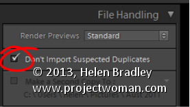
To ensure that you don’t import images that are already in your catalog, enable the Don’t Import Suspected Duplicates checkbox in the Import dialog. With that setting enabled you will no longer be able to select to import images that are already in the catalog. So any images that you can select to import aren’t duplicates so it is safe to import them.
This feature is particularly useful when you only want to import images from a camera card that you haven’t previously imported into the catalog.
Learn to create a monochrome stamp effect from a photo in Photoshop. Includes using filters such as Posterize, black and white, threshold and the Photocopy and Stamp filter to adjust the image to get the effect. Also see how Dodge and Burn can help you fine tune the effect.
Transcript:
Hello, I’m Helen Bradley. Welcome to this video tutorial. In this tutorial I’m going to show you how you can convert an image so that it looks like a stamped monochromatic image.
Before we get started on this tutorial this is the effect that we’re looking for. I have an original bird image here and what we’re going to do is to firstly get rid of the background around the bird. And then we’re going to convert it to black and white. We’ll posterize it and then we’ll apply a filter to it. And finally we’re going to apply the Threshold Adjustment. And we’re going to end up with this sort of stamped monochromatic effect from an original photograph. So let’s just hide that and let’s get started on the image that we’re working with. And I have a duplicate image sitting here.
Now I’ve already gone ahead and made the mask for this image so that we’re not wasting a lot of time cutting out the bird. But essentially what I would use is the Quick Select tool to just select over the bird. And then I made a duplicate of the background layer by just dragging it onto the New Layer icon and then just clicked this Layer Mask icon and that adds a layer mask to the image. So there’s the bit that we had selected. Then obviously I would make a much better selection and this would give me my isolated bird here.
So the next thing that we’re going to do is to convert this to black and white. So I’m going to click on the topmost layer and we’re going to do this using an adjustment layer. The reason for this is that it can then be redone later on if we don’t like the effect. So I’m going Layer, New Adjustment Layer, Black and White and click Ok, and here is the black and white adjustment.
Now what I’m looking for here is that we’re going to make this into a pure black and white only image later on so I want plenty of detail here. So I’m just going to walk these sliders in either direction to see where they go. And I want some edge detail because that’s going to define the birds so I probably want to bring the blue channels and the purple channels over towards the black. And let’s just see where the red gets us. I want to definitely see the bird’s eye so I want that to be different to the colors surrounding the bird. So I’m just looking for a reasonably good black and white conversion at this point, and I’ll just close that down.
Next we’re going to use Layer, New Adjustment Layer, Posterize. And what the posterize adjustment does is it flattens the image to a certain number of colors. They’re called levels but here we’ve got four levels of lightness and darkness. So if we had a color image we’d have four colors. And we can wind this up to a sort of surrealistic amount or we can take it back to a less realistic, more stylized amount. And that’s exactly what we want here.
But you’ll see that every time you change this it has different affects around the edge. So the difference between 5 and 7 and perhaps 6 and 5 is really quite significant. So I’m looking for a number of levels that gives me a good result. I’m worried about the eye disappearing here. Three is not enough. Four is a whole lot better. I really quite like that four so I’m just going to let that be what we’re using here. At this point if we were not getting the exact result that we like we could go back and dodge and burn on this layer. So we could grab the Dodge or Burn tools here to darken and lighten the image by clicking on these, taking the highlights, just make the brush a little bit smaller and perhaps brush around the edges here to darken it up which will ensure that later on we’re going to get some dark edges around the edge of our bird. So if that’s of concern to you selecting a tool such as Dodge or Burn will allow you to lighten and darken the areas around this bird that you want to have lighter or darker.
So for example if we really wanted to see this eye we could lighten the areas around the eye. So you can craft that to an extent using the Dodge and Burn tools here. So I’m just going to burn in a little bit around the top of the leg and the sides of the leg here, and perhaps just under the belly. So once we’ve done that I’m going to come up to the topmost layer and I’m going to make a flattened version of the image so far. And I do that by holding Ctrl and Alt and Shift and E, that’s Command, Option, Shift E on the Mac. And this gives us a flattened version of this that we can now apply a filter to.
I could use smart filters but the filter is just going to be fine for this. So I’m going to choose Filter and then Filter Gallery but before I do this I’m making sure I’ve got black and white as my foreground and background colors because the filter set that we’re using relies on black and white for the color. So if you don’t have black and white selected as the color it’s not going to be a black and white effect that you’re going to end up with. So I’m just going to drag this back in. And I used the Photocopy earlier, and I found that that was a really good result for me.
But you could also try the Stamp and see if in the light and dark balance you can get what you want with the Stamp. We’re going to get pretty much the Stamp effect by just using the Photocopy. But I’ve got a way of getting rid of these sort of almost blurry sort of gradient detail in the bird’s back. So I’m going to ignore that for now and just go for a good sort of stamped effect. I’m looking at the blacks and the whites in this image because that’s essentially what I’m going to get at the end of this. So I’m going to say that that’s good and click Ok.
And the final tool that we need to make these areas disappear is a Threshold Adjustment. And again, I’ll do this using an adjustment layer with Layer, New Adjustment layer and then Threshold. Now Threshold is an unusual sort of filter. What it does is it turns everything either pure black or pure white. There is no in between. And this selector here tells Photoshop at which point we want the colors to go to white or to black. So if we wind this back down a little bit we’re going to get rid of some of these areas in here and they’re become darker or lighter according to how we have this selected.
So I’m just going to go around about that midpoint because we do have this as an adjustment layer which means that if we make changes to this layer they will affect the adjustment layer. So I’m just going back to the Dodge tool here and just see if I can get rid of the very obvious sort of circling effect here, so I’ll just make that a little less obvious that that was something that got left behind with the Photocopy filter. Let’s just bring the exposure right up. And there’s our finished bird there. And we can do whatever we like with it.
You may want to save it out so that you could use it perhaps with a background color or something like that. But there’s this sort of stamped monochromatic effect created in Photoshop. And it’s done very easily by first just isolating the object and then converting it to black and white in a way that gives you the contrast that you want, posterize it to flatten it to some levels of color or levels of tonal range, create a brand new layer from that and apply a Photocopy or Stamp filter to it and then finally finish off with the Threshold Adjustment.
I’m Helen Bradley. Thank you for joining me for this video tutorial. If you liked the tutorial please Like it and comment on it and share it with your friends. Look out for more videos on my YouTube channel and visit projectwoman.com for more tutorials on Photoshop, Photoshop Elements, GIMP, Lightroom, Illustrator and a whole lot more.
How to make a New Page (or Page Break) When and Where you Want
To create a new page in a Word 2010 and 2013 document before you’ve reached the end of your current page, simply press CTRL + ENTER. This places a ‘…Page Break…’ in your document exactly where your insertion point was. It also moves the insertion point onto the top of the next page. You can see the page break marker if you select the ‘¶’ button on the Home tab of the Ribbon.
Lastly, if you need to, you can delete the page break by positioning the insertion point immediately in front of it and pressing Delete.
Creating multiple new folders in windows can be a pain, since it forces you to click through multiple context windows every time. It can, however, be bypassed with a nifty set of keyboard commands that navigate those windows for you.
While in the Windows Explorer view, simply hold Alt and press F+W+F. This opens the File menu, selects New, and chooses Folder almost instantly. This is extremely useful because it allows you to create and rename multiple new folders without taking your hands off of the keyboard.
You can use these commands to open other menus as well. While holding Alt you will notice certain letters of menu selections become underlined. Pressing these letters on your keyboard will select that menu option. For example, Holding Alt and pressing F+W+S will create a new shortcut. This functionality extends to Microsoft Office as well. The next time you’re in Word, press Alt and see what you can start controlling with a few key strokes.
Learn what is new in Word 2013 and how you can put it to work in your day. Features include new Design tab, start screen, Layout Options, PDF editing, Table border painting, styles and sampler, Read Mode options, Present Online, Save to skydrive, insert images and video from the web.
Transcript:
Hello, I’m Helen Bradley. Welcome to this video tutorial. Today we’re going to look at what’s new in the new Word 2013. This is the new start screen that you’ll see when you start Word 2013. And it’s similar to that in Excel and PowerPoint and Publisher. You’ll see the recent documents that you’ve had open down the side of the screen here, and you’ll be given the option to open other documents for example from SkyDrive or your local computer. There are templates here and these are current so at the moment it’s sort of October so we’re seeing Thanksgiving and Halloween templates. They will change with the seasons. If there is a template that you like you can click on it and you can pin it to your start screen. You can also click to have a look at it in more detail. If there are multiple images you can look through it here. If you want to use it click Create, otherwise just close it down, and you can go and have a look at another template. You can search online for templates and there are some suggested searches here. If you have your own templates you can click Personal and view the templates that you’ve created for yourself. Up here in the top corner are details of the account that you’re currently logged into. So this tells me I’m logged in to this particular SkyDrive account. Let’s open a document and we’ll start working inside the new 2013.
Here I have a document open inside the new Word 2013. You’ll see that the screen is very clean. It’s got that sort of metro style interface that is typical of the new Office 2013 suite. Everything is very flat and your documents sort of take center stage. So let’s have a look at a couple of the new features. The first one is the new read mode. I’m going to View and then Read mode because a lot of people actually use Word as a reader. So I’m just going to set this back to the layout that you will see by default. This is this sort of two column layout which allows you to work through the document and read it and particularly appropriate for using on a tablet. You can change this to the regular page layout if you want to by choosing Paper Layout. There are paper colors that you can choose. We’re obviously using sepia at the moment. And you can set it to the default which is two columns, narrow or wide as you choose.
There are some other features here. If you right click a word you can click Define and it will be defined on the screen for you. I don’t have a word that’s actually going to be definable to show you that, but it works just fine. The other thing in this read mode is that you can look at things more closely. For example we might look at this chart and double click it. And it will now open over the top of the document so that we can look at it in more detail. And that happens as well with smart art. Now this read mode is not looking at the document the way it would be presented so things may overlap if they’re complex. The important thing about this read mode is that it’s for reading the document and not sort of previewing it the way it’s actually going to appear when it’s printed.
I’m just going to escape out of here to go back to the regular Word. Now one of the other changes to Word is in the review area so I’m going to open a different document. I have one here that has track changes in it. The track changes feature has been overhauled a little bit. Let’s go into review and I’m just going to show the new mode which is simple markup. In simple markup we’re going to see the document as it would be if all the changes were incorporated. So that’s text that is inserted is inserted and text that has been marked for deletion is deleted. And we can switch between these two modes either by choosing simple markup or all markup here on the tab, or we can click these lines. These are lines indicating that there are changes here, but we’re seeing it in simple mode at the moment. So we’re not seeing the changes. We’re just being warned that there are changes. Click again and now we can see what the changes are.
There are some changes too to comment. So for example if somebody adds a comment to a document, if you want to reply to that comment you can click this Reply button that allows you to now reply to that comment. The changes here are quite significant because in the past if you wanted to reply to a comment all you could do was add another comment. So conversations could become quite long and complex as they sort of scrolled down the page. Here now all the comments or all the conversation about a particular point can be isolated inside a single comment. And I’m just going to delete that comment. Let’s just get rid of it in its entirety and let’s go back to viewing this document in the new simple markup.
Now I’m going to get rid of all the changes in this document. I’m going to accept everything because I want to show you some of the new design features in the new Design tab. The new Design tab has put together some of the features that were really difficult to find in earlier versions of Word, in particular the sort of document formatting styles. Now you can see what the document formatting styles are. And if you like one you can click on it to apply it to your document. And there are lots of different styles here to choose from. This is the one that we were using previously, but they’re easy to find and to use. If you see one that you like, for example we might like this sort of gray look, we could change the color scheme that’s applied to it. So we could make it blue for example. There’s also the ability to choose different font combinations for our document if we like the look of it but prefer a different combination of fonts for example.
Now if we create a look that we like and we want to use it every time we open Word then we can set this as default. This is a new option on the Design tab. If we click this, this is now going to be the default look for all our documents in future. So this new Design tab has lots of features on it that make things more accessible than they were. Of course if we want to format individual elements on this page we’d back to the Home tab and selecting styles. But these styles are linked to the design or the document format that we’re using here from the Design tab.
Still in this document I’m just going to change its rotation back to normal and we’re going to have a look at the new layout options that we have for this. One of them is this layout options icon here which makes it more accessible to find the text wrapping options. In the past these were really quite difficult for people to find. And now they’ve been attached to the image itself. You can also opt to move the image with the text or fix its position on the page. If you click See More you’ll get the more traditional layout dialog. There are also alignment guides so watch as I move this image around the page. It becomes aligned or we can see when it is aligned to various objects on the page because we get this green alignment guide appearing. So we can see when it’s aligned with paragraphs, with margins of the page, perhaps the edge of the page itself. So this allows you to align things up more easily than you’ve been able to do in the past. Now still in this document we’re going to have a look at the new navigation pane. I’m choosing View and then Navigation Pane. This document has been set up using styles. So because it’s been set up using styles I can navigate the document by selecting the headings in this navigation pane. It just makes it easier to move around and particularly a long document. In addition, there are these new collapse icons. Again, because this document has been formatted using heading styles these collapse and expand icons appear and I can click on them to collapse the document down to just the heading. So imagine this in a really long document. If you had really large headings that had lots of text underneath then you could collapse your document so that you only work on the headings that you’re interested in working on at the time and then you can expand the other headings as you go through it. Now this is a feature that used to be available in outline mode but it’s been brought into print layout. So it’s accessible to any document that you create using heading styles, not only the ability to collapse and expand paragraphs but also this slightly smarter and more useful navigation pane.
Now as well as collapsing parts of the document you can now collapse the ribbon. So you can click here to collapse the Ribbon and it collapses to just the headings. And then you can click to open it. You can pin it or unpin it depending on what you want it to appear like. I’m going to pin it because I like to see the ribbon particularly on large screens.
Before we start looking at tables let’s just go to headers and footers. I’m going to choose Insert and then I’m going to just insert a plain old header into this document. One of the changes here to the header option is that there is access to document info. You can get access to the author, file name, pathname and document title from the Header tab and that’s new in this version of Word. So let’s just close out of there and let’s switch to a document that has a table in it. Here we have a document that has a table in it, and with the table selected we now have options for formatting that table. From the Design tab you’ll see that there are additional table styles here. And these are theme aware so they’re going to look like the theme itself. So I’ve just applied one of them here. Now I can go ahead and format this table a little bit better if I want to. I’m thinking that the text would be better white. So let’s just go and get some white text, and let’s make it a bit bolder.
Now there is a new feature with the design of this table in the border. So we’re going to the table, let’s just grab the table. I’m going to the Design tab and here are our new border styles. This allows us to bypass the old border option that was available inside Word and to paint borders on. Now I can click here for border styles, and I’ll get borders that are theme aware. So these are borders that look like the theme. So I’ll just select one, but I might make a slight change to it. I think I’ll add a slightly wider border. So I’m choosing the color I want from the styles, but I’m making it a bit wider. Now I’m going to click on the border painter and I’m going to start Painting this border onto my table. And wherever I click and paint it’s going to be painted on. So this allows me to paint borders on where I want them to appear and to remove them where I don’t want them. For example, I could just set a border to none and they would be removed. Now let’s say that I make a mistake down here and I paint this border on by mistake. I want to go back to the regular border. Then all I need to do is from the border styles option here is choose my border sampler. I can sample a border. It’s now attached to the border painter. So having sampled it, I can now paint it back onto the table. So this gives me a lot more flexibility in working with tables than I’ve ever had particularly with borders and tables because that’s really been a nightmare issue for a lot of users.
Now the other thing that I can do in tables that I haven’t been able to do easily in the past is to add a row or a column. All I need do is to position my cursor just where I want the row or column to be inserted and I get this new indicator. And I can click to insert a row. I’m just going to undo that. But let’s go and see that the same thing appears between columns so we could add an extra column to the document. Let’s just undo that. We could also add one at this edge if we want to. So there are some new features inside Word not only new table styles but the ability to paint on borders, to sample borders and to access border styles.
The new features in Word 2013 extend to images and video. If you click the Insert tab you get access to online pictures. So you can view images that are in the office.com clipart collection. You can search Bing or you can go and search your own SkyDrive account. So let’s just type cupcake here. You can see that our cupcake image came from there, but you can add additional images by just clicking on them to insert them into your document. The same thing happens with video content. You can click Online Video and access online video. The benefit of these insert video and online picture options is that you can insert content direct from the web without needing to download it and save it to your computer first.
Let’s have a look at some of the screens that are available here. The open screen gives you access to recent documents, and if you click Computer you’ll see access to your recently open folders. And you can pin folders here as well as pin documents here. You can also get access to your SkyDrive account. One of the new features is in this share Option because you can now present online. If you click this you can go into a present online feature that is presented through the Office presentation service which is a new service. And this is similar to presenting a PowerPoint presentation online. Your presentation or your Word document is uploaded and you’re given a link that you can then share with others and they can watch as you present the document to them. You also have the ability to publish blog posts and invite people also to share your document. This would be done via a SkyDrive location. Here are the account options. Here you can see what account you’re currently logged into. You can also add services. For example we could add a LinkedIn or Twitter service here. We’re already connected to Facebook and SkyDrive, and you can see your update options.
The other feature that I want to talk about is the ability to open and edit PDFs. So I have the open screen available here, and there is a PDF that I just downloaded. So I’m just going to click it to open it. Now you’ve never been able to do this before inside Word and that is to open a PDF for editing. Now the application is not perfect. In fact it’s far from perfect, particularly with complex documents like this one that actually has images and pieces in it. But if we go to the select pane here we’re able to actually locate the picture and the elements that are part of this document so I can actually find these shapes. And I’m just deleting them. So I’m getting rid of these shapes that made the image and now I have something more attune to the original PDF and I could make changes to it. I would probably need to reformat this table as tables aren’t particularly friendly. But you do get access to the internal contents of a PDF file which you couldn’t in the past.
So there’s a roundup of the features that are new in Word 2013. I’m Helen Bradley. Thank you for joining me for this video. Please subscribe to my YouTube channel so that you’re advised of new videos. You can also find more blog posts and information on my website at projectwoman.com.