Five Must Know Features of the Photoshop Brush Tool
Brushes are used a lot in photo editing from removing blemishes and smoothing skin to dodging and burning and painting on masks. Here are five important features of the brush tool in Photoshop.
1. Adjust Size, Opacity and Hardness from the Keyboard
When a brush is selected you can adjust its size without having to open the Brushes palette by clicking the [ and ] keys on your keyboard.
Provided a brush is selected you can change its Opacity by typing a number. For example, type 5 to set Opacity to 50%, type 1 for 10% and 0 for 100%.
To adjust the hardness of the brush hold the Shift key as you tap either the [ or ] keys on the keyboard. Each tap increases or decreases the hardness by 25% in the range 0%-100%. The results of doing this are harder to see as there is no hardness indicator on the tool options bar. However, if you have the Painting Cursor set to Normal Brush Tip in preferences you will see a difference in the brush size as you do so
2. Save the Brush
When you have a brush configured with your preferred settings, save it as a Tool preset. To do this from the Brush Preset list in the top left of the screen click the Create New Tool Preset button and type a name for the preset. Click Ok.
In future you can select this saved preset from the list and just start painting with it.
3. Disappearing Brushes
One of the very annoying things that will happen to most of us at one time or another is to have the brush appear to disappear. Instead of the regular brush cursor which shows the size and style of the brush you will see a crosshair cursor.
The issue is not with the brushes themselves but is with the Caps Lock key. If you disable Caps Lock on your keyboard the more visual brush cursor will reappear.
4. Paint a Straight Line
To paint in a straight line, click at one end of the line, hold the Shift key and click at the other end of the line. This draws a continuous brushstroke between both points.
If you adjust the spacing of your brush by using the Brush panel Spacing option to make it more than 100% you can create a line of dots this way.
This can also be used to remove power lines with the Spot Healing Brush Tool. Click at one end of the power line, Shift + Click at the other end to paint a straight line over the power line and it will be removed automatically.
5. Quickly Show the Brush Panel
You can quickly show the Brush panel so you can choose a brush to use by first selecting a tool that uses a brush such as the Brush Tool, Dodge, Burn, Eraser tool and so on.
Then right click on the image and the brush panel appears automatically. To select a brush and exit the panel in one step, double click the brush to use.
And now it is over to you. What other features of Brushes do you think are valuable for photographers to know?
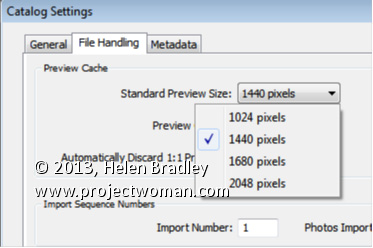
Set the size of your Standard previews to match your screen size.
When you choose to render Standard previews you can choose how large the previews will be. You should do this because setting the size to match your screen size maintains a good balance between disk space the previews take up, the time they take to render, and general usability.
To configure the image preview size for Standard size previews, choose Edit > Catalog Settings (or Lightroom > Catalog Settings on the Mac) and select File Handling.
From the Standard Preview Size drop-down list, you can choose from one of four sizes; 1024, 1440, 1680 and 2048. Choose the size that matches the size of your monitor or which is a little smaller.
This setting will be applied to previews that you create on Import or which you create from inside the Library module itself.
Create a cancelled postal stamp watermark to use in Photoshop and Lightroom. See how to use the path tools to create the watermark and then save it as a png image with a transparent background so it can be used over your images.
This is the video explanation of the blog post on the same topic which you can find here:
Transcript:
Hello, I’m Helen Bradley. Welcome to this video tutorial. In this tutorial I’ll show you how to create a postage style copyright stamp that you can use on your images. In this tutorial I’m going to show you how you can create a copyright symbol like this which is a couple of concentric circles and some wavy lines and text. And it’s got an overall texture to it.
This is a tutorial that I created for digital-photography-school.com when one of my readers there was having a bit of difficulty following along. So that’s why I’ve created this as a video tutorial. And because of this I’m going to be doing it step-by-step as I did it for that particular tutorial on the Digital Photography School site. And you’ll see in the comments here just below the tutorial I’ve given you a link to that site if you want to follow along.
So the first thing that I did in that tutorial was to create a brand new image. So I’m going to do that now. I’m going to choose File and then New. And I’m going to do a letter size image, landscape. So it’s 11 inches wide by 8.5 inches tall, and it’s 300 pixels resolution, RGB color and the background contents are white. So I’m just going to click Ok. And here’s our starting image.
Now we’re going to add a new layer so I’m going to have my layers palette visible. So if you don’t have it visible choose Window and then Layers so that you can see it. And we’re going to add a new layer and we do that by clicking this little icon here. It’s the Add New Layer icon. It looks like I clicked it twice. So I only want one new layer here. And we’re going to draw our circles using the Ellipsis tool. And it’s here in the toolbar so let’s just have a look and see what we’re looking for.
We’re looking for this tool here. It’s the Ellipsis tool. And when you choose it you want to choose Paths from the tools option palette. Now the options are a little bit different in earlier versions of Photoshop. There are three icons here and you want to make sure that you click the icon that says Path when you mouse over it. They’re the exact same options. They just deliver differently. And this is Photoshop CS6’s version so I have Path selected.
I’m going to drag to draw an ellipsis, but you can see that this is going to be a sort of oval. I want it to be a circle so I’m going to hold Shift as I draw it. And if it’s not in the correct position before I let everything go I’m going to hold the Spacebar and move it into position, let go the Spacebar and just make sure that I have the outermost of my circles created. And when it’s dead right, I’ve still got the Shift key held, I’m going to let go of my Left Mouse button.
So now I have a circle the shape of this outer circle that we’re going to use. Now this is now going to be colored in and we want to stroke this circle. And we do this by going here to the Paths palette. Now the Paths palette you get to by choosing Window and then Paths. And the topmost path is going to be called your work path and that’s the one that you’re working with. This is this circle here. We want to stroke the circle with a brush so we’re going to go and select a brush to use.
So I’m going to click on my Brush tool and then I’m going to select the kind of brush that I want to use. And I’m going to use a hard sort of brush here. So I’m going to select that brush. It’s a hard brush. And let’s just check and see from the original tutorial just how big it needs to be. And apparently it needs to be 40 pixels. So let’s just take it up to around 40 pixels. That’s 39, but that’ll be fine.
I’m going to set black as my foreground color. So I’ve set my brush and my foreground color and what I want to do now is with this path selected I’m going to choose the option that says Stroke Path with Brush. So that’s this icon here. So I’ll click it to stroke the path with a brush. Now I’ve got a funny sort of stroke here and the reason is that my stroke is set to something I don’t want it to be set to. So let’s just wind that back with Edit, Undo.
Then I’m going to right click on this Path option here and choose Stroke Path. And I want to disable this option here, Simulate Pressure. I just want to stroke it with the brush so I’m going to click Ok. Now it’s working the way I want it to. So now I have my path stroked, well at least the outside stroked. Now I need to use the outside to make the inside because it’s going to be really easy to make a concentric circle. To do that I’m going to click on this tool here. It’s the Path Selection tool.
This is the one I want and it shares a position with the Direct Selection tool. But it’s the black one, the Path Selection tool that I want, and I’m going to click on my path so it is selected. Now I want to transform this. And the transformation handles have not appeared so I’m going to press Ctrl T to make them appear. I want to drag in on this handle. But I want to make sure that I don’t lose the circle and I want to make sure that I don’t lose the fact that it needs to be concentric. So I’m going to just hold down both Shift and Alt as I drag in on this handle. So let’s Shift Alt and drag inwards. And you can see that what I’m doing is making a concentric circle. It has the exact same middle as the original circle. I’m going to let go of my Left Mouse button and then let go of the shift and the Alt keys. Now my work path here is a much smaller path so I’m just going to click the checkmark here.
Now I’m going to do exactly the same thing. I’m going to select my brush and I’m going to stroke it, make sure black is my foreground color, and I’m going to stroke this path with the brush. And I get the exact same effect. Now what I need to do is to make a path for my type. And it needs to be a little bit bigger than this inside circle. So again, I’m going to click this Path Selection tool. I’m going to press Ctrl and T to show my handles, I’m going to hold down Alt and Shift, that’s Option and Shift on the Mac, and this time drag out just a little bit so that I get a path for my type, let go of the Left Mouse button, let go the rest of the keys and click the checkmark. Now I’m going to add my text. And to do that I’m going to select my Text tool and then select my type. And I want to use Myriad Pro.
So I’m going to go down here until I find Myriad Pro. And I think the type that I suggested in the article that we used was about 24 points so I’m going to click that. I have black as my type color. So everything looks pretty good. I’m going to hold my mouse over the line, over this path that is still selected, and when I do you’ll notice that the I-beam pointer changes from this I-beam to an I-beam with a short of squiggly line. That means I’m typing on the path. So I’m going to click to do that.
Now the first thing I need to do is to add my copyright symbol. So I’m going to hold down the Alt or Option key and type out 0169 on the keyboard because that gives me copyright, and now 2013, and I’m going to type my copyright details. And I think I’ll do this all in capitals. And I’m using Helen Bradley, projectwomam.com. And I think actually I just want to put a www in there so I’ll just arrow back and make that change.
Now so far my type hasn’t quite stretched all the way around my words. So the next thing we need to do is to stretch it just a little bit more. And I’m going to do that using the Character Spacing tool. So first of all, I’m going to make sure that all my text is selected and then I’m going to choose this dialogue here which will get me to the Character Spacing dialogue. Now this is two dialogues.
There’s a paragraph and a character, and we want the character. And what we want is this tool here, this VA tool. And it’s a scrubby slider so all I need to do is to adjust it a little bit. And can you see that the text is getting bigger every time I drag on it? And I think I’m going to wind that back just a little bit because I could probably add a trailing dash to this. And that’s now all the way around that shape. And let’s just up that to bold because I don’t think it’s really quite dark enough for me. And if I’m using bold I’ll going to have to wind back up on my character spacing a little bit. And so now I’ve created my text on a circle.
Now the only thing that I’m a little bit concerned about is I think that this circle could be a little bit smaller. So I’m going to reselect my text layer here, and again with Alt and Shift selected, I’m going to drag inwards just a little bit to resize that circle path that the text is on because I just think it was a little bit on the big side. So I’m a little bit happier with my text now.
So we’re ready now to go ahead and to create the wavy lines. And we’re going to do that by clicking on the Custom Shape tool here that shares that toolbar position with the Ellipse tool that we used earlier. But this time we want Custom Shape. And from the Shape dropdown list here what we’re looking for is this wiggly line wave shape. Now this is shipped with Photoshop so you will have the wave shape. If you don’t have it in your collection you can click this little fly out arrow and choose All to add all the shapes or append all the shapes to your shapes collection. But this is the one we’re using.
I’m going to drag the shape onto my image and then use the Path Selection tool to just move it into position. Now at the moment it’s a series of closed paths and I want to open these paths. And I’m going to do that by clicking here on the Add Anchor Point tool. Unfortunately you can’t just delete points in Photoshop to open up these curves.
We first of all have to add a point in here that we can then go and delete to open it up. It doesn’t work otherwise. It’s a bit of a nuisance. But this is how we’re going to do it. So I’m going to click once with this Add Anchor Point tool on the ends up all of the shapes. And now I’m going back to the Direct selection tool. And I’m going to make sure that I’m selected on this point that I just added, so it’s black and everything else around it is not, and I’m going to press the Delete key. And that will just break that path in two. And I’m going to repeat that for each of these points.
So select it and press Delete, select it, press Delete, select it, and press Delete. Now if Photoshop is running out of memory if you’ve been using it quite a bit, you might find as I just did earlier that that was not working. Every time I pressed Delete the entire path was going. So I just closed down Photoshop and reopened it and went back to where I was working and it’s working perfectly. So now I have my lines. And you’re probably beginning to see a pattern here because this is just another path. And we can stroke it because we have our tool that we can stroke it with.
So I’m just going to go back and make sure my brush is selected. The same brush is selected, black paint, click on the work path so that I have it selected and now I’m going to stroke it. And that is giving us our lines. And so if you wanted to leave it at this point you could because everything is in place. But I’m going to go ahead and add a Grunge effect to it.
Now we’re ready to create our Grunge effect. And to create that, first of all what we need to do is to flatten the image. But in flattening it I need to remove the white layer from the flattened version. That is because later on when I will put this copyright image over my photograph I want the background to be transparent. So I want to keep this white layer out of the action right now. So I have two visible layers. I’m going to click on the topmost layer and press Ctrl Alt Shift and E to create a new flattened version of this layer. So this is the version that I’m going to use. And now I’m going to bring in a texture layer.
So I have a texture image open here, and I think it’s a really nice texture to use. So I’ve got the texture open. And to add the texture to this particular layer I’m going to select the layer and click the Add Layer Mask icon because that adds a layer mask to the image. And now this texture has to be made the exact same size as this image so I’m going to choose Image and then Image Size. And I want to resize it to the exact same size as this one.
So I can do that by just clicking Window and just pointing to the image whose size I want to borrow. And that’s apparently the size of this image here so I’m just going to click Ok. And because it’s a texture image it doesn’t matter that I’m skewing it a bit out of proportion because nobody really knows what a scratch is supposed to look like. Having done this, and it’s critical that you resize the texture to the exact same size as this image or you can’t use this next technique, which is to apply the texture as a mask.
So I’m going to click on the mask, and I’m going to choose Image, Apply Image. And if you don’t have the texture file the exact same size it will not appear here. So it does obviously appear here so that’s exactly what I want. I want to apply the texture to the image. And at the moment it’s set to Multiply blend mode. But I can test other blend modes and I can even test inverting the layer. So I’m just going to look for the best effect that I can get here.
In fact in the tutorial I suggested that we use Hard Light. So that looks like the one that we’re going to use, Hard Light. So I’m just going to click it and click Ok. And that gives us the sort of texturize look to our shape. And again, I was going to create this as a new layer so I’ll click on this layer and again press Ctrl Alt Shift and E to gives me a newly stamped layer. Well it’s not appearing to work right now. So let’s just add a new layer and press Ctrl Alt Shift E because that will work. And then we’re going to save this as a PNG image. But before I do it I think it’s going to be cropped because I think it’s a bit too big at this stage.
So I’m just going to crop down to get rid of the bits of the image that I don’t want and click the checkmark. And now I’m going to save this but making sure that I have this background turned off because I want it to be a transparent image. So I’m going to save it as a PNG image. So I’ll choose File, Save as, and I’m going to call this HB copyright, black, and PNG. And I’m going to make sure that I select PNG from this list here. And here’s PNG. So I’m going to select it and just click Save and click Ok. And that’s now saved as a PNG image.
Having done that I then want to make it white. So I’m going to choose Image and then Adjustments and then I’m going to invert it so what was black becomes white. And now if I just test this with a black filled layer behind it, you’ll see that it’s now a white image. So we could use that to go over the top of for example a very dark image.
So having created that I’m going to turn off my background because I want this to be a transparent image, and I’m going to resave it this time as a PNG. But this time I’m going to call it white. So again, this is going to be HB copyright, and it’s going to be white, PNG. I’m going to save it as a PNG image, and Ok. And so this is now the copyright image that I can use on my images in future.
I’m Helen Bradley. Thank you for joining me for this video tutorial. And look out for more of my tutorials both on digitalphotographyschool.com and also on my own website at projectwoman.com.
When you install a new version of Photoshop the first thing you’ll need to do is to set things up so that they work properly for you. Here are settings I make in the Preferences panel every time I upgrade.
1. Set your History States
Choose Edit > Preferences > Performance or Photoshop Preferences > Performance on a Mac and set the number of History States. Having a high setting for History States ensures that you can undo changes that you make to your image. By default it’s set to a paltry 20 so this is the first change to make.
I set my History States to the maximum value 1,000 – but even a quarter of this would be a good setting.
Here too I ensure that Photoshop can use plenty of the available RAM so I’ll crank that up to a large value – what you use will be dependent on the amount of memory you have installed.
2. Set Cursor Shape and Size
Still in the Preferences panel I like to use a Normal Brush Tip for my Painting Cursor and Precise for my Other Cursors. This can be set in the Cursors area.
You may want to use something different but it pays to look at these options and decide how you want your cursors to look as you work with them.
3. Opening Files My Way!
I dislike that Photoshop opens documents as tabs and that they are docked to the toolbar. This behavior really grates on me. If you’re like me and you prefer your documents to float you can set this in the Preferences Panel.
Choose Interface and disable Enable Floating Document Window Docking and disable Open Documents as Tabs.
In this panel you will also find the new Photoshop Color Themes in Photoshop CS6 so if
the dark gray look is not to your liking you can return to a more “CS5” look by selecting the lighter gray color.
4. Control Where Files are Saved to
Photoshop can be set either to save images back into the original folder when you choose File, Save As or to the folder that was last used for saving files. You can choose which of these behaviors you prefer Photoshop to default to in the File Handling area of the Preferences panel.
To save back to the original folder, enable the Save As to Original Folder option. To default to the last folder you saved to disable this checkbox.
5. Write your own History
So I can go back and retrace my steps in a large project I like to store a History of all that I do in Photoshop. To do this, click the General tab and enable the History Log checkbox. I save to a Text file (rather than inside the file itself) and I save a Detailed history as that stores the richest data. Choose a filename and place to save it and Photoshop will keep a log file of everything you do to every file.
So, now it is over to you. What preferences do you set up when you first install a new version of Photoshop?
With the increasing popularity of the iPad and iPhone it’s no longer appropriate for most of us to create Flash based web galleries – they just can’t be easily viewed on these devices. If you want almost everyone to be able to see your galleries then you need to create them as HTML galleries and not Flash.
Lightroom has a range of HTML Templates you can use to create a reasonable looking gallery in a very short time.
To make your web gallery in Lightroom start by placing your images in a Collection. This makes it easier for you to work with the images and you can save the gallery so you can edit it in future if needed.
Select your Collection and switch to the Web module. From the Layout Style options, you can select Lightroom HTML gallery or, easier still, from the Template Browser panel on the left of the screen, select a gallery that is HTML based. If you look in the preview area the HTML gallery templates all have the letters HTML in their bottom left corner. Select a template to use.
From the toolbar (press T if it isn’t visible), choose All Filmstrip Photos if you have a Collection selected and this will add all the images to your gallery. What you see on the screen in the editing area is a live version of your web gallery. You can click on any image to view it as it will look on the web.
Open the Site Info panel and type a Site Title, a Collection Title and a Collection Description. If you don’t want to use all of these simply delete the placeholder text for those items you don’t want to use and the space they take up in the template will be freed for use for your images.
For the Contact Info, type your contact name if desired and then complete the Web Or Mail Link and this will be linked automatically to the contact name in the web gallery.
You can add an identity plate to the gallery, if desired, it will sit above the Site Title. You can link it back to your site if desired by completing the Web or Mail Link box.
The Color Palette options let you change the colors for the various elements in the website template.
In the Appearance panel you can set the thumbnail image grid size – it defaults to 3 x 3 and cannot be any smaller but it can be considerably larger. If you want to show cell numbers over the images you can do so – this is useful when you need to give viewers an easy way to identify images they like. Images are numbered sequentially and if you have multiple pages the images on the second page continue sequentially from the numbering from the first page.
You can control the size of the full size image on the Image Page by adjusting the Size slider. You can also add Photo Borders to the images in the Image Pages. Note that the Appearance panel is divided into Common Settings, Grid Pages and Image Pages allowing you to make change that effect the entire gallery, only the grid pages or only the image pages.
In the Image Info panel you can select to add labels to your images. These appear on the Image Page only. You can select a Title which appears above the image and a Caption which appears below the image. For each you can source the text from the image metadata and there is no reason why you can’t set the Title to be the Caption metadata and the Caption to be your Equipment metadata, for example.
In Output Settings select the quality of the larger size JPG images – 0 is low quality and 100 is high quality. If you want to include Metadata with the image select what to include – your choices are Copyright Only or All.
Also add a Watermark if desired. If you select to add a watermark, you’ll see it on the image page and the index pages so you can check to see that it’s what you want.
Select whether or not to sharpen the images – this sharpening is only applied as the images are output so you won’t see it on the screen. If you’re unsure what to use, enable Sharpening and set it to Standard.
When you’re done, click Create Saved Web Gallery – this is a new option in Lightroom 4 and it appears to the top right of the main editing area. Type a name for your web gallery and click Create. Doing this ensures that the gallery is saved and once you have done this, Lightroom will track your changes from now on.
In future you can come back to the web gallery by clicking the special collection that Lightroom creates for you.
If you want to upload your gallery to the web later on, click Export to export it to disk. Otherwise you can upload it direct to your website by selecting the Upload Settings panel and configure your FTP server. For this, you’ll need your server details, user name and password. You’ll also need the server path although you can click Browse to browse your server to find it if desired. Type a subfolder in which to place the gallery – you’ll need to do this if you plan to have multiple galleries in the server folder you are using. Each gallery needs to be placed in a different subfolder or it will overwrite the previously uploaded gallery.
When you have everything configured click Upload to render the gallery images, create the necessary html code and upload it all automatically to your server.
The HTML galleries in Lightroom aren’t the best looking galleries in town but having a gallery accessible to almost any device is definitely and incentive to use them in place of Flash galleries.
One of the most frustrating things that you’ll encounter with Lightroom is when your entire title bar for the application disappears. You’ll see your menu but everything else including the Close, Minimize, Maximize and other buttons will be missing.
The problem is that you’ve pressed the F key to get to full screen mode.
The solution is to press the F key repeatedly until the screen returns to normal. Too easy? Maybe but it sure is frustrating when you don’t know what happened and how to fix it.