Learn three things about using Filters in Photoshop – including how to control the colors used (and why sometimes the colors look horrible), how to combine and reorder filters and how to add them so you have maximum flexibility when using them.
Transcript:
Hello, I’m Helen Bradley.
Welcome to this video tutorial. In this tutorial we’re going to look at three things that you need to know about using filters in Photoshop. In this video I’m going to cover some of the important things that you need to know about filters.
And the first one is that what you have selected as the foreground and background color is critical when you’re using filters. Now I’m going to convert this layer into a Smart Object layer. So I’m going to choose Filter > Convert for Smart Filters and that makes this a Smart Object so that the filters will be editable.
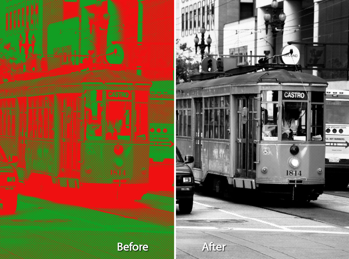
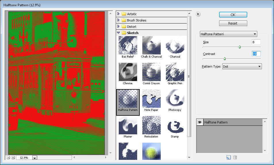
If you’re using Photoshop CS4 or later you’ll want to do this. Now I’m going to choose Filter > Filter Gallery and notice that my foreground and background colors are sort of a lime green a bright pink. And they’re exactly the same colors that are being applied here with this halftone pattern filter.
Now you might come into this filter dialog and take one look at this result and say well this is not for me. Well the reason why it’s probably not for you is that you’ve got selected these foreground and background colors and if you weren’t using those colors then this halftone filter wouldn’t look like this.
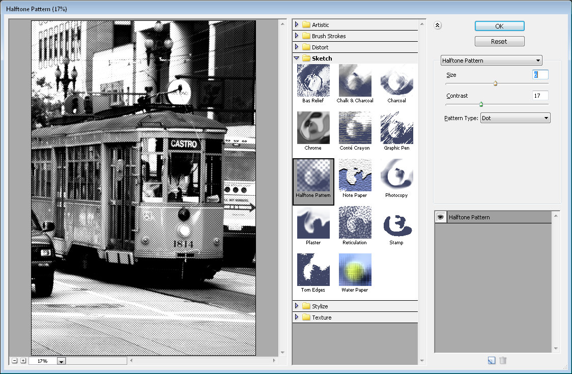
Let’s just click Cancel to exit out of here and I’m going to press the D key which sets the default foreground and background color. Now let’s go back into the filter gallery and you can see that the halftone pattern looks very different this time.
It’s black and white. And it’s black and white because of this black and white here. Now again if I exit this dialog and if we switch black and white around and I go back into the filter gallery you’ll see that we’re getting this sort of negative look on our image. Because white is now the foreground color we’re getting the effect of a digital negative with a halftone on it.
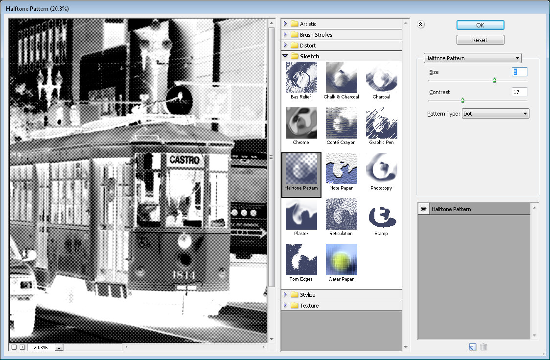
So you can see how critical it is that you’re using these colors as black and white with the darker color in the foreground before you go into the filters if you want a sort of standard filter effect. So I’m just going to make this sort of a brown color so that I can use brown and white and I’m going into Filter and then Filter Gallery.
And now we’ve got a brown and white sort of color halftone effect. So that’s the first trick in Photoshop, always make sure that you have the correct foreground and background colors selected. And if things look funky in here then just exit the dialog and start again. Now this is not going to be the case for most of these effects.
The artistic effects for example do not generally rely on those colors the foreground and background color so you’ll probably find that most of these work just fine. For example sponge is working just fine. With brush strokes you might find that the colors are being used but you can always test this to make sure by choosing some really, really bright colors and see if you see these colors in the resulting filter.
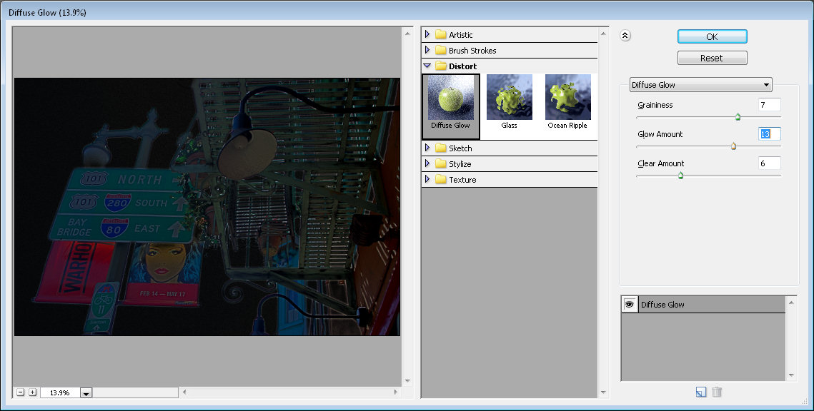
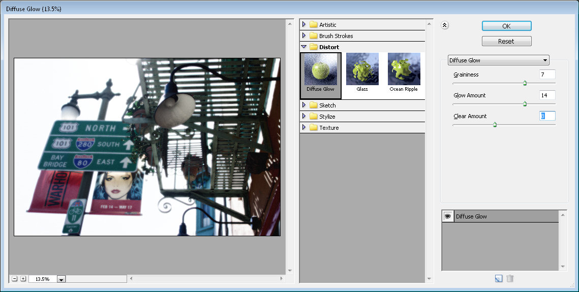
If you do see the colors then you can say to yourself well yes these colors are being used by the filter and if I don’t like the effect then I’m going to need to exit this filter gallery and go and do something about it. You can see that the diffuse glow filter is using the background color, the pink that we have selected as a background color. Again, glass knot, ocean ripple knot, all the sketch filters, pretty much all of them use these foreground and background colors.
Chrome is an exception to that but all the others are using it. Water paper is different, again glowing edges will be different. The texture filters probably aren’t going to use these colors but certainly all of these sketch ones are. Now the other thing to be aware of here is that you can add multiple filters.
So for example I’m just going to set up this filter pretty much the way I want it to look on this image. I just probably want the size to be a bit smaller. But having done that to the image I can now click here on this New Effect Layer option and I can add a second effect. So for example I could go and put some sort of painterly effect over the top of this, for example accented edges. And this is accented edges over a halftone pattern filter.
But if I reverse these I may find that the result is quite different and it is in this combination. If I do the halftone first and accented edges second the entire result looks very different. So working these filters out the ones that you want to use and the order in which you want to use them is critical.
To turn a filter off deselect its eyeball here and that just turns its effect off in the image. You can add new effects layers, new filter layers by clicking New Effect Layer and if you to remove an effect layer just click it, for example accented edges, and click the Delete button and it’s now been removed. I’m just going to go back and put accented edges in and click Ok.
Now because of the way I set this up with Smart Filters there’s one option here for the filter gallery. When I open it I can then change both of these filters. It is also possible to create separate filters. So while this object has been created for Smart Filters I’m just going to trash my filters and let’s go back and put them in one at a time.
So first of all I’m going to go in and add my accented edges. So I’m going to remove the halftone filter. So I’m just going to click that and click Ok. And now I’m going to add a second filter. This one’s not going to be accented edges. This is going to be my halftone pattern. And then I’ll click Ok.
You’ll notice that what we’re seeing is pretty much the halftone filter. This is the halftone filter on top and this is the accented edges underneath. Now in this case these two filters can be dragged around inside the layer palette to reverse the order. So I get a bit more flexibility here if I add the filters separately because in this case I can drag to reorder them outside of the filter gallery.
I don’t have to go back into the filter gallery to edit them and I can also disable a filter if I want to by deselecting its eyeball here. So that’s another thing to consider when you’re applying filters to images inside Photoshop. Before we finish up let’s have a look at another reason why I like to add my filters one at a time and then reorder them as required.
At the moment we have green and pink selected as our foreground and background colors but I’m going to press the letter D to change these around so that they’re now the default colors. I have my image selected and I’m going back into the filter gallery. And this time I’m going to choose a different sort of filter effect.
I’m actually going to choose a sketch filter because I want to make use of the black and white. So I’m thinking graphic pen will probably be a good choice here so I’ll just click Ok. And now this is the filter that we’ve just applied and it’s been applied on top of the other filters. Now I can click here to change the blending on this filter and instead of normal I’m going to choose multiple so I get this darkening effect on the image.
But you’ll notice that this filter is using the black and white colors and these other two filters are using the original pink and green. And if I go in and try and edit this filter by double clicking on it you can see that we’re working with the pink and green filter. I’m working on accented edges. Although I’m seeing the halftone dots it’s the accented edges filter that I’m making changes to while I’m in here.
And I can change the edge brightness and the smoothness. I’ll click Ok. And now I want to have a look at the halftone filter and that’s this one here. I’m going to double click on it to open it. This time we’re looking at the halftone pattern filter and any changes that we’re making are to that pattern filter only.
So I’m going to make it a little bit larger size dots and click Ok. And you can see the result in the image. Halftone pattern filter, accented edges filter, both of these were they using a foreground and background color are using the original pink and green because that was the color combination when we applied those filters.
This filter is the brush strokes on the top and it’s black and white because when we applied this filter we were applying it using the then current black and white colors. So you can see that there’s really a lot more to filters in Photoshop than may first meet the eye.
I’m Helen Bradley.
Thank you for joining me for this YouTube video. Look out for more videos on this YouTube channel.
Subscribe to my channel and visit projectwoman.com for more tips, tricks and tutorials on Photoshop, Photoshop Elements, Lightroom, Illustrator and a whole lot more.
 (photo by: Jürgen Eixelsberger)