Know the filename or part of it? Here’s how to find it in Lightroom
When you need to find a file by looking up its name in Lightroom, here’s how to do so:
1 Go to the Library and on the left in the Catalog area, select All Photographs to search all the photos in your collection.
2 Press the Backslash key \ to display the filter bar (you can also select View > Show Filter Bar
3 Select the Text option
4 Type the filename into the box as shown here:
Lightroom will find the image if it exists in the catalog if it exists.
5 If you want to do so, you can type only part of the filename in the box – just make sure to select Contains from the list so you find all files whose names contain that text.
When you are done, select the Custom Filters dropdown and choose Filters Off to return to viewing all your photos.
When you need to find everything you haven’t flagged, here’s two ways of doing it
The long way (using the menus) is to:
1. First click on the Folder containing the photos to check
2. In the Library module, choose Library > Enable Filters (if it is already checked then don’t select it!)
3. Choose Library > Filter by Flag > Unflagged Photos Only to see the unflagged photos.
If you flag any photos with this filter in place, they will immediately disappear from view – because they are no longer umflagged – they won’t match the current filter.
When you are done, click Filters Off to go back to viewing all the photos.
The second way to isolate unflagged photos:
Again, is to click on the Folder containing the photos to check
Now, on the Filter bar, just above the Filmstrip click the middle of the three flag icons. You will see the Unflagged Photos alert appear temporarily to indicate you have selected to view unflagged photos only.
Despite their existence in earlier versions of Photoshop some categories of filters are mysteriously missing from the menus in Photoshop CS6, Photoshop CC and Photoshop CC 2014. This is the default behavior so you won’t find the Artistic, Brush Strokes, Sketch, Stylize or Texture category of filters in the Filters menu. This is a problem if you use these filters so luckily you can bring the filters back when you know how.
It turns out that an option in the Preferences menu acts as gatekeeper for displaying the missing filter categories. To re-enable them, select Edit > Preferences > Plug-Ins…. Then check the box that reads Show all Filter Gallery groups and names. Click OK and restart Photoshop. This will put the filter categories back in the Filters menu.
Now you could have accessed the missing filters from the Filter Gallery but the way the filters are named in the Layers palette is different if you access them from the Filter Gallery rather than from the menu itself. So, if you use Convert for Smart Filters to create a smart object before applying the filters and if you start a filter from the menu then the filter name appears below the layer so you can tell the name of the filter you are applying. This image shows this situation:
If, on the other hand, you start your filter from the Filter Gallery the Layers palette simply shows Filter Gallery – with no indication of which filter you applied. This is what the Layers palette looks like – not very helpful at all.
In short, having the filters back on the menu and selecting them from there is the better option.
Be aware too that the Oil Paint filter was removed from Photoshop CC 2014 so it is gone for good.
Need to check what you didn’t pick in Lightroom – here’s how!
My workflow for choosing the best of my photos in Lightroom is to go through the photos in a folder and either click the Pick flag, the Reject flag or simply move past the photo onto the next one. Now sometimes I’d like to review the photos that I haven’t picked – they aren’t the best but they aren’t rejects. I will do this just in case there are some good images I have overlooked.
So, how do you display only the unflagged photos? Luckily it’s dead easy to do this.
These icons across the top of the filmstrip are, from right to left: Show Flagged Photos (ie Pick Flag is on), Show Unflagged photos (no flag present) and Show Rejected photos (Reject flag on).
So, click the middle flag to see only those photos that don’t have either the Pick or Reject flags enabled.
Now, if you add a Pick (or Reject) flag to one of the images it will immediately disappear from view – that’s because this filter is a live filter – it only shows the unflagged photos and as soon as a photo has a flag it no longer matches the filter so it is removed from view.
Of course, when you are done, make sure to select Filters Off from the Filters: list (or click the same flag a second time) to return to viewing all your photos.
Learn three things about using Filters in Photoshop – including how to control the colors used (and why sometimes the colors look horrible), how to combine and reorder filters and how to add them so you have maximum flexibility when using them.
Transcript:
Hello, I’m Helen Bradley.
Welcome to this video tutorial. In this tutorial we’re going to look at three things that you need to know about using filters in Photoshop. In this video I’m going to cover some of the important things that you need to know about filters.
And the first one is that what you have selected as the foreground and background color is critical when you’re using filters. Now I’m going to convert this layer into a Smart Object layer. So I’m going to choose Filter > Convert for Smart Filters and that makes this a Smart Object so that the filters will be editable.
If you’re using Photoshop CS4 or later you’ll want to do this. Now I’m going to choose Filter > Filter Gallery and notice that my foreground and background colors are sort of a lime green a bright pink. And they’re exactly the same colors that are being applied here with this halftone pattern filter.
Now you might come into this filter dialog and take one look at this result and say well this is not for me. Well the reason why it’s probably not for you is that you’ve got selected these foreground and background colors and if you weren’t using those colors then this halftone filter wouldn’t look like this.
Let’s just click Cancel to exit out of here and I’m going to press the D key which sets the default foreground and background color. Now let’s go back into the filter gallery and you can see that the halftone pattern looks very different this time.
It’s black and white. And it’s black and white because of this black and white here. Now again if I exit this dialog and if we switch black and white around and I go back into the filter gallery you’ll see that we’re getting this sort of negative look on our image. Because white is now the foreground color we’re getting the effect of a digital negative with a halftone on it.
So you can see how critical it is that you’re using these colors as black and white with the darker color in the foreground before you go into the filters if you want a sort of standard filter effect. So I’m just going to make this sort of a brown color so that I can use brown and white and I’m going into Filter and then Filter Gallery.
And now we’ve got a brown and white sort of color halftone effect. So that’s the first trick in Photoshop, always make sure that you have the correct foreground and background colors selected. And if things look funky in here then just exit the dialog and start again. Now this is not going to be the case for most of these effects.
The artistic effects for example do not generally rely on those colors the foreground and background color so you’ll probably find that most of these work just fine. For example sponge is working just fine. With brush strokes you might find that the colors are being used but you can always test this to make sure by choosing some really, really bright colors and see if you see these colors in the resulting filter.
If you do see the colors then you can say to yourself well yes these colors are being used by the filter and if I don’t like the effect then I’m going to need to exit this filter gallery and go and do something about it. You can see that the diffuse glow filter is using the background color, the pink that we have selected as a background color. Again, glass knot, ocean ripple knot, all the sketch filters, pretty much all of them use these foreground and background colors.
Chrome is an exception to that but all the others are using it. Water paper is different, again glowing edges will be different. The texture filters probably aren’t going to use these colors but certainly all of these sketch ones are. Now the other thing to be aware of here is that you can add multiple filters.
So for example I’m just going to set up this filter pretty much the way I want it to look on this image. I just probably want the size to be a bit smaller. But having done that to the image I can now click here on this New Effect Layer option and I can add a second effect. So for example I could go and put some sort of painterly effect over the top of this, for example accented edges. And this is accented edges over a halftone pattern filter.
But if I reverse these I may find that the result is quite different and it is in this combination. If I do the halftone first and accented edges second the entire result looks very different. So working these filters out the ones that you want to use and the order in which you want to use them is critical.
To turn a filter off deselect its eyeball here and that just turns its effect off in the image. You can add new effects layers, new filter layers by clicking New Effect Layer and if you to remove an effect layer just click it, for example accented edges, and click the Delete button and it’s now been removed. I’m just going to go back and put accented edges in and click Ok.
Now because of the way I set this up with Smart Filters there’s one option here for the filter gallery. When I open it I can then change both of these filters. It is also possible to create separate filters. So while this object has been created for Smart Filters I’m just going to trash my filters and let’s go back and put them in one at a time.
So first of all I’m going to go in and add my accented edges. So I’m going to remove the halftone filter. So I’m just going to click that and click Ok. And now I’m going to add a second filter. This one’s not going to be accented edges. This is going to be my halftone pattern. And then I’ll click Ok.
You’ll notice that what we’re seeing is pretty much the halftone filter. This is the halftone filter on top and this is the accented edges underneath. Now in this case these two filters can be dragged around inside the layer palette to reverse the order. So I get a bit more flexibility here if I add the filters separately because in this case I can drag to reorder them outside of the filter gallery.
I don’t have to go back into the filter gallery to edit them and I can also disable a filter if I want to by deselecting its eyeball here. So that’s another thing to consider when you’re applying filters to images inside Photoshop. Before we finish up let’s have a look at another reason why I like to add my filters one at a time and then reorder them as required.
At the moment we have green and pink selected as our foreground and background colors but I’m going to press the letter D to change these around so that they’re now the default colors. I have my image selected and I’m going back into the filter gallery. And this time I’m going to choose a different sort of filter effect.
I’m actually going to choose a sketch filter because I want to make use of the black and white. So I’m thinking graphic pen will probably be a good choice here so I’ll just click Ok. And now this is the filter that we’ve just applied and it’s been applied on top of the other filters. Now I can click here to change the blending on this filter and instead of normal I’m going to choose multiple so I get this darkening effect on the image.
But you’ll notice that this filter is using the black and white colors and these other two filters are using the original pink and green. And if I go in and try and edit this filter by double clicking on it you can see that we’re working with the pink and green filter. I’m working on accented edges. Although I’m seeing the halftone dots it’s the accented edges filter that I’m making changes to while I’m in here.
And I can change the edge brightness and the smoothness. I’ll click Ok. And now I want to have a look at the halftone filter and that’s this one here. I’m going to double click on it to open it. This time we’re looking at the halftone pattern filter and any changes that we’re making are to that pattern filter only.
So I’m going to make it a little bit larger size dots and click Ok. And you can see the result in the image. Halftone pattern filter, accented edges filter, both of these were they using a foreground and background color are using the original pink and green because that was the color combination when we applied those filters.
This filter is the brush strokes on the top and it’s black and white because when we applied this filter we were applying it using the then current black and white colors. So you can see that there’s really a lot more to filters in Photoshop than may first meet the eye.
I’m Helen Bradley.
Thank you for joining me for this YouTube video. Look out for more videos on this YouTube channel.
Subscribe to my channel and visit projectwoman.com for more tips, tricks and tutorials on Photoshop, Photoshop Elements, Lightroom, Illustrator and a whole lot more.
Learn how to find only photos or only illustrations when searching Office 2013 online images
In Office 2013 the old Clip Art feature was removed and now you can insert an image by searching for it online at a number of places. One of these is the Microsoft clip art collection which is now stored totally online and not partly on your computer.
So far, so good.
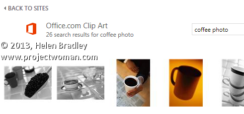
The problem is that the old task pane feature which let you determine the types of images you want to search for is now gone. So, on the face of it, when you search for something like coffee you get illustrations and photos. In many cases much more than you want or need.
Often, I know ahead of time I want a photo or an illustration so I want my search to return only one type of image. There’s no information at all as to how to do this but you can! Instead of searching for coffee, type coffee photo to find photos relating to coffee or coffee wmf to find just illustrations as these are generally wmf format images.
It isn’t a perfect solution and you will miss out on some images as well as get the occasional illustration with your photos or vice versa.
However, if you’re not too fussy about missing out on some imagery then using this search format will weed out a lot of the stuff you don’t want and serve up mostly the type of content that you do want.
This tip works in any of the Office 2013 applications – PowerPoint 2013, Excel 2013, Publisher 2013. Word 2013 and more.
Many of the fixes we commonly apply to images come from darkroom processes. Contrast masking is one of those fixes and it can be used to fix an image which is under or over exposed.
Contrast masking is a relatively simple process and it can work wonders with your images. I like it because it generally doesn’t require you to make selections and there is a lot to like about fixes that don’t involve selections.
Here’s how to use Contrast Masking to fix an under exposed image:
Open your image and duplicate the background layer. Target this duplicate layer in the Layers palette.
Desaturate this layer by choosing Image > Adjustments > Desaturate. Right now the default convert to black and white is just fine.
Alter the blend mode of this layer to Overlay.
To invert this black and white layer choose Image > Adjustments > Invert – this gives a negative of the image.
Adjust the layer opacity to suit.
Convert the top layer to a Smart Object by choosing Filter > Convert for Smart Filters.
Now blur this layer by choosing Filter > Blur > Gaussian Blur. Adjust the Radius to adds some sharpening back to the image. Check the preview to get the best result for the image.
Learn to make realistic rivets in Photoshop. This tutorial makes use of the new photo filters in Photoshop CS6, but doesn’t require their use, so, you can make the rivets in any version of Photoshop. You will see how to add dimension with Bevel and Emboss and Contours, as well as with gradients and light. The tutorial is easy to follow and the process of making a rivet quite simple.
Transcript:
Hello, I’m Helen Bradley. Welcome to this video tutorial. In this tutorial I’m going to show you how you can create rivets quickly and easily in Photoshop. Before we get started making the rivets let’s have a look and see what it is that we’re creating. And this is the type of rivet that we’re going to create. This one’s a copper rivet, but we can make them in any colors that we like.
To start off I’m going to choose File and then New and I’m going to create a new image. This one’s going to be 500 by 500 pixels because I like my rivets to be able to be shrunk down so that they can look realistic in place. So I’m just going to click Ok. And the first thing I’m going to do is to fill this layer here with a gradient.
Now in Photoshop CS6 there are some new photo gradients that you can use. And I really like these for rivets, but in earlier versions of Photoshop you can go and do the same thing and you can create your own look in gradients. So you don’t have to have these gradients available, but you will find that they are kind of handy for creating rivets as well as of course coloring photos. So I’m just going to click Ok and I’m going to apply this as a linear gradient. So I’m going to make sure I have Linear Gradient selected here and I’m going to drag it across the image here. I’m holding Shift to constrain it to a straight line. Now I’m not totally convinced about this particular gradient so let’s go and get something.
I know this copper one is going to work. So I just want something that is a little less harsh. This one’s got a distinct dark area and I want something that transforms from light to dark a little bit more smoothly. So this is a pretty good gradient. Now if this is a bit dark you can add a new layer to your image. So I’m going to add a new layer and I’m going to fill it with the foreground color by pressing Alt and Backspace because my foreground color is white. That’s Option Delete on the Mac. I’m going to set this to Screen Blend mode and just adjust the opacity down so that I can use most of the color underneath. But I could make it lighter if I wanted to. And I’ll just merge those layers with Ctrl and E to merge the layers. But if your gradient isn’t too dark then you don’t need to do that step.
I’m then going to choose the Elliptical Marquee tool and I’m going to drag a circle onto my gradient. And if I hold the Shift key with it that will be a pure circle. And if I use the Spacebar I can move the circle right into the center of the image. So I’ve still got the Shift key selected, I’m going to let go of the left mouse button and then let go the Shift key so I’ve got a circle here.
Now I’m going to invert that with Select Inverse so I have selected everything but the circle and I’ll press Delete. So this is the first part here of my rivet and it’s actually this outside part here. I’m going to duplicate this layer by dragging and dropping it on the New Layer icon. Now I got a bit enthusiastic there and ended up with more layers than I needed. So I now have two identical layers. I’m going to deselect the current selection by pressing Ctrl D or I could choose Select, Deselect. Now this is going to be in my inner shape so I’m going to Ctrl click on it, choose the Move tool, and then I want to size it in smaller. Now the way I do that is to hold both the Shift and the Alt keys as I do this. The Shift key constrains my movement to a full circle so I’m always going to have a circle here and the Alt key sizes it from the middle so that it’s not being repositioned. This second circle is going to be right in the middle of the first circle. So when I get it in place, let go of the left mouse button and then and only then let go of the Alt and the Shift keys, I’m going to click the checkmark here.
Now I want to transform this. And I want to transform it through 180 degrees so I’ll press Ctrl and T to get my transform details up here and I’ll type 180. And that’s flipped it around. In fact I think it could be rotated a little bit more attractively, probably to about here. Now at this point you’re going to get a relatively flat looking rivet. And I actually prefer to at this stage actually go and reapply the gradient. So I’m going to select my gradient again, with this layer I’m going to lock the pixels on it so that I can drag my gradient in and it’s only going to affect the area marked out by the circle. I’m also going to select a radial gradient because what I want to do is for this part of the gradient here to be light and the outer edge to be dark, and I’m just going to find a good position for it. And I think this is a pretty good gradient. So you can just continue to drag until you get it into the right place. Let’s just unlock that now. We’re ready now to add a Bevel and Emboss.
So I’m going to click the bottom layer here, choose the Add Layer Style icon and I’ll choose Bevel and Emboss. Now in contour I want one of these contours, this one, this one or this one. They’re all going to work pretty well. And I’m going to just adjust the range so that I push it to the very edge of the shape. Let’s go back into Bevel and Emboss and now I’m going to reduce the depth quite a bit, reduce the size, just get it to what I want it to look like. Now we have a problem with the light now. At the moment from Photoshop’s point of view and for this Bevel and Emboss effect, Photoshop has the light coming from this direction. But you can see that the light is actually coming from this direction on the rivet itself. So we need to adjust the light here to match our rivet.
So I’m going to bring in a global light here that is hitting from this direction. And then I’m going to adjust my Screen and my Multiply so that I get the effect that I want. I don’t want a really, really harsh set of settings here. I just want the very smallest amount. And then I’m going to add a Drop Shadow so I’ll click Drop Shadow, select the Drop Shadow itself.
Now I think that these are badly named in Photoshop. Size in actual fact it’s more like a feather. So size will give you a softer or a harsher shadow and the actual physical size of the shadow is really controlled by the spread and the distance. So I’m going to bring my distance and my spread in quite small and adjust the size of it which gives me that sort of feathering effect and click Ok. And let’s just zoom out here and there we have our rivet. And this one’s a copper rivet but you’ll find that there’s plenty of things to choose from in this set of photo gradients. And you can create your own gradients to create your own look for your rivets.
I’m Helen Bradley. Thank you for joining me for this video tutorial. Look out for more video tutorials on this YouTube channel, subscribe to the channel, click Like if you liked this video and visit my website at projectwoman.com for more tips, tricks and tutorials on Illustrator, Photoshop, Lightroom and a whole lot more.
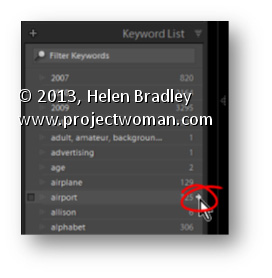
In the Library module in Lightroom the Keyword List panel tells you how many images are keyworded with a particular keyword. It can also find these images for you so, open the Keyword List panel, and click the arrow to the right of a keyword to view images that have that keyword associated with them.
These arrows appear only when you are hovering over a keyword in the list.
Learn to make lines thicker or thinner using a Filter in Photoshop. This is useful for adjusting scanned line art images, as well as, for thickening up lines on images which you have converted to a line drawing inside Photoshop.
Transcript:
Hello, I’m Helen Bradley. Welcome to this video tutorial. In this tutorial I’m going to show you how you can easily make lines thicker or thinner on line art images that you either scan into Photoshop or create in Photoshop yourself. In this video tutorial I’m going to show you a really quick technique for making lines a lot thinner or a lot thicker. And this is handy for images where you’ve actually converted it to line art or where you’ve got line art like this that we’ve actually scanned in.
To make the lines thicker choose Filter and then Other and then Minimum. And with Minimum you can then select the minimum radius which is going to make the image lines a lot thicker and you can test these out. Generally just one or two pixels is like all you need to do. And this is the original image and this is the thicker lined image. So let’s perhaps take this up to 4 and I’ll click Ok. And that has just thickened the line. So if that were all we wanted to do we could just save this and be off. But let’s have a look and see how we can make the lines thinner.
I’m going to choose Filter and this time, Other, and this time we’re looking at Maximum. And we’re just going to set the maximum line width. And so we want this down to something that gives us the lines that we’re looking for. So here I have it set to 5. This is what it was. This is what it is now. If I go a bit smaller the lines are going to get thicker. If I get bigger the lines are going to get thinner to the extent where they actually totally disappear. So you need to find this sweet spot here for your particular image. But if you do want to make the lines that are fairly thick right now to be a little bit finer then you can do that here with this tool. And these are again Filter, Other. Maximum allows you to set it so it’s smaller and minimum allows you to set the width so it’s larger.
I’m Helen Bradley. Thank you for joining me for this video tutorial. Look out for more tutorials on my YouTube channel. Please like and comment on this video if you do like it. And look out for more videos, tips, tricks and techniques on my website at projectwoman.com.


