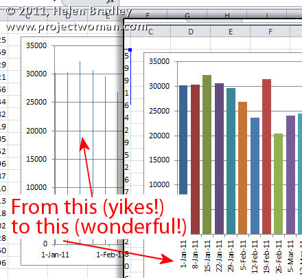
It’s probably happened to you, you’ve created an Excel chart and the columns are so narrow they are almost unreadable. The chart is ugly and it appears as if there’s nothing that you can do because nothing that should work does work.
The problem typically happens when you have a chart with an X axis that is has date data and where you aren’t plotting every day but, instead, for example, one day a week.
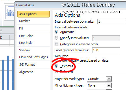
The solution is to click the X axis of the chart so that you have it selected, right click and choose Format Axis. From the Axis Options panel, select Text Axis. This turns your skinny bars into something a lot more attractive.
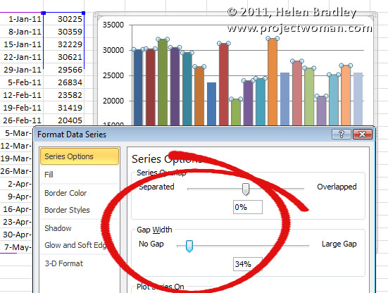
If the bars still not thick enough – and typically, for me, they aren’t – click on one bar to select the series, right click and choose Format Data Series. From the Series options, decrease the Gap Width value to around 35 percent. This option won’t work unless you first set the X axis to a Text axis although you and I both wish it would!


Great post – still relevant. After so many other posts I found the most appropriate one here like others. Worked like a magic and now I know the reason.
Joanne, change the interval between labels to 1 in the Axis options tab of the Format Axis window that appears after right-click on the horizontal axis
Thank you!!!
Thanks! I searched the Excel help for hours and it was worthless. You fixed my problem in seconds!
Amazing!!
Thank you!
Thank you so much! I have never seen this before and it was a well explained and easy fix!
I have an Excel 2010 chart plotting annual data over 18 data points. I’ve done everything suggested but when I click on Axis Type – Text Axis, all the bars simply shift over to the left of the table in a heap and no amount of fiddling with Gap Width or anything else makes any difference and the information is completely illegible. Any ideas? Thank you
still doesnt work… when i open up the “format axis” tab, i dont even have an option to save changes, just “close”… and when i close that and open the format data series tab, i dont have an option to change gap width. what is going on?
I just wanted to say THANK YOU so much for this site. I just started working for a global company that I really want to grow with, but it’s been 10 years since college and technology and software has changed so much! My superiors are always coming to me for help with their word and excel problems, and this site really helps me look good by being able to fix their issues, plus it allows me to get caught up on modern day Word and Excel. THANK YOU!!!!
Lifesaving…thank you!
Can’t tell you how much I appreciate this info. Saved me lots of headache. Thank you!
Thanks!! This was driving me up the wall. Turned out all I needed to do was change the axis type to text.
Thanks a million!
Worked a charm. Exactly what I wanted. Thankyou
Thank you. 🙂
Brilliant – just the problem that I had. All these years working with excel, and I had never stumbled upon this solution to the underlying problem – a date range in the x-axis being “hijacked” by Excel. You’ve solved my other problem – Excel adding unwanted (empty) days to my chart. Sweet; nice job.
Thank you!!! I was struggling with this for too long before I found your tip. You’re my Excel hero!
My God! You saved my life. Why did they make it so obtuse, arcane and stupid?
very Helpful.am glad you put diagrams they make it easy to see what i should do
I am an excel guru and this has pissed me off a bunch. I usually just go to my VBA to auto adjust the columns but this is so easy I am hitting myself for not knowing it!!
Thank you!
This was very useful. Thank you.
Thank you!!! I messed with this for two hours before I found your solution. I KNEW it would be something stupid!
Super helpful, saved me time thanks!!
There are ton of incorrect answers out there. This one nailed it!
Very much useful hint. Thanks.
Thank you so much!! This post may be old, but it’s definitely still helpful. All the other links I looked at just talked about changing the gap width….but that only got me so far. Thank you for sharing WHY this issue was occurring…now I know how to correct it in the future.
Thank you!! This was driving me crazy!
Yeahhh! Thank you!!
Still using Office 2010 at an academic medical center, however, your insights helped me very much and was an incredibly useful lesson in resolving this problem. Thanks! With appreciation-
Excel automatically selects “date” to this day, so this explanation, while old, still applies. They really hide some of this stuff, had no idea how to fix it. Thank you so much!
This was very helpful. Saved a lot of my time
really solved my issue. thanks very much
Thank you! You helped us out a ton 🙂
Great solution. I have tried and solved my problem. Thank you.
Fantastic post.
I had copied my file for some re-purposing but the axis changed and picked up the dates. I couldn’t figure it out until you saved the day.
Keep up the great work. Thanks!:-)