Wednesday, June 19th, 2013

Lightroom Tip – Faux Orton Effect

Create the Orton Effect in Lightroom with the Clarity Slider

The Orton Effect is named after photographer Michael Orton. This process results in a somewhat surreal image which has a slightly out-of-focus look while retaining lots of edge detail.

You can quickly give an image a faux Orton look using the Clarity slider in Lightroom. All you need to do is drag the Clarity slider to the left close to -100 and then, increase the Blacks in the image to an higher than usual value.

Of course there is a lot more to the Orton effect than this but this gives you a good start and, for many images, may be all you really need.

Helen Bradley

Thursday, June 13th, 2013

Lightroom Tip – Clarity and Portraits

Add that Softened Look to Your Portraits with the Clarity Slider

One time when you’ll want to use a negative value for Clarity in Lightroom is when you have a portrait that you want to give a softened look to.

Negative clarity softens an image so it’s a good choice to use. Just adjust the slider to the left to around -20 or more depending on the results.

Use this on portraits of women and children or to give an image an ‘Early Hollywood/Casablanca’ feel.

Helen Bradley

Monday, June 10th, 2013

Lightroom Tip – The Clarity Slider

Give an image’s Midtones a Boost with the Clarity Slider

The Clarity slider helps you adjust the Midtones in the image so it adds Contrast to them which also results in them looking a little crisper and more saturated too.

It’s a great tool, but try not to overdo it. Typically, a Clarity adjustment of around 25 is a good choice for most images. In Lightroom 4 the adjustment has been tweaked a bit so you can add more Clarity in Lightroom 4 than you are perhaps used to doing in Lightroom 3.

Helen Bradley

Friday, April 26th, 2013

Lightroom Tip – Discover more options with Alt (Option)

Learn to find some hidden options in Lightroom by using the Alt (Option) key

Some buttons and other features in Lightroom change depending on whether the Alt key (Option on the Mac) is pressed. For example in the Quick Develop panel in the Library module the Clarity and Vibrance options change to become Saturation and Sharpening when you hold the Alt (Option) key.

Also in the Library module the Import and Export buttons become Import Catalog and Export Catalog when the Alt (Option) key is selected. As you work in Lightroom, occasionally press the Alt or Option key to see if any useful options become visible when you do so.

Helen Bradley

Thursday, October 13th, 2011

Photoshop CS6 – What’s on your wish list?

When you’ve been using a program like Photoshop for a length of time, you begin to develop a wish list of things you’d like to see in future versions. Sometimes these are addressed by new releases and sometimes they’re not.

Now I know Photoshop CS5 isn’t that old but there are still things on my wish list that aren’t in Photoshop. Here are some things I’d like to see in the next version of Photoshop:

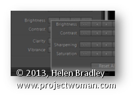
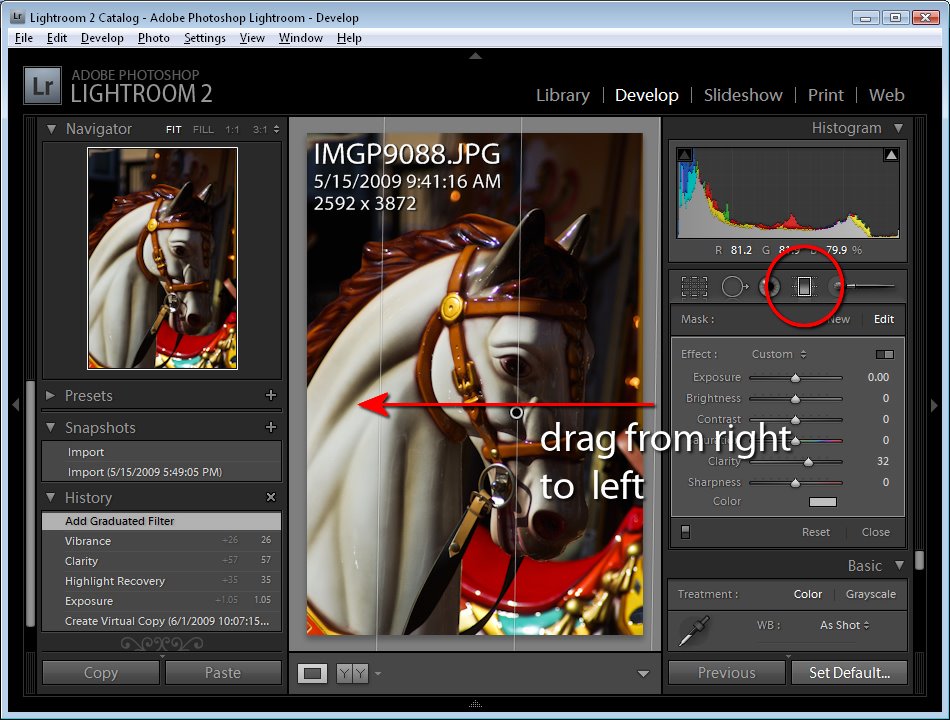
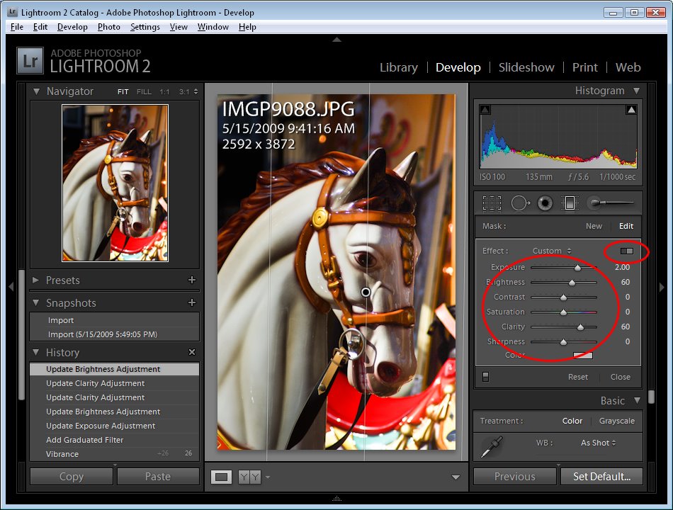
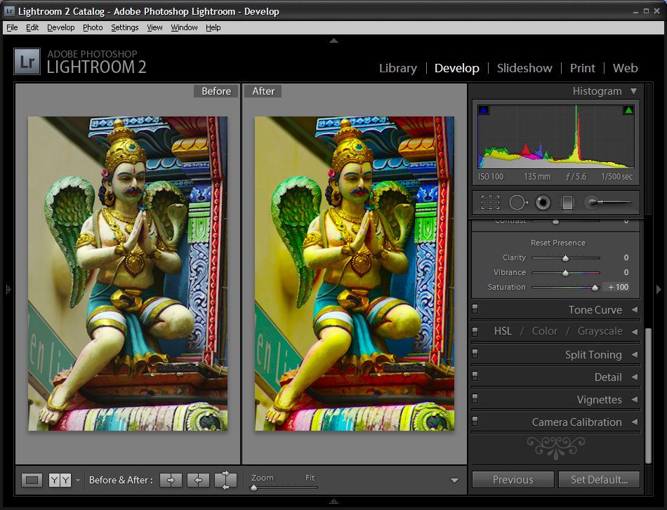
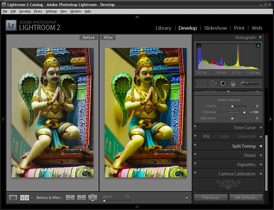
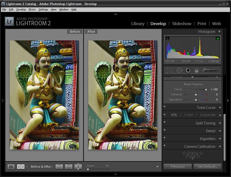
Give me some Clarity

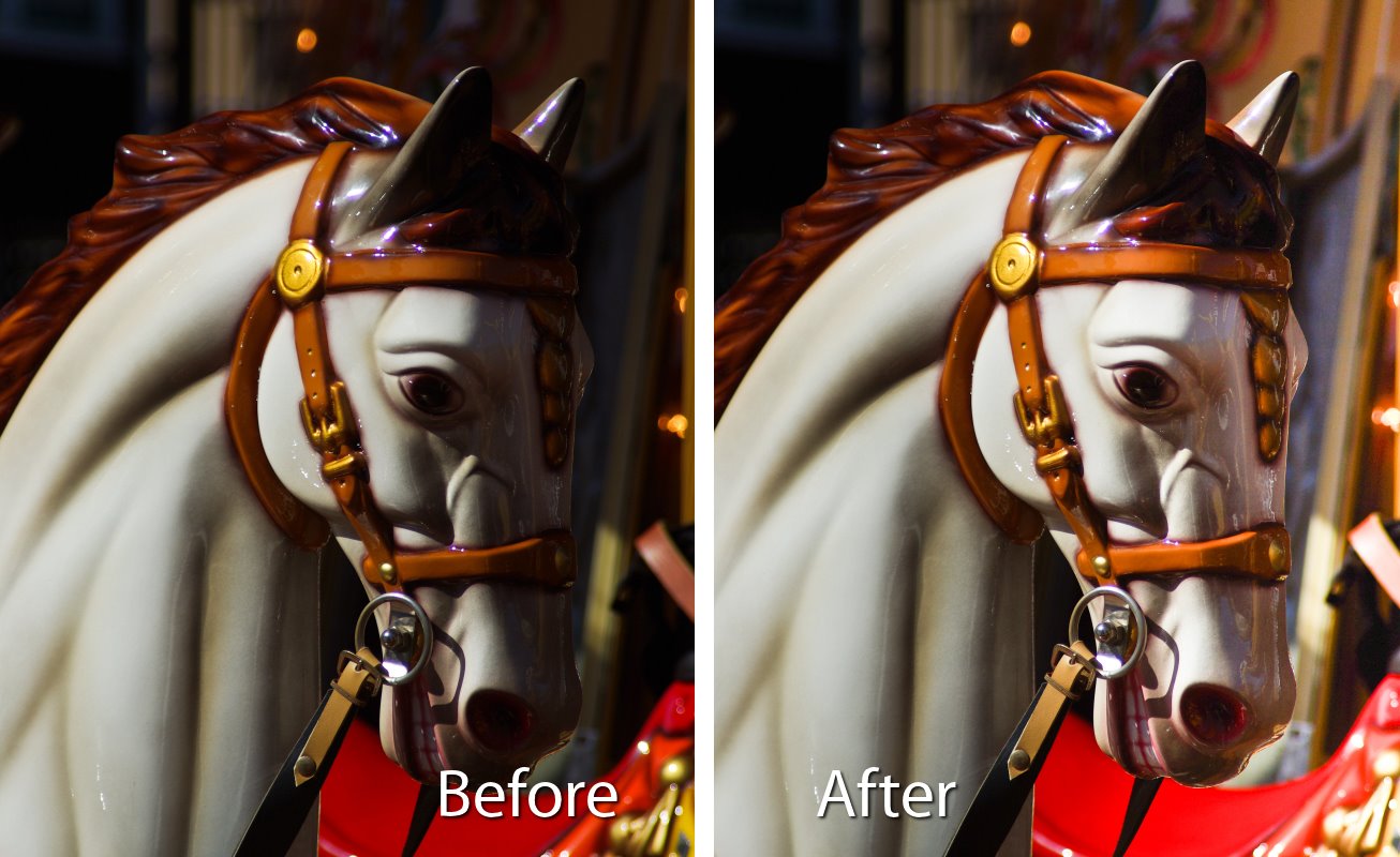
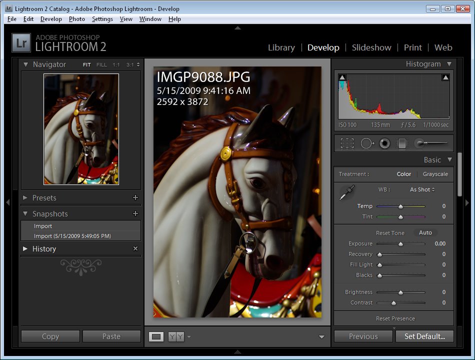
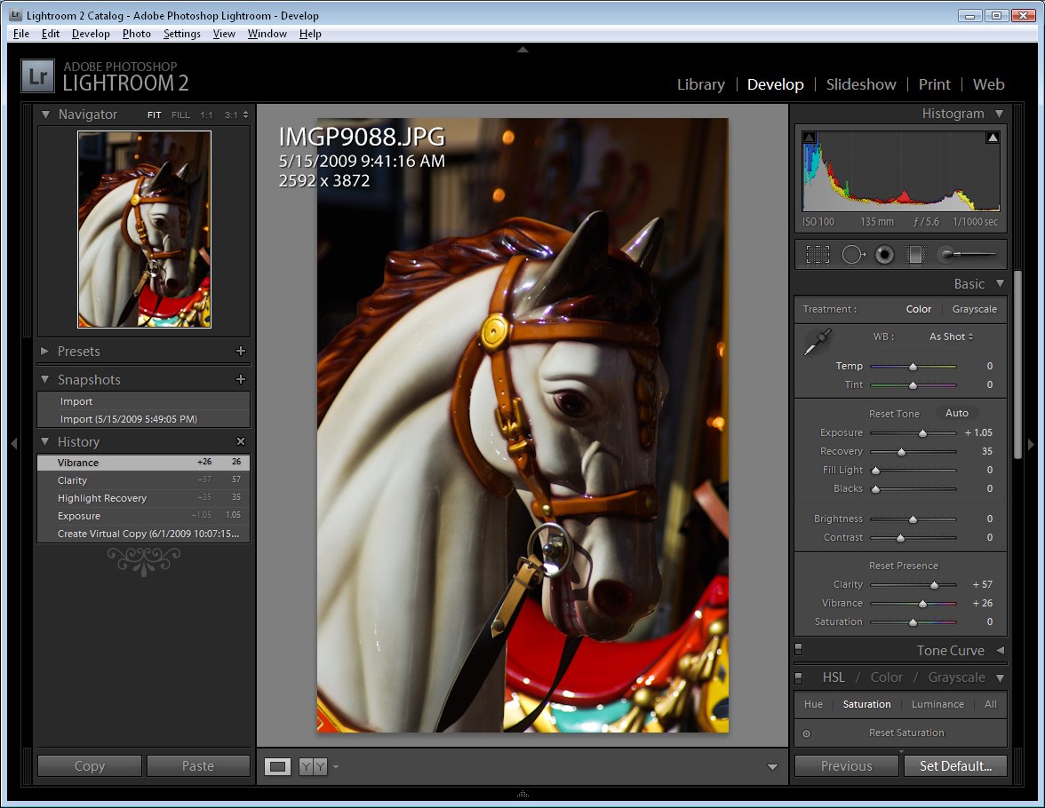
While Vibrance, which first made its appearance in Lightroom, has now been included as an adjustment in Photoshop, Clarity has not yet made the grade – it’s available in Camera Raw but not in Photoshop itself.

In Lightroom and ACR the Clarity slider lets you adjust the midtone contrast and it gives a much needed boost to the midtones in an image with quite spectacular results. At the top of my list for the next version of Photoshop would be the inclusion of a Clarity adjustment.

Paste into a Selection

One thing I’d love to see in Photoshop is the ability to paste a copied item from one image in Photoshop into a second image but with the copied selection being pasted in at a specific size.

In short, I’d like to make a selection on the target image with the marquee tool and have Photoshop paste the clipboard contents into the marquee area at a size that fits it to the selection.

You can make a selection and paste the clipboard contents into it but the pasted image isn’t resized to fit – I’d like the option to do both.

Print Multiple Images

Having used PaintShop Pro for many years, the feature that I’d love to see Photoshop ‘borrow” from that program is some means of easily assembling multiple images to a layout for printing on a single sheet of paper.

PaintShop Pro has a very smart Print Layout tool which displays images down the left of the screen which you can drag and drop into a page for printing. You can drag to resize the images, right click and size them to a fixed size or add them automatically in position on a pre-designed template – built in or custom made.

Adobe has some workarounds to this problem available: Lightroom 3 has a multiple print feature which is reasonably flexible and simple to use and which I wrote about in this post http://projectwoman.com/2010/02/lightroom-3-print-improvements.html. You can assemble multiple images for printing on a single page through Adobe Bridge but the tool is a little cumbersome and it’s in Bridge and not where most people will expect it to be – in Photoshop itself.

You can add the Picture Package tool back into Photoshop CS4 and CS5 (which Adobe removed in these versions) as I explained in this post: http://projectwoman.com/2011/03/multiple-image-printing-in-photoshop-cs4-cs5.html.

But, workarounds aside, I dream of the day a really smart multiple picture print tool appears in Photoshop.

So, now you know the top three things I’d like to see in Photoshop CS6 – now it’s up to you – what’s on your wish list?

Helen Bradley

Monday, September 14th, 2009

Lightroom: Add a light source


The Lightroom Graduated Filter tool can be used to add a secondary light source to an image where one was not in existence when you shot it. This often works better to rescue an unexposed area of an image than, for example, applying a Shadow/Highlight fix in Photoshop.

This image is extremely dark on the right – a problem caused by capturing the carousel horse in broad daylight on a very sunny day..

After adjusting the Exposure in Lightroom and tweaking the image using the small Recovery, Clarity and Vibrance sliders the image is still dark in areas where I would like to see more of the detail in the underlying image.

To bring in some light on the right, click the Graduated Filter tool and drag the selector in from the right edge of the image so that the midpoint of the filter is over the point where the problem ceases to exist (around the level of the carousel horse’s eye).

With the Effect Sliders visible, increase the Exposure and then, if desired, adjust the Brightness and Clarity sliders. Click Close when done.

In many cases you will find the Graduated Filter gives better results than, for example, the Shadows/Highlights filter in Photoshop shown here, and it’s a lot less work.

If you’d like to learn more about using the adjustment tools in Lightroom, here are a couple of useful recent posts:

Fixing Blemishes in Lightroom

Spot fixing with the Adjustment Brush

More Adjustment Brush techniques in Lightroom

Helen Bradley

Wednesday, May 20th, 2009

Lightroom – Understanding Clarity, Vibrance and Saturation.


In Lightroom 2 the collection of Basic fixes available for your image includes three Presence sliders that sit together in the Develop module: Clarity, Vibrance and Saturation. This week I’ll explain the differences between these three adjustments and how they affect your photos. In each of the screenshots below I have set the slider value to 100 – way more than you would use to fix your image but a setting that will show clearly how the fixes work.


Step 1
Let’s tackle Saturation first. The Saturation slider works similarly to the Saturation slider in Photoshop or any other graphics software. It lets you adjust the saturation of the colors in the image – drag it to the right to brighten and deepen the colors in the photo. If you drag to the left, you remove some of the depth and brightness in the colors and, if you go all the way to -100 you end up with a desaturated or monochrome image.

One of the problems with using the Saturation slider is that it adjusts all the pixels in the image – those where the color is lacking in saturation and those that are already highly saturated. In trying to fix the pixels that need a color boost you can end up shooting some other pixels into right over the edge so the colors tend towards the ridiculous.


Step 2
The Vibrance slider solves some of the problems that you’ll encounter when trying to boost color saturation because it is more particular about what it adjusts. With vibrance only the least saturated colors in the image are adjusted and those pixels which are already relatively saturated are adjusted less. The result is that you’ll get a general improvement in the saturation in colors in the image but not to the extent where colors become unrealistically bright. Vibrance also offers some protection for skin tones which makes it a good choice for adding saturation to portraits as it is less likely to over saturate and destroy the subject’s skin tones. In many instances you can safely bypass the Saturation slider and adjust Vibrance instead.

Step 3
The Clarity slider affects the contrast in the midtones in the image. It works by increasing some of the edge detail in the midtones giving a general sharpening which adds punch to your photo. Typically you will want to adjust the Clarity of your image in a positive direction using a setting of around 10 to 15. If possible, view your image at 100 percent so that you can see the changes that you’re making to it as you adjust it.

Helen Bradley