Split Toning a Black and White Image – learn how to make the Highlights and Shadows Different Colors
Split Toning applies one color to the highlights and another to the shadows in an image.
Good color choices when applying a split tone are colors that are opposite each other on the color wheel such as magenta and green, blue and yellow, or red and cyan – although you can choose any combination you like.
To apply the split tone effect, drag on the Hue slider or click the color picker to choose a color to use for the Highlights and then choose something else to use for the Shadows.
Adjust the Saturation of the colors as desired.
Balance allows you to fine tune how the colors are applied to the image – drag to the left to adjust the balance towards the shadow color and drag to the right to add more of the highlight color.
How to use the Color sliders to change color and remove color casts
When an image has a colorcast or a color that you’re wanting to play down in it, select the Color option in the HSL/Color/B&W panel. Here you can select the color to minimize the impact of and reduce its impact by dragging on the Saturation slider to reduce its saturation. Drag to the right on the Luminance slider to lighten the color.
This tool also allows you to take one color and alter its hue. So, for example you can target yellow and drag it towards green or towards orange by dragging on the Yellow Hue slider. In this way, any color in the image can be adjusted to one of its adjacent colors.
Understand the differences between Vibrance and Saturation
The difference between Vibrance and Saturation is often misunderstood. If you drag the Vibrance slider to the right, you increase the saturation in under-saturated colors in the image. Fully saturated colors are adjusted less and skin tones are protected.
In contrast, increasing the Saturation boosts the saturation across the entire image which can destroy skin tones and which can oversaturate already saturated colors.
Typically you’ll use Saturation if your image needs an overall boost to all colors and use Vibrance to boost under-saturated colors.
Learn how to combine two images to make a collage. Includes use of Blend modes in Photoshop, color range color selection, clipping mask, layer mask, hue saturation adjustment layer, drop shadow layer style.
Transcript:
Hello, I’m Helen Bradley. Welcome to this video tutorial. In this tutorial I’m going to show you how you can create some simple collage effects using blend modes in Photoshop. This is the effect that we’re going to create in this video tutorial. I’m going to show you how you can put the pieces of this together in just a few minutes using a couple of images and some blend modes.
We’re going to start off with this image and another one that I shot at the neon boneyard in Las Vegas, and that’s giving us the texture. And we’re going to combine these two images with a blend mode. And then we’re going to extract the color from this original image, this sort of orange color. And we’re going to recolor it using a Hue/Saturation adjustment layer. But if we wanted to leave it at this point we could leave it just with that additional color. And we’ll also going to add a drop shadow with a different color behind it.
So let’s see how we would create this effect. And I’m going to start with my two images, and I’m going to put one image into the other. So I’m going to grab this neon boneyard image and I’m just going to drag and drop its background layer in on top of this original image. I’m just going to size it so that it’s right over the top. And the first thing I would do with a collage like this is look and see what sort of opportunities I had with blend modes.
So I’ll generally select the first blend mode in the list, Dissolve, which generally gives me nothing at all. And now I can just arrow down and see what happens when I click on each of these blend modes. And all I’m looking for is something interesting. And you’ll generally get a better effect with this if you use images that are a little bit more textural and a little less like something where you don’t really particularly want to bring out of the image exactly what was in it. But you want to discover how these two images can interact with each other and what you can do with them as they interact. So that’s all the way down through the blend modes. And so I’m going to go back up and I’m going to settle on something that I want to use. And generally the most interesting bits are going to be in the overlay or the contrasty area. So in this area and sometimes even with lighten and darken.
So let’s just go up through these and find something that we like. And I’m thinking actually I might like something like this perhaps with the Opacity dragged down a little bit. Now what I want to do is to bring out the orange color in the original flower so that I can lighten them a little bit in this layer here. And what I’m going to do is create a duplicate of the background layer. And I’m going to drag it above the image. So right now all we’re seeing is this original background. And what I want to is to select the leaves in it.
Now the leaves are really bright colored here. So I’m going to choose Select. And in this case I’m going to use Color Range because it’s going to be the easiest way to select these leaves. Now either I can select on the sampled color and add to it this way by just clicking on these leaves or I could use just the reds and just grab the reds. But I think Sampled Colors is actually going to give me a slightly better effect here.
So let’s just go back to this and let’s choose Sampled Colors here and just click Ok. Now that has isolated the leaves here and what I want to do is to keep these leaves but drop the rest of the image out. And I’ll do that with a mask. And because my leaves are selected, all I need to do is to click on the Add Layer Mask icon. And what happens is that the leaves are then masked and left behind and the rest of the image is just dropped away. So this is the before and this is the after. And you can see we have brought in the color from these leaves.
Now if we wanted to we could even lighten this color. We’ve got some of the orange color in. But we may want to brighten it up even more. So I’ll make sure that my image layer is selected and choose Image, Adjustments. And then I could use levels or curves. I’m going to use levels, and I’ll just lighten this is a little bit and click Ok. Now in the earlier image that you saw we had actually colored these blue and it’s very easy to color them blue.
To do that we’ll choose Layer, New Adjustment Layer and we’ll choose a hue/saturation adjustment layer and just click Ok. Now I want this adjustment layer to only affect the red leaves so I’m going to clip this. So with this adjustment layer selected I’m going to choose Layer, Create Clipping Mask. And so anything that I do to this adjustment layer here is only going to affect the layer below, just these red flowers. So now let’s double click on the Hue/Saturation adjustment layer and now we can go and make some changes to it. And I’m looking for a blue color which will either be at this end or this end of the hue slider. So I can get to either this sort of greeny blue if I wanted or I can get to a sort of purplely blue. I’m thinking the greeny blue will be pretty good here. And now I can adjust its saturation and its lightness from here. So when I have what I like I’m just going to close that dialogue. So that has recolored those leaves to a bluey color.
And finally let’s add a drop shadow behind the leaves. So I’m going to select the leaf layer, and I’m going to choose a drop shadow effect. Now drop shadows might start out being dark but they don’t have to end up being dark. So what I’m going to do is go and find a really cool color for this drop shadow. And I’m thinking a really, really bright pink will do me. So let’s choose that. And I want to up the opacity of this. I could set it to normal so it’s going to be a very, very pink shadow. And then I’m going to adjust the settings for this. Spread is going to be the size of the shadow and softness or size is going to give me some softness. But there’s a very small sweet spot here on this that I can very, very easily exceed. So I’m just going to add my shadow in. And I think I’m going to multiply blend mode my shadow, not apply it with the normal blend mode. Although I could use normal for example with a much lower opacity if I wanted to give it this sort of pinky color. I might leave it at that.
So there’s a way of creating some interesting collage effects. And all we’ve done is grabbed a couple of images and put them on top of each other and blended them with something that counts as being an interesting blend mode. And then I isolated the orange flowers in the image and brightened them up. I also added a drop shadow in a very contrasty color. And I added to a hue/saturation adjustment layer that only effects these orange flowers to use the brightness of them but to color them a different color. And you can do all sorts of things by just combining images. And that gives you lots of practice at making color selections, using clipping masks, using masks, using blend modes and just having a little bit of playtime and a little bit of fun creating interesting effects in Photoshop.
I’m Helen Bradley. Thank you for joining me for this video tutorial. Look out for more of my tutorials on this YouTube channel and please like and comment on the tutorials if you would. Also visit my website at projectwoman.com where you’ll find more tips, tricks and tutorials on Illustrator, Lightroom, Photoshop and a whole lot more.
Learn to find some hidden options in Lightroom by using the Alt (Option) key
Some buttons and other features in Lightroom change depending on whether the Alt key (Option on the Mac) is pressed. For example in the Quick Develop panel in the Library module the Clarity and Vibrance options change to become Saturation and Sharpening when you hold the Alt (Option) key.
Also in the Library module the Import and Export buttons become Import Catalog and Export Catalog when the Alt (Option) key is selected. As you work in Lightroom, occasionally press the Alt or Option key to see if any useful options become visible when you do so.
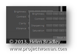
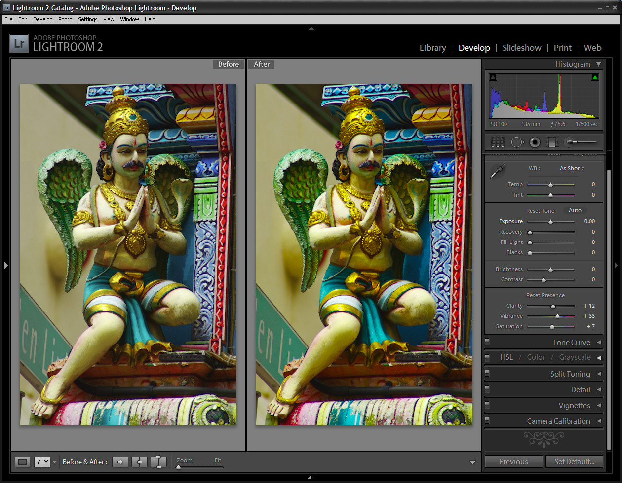
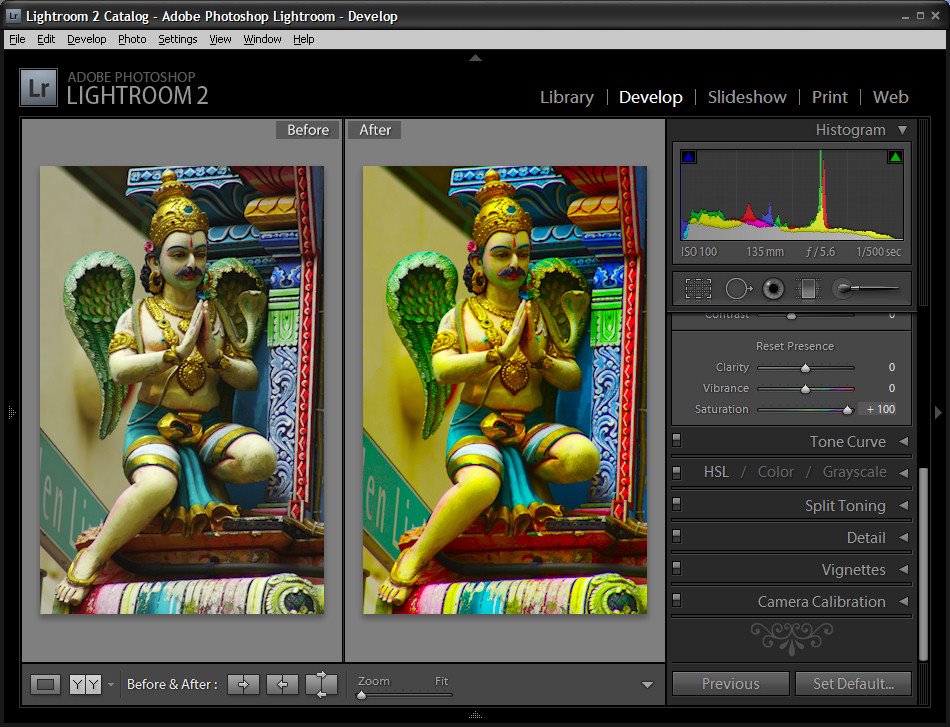
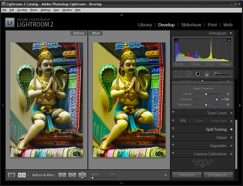
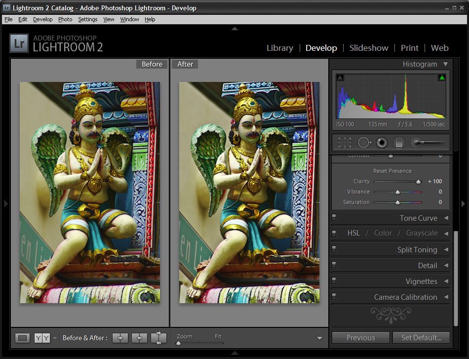
In Lightroom 2 the collection of Basic fixes available for your image includes three Presence sliders that sit together in the Develop module: Clarity, Vibrance and Saturation. This week I’ll explain the differences between these three adjustments and how they affect your photos. In each of the screenshots below I have set the slider value to 100 – way more than you would use to fix your image but a setting that will show clearly how the fixes work.
Step 1 Let’s tackle Saturation first. The Saturation slider works similarly to the Saturation slider in Photoshop or any other graphics software. It lets you adjust the saturation of the colors in the image – drag it to the right to brighten and deepen the colors in the photo. If you drag to the left, you remove some of the depth and brightness in the colors and, if you go all the way to -100 you end up with a desaturated or monochrome image.
One of the problems with using the Saturation slider is that it adjusts all the pixels in the image – those where the color is lacking in saturation and those that are already highly saturated. In trying to fix the pixels that need a color boost you can end up shooting some other pixels into right over the edge so the colors tend towards the ridiculous.
Step 2 The Vibrance slider solves some of the problems that you’ll encounter when trying to boost color saturation because it is more particular about what it adjusts. With vibrance only the least saturated colors in the image are adjusted and those pixels which are already relatively saturated are adjusted less. The result is that you’ll get a general improvement in the saturation in colors in the image but not to the extent where colors become unrealistically bright. Vibrance also offers some protection for skin tones which makes it a good choice for adding saturation to portraits as it is less likely to over saturate and destroy the subject’s skin tones. In many instances you can safely bypass the Saturation slider and adjust Vibrance instead.
Step 3 The Clarity slider affects the contrast in the midtones in the image. It works by increasing some of the edge detail in the midtones giving a general sharpening which adds punch to your photo. Typically you will want to adjust the Clarity of your image in a positive direction using a setting of around 10 to 15. If possible, view your image at 100 percent so that you can see the changes that you’re making to it as you adjust it.
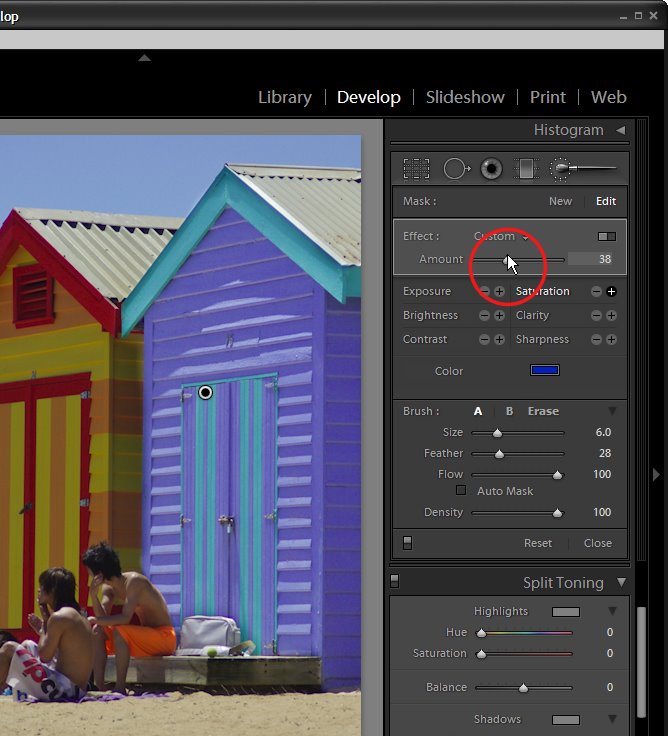
One of the exciting new features in Lightroom 2 is the adjustment brush which lets you to make spot fixes to your image in Lightroom. These fixes apply to only the area you select rather than the entire image. This means you can make local adjustments for contrast, saturation, exposure, brightness, clarity and sharpness without having to take the image to Photoshop to do this.
In this post I’ll show you how to get started using the adjustment brush in Lightroom. 2
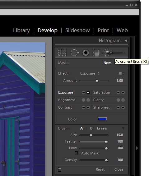
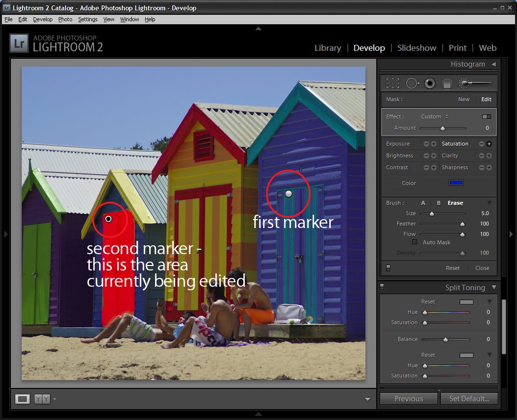
Step 1 Open Lightroom and click the Develop module. Locate the Adjustment Brush and click it to select it. Hold the brush over the image to check its size. The inner circle is the hard part of the brush and the outer circle shows the edge of the feathering. To adjust the brush size use the [ and ] keys or adjust the Size and Feather using the sliders.
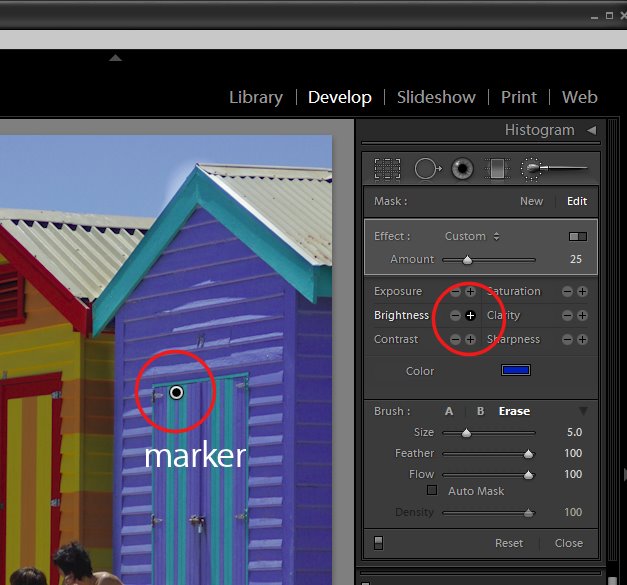
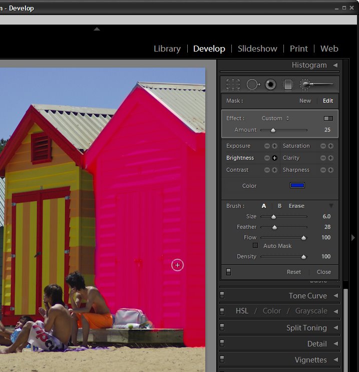
Step 2 Select the adjustment to make, such as Brightness or Saturation by clicking its + symbol to increase its value or the – symbol to decrease it. Then start painting on the image to adjust that part of the image. When you start painting the effect onto the image, Lightroom places an identifying marker on the screen. Here I have Brightness selected and the marker is visible.
Step 3 If you don’t know where you have painted – and it’s often very hard to know exactly – press the O key to view or hide a mask which shows the area you have painted on. If you prefer to, you can display the mask as you work. The mask also appears if you hold your mouse over the marker.
To erase the brush strokes, click the Erase option in the brush area and erase over the area to remove the strokes. To return to painting click brush A which is the default brush and continue to paint over the area. You can also use the brush with the Alt (Option on the Mac) to remove the painted areas rather than switching between the brush and eraser.
Step 4 If the effect is too much or too little you can adjust the intensity of the effect using the slider.
Step 5 If another area of the image requires fixing, click the New option and then repeat the steps to select a fix and then paint it onto that part of the image. Later on you can adjust either of the fixes by first clicking the Adjustment Brush tool to select it and then click on the marker for the area to change – you will see that the word Edit is now highlighted – and you can now adjust the painted area or adjust the amount of the fix.
In a future post I will look at some more advanced functions of the Adjustment Brush.