Learn to find some hidden options in Lightroom by using the Alt (Option) key
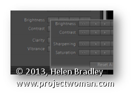
Some buttons and other features in Lightroom change depending on whether the Alt key (Option on the Mac) is pressed. For example in the Quick Develop panel in the Library module the Clarity and Vibrance options change to become Saturation and Sharpening when you hold the Alt (Option) key.
Also in the Library module the Import and Export buttons become Import Catalog and Export Catalog when the Alt (Option) key is selected. As you work in Lightroom, occasionally press the Alt or Option key to see if any useful options become visible when you do so.
Make your own custom glossy buttons in Photoshop – shows how to layer pieces on top of each other, and how to use Styles, a gradient and Warp to quickly and simply create a button in just a few steps.
Check out all our tutorials on our YouTube channel.
Complete transcript of this video:
Hello, I’m Helen Bradley. Welcome to this video tutorial. In this tutorial I’m going to show you how to make custom buttons in Photoshop. This video was really born of necessity. What I needed was for a project that I was working on I needed a stop and a go sign. And all I could find on the stock websites that I liked and that really worked for me was a stop sign. I couldn’t find a matching go sign. So instead of buying just the stop button and then going ahead and reworking it to make my go button I decided I’d make it from scratch.
So here’s my stop button, and we’re going to make it. And I’ll show you have to turn it into a go button so that you can do that as well. I’m going to start with a new document. And I’m going to start with a relatively small one but you can make yours as large as you want and if you were using this at a lot size you’d want a large size document. So I’m just going to click Ok. And it has a white background and that’s Ok for now.
So I’m going to choose Window and then Layers so we can see our layers palette. I’m going to start with the shape that I’m going to use. So I’m going to show my toolbar which has disappeared here, and I’m going to go and get a custom shape. Now there is already a shape that I can use here and what it is is the polygon shape. And all I need to do is to set the number of sides.
Now this is a sided figure so it’s already preset. Let’s just click on a new layer and we’re going to choose pixels. And I’m going to go and get a red color to use. So now that I have Pixel selected and my red color and a brand new layer I’m just going to draw my polygon. Now I’m going to hold the Shift key so it’s constrained to a regular shape. And because it’s being drawn in exactly the wrong place I’m going to hold the Spacebar down and move it into the middle of my image. And only when I’m ready am I actually going to let go the left mouse button which I’m doing now. As you can see it’s not actually rotated correctly but we can fix that with the move tool.
I’m going to go to Edit Free Transform and I’m just going to rotate it 15 degrees because that’s all it needs to be straightened up. So we’ve got our starting shape now. Now we need this white bit. So what I’m going to do is to actually just put this on a new layer. So I’m going to create New Layer via Copy which means I’m going to copy the exact shape into a brand new layer. I’m going to make white my foreground color. I’m going to fill this layer with white using Alt Backspace on the PC, Option Delete on the Mac.
Now if I click on this icon here you can see that now I have a white shape. I want it to smaller than this bottom shape. So I’m going to click and drag on the corner but I’m going to do it with the Alt key selected because that is going to size that relative to the middle portion of the shape. So now I’m just going to size it in and let go the left mouse button and then let go the Alt key. So now I have a second shape on that layer.
So again once I’ve created this layer I’m going to choose Layer New Layer via Copy. And this time we’re going back to our red color. So I have that selected. I’m going to click here to lock these pixels, Alt Backspace Option Delete to fill it with that color. And again I’m going to size it in by dragging with the move tool and do that with the Alt key selected so that I can actually set this border here so it’s sort of even all the way around and then let go and click the checkmark here. And now we have our shapes.
Now we’ve got basically all the bits that we need except for the text. So let’s go ahead and put the text on. So I’m going to go and grab the text tool. I’m going to reset these so that I have white as my foreground color. I’m just going to go and find a font to use. I’m really not that fussed about what font we use because you can go ahead and find a really good font yourself. I think I might just use Calibri. Nowhere near big enough in actual fact, so let’s just go in here and let’s make it 200.
Not nearly big enough even still. 350 pixels is pretty good. And let’s just move that down into position. Ok, so there’s my stop sign. What it’s missing right now is this sort of look that gives it a sort of dimension. Now the dimension that we’re going to give our shape is going to be created using styles so I’m going to click here and add a style. And I’m going to choose bevel and emboss. Now we’re on the back layer so we’re on this outside edge. And what I want to do is to add quite a deep bevel. And we’re just going to size that to suit.
Now you can see that the highlight mode here is Screen but it doesn’t have to be screen. We could actually multiply it and we could use a slight color here if we wanted to darken up the edges of the highlight. And here around the shadow areas we’ve got again multiply and a darker color. In this case I may want my dark red, but I may want it a bit redder. So instead of using a sort of black color to multiply I’m multiplying with a darker version of the color I’m using. But you can play around with that.
You can also play around with the shape of the bevel. So you can make it all sorts of different shapes. And you can even click here and change it manually by dragging on the curve. But I’m just looking for a beveled edge here. And it needs to be an inner bevel, but we could make it chisel hard or we could make it chisel soft as well. They’re alternatives that we could use. Once we’ve done that I’ll just click Ok. So that’s taken care of the outside edge, and we’ve got the white mark. All we need to do is to deal with the middle.
So again I’m going to select the middle and I’m going to again add a slight bevel to it. So let’s go to bevel and emboss. This time again in a bevel I want quite a large one, but I want it to be really, really soft in shadow. I just want it there, only just barely. So I’m going to call that good for that inner bevel right now. If you have a look at this particular stop sign you can see that it’s got a line through it. And now we’re going to create that affect again here in Photoshop.
There are any number of ways that you can create that sort of custom shape. But I’m going to show you just one way that you can do it. I’m going to start with a new layer and I’m going to drag a rectangle on it. And this rectangle is going to be over the top of my stop sign. And I’m going to go and grab the same colors as I’ve used in my stop sign, this red, and I’m going to choose a slightly darker version of the red. And let’s make this a slightly lighter version of it, but again all in the same color palette.
Now that I have these colors I’m going to fill this shape with a gradient made from those colors. And the gradient I want is this foreground to background gradient. So I’m going to select it, and I’m going to drag it into here. And I want a linear gradient. And I want it the other way around because I want the lightness at the top. So I’m going to reverse it. So once I’ve got my linear gradient in place I’m going to call that good. And I’m going to then clip it because what I’ve got right now is a gradient that’s going to give me the beginnings of the effect that I want.
The problem is is that it’s much bigger than the shape underneath. But if I create a clipping mask it’s all going to work perfectly. So with this layer selected I’m going to choose Layer, Create Clipping Mask. And you can see that that shape is now clipped to the shape of the layer below. Now I just need to drag down the opacity a bit. Ok, now we want to make that nice shape. So with this layer selected I’m going to choose Edit and then Transform and then Warp. And now I can warp this shape to the shape that I want. So I’m just going to drag down on this edge. And I’m going to look to make a smooth warp over my image.
If I want some more darkness into my image I can just pull up the darker edge of this rectangle. I don’t want to twist these if I can help it. I did in my shape and it didn’t end up quite the way I wanted it to look. But here we’ll be a bit more careful. So now that I’ve got my sort of warp look I’m just going to click the checkmark here. And that’s now in place. And if I want it a little bit differently I can just drag on this shape and just bring it down or I could re-warp it. But there’s the basics of a stop sign. And that’s all been created now inside Photoshop. So I could save this off as stop. Now to recolor this and make this the go sign all I need to do is to put in an adjustment layer.
So I’ll choose Layer, New Adjustment Layer, Hue/Saturation and click Ok. And this hue/saturation adjustment layer is going to affect everything below it. And so all I need to do is to drag around until I find a green for go. And somewhere in here is a pretty good green, decrease the saturation a bit and just work out exactly where my correct green is. Ok. So now we’ve actually turned stop into go. And we’ve done that just using this layer. And all I’d need to do now is to just go ahead and type a layer that has go written on it. Let’s click the text tool. Let’s make sure we’re typing in white, click here and just type go. So my stop sign is now a go sign.
Here is the stop version. And then with the adjustment layer that changes the color and then a text layer here’s my go sign. And these two signs match exactly. And it was really fairly quick to create them inside Photoshop. I’m Helen Bradley. Thank you for joining me for this video tutorial. If you liked this tutorial place give it a thumbs up and like it on YouTube so that you tell others that it’s a good tutorial. You’ll find more of my tutorials on this YouTube channel. If you subscribe you’ll be advised when new videos are launched. And look out for my website at projectwoman.com where you’ll find more tutorials, Tips and tricks for these applications.
If you’re new to Lightroom, there are a lot of interface options that you may not realize hide must know and handy program features. In this post, I’ll show you some of the buttons, icons, samplers and switches that a knowledge of Photoshop (at least versions prior to CS4) won’t help you identify or locate.
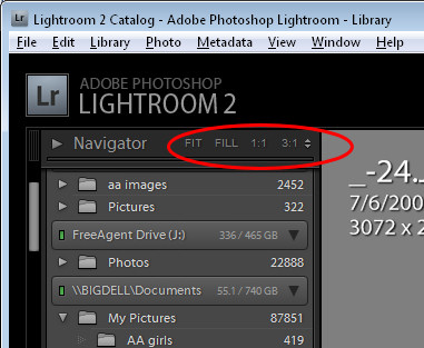
1 Navigator In the top left corner of the Library and Develop modules you’ll see the Navigator. Beside it are the Fit, Fill, 1:1 and 3:1 options. Click these to resize the image in the current window to various sizes including fitting in the space, filling it and 1:1 and 3:1 resizing options. Other sizing ratios are available from the dropdown list.
The 1:1 ratio is particularly useful when you’re sharpening an image. You may already know that, when you hold the Alt key as you drag on the sharpening sliders the small preview image turns to a grayscale mask showing you the impact of the slider on the image.
If you are in 1:1 preview, the entire image acts as the preview, allowing you to focus in on a much larger area of the image and see the sharpening effect. 3:1 and other larger sizes also work but 1:1 is the minimum size
2 Switches Switches in Lightroom appear in areas such as the Develop module where they can be used to enable or disable a setting such as the Tone Curve. Switch the switch to the up position to turn it on and to the down position to turn it off.
When using the Adjustments Brush the switch works from left to right to select to work with one fix at a time (Effect Buttons) or to work with multiple adjustments at once (Effect Sliders).
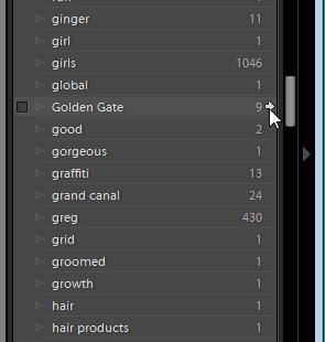
3 Arrows In the Library > Keyword list panel, you can click the arrow to the right of a keyword to view images that have that keyword associated with them.
These arrows only appear when you are hovering over a keyword in the list.
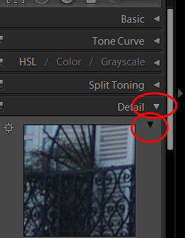
4 Expand/Collapse Triangles Throughout the Develop panel, for example, are small triangles beside the various options that you can click on to display or hide that option. For example, when Detail is not visible click its triangle and the detail panel will display.
There is another triangle directly below the Detail triangle which appears only when it is expanded. Click this to display and hide the sharpening preview dialog.
Watch out for these triangles – sometimes they aren’t light gray and are, instead, almost black and difficult to see.
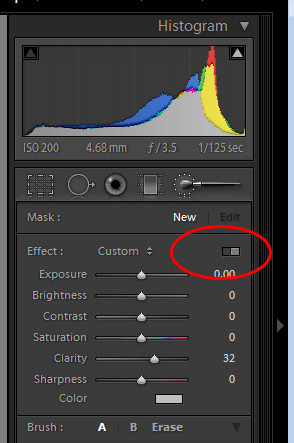
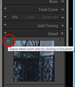
5 Area Picker Also in the Detail area of the Develop module is a small square icon with lines radiating from it that you can click on and then click on an area of the image to determine what shows in the preview panel for the sharpening process. This icon has a visible tooltip which helps identify what it does – most do not.
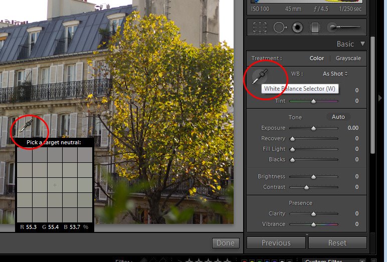
6 Eyedropper In the Develop panel’s Basic module is a white balance selector icon. Click it and click on an area of the image which should be white.
This adjusts the white balance of the image based on that selection. It also displays a small 25 x 25 pixel grid showing the pixels in the general area so that you can be more accurate in your selection.
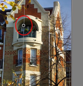
7 Adjustment Markers When you use the Adjustment Brush or the Graduated Filter, you will see a marker on the image which, when you click on it turns into a black circle surrounded by a lighter circle.
This marks the adjustment or the filter and you need to click this to select it before you can make alterations to the adjustment or to the filter.
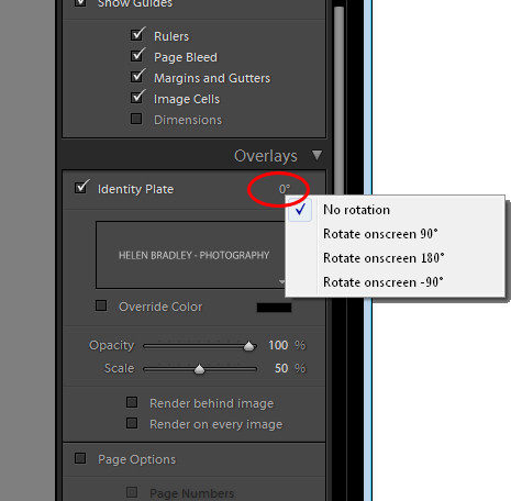
8 Invisible clickable rotation options In the Print module, watch out for items that don’t even look like they are selectable.
For example, in the Overlays > Identity Plate area when you have the identity plate enabled there is a small indicator to the right of it showing the current rotation in degrees.
If you click it you will see a popup menu offering other rotation options.
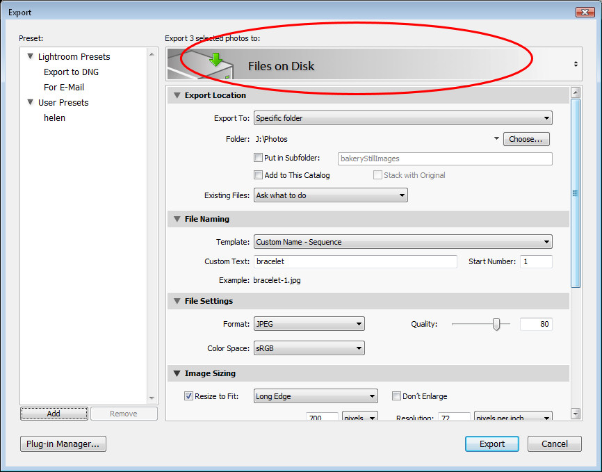
9 Way big buttons Watch out for panels at the top of dialogs which can contain selectable options. For example, a dialog that has a large area like that shown in this image is often selectable offering different options but because it doesn’t look like a typical selectable option, it’s easy to overlook.
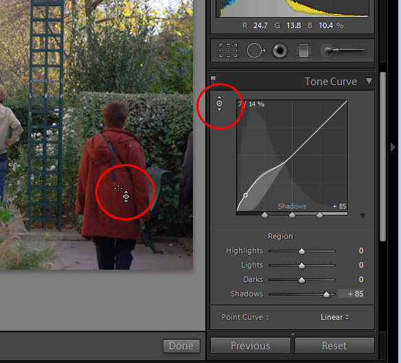
10 Direct Adjustment tool In some areas such as the Tone Curve and Hue/Saturation Lightness in the Develop module you’ll see a small adjustment indicator in the top left of the panel area.
Click it and then drag on the image to change the image at that point.
While in Photoshop CS3 you would drag left to right to alter the sliders, in Lightroom you’ll typically drag up and down with this tool.
While these aren’t all the unusual buttons that you’ll find in Lightroom, it should help you understand that a lot of the features in Lightroom are hidden behind icons and buttons for which even a program like Photoshop is no adequate preparation for locating, understanding and using.