

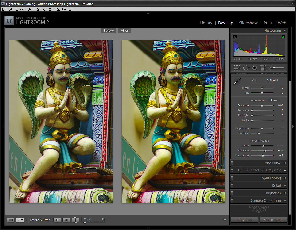
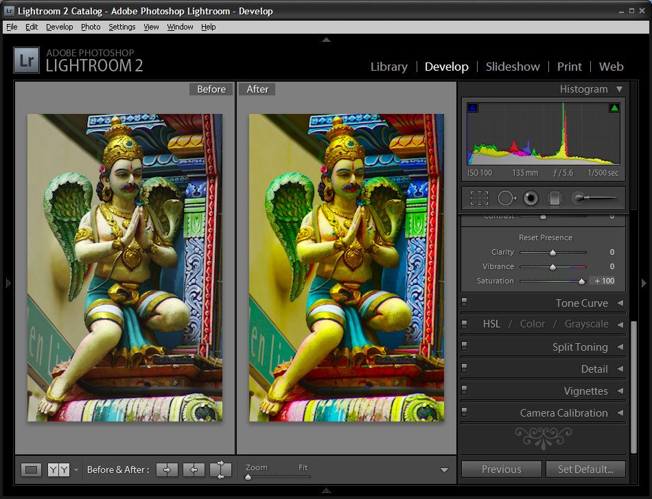
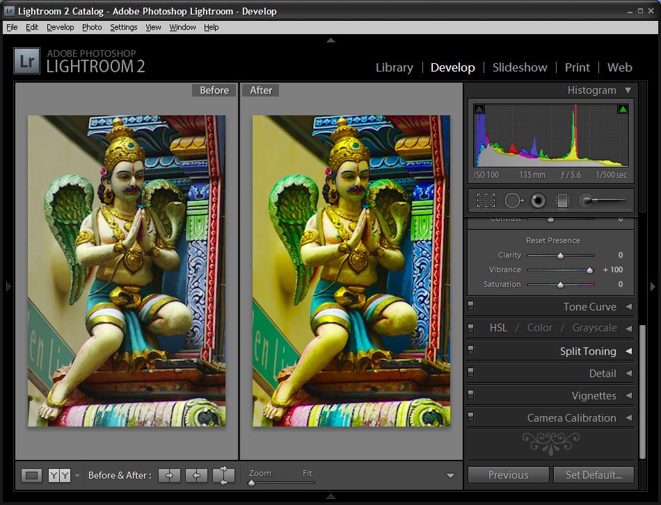
In Lightroom 2 the collection of Basic fixes available for your image includes three Presence sliders that sit together in the Develop module: Clarity, Vibrance and Saturation. This week I’ll explain the differences between these three adjustments and how they affect your photos. In each of the screenshots below I have set the slider value to 100 – way more than you would use to fix your image but a setting that will show clearly how the fixes work.
Step 1
Let’s tackle Saturation first. The Saturation slider works similarly to the Saturation slider in Photoshop or any other graphics software. It lets you adjust the saturation of the colors in the image – drag it to the right to brighten and deepen the colors in the photo. If you drag to the left, you remove some of the depth and brightness in the colors and, if you go all the way to -100 you end up with a desaturated or monochrome image.
One of the problems with using the Saturation slider is that it adjusts all the pixels in the image – those where the color is lacking in saturation and those that are already highly saturated. In trying to fix the pixels that need a color boost you can end up shooting some other pixels into right over the edge so the colors tend towards the ridiculous.
Step 2
The Vibrance slider solves some of the problems that you’ll encounter when trying to boost color saturation because it is more particular about what it adjusts. With vibrance only the least saturated colors in the image are adjusted and those pixels which are already relatively saturated are adjusted less. The result is that you’ll get a general improvement in the saturation in colors in the image but not to the extent where colors become unrealistically bright. Vibrance also offers some protection for skin tones which makes it a good choice for adding saturation to portraits as it is less likely to over saturate and destroy the subject’s skin tones. In many instances you can safely bypass the Saturation slider and adjust Vibrance instead.
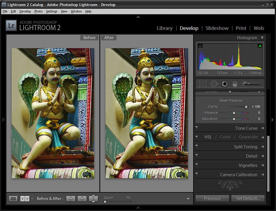 Step 3
The Clarity slider affects the contrast in the midtones in the image. It works by increasing some of the edge detail in the midtones giving a general sharpening which adds punch to your photo. Typically you will want to adjust the Clarity of your image in a positive direction using a setting of around 10 to 15. If possible, view your image at 100 percent so that you can see the changes that you’re making to it as you adjust it.
Post a Comment
Please feel free to add your comment here. Thank you!