Saturday, February 13th, 2010

Master Repeating Patterns in Photoshop

By Helen Bradley

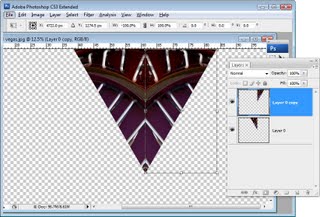
In a recent post I showed you how to create a kaleidoscope using Photoshop. As one of the techniques for using a kaleidoscope, I suggested you could create a repeating pattern from it. One reader posed the question as to how a repeating pattern could be created given that there were spaces around the original shape. Today, I’ll show you how to solve the issue and, in the process, get a grasp on creating repeating patterns in Photoshop.

Step 1
Start with the finished kaleidoscope image document. If you didn’t see the original article, here’s a link to it http://digital-photography-school.com/how-to-create-kaleidoscope-patterns-from-your-photos
Step 2
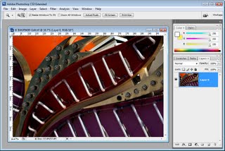
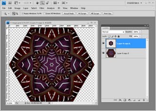
Save a copy of this image and this time flatten the image layers – not any solid color or white background layer you may be using.

To do this, select all the layers containing content by Control or Command clicking on them and choose Layer > Merge Layers.

Create a duplicate of the image layer so you have two copies of it.

Hide the top layer for now and select the second of the image layers.

Choose Image > Image Size and read off the image width and height. Divide each by two and write down the resulting values. Click Cancel to exit out of this dialog.
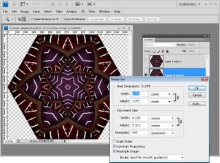
Step 3
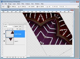
Choose Filter > Other > Offset and enter the values for half the width and height of the image. Select the Wrap Around option and click Ok. This offset command creates the repeating part of the pattern and it saves quite a bit of manual work in carving up the image.
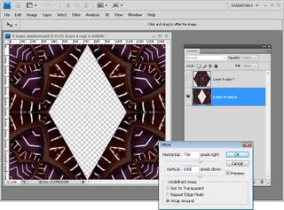
Step 4
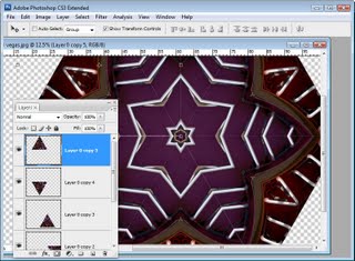
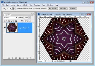
Reveal the top layer again and your canvas will now be complete. Flatten this image and use it to create your pattern. If it is a large design you may want to reduce its size to 25% or less before making it into a pattern by choosing Edit > Define Pattern. Type a name for the Pattern and you’re done.
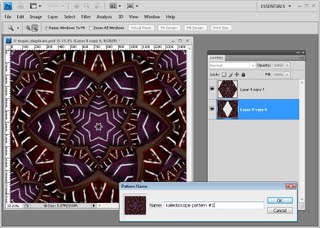
Step 5
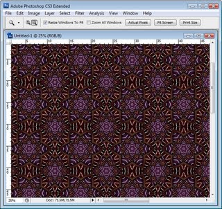
Create a new empty document many times larger than your pattern image and fill it with your pattern by using Edit > Fill > Pattern and choose your pattern from the very end of the pattern palette.

Step 6
If you start with a regular rectangular or square image you can create it as a repeating pattern in a similar way. However instead of getting a big empty area in the middle of the image you will have seams. Use your clone tool or some other tool of choice to remove the seams without touching the edge pixels. Then create your pattern and it will repeat perfectly!
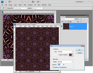
Helen Bradley

Thursday, February 11th, 2010

Word 2007 Quick Tables

New to Word 2007 is the Quick Tables feature.

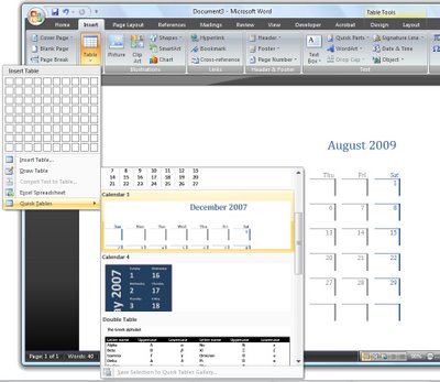
To see what is available, click the Insert tab, choose Table > Quick Tables and choose from a range of preconfigured tables such as calendars and tables with sub headings and other features.

Once the table is inserted into the document, you can replace the text in it with your own text such as the dates for your desired calendar month.

Most of the elements that you’re used to selecting from the Tables menu in previous versions of Word can be found on the Tables Tools > Layout tab and these include the ability to repeat header rows at the top of the table and options for adjusting the text direction and inserting and deleting rows.

Once you have a table formatted in the way you want it to look you can add that particular format to the Quick Tables Gallery so you can use it anytime.

To do this, click inside the table and choose Table Tools > Layout tab. Click Select > Select Table so the entire table is selected. Now, from the Ribbon, choose Insert > Table and click on the Quick Tables option.

Choose Save Selection to Quick Tables Gallery and the Create New Building Block dialog will appear. Complete it as you would for a regular Building block element with the exception that this time, leave the Gallery option set to Tables so the table will appears in the Quick Tables Gallery.

Click Ok when you’re done. In future, your custom designed table will be selectable from the Quick Tables Gallery.

Helen Bradley

Wednesday, February 10th, 2010

Kaleidoscope patterns

Helen Bradley

If you are like me you had a kaleidoscope as a kid. You would look through one end and turn a dial and the world would be displayed as a mirrored fractured shape. Thanks to Photoshop you can create kaleidoscopes from your photos. Any image with interesting color and shapes will work just fine.

Step 1 Convert the background layer to a regular layer by double clicking it and click Ok.

Step 2
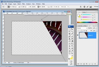
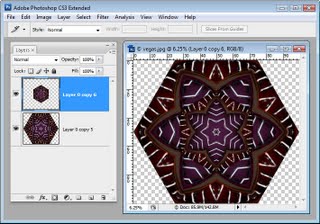
Select the layer and use the Move tool to rotate to 60 degrees and position it over one corner of the image canvas making sure one side of the image sides crosses two sides of the canvas.
Step 3
Use the Magic Wand tool to select the empty background, choose Select > Inverse to select the shape and choose Select > Modify > Contract and contract the shape by one pixel. Now choose
Image > Crop to crop the image to the shape itself. It is important to do this to remove the anti-aliasing that Photoshop applies to the image edge as it rotates it.
Step 4
Duplicate the image layer.

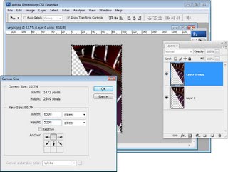
Choose Image > Canvas size, click Relative and set the width to around 3 times the current image height (NOT its width), and the height to 2 times the current height. Select the middle top of the nine positioning boxes and click Ok.
Step 5
Choose View > Snap to > All and make sure View > Snap is selected. Click the Move tool and the top layer of the image and drag the left edge over the right until the W: value is -100%. Ensure the piece is lined up against the edge of the piece on the layer below.
Step 6
Merge these two layers by selecting the top one and press Control + E (Command + E on the Mac).

Duplicate this merged layer, select the top layer and choose Edit > Free Transform and, in the tool options area, select the middle bottom of the 9 point grid to fix the point around which the shape rotates. Set the Rotation to 30 degrees.
Step 7
Press Control + J (Command + J on the Mac) and then Control + Shift + T (Command + Shift + T on the Mac). This duplicates the current layer and repeats the transformation on it.

Repeat this until the kaleidoscope is complete – four times in all.
Step 8
Merge all the layers. Use the crop tool to select around the canvas. You can drag outwards if necessary to add back in any of the image that extends beyond the outside of the image canvas.
Step 9a
Now you can get creative with the shape. For example, you can make a duplicate of the shape and place it in the middle of the original shape sizing this second version down to a small size and then cropping the final image to a square shape. Use the Alt and Shift keys (Option and Shift on the Mac) to size the shape down leaving the middle in the same place and in proportion.
Step9b
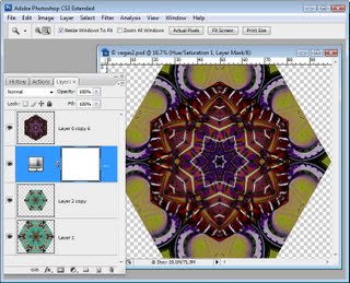
You can fill the middle with another kaleidoscope if desired. Here I used a Hue/Saturation adjustment layer to match the colors of the two kaleidoscopes better.
Step9c
You can select the shape and choose Edit > Define Pattern to make it a pattern. You can then fill a larger image with it so it displays as a repeating shape.
There are lots of creative ways you can use your Kaleidoscope.

Helen Bradley

Tuesday, February 9th, 2010

Step 1 photo-editing workflow – assess the image

This image needs work, it is underexposed, it has lackluster color and it is not straight.

Despite your best intentions you’ll often capture a photograph which needs some fix to improve it. If this is the case you’ll use your photo editing software to fix the problems.

When you do, there is a handy workflow that you can use that will streamline how you work and ensure that the image is processed efficiently and effectively. I’ll show you how to assess your image to determine what it needs, how to fix the image and prepare it for printing or sharing online.

I’ll illustrate the process in Photoshop Elements but the steps are the same in any photo editing program. If a step isn’t appropriate to your image, skip it and move onto the next.

Assess the problems
Before you begin, take a look at the photograph and determine what needs to be done. Check to see it is straight or if there extraneous elements that should be removed.

Check the colour in the photograph to see if there is a colour cast that needs removing. If the image is muddy or lacklustre then it may need an adjustment to increase the tonal range in the image to create darker darks and lighter lights. If the image is overly dark or too light then a shadow/highlight fix can be applied to lighten or darken it as required.

Also look to see if there are any flaws in the image. If there are electricity wires or distracting elements such as a rubbish bin that needs to be removed make a note of this.

For portraits check to see if there are any skin blemishes that need to be removed. Finally, determine what you want to use the photograph for as the final steps in the fixing process will vary according to your intended use of the photo.

Helen Bradley

Tuesday, February 9th, 2010

Controlling Images in Word 2010

For many years now Microsoft has made it hard for new users to control inserted images in their documents.

Unfortunately, Word 2010 is no exception and, by default, images are inserted into a new Word document as inline images. This means that they cannot be moved or easily positioned on the page without you needing to first change the image’s wrap settings.

This leaves hapless new users with absolutely no clue that this feature is available or needed much less where to find and set it.

To change the way that images are inserted into Microsoft Word documents to make it a one-step process that never needs to be tweaked, in Word 2010 choose File > Options and select the Advanced tab. Locate the Cut, Copy and Paste options and set the Insert/Paste Pictures As setting to Square, Tight, Behind Text, In Front Of Text, Through or Top And Bottom – in fact anything other than the default Inline With Text.

Once you’ve done this, when you insert an image into a document it will be inserted with the setting that you determined. This makes it easy to move the image around the screen and position it exactly where you want it to be.

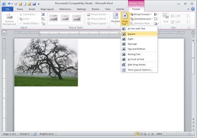
If you have images in your document and if you need to change their wrapping so that you can work with them, click the image, click Picture Tools > Format and from the Wrap Text dropdown list, select Square or another setting (other than Inline with Text).

Microsoft, this default setting earns you a score of -10 it’s not the typically required setting and it doesn’t make good sense as a default.

Helen Bradley

Sunday, February 7th, 2010

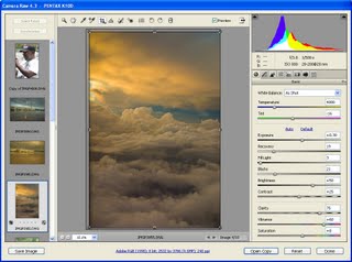
Better Photos Tip #10 – Camera Raw vs, jpeg

Capturing in Camera RAW offers superior image adjustment options for your photos.

If your camera is capable of capturing images using the RAW format, this will allow you more editing opportunities later on.

It’s a good idea to capture JPEG when shooting regular snapshots simply because JPEGs are easier to process and use and to use RAW for more creative captures.

Some cameras have a button you can press which gives you a one shot RAW capture so you can shoot in JPEG but easily capture a single RAW shot when you need one.

Helen Bradley

Thursday, February 4th, 2010

Tables in Word 2007

The table options in Word 2007 allow you to create quite sophisticated tables more easily than you’ve been able to in the past.

Click the Insert tab and click the Table button and drag over the number of cells you want for your table.

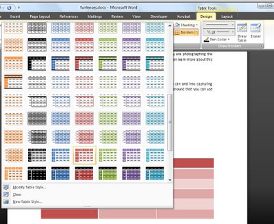
With the table selected, choose Table Tools > Design tab and choose a Table Style from the dropdown list.

Many of the styles are linked to theme colors so you can create a table with an attractive style which like other Word objects changes color to match the theme when it changes.

When you have a table style selected you can configure other options for it by, for example, selecting the Banded Rows checkbox in the Table Style Options group and adjusting the look of the first and last columns and header row using the checkboxes.

Helen Bradley

Wednesday, February 3rd, 2010

Better Photos Tip #9 – Read the Histogram

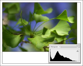
The image histogram on your camera shows the tonal range in the image, use it to assess the quality of the image. Here there is a little too much data in the shadows (we say the shadows are plugged) and we could adjust the exposure accordingly.

To understand if you need to adjust your exposure, check the image histogram in the camera rather than relying on the image that appears in the LCD screen.

The histogram gives you a graphical representation of the image’s tonal range. If the chart data doesn’t extend from one edge of the chart to the other, you will probably have a muddy lacklustre image.

If the chart is too far to the left, you need to lighten the image and if all the data is to the right the image is being overexposed.

If you’re using a digital SLR you control the exposure by enlarging the aperture or decreasing the shutter speed to let in more light or vice versa to reduce the amount of light.

On a point and shoot camera, the exposure compensation feature lets you adjust the exposure amount to compensate for lighting issues. Typically you can adjust the exposure by any amount in the range -2.0 – +2.0 to darken or lighten the image. Exposure compensation was used here to expose this musician correctly against a very light background – I traded blown out highlights in the background for a properly exposed foreground.

Helen Bradley

Tuesday, February 2nd, 2010

Excel VBA: What Sheet is that?

When you’re working in Microsoft Excel Visual Basic for Applications, you may need to refer to a worksheet by name. This can be confusing because the sheet names are not necessarily what are displayed in the sheet tabs at the bottom of the screen.

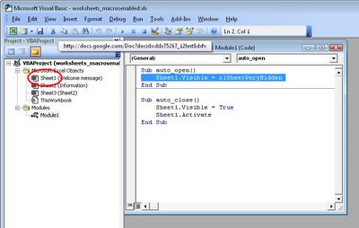
There is only one way to know exactly what a sheet’s name is so you can refer to it by that name regardless of what the tab says. That is to view the Visual Basic Editor and select your project in the Project Explorer. Here you will see each sheet listed by name with the sheet tab name in brackets after it.

If you want to refer to a sheet by name in your VBA code use the sheet name at the left (not the one in brackets) in the Project Explorer.

This will ensure that you always use the exact sheet that you expect to be using in your Visual Basic application.

Helen Bradley

Monday, February 1st, 2010

Lightroom: Controlling the Before and After

By Helen Bradley

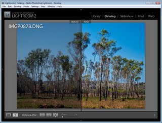
One of the nice things about Lightroom is that it lets you view before and after versions of your image. Lightroom can do this so easily because it does not make permanent changes to your image as you work on it. Instead, Lightroom keeps a log of the edits that you have made and only applies them to the image when you export the image.

Use the Before/After options in Lightroom to check that the changes you have made to your image to make sure that you’re headed in the right direction.

Here are some ways to harness the comparative Before/After power of Lightroom:

Step 1
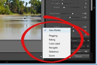
If you are in the Develop module you’ll need to make sure that View Modes are enabled so that you can see the necessary icons. To do this, click the small triangle under the image to the right in the Develop module and choose View Modes.
Step 2
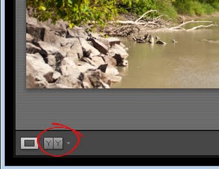
You will now see a button which has Y|Y on it. Click this to see the before and after views of your image.
Step3
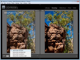
From the dropdown list you can choose from multiple ways to see the before and after views. Before/After Left/Right shows the before and after views side by side – this works well for portrait orientation images.
Step 4
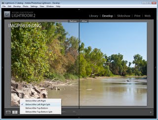
The Before/After Left/Right Split shows a single version of the image split so that the left side of the image is the before view and the right side is the after view.
Step 5
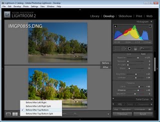
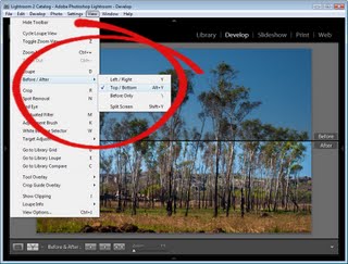
The Before/After Top/Bottom option shows the before image at the top and the after image at the bottom – this works well for landscape orientation images.
Step 6
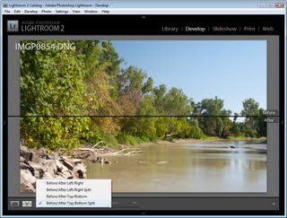
The Before/After Top/Bottom Split view shows a single version of the image split so that the top half is the before version and the bottom half is the after version.
Step7
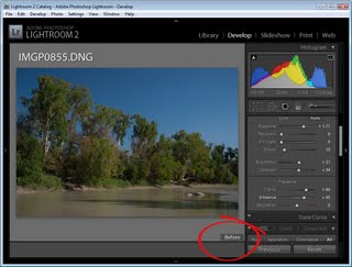
You don’t have to use the buttons, however, and any time as you’re working on an image you can switch between before and after view by pressing the backslash (\) key. The image displays an indicator in the bottom right corner if you are seeing the Before version – no indicator appears for the After version.
Step8
Sometimes you’ll want a “somewhere between before and after”/after comparison – such as when you are sharpening an image. In this case you may want to compare the image before sharpening and after sharpening but the before/after options won’t allow for this.

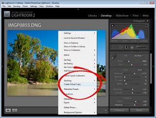
There are two workarounds. One is to create a Virtual Copy before you apply the sharpening to the image. Right click the image and choose Create Virtual Copy. This is your new “before” image and you can now apply the sharpening to it. When you perform a Before/After comparison you will now see just the result of the sharpening and not the entire image correction.
Step9
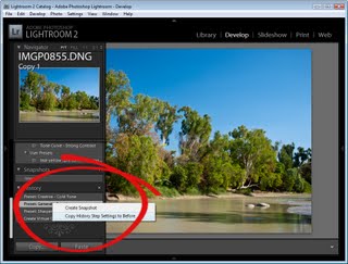
The second works well when you’ve already applied the changes and want to compare the after with a previous history state. Locate the history state in the History list that you want to compare the final version with. Right click it and choose Copy History Step Settings to Before. This changes the ‘Before’ view of the image so it looks like the current image on the screen. Click in the History to return to the adjustment you want to compare and now, when you compare before and after you’re really comparing after with something more meaningful.

When you copy the settings like this you’re not removing any history so you can still revert the image to an earlier version using the history list.

Step 10
The Before/After view options are also selectable via shortcut keys and from the View menu.

Helen Bradley

Page 2 of 212