Friday, June 28th, 2013

Photoshop – Adding Images to your Reusable Layout Template

Learn how to populate the layout template that we created in an earlier post with images of your own.

Click Here for Part 1


Transcript:
Hello, I’m Helen Bradley. Welcome to this video tutorial. In this tutorial I’m going to show you how you can actually make use of your reusable layout template that we made in an earlier video. In the previous video I showed you how to create this template.

It has a background color of white but that could be any color. It has space for two images. And then it has two copyright symbols here. One is black and one is white depending on which we want to use for any particular layout.

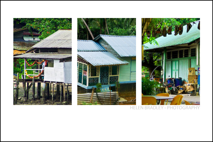
Now I’m going to show you how you can take this particular template and make it into this by adding images to it. I’m just going to hide this one away and we’ll focus on the one that we created.

I haven’t saved that yet but that doesn’t matter too much. Now I’m going to open some images that I want to use in it. So I’m going to go and select the images that I’d used previously. That’s winter7. And I want bird7 as well. So I’m just going to move these images into position. This is the main template and these are the individual images.

So to start off with I’m going to just drag and drop the background layers from each of these images into my main template. So this is this image first. I’m going to drag and drop it into position and I’m going to drag and drop this one in. Now you can see that the images that I’ve dragged and dropped in are way, way bigger than the template is. But that doesn’t matter because we know how to make them smaller. I’m going to click on the layer thumbnail, Ctrl T and then Ctrl Zero. You can see how much bigger these images are than the actual template itself. I’m going to size the image down quite small, click on this link here so I make sure that I don’t destroy its ratio of width and height, and I’m just going to move it roughly into position as to where it’s going to be in the final template. Now I’ll click the checkmark here and let’s go ahead and resize this one.

Click on the layer thumbnail, Ctrl T, Ctrl Zero. And now I’m going to scale it small, place it roughly in position, make sure that the width and height are scaled correctly in exactly the same proportion, finish off the positioning of it and then click the checkmark here. Now let’s zoom into the image. To make sure that this now works as we expect it to we need to bring back this line down here and we probably need to crop these images. Now the template has those crops already built into it.

The first thing I’m going to do is to drop this particular layer immediately above the layer that’s going to control its size. And then I’m going to drop this one immediately above the layer that’s going to control its size. And we’re going to use a simple feature called Clipping Path. With the topmost of this pair of layers selected, I’ll choose Layer and then Create Clipping Mask. And what that does is it clips this image to the exact size of the rectangle below. And now let’s do that with this one, click on the layer, Layer, Create Clipping Mask. And you can see that that’s clipped this particular image here to the exact size of the black box below.

The black has disappeared. It has nothing to do with it. These colors could be any color you like. But you can see that in doing so we’ve brought back the color from this layer here. And we can prove that that’s where the color is coming from. So I’m just going to select a blue color here and I’ll just fill this layer with blue. And you can see now that the space between those two images is the exact same blue as I just filled the background layer with. I’ll just undo that because I don’t really want blue.

To finish off I’m just going to decide which of these two copyright symbols is going to work better in this instance. Well I think the white one is. So I’m going to click its eyeball or its visibility icon and turn off the black one. So that’s how we would fill that template that we created in an earlier video.

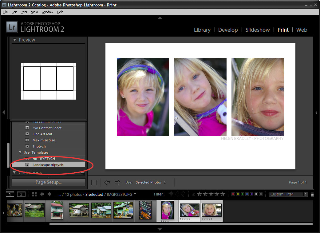
Now your templates don’t have to be as simple as this one. They can be quite complex. And you may be aware that I have templates available on projectwoman.com. This is a free set of templates that you can download and use exactly as you’ve seen here. There are some triptychs and there are also some layouts with 9, 4 and 6 images in them.

I’m Helen Bradley. Thank you for joining me for this video tutorial. If you liked this tutorial place click the thumbs up to give it a like. Think about subscribing to my YouTube channel and visit my website at projectwoman.com for more tips, tricks and tutorials on Illustrator, Photoshop, Lightroom, Photoshop Elements, iPad and a whole lot more.

Helen Bradley

Friday, June 21st, 2013

Photoshop – Make a Reusable Layout Template

Learn how to make a reusable layout template for your photos in Photoshop. This is part one of a two part series.

The second video/post shows how to use the template to populate it with images. This can be done with any version of Photoshop.

Click Here for Part 2

This technique shows a quick way to create even complex layouts using selections and layers in Photoshop. It is simple to achieve for any one with advanced beginner skills or better in Photoshop.

Transcript:
Hello, I’m Helen Bradley. Welcome to this video tutorial. In this tutorial I’m going to show you how you can use Photoshop to make a reusable layout template. In a later video I’ll show you how you can go ahead and reuse that template.

This is the type of template that I’m going to show you how to create in this video and in the next video I’m going to show you how to populate it. Basically the template is made up here of a background layer which can be any color you like and you can also change the color if you want to. And into the template we’re going to put two black boxes and these later on are going to be filled with images. Here’s one image and here’s another. And it’s going to be done in a way that’s going to be very easy for you to limit the size of these images to match these black boxes. And then you can add copyright symbol.

Now I’ve got two in this particular template because I’m not sure whether I’m going to need a black one or a white one. And that will pretty much depend on what the images are that I’m using. So into this template I’m going to put both of them so they’re both available. So in this particular video this is the point at which we’re going to have the template created. We’ll have a backing, the two boxes and then two alternate copyright symbols that we can use. So let’s get started.

The first thing to do is to choose File, New and then make a size for your template. I’m using one that could be used for a blog so it’s a mere 650 by 300 pixels in size, 72 pixels per inch because this is going to the web, RGB color mode, and because I want a white background I’m just going to select Background Contents White. But we could color that later on if we wanted to, and I’ll just click Ok. And here is my new document. It has just a background layer.

The next thing to do is to add a guide that I’m going to use to make it just a little bit easier to make those black boxes. I’m going to choose View and then New Guide and I want this one to be at 40 percent vertical. So that’s a little bit more than one-third of the way across this document. Now I’m going to add a new layer by clicking the Add New Layer icon here at the foot of the layer pallete. I’m going to target the Rectangular Marquee tool. And making sure that I’m pointed to this new layer I’m going to drag over to create a rectangle. Now I’m going to do that again so that you can see that I start my rectangle here outside the edge of the image to make sure that I get all the image up to this line. And because View is set to Snap I’m snapping to this guide so I’m making sure that I’m filling this exact area.

I have black selected here as my foreground color so I’m going to press Alt Backspace or Option Delete on the Mac to fill my rectangle with that black color. Now I’m going to add another new layer and this time I’m going to choose Select, Inverse because what that does is to select everything that I didn’t have selected before. Now I’m going to fill this with black again, Alt Backspace, Option Delete.

Now right now I’ve got two black boxes. And if I turn off these guides, I’m just going to clear the guides, you’ll see that these two boxes in fact butt onto each other so they’re creating an entire document. That’s not what I want. I want a marker between the two of them.

So I’m going to click on the topmost layer, click the Move tool and then just tap with the right arrow key and I’m just visually deciding how much space I want between these two boxes. And I think that’s a pretty good amount. So having done that I’m just going to select a different tool and that will turn this off. So here I’ve got my two layers and my background layer.

And all I need to do now is to add the copyrights so I’m just going to choose File, Open Recent because I recently opened my black and my white copyrights. So here they are. I’m going to just pull these images out of the way so that I can see my main image. And this is the white copyright here that is selected so this is its layer. So I’m just going to drag and drop it into my image. It’s way too big but we’ll worry about that in a minute. I’ll close it down. And now this is my black copyright image and I’m going to drag and drop its background layer into my image. And again, it’s way too big too. I’m now going to select the black copyright layer here and I’m going to press Ctrl and T and then Ctrl and zero. And what that does is it lets me see my sizing handles because this image this copyright image is really, really huge.

So I’m just going to size it down so it’s going to fit better in this area here. I’m going to make sure that I click this link here so that it’s sized in proportion. And now I’m going to just drag it back to approximately where I want it to be and click the checkmark. I can hide that now. And now let’s focus on the white layer exactly the same, click the layer thumbnail to select it, Ctrl and T and then Ctrl and zero. Now I’m going to drag in on the sizing handles to make my copyright small enough to position it in place on my image. I’m just going to click this link again just to make sure that this is scaled in proportion and click the checkmark.

So this is my template. It’s all done and now I can save it. So I can choose File and then Save as and I would give it a name such as 40, 60 something, like that to indicate to me that this is a template that I can now use to create other documents in future. In the next video I’ll show you exactly how to do that.

I’m Helen Bradley. Thank you for joining me for this video tutorial. If you liked the tutorial please click Like. Think about subscribing to my YouTube channel and look at my website at projectwoman.com for more tips, tricks and tutorials on Photoshop, Lightroom, Illustrator, iPad and a whole lot more.

Helen Bradley

Monday, May 13th, 2013

Word 2010 and 2013 Tip – Misssing Page Numbers

Finding and Fixing Page Numbers that Can’t be Seen and/or Won’t Print

If you have included page numbers at the foot of a page and find that they’re missing from your printouts the problem lies with your page settings. The footer text is being forced to print so far down the paper that your printer is ejecting the paper before this point is reached.

Solve the problem by selecting the Page Layout tab, click the Margins dropdown list, and click Custom Margins. Now, in this dialog select the Layout tab. Finally, increase the From edge: Footer measurement slightly. Experiment to find the smallest increase which will allow your page numbers to print.


Helen Bradley

Saturday, February 4th, 2012

Slideshow Titles with Identity Plates in Lightroom

Identity plates are one of the best kept secrets in Lightroom. There are lots of ways that you can use Identity Plates in Lightroom not only to customize the interface as I discussed in this post: http://projectwoman.com/2011/11/personalize-lightroom-with-identity-plates.html but also customize your print, web and slideshow applications.

In this post, I’ll show you how to create and use identity plates to create custom title and ending slides in the Lightroom Slideshow module.

Create a slideshow

For a slideshow, it is a good idea to start by placing all the images in a collection – then select the collection and switch to the Slideshow module.

From the toolbar choose All Filmstrip Photos to set up the slideshow with all those images.

From the Template Browser choose the Default template. Chose a background color by opening the Backdrop Panel and choose Background Color and sample a color to use.

You can add a background color with or without a color wash. You can also set a background image – for example use an image from your slideshow with a reduced opacity as the background.

Here I have settled for a plain dark gray background.

From the Layout panel select Show Guides and make sure Link All is selected and then drag in on the guides so you have some space around the images.

By unlinking the guides, you can set one guide to be smaller than the others – I like to make the top margin smaller than the others to push the images higher on the screen.

Use your Identity Plate

The first place you can use an identity plate is in the Overlays panel. This Identity Plate will sit on each slide and it will show as the slideshow plays. For this, I like to use a plain text identity plate so make sure Identity Plate is checked and then click the down-pointing arrow and select an identity plate that you’ve already created.

Alternatively, click Edit and type identity plate information into the box and then select it and select a font, font size and color. When you’ve done this, click the Custom button, click Save as and give your identity plate a name.

It doesn’t matter what color you have selected for the Identity Plate text because you can select the Override Color checkbox and select an alternative color for your text identity plate. Adjust the scale to a large value so that you can see the identity plate text on the screen, drag it into position and then fine-tune the scale and opacity to suit.

Identity Plate for a Title

Another place you can use an Identity Plate is the Titles panel. Here you can add an Intro and Ending screen to your slideshow. While you could use a simple identity plate configured for the purpose, you can also use an image.

Here I have taken one of the images from the slideshow into Photoshop by right clicking it and choose Edit in Photoshop.

I cropped a portion of the image and used it to create an interesting starting slide for the slideshow. Here I added some text to the image to introduce the slide show. Where possible, it’s a good idea to leave as much of the image transparent as possible so you keep the file size small.

Size the image to approximate the size of the slideshow window – I used 1408 x 800 pixels.

Save the image in Photoshop as a PNG file so it retains its transparency. Later you can control the background color for the title slide by selecting a color from the Intro screen color selector rather than having the color already in the Identity Plate image.

Now, back in Lightroom, in the Title panel click Add Identity Plate and select Edit and this time select Use a Graphical Identity Plate. Click Locate file and either drag and drop the image into the window or find the image on disk. Click Ok to load it as an identity plate – you may be prompted that it is very big – click Use Anyway to continue.

The image will appear for a second or two on the title slide and it will then disappear from the main screen but you will see it in the Titles panel. It will probably be too small so adjust the Scale slider to increase its size.

You can go ahead and create a similar graphical identity plate if desired for the ending screen.

By creating a second Photoshop image in the same way and importing it as a Graphical Identity Plate you can have a different and custom ending screen for your slideshow.

To view the slides and your new titles, click the first image in the slideshow and click the Play button.

Helen Bradley

Thursday, February 11th, 2010

Word 2007 Quick Tables

New to Word 2007 is the Quick Tables feature.

To see what is available, click the Insert tab, choose Table > Quick Tables and choose from a range of preconfigured tables such as calendars and tables with sub headings and other features.

Once the table is inserted into the document, you can replace the text in it with your own text such as the dates for your desired calendar month.

Most of the elements that you’re used to selecting from the Tables menu in previous versions of Word can be found on the Tables Tools > Layout tab and these include the ability to repeat header rows at the top of the table and options for adjusting the text direction and inserting and deleting rows.

Once you have a table formatted in the way you want it to look you can add that particular format to the Quick Tables Gallery so you can use it anytime.

To do this, click inside the table and choose Table Tools > Layout tab. Click Select > Select Table so the entire table is selected. Now, from the Ribbon, choose Insert > Table and click on the Quick Tables option.

Choose Save Selection to Quick Tables Gallery and the Create New Building Block dialog will appear. Complete it as you would for a regular Building block element with the exception that this time, leave the Gallery option set to Tables so the table will appears in the Quick Tables Gallery.

Click Ok when you’re done. In future, your custom designed table will be selectable from the Quick Tables Gallery.

Helen Bradley

Wednesday, July 1st, 2009

Creating a Triptych in Lightroom


When presenting your photos you will sometimes want to create and print them as a series of three images on a single sheet of paper rather than a single image. You might want to do this, for example, to use to decorate a gift card or for framing.

Using Lightroom you can assemble multiple images ready to print and a triptych or series of three images is one way to do this. Here’s how to use the Lightroom Print module to assemble a triptych for printing and how to save it as a reusable preset:


Step 1
You can create a triptych for any images that you have in Lightroom so begin by selecting the folder or collection which contains the images in the Library Module.


Step 2
Switch to the Print module and from the Layout Engine options in the top right corner of the screen, select Contact Sheet/Grid.

In the bottom left of the window click Page Setup, select your printer and select the paper size to print on. Lightroom uses the paper size you select as the paper size for your contact sheet. Select Portrait or Landscape orientation as desired (I chose 4 x 6 in Landscape), and click Ok.


Step 3
Use the layout options on the right of the screen to configure the output image to show three images.

Set the Layout to 1 Row and 3 Columns. Set the Width and Height of the cells using the sliders and the Top and Bottom margins to your desired values. I like to add more space below the images and less above them.

To fill the three slots with images, select three images in the filmstrip by Shift + clicking on them.

To display or hide the guide lines, enable or disable the Show Guides checkbox in the Guides area of the panel.


Step 4
In the Image Settings area at the top right of the screen, enable the Zoom to Fill checkbox and disable both the Rotate to Fit and Repeat One Photo per Page checkboxes. Use your mouse to drag each image around in the cell to find the best position for it.

To add a space between the images either adjust the Cell Spacing: Horizontal value or if you don’t plan to use a contrasting border, enable the Stroke Border checkbox and add a white border around the images.


Step 5
The images appear from left to right in the order they appear in the film strip. To change the order in the triptych, drag them into the desired order in the film strip.


Step 6
To add an overlay, open the Overlay group and enable the Identity Plate checkbox. Where the identity plate shows Lightroom, click the down-pointing arrow and click Edit.

Type your name or other information into the identity plate area, format the text and click the Custom dropdown list and choose Save As to save it so you can use it again in future. Click Ok.

Adjust the Opacity slider to make the Identity plate more transparent and use the Scale slider to scale it to size.

Opposite the Identity Plate checkbox is an indicator that probably reads -90 degrees. It is a dropdown list so click it and choose an alternate rotation for the identity plate, if desired. You can also drag the identity plate into position using the mouse.


Step 7
To print the finished image, click the Print button at the foot of the panel.

You can also save the image as a JPEG file by selecting Print to JPEG file. Select the file resolution and the JPEG quality and click the Print to File button to create an image that you can print later on or send to a commercial printer.


Step 8
To save your new design, from the left of the screen click the + symbol adjacent to the words Template Browser and type a name for the template and click Create. You can then use it at any time by selecting it and selecting the three images to add to it.

Ready to learn more about Lightroom? Here are links to two of my other Lightroom tutorials:


Sharpening in Lightroom 2


Lightroom: Spot fixing with the Adjustment Brush

Helen Bradley