

In a recent article, I explained how to create a triptych in Lightroom. The solution covered the mechanics of setting up a triptych template in Lightroom.
In this post, I’m going to address the issue of selecting images to use in the triptych. I’ll explain some rules of composition and show how I make a selection of suitable triptych photos.
There are some basic rules of design that will help you layout a triptych and I like best the four rules Robin Williams explained in her wonderful book: The Non-Designer’s Design Book. In it she describes the rules of Alignment, Proximity, Repetition and Contrast and these form the basics of any good design and can be applied to our triptych.
In our template design we already have alignment covered – the photos are positioned so the top and bottom of each image is on the same horizontal line and the spacing between all the images is equal.
We’ve also got proximity covered – the photos are positioned close together rather than scattered in different places on the printed page. The template itself is providing us with some strong design elements and that is, in part, why a triptych looks so good.
As a rule, our eyes like odd numbers of elements so a single image or a triptych often look better than a diptych – two simply is not so pleasing a number of elements to look at.
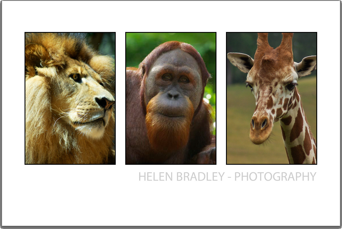
When selecting images for a triptych, you want three images that relate to each other in some way such as location, people, genre and so on.
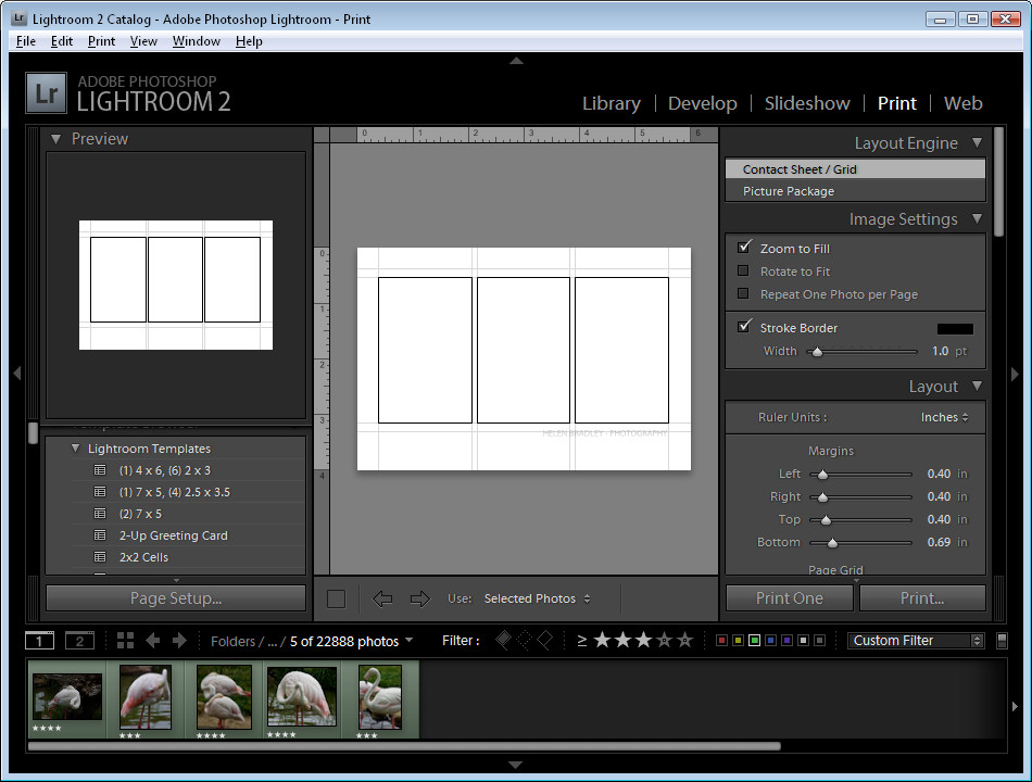
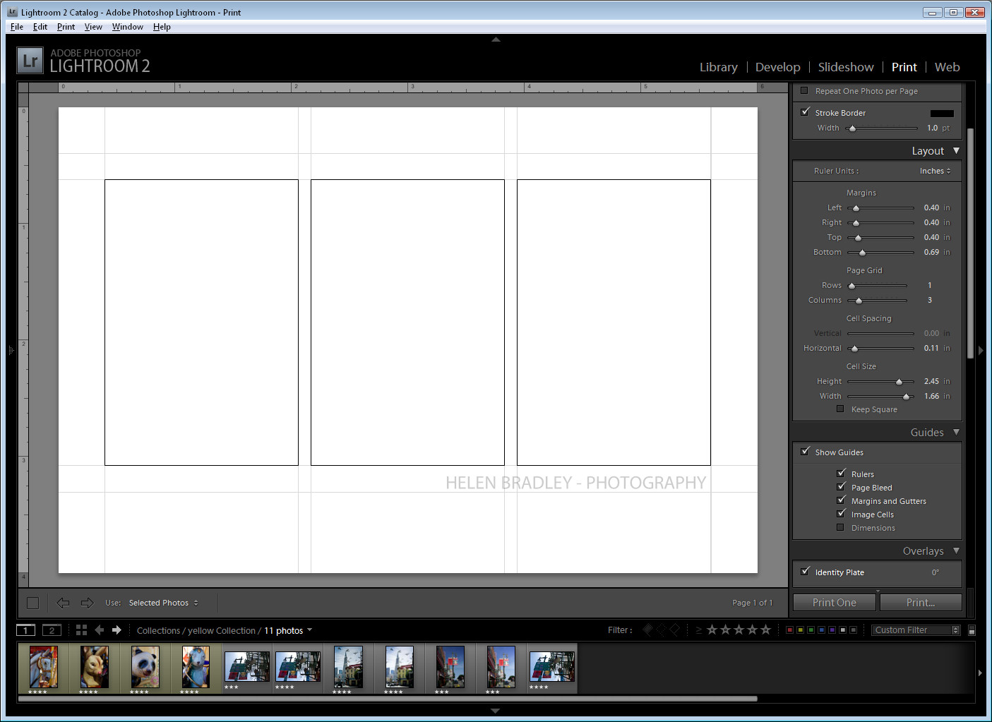
I like to start by selecting a five or six images which I think will work well together and then try them out. I assemble a collection of these images (make a collection, not a smart collection) so that I can work with them in the print module and not have other images in my way.
Select three of the images to use to start with. The order that the images appear in the photo strip is the order that they appear in the triptych. If the order isn’t right, drag the images into a different position in the photo strip and the images will be rearranged in the triptych too.
One way to create a safe design is to ensure that the horizons in the images (or each subject’s eyes) are roughly level across the triptych and, when combining different images, look for images all shot at about the same zoom. This doesn’t mean you can’t mix image sizes, it just means that its sometimes easier to get them to look good if they are the same size.
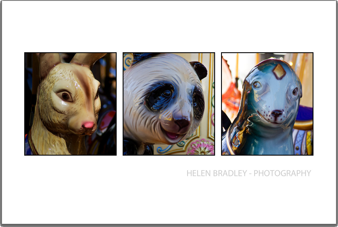
If you have elements that have a strong sense of direction such as the carousel animals in this triptych, place the animals so they face inwards rather than outwards from the design.
If they point outwards the viewer’s eye will follow them straight off the page. If you direct them into the triptych your viewer’s eye will stay there longer.
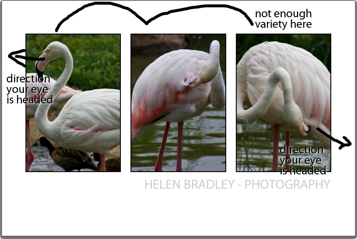
While this sequence of birds look alright the directions in which they are facing and the fact that the three images are so similar is actually a little distracting.
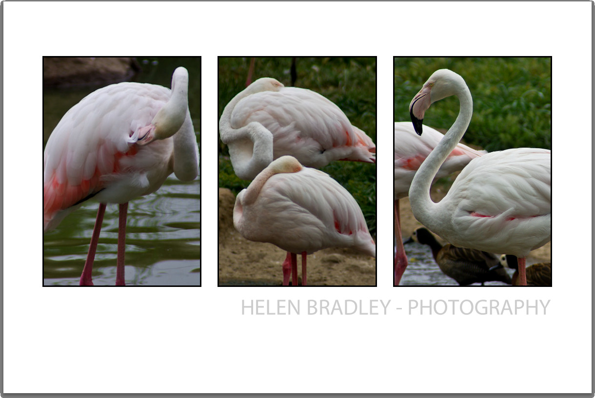
In this version, I moved the images around and replaced one with an image of two birds which adds some variety to the mix. The result looks better to my eye.

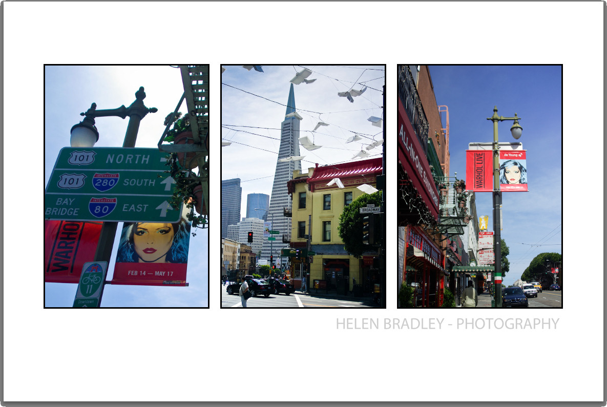
This triptych combining two streetscape images and a door, while all from a similar location, look unbalanced to me. The door doesn’t co-ordinate well with the street images and it is facing out of the image. In addition the door is a little too colorful for the other two images and it doesn’t enhance them. I like the arrangement better when a different image is used and one which is more in keeping with the others like this image:
Developing an eye for what looks balanced and what doesn’t will take time. I highly recommend Robyn Williams’ book as a starting point for understanding basic design and this video may help to understand some of the principles at play: http://www.microsoft.com/video/en/us/details/e1882b7a-5e66-45cd-b5b4-28301c0a747e
If you found this useful, here is the original post on how to create a triptych in Lightroom.