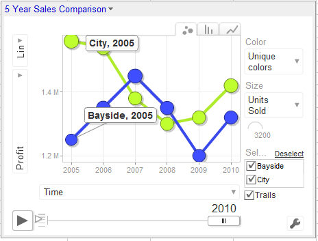
Gadgets allow you to do things with Google Docs that would be time consuming if not beyond most people’s skills to create in a program like Excel. In this article I’ll demonstrate how to create a motion chart in Google Docs spreadsheet.
Prepare the data
In the first column of a new worksheet type the name of the item you’re charting such as office locations – we’ll use City and Bayside. In the next column, type the period that the data is for – this needs to be a time field such as year, week or quarter. The data needs to conform to ISO8601 so use 2011 for a year, 2011W08 to enter week eight of 2011 or 2011Q2 for second quarter 2011.
In the next column, type the data to plot such as Profit. The next columns are optional but we’ll add one which records units sold. To have some data to work with, add at least five years of data for the two offices.
Add the Gadget
Select over the entire range (including headings), and choose Insert > Gadget > Charts and scroll to find the Motion Chart and click Add to Spreadsheet. In the dialog which appears, the range should already cover the selected range, leave the Default State empty for now and type a title for your chart such as 5 Year Office Comparison and click Apply & Close.
The chart appears on the screen but requires some customisation to work. From the fly out menu of Y axis options on the left select Profit and then from the X axis dropdown list select Time so you plot Profit against Time.
From the Color dropdown list, select Unique Colors and from the Size dropdown list, select Units Sold.
Click the Play button and the chart will play showing the change in your data over time. The Y axis movement shows movement in Profit and the size of the bubble shows change in Units Sold.
The tabs change the chart from a Bubble to a Column or Line (this is not a motion chart).
If you click the office checkboxes and Trails you will see additional labels on your data and to the right of the Play button is a slider which controls playback speed.
Save the default
Wind the play button back to the beginning. Click the Settings button and click Advanced and Advanced again. Double click the state string to select it, right click and choose Copy. Click the chart title to display the chart menu, click Edit Gadget and paste the string into the Default State textbox. Save the worksheet and the chart will appear whenever the worksheet is viewed and it will be configured as you set it up to look.


Post a Comment
Please feel free to add your comment here. Thank you!