Thursday, October 30th, 2008

Goodbye Florence, Hello Roma!

Today I ended my stay in Florence and took the train to Rome. Before I left Florence, I got up early enough to take the D bus to the Ponte Vecchio as I wanted to photograph the “other side” to the one I’d seen previously. As luck would have it there were a couple of other things I’d seen on earlier trips that I also saw as I walked back to the hotel before checking out so it was a successful hour of photographing.

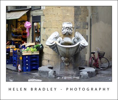
This corner fountain was one of those things I wanted to capture. So wonderfully unexpected – you fly round the corner and see this… very Florentine:

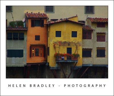
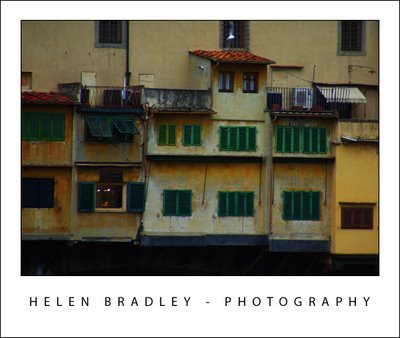
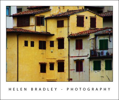
These are sundry photos from the Ponte Vecchio – it is a very very old bridge with shops along it and the cutest little buildings growing out of it:

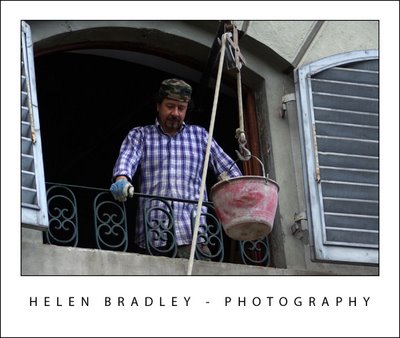
This guy was working on a house, and passing bucket loads of broken rubble down to his mate below. They thought it too funny I wanted to photograph them and we exchanged lots of laughs as they posed for the camera:

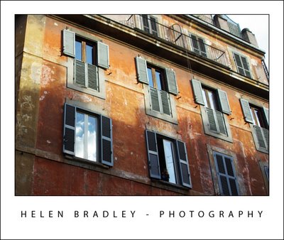
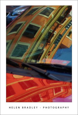
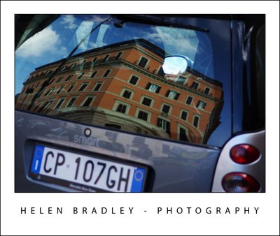
One of my challenges this trip has been to photograph reflections. They aren’t so easy to capture as we’re so used to looking past them – we just don’t notice they are there. These are first, bright morning sunshine in a window in Florence and then two buildings captured reflected on cars in Rome:

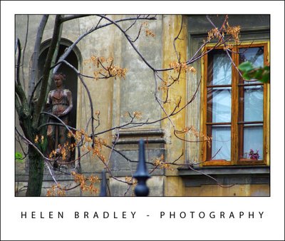
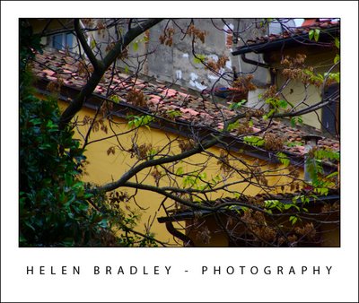
One thing I wasn’t expecting was that it would be still Autumn in Italy. I seriously thought that since I was in Paris last year in Sept/Oct and it was Autumn then that it would be well past it in Italy. Well, I lucked out. Italy has been experiencing very hot weather until the week before I arrived when it started to turn cold. Result? It is Autumn in Italy and the colours are magic. Here are some photos from along the banks of the Arno River showing some of the Autumn colours in the leaves:

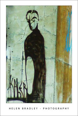
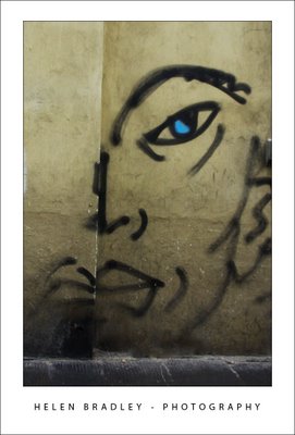
It wouldn’t be a happy day if I didn’t find some great graffiti. I’d seen this piece a number of times across the city, and this morning I finally captured it:

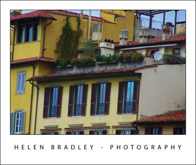
More from alongside the Arno River in Florence:

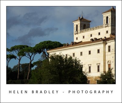
Now we move to Rome. This building towers over the top of the Spanish Steps which, themselves, offer breathtaking views across Rome:

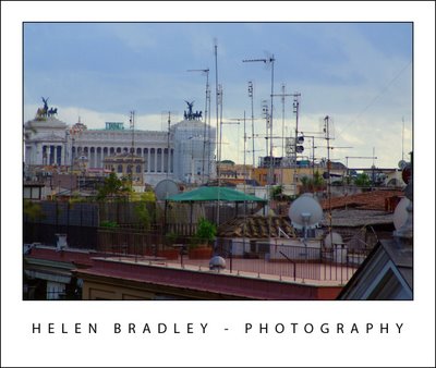
Because no buildings can be taller than one of the churches here, the panorama is spectacular from the Spanish Steps you look out all across the tops of the buildings below:

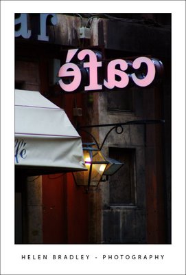
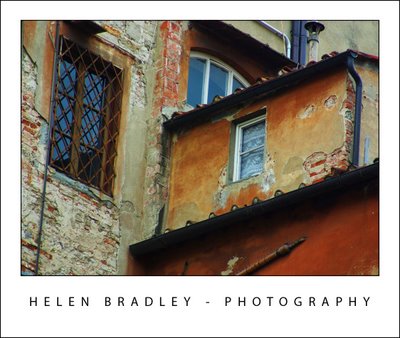
Last photo for today is this one. Taken as the sun was retreating in the late afternoon, it encapsulates some of the magic of this city – it’s really in the small things that Italy etches herself deep in your soul:

Helen Bradley

Wednesday, October 29th, 2008

Florence IT, wow!

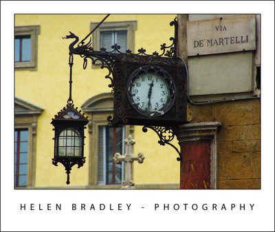
Roof detail, Florence, IT.

Clock near the Domo, Florence, IT.

I came to Florence really to see the statue of David which I had missed out on seeing when I was here the first time. I spent about an hour just sitting and looking at it – it really is a beautiful piece of work. You can’t photograph in there but luckily someone had taken good photos which were available as postcards so I have them.

The rest of Florence, I have now spent two and a half days photographing and I spent today in Siena.

Here are some of the results.
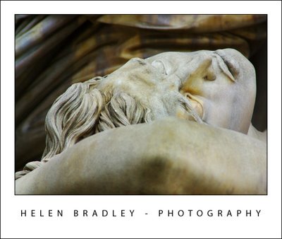
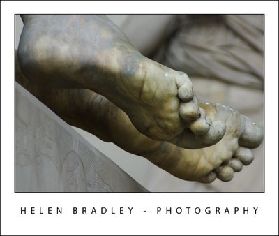
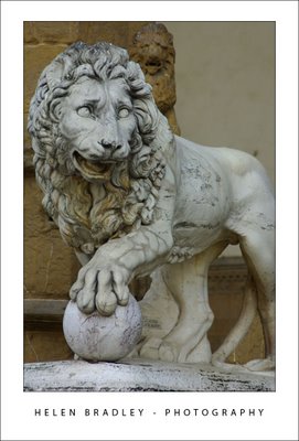
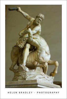
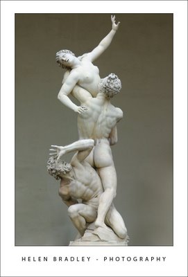
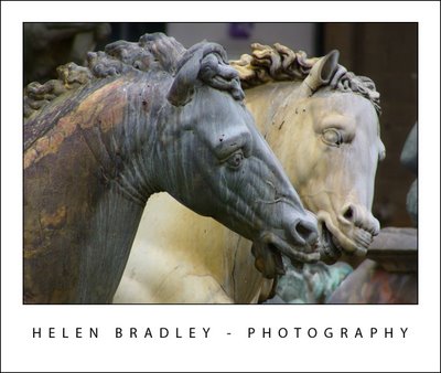
These first photos are from the statuary in the Piazza della Signoria. Photos of some of these statues I’ve been working with for a while now, courtesy of a friend (thanks Greg) who shot them about 8 years ago. It was funny to actually see them with my eyes. I spent quite a time shooting these capturing all sorts of detail as you see:

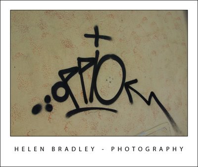
Of course, obsessed as I am by Graffiti there are always some shots of graffiti to entertain:

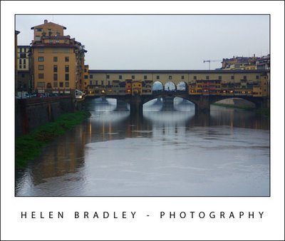
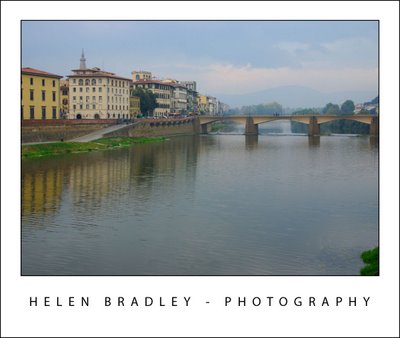
These are photos of the Arno River which flows through Florence. The first is of the Ponte Vecchio which is the oldest bridge here. The second is looking the other way.

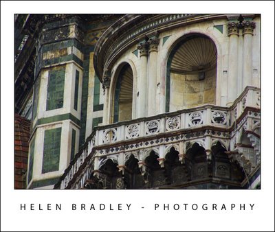
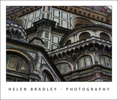
You think when you see photos of the Domo that is looks pretty but, in reality, it is absolutely spellbinding and the colours and detail in the building are stunning. Here are some detail shots:

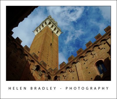
This is a tower in Siena – about 50km from Florence. The day was alternately wet and sunny – as luck would have it, sunny at just the right time and the clouds really made the shot:

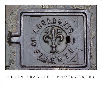
My themes for this trip include manhole covers and this is one of the ones I found in Florence, I have a very big collection which is growing daily!:

Helen Bradley

Tuesday, October 28th, 2008

Venice in Pictures

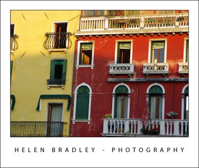
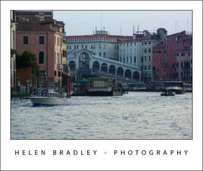
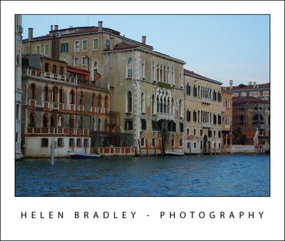
Venice is the most wonderful place and I took an awful lot of photos. The above is detail from the houses along the Grand Canal.

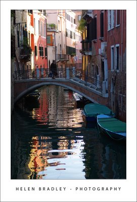
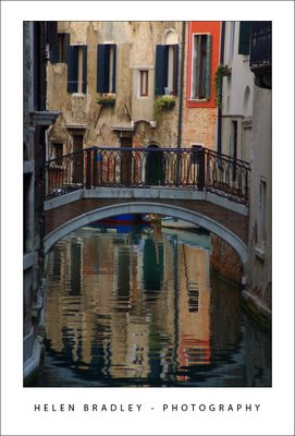
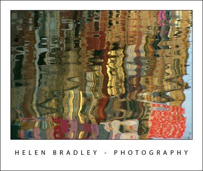
I loved capturing reflections and these are some of those I lucked upon – you have to catch the canals without traffic and that’s not easy in a city that has no cars so everyone walks or boats:

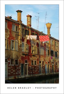
These next photos are the same place – one is a what is above the water and the other the reflection. I just love laundry hanging out to dry and Italy is laundry heaven!

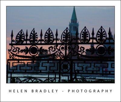
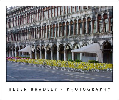
Just to prove I can get up early. These photos are from a walk along the Grand Canal at dawn just as the sun came up. You won’t catch St Marks’s square empty like this at any other time of the day:

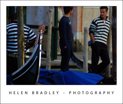
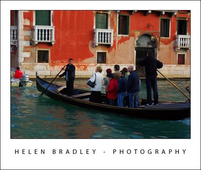
Gondolas are one method of transport in Venice but not the only one. Vaporetti are public ferries and they go up and down the Grand Canal and around the lagoon. The Vaporetto stops are floating barges with yellow strips so they’re easy to see. Some stops have barges for each direction, some stops the same barge works for both:

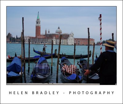
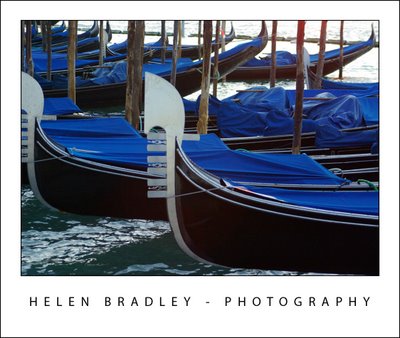
Gondolas go where you want them to go – they’re expensive and only 2 of the 6 seats are actually side by side and sitting back, the rest are upright and look pretty damn uncomfortable if you ask me.

Traghetti go across the Grand Canal. Because there are are only 3 bridges in around 2miles of Grand Canal sometimes you have to get across it where there isn’t a bridge. A traghetto is the answer – it is cheap to ride – the catch is that you stand up – not for the faint of heart. There are traghetto stations at intervals along the canal.

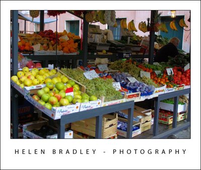
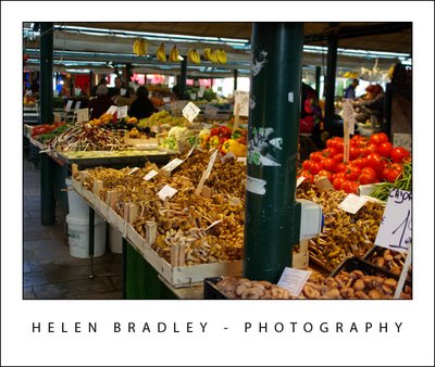
At one side of the Rialto Bridge there is a huge market each morning where people go to buy food for the day. Here are some images from early morning at the Rialto markets.

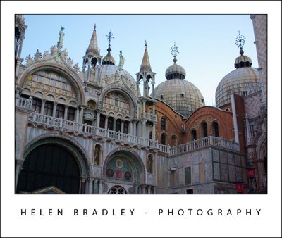
This is detail from St Mark’s Basilica:

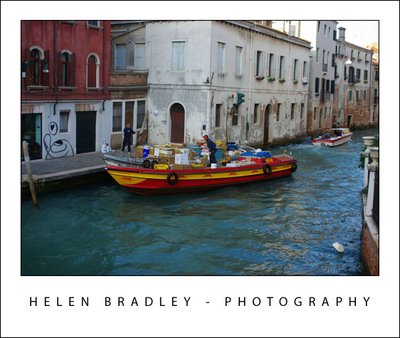
Ever wondered how UPS, FedEx and DHL deliver in a city with no cars – check this out – DHL boat delivery service:

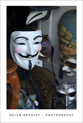
V for Venice or V for Vendetta – you choose:

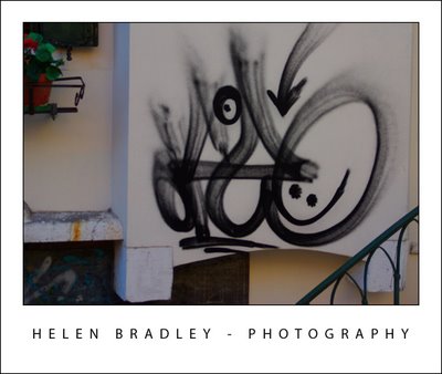
Graffiti Venice style:

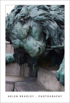
Lion detail from Victor Emmanuel equestrian statue – Grand Canal:
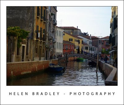
Grand Canal and minor canal photos:
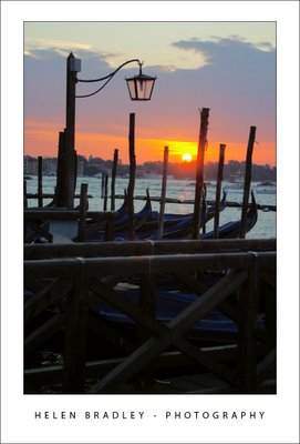
That’s it for today.

Helen Bradley

Monday, October 27th, 2008

This post carries a warning – sensory overload ahead

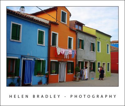
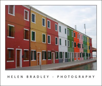
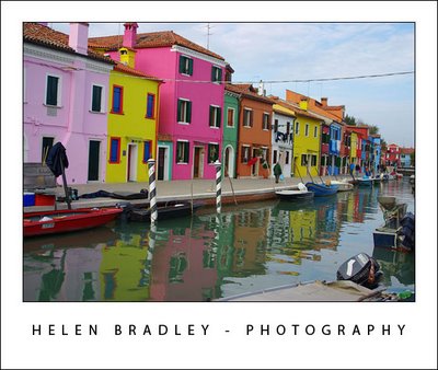
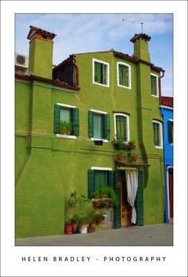
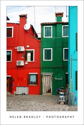
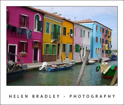
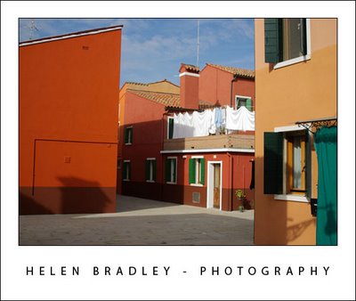
Burano is an island in Italy and it has to be one of the most colourful places in the world. It’s proof that what your mum told you about mixing colours was way wrong. You see, red and green “can be seen” and if pink and blue aren’t enough, go ahead, add orange and mauve – it’s ok!

I spent half a day photographing this wonderful place. I just put the map in my backpack and started walking. It’s an approach I took to discovering Venice – as soon as you leave the tourist areas, things get really interesting and, it’s an island – it’s not like you can get really lost.

So here, for your enjoyment is the first batch of Burano pix:


Helen Bradley

Wednesday, October 22nd, 2008

OneNote – Send it to me!


OneNote is one of those underused applications which really should have a place in everyone’s day.

Planning a trip? Researching a topic? almost anything you are doing, OneNote should have a place in your toolkit. With OneNote 2007 installed you have better than ever integration between OneNote and, for example, Internet Explorer or Word. In Internet Explorer, find a site you like and which you want to keep the information from and you can. With the page visible, choose Tools > Send to OneNote and Internet Explorer sends the page contents and the URL to a new page in a OneNote notebook. It’s all stored ready for you to use when the time comes you need the information.

It’s fast and smart.

In Word 2007 you have a OneNote printer. Open a document and choose to Print it but this time, select the Send to OneNote 2007 printer and the document gets sent automatically to OneNote.

It’s a great place to store all your stuff, check it out. It was, from its inception a fantastic piece of programming and a leader in its field. It rocks even more in the new 2007 version.

Helen Bradley

Wednesday, October 15th, 2008

Better character spacing in Word


First the explanation:
Look at any book and the characters in it don’t look quite like those you print on your printer. The reason? the characters in the book are placed closer together than those on your printed page.

Now the technical stuff:
Character spacing is the amount of space between characters of type. If you reduce the amount of spacing just a bit, you get a nicer look to your font, it just looks that little bit more professional.

Now the how to big:
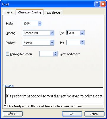
To alter the spacing between characters, select the text to alter and select Format > Font > Character Spacing tab. From the Spacing list box select Condensed and in the By: textbox set the reduced spacing value to somewhere between .1 pt and .3 pt – the results will be subtle but noticeable and your text will look lots nicer.

Helen Bradley

Tuesday, October 14th, 2008

Paint in color in Phothoshop with color brushes


If you ask most people they’ll tell you that brushes in Photoshop don’t paint in color. That’s not true. Brushes can paint in all sorts of colors when you know how.

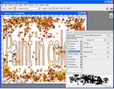
To see this at work, select two colors in your color palette for foreground and background colors and display the brushes palette by choosing Window > Brushes. Click the Color Dynamics checkbox to make sure it is enabled. Drag the Foreground/Background Jitter to a high value and adjust the Hue jitter to a high value as well.

Click the Brush Tip Shape option and, if desired, adjust the spacing to get the best results. For example, if you want the shapes that you’re painting with the brush such as a leaf shape to be separated from each other choose a value higher than 100 percent.

In the Shaped Dynamics area, adjust the Size and Angle jitter, for example to angle the brush and change its size as you paint.

Now click back in the document and drag to paint. You’ll see that the shape that you are painting is rotated and sized because you are using size and angle jitter but it is also painted in color because of the hue jitter value. To get brighter results adjust the brightness jitter so you get some variety in brightness in the painted elements. Whatever the choices you make you’ll never again believe that you cannot paint in color in Photoshop.

Helen Bradley

Friday, October 3rd, 2008

Borderless printing in Microsoft Publisher – Yay or Nay?

Before you go looking for borderless printing and margin settings in Publisher 2003 – give up – they’re not there.

Simply put, Publisher does not do borderless printing.

While on the face of it this is a nuisance, to say the least, there is a workaround that will get you going. Here’s how:

1 First of all set up your Publisher document so that it has everything on it that you want to print borderless. For example, I like to, when I’m using a template for a calendar, for example, stretch the background filled shape to fill the entire document so that there is color all the way to the border.

2 Save the document as a publication (*.pub) file so that you can come back to it later on if necessary and edit it.

3 Now create the print version – to do this, save the document as an image. Choose File > Save As and from the Save as Type dropdown list choose an image format such as Tagged Image File (*.tif) and give the file a name.

4 Now crank up your graphics software, set up your printer using the printing options for borderless printing and print the image.

Not pretty but it works!

Helen Bradley