Wednesday, July 30th, 2008
If the default font that Excel 2003 uses for all new worksheets doesn’t suit your needs – change it by selecting Tools > Options > General tab and set the Standard font and Size to your preferred choice and choose Ok.
In future, all new workbooks you create will be set by default to this font although those you have previously created will remain unchanged.
If you’re using Excel 2007 and you don’t fancy the new Calibri font, click the Office button, choose Excel Options and click the Popular group. From the Use this font dropdown list choose the font to use for your new worksheets and click Ok. You’ll need to close Excel and restart it for the new font change to be in force.
Helen Bradley
Labels: default worksheet font, Excel 2003, Excel 2007
Categories:Uncategorized
posted by Helen Bradley @ 3:19 amNo Comments links to this post
Thursday, July 17th, 2008
Colour me stupid. I am reeling from having single handedly wiped out all the images from my blogs – yep! 2 of them decimated by my stupidity. I’m now resorting to begging friends, family, neighbours and anyone I meet (ok I’m exaggerating, but I am desperate), to spend time helping me put it all back together. I have the images, they just aren’t on my server any more and my computers and Blogger have this love hate relationship, the more frustrated I get with how slow the connection is the slower they go – see! they say, if you think that was slow, try this.. seriously it is hours of work to get this all back. Hence no delicious new posts.
This happened over two weeks ago so I’m slowly resigning myself to putting it back over time, so here’s today’s tip – no image – sheesh – don’t talk to me about images!
To make the column widths on an Excel 2007 chart wider – or narrower if you think they aren’t awful enough when you have long X-axis values, right click a column choose Format Data Series. From the Series Options selection drag the Gap Width value close to the No Gap end of the slider for a larger column and the other direction for a smaller one. This increases the column width by decreasing the gap between the columns. Click Close and you’re done.
Now, back to uploading images one by one .. hell, even Noah got them in two by two!
Helen Bradley
Labels: chart, column widths., Excel 2007, gap width
Categories:Uncategorized
posted by Helen Bradley @ 3:52 am2 Comments links to this post
Saturday, May 31st, 2008
One of the other handy features of the new conditional formatting tool in Excel 2007 is that it can handle date formatting. For example, if you have a worksheet with a series of dates in it you can highlight the dates that correspond to a period of time.
Choose Conditional Formatting > Highlight Cells Rules and choose the A Date Occurring option. You can then format cells using rules such as Yesterday, Today, in the last seven days, this month, next month, next week, etc.. When you do this cells containing dates which match this criteria will be coloured appropriately. Better still, when the date changes, the formatting on the worksheet will change accordingly.
Helen Bradley
Labels: conditional formatting, Dates, Excel 2007
Categories:Uncategorized
posted by Helen Bradley @ 12:19 amNo Comments links to this post
Saturday, January 26th, 2008
Lists were a big addition to Excel 2003 as they allowed you to work with list data in Excel more easily than ever before. One key plus was that they let you create charts that expanded automatically as the data in the list grew. This was something you simply couldn’t do before very easily.
Now in Excel 2007 lists are called tables and they are simple to create using the Format As Table option on the Home tab on the Ribbon. One gotcha is that you shouldn’t use a table format if you don’t want to create a list, instead use the much more cumbersome and much less pretty Cell Styles options.
When you create a list you automatically get Filter buttons for the list. If you don’t like or want them, disable them by clicking to disable the Filter button on the Data tab – just make sure your cell pointer is somewhere in the list when you do this. Like in Excel 2003, if you create a chart based on your table, it expands when you add new data to it.
Helen Bradley
Labels: Excel 2003, Excel 2007, filtered lists, table fromat
Categories:Uncategorized
posted by Helen Bradley @ 12:08 amNo Comments links to this post
Tuesday, December 11th, 2007
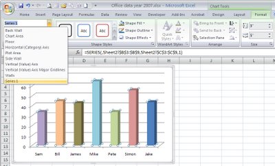
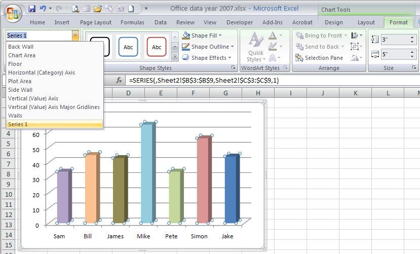
It used to be easy to know what part of a chart you had selected in Excel 2003 – you just read the name off the left hand side of the Formula Bar.
Look in vain for this same feature in Excel 2007. Click anything on the chart and the formula bar just says Chart 1 – like duh! I know I have the chart selected it’s the element on it that I’m interested in.
The solution is the new Chart Element tool. Click the chart to select it, choose Chart Tools > Format on the ribbon and in the top left corner is the Chart Element list. Not only will it tell you what you have selected on the chart but it’s a dropdown list of names of various chart elements. Click one and that portion of the chart is selected automatically.
It’s a handy new tool, I’d just like the benefits of the features from Excel 2003 and 2007 blended into one.. call me fussy.
Helen Bradley
Labels: chart element, Excel 2003, Excel 2007, selecting
Categories:Uncategorized
posted by Helen Bradley @ 6:54 pm1 Comment links to this post
Wednesday, November 28th, 2007
This post is subtitled Undos that Do and Those that Don’t
If you’re using Excel 2003 or earlier, you have a big problem with the Undo command, you see much of the time, it plain doesn’t work.
Curious? Try this: open an Excel file, make some changes to it (minor however, you won’t be able to undo these however much you think you can). Check the Undo button – it is enabled. Save the file. Now check the Undo button again. Yikes, it’s now disabled. You see, after you save a file in Excel 2003, all the Undo steps are removed – no more Undo. It pays to know this is how it works.
In Excel 2007, things are much better, and the Undo retains the changes even after you have saved the file. Much nicer behavior.
Helen Bradley
Labels: Excel 2003, Excel 2007, Undo
Categories:Uncategorized
posted by Helen Bradley @ 5:39 pmNo Comments links to this post
Monday, November 19th, 2007
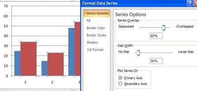
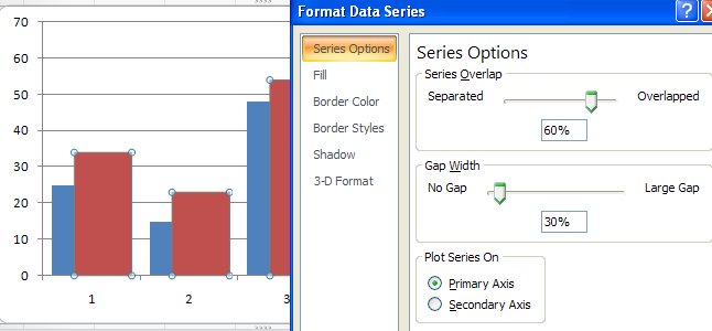
Sometimes an Excel chart will look better if your series overlap – this might be the case when you are comparing data from two years and where you want to show how the values have increased from one year to the next.
To make your series overlap in Excel 2007, select one series, right click and choose Format Data Series. Click the Series Options and decrease the Gap Width (it closes the chart up nicely) and incease the Series Overlap. Set the Series Overlap to around 60% and the Gap Width to around 30% for a good result. This is particularly useful when you are using images in place of colors for the bars of your chart but works in almost any situation.
Helen Bradley
Labels: charts, Excel 2007, gap width, overlap, series
Categories:Uncategorized
posted by Helen Bradley @ 11:46 pm1 Comment links to this post
Wednesday, November 7th, 2007
For a long time Excel users have wanted a way to plot a bar showing the relative magnitude of a range of numbers without having to resort to a chart or complex formulas to do this.
Now, with Excel 2007 this feature is now built in and dead easy to use. To try it out, first type a series of numbers in a column, then select the series. Click the Home tab and click the Conditional Formatting button.
Select Data Bars and then select the color of the bar to use. The relative length of each colored bar indicates the relative value of the number in that cell.
There is one caution, however. All values – even very small values will be given a minimum bar length of 10% so they can be seen – so, use this feature as a guide and not an accurate measure.
Helen Bradley
Labels: charts, conditional formatting, Excel 2007
Categories:Uncategorized
posted by Helen Bradley @ 6:59 pmNo Comments links to this post
Monday, November 5th, 2007
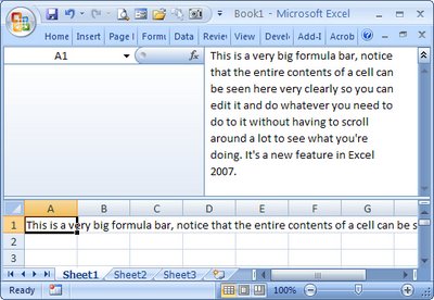
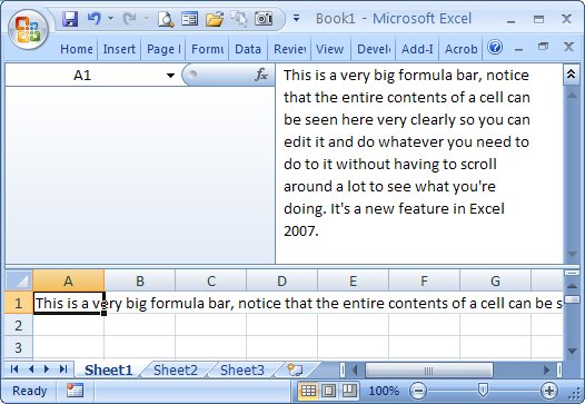
If you’ve ever created a very long formula in Excel 2003 you’ll know that it is difficult to see and to edit it – it simply is too big for the formula bar.
In Excel 2007 the problem is resolved, you can make the formula bar as big as you need it to be. Simply drag down on the bottom edge of the formula bar using your mouse, and it becomes as large as you need it to be.
Helen Bradley
Labels: Excel 2007, formula bar resizing.
Categories:Uncategorized
posted by Helen Bradley @ 5:56 pmNo Comments links to this post
Friday, October 26th, 2007
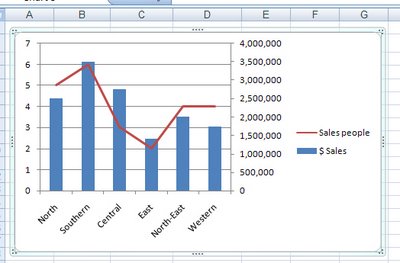
Disaster will strike your Excel charts if you try to plot very large data values and very small values on the one chart. You’ll see the big values but the little ones will blend into the x-axis of the chart so you won’t even see them.
To include both sets of data on the one chart, add a second axis and plot the smaller values against it. Now you’ll be able to see them alongside the very large values.
To add your second axis, select the chart, select the series you can’t see (click on one you can see and use the tab key to move until you have it selected). Right click and choose Format Data Series. Select Series Options, Secondary Y Axis. With the data series that should be plotted against the secondary axis still selected, right click and choose Change Series Chart Type and select a different chart type such as Line.
Helen Bradley
Labels: chart, Excel 2007, secondary axis
Categories:Uncategorized
posted by Helen Bradley @ 4:01 amNo Comments links to this post