Monday, March 9th, 2009

Photoshop – change the color of your house


You can change the color of anything using Photoshop. A friend of mine is about to paint her house but before her husband goes shopping for paint, she wants to know that the result will look good and that the house will blend nicely with its surroundings. It’s a job for a digital camera and some Photoshop know-how. Here’s how to recolor your house (or anything else) and save color combinations to review with someone else later on. I’ve used Photoshop CS3 but almost any version will do.

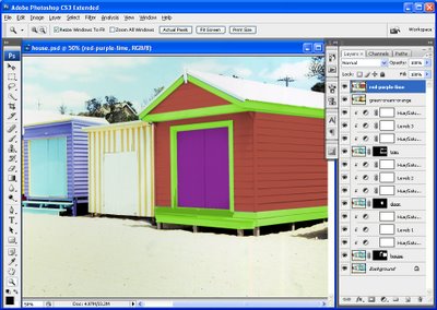
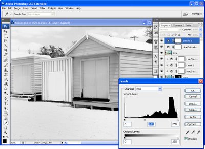
Open a photo of your house in Photoshop. I’ve used a bathing box for simplicity but the principles are the same for a house or, indeed, anything at all. You’ll need one extra copy of the background layer for each item you’ll recolor. For this image I’ve duplicated the background layer three times so I have a background layer, a layer for the house color, one for the door color and one for the trim and I’ve named them appropriately.

Start with the house layer and hide the others. Choose Layer, New Adjustment Layer and add a Hue/Saturation adjustment layer and drag the Saturation slider to -100 and click Ok. Add a second adjustment layer by choosing Layer, New Adjustment Layer, Levels and adjust the sliders until the area you’re focusing on looks like it could be painted with white paint. You want to retain the detail but lighten the area. Ignore everything else in the image for now. Click Ok when you’re done.

Now add a third adjustment layer using Layer, New Adjustment Layer, Hue/Saturation. Click the Colorize option and adjust the Hue, Saturation and Lightness sliders until you have the color that you want for the area you are working on. Again, ignore the effect on the rest of the image. Click Ok when you’re done.

Now, to limit the effect to the area you want painted in this color, select the adjustment layer just above the layer you’re working with and choose Layer, Create Clipping Mask. Repeat for the other two adjustment layers. You should see the adjustment layers indented in the Layers palette. Now, you can paint on the color. Select the layer you’re working on, in my case this will be the layer named house and hold Alt as you click on the Add Layer Mask button at the foot of the Layer palette. This creates a Reveal All layer mask so your photo should now be its original color.

Select white as your foreground color and paint over the areas you want to be coloured with the color you just selected. If you paint over something by mistake, switch to black foreground color and paint the original color back.


Step 1
For each area of color in the image, add the same three adjustment layers, one to remove the color, one to adjust the lightness and one to add color back. Create the adjustment layers as a clipping group with the appropriate layer. Finally, add a layer mask and paint the effect onto an area to recolor it.

Step 2
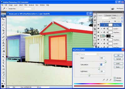
Because you will use adjustment layers for all the changes, you can alter the settings at any time if desired. Simply double click on the Adjustment layer thumbnail and the dialog will open so you can make changes to its settings and then click Ok to reapply it to the image.

Step 3
To save a color scheme, add a new layer at the top of the Layers palette, select it and press Control + Shift + Alt + E to create a new merged layer. Name this and turn its visibility off. Now change the colors to test a different look and save that version the same way.

Helen Bradley

Thursday, March 5th, 2009

Photoshop: Color that packs a punch


I like to see lovely saturated color in my photos but sometimes the color I capture just doesn’t do justice to the subject and it isn’t what I remember the scene looked like. Boosting the color can turn a lackluster image into one that totally rocks. So, if you find that the color in your photos is lacking, here’s what I do to make it better. The process is ridiculously simple, it requires no selections to be made, and it can be recorded as a simple action. It’s my kind of fix – quick, easy and very powerful.

A word about LAB
The fix uses the LAB color space. This is not an often used color space and it isn’t available in most other programs so you won’t be able to mimic this effect in, for example, Photoshop Elements. However, LAB has been around in Photoshop for years.

In the RGB color space you work with the red, green and blue channels and in CMYK you work with cyan, magenta, yellow and black channels. In LAB you have three channels; L, a and b. The L channel is the lightness channel and, if you adjust it you adjust only the lightness in the image and you don’t change any of the color in the image. This sets Lab apart from RGB and CMYK as color and lightness are separate in LAB where they aren’t in the other modes.

In Lab the two color channels are a and b. The a channel contains color information for the green and magenta in the image. The b channel manages the blue and yellow colors in the image. If you were to look at these channels they would look very light because they contain only color information and no lightness data.

By separating lightness from color as LAB does you can make adjustments that would be difficult or time consuming to do in any other color space. However, that said, I think this fix works best on animals, landscapes and streetscapes – but not on close ups of people. On people it tends to destroy the natural skin tones.

How to fix in Lab
To see this LAB fix at work pick an image that has color in it but which you think could use a color boost.

Step 1
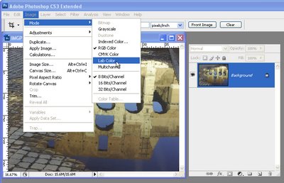
With the flattened image open in Photoshop, choose Image > Mode > LAB Color. If you’re working on a flattened image you won’t see anything except LAB/8 appearing in the title bar of the image.

Step 2
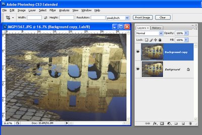
Duplicate the background layer of the image by right clicking it and choose Duplicate Layer. You’ll make your adjustments on this duplicate of the background layer so that you can blend them into the background layer later on.

Step 3
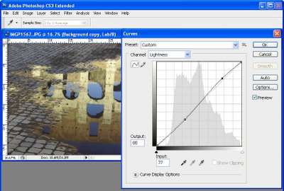
Choose Image > Adjustments > Curves to apply the curves adjustment to the duplicate background layer. Don’t use an adjustment layer as you’ll only have to flatten it on returning to RGB anyway.

In the curves dialog, the L channel is visible on the screen. This channel that contains only lightness and darkness values so that you can drag on the curve to adjust this if desired.

Step 4
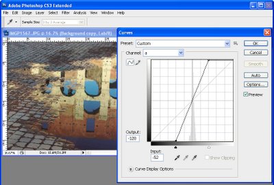
Select the a channel – this is the magenta/green channel. In a standard Photoshop setup green is on the left and magenta is on the right. Drag the bottom edge of the curve inwards 2-3 squares. Then drag the top edge of the curve inwards the same number of squares. It doesn’t matter how many squares you drag but you must drag the same number on either end so the curve line crosses the middle of the grid – this stops you from inadvertently inducing a color cast into the image.

Step 5
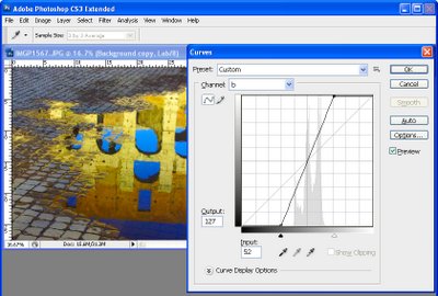
When you’ve adjusted the a curve, repeat the process with the b curve. At this point the image is probably looking very scary indeed. However, you need to make the adjustment strong enough that you get too much color rather than too little at this stage. Click Ok to apply the curve to the top image layer.

Step 6
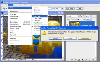
To return to RGB mode choose Image > Mode > RGB Color. When prompted, select the Don’t Flatten option. This is critical because you want both layers intact back in RGB mode.

Step 7
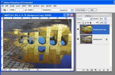
Now drag the Opacity slider for the top layer back to 0 so you see the original image and slowly walk the slider back up until you get the amount of color you want in your image. When you’re done, save the result.

Once you’ve done this a couple of times, you’ll appreciate how much of a boost in color you can get and how fast you can do it. Record the fix as an action and you can do it in one click and then just adjust the opacity to suit.

In some cases altering the blend mode of the top layer can yield pleasing results. The blend modes in the Overlay, Soft Light, Hard Light, Vivid Light, Linear Light and Pin Light grouping in the Blend Mode list give the best results. You can also duplicate the top layer and apply different blend modes to each copy to bring out different areas of the image.

So, if you want to produce eye-wateringly beautiful color in your photos, chances are that a Lab color fix like this is just what you need.

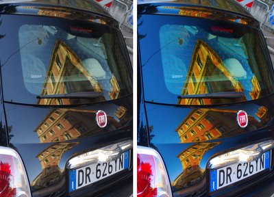
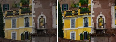
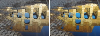
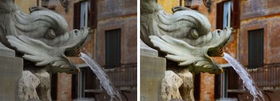
The images below show the original image on the left and the LAB color fix applied to it in the image on the right. No adjustments other than working LAB and blending the resulting layers have been used on the right hand versions.


Post Script: To learn more about LAB color mode and the fixes that you can perform using it, look no further than Dan Margulis’ book— Photoshop LAB Color: The Canyon Conundrum and Other Adventures in the Most Powerful Colorspace – it’s practically the definitive book on Lab by the master of Lab himself.

I contibute to the Post Production blog at Digital Photography School and this post first appeared there.

Helen Bradley

Wednesday, March 4th, 2009

Sharpening in Lightroom 2

Sharpening is the last step in editing an image. If you’re working in Lightroom then you have a very sophisticated Sharpening tool at your disposal. It’s hard to determine what the coolest part of the process is – the Detail and Masking sliders or the fact that sharpening is applied to only the image luminosity so it doesn’t mess up the image colors.

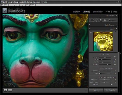
To sharpen in Lightroom, open the Develop module and the Detail panel to show the sharpening tools. A good starting point for most images is to set the Amount to 100, set the Radius to 1.0 and the Detail to around 25. As an aside, it’s nice to see that Lightroom is realistic about the appropriate radius to use and it limits you to a value between 0 and 3 which takes some of the guess work away from determining what value you should use.

Now you have a starting point, adjust the Detail and Amount sliders to see how they affect the sharpening. To see the before and after, press the backslash (\) key. The Detail slider is unique to Lightroom – it doesn’t appear in Photoshop. What it does is to remove halos around the sharpened edges. Low values for Detail reduce halos and higher values allow them.

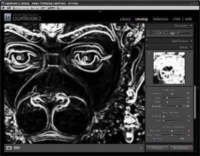
The Masking slider is a way cool tool. It lets you remove the sharpening from texture areas of the image and areas that you typically would not want to be oversharpened such as skin tones. To use it, drag the Masking slider to around 75 and compare the results. You should see less sharpening in areas that don’t typically need it the larger the Masking value. To see what the mask looks like, hold the Alt key (Option on the Mac) as you drag on the slider and you’ll see a grayscale mask in place of your image. The white areas of the mask are the areas that will be sharpened – they are the edges in the image – and the black areas are those that will not be sharpened or which will be sharpened with less intensity.

The mask gives you a lot of control over how the sharpening is applied to the image and it prompts the question “why isn’t this in Photoshop too?”

Helen Bradley

Tuesday, March 3rd, 2009

Protect part of a Word document


You know when it happens. You’re developing a template or document for someone to work on and you know that they will clobber part of it when you least expect it. So, you want to protect this from happening and make sure your document never gets destroyed.

Problem is how to do it?

Solution? Read on..

Ok.. so, Word has a document protection feature you can use but it only protects the whole document. But, it can be tweaked to protect only part – but we have to set it up to work this way. So, you have to add section breaks around the area to protect. Pretty easy to do. Click just above where the protection is to start and choose Insert > Break > Continuous – this adds a continuous section break in at this point and, because it’s continuous there isn’t really any indication it’s there.

Move to just beyond the area to protect and repeat to add another continuous section break. If you just want to protect the beginning or end of your document you only need one section break.

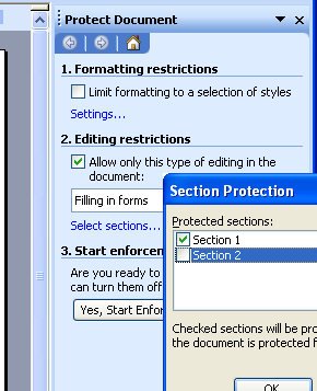
So far, so good. Now for the protection bit. Choose Tools > Protect Document and in the Editing Restrictions area, click the checkbox and from the list choose Filling in Forms. Now click Select Sections and check the sections to protect (ie leave the ones you want to be able to edit unchecked).

Then click Yes, Start Enforcing Protection and, if desired, add a password.

Now users are locked out of the protected area of the document and they can’t change it.

In Word 2007 it works just the same. Find the section breaks in Page Layout > Breaks > Continuous and the protection tool in Review > Protect Document > Restrict Formatting and Editing.

Neat huh?

Helen Bradley

Page 2 of 212