Sunday, June 21st, 2009

Twitter: Managing following and followers in bulk


There are limits on Twitter as to how many people you can follow before you’re stopped from following any more. The limit is reached when you are following 2,000 people if you don’t have enough followers of your own. When you reach this number you won’t be able to follow any new people.

This is a limit that you might encounter if you’re involved heavily in social marketing using Twitter. To cull your accounts so that people who you are following and who do not also follow you can be removed check out http://huitter.com/mutuality/.

At Huitter.com you can type your Twitter user name and password and select from one of the options to unfollow all who do not follow you back, to unfollow everyone (if you’re having a bad day – but be careful, tomorrow you might be disappointed you did this), and to follow everyone who follows you. This later option is handy if you suddenly decide that instead of being picky about who you follow you now want to follow everyone who is following you.

Using the exclude list you can list specific people by user name from the task so you still follow some people, for example, even if they don’t follow you.

When you click Go the program goes ahead and performs the task for you. This way you can make bulk changes to your Twitter account in a very short time and painlessly. This is something which you cannot do otherwise on Twitter short of doing it all manually.

For people interested in social marketing, http://huitter.com/mutuality/ is a great tool because it lets you determine instantly who is not following you so that you can weed them out of your list freeing you up to find more Twitter followers in future.

Helen Bradley

Friday, June 19th, 2009

Photographing buildings


Buildings are a great subject for photographers. Buildings don’t move and that’s a big plus when you’re starting out. They also reflect changes in light throughout the day so photograph a building in the early morning and return at midday and you’ll have an entirely new perspective on it. However there are some tricks to composing good shots of buildings and the first step is to consider what you’ll photograph.

When you’re photographing a building there are a couple of possible approaches to take. One is to give the building some context by including elements around it in the photo so you get a feeling for where it is situated and how it relates to its environment. For example, when photographing a small old building in a big city – the image will look most compelling if you show the building dwarfed by the skyscrapers around it. Farm buildings can also look great when captured as small dots on a landscape of grass and trees – but they also look great close up if you fill the shot with their architectural details.

On the other hand, some buildings benefit from being closely cropped so they are the clear focus of the photo and so the viewer is invited to imagine the world beyond the edge of the image.

When you’re photographing in the city, consider including pedestrians to give the photograph a sense of the busyness of the city. If you’re in a foreign city then buildings with interesting colours and signage make for great photos and help to capture the essence of the country you’re visiting. Look for colour in buildings too. Quite often you’ll find a building painted a different colour to those around and the contrast between the bright saturated colour and dull grey makes for a great shot – but remember that you’ll need to include some of the grey buildings for the coloured one to really pop.

In some situations, it’s the small architectural details of the building that are most compelling. Features like small altars built into the walls or gargoyles make a wonderful shot. In other cases, look for repetitive elements such as a bank of same size windows or arches – while one arch is nice and two is ok, three or more creates a repetitive pattern which makes for a more interesting photo. If you can shoot it so the pattern starts close up and then recedes into the distance, all the better.

It is also possible to photograph a building through an arch, and when you do, you’ll find the arch shape is nicely dark and in shadow, providing a simple frame for the building.

Other features that are great subjects for a photo are windows, doors and staircases. In the old part of many cities you’ll find interesting old wooden doors and cute windows, in some cases you’ll find that the inside of the building or a reflection in the window gives some interesting detail and context for the image. Staircases and paths draw the eye along the direction of movement and into the photo.

When photographing swimming pools such as at a hotel, either capture part of it framed in the landscape around it or get up high and photograph it from above. If you do this in the early morning before anyone is around you’ll get a very different photo to the one you’ll capture at midday in summer.

Bridges are also great to photograph – for these, either get far enough away to shoot the entire bridge, perhaps jammed with peak hour traffic or look for a different view. Perhaps a close up of an architectural detail or the city framed in its shape. As with all subjects, any building is best shot either early in the morning or late in the afternoon and not at midday. The exception to this is where there are some interesting weather details that throw a different colour or type of light and which will help add warmth and interest to the photo.

Night time opens up a world of possibilities as even the most ugly skyscraper takes on a magical glow as the sun goes down. The trick with night photography is to take long enough exposures so you capture the detail. Start by using a tripod and set it to night shooting and disable the flash (its range is only around 3 metres so it’s useless for long shots). If your camera allows you to take timed exposures, experiment with different timings. With a long exposure time, set a small aperture such as f/16 or f/22 to minimize overexposing the strongest lights in the scene. Alternately, use a shorter exposure with a larger aperture such as f/2 or f/3.5. When you combine a small aperture and a long exposure time, you will capture delicious streaks of light from car tail lights and the lights of city buildings will give the photo a great glow.

Some buildings or streetscapes are simply too wide to capture in a single shot. For these, put your camera on a tripod and capture a series of shots of the buildings from left to right overlapping each by about 20% so you can stitch these into a panorama later on. If your camera has a panorama function, use it to help line up the successive shots.

Photographs of buildings taken with digital cameras will often display perspective problems and the top of the buildings will be narrower than the bottom. This can be fixed in your graphics software later on but, when you’re taking the shot, allow for this correction and capture some extra detail either side of the base of the building so you have plenty of image to work with when you’re straightening the photo later on.

Helen Bradley

Friday, June 19th, 2009

Cool excel printing options

Excel offers some cool options for printing worksheets. Here are six of my favorite techniques:

1 Printing grid lines (or not)

To print grid lines on your final printout, choose File, Page Setup, Sheet tab and enable the Gridlines checkbox. This prints horizontal and vertical lines much like you see on the screen in editing view.

2 Printing row and column headings


To print the letters A, B, C etc above the columns on your worksheet and the row numbers choose File, Page Setup, Sheet tab and enable the Row and column headings checkbox. This works particularly well when combined with printing Gridlines but can be used without gridlines too.

3 Setting your own page margins


You can configure the margins around the page by choosing File, Page Setup, Margins tab. Set the margin values and use the Horizontal and/or Vertical checkboxes to centre a small worksheet on a larger page.

4 Drag a margin into place


You can also control margins from the Print Preview screen. Click Margins to turn the margin indicators on. You can now move these into new positions by simply dragging on them.

5 Select an area to print


When a print area is set, this will print by default regardless of how big the worksheet is. Drag over the area to use and choose File, Print Area, Set Print Area to configure it. To clear the print area, so you can print the entire worksheet, choose File, Print Area, Clear Print Area.

6 Print a chart


When you click a chart on a worksheet to select it and choose File, Page Setup, the page setup dialog shows no longer contains the Sheet tab and, instead, contains a Chart tab. This shows options for sizing and printing charts. When you click Print, only the chart will print.

Helen Bradley

Friday, June 19th, 2009

Word 2007 – smart date entry


Word 2007 has some totally cool new tools for entering data in your documents. Trouble is they are hidden so most folks don’t know they are there.

To start, display the Developer tab by clicking the Office button > Word Options > Popular > Show Developer tab in the Ribbon.

Now click the Developer tab and, in the Controls area you’ll find entries for a range of tools including the Date Picker. To insert the date picker into your document click Design Mode and then click the Date Picker button. Click Design Mode again to exit that mode.

Now your user will see a Click here to enter a date option and, when they click the content control, a dropdown date picker will appear allowing them to select a date to insert into the document.

To ensure the date is formatted in a particular way return to the Developer tab, click Design Mode and click the Date Picker in the document. Click the Properties button on the Ribbon and from the Properties dialog select a date format to use. Make sure to deselect Design Mode before you return to your document.

Helen Bradley

Wednesday, June 17th, 2009

Photoshop – keep a log of everything you’ve done

How many times have you created a neat effect on an image using Photoshop and then wanted to duplicate the effect on another image? The problem is that unless you’ve taken notes about what you’ve done, it is often difficult if not impossible to remember exactly the steps you took to get the final image.

While Photoshop has a History feature this is of limited use. One problem is that, by default, Photoshop only stores 20 history states so, if you’ve performed a lot of steps they may not all appear in the list. The second problem is that, even if you have configured Photoshop to store a large number of history states, all you see in the History panel is a brief description of what you did to the image such as Gaussian Blur, Apply Image, Blending Change and you don’t see the actual settings used.


The History panel in Photoshop lists the basics of what you’ve done but not the detail.

Here are some ways to improve on the basics and keep a log of your work:


Step 1
Before you start work on an image choose Edit > Preferences > General and select the History Log checkbox. You can select to save log items to the image Metadata, to a separate text file or to both. If you select either Text file or Both you’ll be prompted to enter a file name and a location to save the file to. Do this and click Save.

From the Edit Log Items dropdown list select Detailed. Sessions records only the time you spend working on a file, Concise records the Sessions information and the detail from the History palette and Detailed records the detail about the changes – it’s Detail you need.


Step 2
Now, when you work on an image, the detail is stored in the text file, the Metadata or both, depending on the setting you chose.

If you chose to store the data in a text file you can later open the text file with a word processor or a text editor such as Notepad on the PC.

If you chose to record the history in the image metadata choose File > File Info > History and you can read details of the edits you made to the image in the dialog. Use this information to perform the same steps on another image


Tip
To configure Photoshop to store more than the default 20 history states, choose Edit > Preferences > Performance and set the History States value to a higher number. You should note that this History information is available in the History palette and only while the image is still open – it is lost when the image is closed – unlike the Log data which is stored permanently.

Helen Bradley

Tuesday, June 16th, 2009

Word 2007 working with boilerplate text


One typical use for Microsoft Word is in offices where documents and letters are created by assembling a series of standard paragraphs from a range of alternatives. In the past Microsoft Word included the AutoText and AutoCorrect features and, like many users, you may have adapted AutoCorrect to use in creating boilerplate documents. Some other users tweaked the AutoText tool so they could use it to insert content, such as graphics and text.

The AutoText tool no longer appears in Word 2007 and it has been replaced by a Quick Parts Gallery which makes saving, organizing and assembling documents from stored paragraphs, aka Building Blocks, much easier to achieve.

Boilerplate text with Quick Parts
Find the Quick Parts tool on the Insert tab and click the down pointing arrow to open the Quick Parts Gallery. Here you have a number of options including Document Property which lets you insert some of the common document properties into your document by clicking on the one to insert. The Field option lets you insert fields much as you could in earlier versions of Microsoft Word.

The Building Blocks Organizer is the newest feature and this is a repository of text blocks which you can add to your Word documents. These Building Blocks can be sorted by Name, Gallery or Category. Some of the Building Blocks come built-in to Microsoft Word and others are legacy AutoText entries from earlier installations of Microsoft Word. You can insert a Building Block into a document by selecting the entry in the list and click Insert.

Create you own entries
To add your own paragraphs to the gallery, type the paragraph or open a document which contains it and select it. Click the Quick Parts button and choose Save Selection to Quick Part Gallery and, when the Create New Building Block dialog appears, type a name for the Building Block. This will be the name you’ll use to identify it in the list so make it self-explanatory of what the Quick Part contains. Select the Gallery to add it to, in most cases this will be the Quick Parts Gallery.

Select a Category from the list or click the Create New Category option to create your own subcategory of the Quick Parts Gallery. By creating sub categories you can organize your Quick Part entries so that they are easier to find. Type a description of the Quick Part, if one is needed to identify it, and, from the Save In list, choose buildingblocks.dotx which is the default setting. From the options dropdown list you can select to Insert Content Only, or insert the content in its own paragraph or its own page depending on how the content should be used. Click Ok when you are done.

In future you can insert the Quick Part into a document by clicking the Quick Part button and then select it from the dropdown list. If it does not appear in the list, click the Building Blocks Organizer and select the Building Block by name. You can locate building blocks in the organizer by sorting on the Gallery column and locate the Quick Part area which is where your building blocks will appear. Click the one to insert and click Insert.

Helen Bradley

Sunday, June 14th, 2009

Orton Effect – Photoshop


Photoshop gives us tools we can use to create effects which previously could only be obtained in the darkroom using images which were captured specially. One such process is the Orton effect named after photographer Michael Orton. This process results in a somewhat surreal image which has a slightly out-of-focus look while retaining lots of edge detail.

In the darkroom this effect is created using two images one of which is slightly out of focus and both of which are slightly overexposed. Sandwiching these together and taking a print yields a photograph similar to the one above.

Thanks to Photoshop we can create this effect from a single well exposed image and create the overexposed and soft focus looks digitally.

Here is how to create this Orton effect on an image from your collection:


Open the image, right-click the background layer in the layers palette and select Duplicate layer. With the duplicate layer selected choose Image > Apply Image, select the Screen blend mode and click Ok. This applies the image to itself in screen mode which is the same as creating an additional duplicate layer, setting this layer’s blend mode to Screen and then merging the two layers. The benefit to using Apply Image is that you do it all in one step.


Duplicate this layer and set its blend mode to Multiply. This has the effect of cancelling out the lightening effect from applying the Screen mode.


With this topmost layer still selected apply a blur to it using Filter > Blur > Gaussian Blur. Select the Preview checkbox so you can see the result on the image. Adjust the blur Radius to your choice of value – I used 4.5 but choose the best for your image. Notice that, if you create a very large small or very large blur, the effect all but disappears.


If the image isn’t light enough, return to the middle layer and repeat Step 1 to apply the image to itself again in Screen mode.

Then, if desired, add some noise to the image to give it a grainy look. To do this, choose Filter > Noise > Add Noise. Disable the Monochrome checkbox, click Gaussian and adjust the amount till you get a slightly grainy feel to the image.

The result is a soft focus image which still has lovely detail in the edges and it is a process well suited to being used with portraits as well as landscapes and cityscapes.

Using Photoshop Elements?
The same effect can be achieved in Photoshop Elements but you will need to perform step 1 the long way. To do this, duplicate the Background layer twice, set the top layer’s Blend Mode to Screen then choose Layer > Merge Down to merge it to a single layer. There is no Apply Image command in Photoshop Elements.

Helen Bradley

Saturday, June 13th, 2009

Formatting pictures in Word 2007


The picture formatting tools in Word 2007 are far more sophisticated than those in earlier versions of Word.

To see them at work, insert a picture into your document, click the image and choose Picture Tools > Format on the Ribbon. The Picture Styles are formats you can apply to your image and they include some attractive looking options including wide and narrow black or white borders and rotated options.

Once you have selected a picture style to use you can adjust other characteristics of the format such as the Effects which it are applied to it. So, for example, you can create a reflection by selecting the picture and choose the Picture Effects > Reflection to add a reflected edge.

You can recolor the picture border using the Picture Border option.

If you have formatted a picture to look the way you want it to look and you change your mind about the image to use, don’t panic. Choose Picture Tools > Format > Change Picture and choose an alternate image leaving your formatting unchanged.

Helen Bradley

Wednesday, June 10th, 2009

Multi colored Excel charts


It isn’t always the case that you want to chart multiple series of data on a single chart. Sometimes you only have a single series and Excel, by default, plots all the bars or columns so they are colored identically. Boring!

Luckily, in Excel 2007 a solution is at hand. Simply select and right click the series and choose Format Data Series > Fill > Vary Colors by Point. Excel colors each bar a different color. Best of all, the colors are linked to themes so you can change the colors by changing the Theme – the theme tools are on the Page Layout tab.

So, no more boring single color charts – ever – please!

Helen Bradley

Monday, June 8th, 2009

Understanding the basics of Sharpening in Photoshop

Sharpening is one of those everyday tasks that most photos can benefit from. In this post I’ll explain what sharpening is, when you should perform it and how to do it. The information here, although it is explained using Photoshop, is relevant to all photo editing programs.

Sharpening does as its name suggests and sharpens the image making it look crisper and making the edges in the image more distinct.

In the darkroom the process is achieved by taking one negative and a slightly blurred positive image, sandwiching these together and making a very quick exposure of this sandwich. Then the exposure is completed using the negative. The resulting image has sharper and crisper edges than it would have had if the blurry (unsharp) mask image had not been used. The typical sharpening tool used in Photoshop and other graphics programs is named after this traditional darkroom process and is called the Unsharp mask.

In a graphics editor the Unsharp mask works by creating small halos along the edges in the photo. These halos enhance the contrast between the edges and the surrounding pixels making the edges look more obvious and giving the image a crisper and sharper look.

Here’s how to sharpen an image using the Unsharp mask:


Step 1
Sharpening should be done at the end of the editing process so finish doing all your edits to the image before you sharpen it.

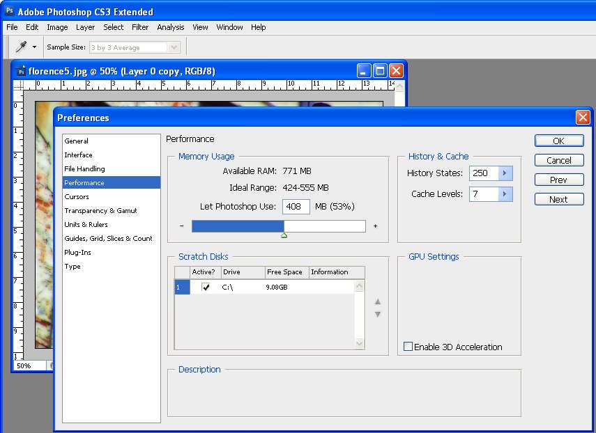
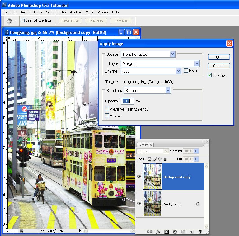
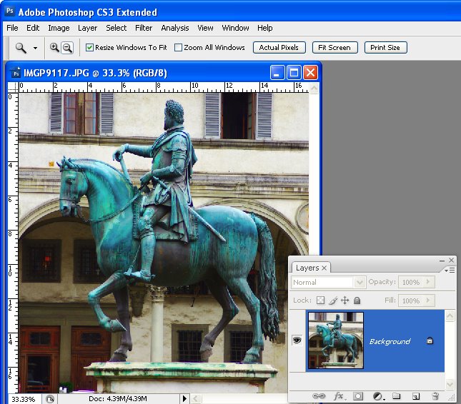
Now create a flattened version of the image either by flattening or merging all the layers or press Ctrl + Alt + Shift + E (Command + Option + Shift + E on the Mac) to create a flattened layer at the top of the image. The Unsharp mask works only on the current layer so you need to have the image on a single layer for it to do its work.


Step 2
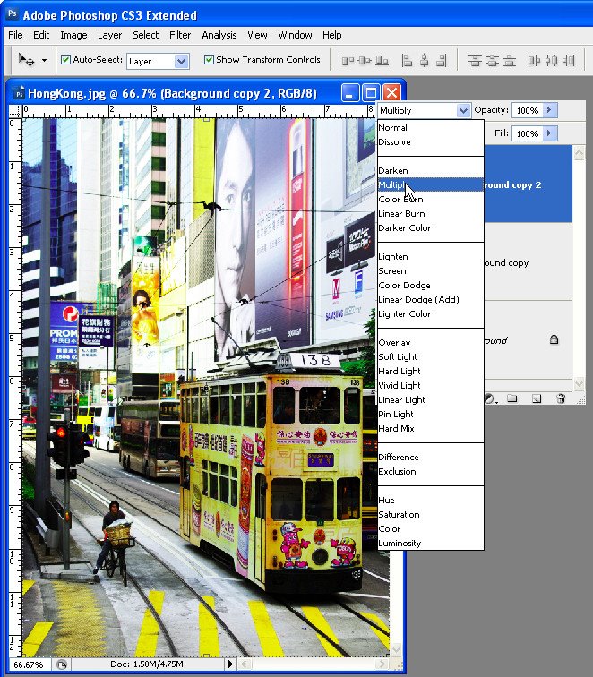
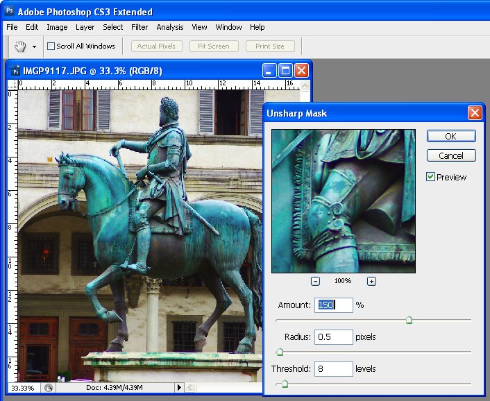
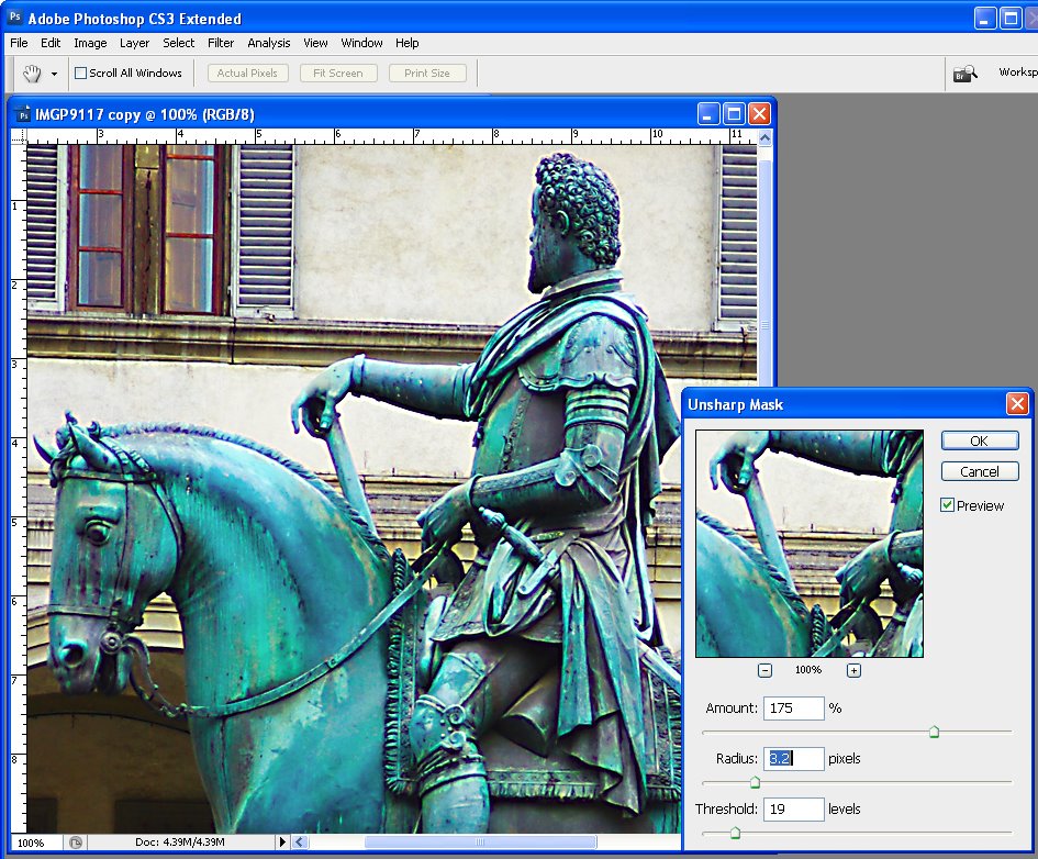
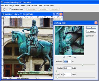
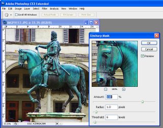
Choose Filter > Sharpen > Unsharp Mask. Set the Radius to somewhere between .5 and 1. This sets the width of the halos which are applied along the edges in the image – the smaller the radius, the smaller the halo and 0.5 – 1 is ideal – this is not always a situation where the more is better!

Set the Threshold to around 10. The Threshold value determines how edges are found – the higher the value, the more different adjacent pixels must be to be considered an edge so less of the image will be sharpened. A small value means that smaller differences in pixel values are considered an edge so more of the image is sharpened. The risk with a small Threshold value is that it can add noise to the image by enhancing edges in places where you don’t want to see them.

The Amount setting controls how much contrast is added to the edges – a higher value means more contrast and a more obvious sharpening. Start by setting this value to around 150.


Step 3
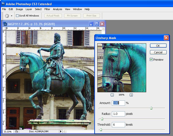
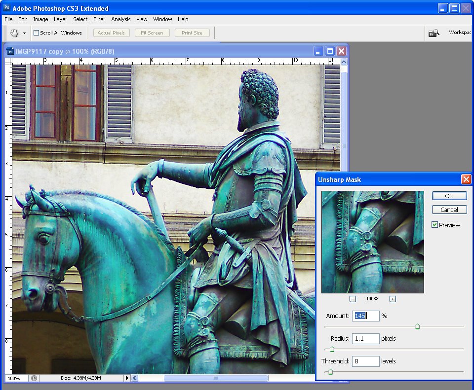
Take a look at your image and adjust the sliders from this starting point until you see more detail in the edges in the image but not so much that you see unattractive halos around the edges.

Typically, if you have an image with a lot of very fine detail you can use a very small radius value (so the halos are small) and a correspondingly high Amount value (so that the halos can be seen to sharpen the image). On the other hand, if you have an image without a lot of fine detail can use a larger radius say, 1 – 1.5 or more (which gives larger halos), and a smaller Amount setting because the halos will be bigger and more visible anyway.

Adjust the Threshold value so you get sharpening in the areas you are interested in being crisper but not so that it results in unwanted noise in the image.


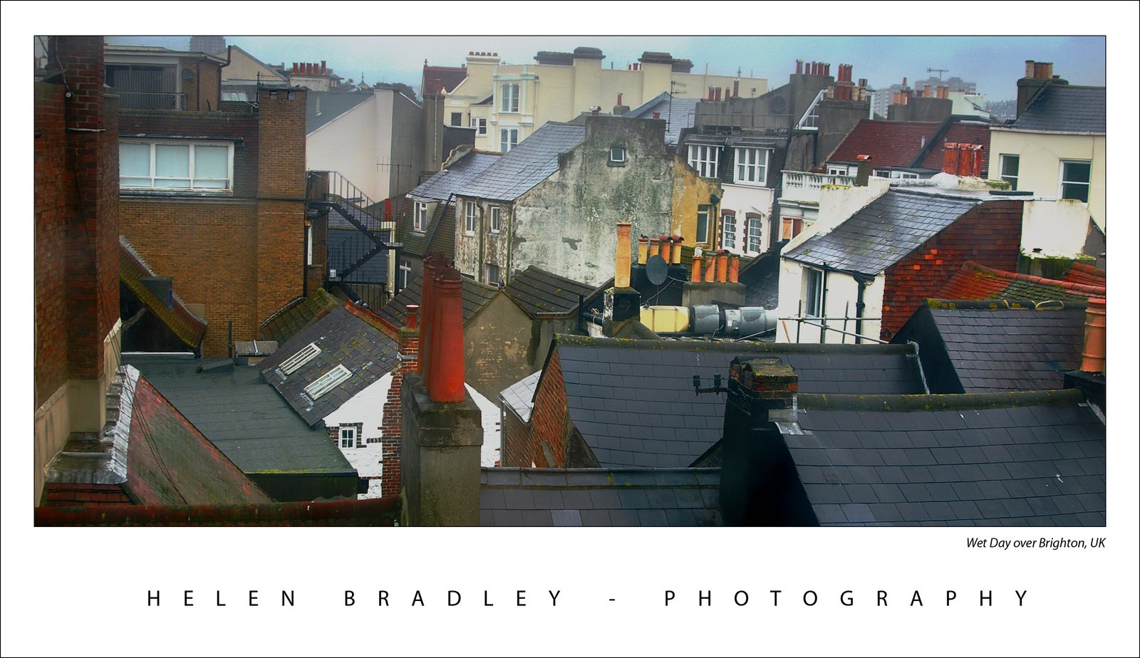
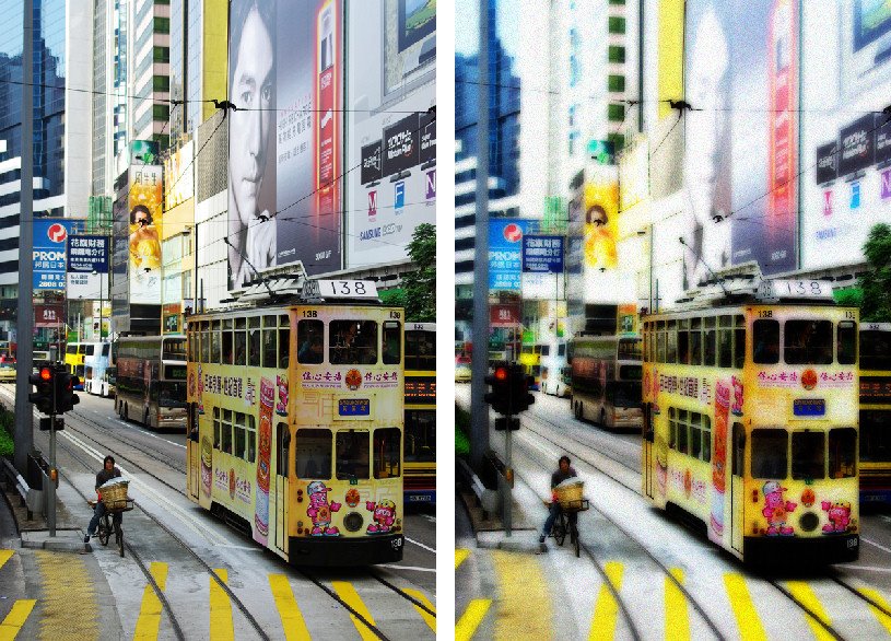
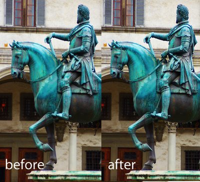
This image is nicely sharpened – you can see the crisper edges.


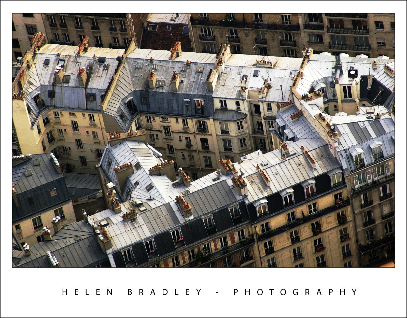
This image is over sharpened – notice the unsightly halos around the edges.

Tips
It is generally advisable to view the image at 100% when you are sharpening it so you can see the effect on the image. You can do this by sizing the image to 100% before launching the Unsharp mask tool. Alternately, use the 100% preview in the Unsharp mask dialog –click on the preview to see the unaltered image so you can compare it with the preview..

When you are sharpening for printing you can generally sharpen more heavily than you should do for onscreen viewing.

There are other sharpening tools available in Photoshop CS2 and later which do an even better job of sharpening than the Unsharp mask. I’ll look at these tools in a future post. For now, regardless of which graphics editor you use, you should have an Unsharp mask tool and it should work in a similar way to the Photoshop Unsharp mask shown here.

Helen Bradley

Page 2 of 3123