Thursday, July 5th, 2012

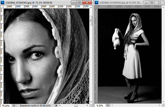
Trevor’s tip of the Week – One image, two Windows

(photo by: Belovodchenko Anton)

When doing detailed work, such as sharpening or color correction, on an image it’s important to see how your changes affect the whole image.  You can do this by having the same image appear in two separate windows.  All you need to do is select an image, go to Window > Arrange, and there will be a New Window for <image name> option at the bottom of the drop down menu.  Click to select it and you now have the same image in two windows that you can size and edit separately.

Helen Bradley

Tuesday, July 3rd, 2012

Make a Website a Chrome App

I’ve been working with Google Chrome a lot lately because it makes good sense as a Browser. I have my assistant to thank for this as, without his continual poking and prodding to explore Chrome I probably would not have got there as quickly as I did.

One of the nice things about Chrome is its integration with Google+. However it’s not Google+ that I plan talking about here but rather I want to show you how to add a website as an app to Chrome.

If you click the New Tab icon in Chrome and then click Apps at the foot of the page you’ll see that there are some apps already in the list such as YouTube, Gmail and so on. What I am going to show you is how to add your own choice of websites as apps and to do it quickly and easily.
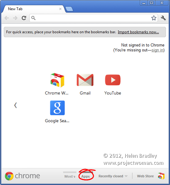
You may already know that you can create an app from a Most Visited page. Click Most Visited at the foot of the New tab and anything that’s in that list can be easily created as an App by just dragging and dropping it onto the Apps icon. This automatically makes the page an App.

The problem is that if something isn’t a Most Visited page it’s a little cumbersome to make it an App. The solution is to click the New Tab icon and display the Apps page. Size your browser down so that you can see everything clearly.

Now click the New Tab icon again and this time browse to the page that you want to add as an App. Once you’ve visited that page drag the tab for that page somewhere else on the screen so that you have two browser windows – one showing the Apps area and the other one with your web page open in it.

Now locate the icon immediately to the left of the page URL that you want to add as an app. As you hold your mouse over it, it will show View Site Information as a tooltip.

Drag and drop this into the Apps area in your Chrome browser. It will automatically be added as a new App. You can then drag and drop that App or any others to rearrange them to suit.
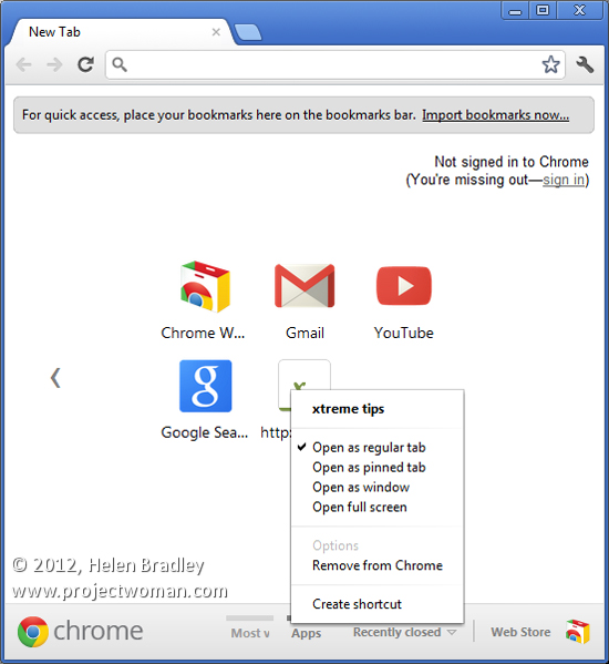
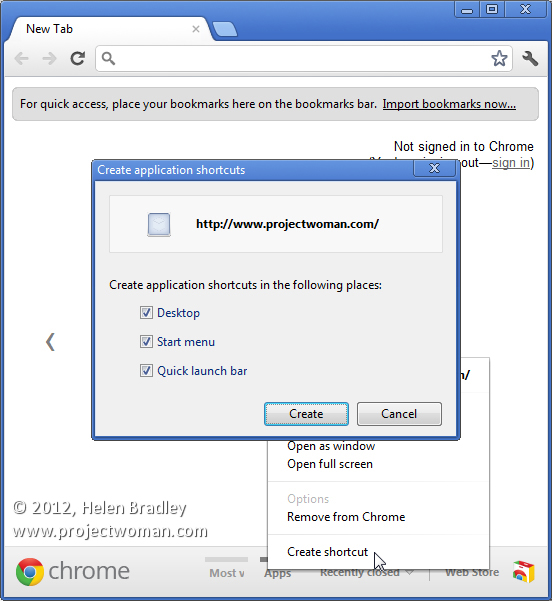
An app can also be created as a Desktop, Taskbar or Start Menu shortcut. To do this right click the web page in the Apps area and choose Create Shortcut. You’ll get a series of shortcut options including Desktop, Start Menu and Pin to Taskbar. Select the checkboxes for those that you want to create and click Create.
There’s a lot of misinformation on the web regarding adding websites to the Chrome apps collection. A lot of sites suggest you repeatedly remove Most Visited pages until you get to the page that you want to add. This solution which involves simply dragging and dropping a URL into the page is far quicker and makes a lot more sense.

Helen Bradley
Tuesday, July 3rd, 2012

Illustrator – Trace & Color with Live Trace & Kuler

How to use Live Trace to trace an image and how to recolor it once traced and how to harness the power of Kuler to recolor it with a color scheme.

Check out the rest of or tutorials on our YouTube channel.

Helen Bradley

Tuesday, July 3rd, 2012

Photographing in Black and White Part 7 Your Digital Workspace

You can learn a lot about black and white photography using your favourite photo editing program as most have tools for converting from colour to black and white.

Avoid the adjustments that do the work for you such as by choosing Image > Mode > Grayscale as you won’t be able to make any creative changes to the image.

Instead, in Photoshop Elements, choose Enhance > Convert to Black and White and experiment with the sliders and options. There are different options down the left of the screen to select from and you can then adjust the red, green and blue sliders to fine tune the result.

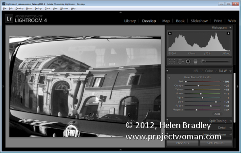
In Photoshop, choose Layers > New Adjustment Layer > Black & White and adjust the sliders for the colors – this lets you control how the colours are converted to either black or white. In this way you can separate colors like Green and Red for example making them significantly different to what they would look if you do a regular conversion.

For more information on making a detailed colour to black and white conversion in Photoshop Elements visit this blog post: An Adjustable Black and White conversion http://projectwoman.com/2009/08/an-adjustable-black-and-white-conversion.html

In Lightroom and in Adobe Camera Raw you can convert to black and white and then adjust the color sliders to create a good looking black and white image.

Helen Bradley

Tuesday, July 3rd, 2012

Clean up scanned line drawings in Photoshop


We hand draw a lot of images that you can buy and use as borders for your photos. These scanned sketches need to be cleaned up before selling them as there is often some residual mess from the scanning process.

Some of this might be dust on the scanner glass and occasionally we get small ink dots on the paper.

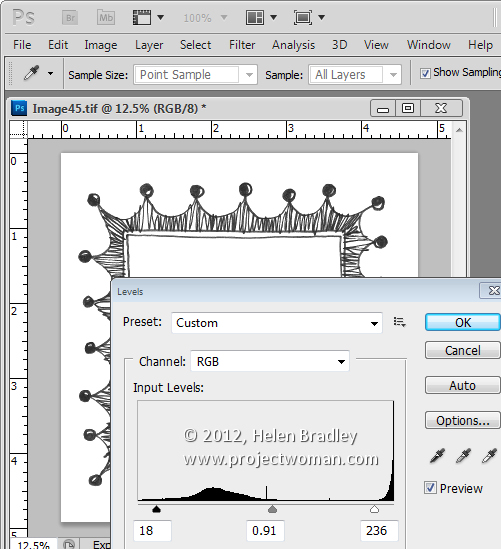
To remove these flaws from the scans once the scans have been made, we use Image > Adjustments > Levels and drag inwards at both ends of the slider to make the blacks blacker and the lights lighter. Sometimes a midtones adjustment is made to darken the blacks too. This fix gets rid of any small discolorations on the paper.


Then obvious problems can be fixed by painting over them with a white brush.

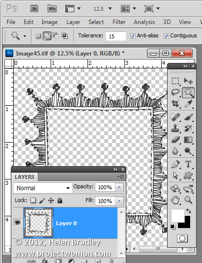
One other way to clean up when you got black line art on white paper is to make a selection of the white content. Start by making the background layer a regular layer by double clicking on it in the Layers palette. Set the Tolerance for the Magic Wand to ten or fifteen and click on the white areas to select all the white content. Then delete by pressing Delete.


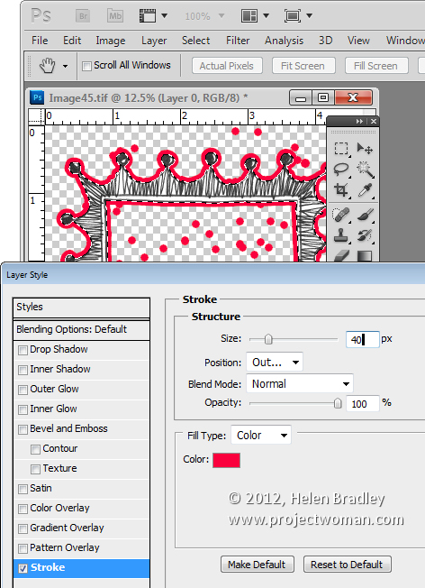
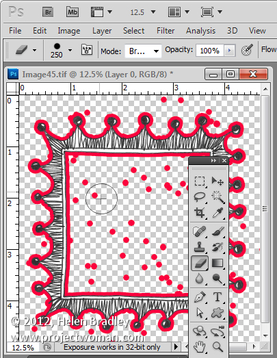
Now click the Add a Layer Style icon at the foot of the Layer palette. Choose Stroke and create a stroke that is red in color and quite big – just how big depends on the image – here mine is 40 pixels in size.


What this stroke does is to identify where the spots are on your image. Everywhere there’s a red dot on the image there is a stray tiny black or colored dot on the image itself – right in the middle of the red dot. It is this dot that is surrounded by your coloured stroke and the colour just makes it easier to find and fix it.

Grab a small hard edge eraser and start erasing the problem areas. All you need to do is to click in the middle of a dot and the problem will disappear. Make sure not to get too close to the lines if yours are uneven as there will be some natural bumps in hand-drawn images but you don’t want too much.


When you’re done and everything is nice and clean drag and drop the stroke layer into the trashcan.

Then you can put fill the areas you want to fill back with white by setting white as the foreground color and use the paint bucket to fill the empty spaces with white. Alternately add a white filled layer below your image and merge the two layers together.

If you like this frame, it and others are for sale for less than a buck for 10 here.

Helen Bradley

Page 3 of 3123