Wide angle lenses come in two types, some are wide angle and some are fisheye. I have a fisheye and from my experiences recently with it, I am tempted to buy the other type – not because I don’t like the fisheye, but because I see the possibilities with a wide angle lens.
Where I use a wide angle is when I have a lot of stuff in front of me – generally high things and where it just doesn’t fit in the screen.
These next images are from the Avon Aqueduct in Scotland. It is high and wide – impossible to capture without a wide angle, but with a wide angle lens everything fits nicely and you get an idea of the scope of the structure.
Now on the top of the aqueduct, which by the way is a canal for boats, the view is expansive. Huge, wide, diverse and you really want everything in the one shot if you can. Here, again, the wide angle saves the day and lets you get plenty of the scene in your shot.
In fact, this trip to Scotland, I pulled the wide angle out a few times. Tall buildings, streetscapes and bridges all got captured with it. I love the curve you get with the fisheye but I’d like the option to just get a wide shot without the bulge sometimes.
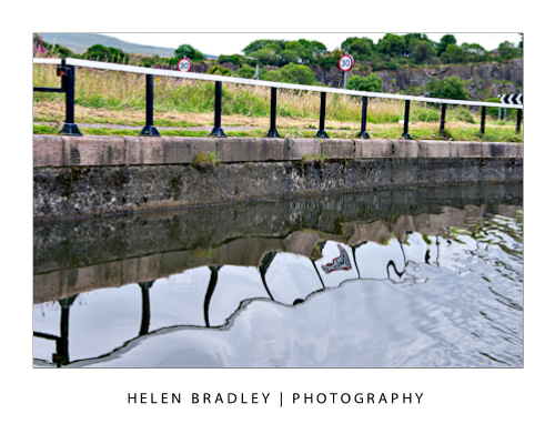
I really cannot emphasise too much how reflections can help you capture wonderful images. They can make even the most ugly objects like discarded road signs and rusty fences look great. It seems that anything reflected seems to grow an immediate charm factor and you can take advantage of this.
In this image, the traffic cone caught my eye so that made the subject something to look at. Perched on the old fence and standing in the canal it had a certain charm. Then the reflection made the shot. If I could pull it all together I had a worthwhile image. I like the result.
When you are out, look for reflections – you will find them in water and in shop windows, in car windows and all sorts of places you might not think of but they are there.
Learn how to use Distort filters to create a cool sunburst in Photoshop.
Check out all our tutorials on our YouTube channel.
Complete transcript of this video:
Hello, I’m Helen Bradley. Welcome to this video tutorial. In this tutorial I’m going to show you how to create a quick and easy sunburst in Photoshop. To create my sunburst I’m going to start with a new image. I’m going to make mine 3,000 x 3,000 pixels in size so it’s a reasonable size. I’ve yellow selected as my foreground color. I’m just selecting the Rectangular Marquee Tool and just selecting about half of this image and filling it with the foreground column by pressing Alt Backspace on the PC, Option Delete on the Mac. I’m going to do Select Inverse so that I have the other half of the image selected. Again, I’ll select white as my foreground color and fill it with that color and then Ctrl or Command D to deselect the selection. So all I have right now is an image where half of it is yellow and half of it is white and it’s all on one layer. To distort it I’m going to start with the Filter Distort Wave, and that’s the first part of my sunburst. I’ll select Square as the type. And now I’m going to set the Wavelength. And you’ll find that the larger you set the Wavelength you get more of these stripes. Don’t worry that they don’t extend yet. What you’re worried about at this stage is the number of them. So I want about that number of stripes. Now I’m going to increase the Amplitude until I get stripes all across my image. So all I’m doing is square, equal values or nearly equal values for Wavelength and then adjusting the Amplitude until I get what I want in this little diagram here in this little preview window. And then I’m just going to click Ok. Before I leave here I’m just going to make sure that I Crop this because what I want is the exact same starting point and ending point. So here I’m starting on an orange stripe and I’m going to end over here on a white stripe. I’m just going to make sure that I have a pretty good crop here because that will make my wraparound work well in the next step. And the next step is to use the Filters again. We’ll choose Filter, and again this Distort option, but we want Polar Coordinates. And all I do is select the Polar to Rectangular or Rectangular to Polar that gives me the effect. If you don’t remember which one to use just flick between the two because it’s going to be really obvious which one gives you your sunburst and which one doesn’t. And obviously Rectangular To Polar is what I want so I’ll just click Ok. And here is my sunburst shape. It really is as easy as that. And I have a silhouette because I love to use silhouettes with sunburst shapes. So let’s just drag and drop a silhouette layer into here and then we can size it to suit. Now you can do all sorts of things with your sunburst effects. We could grunge this. We could texturize it. We could do all sorts of things with it. But to create it is as simple as a layer that is half of one color, half of the other color. Then you’ll Filter Distort, Wave to create a series off stripes, then you’ll Crop it so that you get the beginning of a stripe on one side and the end of the corresponding stripe on the other side. So you get this seamless sort of sunburst effect and you don’t have one really large stripe and then use Filter Distort Polar Coordinates to rotate it around. So there you have a sunburst effect in Photoshop.
I’ve been photographing recently on the canals of Scotland. There has been so much potential for creative stuff I have really been glad that I photograph so regularly and I’m so familiar with my lenses and camera that I don’t worry too much about setup and can spend more time on the creative side.
Here I had photographed these industrial buildings already and I knew there were steers in the field but nothing had quite come into position. The secret is to wait, somehow if you wait, chances are that things just move to where you want them. This field had wonderful colourful scrub, green grass, black and white (friesian) steers and buildings belching smoke in the background. I just had to wait till everything lined up and, in time, it did.
So far as apertures are concerned this is a hard shot to get everything all in focus. It is just too much depth and it was early evening so the light was low. I settled for what I generally use when I want a big depth of field which is around 7.1 or 8 and then I focused on the steer. This brought the industry on the horizon into some focus but threw the flowers close to me out of focus. There was no where to move to as I was standing in the only place I could get everything in the picture and that put some flowers directly in front of my camera.
Turns out I love the effect and the colours in the foreground just work for me. The layers in the image from the out of focus flowers through the field and the steer and back to the industry on the horizon just makes this image for me.
Next time you are out, look for layers to capture. Look for something interesting to shoot and then ask yourself how can you position yourself to capture the shot and get some foreground interest too. You might be surprised at what you can find and what creative opportunities you encounter.
I got caught recently photographing in Scotland. While I had packed 2 more lenses than I ususally travel with – usually it is only one – I forewent the tripod – I do have my limits and I was spending 6 nights on a 6 foot wide narrowboat on the canals so to say that space was at a premium is an understatement. So, night one of the trip we are moored at the Falkirk Wheel. This huge monolith lifts boats using a rotating wheel up 80 feet or so from one canal to another. It’s big and beautiful and very kindly the guys at the wheel turned the lights on for me so I could photograph it. So, there I was late at night, the weater was cold but luckily pretty still but I really needed a tripod. There was nothing around to sit the camera on so I braced myself and got off a few shots, not too shabby in the circumstance – the lights were great but I love to get something just a bit different.
So here’s what happened – I had spent the afternoon photographing some kelpie statues – these are creatures with horse like heads and dragon like tails. In this case there were only the heads and they were sitting on a boat in the mooring pond at the foot of the wheel – funky stuff. At night it made a perfect focal point for my shots – but still the problem of no tripod. Now there is a flash curtain setting on most cameras – you typically have a front and a read curtain sync flash. Essentially what it gives you is a combination of both a flash and a long exposure – the front and rear bit is when the flash fires – the beginning or the end of the exposure.
So, I could use the flash to capture the statues and the long exposure to capture the lights. Because the sculptures were so dark they didn’t get caught in the long exposure but they were frozen in the flash. Having shot a few test shots, I thought it needed just a bit more so I combined the flash and long exposure and at the same time I moved the camera.
So, the kelpie (horse) statues are lit and they are sharp, the lights are caught but moving and out of focus – and because the statues are little bits of metal welded together with holes in them, the light show through and over them. All in all I called that a technical challenge well met and an ace final result.
A word of caution. The solution to this problem required me to have played with the flash in the past so I understood the curtain sync process, it also helped that I’d played a bit with moving the camera so I could forsee what that might give me. So, as always it will pay to learn to use your camera features before you really need to put them to use.
Then pure luck put the statues there (they get moved around a bit) and it got my host Nick to call the wheel guys and get the lights turned on and Irene to wake me and tell me the lights were on – an all round community effort which paid off with some shots I love.
Learn the Illustrator Pen Tool to draw a folk art shaped heart. You’ll learn how to draw with the Pen tool, how to know which way to drag to make a shape and how to adjust the path when done. Also shows using the Twirl, Scallop and Crystallize tools.
Hello, I’m Helen Bradley. Welcome to this video tutorial. In this tutorial I’m going to show you how you can use the Illustrator pen tool to draw a folk art heart. I’m going to focus on how to use the pen tool for people who haven’t used the pen tool very much before. And in the process we’re going to create an interesting heart shape that could be used for a lot of things including adapted for use in one of my other tutorials which shows you how to create a half drop repeating pattern. But let’s get started on the folk art heart. I’m going to show you how to use the pen tool here to make a folk art heart. So we’re going to click the pen tool to begin with and we’re going to draw the heart shape. I’m going to start with some color though because it would be really nice to see this heart as we make it. So I’m going to give it a dark pink fill and I’m going to make a darker pink for its stroke. Let’s take this pink and let’s just adjust it a little bit. I’ll double click on it and let’s make it a bit darker. And we’ll give it a bit of a weighted stroke as well, let’s say 5 points. I think this document is a letter size sheet of paper so this should be a pretty good start. So with the pen tool selected I’m going to click and drag. So my first point is going to be at the sort of bendy bit of the heart, so I’m going to click and drag. And I’m dragging up here in the direction that I want to go in, and then I’m going to let go. Now my paper on art board has taken off so I’m just holding the spacebar down to move it back into position. I haven’t lost my pen tool or my shape. I’m all ready to go and do the next bit. Now having gone up here the next point I want is about here. So look at my heart shape. I’m going down towards here. So I’m going to click here and drag in the direction I want to go in, and I’m going all the way down to the bottom pointy bit off my heart. I still haven’t let go of the mouse button. I’m not overly worried about the shape. I’d like it to sort of look heart shape, but I can fine-tune it later on. Now I’m letting go the mouse button. The next bit I need to focus on is where I want the pointy bit. And the pointy bit because it is going to be pointy, I want it to come down, point and up again, I’m just going to click. So I’m thinking about here is a good spot so one click is all I need. And now I have half my heart shape. Now I could do all sorts of things like flip this over and join it back together again, but this is a folk art heart so it’s supposed to be uneven. So the next point is going to be up here somewhere and I’m going to be drawing in this direction. So I’m going to click here and drag in the direction that I want this line to go, click, drag. You can see if I went the other way my line wouldn’t go the way I want it to, so I have to click and drag up towards the top right hand corner of this art board. And I’m just going to shape it as I go. And I think that’s a nice sort of shape. I’m going to now let go the left mouse button. And here’s the next piece of our heart shape. The last piece is the final piece, and I’m just going to click here to finish off. And there’s the end of my heart. This is a closed shape, so if I click the move tool or press V to move I can now move my heart around. And I can also adjust it with this tool, the Direct Selection or A tool. And what I do with that tool is just drag over a point on the heart that I want to adjust, and then I can pull it into a different position and I can reshape the curve. And if I want these handles to work independently of each other they will. All I need to do is hold my mouse pointer over the handle and hold the Alt or Option key so it gets that little plus symbol beside it. That means that these handles will now operate independently of each other. And sometimes that allows you to create something that you wouldn’t otherwise be able to create. Now I want as I said a sort of folk art style heart so I want a beefy side and a less beefy side. Now I’ve got the Direct Selection Tool selected but you can see that when I’m dragging on it I’m actually dragging on the path. That’s because I don’t have just this point selected. To do that I just drag over this point, and when these are hollow boxes and this is a filled one it tells me that I’m working on this point alone. And I’m going to call this good. This is now my folk art heart shade. Now because it’s a shape in Illustrator we can do some other things to it. So let’s look quickly at how we might decorate this heart using some of Illustrator’s tools. There are some fun tools in Illustrator that you can use to work on this heart a little bit to give it a more sculptured look. For example there’s the Twirl tool. Now I’m going to select the Twirl tool. My brush is pretty big. So I’m going to Alt or Option drag on it, and I’m dragging down towards the bottom left corner of the image to make the shape a little bit smaller. That’s a good sort of shape for this brush. And now I’m just going to twirl. Now I twirled a little bit too much there so that you really can’t see what I’ve done. What happens when I use the Twirl tool is that it twirls the edge of this shape. So I could create my heart with a twirled edge by just twirling this edge with this brush. Now I’m pressing Ctrl or Command Z to undo that if I don’t like the twirl. So I’ve just got my fingers over Ctrl or Command Z so I can undo a twirl if it’s not to my liking. So that’s one way that we could decorate the edges of this heart. We could also use tools such as the Scallop Tool, and scallop will allow us to scallop the edges off this heart. But I’m thinking that I don’t have nearly a big enough brush here. So I’m going to Alt or Option drag towards the top corner of this image, the top right hand corner, and see if that’s a better option for the Scallop Tool. And I can pull out the edges of the heart. Now it’s not looking particularly effective on this heart shape but for other shapes it may be of interest to you. Let’s have a look and see what the Crystallize Tool will give us. This will give us some crystallized edges. So in actual fact for this heart that may work reasonably well. Let’s just undo it and have another shot at it. I’m just going to click and drag as I click. So undo it again, click and drag and just see if that’s going to give me anything of interest. The other tool I could choose is this Wrinkle Tool, and that will wrinkle the edges as well. So we could run that around the edges of the heart if that was the effect that we were looking at. But there are some interesting tools here that having drawn your heart shape you could now come and do something a little more interesting with it. This might do for somebody who’s trying to illustrate something on say looking after someone’s heart because we’re getting almost a sort of blood pressure reading or heart pressure reading effect around the edge of the heart. So there are a whole heap of tools here that you can use. Having already created your heart with the pen tool it can now be adjusted because it is a vector object in Illustrator using all these tools.
You can learn a lot about black and white photography using your favourite photo editing program as most have tools for converting from colour to black and white.
Avoid the adjustments that do the work for you such as by choosing Image > Mode > Grayscale as you won’t be able to make any creative changes to the image.
Instead, in Photoshop Elements, choose Enhance > Convert to Black and White and experiment with the sliders and options. There are different options down the left of the screen to select from and you can then adjust the red, green and blue sliders to fine tune the result.
In Photoshop, choose Layers > New Adjustment Layer > Black & White and adjust the sliders for the colors – this lets you control how the colours are converted to either black or white. In this way you can separate colors like Green and Red for example making them significantly different to what they would look if you do a regular conversion.
In Lightroom and in Adobe Camera Raw you can convert to black and white and then adjust the color sliders to create a good looking black and white image.
Traditionally, when shooting with black and white film, photographers use filters to enhance the colours in the image.
Using red, yellow or orange filters when shooting landscapes or shots where the sky has interesting detail can help darken the blues in the sky giving them more punch than they would otherwise have.
You can purchase coloured filters that screw onto the lens of a digital SLR or which can be placed over the lens of a point-and-shoot camera using an adaptor ring.
The images captured with these filters will show different conversion of colours to black and white than you would see if you were to shoot in regular black and white without the filter.
The image at the top shows two different renderings of a single image the first with a red filter and the second with a blue filter.
A quick tip for Photoshop that will save you some time. To see an image at 100% size all you have to do is double click the zoom button in the tool bar.
The same rules for composing an image in colour apply when you are shooting in black and white. Make sure the subject of the photo is placed in an interesting position in the shot, make sure the camera is square to the horizon and that the subject is in focus.
When you are photographing in black and white pay attention to how the colours are converted.
Some colour pairs like green and red which contrast so strongly in colour photos convert to the same shade of grey in a black and white image. Depending on what you are shooting this can be an advantage or a disadvantage.
In the image above the solid black of the nuns’ habits ensures that the image will be a strong one and placing the subjects off center makes the image more dynamic.
If you are unsure how the image will convert, check the camera’s viewfinder or on a digital SLR take a reference shot and look at the result in the LCD screen to evaluate the composition and to check that what you are seeing in the scene will render well in black and white.


