Monday, January 12th, 2009

Free Photoshop Brushes

Yup, I am a certified brush junkie and I just love free downloadable Photoshop brushes. However, I’m also a designer so I need to know what I can use for my designs and what I can only use for personal projects.

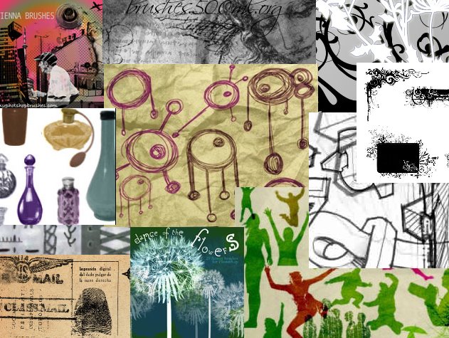
So.. I created this web page with a list of my favorite brushes. You get to see pictures of the brush sets, you get some detail about the set and the all important licence information. Click any of the links or the images themselves to go direct to the web site to download the brushes you like.

It’s all too easy and, best of all, I’ll be updating the page regularly so you’ll always find something new in the list and I’ll be adding links to my own custom brush sets so you can download them too.

If you have a favorite brush set you think I should include in the list, send me an email to helen(at)helenbradley.com, tell me about the set and give me the download link. If I like it, I’ll add it to the list and credit you for finding it.

You can also get regular updates on my favorite brushes by following me on Twitter. I post a new set nearly every other day.

Helen Bradley

Thursday, January 8th, 2009

Turn daylight into sunset


The Photoshop Color Match tool lets you borrow the color from one image and use it to recolor another one. So, for example, if you have an image shot in daylight that you want to make look more like a photo taken at sunset, Color Match can do all the work for you.

Open the two images in Photoshop – the image to change and an image shot at sunset which contains good sunset colors. It doesn’t matter what the sunset image looks like – it doesn’t have to be in focus or nicely shot – all you need is good sunset colors.

Click on the image to convert to a sunset image and choose Image > Adjustments > Match Color. From the Source dropdown list select the image that you will be borrowing the colors from. This automatically recolors your photo to match the sunset image’s colors more closely.

You probably won’t get a perfect result just from doing this so now adjust the Color Intensity, Luminance and Fade sliders until you get a result that you like. The Color Intensity slider adjusts the color saturation, the Luminance slider lets you adjust the brightness of the effect, and the Fade slider fades the effect to blends it back into the original image.

In some circumstances choosing the Neutralize checkbox may also give good results.

Click Ok when you are done.

Helen Bradley

Wednesday, December 10th, 2008

Curves + Luminosity = Better Tones.


In the last blog entry I mentioned some cool things you can find in the Curves dialog that help you adjust the tonal range of your image. Today I’m going to show you how to wreck the color in an image in the name of improving tonal range.

The Curves dialog has four channel options – you can work on the RGB composite channel (the default), or you can work on the separate R, G or B channels. Problem is that although adjusting the R, G or B channels independently can help you improve the tonal range of the image – it can also totally mess with the color. For this reason, few users bother working with the individual channels. Makes good sense? No!

You see working with individual channels is a good fix. If the Red or Green channel lack contrast you can hype it up using a curves adjustment. You’ll mess up the color but, if you’re using an Adjustment Layer, you can simply change the blend mode of the adjustment layer to Luminosity and immediately the messed up color disappears and the adjustment is limited to luminosity only. Instant fix.

So, next time you need to apply a Curves adjustment, check the channels in the Channels palette. If you see a channel that lacks contrast – adjust it to add contrast to it. Then set the blend mode of the adjustment layer to Luminosity to remove the color problems you just created.

Helen Bradley

Sunday, December 7th, 2008

Where on the Curve are you?

The Curve dialog in Photoshop hides some surprise features that aren’t immediately apparent at first glance. In Photoshop CS3 and later, one surprise is that you now have the adjusters under the chart that you’re used to using in the Levels dialog inside Curves. So it’s easy to perform a Levels adjustment in Curves – the reverse isn’t true – Levels can’t do a Curves adjustment. So I don’t use Levels for increasing tonal range in my images anymore – Curves does everything I need.

Second tool is the sampler. If you want to add contrast in a particular area of an image it helps if you can find that area on the curve. Simple. Just move across and hold the left mouse button as you wave your mouse pointer over the area of your image to sample. When you do this, you’ll see a marker move along the curve showing you where those pixels are in the curve. This is the area you want to steepen – the steeper the curve, the more contrast in that area. So pull the curve above the area you want to affect upwards and pull the curve below that area downwards to steepen the curve and you’ll get more contrast in that area of the image.

To add markers to the curve – Control + Click (Command + Click on the Mac) on a point in the image and you will add a marker on the curve indicating exactly where those pixels are to be found. You can use the marker to anchor the curve so it doesn’t move when you pull the curve above or below it or drag on the marker to change the shape of the curve at that point.

Helen Bradley

Thursday, December 4th, 2008

Straightening images with Photoshop’s Lens correction tool


Let’s be honest, Photoshop’s tool for straightening an image sucks – well it would if it really were a tool – it’s not even that. It’s a cumbersome workaround.

Start with the Ruler tool (if you can find it – it’s stuck away under the Eyedropper) then ‘measure’ along the line you want to be horizontal. Then choose Image > Rotate Canvas > Arbitrary and accept the value for the angle – that’s what you used the Ruler tool to measure. Wow, that’s sophisticated – NOT! And it gets worse. While now have a ‘straight’ image, the edges look horrible. Grab the Crop tool and crop the image to remove the messy edges.

So, while there isn’t a tool, there is a slightly smarter workaround. Choose Filter > Distort > Lens Correction – ok, I promised it would be smarter – I didn’t say it would be any easier to remember where to find it.

In the Lens Correction dialog, drag on the Angle to straighten the image – best thing about this is that you get a grid to guide you. Then, drag the Scale slider upwards until the rough edges disappear. Then click Ok and you’re done.

So, there you have it, a one stop straightening tool – still sucks compared with programs like Paintshop Pro and Photoshop Elements which will straighten and crop in one step but it does it in one menu rather than 3 tools – I call it an improvement – just!

Helen Bradley

Saturday, November 29th, 2008

Smarter Photoshop Crop

Before (above), After (below)

There is more to Photoshop’s crop tool than meets the eye! Read on to learn everything you didn’t know about using it:

Shield color and opacity
When you click the crop tool and drag the crop marquee over an image in Photoshop you will see a shield around the area of the image that will be removed when you commit the change. You can change this shield color from the Tool Options bar to make it any color you want. For example, click in the color selector and make it white, gray, black. You can also Adjust the opacity of this shield to make it, for example, 100% so it totally masks out the unwanted area of the image. This lets you see more clearly the portion of the image you have selected.

Rotate your crop
Rotate the crop marquee by dragging on one of its handles to change the angle of the rectangle and make an angled crop from your image. This way you can make a diagonal crop without having to first rotate the image.

Perspective crop
This option is way too cool! Click the Perspective checkbox on the tool options bar and you can crop an image in perspective. So, drag the corner handles into any four sided shape you like – each corner operates independently of the others when this option is enabled. Then click the Commit button and the unwanted part of the image will be discarded and what remains will be reshaped and deliciously distorted to a rectangle.

You can use this feature to fix keystone perspective problems with images such as tall buildings (which tend to be wider at the base and narrower at the top) or you can use it for creative purposes.

So, next time you select the Crop tool, check out these features and put them to work on your images.

Helen Bradley

Friday, November 21st, 2008

Smarter Photoshop Crop


Before (above), After (below)


There is more to Photoshop’s crop tool than meets the eye! Read on to learn everything you didn’t know about using it:

Shield color and opacity
When you click the crop tool and drag the crop marquee over an image in Photoshop you will see a shield around the area of the image that will be removed when you commit the change. You can change this shield color from the Tool Options bar to make it any color you want. For example, click in the color selector and make it white, gray, black. You can also Adjust the opacity of this shield to make it, for example, 100% so it totally masks out the unwanted area of the image. This lets you see more clearly the portion of the image you have selected.

Rotate your crop
Rotate the crop marquee by dragging on one of its handles to change the angle of the rectangle and make an angled crop from your image. This way you can make a diagonal crop without having to first rotate the image.

Perspective crop
This option is way too cool! Click the Perspective checkbox on the tool options bar and you can crop an image in perspective. So, drag the corner handles into any four sided shape you like – each corner operates independently of the others when this option is enabled. Then click the Commit button and the unwanted part of the image will be discarded and what remains will be reshaped and deliciously distorted to a rectangle.

You can use this feature to fix keystone perspective problems with images such as tall buildings (which tend to be wider at the base and narrower at the top) or you can use it for creative purposes.

So, next time you select the Crop tool, check out these features and put them to work on your images.

Helen Bradley

Friday, November 14th, 2008

Vamoose the Grid – Photoshop Vanishing Point Filter

Ok, this one has had me stumped for forever. Problem is I really needed to solve it. You have used the Vanishing point filter in Photoshop to create a grid then you don’t want it any more.. perhaps because you want to show someone how to create the grid. So how do you get rid of it. Delete button? nah! doesn’t work. There isn’t an option in the filter for deleting the grid and starting over, at least I can’t find it. So, what’s a gal to do?

Answer is.. BACKSPACE. Who would have thought it, but it works. Click the panel of the grid you want to remove to select it and press Backspace and it is removed (so too are any grids built off this one). So, to remove the entire grid, select the first panel and press Backspace and all the other grids disappear.

Like so much in Photoshop, easy when you know how!

Helen Bradley

Tuesday, October 14th, 2008

Paint in color in Phothoshop with color brushes


If you ask most people they’ll tell you that brushes in Photoshop don’t paint in color. That’s not true. Brushes can paint in all sorts of colors when you know how.

To see this at work, select two colors in your color palette for foreground and background colors and display the brushes palette by choosing Window > Brushes. Click the Color Dynamics checkbox to make sure it is enabled. Drag the Foreground/Background Jitter to a high value and adjust the Hue jitter to a high value as well.

Click the Brush Tip Shape option and, if desired, adjust the spacing to get the best results. For example, if you want the shapes that you’re painting with the brush such as a leaf shape to be separated from each other choose a value higher than 100 percent.

In the Shaped Dynamics area, adjust the Size and Angle jitter, for example to angle the brush and change its size as you paint.

Now click back in the document and drag to paint. You’ll see that the shape that you are painting is rotated and sized because you are using size and angle jitter but it is also painted in color because of the hue jitter value. To get brighter results adjust the brightness jitter so you get some variety in brightness in the painted elements. Whatever the choices you make you’ll never again believe that you cannot paint in color in Photoshop.

Helen Bradley

Monday, August 25th, 2008

Lighten versus Screen in Photoshop


If you’re confused about the difference between the Lighten and Screen blend modes in Photoshop, here’s how they work:

The Lighten blend mode compares the pixels on the effected layers and selects the lightest to display.

The Screen blend mode multiples the pixel values on each layer and then takes the inverse so that the resulting image will always be lighter than the original.

So, use Screen mode on a duplicate of an image’s background layer to lighten the image – Lighten mode, in this situation, won’t have any effect on the image.

Helen Bradley

Page 21 of 23« First101920212223