Monday, October 22nd, 2007

Seagull at Brighton

As soon as I saw this image in the LCD screen on my Pentax *ist DS I knew I had a great shot. My only hope was that it would be in focus as it was a big ask to get the shot in focus as the bird flew in. After all, I could hardly ask it to hold the position or go back and do it again!

All the shot needed was some cropping and a little contrast enhancement. It’s one of those photos that keeps you coming back and taking more photos.

It’s a photo I’m proud to add to my Helen Bradley – Photography collection.

Helen Bradley

Sunday, October 21st, 2007

Image Autoentry – Word 2003

If there is an image that you typically use in a document such as your company logo you can create it so that it can be automatically inserted into your documents.

To start, first place the image into the document and size it and format it to suit your needs – this will include setting its Text Wrapping properties.

Now select the image and choose Insert > AutoText > New and type a descriptive word to describe the image such as logo. Click Ok.

In future, type the word logo and press F3 and the image will automatically appear in the document. This saves you from having to insert it and format it manually each time you need it. It’s a big time saver.

Helen Bradley

Friday, October 19th, 2007

Word 2007 – Tracking Moving changes

The new Office 2007 is packed full of great features and I’m finding that the more I work with it the more I like it.

Take Tracked Changes, for example. The Reviewing pane can now be placed vertically along the edge of the page (or horizontally, if you insist). I just find the vertical arrangement so much easier to work with.

Also Word now tracks moved text! Yes, you can grab a sentence or paragraph or more and move it from A to B in your document and Word knows you’ve done it and marks it with double strikethrough (where it has been removed from) and double underlining in the position it has been moved to. Neat stuff!

If you later Reject the move step Word checks to see if the moved text has been altered, and if it has it tells you this and asks you what version of the text you want to undo to. It’s smart and a much better solution than marking the text as being cut and inserted.

To use the feature, make sure you’re in Word 2007 mode and not Compatibility mode where you’re working on an older 2003 format document.

Helen Bradley

Friday, October 19th, 2007

4 Bridges – Paris

This photo was taken during a trip on the Seine on a boat. The circumstances were about the worst you could imagine for photography. Four hundred people jammed into a boat which was enclosed mostly by glass and steaming into the sun on a very smoggy Paris afternoon. Great.. the temptation was to put the camera away and start drinking – the effort of trying to take any photo at all was almost too much. My only clear view was out the side of the boat, past a very active four year old and her long suffering mother. It wasn’t my ideal “boat ride for taking photos”, but it came included in the Paris Pass and who knew it would be this horrible?

Like the intrepid photographer I am, however, I persisted and I did get some usable photos, albeit ones that required a bit of help. Like this one taken out the front of the boat through about half an inch of scratched Perspex.

It is a view through four of the wonderful Paris bridges that we sailed through. The photo needed a lot of work. I gave the sky a miss – it just wasn’t there and, in the final analysis, I think the image is all the better for it not even being there. The biggest challenge was to extract some of the usable color and detail from the original image. It was autumn in Paris so there were hints of golden trees in the image which deserved to be brought out and the bridges were what it was all about. The mere fact that you could see all four bridges was spectacular.

I started the work by straightening the image – I find I can’t work on an image until I have it straight, it just bothers my eye when it’s out of square. To do this, I use the Photoshop Ruler tool to draw a line along the horizon or a vertical object that needs to be perpendicular. Then I choose Image, Rotate Canvas, Arbitrary. The exact angle from the Ruler is already there so all you have to do is click Ok. It’s simple and effective. For this image I used the top of the bridge as a ‘horizon’.

A few tricks with Levels and curves and the image gave up its magic and turned into what you see here. It’s one of my favourite shots – so far.

Helen Bradley

Thursday, October 18th, 2007

Brighton Pier

Oh wow. I had all these photos of Brighton Pier. It was raining cats and dogs when I got there so I had to shoot everything with water dripping down my neck and trying desparately to keep water off the camera.

I though I’d probably lost out on good shots. Not so! A little fix here and there and I have some great results. I love this Caution, No Entry one. I had to adjust this image twice, once to bring in the pier and water/buildings detail and a second time to get the reflections in the timber pier flooring. I used a mask to bring in the bits I wanted to use. You wouldn’t believe what I started with and how far it came, so – just in case you’re interested, here’s a preview of the starting image:

Helen Bradley

Thursday, October 18th, 2007

Shopping for books by the Seine – No 2

I took yesterday’s image and decided I wanted to look at it another way. So, I cropped it horizontally this time and worked a lot with the colors. I wanted not only to crisp it up but to punch some of the colors.

I’m working on some notes from Dan Margulis from Photoshop World in Las Vegas – his 5 minutes to a picture postcard class.

One of the great tricks I learned there is using the Luminosity channel to add punch to a photo. The idea is to duplicate the main layer in the image and then select this duplicate layer. Then use the Apply Image command. It’s a command most people don’t use because it’s so damn obscure but I’ve used it quite a bit before and I love it. Here you apply a channel such as the Red, Green or Blue to the image but, after you’ve done this, instead of accepting the default blend mode in the Layers palette – which is Normal and which makes the image Greyscale, you use the Luminosity blend mode to take the contrast but drop the color.

It’s a great tool – it’s only one of Dan’s tricks but it is fun to play with. Use the Green channel for portraits and the red channel for skies.

I did a lot to this image to try and recover and enhance the color. I started out by balancing the color to remove the cast. Then used a range of tools including curves and apply image to try to punch up the color.

I quite like the result.

Helen Bradley

Thursday, October 18th, 2007

Paris – by the Seine

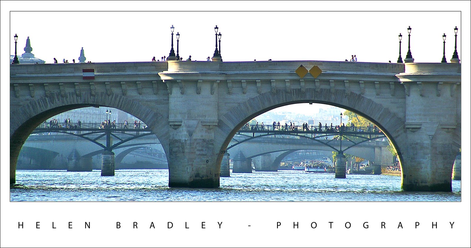
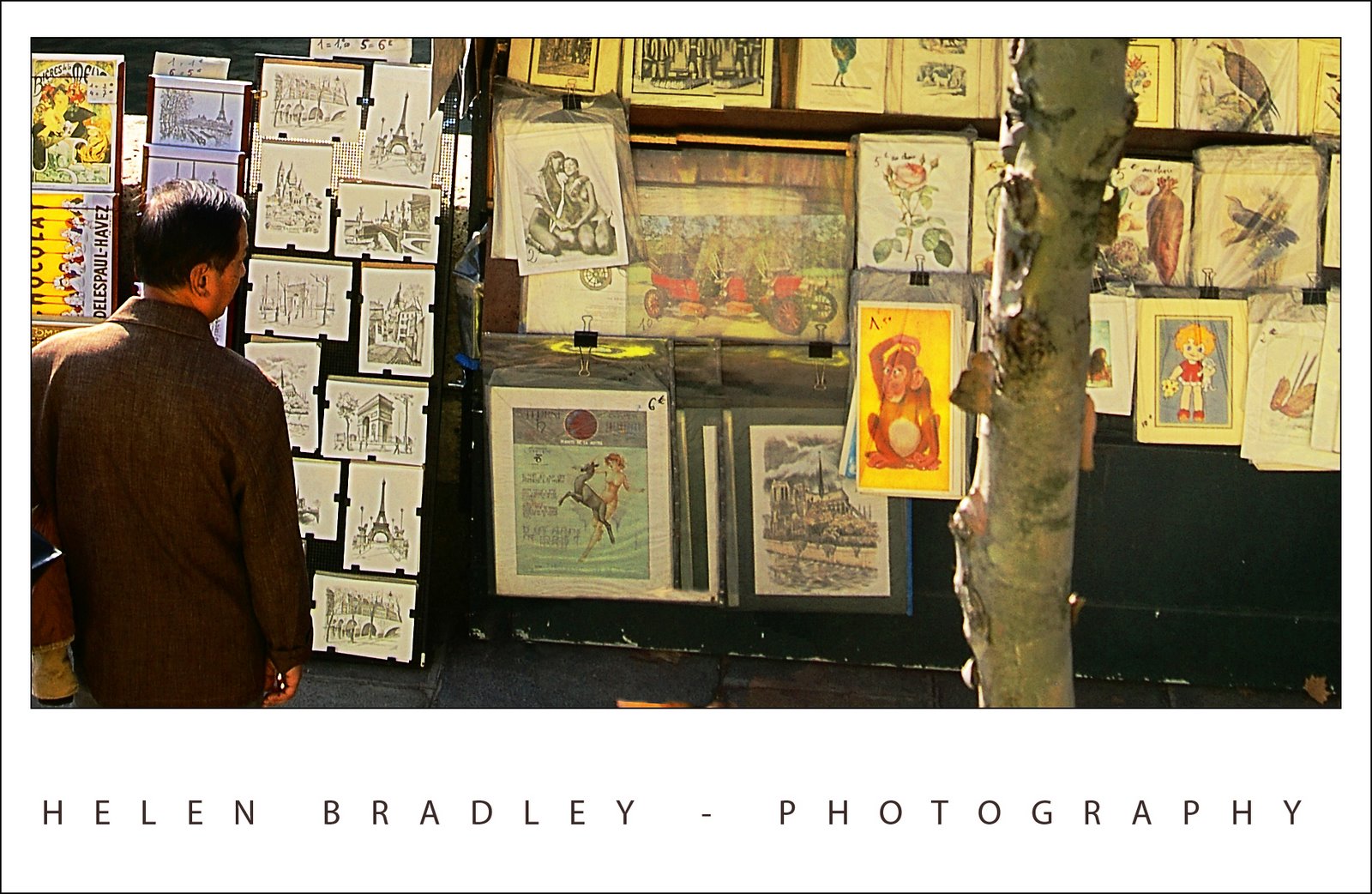
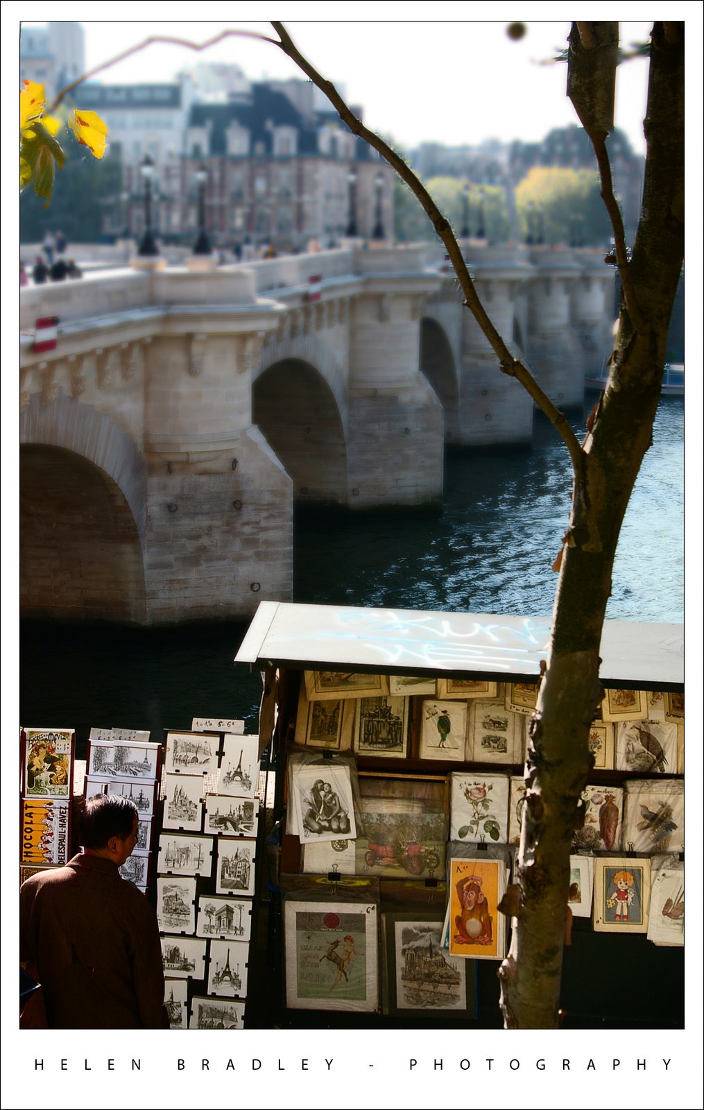
There are beautiful little boxes all along the Seine where they sell books and manuscripts and old post cards. A sunny Autumn afternoon is just the place to stroll and find some “must have” item.

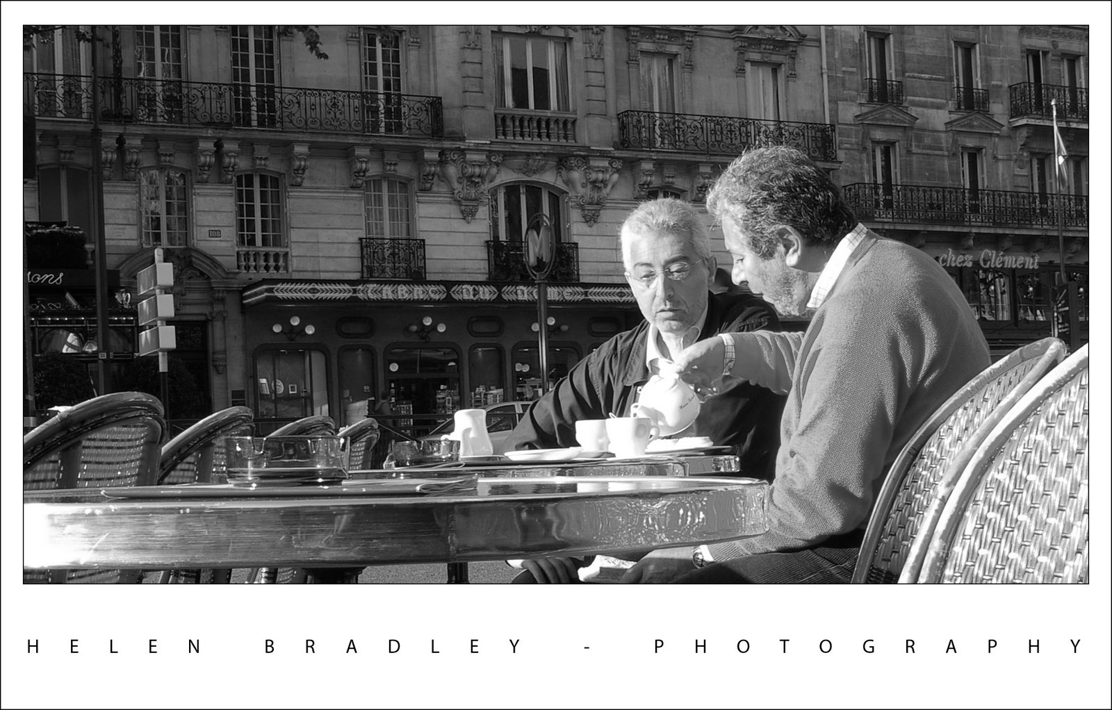
This photo underwent radical surgery. It is two photos blended together using Photoshop CS3’s new Auto Align layers and Auto blend layers tools. To do this, add one image’s background layer to the other. Select both layers and you’ll find the commands on the Edit menu. I did Auto align first. You might want to experiment with which layer you use as your topmost layer as the results differ. Then I did Auto Blend which makes a mask on each layer to bring in the bits it thinks you want from each layer. Remember you can click a mask to select it and then paint with white or black as required to reveal or hide detail on that layer – I did this as I wanted the guy in the image but needed to remove the other people who were in the originals.

Then I made a composite merged layer with my fave command CONTROL + ALT + SHIFT + E (Command + Option + Shift + E on the Mac). This gave me an image to work on the colors with. I’ll talk more about how to do that in another post.

Finally, to bring the attention to the bottom of the image (rather than the top), I created yet another merged layer, duplicated this and blurred the topmost layer. On the top layer I added a mask and a gradient fill using the Foreground to Background gradient. This resulted in the top of the image being nicely blurred and leaving the bottom in focus. I also picked out the tree and added it to the mask so it would be more in focus as it’s in the front of the image.

Finally, I added the small black border which defines the edge of the photo. To do this, choose Select, All and then Edit, Stroke and add a small 2 pixel black stroke around the Inside of the image. Add the white photo edge, the text and another small black border around the lot.

Sounds like a lot of work but once you’ve done it a few times it all happens pretty quickly. The worst part was the color correction as it is a bit fiddly.

Helen Bradley

Thursday, October 18th, 2007

Gotta love Paris

This photo captured me because of the shop’s wonderful name and the blue and red colours. It’s unexpected and funky.

The fixes included cropping it to remove excess and unwanted detail and colour correcting it to boost the colours in it. I also duplicated the final image layer, blurred the top layer then used a mask filled with a white to black gradient across the image to blur the right edge of the photo. I needed to also paint onto the mask to bring the tree back into focus.

It’s proof that even funky shots that you don’t think will amount to much can be great if you give them a chance to shine. I also love short wide crops.

Helen Bradley

Thursday, October 18th, 2007

Where did my Photoshop cursor go?

Ok. So this morning I went to do some work on my images from my trip and my Photoshop cursor went missing. All I had was a funky little cross hair thingie. It’s not a machine I use a lot so I thought it was just that the brush hadn’t been set correctly. Into Edit, Preferences and – well, all the brush settings look ok. So I try another brush option just in case. Same problem. Not good.

The solution is, luckily very simple. When you know how. It’s just a matter of pressing the Caps lock key. In fact, I suggest you do it right now so you know how it works. Choose a brush tip and press the Caps Lock key – voila, your cursor changes and disappears. Press it again and it comes back. That’s what happens, your Caps lock key toggles the brush tip display. So, when your brush tip goes west and you can’t see it so you have no idea how big it is or pretty much where it is, the Caps lock key is about to become your new best friend. Promise.

Helen Bradley

Wednesday, October 17th, 2007

Early morning Paris style

I’ve just returned from 10 days in Paris, London and the surprisingly wonderful Brighton.

I plan to display some of my photos as I fixed and work with them. Today, it’s two gentlemen at the cafe I stopped at for a Cafe Creme every morning in Montparnasse. This is the essence of what Paris means to me. Lazy mornings sipping great coffee. I will never again make the mistake of imagining for one minute that Starbucks has anything at all to do with good coffee!

The photo is pretty much unedited. It has been converted to black and white, straightened and cropped but that’s about it.

Helen Bradley

Page 2 of 3123