Learn to add multiple strokes to a shape in Illustrator
One way I force myself to extend my knowledge of Illustrator is to take an existing illustration and to try to reproduce it. I don’t use these for anything but for learning and improving my skills. It’s a great tool because, when you try to copy someone else’s illustration you have to work out how to do things you may not typically do. You can’t just fluff yourself off and do the same old thing – if you don’t know how to achieve an effect you have to think about the problem and work it out using your existing skills or go research solutions.
Today I’ve been working on shapes that have neat edges and, in particular shapes with solid edges and dots – all in the one shape!
Start by drawing your shape – mine was a speech bubble but you can do it with anything. Then add a fill color and a stroke – this stroke is the thick band around the shape so make it the right size for the edge effect.
Now open the Appearance panel and add a second stroke by choosing the Add New Stroke icon. Make sure this is the top stroke – if not you can drag it up as if it were a layer. In the Appearance panel select a different color for this stroke and size it smaller than the previous one. You can now make it dots by setting up the panel so it looks like this – just note that your gap value should be the same or just larger than the stroke to make dots and that the cap shape is rounded – to get dots!
So, you know how to make a sunburst in Illustrator – here’s how to color it
Some time ago I wrote a post and created a YouTube video to show how to make a sunburst in Illustrator. This is one of my most popular posts and the video has been popular too – seems like it really hit a spot with a lot of readers.
Now, today I received an email from a reader asking how to make the sunburst multicolored. Turns out it isn’t as simple as selecting a ray and recoloring it – because when you select one ray you select them all. However, once you know how to break them up, it works just fine.
To do this, follow the instructions to create the circle, add the dashed line, expand it, select the inside anchors and choose Path > Average. This gets the sunburst made.
Now, to break the shape up, select it and choose Object > Live Paint > Make. Now you can use the Live Paint Bucket tool to color each piece of the sunburst – or not. You see the Live Paint > Make command breaks up the shape (in a way that Object > Expand does not) so you can now select each ray in turn and color it.
If you want to see the change happen, watch the Layers palette when you do the Live Paint > Make command – it turns the compound path into a set of individual vector objects – just what you need to have to be able to recolor them. The plus is that once the shape is broken up like this you can recolor it in the usual way by selecting each shape and color it or you can use Live Paint. You get to choose which works best for you.
Now, one side effect of this is that the spaces between the rays is filled with color – typically white. So you can’t put a solid color behind the rays and have it show through. There is a solution – open the Layers palette and locate the filled white circle shape at the bottom of the expanded sunburst shapes and delete it. Once it is deleted you can add your own background filed shape behind the sunburst.
It’s one of those things that is simple when you know how but not immediately obvious how you do it.
Free Downloadable Illustrator Gradient Swatches for you to try
While Illustrator comes shipped with a range of gradient swatches you will probably find that there are never enough gradients for your needs. Luckily there are a few good quality freely downloadable gradient swatch sets that you can use to expand your Illustrator toolkit.
While there are a lot of gradient swatches you can download for Photoshop there are not a lot of free options for Illustrator. I’ve scoured the web to find you this collection – they all download and install correctly and they aren’t from spammy sites (some others not included here are from spurious sites – so beware!).
This selection of 48 vector gradients makes a good starter pack. There are some handy black and light colored gradients as well as a lot of green and blue ones too. If you’re looking for a simple collection of gradients to start off with this a good choice.
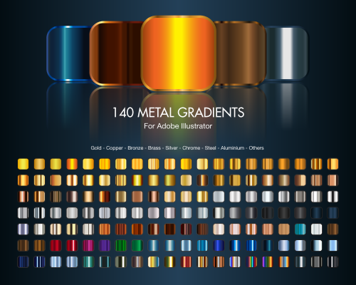
Deviant Art is always a great place to find handy downloadable things. Here we’ve located 140 metal gradients for Illustrator. There are a range of gold, metal gradients as well as copper, bronze, brass, silver, chrome, steel, aluminum and other metallic looks. This is a good starter collection of metallic gradients.
This group of gradients in files called (somewhat unimaginatively) 1.ai to 7.ai is a selection of handy gradients. While it would be nicer if these gradients were all in one pack that’s not the case so you may want to grab the lot and perhaps assemble them into a single swatch file of your own.
4. At Vectorportal.com you’ll find a series of six gradient packs totalling over 700 gradients. The images for these packs look a little on the small side but don’t let this fool you – each pack ranges in size from 75 – 160 gradients per pack. All six can be downloaded from this site.
From Faisaljasnak comes this set of gradients for Illustrator. These gradients range from subtle color shifts to gradients suitable for buttons and other web elements.
6. Adobe Exchange hosted gradients
This next group of downloadable gradients is accessible from Adobe’s own Exchange website.
Learn how to make a vector repeating pattern swatch from a pattern created using a MadPattern template.
The Madpattern Illustrator templates include instructions for saving swatches as bitmap files but most users will want to create vector swatches. How to do this is not either clear or intuitive. This video shows you how to make a vector pattern swatch and how to save and open it so you can use it again in future.
Video covers downloading and opening a MadPattern template. How to create a pattern and then how to save a vector repeating pattern swatch. It also shows how to save the swatch and how to load it to use it again in future. Also covered is how to recolor the pattern and resize it.
Transcript:
Hello, I’m Helen Bradley.
Welcome to this video tutorial.
In this tutorial I’m going to show you how you can create a vector pattern swatch using Mad Pattern templates for creating repeatable patters.
Before we get started making our vector pattern swatch let’s have a look and see what we’re aiming at.
This is a vector pattern swatch that I created earlier using the Mad Pattern templates and all I need to do is to open the swatches library they’re saved into and add it as a fill to a shape such as this one here.
It can be scaled and colored and we’ll see that again in a short period of time.
But for now we need to go and have a look and see where we’re going to get these Mad Pattern templates from.
You’ll find the Mad Pattern templates at madpattern.com.
They’re said to be compatible with Illustrator CS4 and 5.
They’re also compatible with 5.
Click here to download them.
On my website at projectwoman.com you’ll see that I have a link from my Home page to Mad Pattern template images.
These show you the series of templates that you’re being given and how they repeat.
It’s pretty critical once you get into this to know exactly which one you need to get the repeating style that you want.
We’re actually going to use P3M1 here in just a minute.
Now once you’ve downloaded and extracted the files you can open them in Illustrator.
You can choose File, New from Template but I’m actually just going to open the template itself and this is the P3M1 template.
Now when you open these templates the first thing you’ll want to do is to show your layers palette because that will show you what’s going on.
Every template will have a layer that has the exact same name as the template itself.
It will also have a small amount of information which you can turn off by clicking the Info icon here.
If you read the info it does tell you a little bit of what you need to do to actually start creating the illustration for the template and also it will tell you how you can save this for web and devices.
Now the swatch saved for web and devices is a raster swatch so it won’t be scalable to a really high degree.
It would of course be a document that you could use in Photoshop but if you want a vector swatch then that’s what I’m going to show you how to do.
So we’re going to turn off the Info and we’re going to turn off the template elements and we’re going to click in here in this clipped elements area because that’s where we’re going to create the pattern itself.
I’m just going to zoom in here, make this a lot larger to that we can see the area that we’re going to be working.
I’m going to create a simple heart for my pattern swatch so I’m just going to quickly with the Pen tool draw a heart shape.
I’m not worried too much about how it looks.
I’ve got my handles turned off so I’m just going to make sure I turn them on and let’s just call that good for my heart.
Now I am going to color it so I’m just going to get my color swatches.
I’m going to fill it with a pink color and around the edges I’m just going to make it a navy blue.
Now I’d like my stroke to be a little bit bigger so I’m just going to grab my Appearance panel because I often find that stroke and things are a little bit easier to manage in the Appearance panel.
So we’ll give it a nice wide stroke.
Now before we leave here we can also grab the Ellipse tool and we’ll drag out a couple of circles.
So I’m just going to click on the edge here of this triangle.
So I’m looking for the anchor point.
I’m going to hold Alt and Shift so I can grab and drag a circle.
I’ll just reverse the colors here.
I’ll choose my Move tool, click on the object, choose Edit, Copy and then Edit, Paste in Place.
So that gives me a duplicate of this which then I can move over the very edge of this end of the triangle.
I’m going to do the same thing with Edit, Copy, Edit, Paste in Place and this time I’ll put mine at the very bottom of the triangle.
So this is what we have so far as our pattern.
Oops, let’s just grab that there.
So this is our pattern.
And having created the pattern we’re now in a position where we can go and save it as a vector swatch.
Now to do this we need to understand a couple of things about these Mad Pattern templates and one is that this is the area in which we draw our shape.
But this is an art board and this art board is fairly critical because it tells us how big our pattern repeat is going to be.
So I’m going to click here on this Art Board tool here and I just want to click on Art Board too because I want to select it because I want to read off a little bit of information about it.
To do this I’m going to click Art Board Options and this opens this Art Board Options dialog.
And these are the two measurements I’m interested in.
I want to know the width and the height of this art board and I need to know it exactly.
So this .21 pixels, that’s critical too.
So it’s 300 x 173.21 pixels.
I’m just going to cancel out of here because I just need that information, nothing more.
Now I’m going to select and create a rectangle but I’m just going to click once on the background here because I want to type in those measurements that I just got, 300 x 173.21 pixels and click Ok.
Now this is my shape but as you can see it’s got a blue fill and a pink outline.
We just can’t see that because the shape is not in the area in which the repeat pattern is being created.
If I do move it into that area you can see that it does have that fill and that edge to it.
Now it’s critical that it doesn’t have any of those features so with it selected I’m going to turn off the stroke and I’m going to turn off the fill.
So this is now an empty rectangle.
If you’re familiar with working with repeating patterns in Illustrator CS5, 4 and earlier then you’ll know that you need this unfilled rectangle to actually select and create a repeating pattern.
Now I’ve just opened my clipped elements group here.
I’m just going to drag the path all the way down to behind the background.
I just want to tuck it away for now.
And now what I want to do is to expand this layer P3M1.
Now I can’t expand it right now with this clipping mask and also this dummy path that are here with lock icons on them so I need to go in and unlock these two icons.
And then I’m going to select P3M1, the layer that corresponds with the template name, and click on all of these layers here so that everything is selected.
Now I’ll choose Object, Expand Appearance.
If you don’t see Expand Appearance here, if it’s grayed out, then you’ve done something or left something unselected or selected when it shouldn’t be.
So just exit out of this menu and go back and check that these lock icons are deselected and that you have P3M1 or whatever the layer is that corresponds with the template name selected and that these are all selected here because you absolutely have to have Expand Appearance available.
So I’ve clicked Expand Appearance and now you can see that I’ve got this very interesting sort of pattern of things happening in the background.
That’s exactly as it should be because I did need to expand the appearance of all these shapes.
So now I’m going to go back and reselect here the rectangle shape and then I’m going to select all these other objects as well.
So I’ve got everything selected here that makes up the swatch that I want to save.
And having done that I’m going to go and grab my Move tool and drag from the middle of this rectangle so that I’m dragging and dropping it into the Swatches panel.
And this then becomes my swatch.
So to test it before we leave here I’m going to turn off all these layers.
I’m going to click the topmost layer and I’m going to add a brand new layer so that I can add a filled rectangle over the tops.
I’ve just dragged out a rectangle here.
Now we can’t see it.
But you can now see it has a border and we want to select Fill and we want to drop our pattern fill in there so that we can check to make sure that everything looks perfect.
And I suggest you go one step further and that you actually resize this pattern.
So again, making sure that we have this rectangle selected let’s go to Object, Transform Scale and let’s make sure that we’re not transforming the object ourselves but that we are transforming the pattern.
And now we’re reducing it to 25 percent and we can see that this is a perfect pattern.
It’s repeating exactly the way it should be.
It’s looking absolutely perfect.
And if it looks perfect then you’re right to go.
If it isn’t perfect then just turn off this layer, get rid of this layer and just step back and recreate your pattern.
But we’re ready to go.
Now the problem with this is if I get rid of this document as I’m tempted to do I’m going to lose this pattern swatch and it’s not coming back any time soon.
I would have to recreate it.
So I need to save it.
So I’m going to click the dropdown list here now and chose Save Swatch Library as an Eye.
This is the one you want, the one at the very bottom.
And I’m going to call this heart2 mad pattern because I’ve got a heart1 already there just so that we know that this is the pattern swatch we just created.
I’m going to click Save.
So having done that I can now get rid of this image.
I don’t need it any longer and while I might usually save it in case I want to come back and make alterations to it today I’m just going to trash it.
So I’m just going to close it.
And now let’s go and test our pattern swatch.
I’ll choose File and New because I’m going to create a brand new landscape orientation document.
I’m going to drag out a rectangle on that document and if we go to the swatches palette you’ll see that our swatch has gone.
And that is to be expected.
We have to go and grab it.
We have to go and load it.
So from the swatches palette I’m going to choose Open Swatch Library and we’re going to choose User Defined and then heart2 mad pattern because that’s the one that I just saved.
Here is my pattern swatch.
I’ve got fill selected so I’m just going to click here and the object is now filled with my pattern.
And again we can test this by choosing Object, Transform, Scale.
Now this pattern can be scaled as big or as small as you like because it is a vector pattern.
So I’m just going to scale it here.
Now not only can we scale it we can also recolor it.
So if all you wanted to know was how to create a vector pattern for a Mad Pattern template then you’re off and running now.
But if you want to know how to recolor this hang around and we’re going to have a look at this too.
So to recolor it I’m going back to my swatches here.
I’m going to grab my color swatches and I want to create this color scheme here as a new swatch.
So I’m going to click here for new color group and I want to use the selected artwork and I’ll click Ok.
And so now these are here as global colors.
I’m going to select over that and click here the Edit or Apply Color Group button and this opens this color dialog.
Now I can use this color dialog to make changes for example I can say I don’t like this blue for example and I want to make it a sort of aqua color.
And that will make it aqua.
But I can also click the Edit button here and individually change these colors by dragging on the slider.
So I can drag around and the two colors maintain the same distance from each other but I can make them less saturated or more saturated by just dragging in or out on either of these sliders.
Now I can also unlock the slider here so that they’re now independent of each other.
So I can select whatever colors I want for the fill and for the stroke color on the pattern that is being used to fill this rectangle.
So when I’m done I’ll click Ok and I do want to save the changes and so they’re now saved as a swatch.
So you have all sorts of options here using the Mad Pattern templates and there are some really, really good patterns there.
And we’ll have a look at some more things that you can do with these Mad Pattern templates in upcoming videos.
But for this video I just wanted to make sure that you were able to save your patterns as a vector swatch because that’s going to be critical in being able to resize these patterns to any size and particularly very, very large sizes without losing details in your patterns.
I’m Helen Bradley.
Thank you for joining me for this video tutorial.
Look out on this YouTube channel for more YouTube videos on Illustrator, Photoshop, Lightroom and a whole lot more.
Learn to create a vector sunburst in Illustrator – This works with all versions of Illustrator including the new CS6. The process is simple and uses a stroke to make the sunburst – it is quick and doesn’t require a lot of fiddling to create.
Transcript:
Hello, I’m Helen Bradley. Welcome to this video tutorial. In this tutorial I’m going to show you how you can create a sunburst vector shape in Illustrator.
Before we get started creating our sunburst effect let’s have a look and see what it is that we’re aiming for. Here I have a sunburst and it’s just offset in this rectangle, but you could have a circular one if you like.
We’re going to start with circular and then we’re going to crop it to a rectangle. So if you’re ready let’s have a look and see how we create this effect in Illustrator. And we’re going to start by creating a brand new document so I’ll just choose File, New. It doesn’t matter too much what my document looks like.
I’m going to start with the Ellipse tool. So, I’m going to select the Ellipse tool and drag a shape on my image. And I need this to be a perfect circle so I’m going to hold the Shift key as I draw it and then just let go. I want this to be black stroke and no fill so I’m just going to click on the fill here and turn the fill off.
Now let’s go to the Appearance panel for this selected path and I’m going to click the Stroke option. And I’m going to set the stroke to about 200 points. And when I do you’ll see that we get this sort of circle all the way around our shape which is pretty near exactly what we want when we click the Dash Line option. Now with the Dash Line option I can set the dashes to whatever I want and this is going to affect how many of these sunbeam things there are around the shape.
So let’s just go to 20 and try that. This is what I’m a little concerned about. You can see that there’s an uneven spacing here, but you’ll see that you can adjust that by clicking this option here. So just work out how many points you need to get the number of sunrays that you want for your particular shape. I’m going to do a few more in this one rather than less so I’m going to 10 points. And when I’ve got what I want I’m just going to click away from this. And this is the basic shape. Now before we can do anything with this shape we’re going to first have to expand its appearance.
So with the shape selected I’m going to choose Object and then Expand Appearance and then Object, Expand because I want this dialogue here. And I’m going to expand both fill and stroke So I’ll select both of those and click Ok. And now each of these sunbursts is a separate shape and I need now to close up the middle. And I can do that by grabbing the Lasso tool. It’s the easiest tool to use. And all I’m going to do is just drag around because I want to select all the nodes and pointers’ handles in the middle.
Now I’m going to choose Object and then Path, and I’m going to choose Average. And with Average I’m going to select both Horizontal and Vertical and click Ok. And what that does is it just closes up the middle nicely for me. So I’m going to click outside my shape and here is my sunburst shape. So with it selected I can then go to what is now my fill color and I can choose a different fill color for it. And we could fill it with a gradient.
We could do anything we liked at this point. So let’s see now how we’re going to crop it. So I’m going to select the Rectangle tool. I’m going to start by drawing a rectangle and I’m just going to hold the spacebar as I bring it in position over the top of my sunburst because I want to work out exactly where the sunburst is going and where the rectangle is going relative to it. So I think that’s a pretty good position for me. So I’m going to let go of the spacebar and let go of the left mouse button and now select all my objects. I’m selecting other everything, and in the Pathfinder I’m going to select Crop. And that crops the shape to the size of that rectangle. And we lost our fill here so let’s just click on the fill and put the fill back on.
So here is a shape that we could save to our Symbol library. And those sunbursts are very, very easy to create in Illustrator as vector shapes. And of course if you add it to your Symbol library then you’ll have it available anytime you want to use it. And it’s very easy to create ones with different numbers of rays in them.
I’m Helen Bradley. Thank you for joining me for this video tutorial. Look out for more of my videos on this YouTube channel and please like and comment on the videos. Look out too for my website at projectwoman.com. There you’ll find more tutorials and tips and tricks for Illustrator, Photoshop, Photoshop Elements, Lightroom, GIMP and a whole lot more.
See how to create some effects such as rotations and a transparency heart effect in Illustrator. This is Part 2 of the videos on halftone hearts.
Transcript:
Hello, I’m Helen Bradley. Welcome to this video tutorial. In this tutorial we’re going to take a step further from our halftone hearts tutorial and have a look and see what we can do with the halftones that we create. In this video we’re going to go one step further than the last video.
In this video we’re going to create this sort of circular effect from the string of hearts that we created using the Blend tool in Illustrator. And then I’m going to show you how you can use a transparency mask to create this sort of effect in Illustrator as well.
We’re going to start with a brand new file. And I have some of the elements left over from the first video here that we’re going to use. And we’re going to bring in this heart shape. And I also have a spare set of this string of hearts that we created so I’m going to bring that in. That just saves us having to recreate those. Now I want two sets of this so I’m just going to drag a second set away from the first.
Let’s have a look first at how we would create that sort of spiral. I’m going to size the hearts down in proportion so I have a small set because I’m going to rotate these around to create the full rotation. To do that I’m going to choose Effect and then Distort and Transform and I’ll select Transform. I’m going to click Preview so I can see what’s happening, and I’m going to rotate these around at this bottom point. So this is the very bottom point of this chain of hearts and I’m going to rotate them 10 degrees. Now I haven’t got Copy set so this individual string is going to be rotated 10 degrees but I want enough rotations that I can go all the way around a circle. And if I rotate something 10 degrees in 10 degree increments I need 36 of those to go around the circle because a circle has 360 degrees. And that’s all I need to go to create this shape so I’ll click Ok.
And now that shape is created but of course it is still really just a string of heart. And to make it into the individual shapes we’ll choose Object and then Expand Appearance. And now it is those little heart shapes individually. The other thing I want to do is to create a set of halftone hearts that we can use as a transparency mask for this particular heart.
First of all I’m going to switch the foreground and background colors here so that we have a pink heart. And I need to create a box, a sort of rectangle of these hearts. So again I’m going to shrink these down so they’re about the same size or height as this heart is because they’re going to be used for a transparency mask for that. I’m going to select these and again I’m going to do is the transform so I’m going to choose Effect, Distort and Transform and then Transform. This time I’m going to create about 20 copies. And I want to move these so I’m going move these in a horizontal direction about 7 or 8 pixels, let’s say 8 pixels here, and just click Ok.
I just want a block of hearts big enough for me to put my heart on top of that. So they just need to be that size. I’m going to expand the appearance of this halftone effect so I’ll choose Object and then Expand Appearance. And then I want to copy it to the Windows clipboard so I’ll select it all and choose Edit and then Copy. So it’s now in the Windows clipboard and I can just tuck it outside out of the way because we don’t need it anymore.
With the heart shape selected I’m going to use the Transparency palette which we can get to by choosing Window and then Transparency. And I’m going to click to make a mask. And because I want this mask to be clipped to the heart shape I’ll click Clip. I’m going to select on the mask here and I’ll just choose Edit and then Paste. And here is the halftone heart shape. And I’m just going to position it into position here. And I want the little hearts to be pretty much up around the top curve of the heart so it’s really quite well defined. So I’m thinking that’s probably going to be about the right position. And then to go back to working with my heart I’ll click on the heart in the Transparency palette. And that’s how the final effect looks.
What I did when I showed it to you earlier was I created a filled, a red filled square that was over the top of the heart. I’m just going to create my square. And this needs to be sent behind so I’m going to send it to the back. And the heart itself instead of being filled with pink was filled with black so I’ll just click the fill color and we’ll fill it with black. Now if the mask is not in exactly the right place we can also just select back on the heart, reselect the mask and perhaps adjust the positioning of the mask by a pixel or two, reselect the heart and we’re back working with the heart itself.
So there are some effects that you can create using this sort of halftone effect which we created this time using halftone hearts rather than halftone dots in Adobe Illustrator.
I’m Helen Bradley. Thank you for joining me for this video tutorial. Look out on this YouTube channel for more of my video tutorials and go to my website at projectwoman.com for more tutorials, tips and tricks on Illustrator, Photoshop, Photoshop Elements, Lightroom and more.
Learn how to make half tone effects with hearts (instead of dots), in Illustrator. Uses the Blend and the Transform tools for this effect. This is part 1 of a two part series on halftone hearts.
Transcript:
Hello, I’m Helen Bradley. Welcome to this video tutorial. In this tutorial I’m going to show you how you can make halftone hearts in Illustrator.
Before we get started creating our halftone heart effect let’s see what it is that we’re aiming for. And this is the effect that we’re going to create by the end of this video tutorial. And if you look at the link below for the next video tutorial in this series I’m going to show you have to create this effect and this one too.
But for now let’s get started on this effect. I’m going to create a new file by choosing File and then New and click Ok. I’m going to view my rulers so that I can drag a guide in that I will use as a guide for drawing my shape. I’m going to grab the Pen tool. I’ll click and drag on the guide. I’m going to add a curve over here, another one here, and one finally back here down on the guide. And I’m just going to Ctrl click outside to disable that Pen tool. And here is my shape. And obviously I need to do something with it before we go any further.
I’m just going to adjust these points so that we get something looking a little bit more like a heart shape. I’m going to get rid of my guides so I’m just going to clear my guide. And let’s go back over, select this shape and let’s give it a stroke. So with the shape selected I’m going to give it a pink stroke, and I’m just going to make that a bit of a larger stroke so we can see it clearly. To flip this shape to make the rest of my heart I’m going to first select the shape and then I’m going to click the Reflect tool which shares a toolbar position with the Rotate tool.
The first thing to do with this tool is to click on the anchor point across which you want to flip it. So that’s going to be either this top point here or this one here. It doesn’t matter which. I’m going to Alt click on it. Now I’m getting that reflected shape sort of across the vertical access and all I want to do is to click Copy to make that a heart shape. And now I’m going to join it together by selecting it and choose Object Path Join. And here is now my heart shape.
Now I want to size this down a bit. Actually I’m going to scale it in proportion. And I’m going to make a duplicate of it so I’m going to hold it as I drag a duplicate away. And I just want to tuck this duplicate out of the way for the minute. I don’t want it around but I’m but I’m going to need it a bit later on. So let’s go and select this one and let’s size it down to be the starting point for our halftone heart. So I’m just going to fill this with pink. And I want another duplicate of this so I’m just going to Alt drag a duplicate away. And this is going to be the top one of my hearts. And I want these to line up, although right now is not the time to line them up. I’m going to size it down first of all. So this is going to be my little heart. This is going to be my big heart. And now I’m going to place it in position.
So I want these to align perfectly to their mid lines. They’re not doing that right now. There we are. This is the line that I want. I want to make sure that they’re perfectly aligned so that the point of this heart lines up with the point of this one. And I’m going to change the color so this one I’m going to make quite a sort of dark crimson color. Only I wanted that for its fill and not its stroke. So we’ve got a dark large heart and a very pale pink small one. What we’re going to do now is to blend these two shapes together so we’re going to blend the little and the big heart together. So we’re going to use the Blend tool here on the toolbar. So I’m going to select it and then I’m going to click on the first of the shapes and click on the second. And that blends these two shapes together.
Well it does such a good job that it looks nothing like what it is that we really want. So I’m going to double click the Blend tool to open the Blend options dialog. First of all I’m going to enable Preview and I don’t really want Smooth Color. I want Specified Steps. At the moment there are 127 steps to blend these two shapes and colors together. And I don’t want that. I want to actually see the shapes. So I’m thinking I’m going to start with something like 25 steps and see how that looks. That’s pretty good. Probably let’s just try down to 20 on this one. The other thing that you can do is you can also use Specify Distance as well as Smooth Color. So we don’t want Smooth Color. We definitely want to see these shapes. And we can either go with steps or distance. But I think that’s pretty good so I’m going to click Ok to accept that.
So now we’ve got the first of our lines of hearts and we just want the rest. And we get the rest with a Transform effect. So I’m going to click Effects and then choose Distort and Transform and we’re going to choose Transform. And here’s the Transform dialog. Again I always want to click on Preview so I can see what’s happening here. And let’s do 15 copies. And what I want to do is to make each copy a little bit to the side of this one. So I’m just going to choose Horizontal Move here. And I’m going to move these apart until they are looking like what I want them to look like. Now I quite like that but I think I don’t have enough copies. So I’m going for 25. What I want here is I want these hearts to run into each other. I made it so that the ones would run into each other in the vertical direction. And I want these in the horizontal direction also to run into each other so that I get this final effect. So I’m just going to click Ok.
And there is my effect that we came here looking for. This is a halftone set of hearts. And they vary from light at the top, very small too dark at the bottom. And if we want to create these so that we can work with them we’ll expand them. So with this line selected I’m going to choose Object and then just Expand Appearance. And these are now grouped but their appearance is expanded so we can work on them a little more time. Here is the Link on working
Learn to add a texture to an image in Illustrator using an Opacity mask – also often called a Transparency mask.
This method is fool proof and it works – it’s also pretty simple… which is good!
Transcript:
Hello, I’m Helen Bradley. Welcome to this video tutorial. In this tutorial I show you how to add a bitmap texture overlay over an image in Illustrator CS6. To see how we can use a transparency mask on an image to give it a sort of grunge or a slightly distressed look.
Let’s start off with a rectangle. So I’m going to create a rectangle the shape and size of my art board. And I already have it filled with a pattern here. This is the pattern that I’m using. It’s a pattern that we created earlier in another video. I’m going to choose Object and then Transform and then Scale because I want to scale the pattern down to around 75 percent of its original size. So I’ll just type 75 percent and in this case I’m transforming the patterns only. Actually that’s still a bit on the big side so let’s go back and scale this down to say 50 percent, again, just the pattern and click Ok.
So here is my pattern and I want to add a sort of grunge overlay effect to it so I’m going to choose Window and then Transparency because this is going to give me my transparency mask. And I’m going to double click here to create and edit my mask. So I have the mask selected here. This is my image selected. This is my mask selected and I’m going to add a file to it by choosing File Place and we’re going to select the sample that we created earlier and click Place. And here it is over the image. Now right now it’s fairly intense but I can invert it to reverse the colors from black and white to white and black so I get a different effect.
Now this particular mask is really quite a bit larger than the image so I’m thinking that if I scale it down to probably around 30 percent and fix the proportions of this it gets pretty near right here. So I’m just going to scale the original image to the size. Well maybe just a little bit smaller so that we can see that we’ve actually got this transparency mask effect on our image. This is the original look of our image and this is the mask version. Now again we can click Invert if we want to use the white areas of the image or here to use the black areas of the image as our mask. When I’m done with that I can just click back on my image to continue to work with it.
So here is my image or the original filled rectangle. As you can see the mask is applied to that filled rectangle and it’s going with it wherever it happens to go. So wherever I move my rectangle to three quarters or most of it is covered with this transparency mask. Just this bit is not covered. I wanted to show you that the transparency mask is only going to work on the areas of the image that we actually selected for it to work on. And it’s actually attached to this shape so it will travel with it.
So anytime you need to give an image a grunge or a distressed sort of look, head to Photoshop, grab a nice texture, turn it into as close to a black and white of an image as you can or even convert it to black and white. That’s fine too and then just bring it in onto a transparency layer as a transparency mask to give your underlying shape a more grunge look.
I’m Helen Bradley. Thank you for joining me for this video tutorial. Look out for more tutorials on my YouTube channel and visit projectwomam.com for more tips, tricks and tutorials on Photoshop, Photoshop Elements, Lightroom and Illustrator.
Learn to use the new Pattern Maker in Illustrator CS6 to make repeating patterns.
This video covers the tools in the dialog and how to save the pattern. Make half drop repeats, brick and hexagonal patterns in a few seconds.
Transcript
Hello, I’m Helen Bradley. Welcome to this video tutorial. In this tutorial I’m going to show you how to make a repeating pattern in Illustrator CS6.
To make a repeating pattern in Illustrator we’re first going to need a shape to work with. So, I’m going to create just a little square shape to use, and I’m going to add a fill color to it. I’ll select a pink fill and then a blue border so we can see what we’re working with. And I’ll make it about a 5 point border. So that’s my shape that I’m going to work with. And I want it to be sort of like a flower shape so I’ll choose Effect, Distort and Transform, Pucker and Bloat. And I’m going to Bloat it to 200 percent and just click Ok. So, this is my shape that I’m going to be working with.
To make a repeating pattern all you need to do is choose Object and then Pattern and then Make. And we now have a pattern piece added to the Swatches panel so I’ll just click Ok. And that is as easy as it is to create a pattern in Illustrator. But of course now that we can see our pattern we may want to make some changes to it.
So firstly we can change the number of copies to say 3 by 3 but I have a 5 by 5 grid in place so I can see things clearly. Dim Copies allows you to dim the duplicate or the repeating pattern so that you can see which is your original piece and which is the repeating pattern I have that now set at 100 percent so the copies are not dimmed. Let’s go back to dimming them.
Now these settings here can be a little bit confusing when you first encounter them. What these Width and Height are is this blue box so that’s the box in which my pattern is created. So if I lock these together and if then I decrease them say to 150 these are going to be scaled proportionately because I have it locked. So I’m just going to press Tab. Now the box is squeezed up and you can see that my pattern is now going to overlap. And I can control how it overlaps by using these icons here. So I can show various pieces of my pattern. If I want it to be on top over here and underneath here for example I can adjust that. But if I take this up to larger than my pattern piece, and I know that this is going to be larger than my pattern piece, I’ve typed in 250 and pressed Tab.
Now you can see that we’ve built in extra space around our pattern piece so there is more room here for perhaps adding other elements. Here is the type of pattern. At the moment we have grid but we could do Brick By Row and then we can offset the brick by a certain amount, one third, three quarters and so on. There’s Brick By Column and the offset is in a different direction. There’s also Hex By Column and Hex By Row. And for this pattern piece I think Hex By Column looks pretty good so I’m going to settle on that. Now if I wanted to add a bit of extra horizontal spacing I could do so but I’ll need to size my tile to the art and then add it in because you can see that right now these are grayed out. But if I size the tile to the size of my art I can then add some extra spacing. At the moment this is unlocked so that’s 10 points of horizontal spacing and now 20 points of vertical spacing. But I prefer not to size my tile to the art so I’m just going to leave that as it is.
Now one of the other things that we can do in this pattern area is we can add extra bits to it. So this is actually looking a little bit small for me so let’s just take it up a little bit larger so I’ve got some extra room in here. And I’m going to select the Ellipse Tool and I’m just going to hold the Shift key as I draw in here a circle. And you can see that the circle has now become part of the pattern. So if I select on the circle here, hold the Alt key as I drag a duplicate away, I now have two circles. And they’re part of the repeating pattern. I’m going to hold my Shift key as I select over both, now hold Alt as I drag a duplicate away and here we have a total repeating pattern. But we’ve been able to add pieces to it because we were actually working in this Pattern Make feature in Illustrator when we did it. Now these can also be adjusted so we’ll see that in a minute. But for now let’s just click Done. And that has saved our pattern to the pattern Swatches in Illustrator.
So let’s just go and get our pattern piece and we’ll tuck it away here off the art board for a minute. I’m going to select a rectangle and draw a rectangle here and let’s turn off the Stroke and let’s fill it with our new pattern. And there it is. Now you might see a missing pixel through your pattern. Don’t worry. That won’t be there when you actually come to print it. It’s just a resolution issue. Now I have this shape here and I might say well that pattern is fine but it looks a bit big for the shape. So I’m going to choose Object, Transform and then Scale and I’m going to disable Transform Object so that will then scale the pattern down to 25 percent of its original size but not the object and then just click Ok. So there is my pattern filled shape.
Now this shape is, this pattern is in the Illustrator swatches. It is only going to exist for this document. So if you want to keep it go up here, select the dropdown list here and click Save Swatch Library as AI. So this means that you can get it back later on. I’m just going to call this flower55 and click Save. And so now that swatch will be available later on that I can come and get it if I want to reuse the swatch in another Illustrator document.
Now we’ve already seen how we can add shapes to our pattern. But what happens if we look at this and decide that the shapes are ok but the color is not? So what I’m going to do here is go to the Layers panel here and go and locate the actual pieces that are part of this pattern. So I’m going to select this piece here and with this piece selected I can now go and make changes to it. So I’m going to give it a green fill color and then I’ll go here and select the next piece. And this is now targeted and I’ll go and grab a different fill color for it. And let’s go and select this one. We’ll give it the same green fill color as we used previously. And then let’s target this one here and we’ll give it a yellow fill color.
So if you come back and look at your shape and say well yes the pattern looks really good but the colors are not right it’s very easy to open up the layers panel here and to make adjustments to it. So for example if we didn’t like the pink here I can grab the pink path here and you can see that the pink path here for the inside shape has been separated from the path that is the stroke. And then I can just select to apply a different fill color to this particular piece here. And it hasn’t adjusted the stroke. The stroke needs to be separately selected. Here is the blue stroke color here and we could perhaps make it a darker blue. So once I’ve got that looking the way I want it to I can just double check by filling it back in.
And if I say yes that’s fine, that’s exactly what I want, and now this has been created as a new pattern. But if it wasn’t, if I’d already created this as a pattern in the pink color and I wanted to also save a green version what I can do is click Save a Copy and I’m going to call this flower 45 and it will then be saved as a different pattern swatch so it won’t be created over the top of the original. And when I’m done I’ll just click Done.
So now I have two pattern swatches so I’m just going to click the shape here. You can see here now that we could fill it with this green pattern swatch or we can go back to the original pink one. If we go to green again we would probably want to scale this down. So we’ll go to Object, Transform, Scale, again transforming only the pattern, not the object itself. So there you have the ability to create repeating patterns very, very easily in Illustrator CS6.


